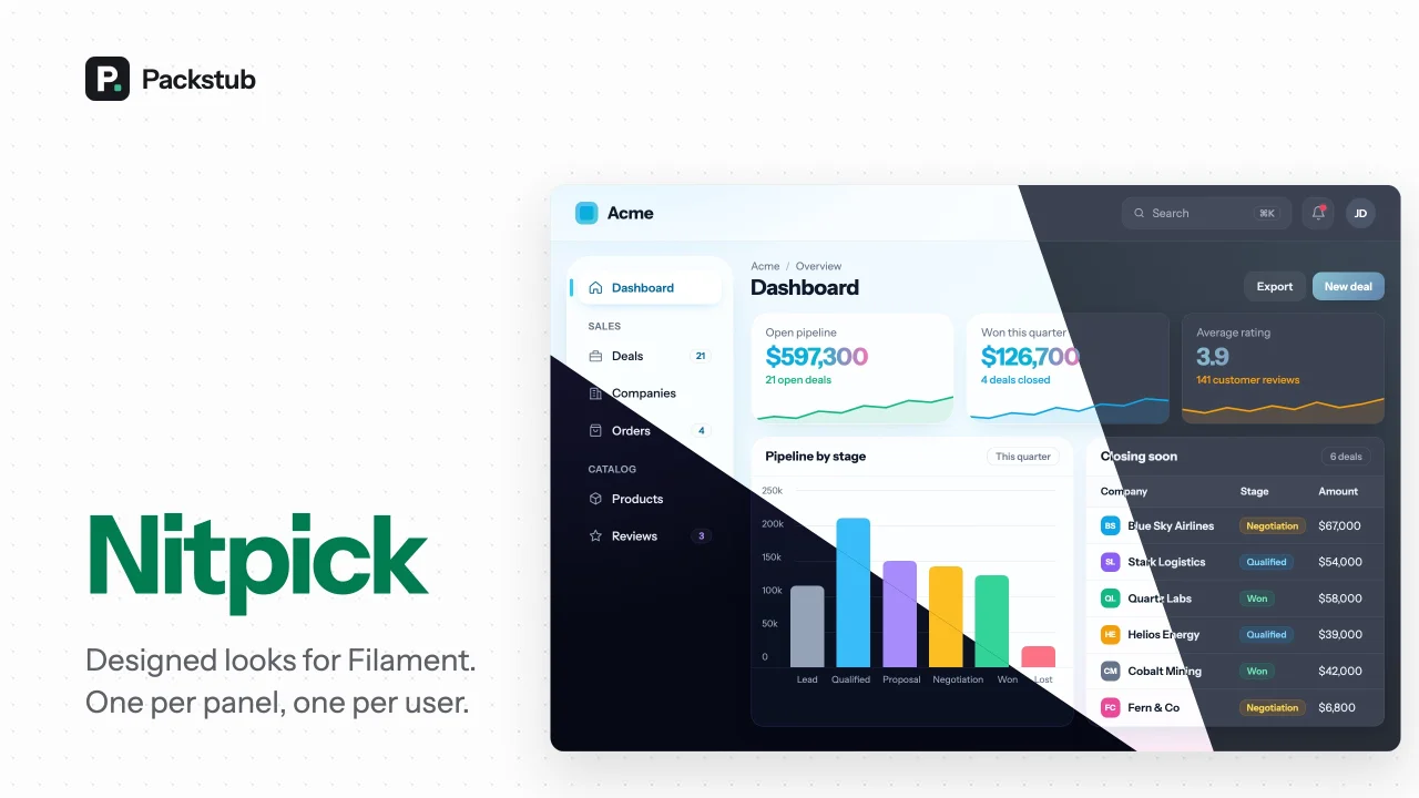
Nitpick by Packstub
CommunityGive users a theme picker in the Filament user menu: designed themes, community themes or your own, with a default per panel.
 Author:
Packstub
Package health
Automated checks of this plugin's Composer package
15 checks
- Passed: GitHub Actions pinned to SHA
- Skipped: GitLab CI includes pinned to SHA
- Skipped: Open security advisories
- Passed: Dependabot PR responsiveness — No open Dependabot PRs.
- Skipped: Renovate MR responsiveness
- Passed: Dependabot or Renovate configured
- Passed: Dependency update cooldown configured
- Passed: Provides a security policy
- Passed: Abandoned or archived — No consulted source marks the package abandoned (packagist, github).
- Passed: Commit and release recency — Active: last commit 0 days ago; no release date available.
- Skipped: composer.lock not committed by library
- Skipped: Dist archive is lean
- Skipped: Current Laravel version supported
- Skipped: Current PHP version supported
- Skipped: Current Symfony version supported
filament/
namespace. Review the source and install at your own risk. Found
malware or an unresolved security issue the author won't
address?
Report it
.
Documentation
- Features
- Compatibility
- Installation
- The bundled themes
- Themes from the Filament plugin directory
- A theme per panel
- A theme per user
- Writing a theme
- Colour overrides and custom CSS
- Configuration
- Documentation
- Testing
- Changelog
- Security
- Credits
- License
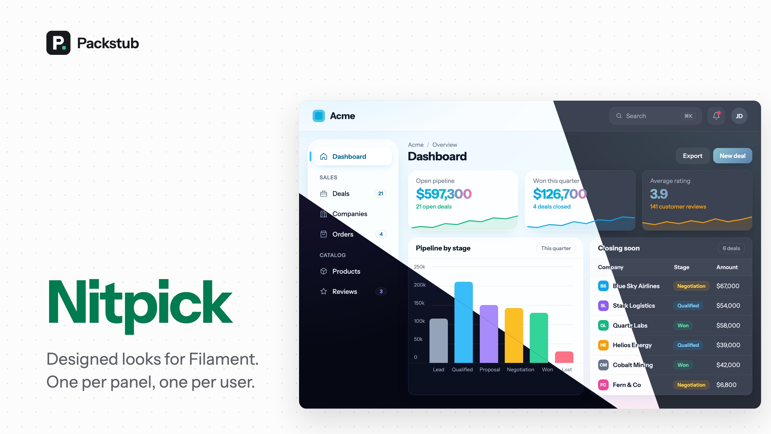





Themes for Filament panels, and a way for every person to pick their own.
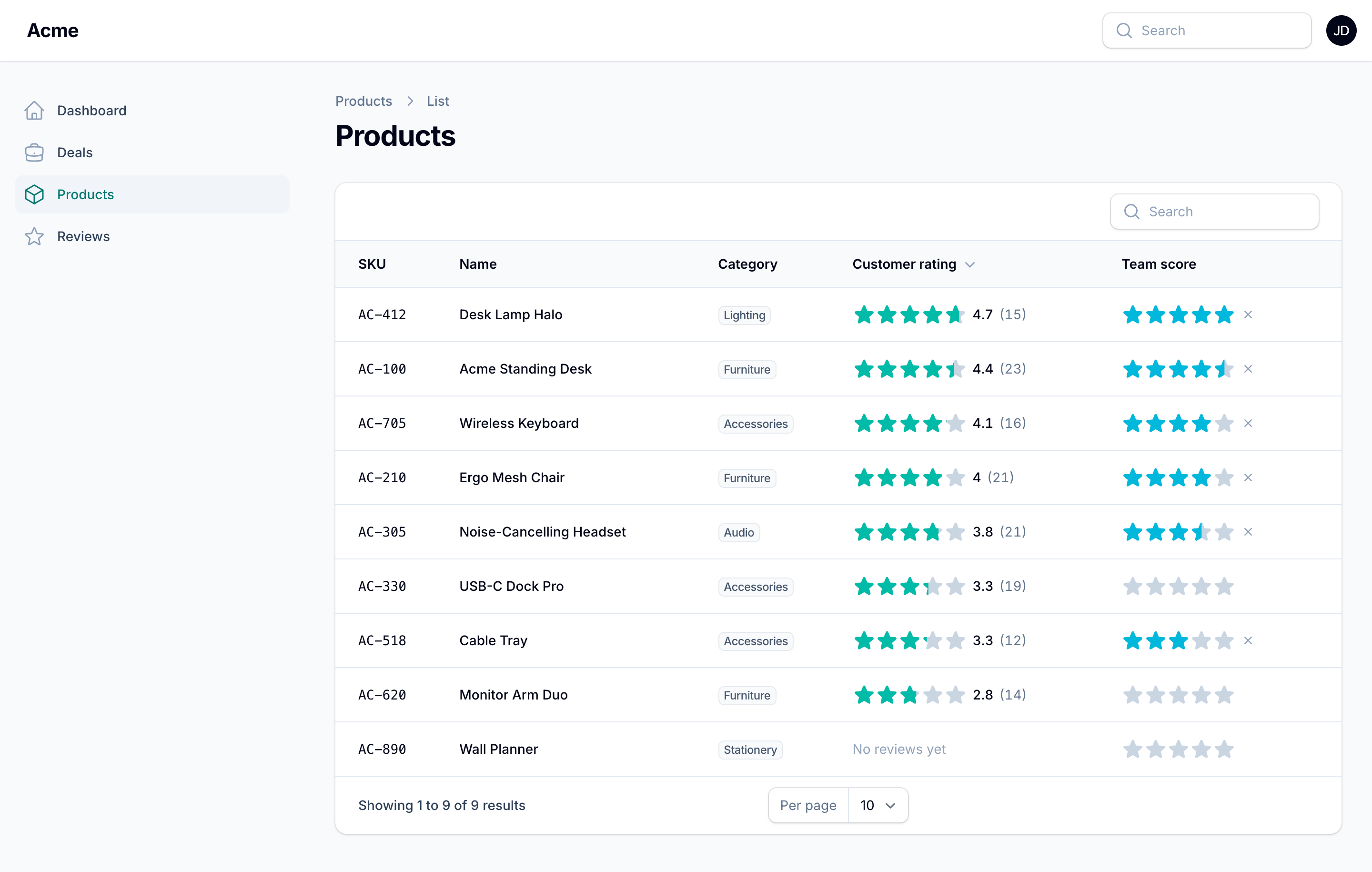
A theme is a colour palette plus a stylesheet that restyles the panel. This plugin ships two designed ones, lets any package add more, gives each panel a default, and adds an Appearance page where a signed-in user chooses the theme they see, the way they already choose light or dark mode.
It is also a home for the themes you already like. Install a theme plugin from the Filament plugin directory, free or paid, and one line puts it in the picker beside the others:
use Caresome\FilamentNeobrutalism\NeobrutalismeTheme;
use Packstub\Nitpick\Facades\Themes;
use Packstub\Nitpick\Theme;

// AppServiceProvider::boot()
Themes::register(
    Theme::make('neobrutalism')->plugin(fn () => NeobrutalismeTheme::make()),
);
#Features
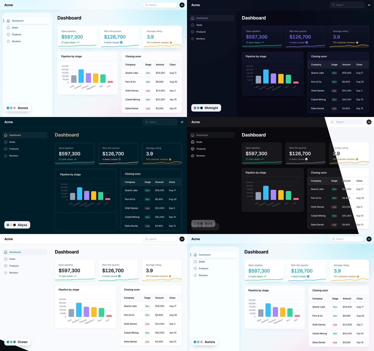
- Two bundled themes: Aurora, glass with a floating dock sidebar, and Midnight, dark with violet accents.
- Themes from the plugin directory: install a free or paid theme plugin and register it in one line; it joins the picker. Ready-made CSS and Vite-built themes alike.
- A theme per panel: each panel picks its themes and default; the default can follow the workspace.
- A theme per user: an Appearance modal in the user menu where each person picks their theme, with a fade, slide or sweep as it changes.
- Write your own: a theme is a class with a palette, plus a stylesheet for a full redesign;
Theme::make()defines one inline, and->panel()lets it configure the panel (top navigation, fonts) while it is active. - Fits your brand: your colours and CSS on top of any theme.
- Dark mode and translations: both bundled themes have a dark variant; every string lives in a language file.
#Compatibility
| Plugin | Filament | Laravel | PHP |
|---|---|---|---|
| 1.x | 5.x | 12.x, 13.x | 8.3+ |
#Installation
composer require "packstub/filament-nitpick:^1.0@beta"
php artisan nitpick:install
php artisan filament:assets
The install command publishes the config file and the theme_preferences migration and offers to run it. Then register the plugin:
use Packstub\Nitpick\NitpickPlugin;

public function panel(Panel $panel): Panel
{
    return $panel
        // ...
        ->plugin(
            NitpickPlugin::make()
                ->default('aurora')
                ->picker(),
        );
}
That is the whole setup. The panel renders in Aurora, and Appearance appears in the user menu.
#The bundled themes
Two themes ship with the plugin. Each has a light and a dark mode, and prefers one of them.
Aurora (prefers light): iridescent glass surfaces, a floating dock-style sidebar, sky and cyan accents. "Daybreak" in light mode, "Twilight" in dark.
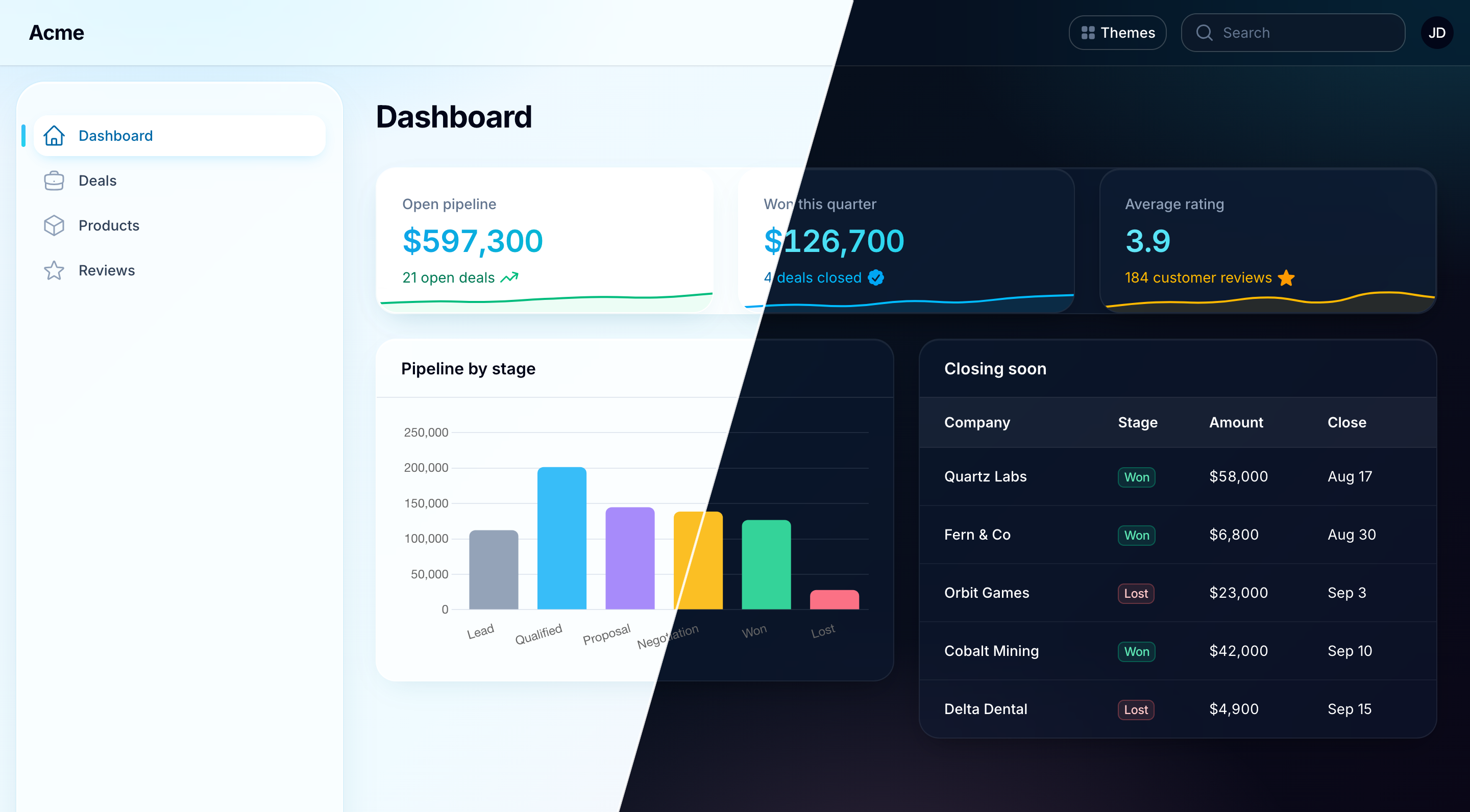
Midnight (prefers dark): deep near-black surfaces with a violet-to-cyan accent gradient. In light mode it keeps its shapes and palette on Filament's standard surfaces.
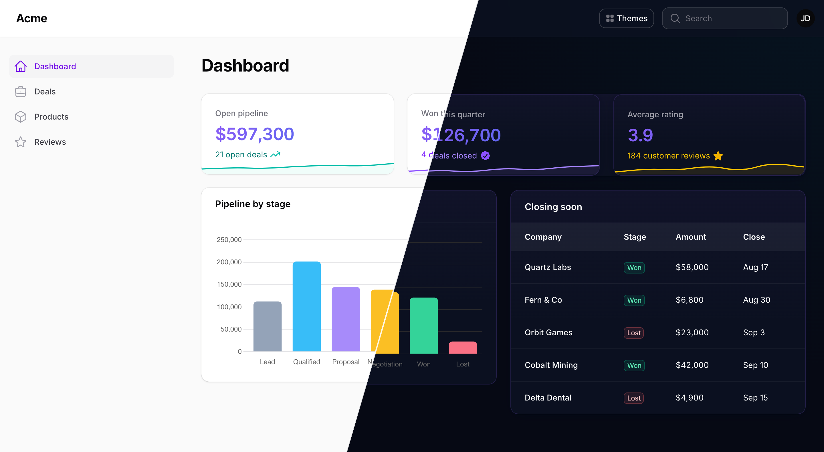
A theme's preferred mode becomes the panel's default mode while the theme is active. A user who has toggled light or dark keeps their choice.
#Themes from the Filament plugin directory
The Filament plugin directory has a growing shelf of themes, free and paid, each with a character of its own. Any of them can sit in your picker beside the bundled ones, so a panel offers as many looks as you care to install.
Install the theme's package the way its own docs describe, then hand its plugin to a theme. Here is Nord, Andréia Bohner's polar-night palette and one of the most installed themes in the directory:
composer require andreia/filament-nord-theme
Nord's docs ask for its CSS to be imported into a Filament theme file. Give it a file of its own, so it is compiled apart from your panel's stylesheet, and add the file to the input array in vite.config.js:
/* resources/css/themes/nord.css */
@import '../../../vendor/filament/filament/resources/css/theme.css';
@import '../../../vendor/andreia/filament-nord-theme/resources/css/theme.css';
Then register the theme, naming the compiled file with the vite: prefix, and run npm run build:
use Andreia\FilamentNordTheme\FilamentNordThemePlugin;
use Packstub\Nitpick\Facades\Themes;
use Packstub\Nitpick\Theme;

// AppServiceProvider::boot()
Themes::register(
    Theme::make('nord')
        ->plugin(fn () => FilamentNordThemePlugin::make())
        ->stylesheet('vite:resources/css/themes/nord.css'),
);
Nord is now one more card in the picker: a panel default, a per-user choice. The plugin joins the panel while its theme is active, and only then, so it styles the panel exactly as its own docs describe (palette, stylesheets, fonts, render hooks, layout) and leaves no trace while another theme is picked. Configure it the way its docs say and the theme follows. Picking it reloads the page.
A theme that ships ready-made CSS needs no build: Neobrutalism, by Caresome, with its bold borders and hard shadows, is composer require caresome/filament-neobrutalism-theme, the one line at the top of this page, and php artisan filament:assets.
A theme can be a palette, too. Shadcn, by Openplain, the most installed theme in the directory, puts its colours in the picker with Theme::make('shadcn')->colors(['primary' => ShadcnColor::Default]).
Register as many as you like, one Theme::make() each. Themes walks through each kind of theme: ready-made CSS, a Vite theme, a palette and its stylesheet (Shadcn), and a theme that changes the layout (Press). Tested themes lists the 30+ community themes run through the picker, with the setup each one takes.
Writing a theme plugin? For theme authors covers the habits that make it work well in Nitpick, and in any app with more than one panel.
#A theme per panel
use Packstub\Nitpick\Themes\Aurora;
use Packstub\Nitpick\Themes\Midnight;

NitpickPlugin::make()
    ->themes([Aurora::class, Midnight::class, 'ocean'])   // what this panel offers; defaults to every registered theme
    ->default(Midnight::class)                             // by class, id or instance
The default may be a closure, evaluated on every request:
use Filament\Facades\Filament;

NitpickPlugin::make()
    ->default(fn (): string => Filament::getTenant()?->theme ?? 'aurora')
Register the plugin on every panel that should be themed. Each has its own offer, default and user choices.
#A theme per user
NitpickPlugin::make()->picker()
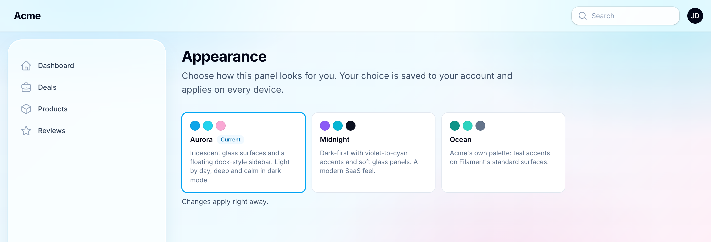
Turning this on:
- adds an Appearance item to the user menu that opens the picker in a modal of fixed width and columns, and registers an Appearance page (
/appearance) with the same picker; - saves each user's choice for this panel in the
theme_preferencestable (or the session, see Configuration); - changes the theme the moment a card is clicked, behind a short fade (
->picker(transition: Transition::Slide),Transition::Sweep, orfalsefor none). A theme that changes the layout reloads the page under the same cover, and the modal opens again.
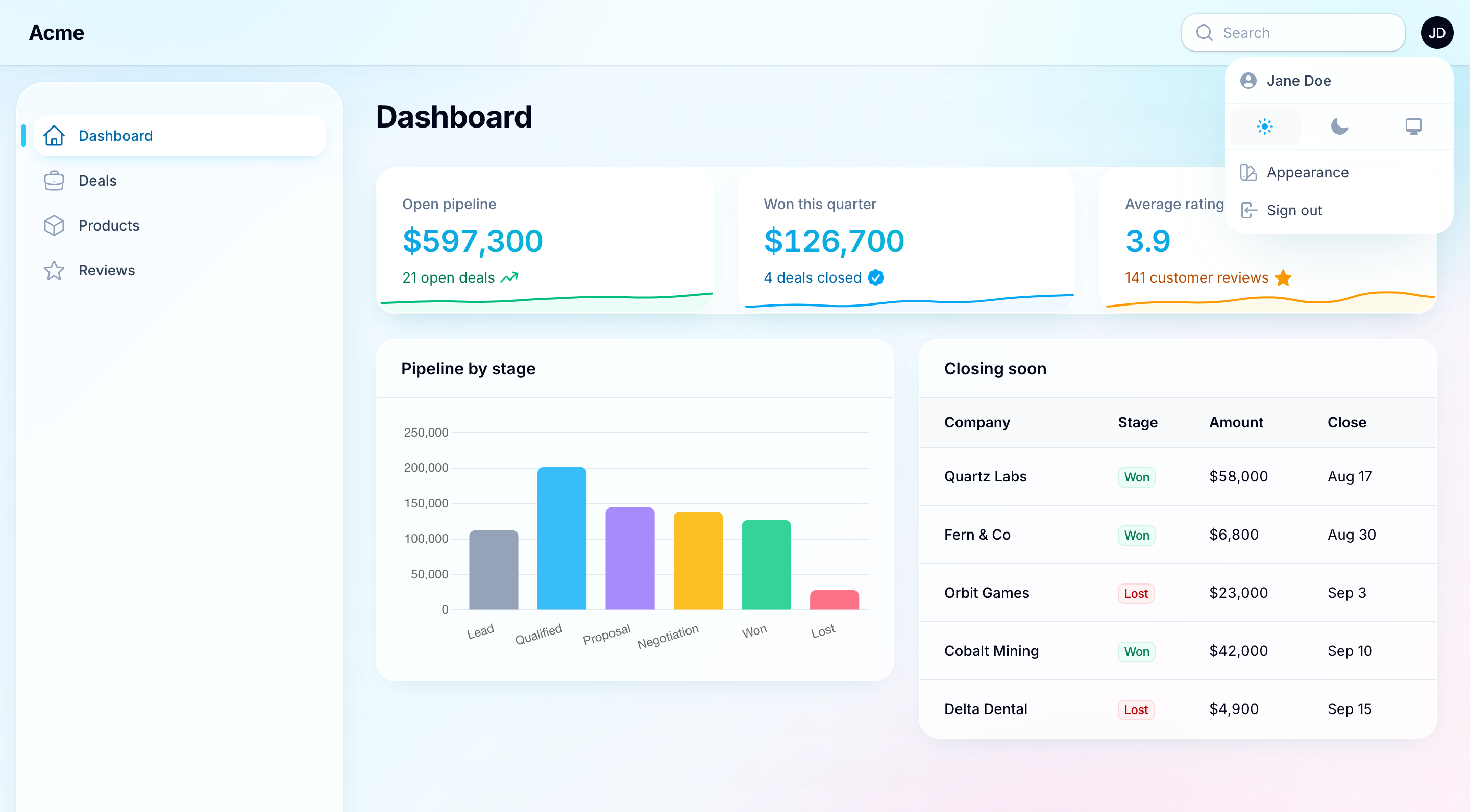
To offer the picker inside your own profile form instead, drop in the field. It fills itself with the user's current theme and saves on change:
use Packstub\Nitpick\Filament\Forms\Components\ThemePicker;

ThemePicker::make(),
Each card shows the theme's swatches and name, with its description as the tooltip; ->descriptions() shows it under the name, and ->picker(fn (ThemePicker $picker) => $picker->descriptions()) on the plugin does the same on the Appearance page. Use ->persist(false) to handle the value yourself on submit, and NitpickPlugin::get()->setUserTheme($id) to save it. Reading and writing a choice from code:
$plugin = NitpickPlugin::get();

$plugin->getActiveTheme();          // what this request renders
$plugin->getUserTheme();            // the signed-in user's choice, or null
$plugin->setUserTheme('midnight');  // save; null clears it
Saving fires Packstub\Nitpick\Events\ThemeChanged.
#Writing a theme
A palette-only theme is three methods:
use Filament\Support\Colors\Color;
use Packstub\Nitpick\Theme;

class Ocean extends Theme
{
    public function getId(): string
    {
        return 'ocean';
    }

    public function getLabel(): string
    {
        return 'Ocean';
    }

    public function getColors(): array
    {
        return ['primary' => Color::Teal, 'gray' => Color::Slate];
    }
}
Add a stylesheet to restyle the panel. Scope every rule to html[data-packstub-theme="ocean"] so other panels stay untouched, and declare the mode the design is made for:
use Filament\Enums\ThemeMode;

public function getStylesheetPath(): ?string
{
    return __DIR__.'/../resources/css/ocean.css';
}

public function getPreferredMode(): ?ThemeMode
{
    return ThemeMode::Light;
}
Register it from a service provider (or AppServiceProvider::boot()):
use Packstub\Nitpick\Facades\Themes;

Themes::register(Ocean::class);
The stylesheet is registered as a Filament asset, so php artisan filament:assets publishes it. From there the theme can be a panel default, offered to users, or shipped as its own Composer package.
A small theme needs no class file. Theme::make() defines one where you register it:
use Packstub\Nitpick\Theme;

Themes::register(
    Theme::make('nord')
        ->colors(['primary' => Color::Sky, 'gray' => Color::Slate])
        ->stylesheet(resource_path('css/themes/nord.css'))
        ->mode(ThemeMode::Dark),
);
An anonymous class (new class extends Theme { ... }) works too.
A theme plugin from the Filament plugin directory joins the picker with Theme::make()->plugin(); see Themes from the Filament plugin directory.
A theme can also configure the panel while it is active, with top navigation or fonts:
Theme::make('newsroom')
    ->colors(['primary' => Color::Red])
    ->panel(fn (Panel $panel) => $panel->topNavigation()->font('Fraunces')),
More in Creating a theme.
#Colour overrides and custom CSS
use Filament\Support\Colors\Color;

NitpickPlugin::make()
    ->colors(['primary' => Color::Indigo])       // on top of whichever theme is active
    ->customCss('css/admin-overrides.css')       // loaded after the theme's stylesheet
    ->forceMode(ThemeMode::Dark)                 // ignore the theme's preferred mode
#Configuration
config/nitpick.php:
| Key | Default | What it does |
|---|---|---|
default |
'aurora' |
The theme when a panel sets no ->default() |
store |
'database' |
database (one row per user and panel) or session (no migration, forgotten at logout) |
table, connection, user_model |
Where the preferences live; the connection follows the user model, which is the central database under multi-database tenancy | |
colors, custom_css, force_mode |
App-wide equivalents of the plugin calls above |
#Documentation
Full docs at packstub.dev/docs/filament-nitpick:
#Testing
composer test
#Changelog
See CHANGELOG.md.
#Security
If you discover a security issue, email [email protected] instead of using the issue tracker.
#Credits
#License
MIT. See LICENSE.md.
The author
Packstub builds plugins for Filament and Laravel, from open-source utilities to paid infrastructure for multi-tenant SaaS. It is the author of Packstub Tenancy, which brings stancl/tenancy's database-per-tenant model to Filament panels, and Filament Account Switcher, which adds linked accounts, impersonation, and developer logins with an audit trail. Packstub is run by XLITE, a web development studio based in Moldova.
From the same author
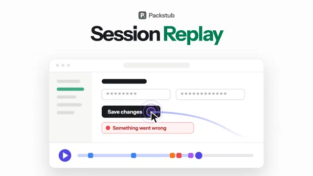
Session Replay
Session replay in your panel: every recording in a filterable resource, played with errors and rage clicks on the timeline.
Author:
Packstub
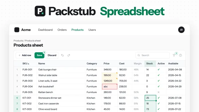
Spreadsheet
Edit hundreds of Filament records like a spreadsheet: paste from Excel, fill down, undo, and one Save checked on the server.
Author:
Packstub
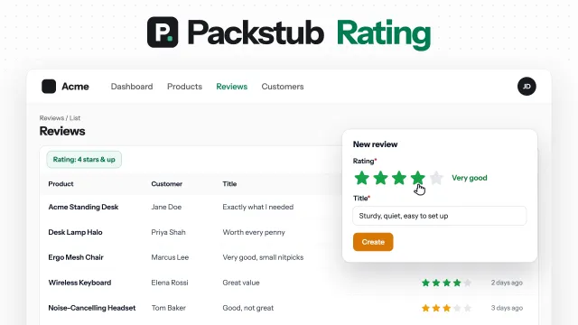
Rating
Star ratings for Filament: a form field, a column you can rate from, a filter, and average and distribution summaries.
Author:
Packstub
Flow
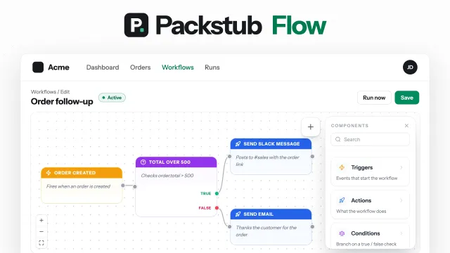
Visual workflows in your panel: record, schedule and webhook triggers, conditions, email, Slack and HTTP actions, approvals.
Author:
Packstub
Featured Plugins
A selection of plugins curated by the Filament team
Compact Theme
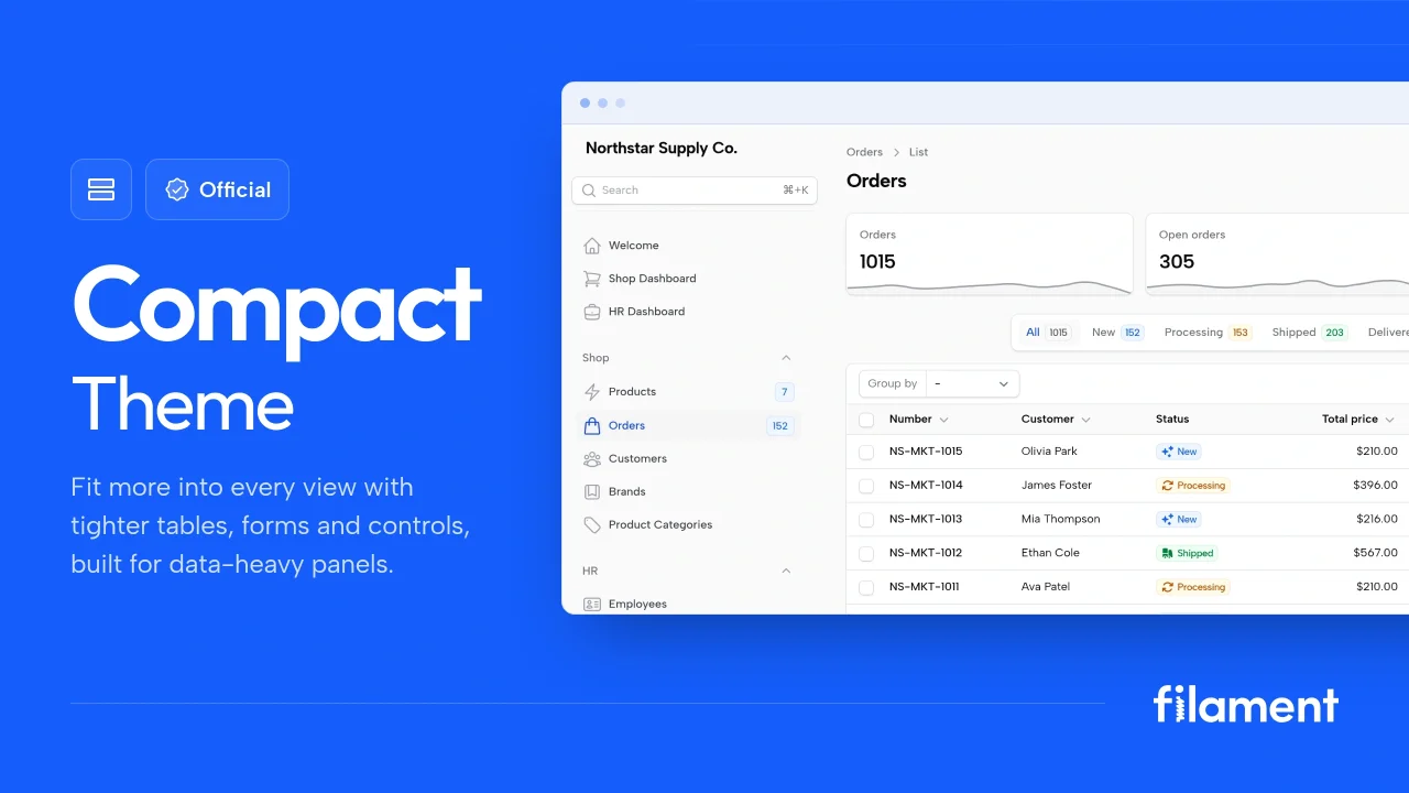
A theme that makes data-heavy panels easier to scan by fitting more useful information on each screen.
 Filament
Advanced Tables (formerly Filter Sets)
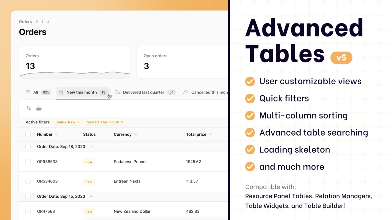
Supercharge your tables with powerful features like user-customizable views, quick filters, multi-column sorting, advanced table searching, convenient view management, and more. Compatible with Resource Panel Tables, Relation Managers, Table Widgets, and Table Builder!
 Kenneth Sese
Sharp Theme
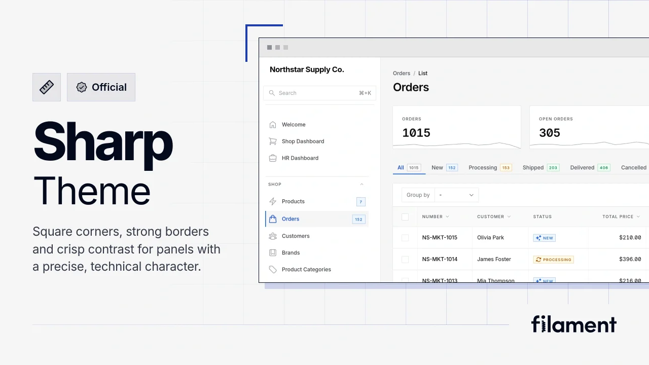
A theme that gives panels a precise, technical look with square corners, strong borders, and clear contrast.
Filament