Shadcn Theme
CommunityShadcn UI theme for Filament with adaptive colors that change between light and dark modes - 8 beautiful official themes included
 Author:
Openplain
Author:
Openplain
Package health
BetaAutomated checks of this plugin's Composer package
13 checks
-
Passed:
Current Laravel version supported
—
Package dependencies resolve together with current Laravel
13.0. -
Passed:
Current PHP version supported
—
Constraint
^8.2|^8.3|^8.4supports current PHP8.5. - Skipped: Current Symfony version supported
- Passed: Abandoned or archived — No consulted source marks the package abandoned (packagist, github).
- Passed: Commit and release recency — Active: last commit 174 days ago; last release 174 days ago.
-
Passed:
composer.lock not committed by library
—
composer.lockis absent from the released dist archive. - Passed: Dist archive is lean
- Skipped: GitHub Actions pinned to SHA
- Passed: Open security advisories
- Passed: Dependabot PR responsiveness — No open Dependabot PRs.
- Skipped: Dependabot or Renovate configured
- Skipped: Dependency update cooldown configured
- Failed: Provides a security policy — View details on Plumb
filament/
namespace. Review the source and install at your own risk. Found
malware or an unresolved security issue the author won't
address?
Report it
.
Documentation
- Why This Package?
- Screenshots
- Installation
- Basic Usage
- All 8 Official Themes
- Advanced: Custom Adaptive Colors
- Requirements
- License
The only Filament theme that changes colors between light and dark modes — just like Shadcn UI.


#Why This Package?
Filament's built-in themes keep the same colors in both light and dark modes. A blue button stays blue. Always.
Shadcn changes the game — the Default theme creates sophisticated contrast with inverted colors:
- Light mode: Dark charcoal buttons that command attention
- Dark mode: Light gray buttons that feel native
This is the Shadcn magic. Now available for Filament.
#Screenshots
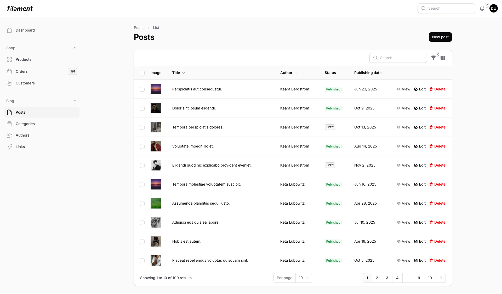
Light Mode - Dark buttons on light background |
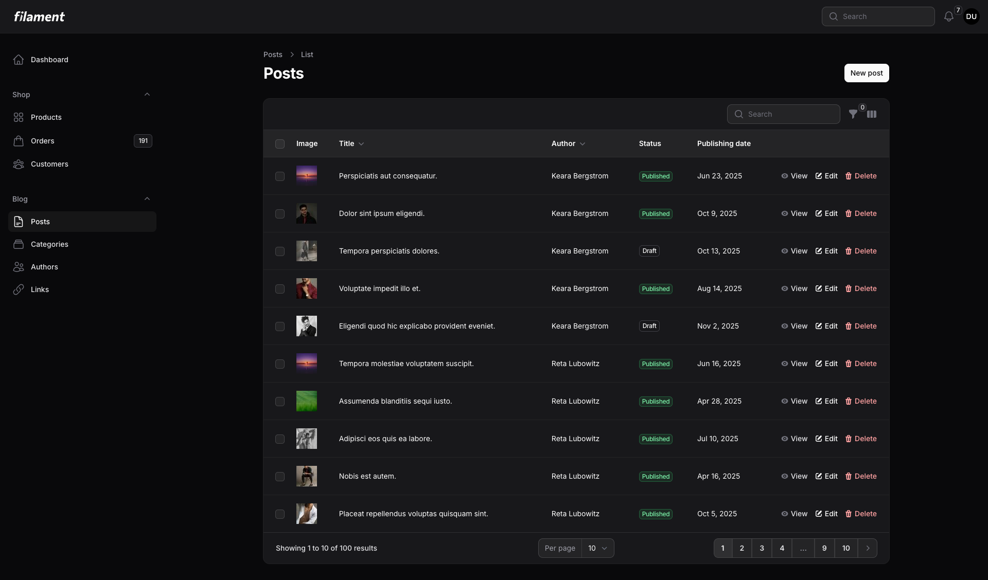
Dark Mode - Light buttons on dark background |
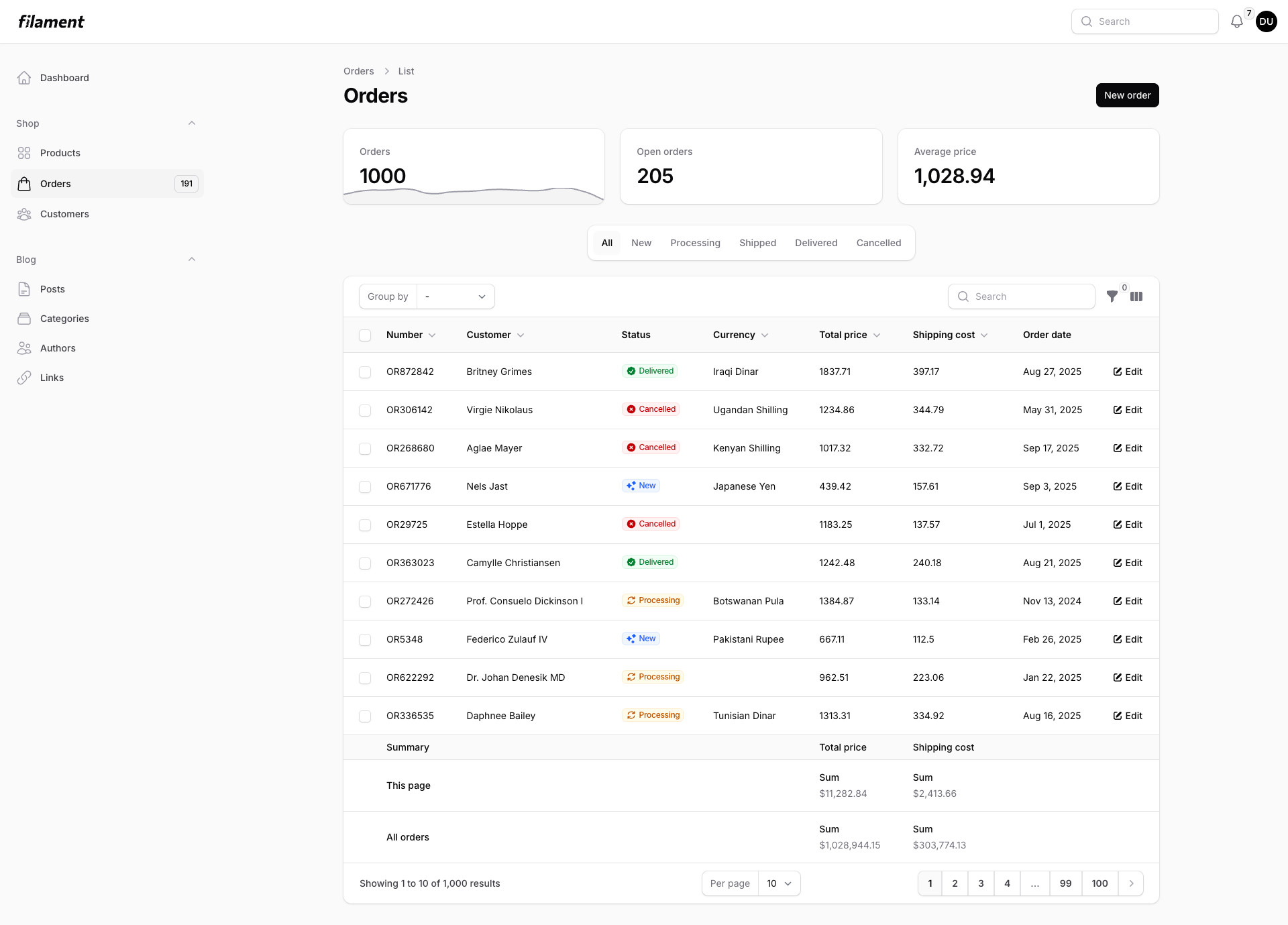
Orders List - With stats and filters |
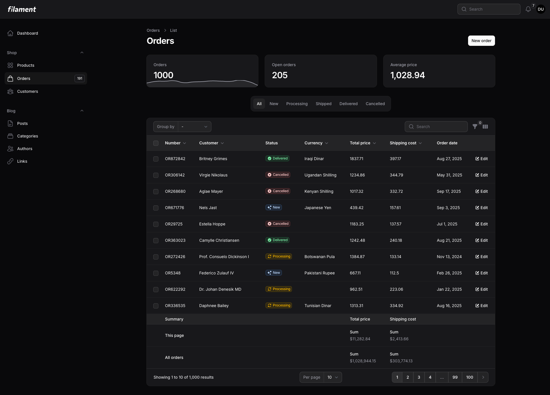
Perfect contrast - In both modes |
#Installation
composer require openplain/filament-shadcn-theme
#Basic Usage
Add to your Panel Provider (e.g., app/Providers/Filament/AdminPanelProvider.php):
use Openplain\FilamentShadcnTheme\Color;

public function panel(Panel $panel): Panel
{
    return $panel
        ->colors([
            'primary' => Color::Default,  // The Shadcn effect
        ]);
}
#All 8 Official Themes
Color::Default  // Inverted grays (Shadcn's signature)
Color::Red      // Vibrant red
Color::Rose     // Soft rose
Color::Orange   // Warm orange
Color::Green    // Fresh green
Color::Blue     // Classic blue
Color::Yellow   // Bright yellow
Color::Violet   // Rich violet
Based on the official themes from ui.shadcn.com/themes.
#Advanced: Custom Adaptive Colors
Want your brand blue in light mode but teal in dark mode? Use the adaptive() method:
use Filament\Support\Colors\Color as FilamentColor;

'primary' => Color::adaptive(
    lightColor: FilamentColor::Blue,
    darkColor: FilamentColor::Teal
)
Perfect for:
- Brands requiring specific contrast ratios
- Seasonal color changes
- Multi-tenant applications with theme requirements
#Requirements
- PHP 8.1+
- Filament 4.0+
#License
The MIT License (MIT). Please see License File for more information.
The author
From the same author

Featured Plugins
A selection of plugins curated by the Filament team
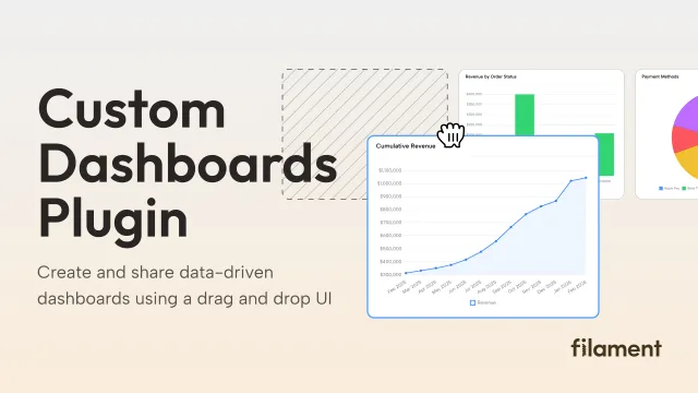
Custom Dashboards
Let your users build and share their own dashboards with a drag-and-drop interface. Define your data sources in PHP and let them do the rest.
 Filament
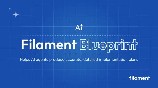
Blueprint
Filament Blueprint is a premium Laravel Boost extension that helps AI agents produce accurate, detailed implementation plans and security reports for Filament apps.
Filament
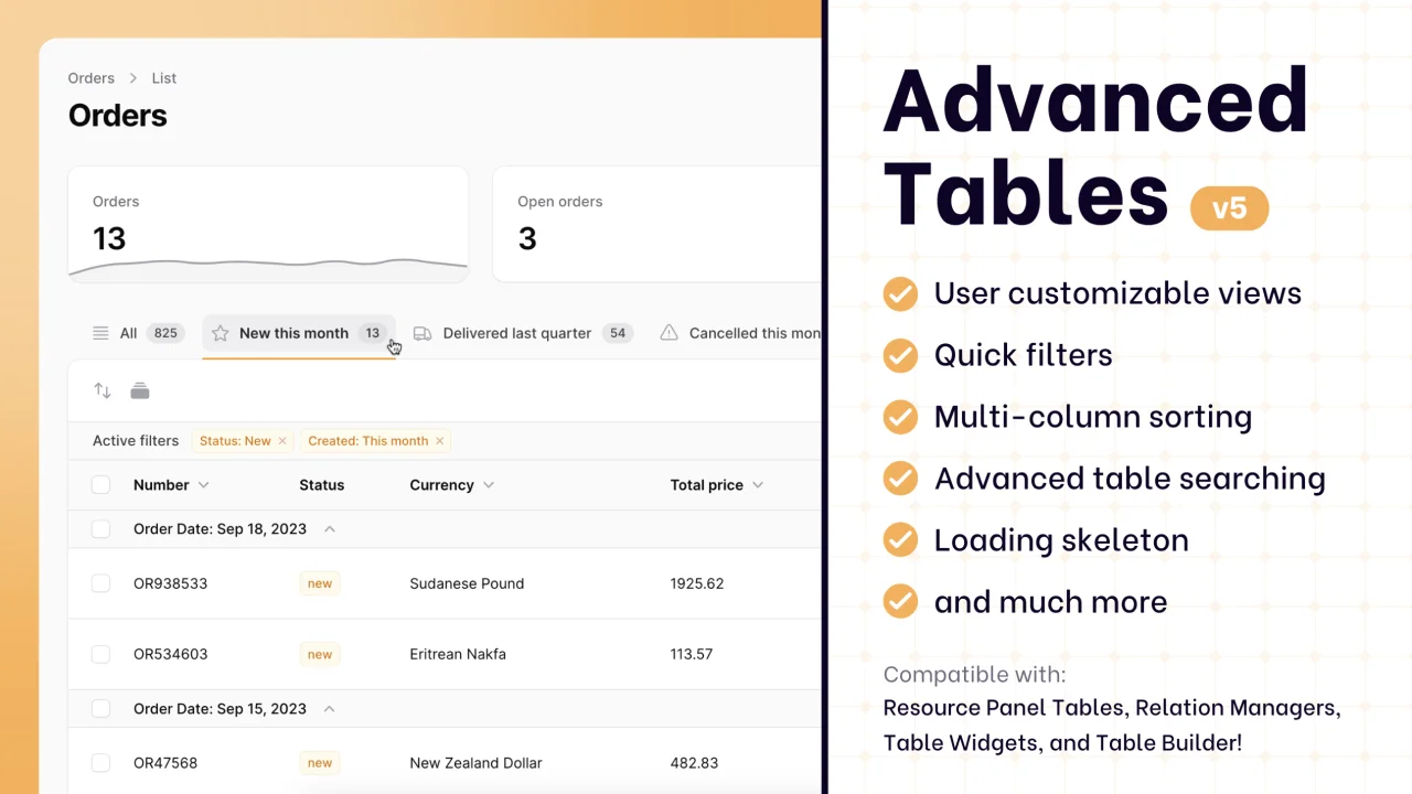
Advanced Tables (formerly Filter Sets)
Supercharge your tables with powerful features like user-customizable views, quick filters, multi-column sorting, advanced table searching, convenient view management, and more. Compatible with Resource Panel Tables, Relation Managers, Table Widgets, and Table Builder!
 Kenneth Sese