Neobrutalism Theme
CommunityA neobrutalism theme for FilamentPHP admin panels
 Author:
Caresome
Author:
Caresome
Package health
BetaAutomated checks of this plugin's Composer package
13 checks
-
Passed:
Current Laravel version supported
—
Package dependencies resolve together with current Laravel
13.0. -
Passed:
Current PHP version supported
—
Constraint
^8.2|^8.3|^8.4|^8.5supports current PHP8.5. - Skipped: Current Symfony version supported
- Passed: Abandoned or archived — No consulted source marks the package abandoned (packagist, github).
- Passed: Commit and release recency — Active: last commit 101 days ago; last release 101 days ago.
-
Passed:
composer.lock not committed by library
—
composer.lockis absent from the released dist archive. - Passed: Dist archive is lean
- Failed: GitHub Actions pinned to SHA — View details on Plumb
- Passed: Open security advisories
- Passed: Dependabot PR responsiveness — No open Dependabot PRs.
- Failed: Dependabot or Renovate configured — No dependency updater configuration found. View details on Plumb
- Skipped: Dependency update cooldown configured
- Failed: Provides a security policy — View details on Plumb
filament/
namespace. Review the source and install at your own risk. Found
malware or an unresolved security issue the author won't
address?
Report it
.
Documentation
A bold, brutalist design system for FilamentPHP admin panels. Transform your Filament interface with thick borders, pronounced shadows, and geometric aesthetics inspired by the neobrutalism design movement.
#Table of Contents
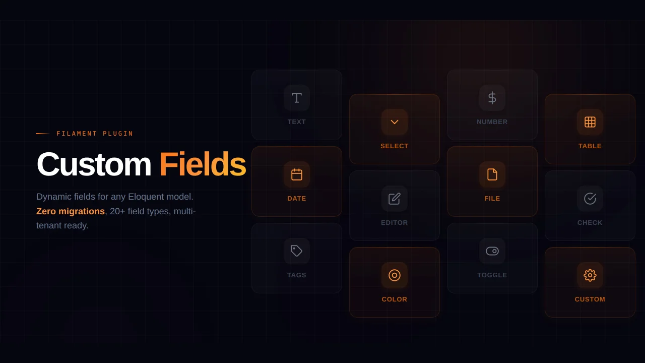
#Features
- 🎨 Bold Neobrutalism Design - Thick borders, pronounced shadows, and geometric shapes
- ⚡ Zero Configuration - Works out of the box with sensible defaults
- 🎛️ Fully Customizable - Override any CSS variable with the fluent
customize()API - 🌓 Dark Mode Support - Seamlessly adapts to Filament's dark mode
- 🔌 Easy Integration - Single line plugin registration
- 📦 Lightweight - Pure CSS with no JavaScript dependencies
- 🚀 Performance Optimized - Minimal CSS with CSS variables for dynamic theming
- ✅ Filament v4 & v5 Compatible - Built for Filament v4.x and v5.x
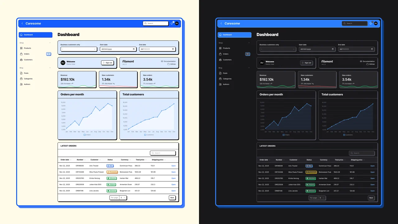
#Screenshots
#Authentication Pages
#Dashboard
#Tables & Resource Lists
#Forms & Resource Pages
#Modals
#Theme Customization
#Installation
Install the package via Composer:
composer require caresome/filament-neobrutalism-theme
#Usage
Register the theme in your Filament panel provider:
use Caresome\FilamentNeobrutalism\NeobrutalismeTheme;

public function panel(Panel $panel): Panel
{
    return $panel
        ->plugin(NeobrutalismeTheme::make());
}
Publish the theme assets:
php artisan filament:assets
The neobrutalism theme will now be active on your Filament admin panel.
#Customization
You can customize the theme's CSS variables using the customize() method:
->plugin(
    NeobrutalismeTheme::make()
        ->customize([
            'border-width' => '6px',
            'border-width-thick' => '8px',
            'radius-md' => '1.5rem',
            'shadow-offset-lg' => '10px',
        ])
)
#Available CSS Variables
The theme provides the following customizable CSS variables (prefix --neo- is automatically added):
Borders:
border-width- Default border width (default:2px)border-width-thick- Thick border width (default:3px)
Border Radius:
radius-sm- Small radius (default:0.375rem)radius-md- Medium radius (default:0.5rem)radius-lg- Large radius (default:0.75rem)radius-xl- Extra large radius (default:1rem)
Shadows:
shadow-offset-sm- Small shadow offset (default:2px)shadow-offset-md- Medium shadow offset (default:3px)shadow-offset-lg- Large shadow offset (default:4px)shadow-offset-xl- Extra large shadow offset (default:6px)
Typography:
font-weight-bold- Bold font weight (default:700)font-weight-extrabold- Extra bold font weight (default:800)font-weight-black- Black font weight (default:900)letter-spacing-tight- Tight letter spacing (default:-0.03em)letter-spacing-normal- Normal letter spacing (default:-0.025em)letter-spacing-wide- Wide letter spacing (default:0.03em)letter-spacing-wider- Wider letter spacing (default:0.05em)
Transitions:
transition-duration- Transition duration (default:150ms)
Spacing:
spacing-xs- Extra small spacing (default:0.25rem)spacing-sm- Small spacing (default:0.5rem)spacing-md- Medium spacing (default:0.75rem)spacing-lg- Large spacing (default:1rem)spacing-xl- Extra large spacing (default:1.5rem)
Scale:
scale- UI scaling factor (default:1)
#Custom CSS Variables
You can also add completely custom CSS variables by prefixing them with --:
->customize([
    '--my-custom-color' => '#ff0000',
    '--my-custom-spacing' => '2rem',
])
#Dynamic Values
Use closures for dynamic values based on user preferences or application state:
->customize(fn() => [
    'border-width' => auth()->user()->preferences['border_width'] ?? '4px',
    'shadow-offset-md' => session('theme_shadow_size', '6px'),
])
#Examples
#Subtle Neobrutalism
->plugin(
    NeobrutalismeTheme::make()
        ->customize([
            'border-width' => '2px',
            'shadow-offset-md' => '3px',
            'radius-md' => '0.5rem',
        ])
)
#Bold & Dramatic
->plugin(
    NeobrutalismeTheme::make()
        ->customize([
            'border-width' => '6px',
            'border-width-thick' => '8px',
            'shadow-offset-md' => '10px',
            'shadow-offset-lg' => '12px',
            'radius-md' => '1.5rem',
        ])
)
#Minimal & Sharp
->plugin(
    NeobrutalismeTheme::make()
        ->customize([
            'border-width' => '3px',
            'shadow-offset-md' => '4px',
            'radius-sm' => '0.25rem',
            'radius-md' => '0.375rem',
            'radius-lg' => '0.5rem',
        ])
)
#License
MIT. See LICENSE.md for details.
The author
From the same author
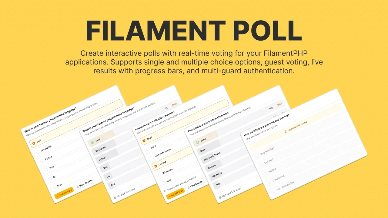
Poll
Create and manage interactive polls with real-time voting, support for single/multiple-choice, guest participation with session tracking and more.
Author:
Caresome
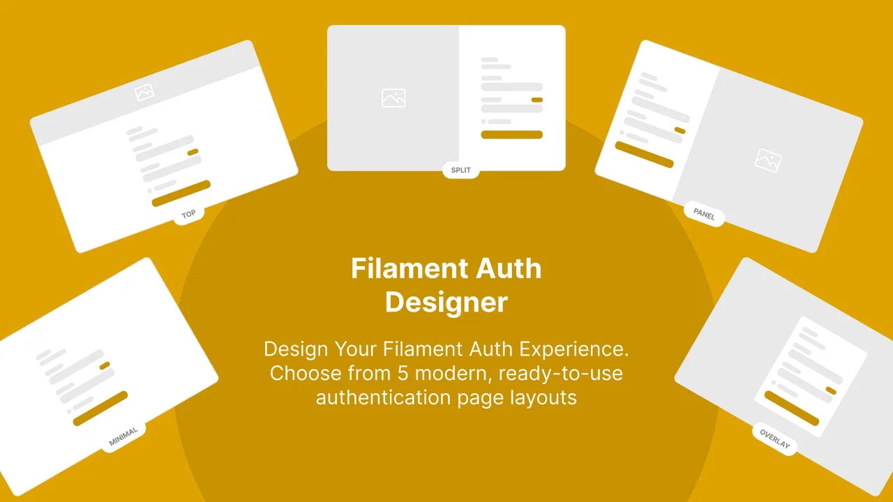
Auth Designer
Transform Filament's default auth pages into stunning, brand-ready experiences with customizable layouts, media backgrounds, and theme switching.
Author:
Caresome
Featured Plugins
A selection of plugins curated by the Filament team
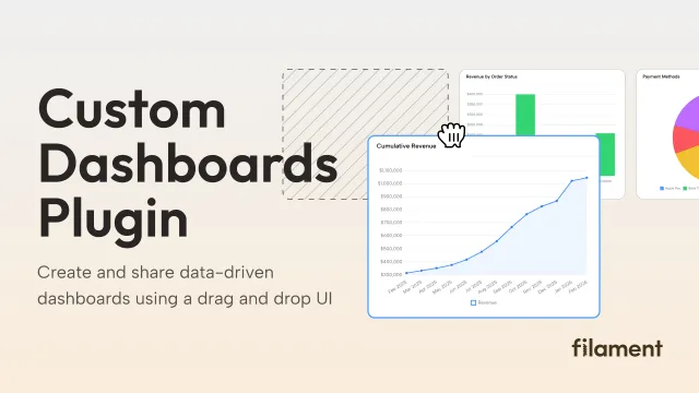
Custom Dashboards
Let your users build and share their own dashboards with a drag-and-drop interface. Define your data sources in PHP and let them do the rest.
 Filament
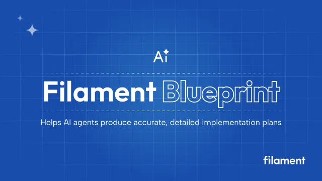
Blueprint
Filament Blueprint is a premium Laravel Boost extension that helps AI agents produce accurate, detailed implementation plans and security reports for Filament apps.
Filament
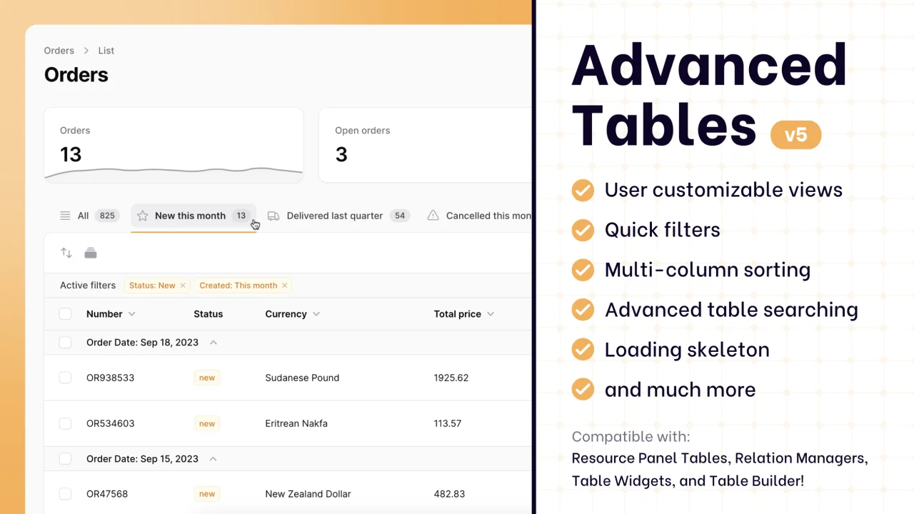
Advanced Tables (formerly Filter Sets)
Supercharge your tables with powerful features like user-customizable views, quick filters, multi-column sorting, advanced table searching, convenient view management, and more. Compatible with Resource Panel Tables, Relation Managers, Table Widgets, and Table Builder!
 Kenneth Sese