Sharp Theme
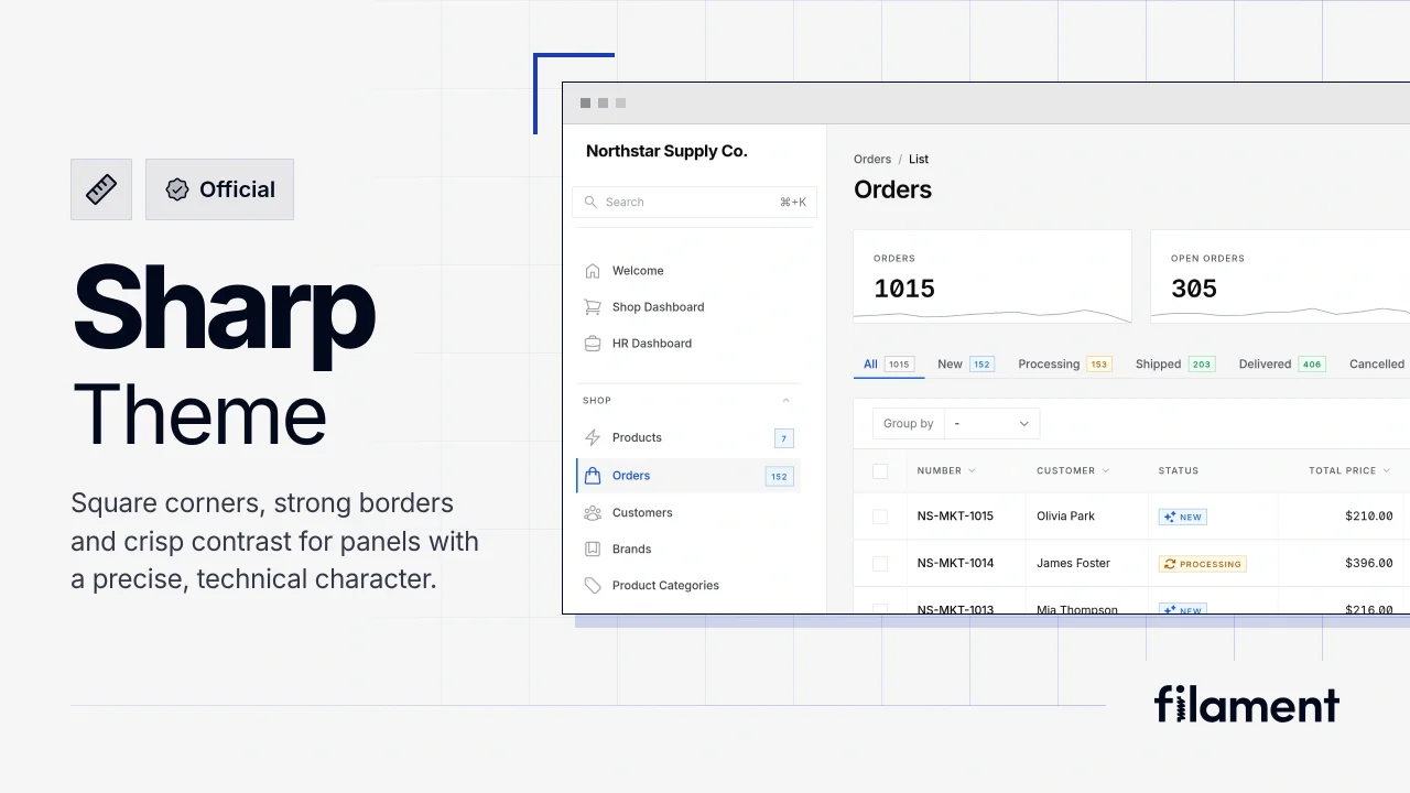
Featured OfficialA theme that gives panels a precise, technical look with square corners, strong borders, and clear contrast.
 Author:
Filament
Author:
Filament
Package health
Automated checks of this plugin's Composer package
15 checks
- Skipped: GitHub Actions pinned to SHA
- Skipped: GitLab CI includes pinned to SHA
- Passed: Open security advisories
- Passed: Dependabot PR responsiveness — No open Dependabot PRs.
- Skipped: Renovate MR responsiveness
- Skipped: Dependabot or Renovate configured
- Skipped: Dependency update cooldown configured
- Passed: Provides a security policy
- Passed: Abandoned or archived — No consulted source marks the package abandoned (github).
- Passed: Commit and release recency — Active: last commit 0 days ago; no release date available.
-
Passed:
composer.lock not committed by library
—
composer.lockis absent from the released dist archive. - Passed: Dist archive is lean
-
Passed:
Current Laravel version supported
—
Package dependencies resolve together with current Laravel
13.0. -
Passed:
Current PHP version supported
—
Constraint
^8.2supports current PHP8.5. - Skipped: Current Symfony version supported
Documentation
- Preview
- Installation
- Using the Sharp Theme with the Compact Theme
- Colors
- Using Material Symbols Sharp
- Features that suit the Sharp Theme
- Customizing the theme
- Support
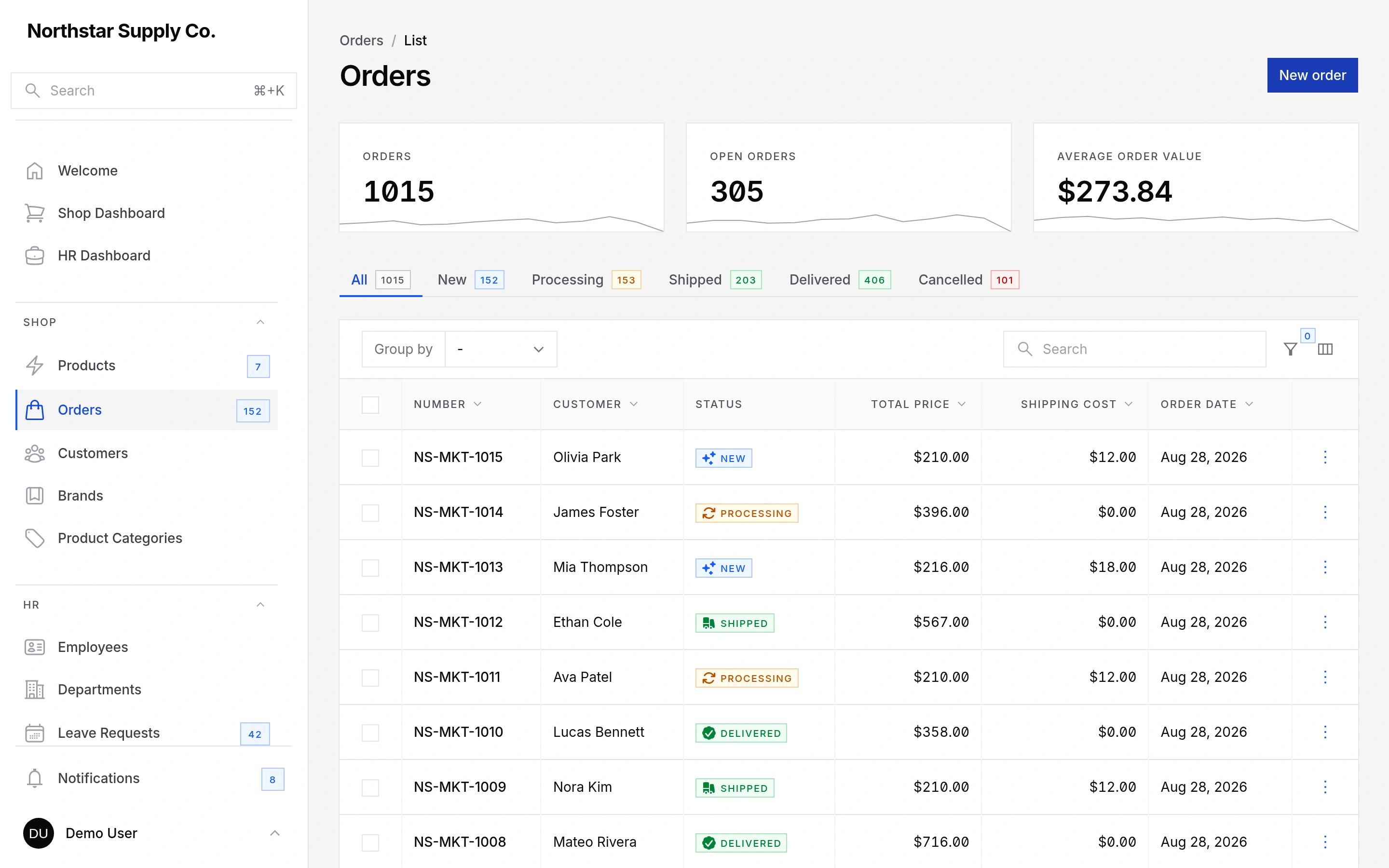
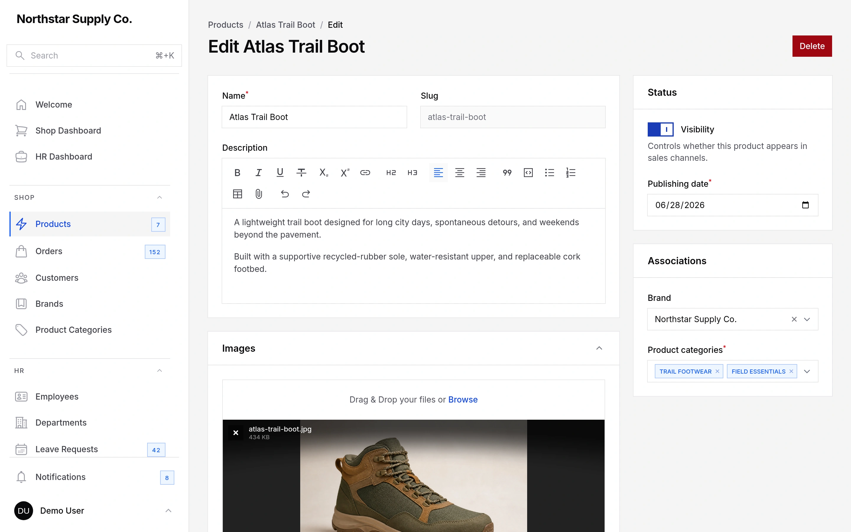
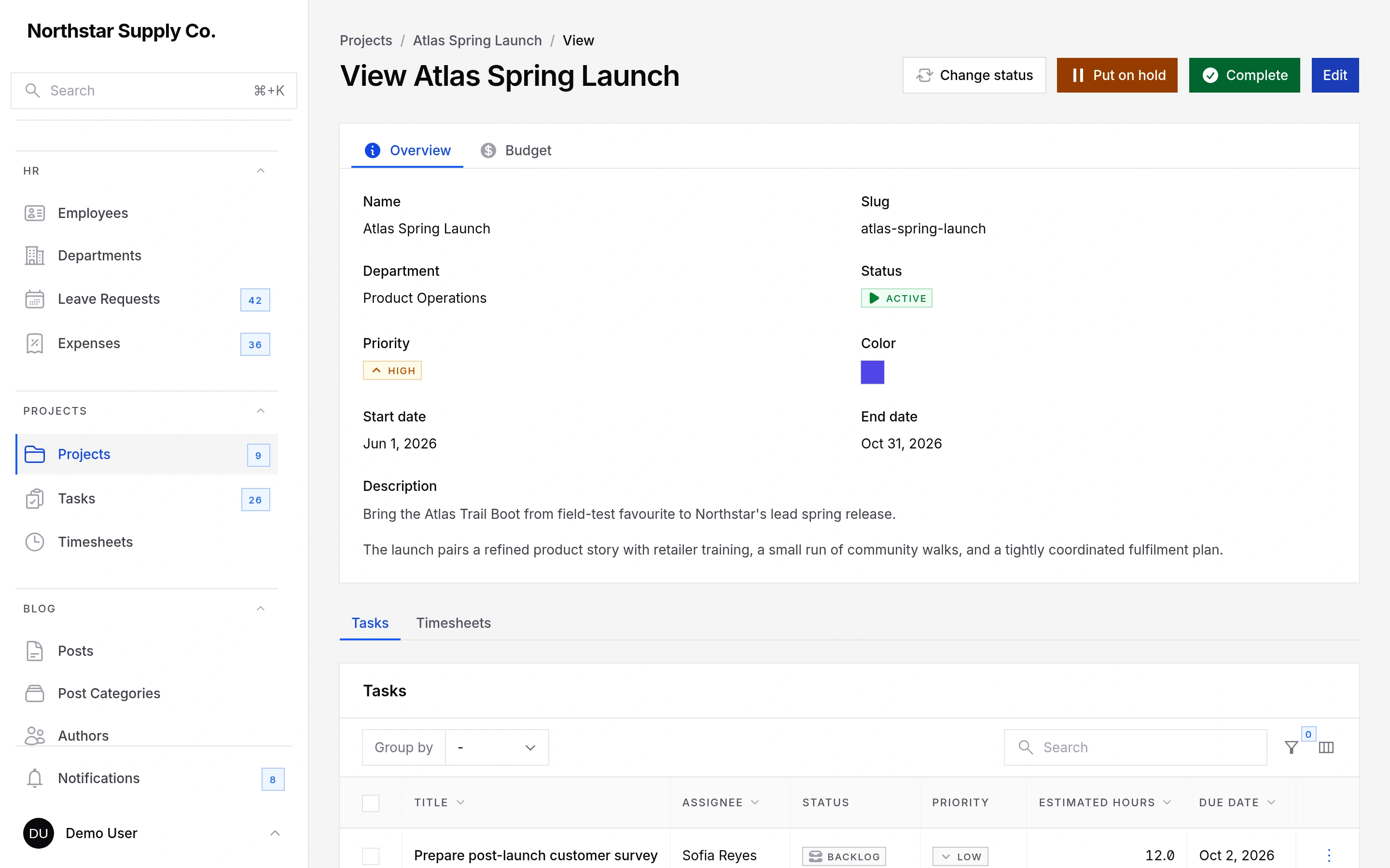
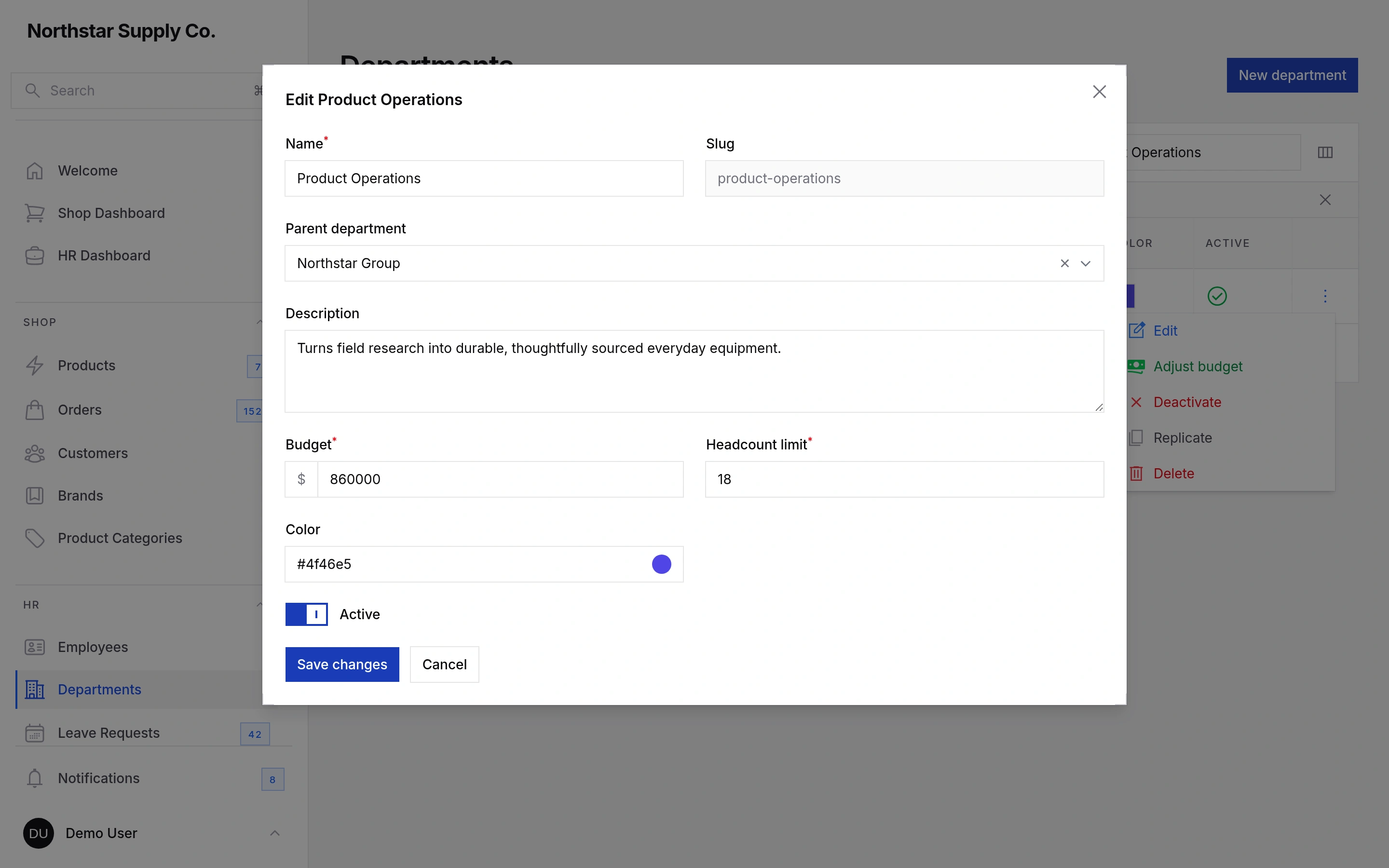
The Sharp Theme gives Filament panels a precise, structured look built around square corners, strong borders and clear contrast. It is a good fit for developer tools, infrastructure products, data platforms and brands with a direct, technical style.
It replaces decorative rounding and most container shadows while keeping menus and modals clearly raised. Customization tokens let you adjust the radius, selection color and drawing details, and an optional Material Symbols preset completes the look.
#Preview
These previews follow your light or dark color scheme. Open the matching Sharp + Compact version below each image.
#Installation
After purchasing the Sharp Theme, install it through Filament's Composer repository:
composer config repositories.filament composer https://packages.filamentphp.com/composer
composer config --auth http-basic.packages.filamentphp.com "YOUR_EMAIL_ADDRESS" "YOUR_LICENSE_KEY"
composer require filament/sharp-theme
You can find your license key in your Filament Packages account.
Register the Sharp Theme plugin on your panel:
use Filament\SharpTheme\SharpThemePlugin;

$panel->plugin(SharpThemePlugin::make())
Add the following imports to your panel's theme file, such as
resources/css/filament/admin/theme.css:
@import '../../../../vendor/filament/sharp-theme/resources/css/layers.css';
@import '../../../../vendor/filament/filament/resources/css/theme.css';
@import '../../../../vendor/filament/sharp-theme/resources/css/theme.css';

@source '../../../../app/Filament/**/*';
@source '../../../../resources/views/filament/**/*';
Then rebuild your assets:
npm run build
The layers.css import must come before Filament's CSS. If the theme does not
look right, run this in your browser console:
getComputedStyle(document.body).getPropertyValue('--sharp-theme-layer-order')
The result should be ok.
#Using the Sharp Theme with the Compact Theme
Install filament/compact-theme, then add its import after the Sharp Theme:
@import '../../../../vendor/filament/sharp-theme/resources/css/layers.css';
@import '../../../../vendor/filament/filament/resources/css/theme.css';
@import '../../../../vendor/filament/sharp-theme/resources/css/theme.css';
@import '../../../../vendor/filament/compact-theme/resources/css/theme.css';

@source '../../../../app/Filament/**/*';
@source '../../../../resources/views/filament/**/*';
The order of the two theme imports does not matter.
#Colors
The Sharp Theme uses the gray and primary colors already registered on your
panel. Filament's defaults work without any extra configuration. For a fully
neutral gray, you can use:
use Filament\Support\Colors\Color;

$panel->colors([
    'gray' => Color::Neutral,
    'primary' => Color::Blue,
])
#Using Material Symbols Sharp
The Sharp Theme uses Filament's default Heroicons unless you install the optional Material Symbols package:
composer require kienso/blade-google-material-symbols
Register the included icon map on your panel:
use Filament\SharpTheme\SharpThemeMaterialSymbols;

$panel->icons(SharpThemeMaterialSymbols::Aliases)
This changes Filament's interface icons. Icons that you set on resources, pages, actions and fields are not changed. In production, cache the icons after deploying:
php artisan icons:cache
#Features that suit the Sharp Theme
#Use a sidebar-only layout
You can hide the topbar to give page content more vertical space:
$panel->topbar(false)
Filament places global search, the user menu and database notifications in the sidebar by default when the topbar is hidden.
#Use monospaced technical values
Monospaced text works especially well for identifiers, hashes, reference numbers and other values that users need to scan character by character. Use Filament's monospaced font family on individual table columns:
use Filament\Support\Enums\FontFamily;
use Filament\Tables\Columns\TextColumn;

TextColumn::make('reference')
    ->fontFamily(FontFamily::Mono)
The same option is available for text entries.
#Customizing the theme
Set the radius on :root. Set the other variables on .fi-body, after the
theme imports:
:root {
    --sharp-theme-radius: 2px;
}

.fi-body {
    --sharp-theme-blueprint-lines: transparent;
}
An override on .fi-body applies to both light and dark mode. To use a
different value in dark mode, add a dark-mode override:
.fi-body {
    --sharp-theme-selection: var(--primary-600);
}

.dark .fi-body {
    --sharp-theme-selection: var(--primary-500);
}
| Variable | Used for | Default |
|---|---|---|
--sharp-theme-radius |
All theme corners | 0px |
--sharp-theme-selection |
Active navigation, tabs and selected rows | var(--primary-600) |
--sharp-theme-table-vertical-lines |
Lines between table columns | var(--gray-100) |
--sharp-theme-sidebar-group-rule |
Lines above sidebar groups | var(--gray-200) |
--sharp-theme-blueprint-lines |
Grid on sign-in and empty-state pages | rgb(23 23 23 / 0.05) |
--sharp-theme-corner-mark-size |
Corner marks on sign-in cards and modals | 12px |
--sharp-theme-corner-mark |
Color of the corner marks | var(--gray-300) |
The table shows the light-mode defaults. The Sharp Theme sets dark-mode values where needed.
#Changing the radius
The default radius is 0px. A small value such as 2px softens the corners
without changing the overall look:
:root {
    --sharp-theme-radius: 2px;
}
Values from 0px to 4px work best.
#Removing the drawing details
You can turn off all four details without changing the layout:
.fi-body {
    --sharp-theme-table-vertical-lines: transparent;
    --sharp-theme-sidebar-group-rule: transparent;
    --sharp-theme-blueprint-lines: transparent;
    --sharp-theme-corner-mark-size: 0px;
}
Avoid using the vertical table lines with Filament's striped() option, since
both are intended to separate rows and columns.
#Support
If you encounter an issue or have a suggestion for improving the Sharp Theme, please open an issue or discussion on the Sharp Theme GitHub repository. You can get an invite by adding your GitHub username to your customer dashboard at packages.filamentphp.com. For account, purchase or license-related questions, email [email protected].
The author
Filament is a powerful open source UI framework for Laravel, built with Livewire to help you ship apps & admin panels fast.
It includes a collection of beautifully designed, fully extensible components that handle the hard parts, so you can focus on what matters.
From the same author
Spatie Media Library
Filament support for Spatie's Laravel Media Library package.
Author:
Filament
Spatie Settings
Filament support for Spatie's Laravel Settings package.
Author:
Filament
Spatie Google Fonts
Filament support for Spatie's Laravel Google Fonts package.
Author:
Filament

Blueprint
Filament Blueprint is a premium Laravel Boost extension that helps AI agents produce accurate, detailed implementation plans and security reports for Filament apps.
Author:
Filament
Featured Plugins
A selection of plugins curated by the Filament team
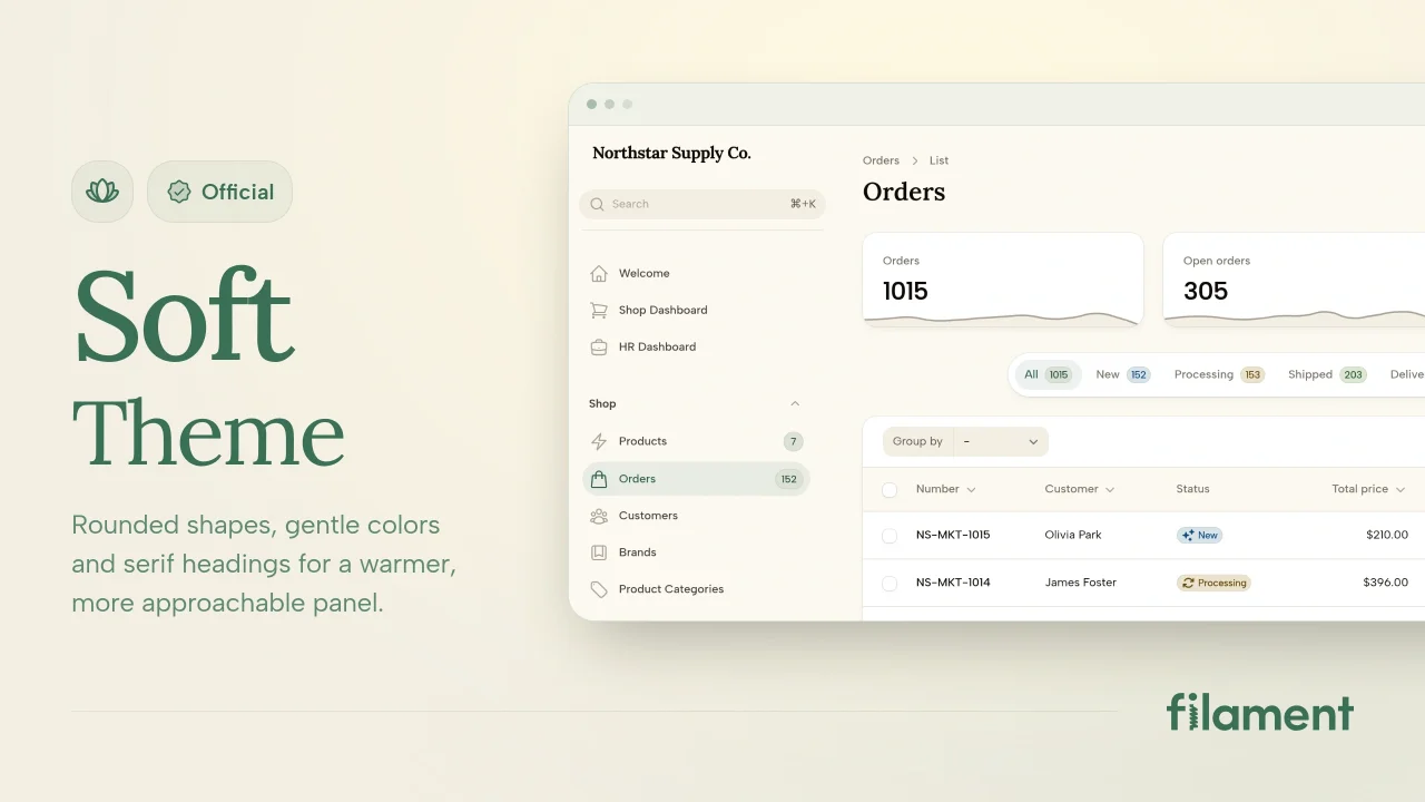
Soft Theme
A theme that gives panels a warm, approachable look with rounded shapes, gentle colors, and serif headings.
Filament
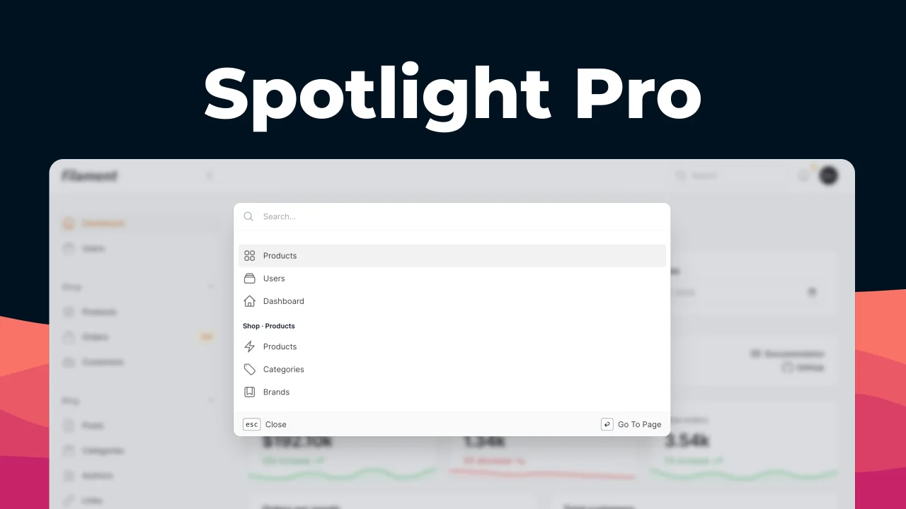
Spotlight Pro
Browse your Filament Panel with ease. Filament Spotlight Pro adds a Spotlight like Command Palette to your Filament Panel.
 Dennis Koch
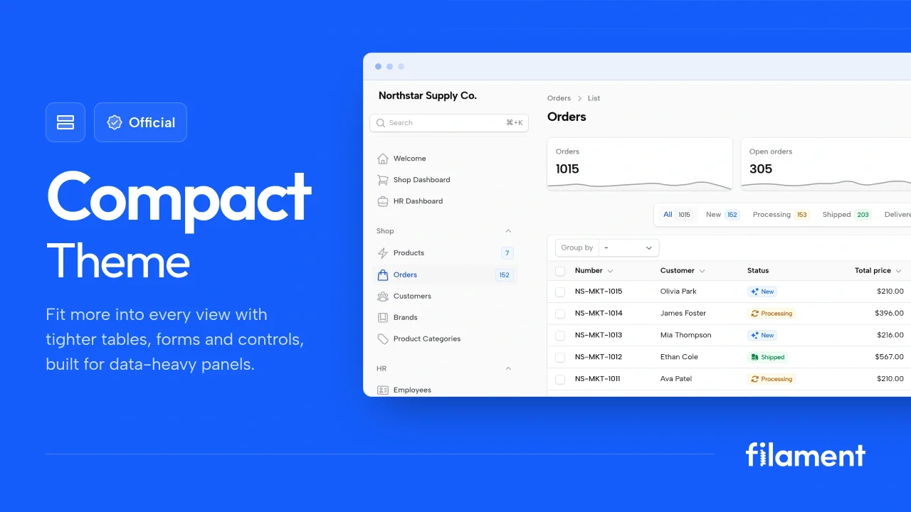
Compact Theme
A theme that makes data-heavy panels easier to scan by fitting more useful information on each screen.
Filament