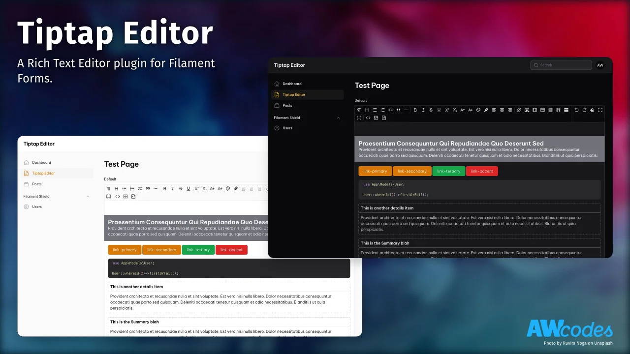
Tiptap Editor
A Rich Text Editor plugin for Filament Forms.
 Author:
Adam Weston
Documentation
- Installation
- Upgrading from 2.x to 3.x
- Usage
- Config
- Overrides
- Colors preset
- Bubble and Floating Menus
- Grid layouts
- Custom Blocks
- Merge tags
- Usage in Standalone Forms Package
- Custom Extensions
- Versioning
- License
[!Warning] This package is deprecated. As of Filament v4 the native Rich Editor covers most of the use case of this package and it is not needed anymore.
A Tiptap integration for Filament Admin/Forms.

#Installation
Install the package via composer
composer require awcodes/filament-tiptap-editor:"^3.0"
In an effort to align with Filament's theming methodology you will need to use a custom theme to use this plugin.
Note If you have not set up a custom theme and are using a Panel follow the instructions in the Filament Docs first. The following applies to both the Panels Package and the standalone Forms package.
- Import the plugin's stylesheet and tippy.js stylesheet (if not already included) into your theme's css file.
@import '<path-to-vendor>/awcodes/filament-tiptap-editor/resources/css/plugin.css';
- Add the plugin's views to your
tailwind.config.jsfile.
content: [
    ...
    '<path-to-vendor>/awcodes/filament-tiptap-editor/resources/**/*.blade.php',
]
- Add the
tailwindcss/nestingplugin to yourpostcss.config.jsfile.
module.exports = {
    plugins: {
        'tailwindcss/nesting': {},
        tailwindcss: {},
        autoprefixer: {},
    },
}
- Rebuild your custom theme.
npm run build
#Upgrading from 2.x to 3.x
- Output is now set with an Enum, please update your files to use
TiptapOutputin all place where you are setting the output, including the config file. bareboneprofile setting was renamed tominimal
#Usage
The editor extends the default Field class so most other methods available on that class can be used when adding it to a form.
use FilamentTiptapEditor\TiptapEditor;
use FilamentTiptapEditor\Enums\TiptapOutput;

TiptapEditor::make('content')
    ->profile('default|simple|minimal|none|custom')
    ->tools([]) // individual tools to use in the editor, overwrites profile
    ->disk('string') // optional, defaults to config setting
    ->directory('string or Closure returning a string') // optional, defaults to config setting
    ->acceptedFileTypes(['array of file types']) // optional, defaults to config setting
    ->maxSize('integer in KB') // optional, defaults to config setting
    ->output(TiptapOutput::Html) // optional, change the format for saved data, default is html
    ->maxContentWidth('5xl')
    ->required();
#Rendering content in Blade files
If you are storing your content as JSON then you will likely need to parse the data to HTML for output in Blade files. To help with this there is a helper function tiptap_converter that will convert the data to one of the three supported Tiptap formats.
Styling the output is entirely up to you.
{!! tiptap_converter()->asHTML($post->content) !!}
{!! tiptap_converter()->asJSON($post->content) !!}
{!! tiptap_converter()->asText($post->content) !!}
#Table of Contents
If you are using the heading tool in your editor you can also generate a table of contents from the headings in the content. This is done by passing the content to the asHTML() method and setting the toc option to true. You can also pass a maxDepth option to limit the depth of headings to include in the table of contents.
<!-- this will generate links for all headings up to h3 -->
{!! tiptap_converter()->asHTML($post->content, toc: true, maxDepth: 3) !!}

<!-- this will generate a table of contents with headings up to h3 -->
{!! tiptap_converter()->asToc($post->content, maxDepth: 3) !!}
Alternatively, you can use & extend the table-of-contents blade component to generate the table of contents.
<!-- This will generate the TOC as a nested array, and use it as a parameter in the contents table -->
<x-filament-tiptap-editor::table-of-contents :headings="tiptap_converter()->asTOC($page->body, array: true)" />
#Config
The plugin will work without publishing the config, but should you need to change any of the default settings you can publish the config file with the following Artisan command:
php artisan vendor:publish --tag="filament-tiptap-editor-config"
#Profiles / Tools
The package comes with 3 profiles (or toolbars) out of the box. You can also use a pipe | to separate tools into groups. The default profile is the full set of tools.
'profiles' => [
    'default' => [
        'heading', 'bullet-list', 'ordered-list', 'checked-list', 'blockquote', 'hr',
        'bold', 'italic', 'strike', 'underline', 'superscript', 'subscript', 'lead', 'small', 'align-left', 'align-center', 'align-right',
        'link', 'media', 'oembed', 'table', 'grid-builder', 'details',
        'code', 'code-block', 'source',
    ],
    'simple' => [
        'heading', 'hr', 'bullet-list', 'ordered-list', 'checked-list',
        'bold', 'italic', 'lead', 'small',
        'link', 'media',
    ],
    'minimal' => [
        'bold', 'italic', 'link', 'bullet-list', 'ordered-list',
    ],
],
See filament-tiptap-editor.php config file for modifying profiles to add / remove buttons from the editor or to add your own.
Tools can also be added on a per-instance basis by using the ->tools() modifier to overwrite the profile set for the instance. A full list of tools can be found in the filament-tiptap-editor.php config file under the default profile setting.
#Media / Images
[
    'accepted_file_types' => ['image/jpeg', 'image/png', 'image/webp', 'image/svg+xml', 'application/pdf'],
    'disk' => 'public',
    'directory' => 'images',
    'visibility' => 'public',
    'preserve_file_names' => false,
    'max_file_size' => 2042,
    'image_crop_aspect_ratio' => null,
    'image_resize_target_width' => null,
    'image_resize_target_height' => null,
]
#Output format
Tiptap has 3 different output formats. See: https://tiptap.dev/guide/output
If you want to change the output format that is stored in the database you can change the default config or specify it in each instance.
use FilamentTiptapEditor\Enums\TiptapOutput;

TiptapEditor::make('content')
    ->output(FilamentTiptapEditor\TiptapOutput::Json);
Note If you want to store the editor content as array / json you have to set the database column as
longTextorjsontype. And cast it appropriately in your model class.
// in your migration
$table->json('content');

// in your model
protected $casts = [
    'content' => 'json' // or 'array'
];
#RTL Support
In order for things like text align to work properly with RTL languages you
can switch the direction key in the config to 'rtl'.
// config/filament-tiptap-editor.php
'direction' => 'rtl'
#Max Content Width
To adjust the max content width of the editor globally set max_content_width
key in the config to one of the tailwind max width sizes or full for full width.
This could also be set on a per-instance basis with the ->maxContentWidth() method.
'max_content_width' => 'full'
use FilamentTiptapEditor\TiptapEditor;

TiptapEditor::make('content')
    ->maxContentWidth('3xl');
#Overrides
The Link, Media and Grid Builder modals are built using Filament Form Component Actions. This means it is easy enough to swap them out with your own implementations.
#Link Modal
You may override the default Link modal with your own Action and assign to the link_action key in the config file. Make sure the default name for your action is filament_tiptap_link.
See vendor/awcodes/filament-tiptap-editor/src/Actions/LinkAction.php for implementation.
#Media Modal
You may override the default Media modal with your own Action and assign to the media_action key in the config file. Make sure the default name for your action is filament_tiptap_media.
The Media Modal can make use of 3 attributes not exposed by default:
srcsetis used for selecting a series of responsive images to display for different browser viewports. Docssizesgoes alongsidesrcsetto specify sizing rules for responsive images. Docsmediaprovides support for an arbitrary ID value to better integrate with Media stored within a Database.
See vendor/awcodes/filament-tiptap-editor/src/Actions/MediaAction.php for implementation.
#Grid Builder Modal
You may override the default Grid Builder modal with your own Action and assign to the grid_builder_action key in the config file. Make sure the default name for your action is filament_tiptap_grid.
See vendor/awcodes/filament-tiptap-editor/src/Actions/GridBuilderAction.php for implementation.
#OEmbed Modal
You may override the default OEmbed modal with your own Action and assign to the oembed_action key in the config file. Make sure the default name for your action is filament_tiptap_oembed.
See vendor/awcodes/filament-tiptap-editor/src/Actions/OEmbedAction.php for implementation.
#Initial height of editor field
You can add extra input attributes to the field with the extraInputAttributes() method. This allows you to do things like set the initial height of the editor.
TiptapEditor::make('content')
    ->extraInputAttributes(['style' => 'min-height: 12rem;']),
#Colors preset
By default, the ColorPicker shows a picker and a field to set hexadecimal color to selected text. Registering specific colors in config file, you can choose one of them directly in ColorPicker
To do, simply set your custom colors in config file preset_colors key
'preset_colors' => [
    'primary' => '#f59e0b',
    'secondary' => '#14b8a6',
    'red' => '#ef4444',
    //..
]
#Bubble and Floating Menus
By default, the editor uses Bubble and Floating menus to help with creating content inline, so you don't have to use the toolbar. If you'd prefer to not use the menus you can disable them on a per-instance basis or globally in the config file.
TiptapEditor::make('content')
    ->disableFloatingMenus()
    ->disableBubbleMenus();
'disable_floating_menus' => true,
'disable_bubble_menus' => true,
You can also provide you own tools to for the floating menu, should you choose. Defaults can be overwritten via the config file.
TiptapEditor::make('content')
    ->floatingMenuTools(['grid-builder', 'media', 'link'])
'floating_menu_tools' => ['media', 'grid-builder', 'details', 'table', 'oembed', 'code-block'],
'bubble_menu_tools' => ['bold', 'italic', 'strike', 'underline', 'superscript', 'subscript', 'lead', 'small', 'link'],
Besides providing your own tools, you can also configure the placement of the tippy toolbar
TiptapEditor::make('content')
    ->tippyPlacement(TippyPlacement::Left)
#Grid layouts
When using the grid tool, you can customize the available layouts in the dropdown by passing them to the gridLayouts() method:
TiptapEditor::make('content')
    ->gridLayouts([
        'two-columns',
        'three-columns',
        'four-columns',
        'five-columns',
        'fixed-two-columns',
        'fixed-three-columns',
        'fixed-four-columns',
        'fixed-five-columns',
        'asymmetric-left-thirds',
        'asymmetric-right-thirds',
        'asymmetric-left-fourths',
        'asymmetric-right-fourths',
    ]);
#Custom Blocks
Note To use custom blocks you must store your content as JSON.
use FilamentTiptapEditor\Enums\TiptapOutput;

TiptapEditor::make('content')
    ->output(FilamentTiptapEditor\TiptapOutput::Json);
There are 3 components you need to create a custom block for Tiptap Editor.
- A block class that extends
TiptapBlockand defines the settings for the block. - A 'preview' blade file
- A 'rendered' blade file
#Creating a custom block
#Block class
use FilamentTiptapEditor\TiptapBlock;

class BatmanBlock extends TiptapBlock
{
    public string $preview = 'blocks.previews.batman';

    public string $rendered = 'blocks.rendered.batman';

    public function getFormSchema(): array
    {
        return [
            TextInput::make('name'),
            TextInput::make('color'),
            Select::make('side')
                ->options([
                    'Hero' => 'Hero',
                    'Villain' => 'Villain',
                ])
                ->default('Hero')
        ];
    }
}
#Static blocks
If you simply need a placeholder to output a block that doesn't have settings you can simply not provide a getFormSchema method and no modal will be shown and blocks will be directly inserted into the editor.
use FilamentTiptapEditor\TiptapBlock;

class StaticBlock extends TiptapBlock
{
    public string $preview = 'blocks.previews.static';

    public string $rendered = 'blocks.rendered.static';
}
#Modal width, slide overs and icons
Note: Currently, icons will only be show on the drag and drop block panel
class BatmanBlock extends TiptapBlock
{
    public string $width = 'xl';

    public bool $slideOver = true;

    public ?string $icon = 'heroicon-o-film';
}
#Preview view
Preview views are just standard blade views. Unfortunately, you cannot use Livewire components in a block preview as they will not work correctly due to the editor having to be wire:ignore.
resources/views/blocks/previews/batman.blade.php
<div class="flex items-center gap-6">
    <div class="text-5xl">
        @php
            echo match($name) {
                'robin' => '🐤',
                'ivy' => '🥀',
                'joker' => '🤡',
                default => '🦇'
            }
        @endphp
    </div>
    <div>
        <p>Name: {{ $name }}</p>
        <p style="color: {{ $color }};">Color: {{ $color }}</p>
        <p>Side: {{ $side ?? 'Good' }}</p>
    </div>
</div>
#Rendered view
Rendered views are normal blade files and can also be used to output livewire components with your block data.
resources/views/blocks/rendered/batman.blade.php
<div>
    <livewire:batman-block
        :name="$name"
        :color="$color"
        :side="$side"
    />
</div>
#Registering your blocks with the editor
In the register method of a service provider you can add your blocks to the editor via configureUsing.
Note You will also need to add the 'blocks' key where appropriate in your profiles in the tiptap config.
use App\TiptapBlocks\BatmanBlock;
use App\TiptapBlocks\StaticBlock;
use FilamentTiptapEditor\TiptapEditor;

TiptapEditor::configureUsing(function (TiptapEditor $component) {
    $component
        ->blocks([
            BatmanBlock::class,
            StaticBlock::class,
        ]);
});
By default, the drag and drop blocks panel will be open in the editor. If you want to change this you can use the collapseBlocksPanel modifier on the Editor instance or globally with configureUsing.
use App\TiptapBlocks\BatmanBlock;
use App\TiptapBlocks\StaticBlock;
use FilamentTiptapEditor\TiptapEditor;

TiptapEditor::configureUsing(function (TiptapEditor $component) {
    $component
        ->collapseBlocksPanel()
        ->blocks([...]);
});
#Merge tags
Merge tags can be used with JSON-based editor content to replace placeholders with dynamic content. Merge tags are defined in the mergeTags() method of the editor instance:
TiptapEditor::make('content')
    ->mergeTags([
        'first_name',
        'last_name',
    ])
To insert a merge tag, the user can either type {{ to open an autocomplete menu, or drag a merge tag into the editor from the "blocks panel". You can remove the tags from the blocks panel using showMergeTagsInBlocksPanel(false):
TiptapEditor::make('content')
    ->mergeTags([...])
    ->showMergeTagsInBlocksPanel(false)
#Rendering merge tags
While you have full control over how the content of the merge tags are replaced, you can use the mergeTagsMap() method on the tiptap_converter helper to replace the tags with the provided data:
{!! tiptap_converter()->mergeTagsMap(['first_name' => 'John', 'last_name' => 'Doe'])->asHTML($content) !!}
#Usage in Standalone Forms Package
If you are using any of the tools that require a modal (e.g. Insert media, Insert video, etc.), make sure to add {{ $this->modal }} to your view after the custom form:
<form wire:submit.prevent="submit">
    {{ $this->form }}

    <button type="submit">
        Save
    </button>
</form>

{{ $this->modal }}
#Placeholders
You can easily set a placeholder, the Filament way:
TiptapEditor::make('content')
    ->placeholder('Write something...')
You can define specific placeholders for each node type using the ->nodePlaceholders() method. This method accepts an associative array, where the keys are the node type names, and the values are the corresponding placeholder texts.
TiptapEditor::make('content')
    ->nodePlaceholders([
        'paragraph' => 'Start writing your paragraph...',
        'heading' => 'Insert a heading...',
    ])
The ->showOnlyCurrentPlaceholder() method allows you to control whether placeholders are shown for all nodes simultaneously or only for the currently active node.
TiptapEditor::make('content')
    // All nodes will immediately be displayed, instead of only the selected node
    ->showOnlyCurrentPlaceholder(false)
#Mentions
The Tiptap Mention extension has been integrated into this package.
#Static Mentions
You can pass an array of suggestions using ->mentionItems(). The most convenient way is to use instances of the MentionItem object, which accepts several parameters:
TiptapEditor::make(name: 'content')
    ->mentionItems([
        // The simplest mention item: a label and a id
        new MentionItem(label: 'Banana', id: 1),

         // Add a href to make the mention clickable in the final HTML output
        new MentionItem(id: 1, label: 'Strawberry', href: 'https://filamentphp.com'),

        // Include additional data to be stored in the final JSON output
        new MentionItem(id: 1, label: 'Strawberry', data: ['type' => 'fruit_mentions']),
    ])
Alternatively, you can use arrays instead of MentionItem objects:
TiptapEditor::make(name: 'content')
    ->mentionItems([
        ['label' => 'Apple', 'id' => 1],
        ['label' => 'Banana', 'id' => 2],
        ['label' => 'Strawberry', 'id' => 3],
    ])
You can specify a search strategy for mentions. By default, the search uses a "starts with" approach, matching labels that begin with your query. Alternatively, you can opt for the tokenized strategy, which is suited for matching multiple keywords within a label.
TiptapEditor::make(name: 'content')
    // You can also use MentionSearchStrategy::Tokenized
    ->mentionSearchStrategy(MentionSearchStrategy::StartsWith)
#Dynamic Mentions
In many scenarios, you may want to load mentionable items dynamically, such as through an API. To enable this functionality, start by adding the following trait to your Livewire component:
use FilamentTiptapEditor\Concerns\HasFormMentions;

class YourClass
{
use HasFormMentions;
Next, you can provide dynamic suggestions using the getMentionItemsUsing() method. Here's an example:
TiptapEditor::make(name: 'content')
    ->getMentionItemsUsing(function (string $query) {
        // Get suggestions based of the $query
        return User::search($query)->get()->map(fn ($user) => new MentionItem(
            id: $user->id,
            label: $user->name
        ))->take(5)->toArray();
    })
There is a default debounce time to prevent excessive searches. You can adjust this duration to suit your needs:
TiptapEditor::make(name: 'content')
    ->mentionDebounce(debounceInMs: 300)
#Adding image prefixes to mention items
You may add images as a prefix to your mention items:
TiptapEditor::make(name: 'content')
    ->mentionItems([
        new MentionItem(id: 1, label: 'John Doe', image: 'YOUR_IMAGE_URL'),

        // Optional: Show rounded image, useful for avatars
        new MentionItem(id: 1, label: 'John Doe', image: 'YOUR_IMAGE_URL', roundedImage: true),
    ])
#Additional Mention Features
You can customize a few other aspects of the mention feature:
TiptapEditor::make(name: 'content')
    // Customize the "No results found" message
    ->emptyMentionItemsMessage("No users found")

    // Set a custom placeholder message. Note: if you set a placeholder, then it will ONLY show suggestions when the query is not empty.
    ->mentionItemsPlaceholder("Search for users...")

    // Set a custom loading message. This will be displayed instead of a loading spinner.
    ->mentionItemsLoading("Loading...")

    // Customize how many mention items should be shown at once, 8 by default. Is nullable and only works with static suggestions.
    ->maxMentionItems()

    // Set a custom character trigger for mentioning. This is '@' by default
    ->mentionTrigger('#')
#Custom Extensions
You can add your own extensions to the editor by creating the necessary files and adding them to the config file extensions array.
This only support CSS and JS with Vite.
You can read more about custom extensions at https://tiptap.dev/guide/custom-extensions.
#JS
First, create a directory for you custom extensions at resources/js/tiptap and add your extension files.
import { Node, mergeAttributes } from "@tiptap/core";

const Hero = Node.create({
    name: "hero",
    ...
})

export default Hero
Next, create at a file at resources/js/tiptap/extensions.js and add the following code.
Note that when adding your extension to the array you must register them a key:array set.
import Hero from "./hero.js";

window.TiptapEditorExtensions = {
    hero: [Hero]
}
#CSS
Create a css file for your custom extensions at resources/css/tiptap/extensions.css. All styles should be scoped to the parent class of .tiptap-content.
.tiptap-content {
    .hero-block {
        ...
    }
}
#Vite Config
Now you need to add these to your vite.config.js file and run a build to generate the files.
export default defineConfig({
    plugins: [
        laravel({
            input: [
                ...
                'resources/js/tiptap/extensions.js',
                'resources/css/tiptap/extensions.css',
            ],
            refresh: true,
        }),
    ],
});
#PHP Parser
You will also need to create a PHP version of your extension in order for the content to be read from the database and rendered in the editor or to your front end display. You are free to create this anywhere in your app, a good place is something like app/TiptapExtensions/YourExtenion.php.
You can read more about the php parsers at https://github.com/ueberdosis/tiptap-php
namespace App\TiptapExtensions;

use Tiptap\Core\Node;

class Hero extends Node
{
    public static $name = 'hero';
    ...
}
#Toolbar Button
You will also need to crate a dedicated view for you toolbar button. This should be placed somewhere in your app's resources/views/components directory. You are free to code the buttons as you see fit, but it is recommended to use the plugin's view components for uniformity.
<x-filament-tiptap-editor::button
    label="Hero"
    active="hero"
    action="editor().commands.toggleHero()"
>
    <svg xmlns="http://www.w3.org/2000/svg" width="20" height="20" viewBox="0 0 24 24"><path fill="currentColor" d="M5 21q-.825 0-1.413-.588T3 19V5q0-.825.588-1.413T5 3h14q.825 0 1.413.588T21 5v14q0 .825-.588 1.413T19 21H5Zm0-2h14v-5H5v5Z"/></svg>

    <span class="sr-only">{{ $label }}</span>
</x-filament-tiptap-editor::button>
#Registering the Extensions
Finally, you need to register your extensions in the config file and add the new extension to the appropriate profile.
'profiles' => [
    'minimal' => [
        ...,
        'hero',
    ],
],
'extensions_script' => 'resources/js/tiptap/extensions.js',
'extensions_styles' => 'resources/css/tiptap/extensions.css',
'extensions' => [
    [
        'id' => 'hero',
        'name' => 'Hero',
        'button' => 'tools.hero',
        'parser' => \App\TiptapExtensions\Hero::class,
    ],
],
#Versioning
This project follow the Semantic Versioning guidelines.
#License
Copyright (c) 2022 Adam Weston and contributors
Licensed under the MIT license, see LICENSE.md for details.
The author
Adam is a full-stack web developer (with a focus on Laravel) who has been coding for close to 20 years. He is a core Filament team member as well and has authored numerous plugins for Filament such as Curator, Tiptap Editor and Table Repeater, to name a few. You can learn more about Adam on his website.
From the same author
Botly
Botly is a Filament plugin to manage your site's robots.txt file directly from a Filament admin panel.
 Author:
Adam Weston

Table Repeater
A modified version of the Filament Forms Repeater to display it as a table.
 Author:
Adam Weston
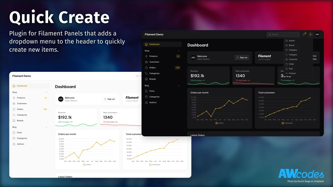
Quick Create
Plugin for Filament Panels that adds a dropdown menu to the header to quickly create new items.
 Author:
Adam Weston
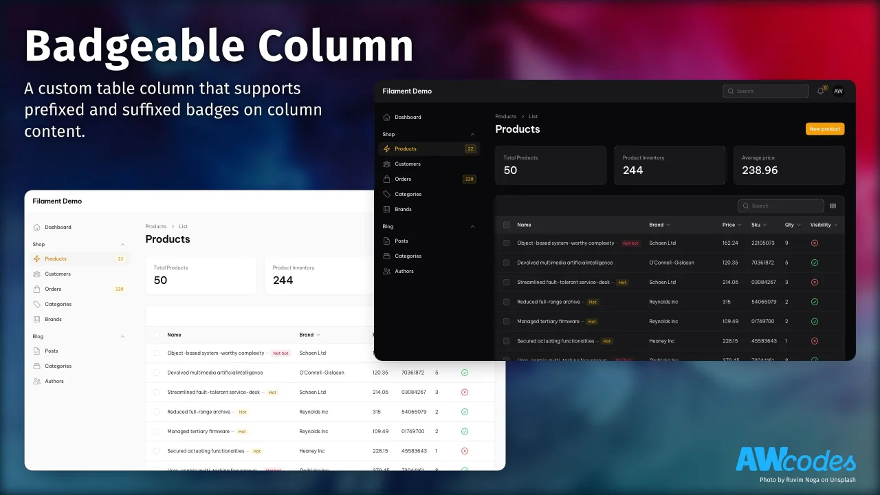
Badgeable Column
Display additional context as badges alongside your Filament table column values.
 Author:
Adam Weston
Featured Plugins
A selection of plugins curated by the Filament team
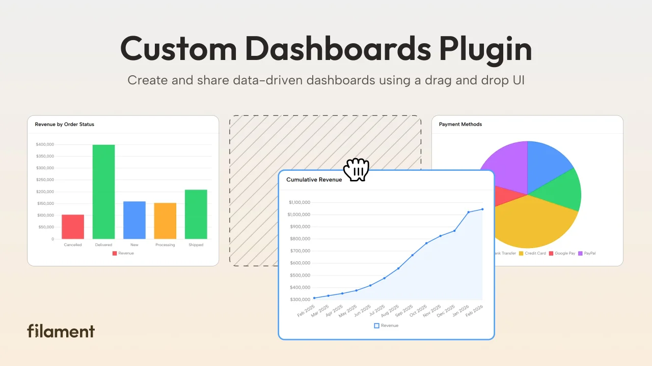
Custom Dashboards
Let your users build and share their own dashboards with a drag-and-drop interface. Define your data sources in PHP and let them do the rest.
 Filament
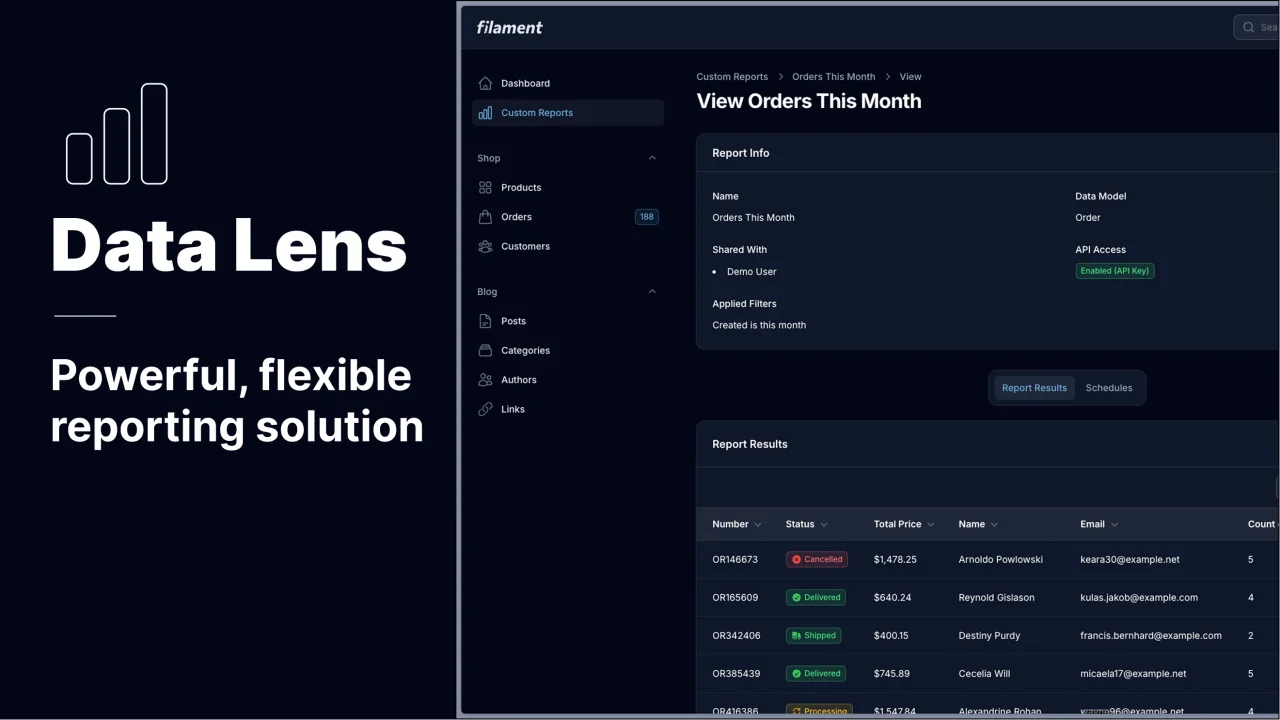
Data Lens
Advanced Data Visualization for Laravel Filament - a premium reporting solution enabling custom column creation, sophisticated filtering, and enterprise-grade data insights within admin panels.
 Padmission
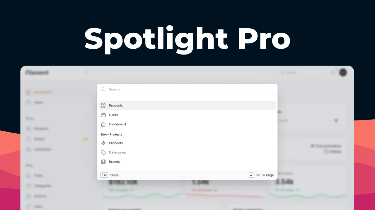
Spotlight Pro
Browse your Filament Panel with ease. Filament Spotlight Pro adds a Spotlight/Raycast like Command Palette to your Filament Panel.
 Dennis Koch
