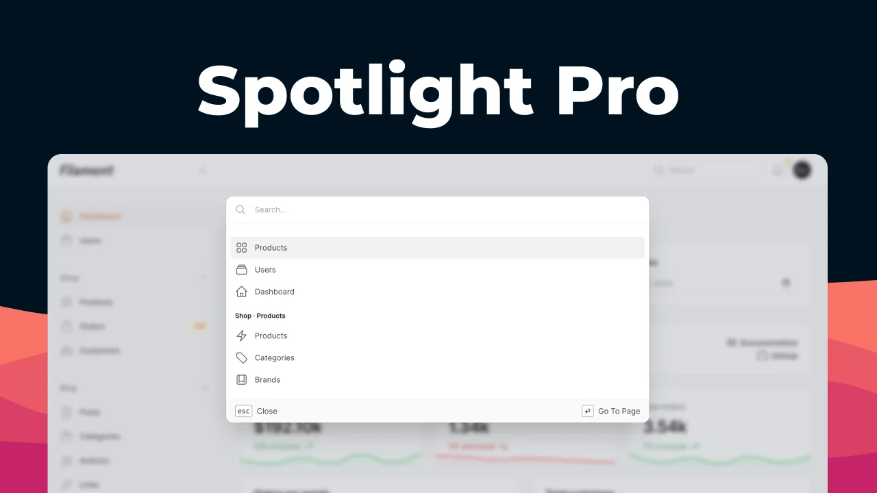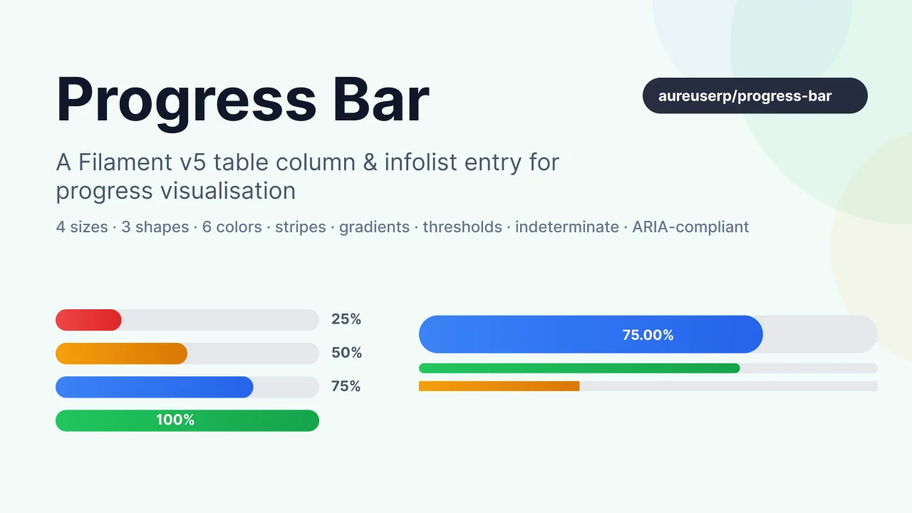
Progress Bar
CommunityA feature-rich Filament v5 table column & infolist entry that renders progress as a horizontal bar. Built for dashboards, task progress, capacity gauges, skill levels, and any numeric value that fits on a 0–100% (or custom min–max) scale.
filament/
namespace. Review the source and install at your own risk. Found
malware or an unresolved security issue the author won't
address?
Report it
.
 Author:
Aureus ERP
Author:
Aureus ERP
Documentation
- Table of contents
- Features
- Requirements
- Installation
- Quick start
- API reference
- Enums
- Real-world example
- Theming & customisation
- Translations
- Publishing resources
- Testing
- Troubleshooting
- Security
- Contributing
- Credits
- License


A feature-rich Filament v5 table column & infolist entry that renders progress as a horizontal bar. Built for dashboards, task progress, capacity gauges, skill levels, and any numeric value that fits on a 0–100% (or custom min–max) scale.
#Table of contents
- Features
- Requirements
- Installation
- Quick start
- API reference
- Enums
- Real-world example
- Theming & customisation
- Translations
- Publishing resources
- Testing
- Troubleshooting
- Security
- Contributing
- Credits
- License
#Features
- Table column — drop into any Filament table as a percentage/gauge column
- Infolist entry — read-only progress visualisation for detail pages
- 4 sizes — Tiny, Small, Medium, Large
- 3 shapes — Rounded, Pill, Square
- 6 colors — primary / success / warning / danger / info / gray, plus custom panel colors
- Threshold-driven colors —
->thresholds([90 => 'success', 50 => 'warning', 0 => 'danger']) - Warn above —
->warnAbove(100)auto-flags over-budget values - Stripes + animation — striped or scrolling diagonal pattern overlay
- Indeterminate — looping animation when the progress is unknown
- Gradient fill — smooth left→right colour transition
- Label anywhere — inside, outside, or hidden; custom formatter with full control
- Icons — start/end icon adjacent to the label
- ARIA-compliant — always emits
role="progressbar",aria-valuenow/min/max,aria-label - Type-safe enums —
Size::Large,Shape::Pill,LabelPosition::Outside,IconPosition::End; strings still work - Self-contained CSS — Tailwind-compiled, no dependency on Filament's button/badge classes
- Translations —
enandarshipped
#Requirements
- PHP 8.2+
- Laravel 11+
- Filament v5+
- Tailwind CSS (via a custom Filament theme if you use Panels)
#Installation
composer require aureuserp/progress-bar
Service provider is auto-discovered. CSS is registered via FilamentAsset and published automatically during artisan filament:assets.
#Quick start
#Table column
use Webkul\ProgressBar\Tables\Columns\ProgressBar;

ProgressBar::make('progress')
    ->label('Completion')
    ->color(fn ($record) => $record->progress >= 100 ? 'success' : 'primary');
#Infolist entry
use Webkul\ProgressBar\Infolists\Components\ProgressBar;

ProgressBar::make('level')
    ->label('Skill level')
    ->getStateUsing(fn ($record) => $record->level);
Both components extend Filament base classes (Column and Entry), so every standard method (->label(), ->sortable(), ->toggleable(), ->visible()) still works.
#API reference
#Value
->max(int | float | Closure $max = 100)           // upper bound (default 100)
->min(int | float | Closure $min = 0)             // lower bound (default 0)
->value(int | float | Closure $value)             // explicit state override
->precision(int $decimals = 2)                    // decimals for non-100% display
->formatLabel(Closure $fn)                        // full control: (value, percentage, min, max) → string
#Display
use Webkul\ProgressBar\Enums\{Size, Shape, LabelPosition};

->size(Size::Large)                               // or 'lg'   — Tiny | Small | Medium | Large
->shape(Shape::Pill)                              // or 'pill' — Rounded | Pill | Square
->labelPosition(LabelPosition::Outside)            // or 'outside' — Inside | Outside | None
->showLabel(bool | Closure $condition = true)      // shortcut: false → LabelPosition::None
->striped(bool | Closure = true)                   // diagonal stripes
->animated(bool | Closure = true)                  // scrolling stripes (implies striped)
->indeterminate(bool | Closure = true)             // sliding animation (value ignored)
->gradient(bool | Closure = true)                  // left→right colour gradient
#Color
->color(string | Closure $color)                   // primary / success / warning / danger / info / gray / custom
->trackColor(string | Closure $color = 'gray')     // unfilled-track color
->thresholds(array | Closure $map)                 // [90=>'success', 75=>'info', 50=>'warning', 0=>'danger']
->warnAbove(int | float $threshold,
            string $color = 'danger')              // over-threshold paints with $color
Resolution order: warnAbove → thresholds → color() → fallback primary.
#Icon
use Webkul\ProgressBar\Enums\IconPosition;

->icon(string | Closure $heroicon)                 // 'heroicon-m-check-circle' etc.
->iconPosition(IconPosition::End)                   // or 'end' — Start | End
#Accessibility
Every render emits:
<div class="pb-track" role="progressbar"
     aria-valuenow="{percentage}"
     aria-valuemin="{min}"
     aria-valuemax="{max}"
     aria-label="{formatted label}">
    <div class="pb-fill" style="width: {percentage}%"></div>
</div>
For indeterminate bars, aria-valuenow is omitted (per the WAI-ARIA spec).
#Enums
| Enum | Cases → values | Default |
|---|---|---|
Size |
Tiny → 'xs', Small → 'sm', Medium → 'md', Large → 'lg' |
Size::Medium |
Shape |
Rounded, Pill, Square |
Shape::Rounded |
LabelPosition |
Inside, Outside, None |
LabelPosition::Inside |
IconPosition |
Start, End |
IconPosition::Start |
Each exposes a default() static. Setters accept Enum | string | Closure; getters return the string value so Blade data-pb-* attributes and the CSS keep working unchanged.
use Webkul\ProgressBar\Enums\{Size, Shape, LabelPosition, IconPosition};

ProgressBar::make('progress')
    ->size(Size::Large)
    ->shape(Shape::Pill)
    ->labelPosition(LabelPosition::Outside)
    ->icon('heroicon-m-check-circle')
    ->iconPosition(IconPosition::End);
#Real-world example
Adapted from a skill-level table (the pattern that originally motivated the extraction):
use Webkul\ProgressBar\Enums\Shape;
use Webkul\ProgressBar\Enums\Size;
use Webkul\ProgressBar\Tables\Columns\ProgressBar;

ProgressBar::make('level')
    ->label('Proficiency')
    ->getStateUsing(fn ($record) => $record->level)
    ->size(Size::Small)
    ->shape(Shape::Pill)
    ->striped()
    ->thresholds([
        80 => 'success',
        50 => 'warning',
        20 => 'info',
        0  => 'danger',
    ])
    ->formatLabel(fn (float $percentage, float $value) => sprintf('%d / 100', $value))
    ->sortable()
    ->toggleable();
Task progress in a project dashboard:
ProgressBar::make('progress')
    ->label('Completion')
    ->warnAbove(100, 'danger')              // over-budget → red
    ->color(fn ($record) => $record->progress >= 100 ? 'success' : 'primary')
    ->animated()
    ->size(Size::Medium);
#Theming & customisation
The plugin ships a Tailwind-compiled CSS bundle keyed on stable data attributes you can target in your own theme:
.pb-wrapper— outer wrapper (flex column, used for outside-label layout).pb-track— the track.pb-fill— the filled portion.pb-label/.pb-label-outside— label text.pb-icon— icon inside the label
Data attributes on .pb-track:
data-pb-size="xs|sm|md|lg"— heightdata-pb-shape="rounded|pill|square"— corner radiusdata-pb-color="primary|success|warning|danger|info|gray|…"— drives--pb-color-500/600CSS variablesdata-pb-indeterminate="true|false"— triggers the slide animation
Data attributes on .pb-fill:
data-pb-striped="true"— adds diagonal stripesdata-pb-animated="true"— animates the stripesdata-pb-gradient="true"— left→right colour gradientdata-pb-full="true"— set when progress is 100% (used to switch label colour to white)
#Custom colors
Register a panel color and reference it in the progress bar:
// AdminPanelProvider
->colors(['magenta' => '#b72d81'])

// Usage
->color('magenta')
#Translations
Ships with en and ar under the progress-bar:: namespace for aria labels and enum display names. Publish to override:
php artisan vendor:publish --tag="progress-bar-translations"
#Publishing resources
php artisan vendor:publish --tag="progress-bar-config"
php artisan vendor:publish --tag="progress-bar-views"
php artisan vendor:publish --tag="progress-bar-translations"
#Testing
vendor/bin/pest plugins/aureuserp/progress-bar/tests/Feature
The plugin ships a full Pest suite covering:
| Area | Coverage |
|---|---|
| Architecture | Column extends Filament\Tables\Columns\Column, Entry extends Filament\Infolists\Components\Entry, shared trait used on both, Plugin implements Filament\Contracts\Plugin, no debug calls in shipped code |
| Value API | max, min, value, precision, formatLabel, getPercentage edge cases (>100, <0, non-numeric, reversed min/max) |
| Layout API | size, shape, labelPosition, showLabel — enum + string input, default fallback |
| Behaviour | striped, animated (auto-enables striped), indeterminate, gradient |
| Status / threshold | thresholds() + warnAbove() correctly map value → color |
| Enum input | Size::Large, Shape::Pill, LabelPosition::Outside, IconPosition::End round-trip |
| Content | formatLabel closure, icon + iconPosition, precision formatting |
| Component instantiation | Base class, view paths, fluent chaining, Column-only color() / Infolist color() |
Fixtures live at tests/Feature/Fixtures/.
#Troubleshooting
| Symptom | Likely cause | Fix |
|---|---|---|
Target class not found |
Autoload cache stale | composer dump-autoload && php artisan optimize:clear |
| View not found | Service provider not registered | php artisan package:discover |
| Styles missing | Filament asset cache stale | php artisan filament:assets |
| Bar stays empty | max() is smaller than current value, or min() equals max() |
Verify min < max and the resolved state is numeric |
#Security
Email support@aureuserp.com for security-related reports instead of opening a public issue.
#Contributing
PRs welcome. Before submitting:
vendor/bin/pest plugins/aureuserp/progress-bar/tests/Feature
vendor/bin/pint plugins/aureuserp/progress-bar
When adding a new option:
- Define a
BackedEnumundersrc/Enums/if the option is one of a fixed set. - Accept both the enum and the raw string in the setter signature.
- Add coverage under
tests/Feature/Unit/. - Document the option in the API reference and Enums sections.
#Credits
- AureusERP — plugin author
- Filament team — the excellent admin framework
- filamentphp/plugin-skeleton — structural template
#License
MIT. See LICENSE.md.
The author
From the same author
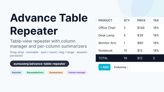
Advance Table Repeater
An advanced Filament v5 Repeater + RepeatableEntry that renders as a table with a column manager, drag-and-drop reorder, resizable columns, and per-column summarizers (sum / count / average / range).
Author:
Aureus ERP
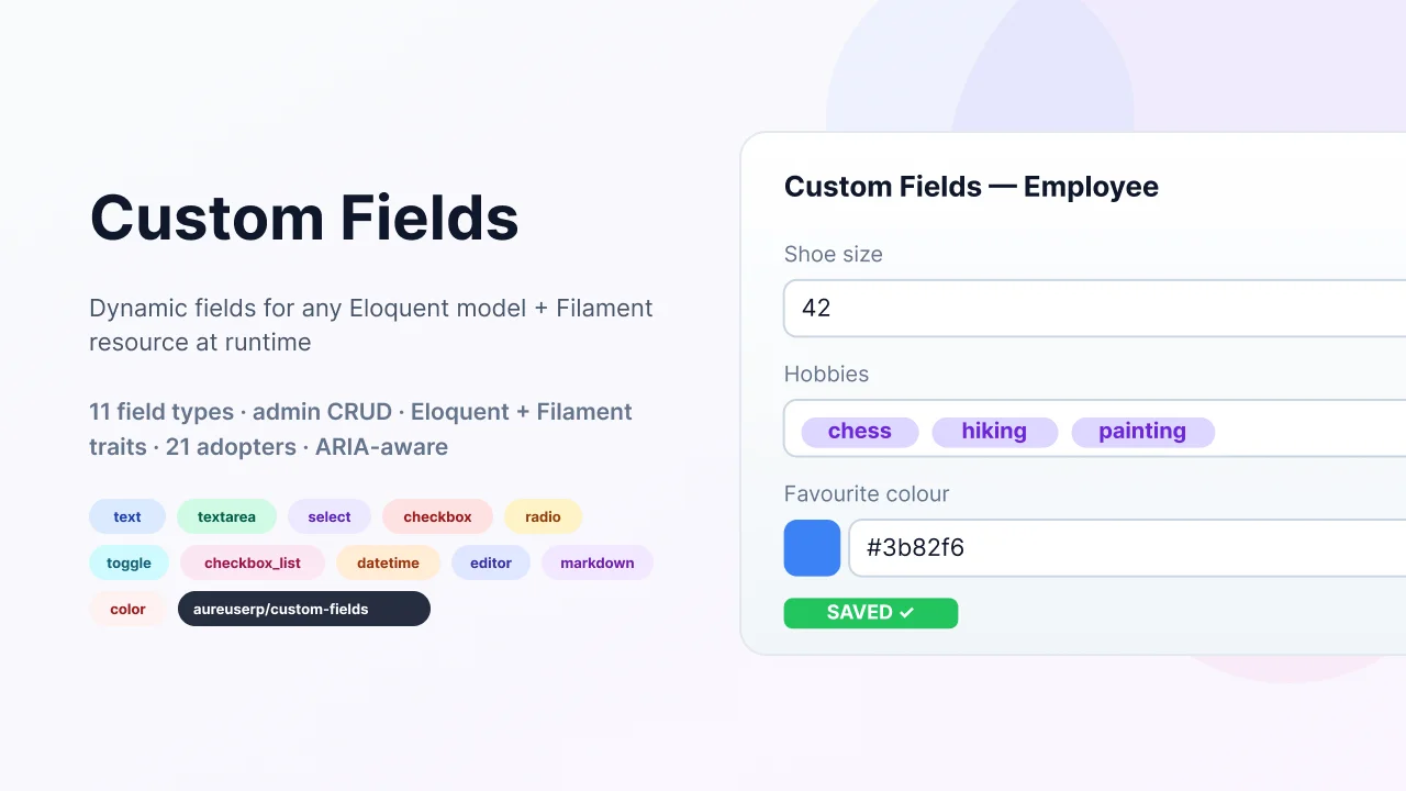
Custom Fields
Let your end-users add dynamic fields to any Eloquent model + Filament resource at runtime, without writing a single migration. Ships an admin CRUD for managing field definitions, an Eloquent trait that auto-merges the new columns into your model's fillable/casts, a Filament resource trait with five merge helpers that inject fields into forms, tables, filters, infolists, and a runtime schema manager that creates the underlying DB columns for you.
Author:
Aureus ERP
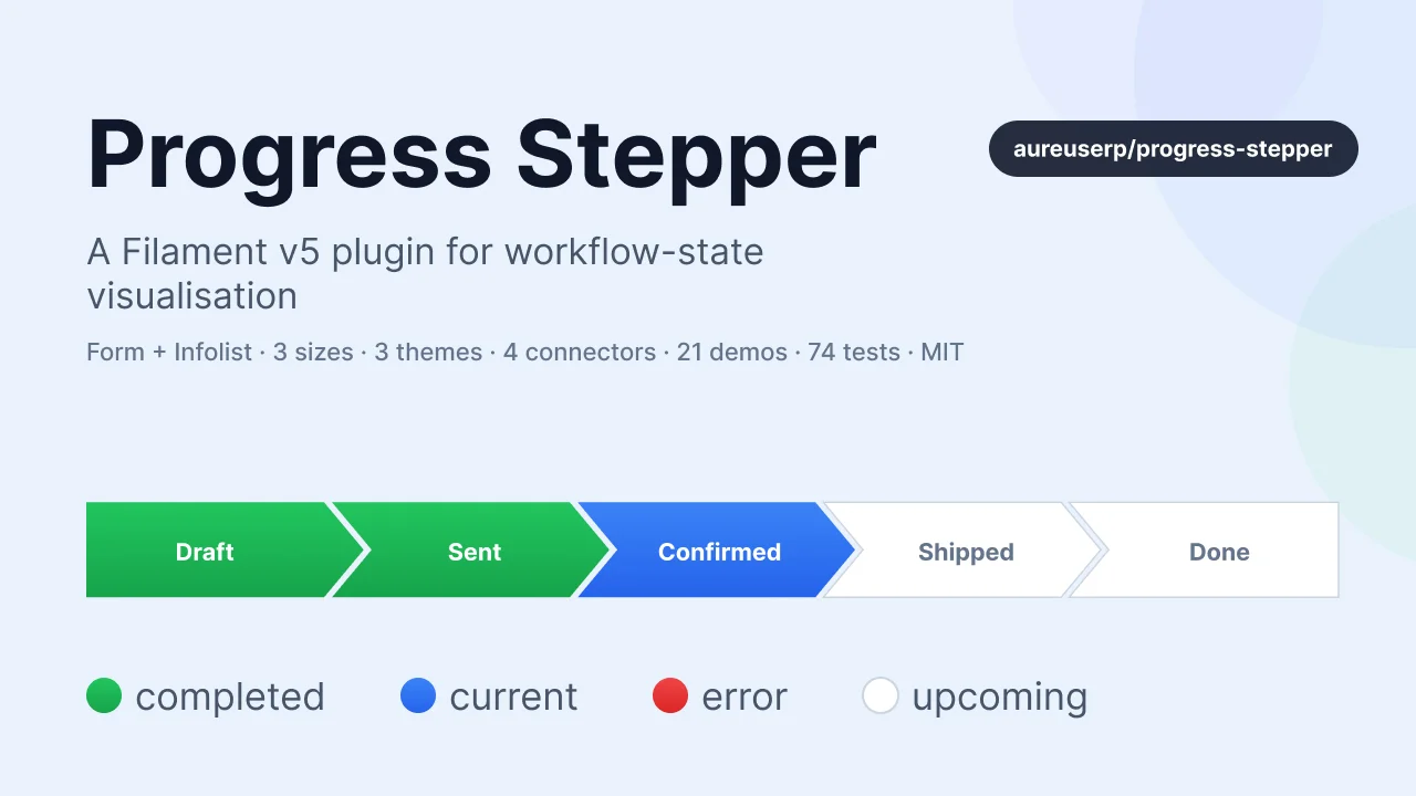
Progress Stepper
A feature-rich Filament v5 plugin that renders workflow state as an interactive arrow-stepper (form) or a read-only status bar (infolist). Built for business apps where orders, applications, or projects move through named states and you want every screen to show that progress visually.
Author:
Aureus ERP
Featured Plugins
A selection of plugins curated by the Filament team

Blueprint
Filament Blueprint is a premium Laravel Boost extension that helps AI agents produce accurate, detailed implementation plans and security reports for Filament apps.
 Filament
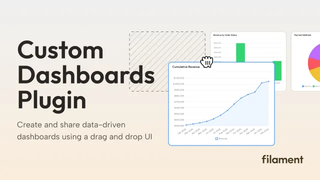
Custom Dashboards
Let your users build and share their own dashboards with a drag-and-drop interface. Define your data sources in PHP and let them do the rest.
Filament
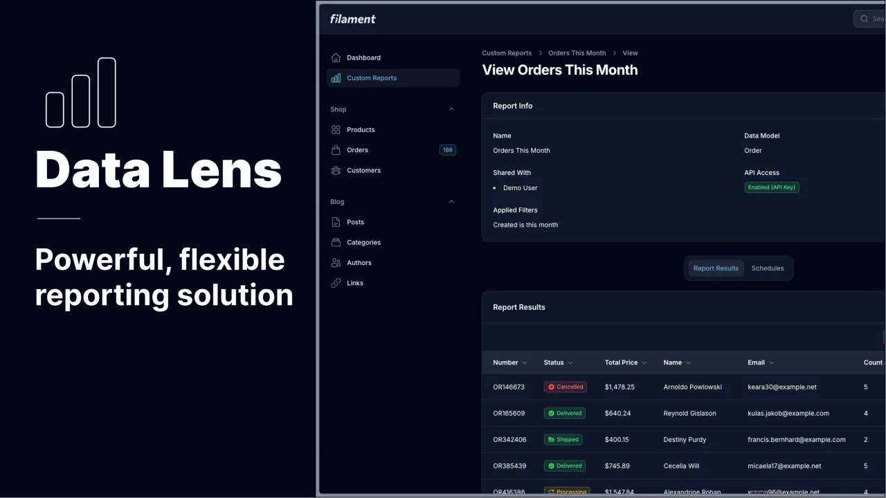
Data Lens
Advanced Data Visualization for Laravel Filament - a premium reporting solution enabling custom column creation, sophisticated filtering, and enterprise-grade data insights within admin panels.
 Padmission