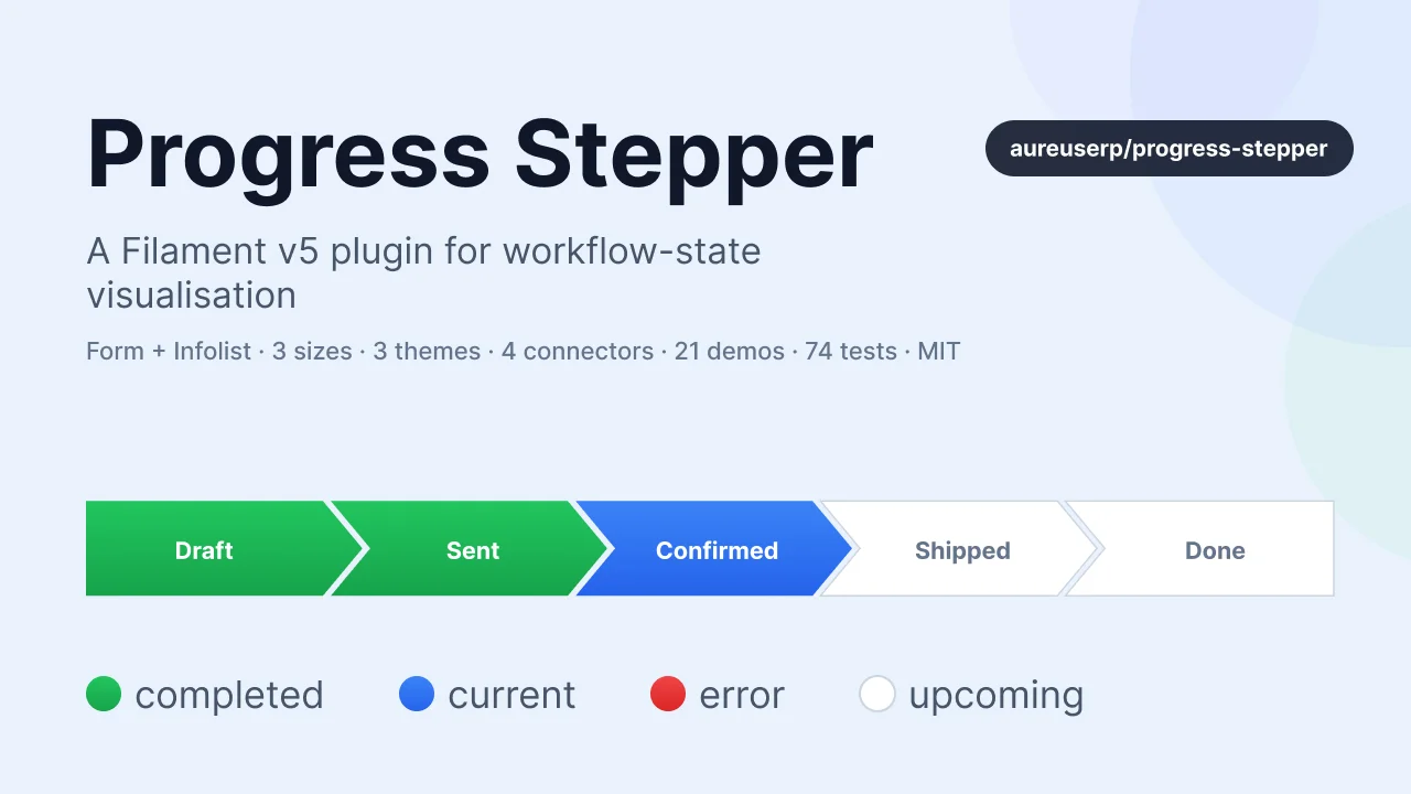
Progress Stepper
CommunityA feature-rich Filament v5 plugin that renders workflow state as an interactive arrow-stepper (form) or a read-only status bar (infolist). Built for business apps where orders, applications, or projects move through named states and you want every screen to show that progress visually.
filament/
namespace. Review the source and install at your own risk. Found
malware or an unresolved security issue the author won't
address?
Report it
.
 Author:
Aureus ERP
Author:
Aureus ERP
Documentation
- Table of contents
- Features
- Requirements
- Installation
- Quick start
- API reference
- Enums
- Real-world example
- Theming & customisation
- Overridable icons
- Translations
- Publishing resources
- Testing
- Troubleshooting
- Naming notes
- Security
- Contributing
- Credits
- License


A feature-rich Filament v5 plugin that renders workflow state as an interactive arrow-stepper (form) or a read-only status bar (infolist). Built for business apps where orders, applications, or projects move through named states and you want every screen to show that progress visually.

#Table of contents
- Features
- Requirements
- Installation
- Quick start
- API reference
- Enums
- Real-world example
- Theming & customisation
- Overridable icons
- Translations
- Publishing resources
- Testing
- Troubleshooting
- Naming notes
- Security
- Contributing
- Credits
- License
#Features
- Form component (extends
ToggleButtons) — interactive radio/checkbox stepper - Infolist entry — read-only status visualisation
- 4 state colors — completed, current, upcoming, error — each overridable
- Auto-mark completed —
markCompletedUpToCurrent()paints every step before the active one - Error states — flag any states as danger via
errorStates([…]) - Hide states conditionally —
hideStatesFor(fn)based on the current record - BackedEnum integration —
optionsFromEnum(MyStatus::class)auto-derives labels / icons / colors - Type-safe enums —
Size::Large,Direction::Vertical,Theme::Outlined,ConnectorShape::Chevron,StepStatus::Completed— strings still work for backwards compatibility - 3 sizes — sm / md / lg
- 2 directions — horizontal / vertical
- 4 connector shapes — arrow / chevron / dot / line
- 3 themes — filled / outlined / minimal
- Step numbering —
showIndex()prepends 1., 2., 3. - Icon-only (compact) mode for tight navigation bars
- Per-step content — descriptions, tooltips, badges, icons
- Overridable icons via
FilamentIcon::register() - Translations shipped for
enandar - Full Pest test coverage — 74 tests across architecture, API, status resolver, enum input, and component instantiation
#Requirements
- PHP 8.2+
- Laravel 11+
- Filament v5+
- Tailwind CSS (via a custom Filament theme if you use Panels)
#Installation
composer require aureuserp/progress-stepper
The service provider is auto-discovered. The component CSS is registered via FilamentAsset and published automatically during artisan filament:assets.
#Quick start
#Form component
use Webkul\ProgressStepper\Forms\Components\ProgressStepper;

ProgressStepper::make('state')
    ->options([
        'draft'     => 'Draft',
        'sent'      => 'Sent',
        'confirmed' => 'Confirmed',
        'done'      => 'Done',
    ])
    ->default('draft');
#Infolist entry
use Webkul\ProgressStepper\Infolists\Components\ProgressStepper;

ProgressStepper::make('state')
    ->options([
        'draft' => 'Draft',
        'sent'  => 'Sent',
        'done'  => 'Done',
    ]);
Both components extend normal Filament base classes (ToggleButtons and Entry), so all standard Filament methods — ->label(), ->helperText(), ->visible(), ->columnSpanFull(), ->state() — still work.
#API reference
All methods return static so they chain. Each accepts either a scalar value or a Closure where applicable (per Filament's standard pattern).
#Options
->options(array | Closure $options)               // ['value' => 'Label', …]
->optionsFromEnum(string $enumClass)              // derive from a BackedEnum
#BackedEnum integration
Implement HasLabel, HasColor, HasIcon on your enum and every case's label / icon / color is picked up automatically:
enum OrderStatus: string implements HasLabel, HasColor, HasIcon
{
    case Draft = 'draft';
    case Sent = 'sent';
    case Confirmed = 'confirmed';
    case Done = 'done';

    public function getLabel(): ?string
    {
        return match ($this) {
            self::Draft => __('orders.state.draft'),
            self::Sent => __('orders.state.sent'),
            self::Confirmed => __('orders.state.confirmed'),
            self::Done => __('orders.state.done'),
        };
    }

    public function getColor(): string | array | null
    {
        return match ($this) {
            self::Draft => 'gray',
            self::Sent => 'info',
            self::Confirmed => 'primary',
            self::Done => 'success',
        };
    }

    public function getIcon(): ?string
    {
        return match ($this) {
            self::Draft => 'heroicon-m-document',
            self::Sent => 'heroicon-m-paper-airplane',
            self::Confirmed => 'heroicon-m-check-badge',
            self::Done => 'heroicon-m-check-circle',
        };
    }
}

ProgressStepper::make('state')->optionsFromEnum(OrderStatus::class);
#State behaviour
->markCompletedUpToCurrent(bool | Closure $condition = true)
    // Steps ordered before the current one take the completedColor. Default: false.

->errorStates(array | Closure $states)
    // Values that should render with errorColor. e.g. ['cancelled', 'rejected'].

->hideStatesFor(Closure $callback)
    // Callback returns an array of values to hide. Receives ['record' => …] if
    // used inside a resource form/infolist — see the real-world example below.
#State colors
Each slot accepts any Filament color token (primary, success, warning, danger, info, gray, custom) or a Closure.
->completedColor(string | Closure $color)   // default: 'success'
->currentColor(string | Closure $color)     // default: 'primary'
->upcomingColor(string | Closure $color)    // default: 'gray'
->errorColor(string | Closure $color)       // default: 'danger'
#Layout
Each layout setter accepts either the dedicated enum (recommended — IDE autocomplete, compile-time checked) or the raw string (quick one-offs, backward compatible):
use Webkul\ProgressStepper\Enums\{ConnectorShape, Direction, Size, Theme};

->size(Size::Large)                              // or ->size('lg')         — default: Size::Medium
->direction(Direction::Vertical)                  // or ->direction('vertical') — default: Direction::Horizontal
->theme(Theme::Outlined)                          // or ->theme('outlined')  — default: Theme::Filled
->connectorShape(ConnectorShape::Chevron)         // or ->connectorShape('chevron') — default: ConnectorShape::Arrow
->showIndex(bool | Closure $condition = true)     // prepend 1., 2., …
->iconOnly(bool | Closure $condition = true)      // hide labels, keep icons
->inline(bool | Closure $condition = true)        // align to the right of the field label
Unknown values silently fall back to the enum's default() case, so misspellings never crash a page.
#Per-step enrichment
Each accepts an array<value, string|int> OR a Closure($value, $label, $state):
->stepDescription(array | Closure $descriptions)   // subtitle under the label
->stepTooltip(array | Closure $tooltips)           // hover help (title attribute)
->stepBadge(array | Closure $badges)               // small pill with count/text
Example:
->stepDescription([
    'draft' => 'Not yet sent',
    'sent'  => 'Awaiting response',
])
->stepBadge(fn (string $value) => $value === 'review' ? auth()->user()->unreadReviewCount() : null)
->stepTooltip(fn (string $value) => __("orders.stepper.{$value}.tooltip"))
#Icons
->icons([                                   // available on both components
    'draft'     => 'heroicon-m-document',
    'sent'      => 'heroicon-m-paper-airplane',
    'confirmed' => 'heroicon-m-check-badge',
    'done'      => 'heroicon-m-check-circle',
])
The form component inherits icons() from ToggleButtons; the infolist component declares its own.
#Enums
The plugin ships five BackedEnums under Webkul\ProgressStepper\Enums so you can use symbolic constants instead of magic strings. Every string value matches what the CSS data-ps-* attributes expect, so passing an enum produces the same rendered output as the equivalent string.
| Enum | Cases → values | Default |
|---|---|---|
Size |
Small → 'sm', Medium → 'md', Large → 'lg' |
Size::Medium |
Direction |
Horizontal, Vertical |
Direction::Horizontal |
Theme |
Filled, Outlined, Minimal |
Theme::Filled |
ConnectorShape |
Arrow, Chevron, Dot, Line |
ConnectorShape::Arrow |
StepStatus |
Completed, Current, Upcoming, Error |
(internal; returned by getStepStatus()) |
Each of the first four exposes a default() static method that returns the case used when no explicit value is set or when an unknown value falls through — useful for building resilient defaults in custom code.
#Enum usage
use Webkul\ProgressStepper\Enums\ConnectorShape;
use Webkul\ProgressStepper\Enums\Direction;
use Webkul\ProgressStepper\Enums\Size;
use Webkul\ProgressStepper\Enums\Theme;
use Webkul\ProgressStepper\Forms\Components\ProgressStepper;

ProgressStepper::make('state')
    ->options([...])
    ->size(Size::Large)
    ->direction(Direction::Horizontal)
    ->theme(Theme::Outlined)
    ->connectorShape(ConnectorShape::Chevron);
#Interop with getStepStatus()
Need to inspect the classification of a step programmatically? Round-trip through StepStatus::from(...):
use Webkul\ProgressStepper\Enums\StepStatus;

$status = StepStatus::from($component->getStepStatus('confirmed'));

match ($status) {
    StepStatus::Completed => /* … */,
    StepStatus::Current   => /* … */,
    StepStatus::Upcoming  => /* … */,
    StepStatus::Error     => /* … */,
};
#Real-world example
Adapted from a Sales Order Resource — mirrors the aureuserp pattern, mixing the Size / ConnectorShape enums with a domain OrderStatus enum:
use App\Enums\OrderStatus;
use Filament\Schemas\Schema;
use Webkul\ProgressStepper\Enums\ConnectorShape;
use Webkul\ProgressStepper\Enums\Size;
use Webkul\ProgressStepper\Forms\Components\ProgressStepper;

public static function form(Schema $schema): Schema
{
    return $schema->components([
        ProgressStepper::make('state')
            ->optionsFromEnum(OrderStatus::class)
            ->markCompletedUpToCurrent()
            ->errorStates([OrderStatus::Cancelled->value])
            ->hideStatesFor(fn ($record) => $record?->is_refunded
                ? []
                : [OrderStatus::Refunded->value])
            ->size(Size::Large)
            ->connectorShape(ConnectorShape::Chevron)
            ->showIndex()
            ->stepDescription([
                OrderStatus::Draft->value     => 'Not yet sent to the customer',
                OrderStatus::Confirmed->value => 'Customer has confirmed the quote',
            ])
            ->stepBadge(fn (string $value, $record) => match ($value) {
                OrderStatus::Sent->value => $record?->unread_comment_count ?: null,
                default                  => null,
            })
            ->columnSpanFull()
            ->disabled(),
    ]);
}
#Theming & customisation
#Custom colors
Any color registered on your panel flows through automatically. Just reference its key:
// AdminPanelProvider
->colors(['magenta' => '#b72d81'])

// Usage
->currentColor('magenta')
#Extending the CSS
The plugin styles ship at vendor/aureuserp/progress-stepper/resources/dist/progress-stepper.css. Publish it if you want to fork it:
php artisan vendor:publish --tag="progress-stepper-config"
Or override selectors in your own theme CSS — the stable hooks are:
.ps-container— outer wrapper.ps-step— each step wrapper.ps-button— the rendered stepper segment.ps-label,.ps-label-text,.ps-index,.ps-description,.ps-badge— inner label partsdata-ps-direction | data-ps-size | data-ps-theme | data-ps-separator | data-ps-compact | data-ps-inlineon.ps-container— values match theDirection,Size,Theme,ConnectorShapeenum valuesdata-ps-status="completed | current | upcoming | error"— values matchStepStatusenum valuesdata-ps-color="primary | success | warning | danger | info | gray | <custom>"— drives the--ps-color-500/--ps-color-600CSS variables that the filled / outlined / minimal themes consume
#Overridable icons
The plugin registers three aliases you can override globally:
use Filament\Support\Facades\FilamentIcon;

FilamentIcon::register([
    'progress-stepper::step-completed' => 'phosphor-check-bold',
    'progress-stepper::step-current'   => 'phosphor-caret-right-bold',
    'progress-stepper::step-error'     => 'phosphor-x-bold',
]);
| Alias | Default |
|---|---|
progress-stepper::step-completed |
heroicon-m-check |
progress-stepper::step-current |
heroicon-m-arrow-right |
progress-stepper::step-error |
heroicon-m-x-mark |
#Translations
The plugin ships en and ar translations under the progress-stepper:: namespace for status / separator / theme labels used internally.
Publish them to customise:
php artisan vendor:publish --tag="progress-stepper-translations"
Files appear in lang/vendor/progress-stepper/{locale}/progress-stepper.php.
#Publishing resources
# Config file (currently empty — reserved for future tuning knobs)
php artisan vendor:publish --tag="progress-stepper-config"

# Blade views
php artisan vendor:publish --tag="progress-stepper-views"

# Translations
php artisan vendor:publish --tag="progress-stepper-translations"
#Testing
The plugin ships with a full Pest test suite covering every public API surface.
vendor/bin/pest plugins/aureuserp/progress-stepper/tests/Feature
74 tests (148 assertions) across:
| Area | Coverage |
|---|---|
| Architecture | Components extend ToggleButtons / Entry, shared trait used on both, Plugin implements Filament\Contracts\Plugin, ServiceProvider extends Spatie PackageServiceProvider, no debug calls (dd, dump, var_dump, ray, die, exit) in shipped code |
| State colors | Defaults, scalar setters, closure setters, chaining |
| State behaviour | markCompletedUpToCurrent, errorStates, hideStatesFor |
| Layout API | size, direction, theme, connectorShape, showIndex, iconOnly — value acceptance and default-fallback |
| Content enrichment | stepDescription, stepTooltip, stepBadge — arrays, closures, empty-value coercion |
| Status resolver | getStepStatus / getStepColor across completed / current / upcoming / error; errorStates overrides; custom color overrides |
| Enum input | Size::Large, Direction::Vertical etc. produce the same strings as raw equivalents; string inputs still work; closures returning enums work |
optionsFromEnum |
Derives labels from HasLabel, icons from HasIcon, colors from HasColor; safely ignores non-enum classes |
| Component instantiation | Base class assertions, view paths, chainable API, inline(), getColor() delegation |
Fixtures live at tests/Feature/Fixtures/ (only a SampleStatus BackedEnum).
#Troubleshooting
| Symptom | Likely cause | Fix |
|---|---|---|
Target class [Webkul\ProgressStepper\Forms\…] not found |
Autoload cache is stale | composer dump-autoload && php artisan optimize:clear |
View progress-stepper::forms.progress-stepper not found |
Service provider not registered | Check the provider is in bootstrap/providers.php or that package discovery ran (php artisan package:discover) |
| Steps render without arrows / colors | Filament asset cache stale | php artisan filament:assets |
Form component throws Declaration of … must be compatible with Filament\Schemas\Components\Component::… |
You called one of the legacy methods (separator(), compact(), description(), tooltip(), badge()) which collide with Filament base traits |
Use the prefixed names: connectorShape(), iconOnly(), stepDescription(), stepTooltip(), stepBadge() |
#Naming notes
Five method names on this plugin intentionally differ from the natural English word to avoid collisions with Filament's base traits:
| Natural name | Use this instead | Why |
|---|---|---|
separator() |
connectorShape() |
Component::separator() takes string|null = ',' |
compact() |
iconOnly() |
CanBeCompact::compact() exists |
description() |
stepDescription() |
HasDescription::description() exists |
tooltip() |
stepTooltip() |
HasTooltip::tooltip() exists |
badge() |
stepBadge() |
HasBadge::badge() exists |
#Security
If you discover a security vulnerability, email support@webkul.com rather than opening a public issue.
#Contributing
PRs welcome. Please run the test suite before submitting:
vendor/bin/pest plugins/aureuserp/progress-stepper/tests/Feature
vendor/bin/pint plugins/aureuserp/progress-stepper       # code style
When adding a new configuration option, please:
- Define (or extend) a
BackedEnumundersrc/Enums/if the option is one of a fixed set of values. - Accept both the enum and the raw string in the setter signature for backward compatibility.
- Add coverage to the relevant test file under
tests/Feature/Unit/. - Document the option in the API reference and Enums sections as appropriate.
#Credits
- Webkul — plugin author
- Filament team — the excellent admin framework
- filamentphp/plugin-skeleton — structural template
#License
MIT. See LICENSE.md.
The author
From the same author
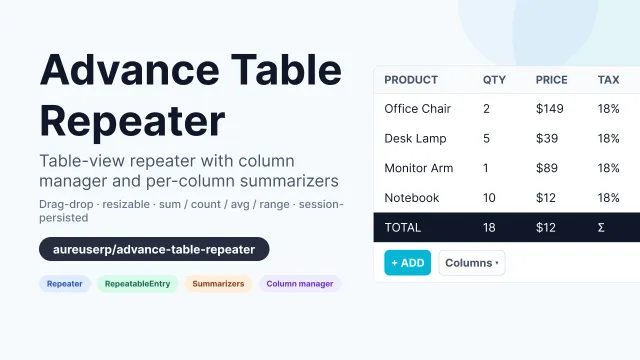
Advance Table Repeater
An advanced Filament v5 Repeater + RepeatableEntry that renders as a table with a column manager, drag-and-drop reorder, resizable columns, and per-column summarizers (sum / count / average / range).
Author:
Aureus ERP
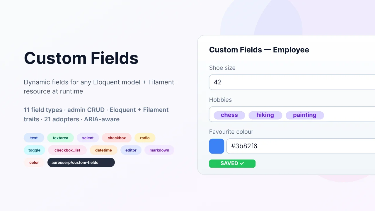
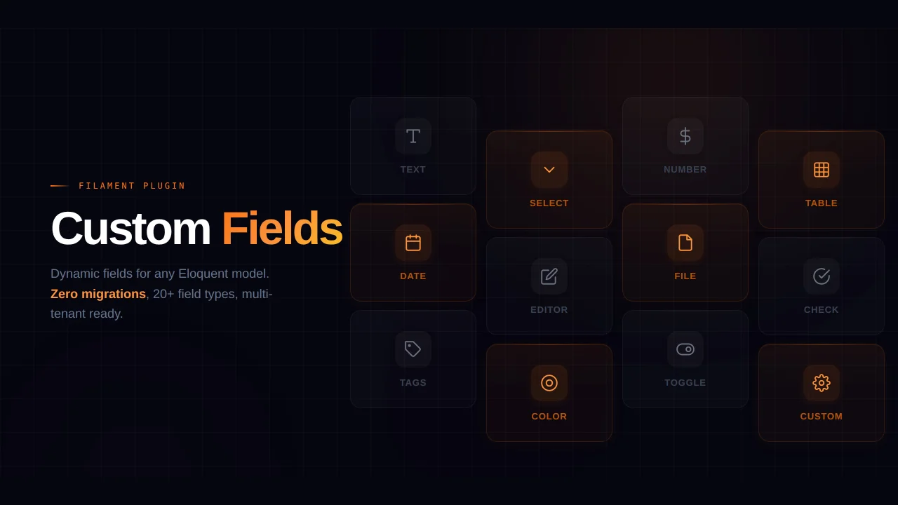
Custom Fields
Let your end-users add dynamic fields to any Eloquent model + Filament resource at runtime, without writing a single migration. Ships an admin CRUD for managing field definitions, an Eloquent trait that auto-merges the new columns into your model's fillable/casts, a Filament resource trait with five merge helpers that inject fields into forms, tables, filters, infolists, and a runtime schema manager that creates the underlying DB columns for you.
Author:
Aureus ERP
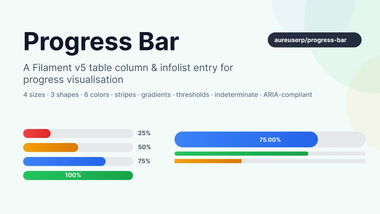
Progress Bar
A feature-rich Filament v5 table column & infolist entry that renders progress as a horizontal bar. Built for dashboards, task progress, capacity gauges, skill levels, and any numeric value that fits on a 0–100% (or custom min–max) scale.
Author:
Aureus ERP
Featured Plugins
A selection of plugins curated by the Filament team

Blueprint
Filament Blueprint is a premium Laravel Boost extension that helps AI agents produce accurate, detailed implementation plans and security reports for Filament apps.
 Filament
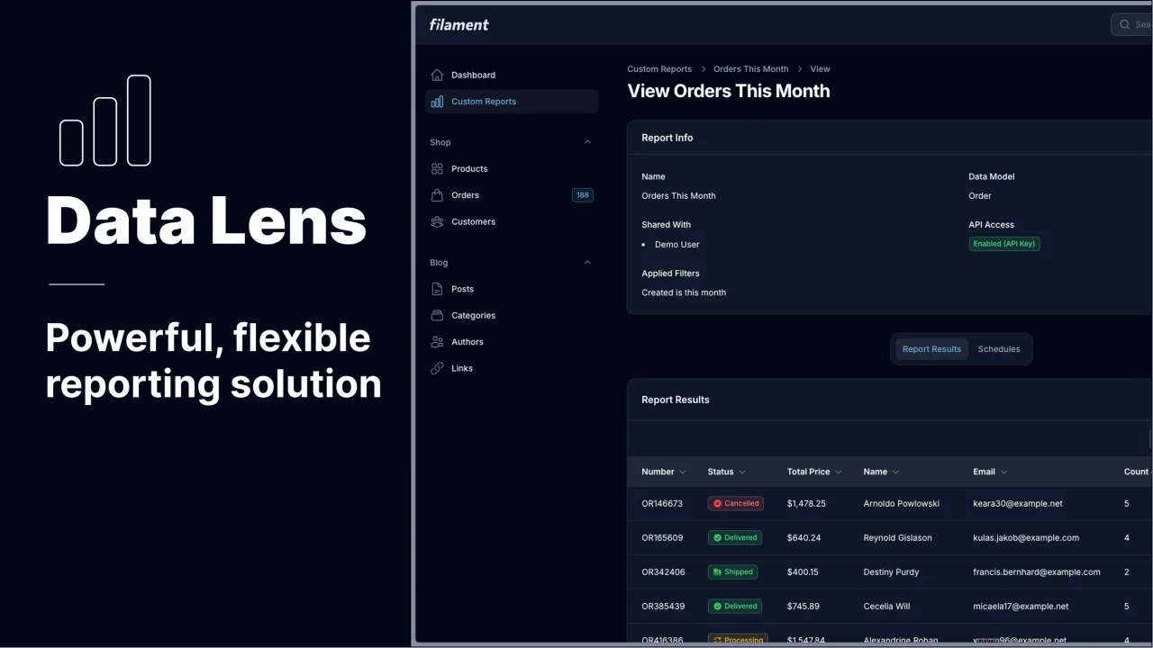
Data Lens
Advanced Data Visualization for Laravel Filament - a premium reporting solution enabling custom column creation, sophisticated filtering, and enterprise-grade data insights within admin panels.
 Padmission

Spotlight Pro
Browse your Filament Panel with ease. Filament Spotlight Pro adds a Spotlight/Raycast like Command Palette to your Filament Panel.
 Dennis Koch