Material 3 Theme
CommunityA Material Design 3 theme for Filament, with dynamic color.
filament/
namespace. Review the source and install at your own risk. Found
malware or an unresolved security issue the author won't
address?
Report it
.
 Author:
Saade
Author:
Saade
Documentation
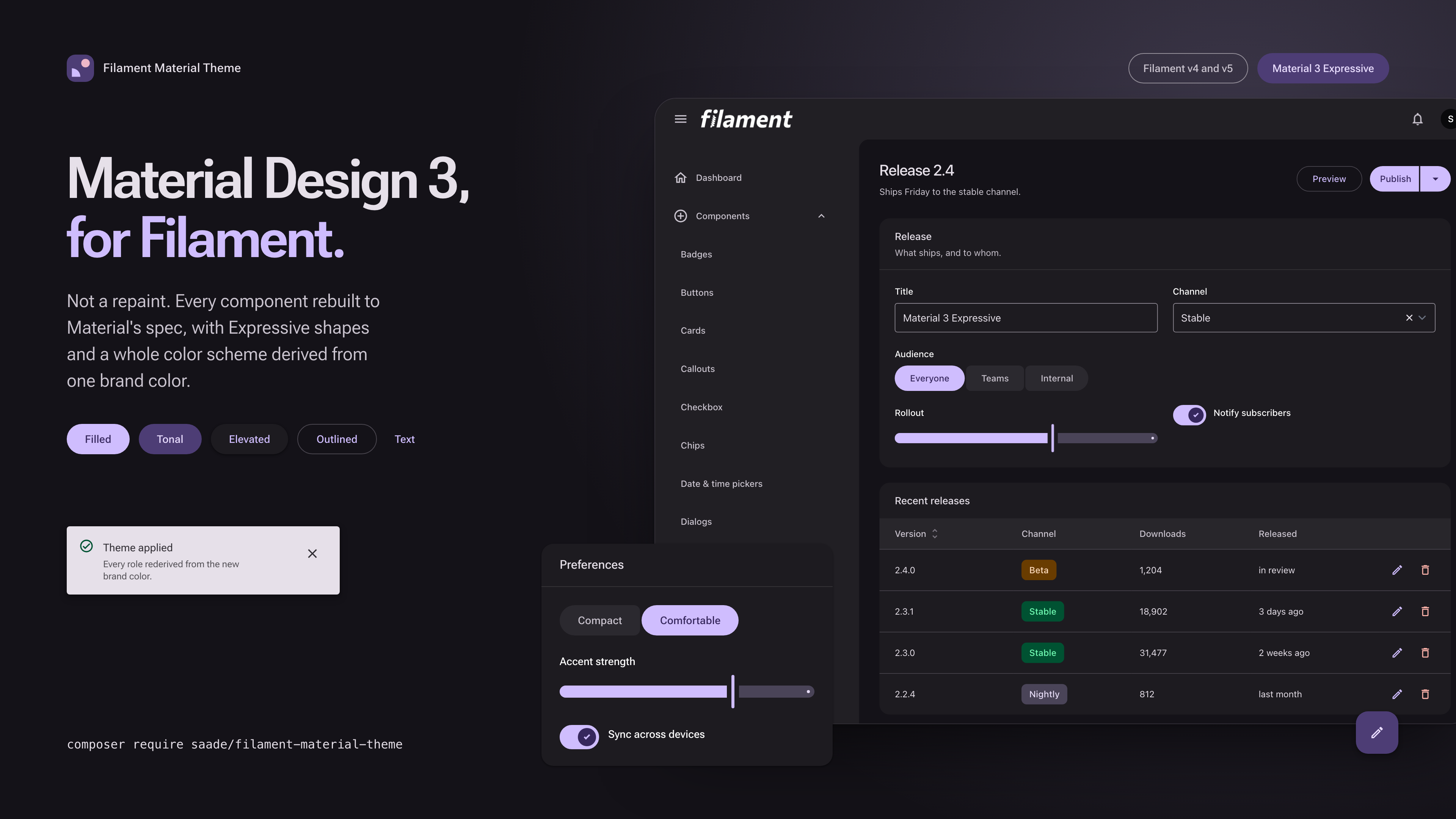
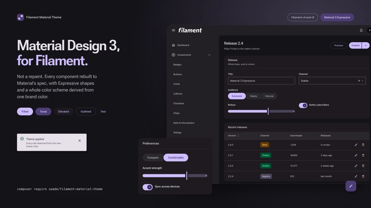
Material Design 3 for Filament. Not a repaint: every component rebuilt to Material's spec, with Expressive shapes and a whole color scheme derived from one brand color.
Live demo · Documentation · Get a license
Launch offer: LAUNCH20 takes 20% off until September 1.
#What you get
Import the stylesheet and every Filament component takes its Material form. No markup to change, no components to swap, no classes to carry around.
use Saade\FilamentMaterialTheme\FilamentMaterialThemePlugin;

$panel->plugin(
    FilamentMaterialThemePlugin::make()->source('#6750A4'),
);
That one color is the whole of theming in the usual case. Material derives the primary from it, along with the secondary, the tertiary, every surface tone and every outline, in both modes.
#Variants you ask for by name
Material ships most components in more than one form. Each is reached through a method on the Filament component that renders it:
Action::make('save')->tonal();                 // filled tonal button
Action::make('compose')->icon($icon)->fab();   // floating action button
ActionGroup::make([...])->splitButton();       // split button
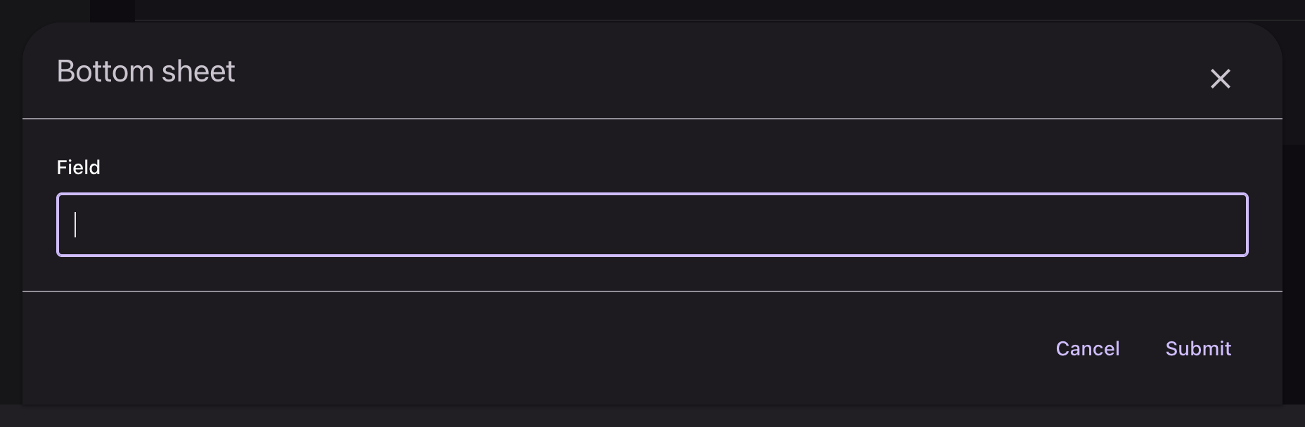
Action::make('edit')->bottomSheet();           // bottom sheet instead of a modal

TextInput::make('name')->filledField();        // filled text field
Section::make('Details')->outlined();          // outlined card
TextColumn::make('status')->badge()->outlinedBadge();
Tabs::make('details')->secondary();
#A tour
 |
 |
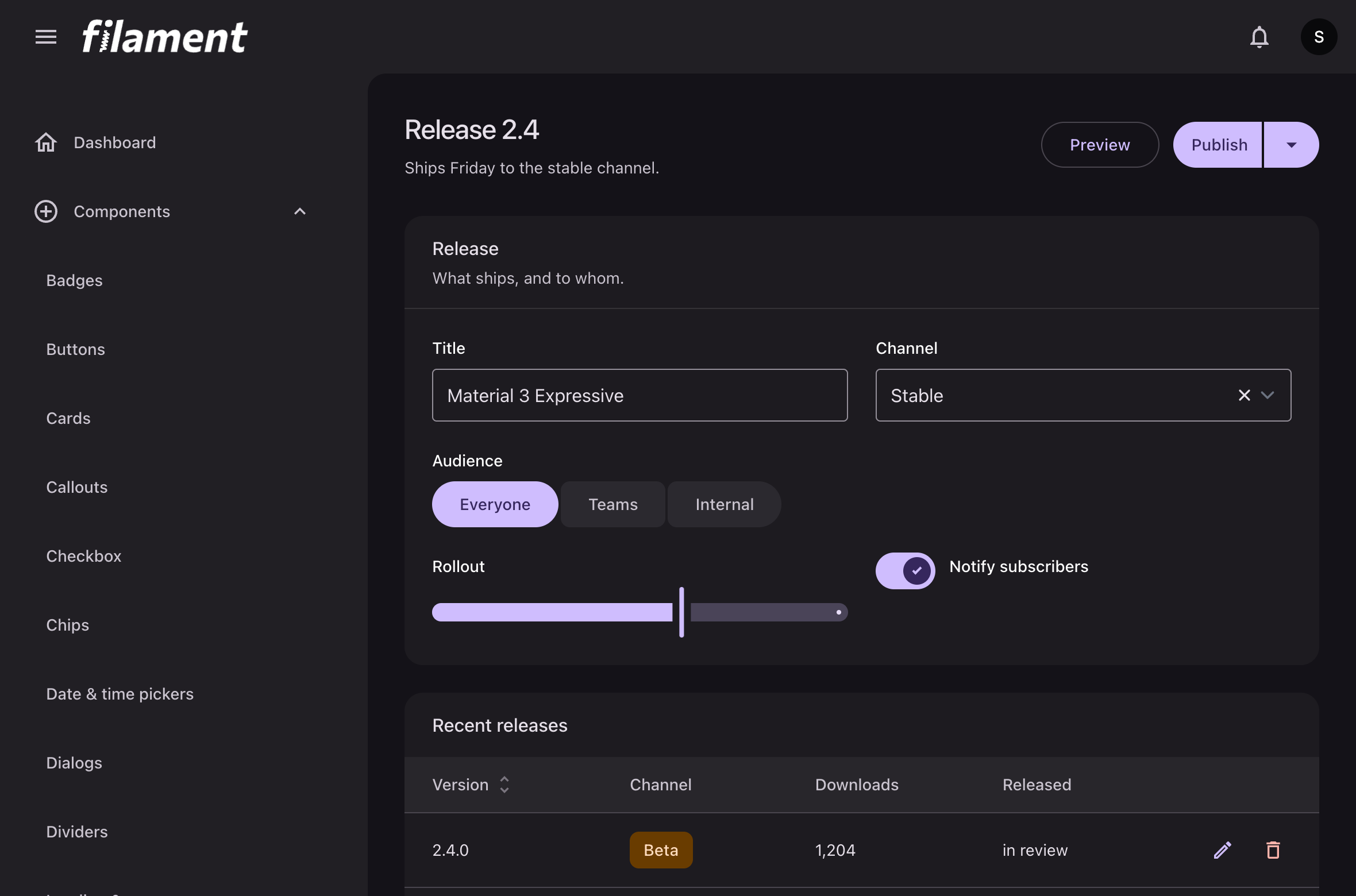
| Every button variant, in five sizes and every Filament color | The connected button group, as Material 3 Expressive redrew it |
 |
 |
Switches on Material's geometry, driven by onColor() |
Primary and secondary tabs |
 |
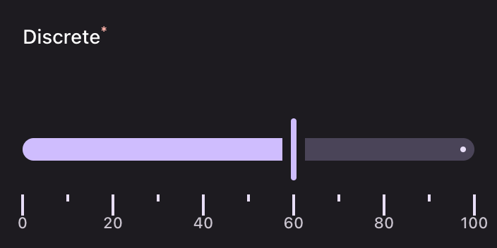 |
| Dialogs, side sheets and bottom sheets | The slider on its Expressive anatomy |
More of everything, component by component, in the documentation.
#Highlights
- Every component, not the common ones. Actions, schemas, forms, tables, infolists, widgets, notifications and the panel's own navigation are all rebuilt. The component index lists what each one maps to in Material.
- Material 3 Expressive where Material has moved on: button groups, split buttons, FAB menus, the new slider anatomy and toolbars.
- Dynamic color. The scheme is derived in the browser from one source color, so it can change at runtime without a rebuild, per user if you want it to.
- Both modes from the same seed. Nothing to configure for dark mode.
- Material icons, optional, answering Filament's icon aliases from Google's set.
- A component the theme adds: a Material divider, since Filament has none.
#Requirements
| PHP | 8.2 or later |
| Filament | v4 or v5 |
| A custom panel theme | Required, since the package ships a stylesheet |
| A license | One per project, with a year of updates |
#Installation
The package is distributed from a private Composer repository and needs a license. The installation guide has the whole of it: the repository, the credentials, the stylesheet import and the plugin registration.
#License
The documentation in this repository is open. The theme itself is a commercial package; see the documentation for how to get it.
The author
CTO & Backend Engineer at a Brazilian startup. Creating top-tier technology for public sector applications, making information and services universally accessible.
From the same author
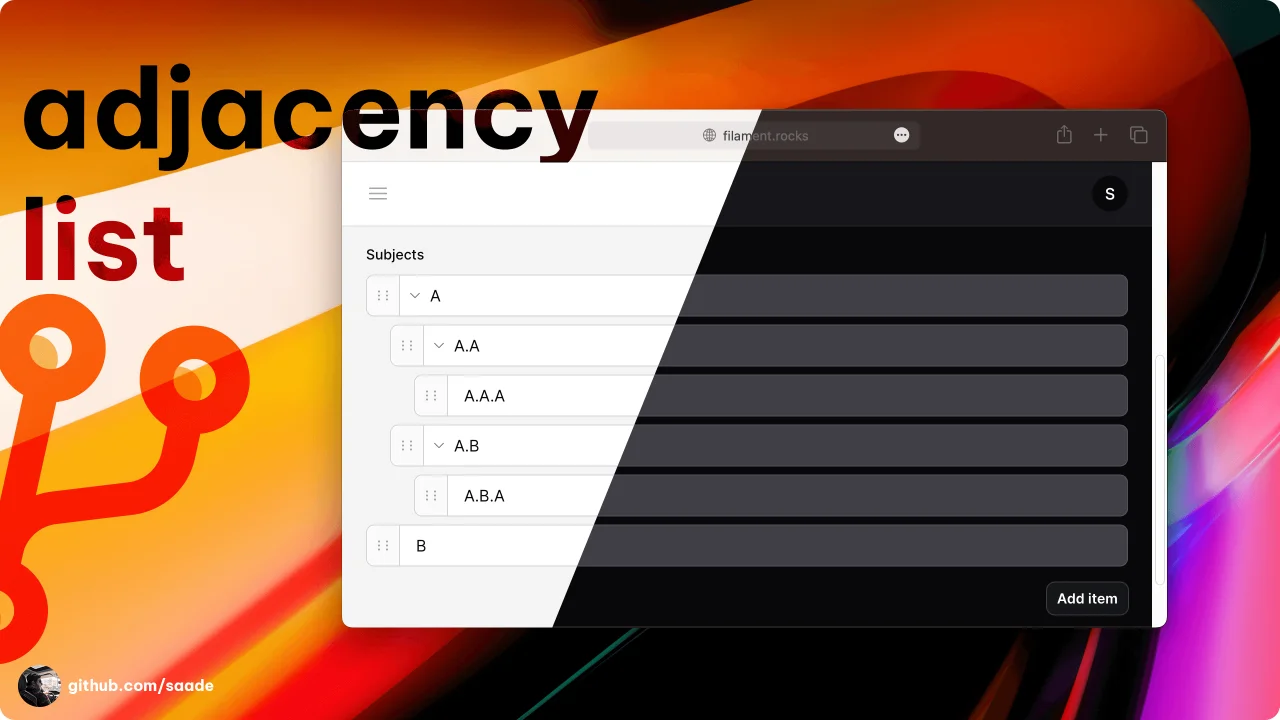
Adjacency List
A package to manage adjacency lists.
Author:
Saade
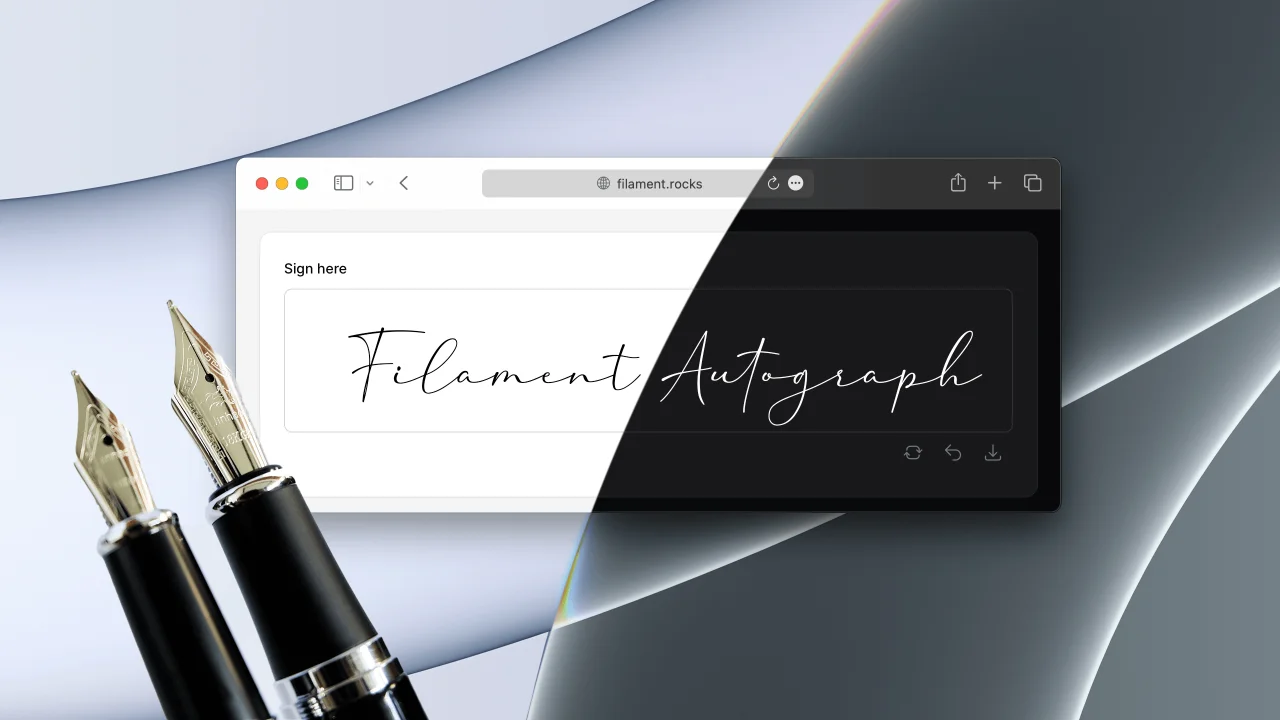
Autograph
A package to collect signatures.
Author:
Saade
Laravel Log
Read Laravel logs from the Filament admin panel.
Author:
Saade
FullCalendar
The most popular JavaScript calendar as a Filament widget.
Author:
Saade
Featured Plugins
A selection of plugins curated by the Filament team

Blueprint
Filament Blueprint is a premium Laravel Boost extension that helps AI agents produce accurate, detailed implementation plans and security reports for Filament apps.
 Filament
Custom Dashboards
Let your users build and share their own dashboards with a drag-and-drop interface. Define your data sources in PHP and let them do the rest.
Filament
Spotlight Pro
Browse your Filament Panel with ease. Filament Spotlight Pro adds a Spotlight/Raycast like Command Palette to your Filament Panel.
 Dennis Koch