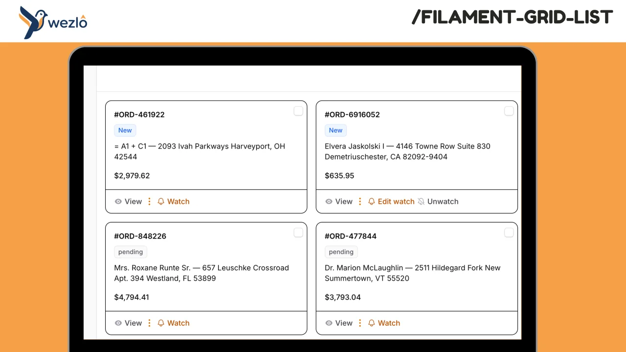
Grid Card layout
Replace any Filament resource's default list table with a responsive card/grid layout. Define how each record card looks using structured sections, a closure, or a custom Blade view — while keeping all of Filament's search, filters, sorting, pagination, bulk actions, and record actions working out of the box. No need to rewrite your resource. The same `table()` definition powers both the grid and the standard table.
 Author:
Mustafa Khaled
Author:
Mustafa Khaled
Documentation
- Requirements
- Features
- Installation
- Quick Start
- Card Rendering Modes
- Configuration Reference
- Plugin Configuration
- Configuration Cascade
- Default Config File
- Full Example
- How It Works
- Performance
- CSS Classes
- License
Replace any Filament resource's default list table with a responsive card/grid layout. Define how each record card looks using structured sections, a closure, or a custom Blade view — while keeping all of Filament's search, filters, sorting, pagination, bulk actions, and record actions working out of the box.
No need to rewrite your resource. The same table() definition powers both the grid and the standard table.
#Requirements
- PHP 8.4+
- Laravel 13+
- Filament 4+
#Features
- Responsive CSS grid — configurable columns per Tailwind breakpoint (
default,sm,md,lg,xl,2xl) - Three card rendering modes — structured sections, closure-based, or custom Blade view
- Full table infrastructure reuse — search, filters, sorting, pagination, bulk selection, record actions, header actions, empty state all work without extra setup
- Configurable pagination — default records per page and page options at the page, plugin, or config level
- Bulk selection — checkboxes on each card, works with existing bulk actions
- Record actions — view, edit, delete, and custom actions render on each card
- Click-to-navigate — cards link to view/edit pages using the resource's existing record URL logic
- Badge support — render status badges with color on each card
- Performance optimized —
content-visibility: autoskips rendering of offscreen cards, lazy-loaded images - Dark mode support
- Plugin-level defaults — set grid columns, gap, and pagination globally for all grid list pages
- Three-level configuration cascade — page overrides plugin overrides config file
#Installation
composer require wezlo/filament-grid-list
Optionally register the plugin in your Panel Provider for global defaults:
use Wezlo\FilamentGridList\FilamentGridListPlugin;

->plugins([
    FilamentGridListPlugin::make()
        ->gridColumns(['default' => 1, 'sm' => 2, 'lg' => 3])
        ->gap(4)
        ->recordsPerPage(12)
        ->recordsPerPageOptions([12, 24, 48, 96]),
])
Optionally publish the config:
php artisan vendor:publish --tag=filament-grid-list-config
#Theme Source (Tailwind v4)
The package's Blade views use Tailwind utility classes. For Tailwind to detect them during your app's build, add the package's views as a @source in your Filament custom theme CSS file (usually resources/css/filament/admin/theme.css):
@import '../../../../vendor/filament/filament/resources/css/theme.css';

@source '../../../../vendor/wezlo/filament-grid-list/resources/views/**/*';

@custom-variant dark (&:where(.dark, .dark *));
If you don't have a custom theme yet, create one:
php artisan make:filament-theme
Then rebuild assets:
npm run build
Without this step, some Tailwind utilities used in the grid view may be missing from the compiled CSS.
#Quick Start
Add the HasGridList trait to your resource's ListRecords page and implement the gridList() method:
use Filament\Resources\Pages\ListRecords;
use Wezlo\FilamentGridList\Concerns\HasGridList;
use Wezlo\FilamentGridList\GridListConfiguration;

class ListProducts extends ListRecords
{
    use HasGridList;

    protected static string $resource = ProductResource::class;

    public function gridList(GridListConfiguration $config): GridListConfiguration
    {
        return $config
            ->gridColumns(['default' => 1, 'sm' => 2, 'lg' => 4])
            ->header(fn ($record) => $record->name)
            ->content(fn ($record) => Str::limit($record->description, 100))
            ->footer(fn ($record) => '$' . number_format($record->price, 2));
    }
}
That's it. The list page now renders as a card grid. Your existing table() definition continues to power filters, search, actions, and pagination.
#Card Rendering Modes
#Mode 1: Structured Sections
Build cards from discrete sections. Each receives the Eloquent record and returns a string or HtmlString. All sections are optional — use any combination.
public function gridList(GridListConfiguration $config): GridListConfiguration
{
    return $config
        ->image(fn ($record) => $record->thumbnail_url)
        ->header(fn ($record) => $record->name)
        ->badges(fn ($record) => [
            ['label' => $record->status->getLabel(), 'color' => $record->status->getColor()],
            ['label' => $record->category->name, 'color' => 'info'],
        ])
        ->content(fn ($record) => $record->short_description)
        ->footer(fn ($record) => '$' . number_format($record->price, 2));
}
| Section | Closure Signature | Description |
|---|---|---|
image(Closure) |
fn (Model $record): ?string |
Hero image URL at the top of the card |
header(Closure) |
fn (Model $record): ?string |
Card title text |
badges(Closure) |
fn (Model $record): array |
Array of badge definitions (see below) |
content(Closure) |
fn (Model $record): string|HtmlString|null |
Card body text or HTML |
footer(Closure) |
fn (Model $record): ?string |
Bottom section (price, date, metadata) |
#Badge Format
Badges can be either arrays or renderable Blade components:
// Array format (recommended)
['label' => 'Active', 'color' => 'success']

// Any renderable (Blade component, HtmlString, etc.)
view('components.my-badge', ['status' => $record->status])
Available badge colors: primary, secondary, success, danger, warning, info, gray.
#Mode 2: Closure-based
Return raw HTML for full control over the card body:
use Illuminate\Support\HtmlString;

$config->describeUsing(fn ($record) => new HtmlString("
    <div class='p-4'>
        <h3 class='font-semibold'>{$record->name}</h3>
        <p class='text-sm text-gray-500'>{$record->description}</p>
        <span class='text-lg font-bold'>\${$record->price}</span>
    </div>
"));
#Mode 3: Custom Blade View
Point to your own Blade view for maximum flexibility:
$config->cardView('products.grid-card');
The view receives three variables:
| Variable | Type | Description |
|---|---|---|
$record |
Model |
The Eloquent record |
$recordKey |
string |
The record's primary key |
$recordUrl |
?string |
URL the card links to (null if no link) |
{{-- resources/views/products/grid-card.blade.php --}}
<div class="p-4">
    <img src="{{ $record->image_url }}" class="w-full h-48 object-cover rounded-lg" />
    <h3 class="mt-3 font-bold text-gray-900 dark:text-white">{{ $record->name }}</h3>
    <p class="mt-1 text-sm text-gray-500 dark:text-gray-400">{{ $record->description }}</p>
    <div class="mt-3 flex items-center justify-between">
        <span class="text-lg font-semibold">${{ number_format($record->price, 2) }}</span>
        <span class="text-xs text-gray-400">{{ $record->created_at->diffForHumans() }}</span>
    </div>
</div>
#Rendering Priority
When multiple modes are configured, the first match wins:
cardView()(custom Blade view)describeUsing()(closure)- Structured sections (
header(),content(), etc.) - Fallback: displays the record's title via
getTableRecordTitle()
#Configuration Reference
#Grid Layout
$config->gridColumns(['default' => 1, 'sm' => 2, 'md' => 3, 'lg' => 4])
       ->gap(6);  // Tailwind spacing unit (6 = 1.5rem)
Breakpoint keys follow Tailwind: default, sm, md, lg, xl, 2xl. The value is the number of columns at that breakpoint.
#Pagination
Set pagination on the grid config (overrides the table's defaults):
$config->recordsPerPage(24)
       ->recordsPerPageOptions([12, 24, 48, 96]);
Or configure it on your table() method as usual — the grid respects it:
public function table(Table $table): Table
{
    return $table
        ->columns([...])
        ->defaultPaginationPageOption(12)
        ->paginationPageOptions([12, 24, 48, 96]);
}
All Filament pagination modes (Default, Simple, Cursor) work.
Note: The
'all'page option is excluded from defaults to prevent page hangs on large datasets. Cards usecontent-visibility: autofor offscreen rendering optimization, but loading thousands of DOM nodes can still be slow. If you need it, opt in explicitly:->recordsPerPageOptions([12, 24, 48, 'all']).
#Bulk Selection
Enabled by default when the table has bulk actions. Disable per-page with:
$config->selectable(false);
#Record Click URL
By default, cards link to the view/edit page using the resource's existing record URL logic (same as clicking a table row). Override per-page with:
$config->recordUrl(fn ($record) => route('products.show', $record));
#Plugin Configuration
Register the plugin in your Panel Provider to set defaults for all grid list pages in that panel:
use Wezlo\FilamentGridList\FilamentGridListPlugin;

public function panel(Panel $panel): Panel
{
    return $panel
        ->plugins([
            FilamentGridListPlugin::make()
                ->gridColumns(['default' => 1, 'sm' => 2, 'md' => 3, 'lg' => 4])
                ->gap(4)
                ->recordsPerPage(12)
                ->recordsPerPageOptions([12, 24, 48, 96]),
        ]);
}
| Method | Type | Default | Description |
|---|---|---|---|
gridColumns(array) |
array<string, int> |
['default' => 1, 'sm' => 2, 'md' => 3, 'lg' => 4] |
Responsive grid columns |
gap(int) |
int |
4 |
Tailwind spacing unit for card gap |
recordsPerPage(int) |
int |
12 |
Default records per page |
recordsPerPageOptions(array) |
array<int|string> |
[12, 24, 48, 96] |
Per-page dropdown options |
#Configuration Cascade
Each setting resolves through a three-level cascade:
- Page-level — values set in
gridList()on theListRecordspage (highest priority) - Plugin-level — values set on
FilamentGridListPluginin the Panel Provider - Config file — values in
config/filament-grid-list.php(lowest priority)
Page-level always wins. If not set, falls through to plugin, then config.
#Default Config File
// config/filament-grid-list.php
return [
    'grid_columns' => [
        'default' => 1,
        'sm' => 2,
        'md' => 3,
        'lg' => 4,
    ],
    'gap' => 4,
    'records_per_page' => 12,
    'records_per_page_options' => [12, 24, 48, 96],
];
#Full Example
use App\Enums\ProductStatus;
use Filament\Resources\Pages\ListRecords;
use Illuminate\Support\Str;
use Wezlo\FilamentGridList\Concerns\HasGridList;
use Wezlo\FilamentGridList\GridListConfiguration;

class ListProducts extends ListRecords
{
    use HasGridList;

    protected static string $resource = ProductResource::class;

    public function gridList(GridListConfiguration $config): GridListConfiguration
    {
        return $config
            ->gridColumns(['default' => 1, 'sm' => 2, 'md' => 3, 'xl' => 4])
            ->gap(6)
            ->recordsPerPage(24)
            ->recordsPerPageOptions([12, 24, 48])
            ->image(fn ($record) => $record->thumbnail_url)
            ->header(fn ($record) => $record->name)
            ->badges(fn ($record) => [
                ['label' => $record->status->getLabel(), 'color' => $record->status->getColor()],
                ['label' => $record->category->name, 'color' => 'info'],
            ])
            ->content(fn ($record) => Str::limit($record->description, 120))
            ->footer(fn ($record) => '$' . number_format($record->price, 2))
            ->selectable()
            ->recordUrl(fn ($record) => ProductResource::getUrl('view', ['record' => $record]));
    }
}
The resource's table() method stays unchanged — columns, filters, search, actions, and bulk actions all carry over to the grid view automatically.
#How It Works
- The
HasGridListtrait overridescontent()on theListRecordspage to render a custom Blade view instead of the defaultEmbeddedTable - The trait overrides
makeTable()to apply pagination config fromGridListConfiguration - Records come from
$this->getTableRecords(), which handles the full filtered/sorted/paginated query pipeline from Filament'sInteractsWithTabletrait - The view initializes Filament's
filamentTable()Alpine component for selection state management - Search binds to
wire:model.live.debounceon the existingtableSearchLivewire property - Filters render using the table's filter trigger action and
$this->getTableFiltersForm() - Bulk selection uses
toggleSelectedRecord()/isRecordSelected()from thefilamentTableAlpine component — same API as the standard table - Record actions are cloned per-record using
$action->getClone()(same pattern as the standard table view) - Pagination renders via
<x-filament::pagination>with the paginator fromgetTableRecords() - Cards use
content-visibility: autoCSS so the browser skips layout/paint for offscreen cards
#Performance
content-visibility: auto— offscreen cards skip layout and paint, keeping the page responsive even with many records- Lazy-loaded images — card images use
loading="lazy"so only visible images are fetched - No
'all'by default — pagination defaults to[12, 24, 48, 96]to prevent DOM overload. Opt in to'all'explicitly if needed - Deferred loading support — respects Filament's
wire:init="loadTable"for deferred table loading
#CSS Classes
All card elements use fi-grid-list-* prefixed classes for targeted styling:
| Class | Element |
|---|---|
fi-grid-list |
Root container |
fi-grid-list-content |
Grid container |
fi-grid-list-card |
Individual card |
fi-grid-list-card-clickable |
Card with a link |
fi-grid-list-card-checkbox |
Selection checkbox wrapper |
fi-grid-list-card-body |
Card content wrapper |
fi-grid-list-card-image |
Image container |
fi-grid-list-card-img |
Image element |
fi-grid-list-card-content |
Text content area |
fi-grid-list-card-title |
Header/title text |
fi-grid-list-card-badges |
Badges container |
fi-grid-list-card-description |
Content/description text |
fi-grid-list-card-footer |
Footer area |
fi-grid-list-card-actions |
Record actions bar |
Override any of these in your theme CSS to customize the card appearance.
#License
MIT
The author
From the same author
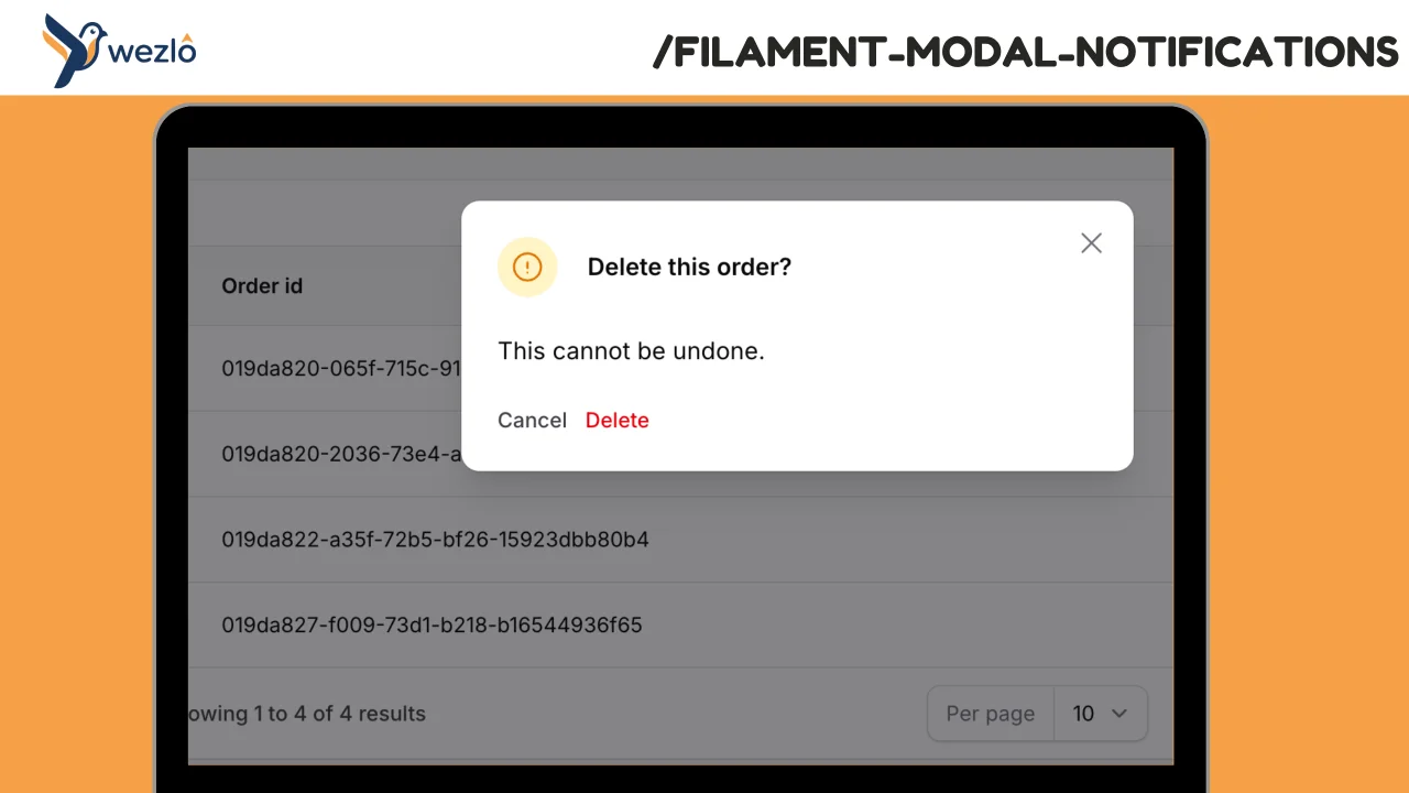
Modal Notifications
Render any Filament notification as a blocking modal by chaining one method: ->asModal(). Multiple modal notifications fired in the same request are queued one at a time — the user dismisses one and the next slides in, no stacking.
Author:
Mustafa Khaled
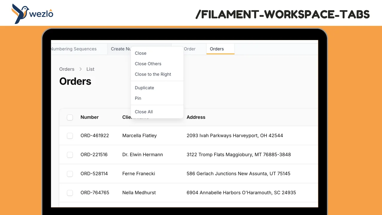
Workspace Tabs
Browser-like tabs for Filament panels. Open multiple pages in tabs without losing context, drag to reorder, pin frequently accessed pages, and right-click for quick actions.
Author:
Mustafa Khaled
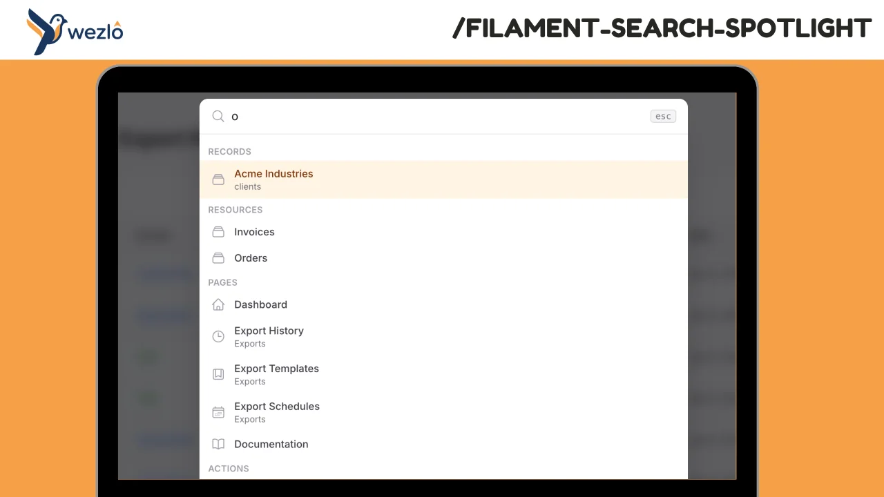
Search Spotlight
A full-screen Spotlight / command-palette search overlay for Filament panels. Opens on ⌘K (configurable), aggregates results from multiple categories (records, resources, pages, actions, plus recent/pinned from localStorage), and composes Filament's built-in `GlobalSearchProvider` — every resource that already implements `getGloballySearchableAttributes()` shows up automatically.
Author:
Mustafa Khaled
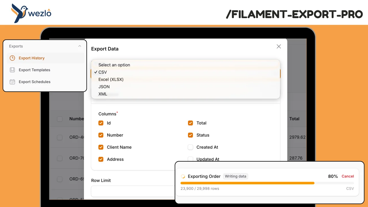
Export Pro
A comprehensive, model-agnostic export engine for Filament. Handles large datasets with background processing and real-time progress tracking, maintains full export history with audit trails, supports scheduled/recurring exports with delivery, and gives admins visibility into who exported what and when.
Author:
Mustafa Khaled
Featured Plugins
A selection of plugins curated by the Filament team
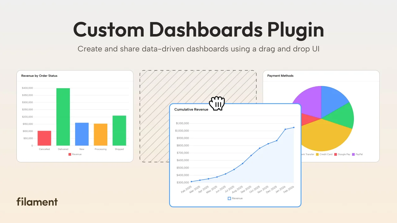
Custom Dashboards
Let your users build and share their own dashboards with a drag-and-drop interface. Define your data sources in PHP and let them do the rest.
 Filament
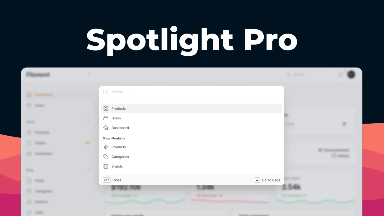
Spotlight Pro
Browse your Filament Panel with ease. Filament Spotlight Pro adds a Spotlight/Raycast like Command Palette to your Filament Panel.
 Dennis Koch
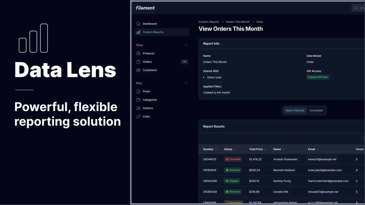
Data Lens
Advanced Data Visualization for Laravel Filament - a premium reporting solution enabling custom column creation, sophisticated filtering, and enterprise-grade data insights within admin panels.
 Padmission