Toggle Icon Column by Kenneth Sese
CommunityCombine Filament's interactive Toggle Column with its Icon Column to give users another way to interact with their tables.
 Author:
Kenneth Sese
Author:
Kenneth Sese
Package health
Automated checks of this plugin's Composer package
15 checks
- Failed: GitHub Actions pinned to SHA — View details on Plumb
- Skipped: GitLab CI includes pinned to SHA
- Passed: Open security advisories
- Failed: Dependabot PR responsiveness — Stale Dependabot PRs: oldest general PR is 299 days old. View details on Plumb
- Skipped: Renovate MR responsiveness
- Warning: Dependabot or Renovate configured — Updater does not cover the JavaScript ecosystem, which has a committed lockfile.
-
Failed:
Dependency update cooldown configured
—
No cooldown configured in
.github/dependabot.yml. View details on Plumb - Passed: Provides a security policy
- Passed: Abandoned or archived — No consulted source marks the package abandoned (packagist, github).
- Warning: Commit and release recency — Low activity: last commit 215 days ago; last release 536 days ago.
-
Passed:
composer.lock not committed by library
—
composer.lockis absent from the released dist archive. - Passed: Dist archive is lean
-
Warning:
Current Laravel version supported
—
Package does not co-install with current Laravel
13.0; the newest co-installable line is12.0, which receives security patches only (until 2027-02-24). -
Passed:
Current PHP version supported
—
Constraint
^8.1supports current PHP8.5. - Skipped: Current Symfony version supported
filament/
namespace. Review the source and install at your own risk. Found
malware or an unresolved security issue the author won't
address?
Report it
.
Documentation
- Installation
- Usage
- Testing
- Changelog
- Contributing
- Security Vulnerabilities
- Other Filament Plugins
- Credits
- License
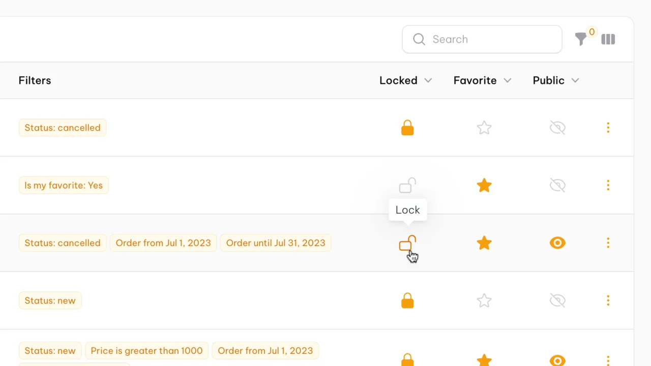
While developing Filter Sets, a premium Filament plugin that lets you save your existing filters into one easily accessible filter set, I needed a toggleable icon column to give users an easy way to see the status of their filter sets and interact with them as well. Out of this, Toggle Icon Column was born.
Toggle Icon Column is a mashup of Filament's interactive Toggle Column and the Icon Column allowing an icon to be toggled on or off in a table, with different icons and colors representing it's different states.
It should be noted that Filament's current Toggle Column is a more obvious and intuitive UX for most people and even supports icons in the toggle button. However, for some, like myself, Toggle Icon Column will give you a great way to add some visual distinction to your tables.
#Installation
You can install the package via composer:
composer require archilex/filament-toggle-icon-column
Optionally, you can publish the views using
php artisan vendor:publish --tag="filament-toggle-icon-column-views"
#Usage
use Archilex\ToggleIconColumn\Columns\ToggleIconColumn;

return $table
    ->columns([
        ToggleIconColumn::make('is_active'),
    ]);
#Customizing the icon
You may customize the icon representing each state. Heroicons v2 are supported at this time:
use Archilex\ToggleIconColumn\Columns\ToggleIconColumn;

ToggleIconColumn::make('is_locked')
    ->onIcon('heroicon-s-lock-open')
    ->offIcon('heroicon-o-lock-closed')
#Customizing the size
The default icon size is lg, but you may customize the size to be either xs, sm, md, lg or xl:
use Archilex\ToggleIconColumn\Columns\ToggleIconColumn;

ToggleIconColumn::make('is_locked')
    ->size('xl')
#Customizing the color
You may customize the icon color representing the on or off state. These may be either primary, secondary, success, info, warning, danger, or secondary:
use Archilex\ToggleIconColumn\Columns\ToggleIconColumn;

ToggleIconColumn::make('is_locked')
    ->onColor('primary')
    ->offColor('secondary')
#Customizing the hover color
By default the hover color will be the inverse of the on/off colors. These may also be customized to be either primary, secondary, success, info, warning, danger, or secondary.
use Archilex\ToggleIconColumn\Columns\ToggleIconColumn;

ToggleIconColumn::make('is_locked')
    ->hoverColor('success')
For further customization you can call a Closure.
use Archilex\ToggleIconColumn\Columns\ToggleIconColumn;

ToggleIconColumn::make('is_locked')
    ->hoverColor(fn (Model $record) => $record->is_locked ? 'text-gray-300' : 'text-success-500'),
#Other options
As ToggleIconColumn extends Filament's Column class, most other methods are available as well such as:
use Archilex\ToggleIconColumn\Columns\ToggleIconColumn;

ToggleIconColumn::make('is_bookmarked')
    ->label('Bookmark status')
    ->translateLabel()
    ->alignCenter()
    ->disabled(fn () => ! auth()->user()->isAdmin())
    ->tooltip(fn (Model $record) => $record->is_bookmarked ? 'Unbookmark' : 'Bookmark')
    ->sortable()
#Testing
composer test
#Changelog
Please see CHANGELOG for more information on what has changed recently.
#Contributing
Please see CONTRIBUTING for details.
#Security Vulnerabilities
Please review our security policy on how to report security vulnerabilities.
#Other Filament Plugins
Check out my other Filament Plugins:
- Filter Sets: Let your users combine their filters, searches, column order, and more into convenient and easily accessible filter sets.
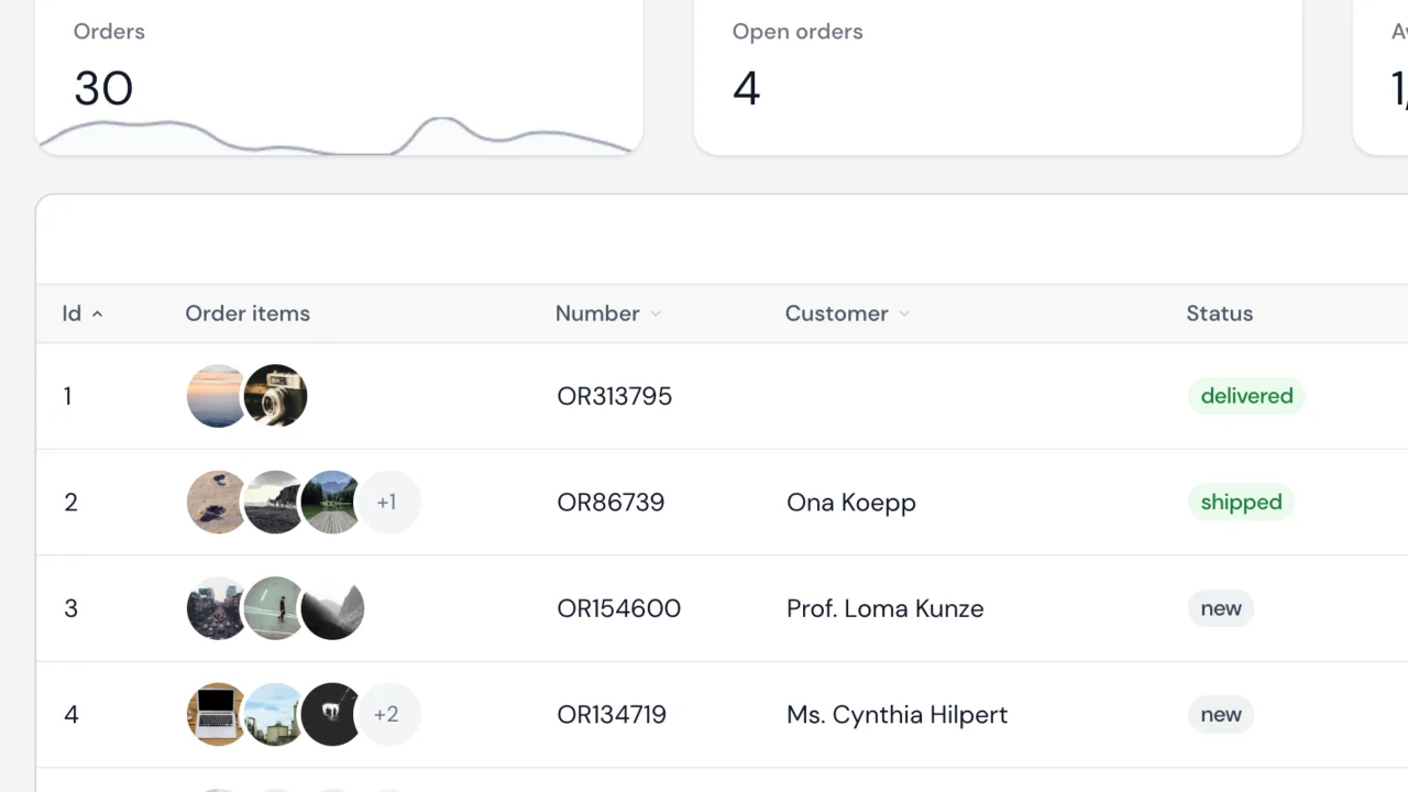
- Stacked Image Column: Display multiple images as a stack in your Filament tables.
#Credits
#License
The MIT License (MIT). Please see License File for more information.
The author
Kenneth Sese has been working in software development for more than 10 years. He is driven by a passion to help organizations that serve developing communities to utilize technology to fulfill their missions. He is currently a developer at Padmission building software that is helping end homelessness for families across the United States. He is also the author of Advanced Tables, Toggle Icon Column, and Stacked Image Column.
From the same author
Stacked Image Column
Display multiple images as a stack in your Filament tables.
Author:
Kenneth Sese
Advanced Tables (formerly Filter Sets)
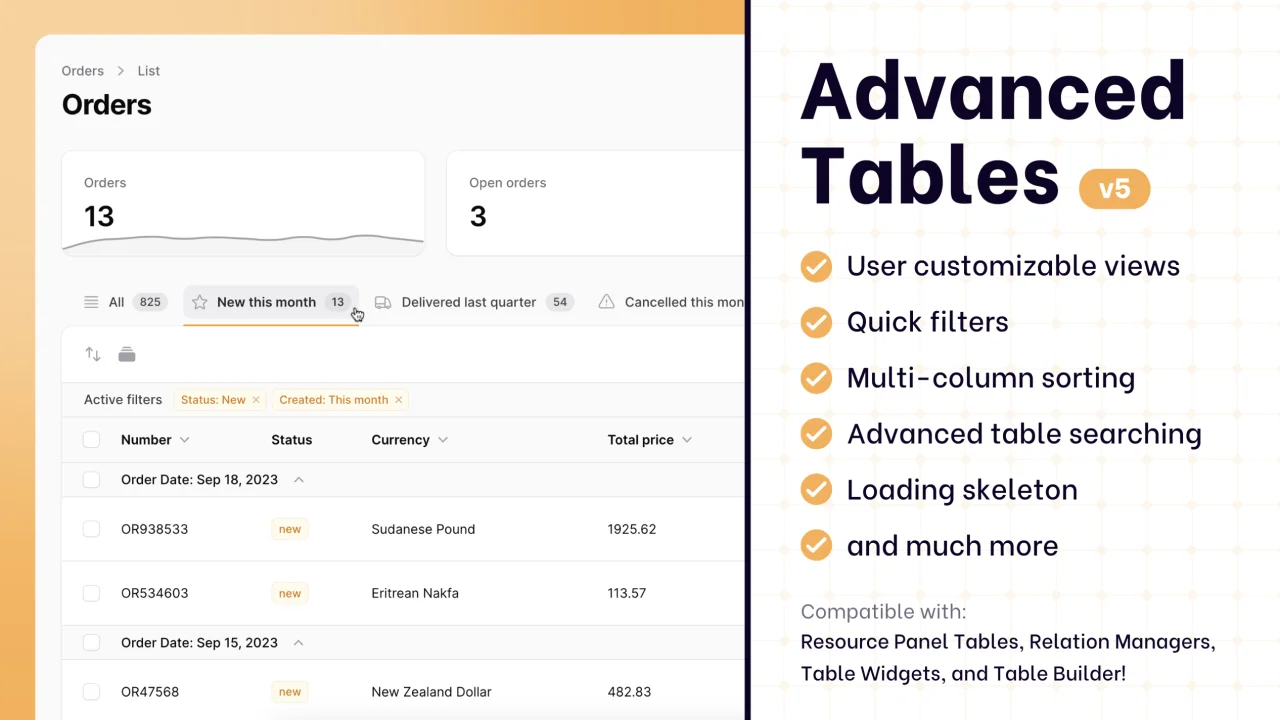
Supercharge your tables with powerful features like user-customizable views, quick filters, multi-column sorting, advanced table searching, convenient view management, and more. Compatible with Resource Panel Tables, Relation Managers, Table Widgets, and Table Builder!
Author:
Kenneth Sese
Featured Plugins
A selection of plugins curated by the Filament team

Blueprint
Filament Blueprint is a premium Laravel Boost extension that helps AI agents produce accurate, detailed implementation plans and security reports for Filament apps.
 Filament
Noir Theme
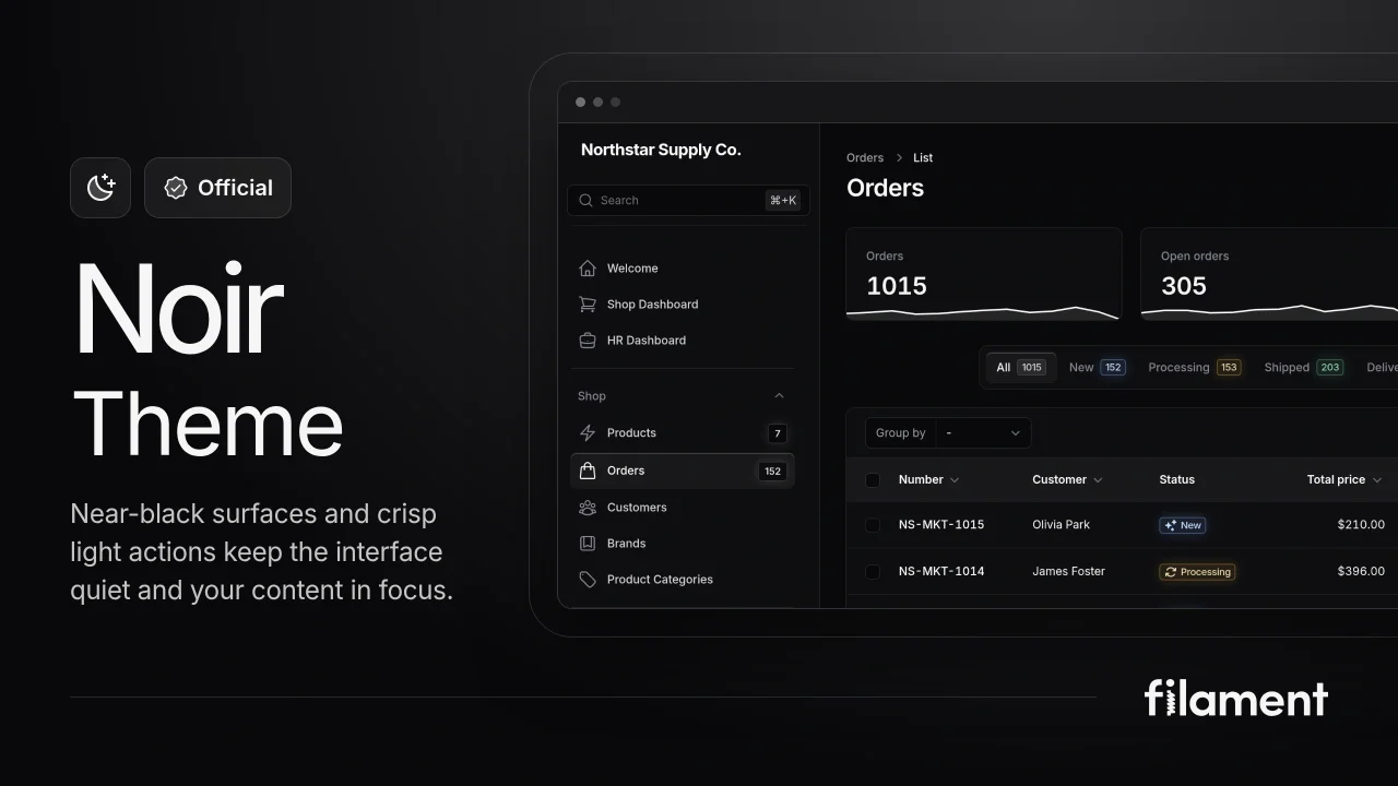
A theme that gives panels a focused, refined look with near-black surfaces, crisp actions, and restrained color.
Filament
Advanced Tables (formerly Filter Sets)
Supercharge your tables with powerful features like user-customizable views, quick filters, multi-column sorting, advanced table searching, convenient view management, and more. Compatible with Resource Panel Tables, Relation Managers, Table Widgets, and Table Builder!
Kenneth Sese