Stat Plus Easy
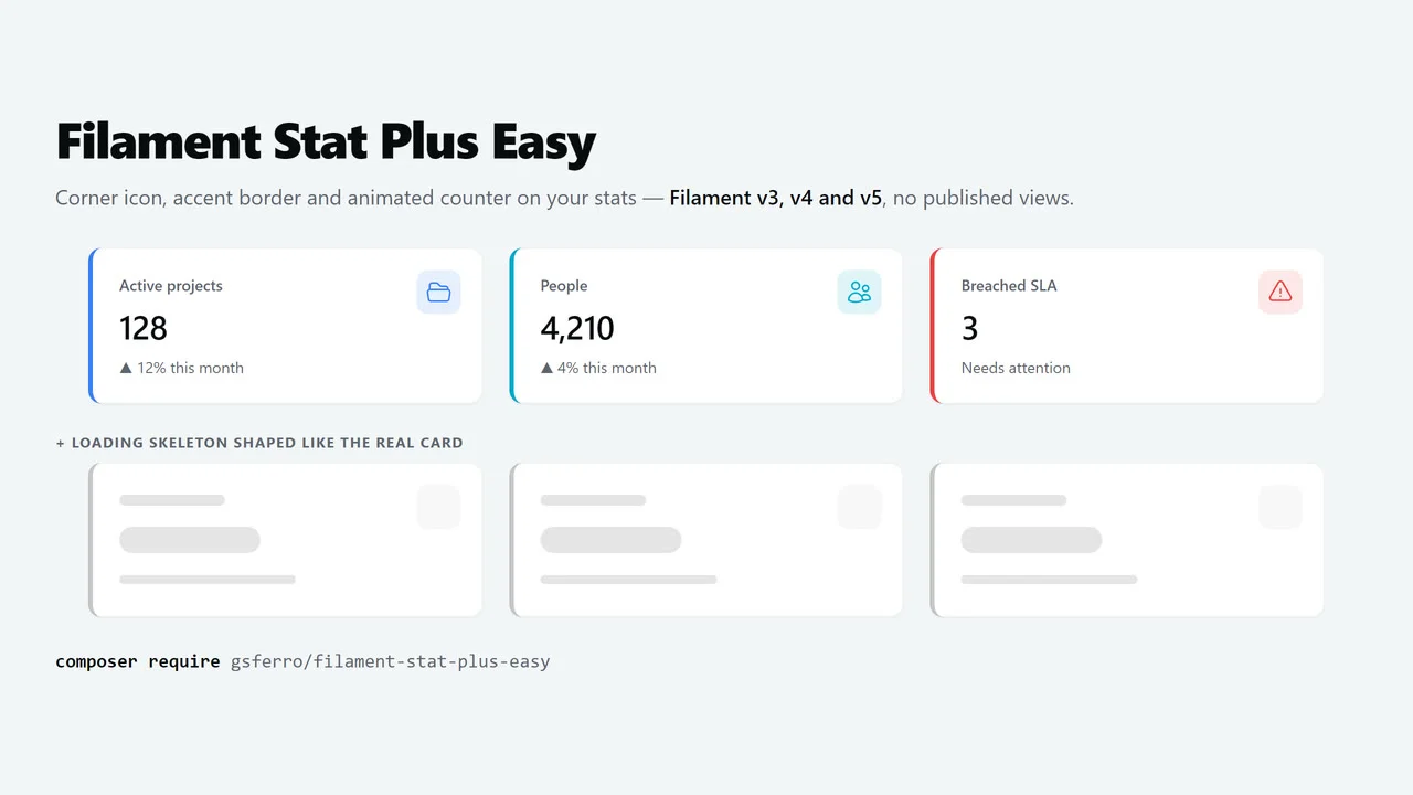
CommunityThe Filament v3, v4 and v5 Stat with the look every dashboard ends up asking for: icon in the top-right corner, colored accent border on the left and an animated counter — plus a loading skeleton shaped like the real card.
 Author:
Guilherme Ferro
Author:
Guilherme Ferro
Package health
BetaAutomated checks of this plugin's Composer package
15 checks
- Passed: GitHub Actions pinned to SHA
- Skipped: GitLab CI includes pinned to SHA
- Passed: Open security advisories
- Passed: Dependabot PR responsiveness — No open Dependabot PRs.
- Skipped: Renovate MR responsiveness
- Failed: Dependabot or Renovate configured — No dependency updater configuration found. View details on Plumb
- Skipped: Dependency update cooldown configured
- Passed: Provides a security policy
- Passed: Abandoned or archived — No consulted source marks the package abandoned (packagist, github).
- Passed: Commit and release recency — Active: last commit 2 days ago; last release 2 days ago.
-
Failed:
composer.lock not committed by library
—
composer.lockis present in the released dist archive. View details on Plumb - Passed: Dist archive is lean
-
Passed:
Current Laravel version supported
—
Package dependencies resolve together with current Laravel
13.0. -
Passed:
Current PHP version supported
—
Constraint
^8.2supports current PHP8.5. - Skipped: Current Symfony version supported
filament/
namespace. Review the source and install at your own risk. Found
malware or an unresolved security issue the author won't
address?
Report it
.
Documentation
- 🎬 Demo
- What you get
- Compatibility
- Installation
- Usage
- Configuration
- How it works under the hood
- Development
- Testing
- Changelog
- Contributing
- Security Vulnerabilities
- Credits
- License



🇺🇸 English · 🇧🇷 Português
The Filament v3, v4 and v5 Stat with the look every dashboard ends up asking for: icon in the top-right corner, colored accent border on the left and an animated counter — plus a loading skeleton shaped like the real card.
Swap Stat::make(...) for StatPlus::make(...), add ->icon(...), done. No published views, no CSS in your theme.
use Gsferro\FilamentStatPlusEasy\Widgets\StatPlus;

protected function getStats(): array
{
    return [
        StatPlus::make('Active projects', Project::active()->count())
            ->icon('heroicon-o-folder-open'),

        StatPlus::make('Breached SLA', Ticket::late()->count())
            ->icon('heroicon-o-exclamation-triangle')
            ->iconColor('danger'),
    ];
}
#🎬 Demo
StatPlus on a dashboard — corner icon, accent border and animated counter:
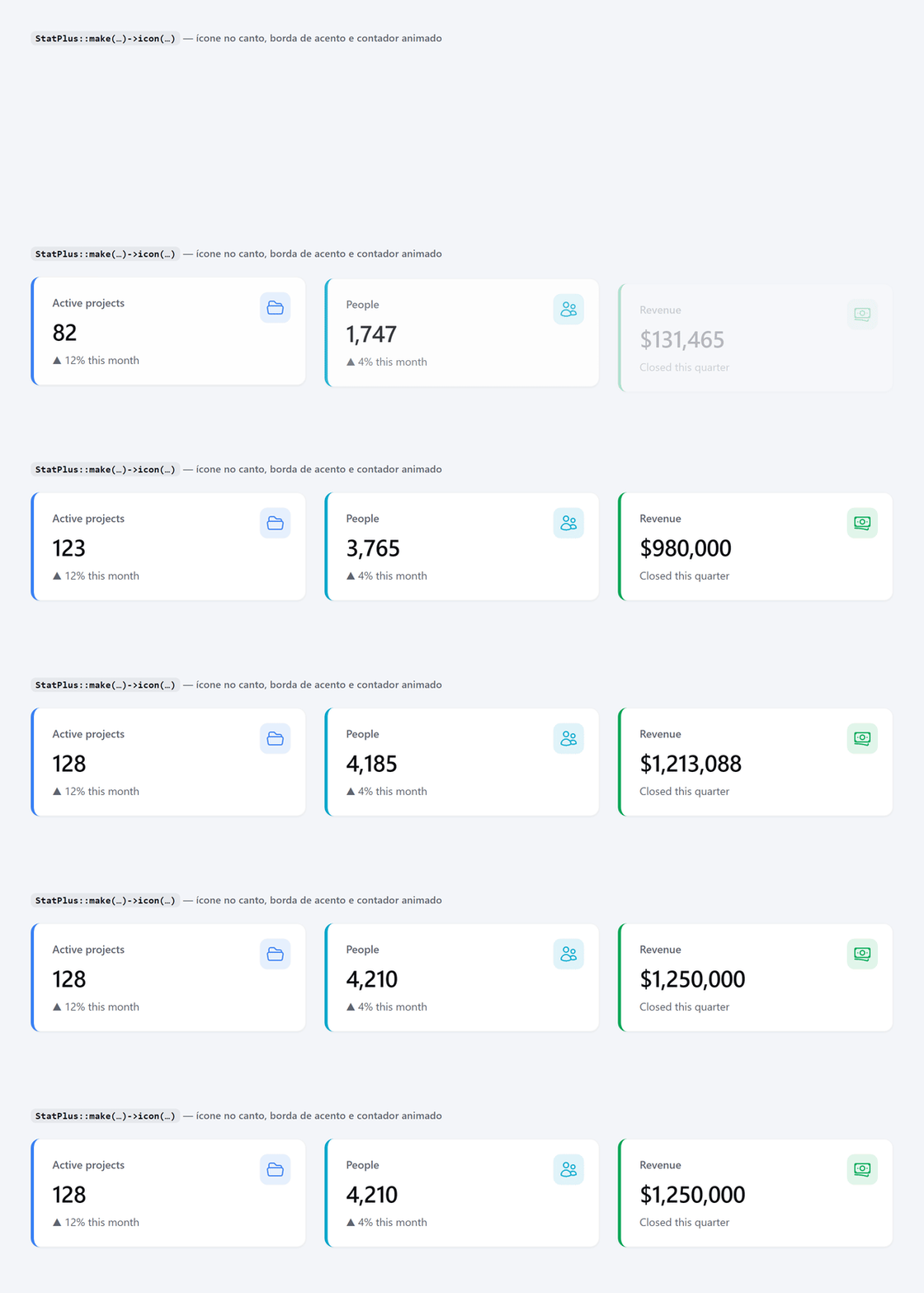
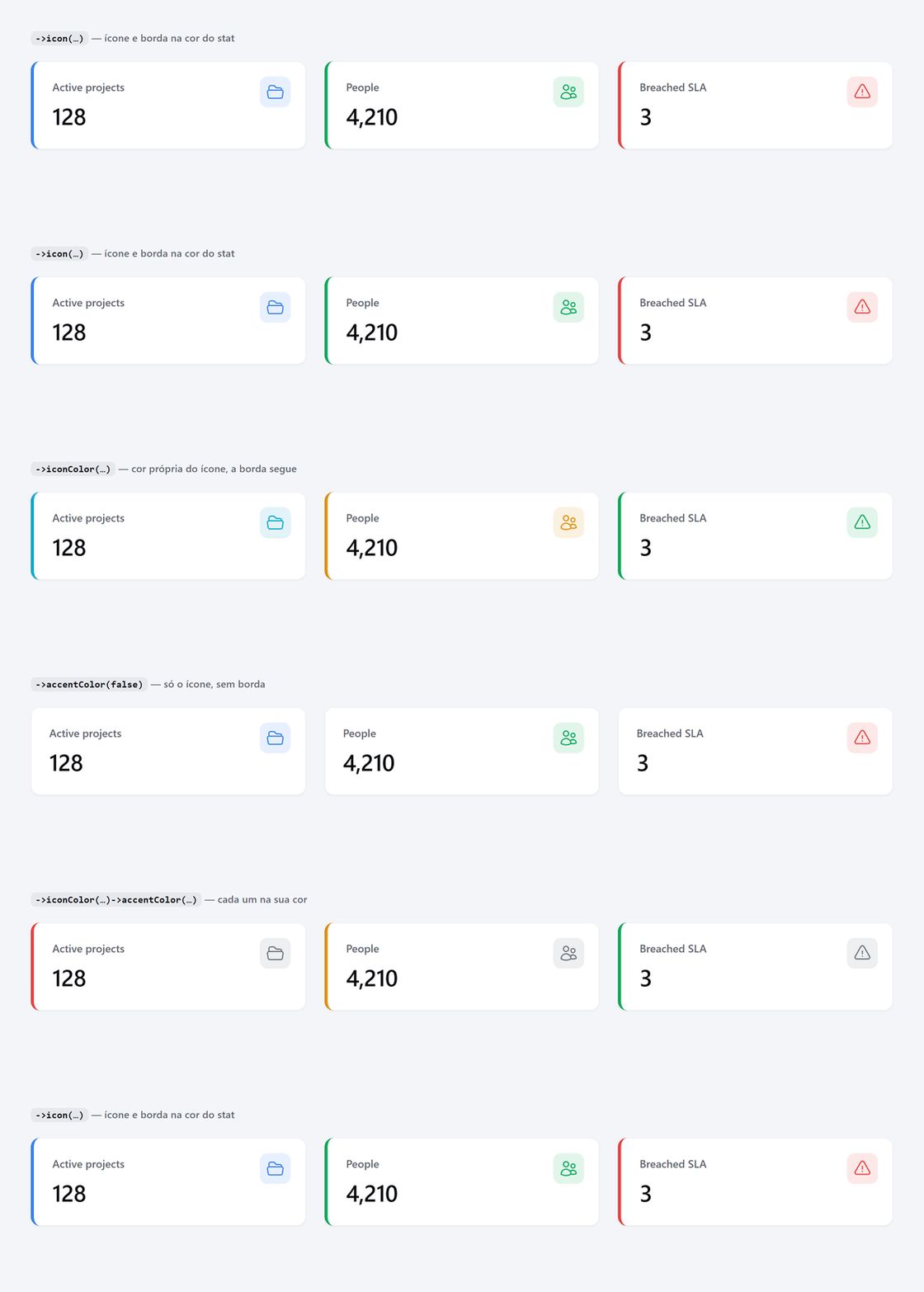
Independent colors — icon in one color, border in another (or no border at all):
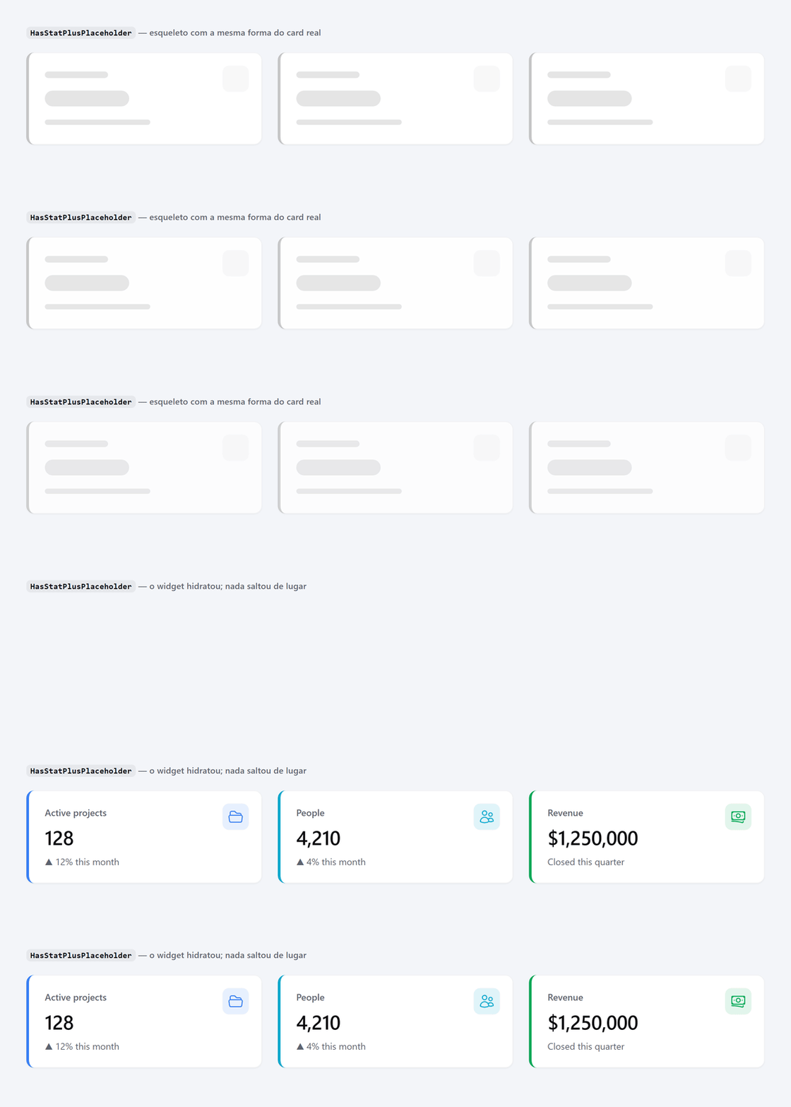
Lazy-loading skeleton — same shape as the real card, so nothing jumps on swap:
#What you get
| Feature | What it does |
|---|---|
StatPlus |
Stat with corner icon, accent border and animated counter |
HasStatPlus |
The same accent on any Stat of yours, without the counter |
HasStatPlusPlaceholder |
Loading skeleton shaped like the card, for lazy widgets |
FilamentStatPlusEasyPlugin |
Per-panel defaults (icon color, border on/off) |
#Compatibility
| Filament | Supported |
|---|---|
v3 (^3.2) |
✅ |
v4 (^4.0) |
✅ |
v5 (^5.0) |
✅ |
PHP 8.2+. The package never publishes or replaces the native Stat view: it injects classes and CSS custom properties into the root element that the view already prints on all three versions. Upgrading Filament asks nothing of you here.
#Installation
composer require gsferro/filament-stat-plus-easy
php artisan filament:assets
filament:assets copies the package CSS into public/ — that is the step that makes the look show up. Run it on deploy too.
Registering the plugin (optional, only to change defaults):
use Gsferro\FilamentStatPlusEasy\FilamentStatPlusEasyPlugin;

public function panel(Panel $panel): Panel
{
    return $panel
        ->plugin(FilamentStatPlusEasyPlugin::make());
}
Publishing the config (optional):
php artisan vendor:publish --tag=filament-stat-plus-easy-config
#Usage
#The basics
->icon() is the trigger: with an icon, the card gets the corner box and the left border, both in the stat color.
StatPlus::make('Organizations', 42)
    ->icon('heroicon-o-building-library');
Without ->icon() and without ->accentColor(), StatPlus renders exactly like the native stat. That is what makes incremental migration safe: swap the class today, add the icon whenever you want.
#Colors — icon and border are independent
// both in the icon color
StatPlus::make('Organizations', 42)->icon('heroicon-o-building-library')->iconColor('success');

// icon only, no border
StatPlus::make('Organizations', 42)->icon('heroicon-o-building-library')->accentColor(false);

// icon in one color, border in another
StatPlus::make('SLA', 3)->icon('heroicon-o-clock')->iconColor('gray')->accentColor('danger');

// border only, no icon
StatPlus::make('Revenue', '$1.2M')->accentColor('success');
Icon color resolution:
->iconColor('success')— always wins- otherwise
->color('danger')(the native method, which also paints description and chart) - otherwise
config('filament-stat-plus-easy.icon_color')(default:primary)
Border color resolution:
->accentColor(false)— no border->accentColor('danger')— its own color- otherwise the icon color — and with no icon, there is no border
Colors are names of colors registered in the panel (
->colors([...])), not hex values. The CSS reads the scale through the--{color}-500variable, which is what keeps the card on-theme in light and dark mode. A color passed as an 11-shade array falls back to the default.
#Everything from the native Stat still works
StatPlus::make('Projects', 128)
    ->icon('heroicon-o-folder-open')
    ->description('12% this month')
    ->descriptionIcon('heroicon-m-arrow-trending-up')
    ->chart([7, 12, 9, 14, 18, 22])
    ->url(ProjectResource::getUrl())
    ->extraAttributes(['class' => 'my-class']);
Chart, description, url, polling, extraAttributes — nothing is replaced. What the package adds is appended to what you passed (class and style concatenate, they do not overwrite).
#Animated counter
StatPlus extends OdometerStat from filament-odometer-easy — shipped as a dependency — so the value animates on its own:
StatPlus::make('Revenue', 1250000)
    ->icon('heroicon-o-banknotes')
    ->format(['style' => 'currency', 'currency' => 'USD'])
    ->duration(1500);
Want the accent without the counter? Apply the trait to your own class:
use Filament\Widgets\StatsOverviewWidget\Stat;
use Gsferro\FilamentStatPlusEasy\Concerns\HasStatPlus;

class MyStat extends Stat
{
    use HasStatPlus;
}
#Loading skeleton (lazy widgets)
A lazy widget paints a placeholder until it hydrates. Filament's default is a plain card — when the real widget arrives with icon and border, the layout shifts. The trait fixes that:
use Filament\Widgets\StatsOverviewWidget;
use Gsferro\FilamentStatPlusEasy\Concerns\HasStatPlusPlaceholder;

class OverviewStats extends StatsOverviewWidget
{
    use HasStatPlusPlaceholder;

    protected static bool $isLazy = true;
}
By default the skeleton draws 4 cards, all with the accent, and does not run getStats() — the placeholder runs before hydration, and calling the stats there would fire the very queries lazy loading defers.
Optional tweaks:
// a different number of cards
protected function getPlaceholderStatsCount(): int
{
    return 3;
}

// mixed widget (some stats with accent, some without): read the real stats and
// mirror them card by card — costs the queries in the placeholder
protected bool $placeholderReadsStats = true;
The skeleton uses the same classes as the real card (fi-wi-stats-overview-stat, fi-stat-plus, fi-stat-plus-bordered), only in gray — that is what guarantees the swap does not move anything. It also respects the widget columnSpan.
#Configuration
#Fluent, per panel
->plugin(
    FilamentStatPlusEasyPlugin::make()
        ->iconColor('info')   // default icon color when the stat defines none
        ->accent(false)       // border off by default in this panel
)
#Or through the config file
// config/filament-stat-plus-easy.php
return [
    'icon_color' => 'primary',
    'accent' => true,
];
#Sizing, through CSS
Icon size, radius, offset, border width and background opacity are custom properties with defaults. Override wherever it makes sense — in your theme (global), per panel, or on a single card:
/* in your theme.css */
.fi-wi-stats-overview-stat.fi-stat-plus {
    --stat-plus-icon-size: 3rem;
    --stat-plus-icon-radius: 9999px;   /* round icon */
    --stat-plus-border-width: 6px;
}
// or on this card only
StatPlus::make('Projects', 12)
    ->icon('heroicon-o-folder-open')
    ->extraAttributes(['style' => '--stat-plus-border-width: 8px']);
| Custom property | Default | What it controls |
|---|---|---|
--stat-plus-icon-size |
2.5rem |
Icon box side |
--stat-plus-icon-padding |
0.5rem |
Breathing room between box and glyph |
--stat-plus-icon-offset |
1.25rem |
Distance from the card corner |
--stat-plus-icon-radius |
0.625rem |
Icon box corner radius |
--stat-plus-icon-opacity |
12% |
Icon box background opacity (light) |
--stat-plus-icon-opacity-dark |
22% |
Icon box background opacity (dark) |
--stat-plus-border-width |
4px |
Accent border thickness |
#How it works under the hood
- No published views. The native
Statview already prints$getExtraAttributeBag()on the root element in v3, v4 and v5. The package injects two classes (fi-stat-plus,fi-stat-plus-bordered) and two custom properties (--stat-plus-icon,--stat-plus-accent) there. CSS does the rest: the card is alreadyrelativein every version, so the icon only needs positioning. - Static CSS, registered as an asset. No
@apply, no Tailwind utilities, no@layer— the file does not go through the consuming app's build. That is why the package needs no theme edits;filament:assetscopies it and Filament injects it into every panel. - One real difference between versions: the format of the color variables. v3 stores RGB channels (
--primary-500: 217 119 6), v4/v5 store a ready color (oklch(...)). PHP resolves it, writing eitherrgb(var(--primary-500))orvar(--primary-500)depending on the installed version. The CSS stays the same for everyone. - The icon markup changed between versions (
.fi-wi-stats-overview-stat-iconin v3,.fi-iconinside.fi-wi-stats-overview-stat-label-ctnin v4/v5), so the rule covers both selectors. Neither one reaches the description icon. - Color names are validated before entering the
stylestring (Filament does not escape extra attribute values): only[a-z0-9-]slugs pass, anything else falls back to the default. This matters when the color comes from data, such as per-tenant branding.
#Development
composer install
composer test        # Pest
composer analyse     # PHPStan
composer lint        # Pint
The CSS is plain CSS committed at resources/dist/filament-stat-plus-easy.css — there is no build step. Edit, test, commit.
The README GIFs come from art/demo/index.html (the page loads the real package CSS) via bash art/make-gifs.sh — headless Chrome for the frames, ffmpeg to assemble them. Each frame is a screenshot with a different ?t=, so capture is deterministic. The plugin-page cover (art/thumbnail.jpg, 1280x720) comes from the same page via bash art/make-thumbnail.sh.
#Testing
composer test
#Changelog
See the CHANGELOG.
#Contributing
See CONTRIBUTING.
#Security Vulnerabilities
See the security policy.
#Credits
- gsferro
- All contributors
- filament-odometer-easy — the animated counter that ships with it
#License
MIT. See the license file.
The author
I am passionate about simplifying complex problems, enabling you to leverage solutions efficiently and intuitively. By using my solutions, you will reduce the time and effort required for implementation, making the development process easier and more straightforward.
From the same author
Odometer Easy
Animated counters for Filament v3, v4 and v5 — tables, infolists and stats widgets — the easiest way possible: install, register the plugin and use it.
Author:
Guilherme Ferro
Starter Kit Easy
A ready-to-use Laravel 13 + Filament 5 starter kit. One command creates the project, installs everything, migrates, seeds the database and hands you three working panels: business, administration and infrastructure. Support for multi-tenant.
Author:
Guilherme Ferro
Featured Plugins
A selection of plugins curated by the Filament team
Noir Theme
A theme that gives panels a focused, refined look with near-black surfaces, crisp actions, and restrained color.
 Filament
Custom Dashboards
Let your users build and share their own dashboards with a drag-and-drop interface. Define your data sources in PHP and let them do the rest.
Filament
Spotlight Pro
Browse your Filament Panel with ease. Filament Spotlight Pro adds a Spotlight like Command Palette to your Filament Panel.
 Dennis Koch