Column Filters by zvizvi
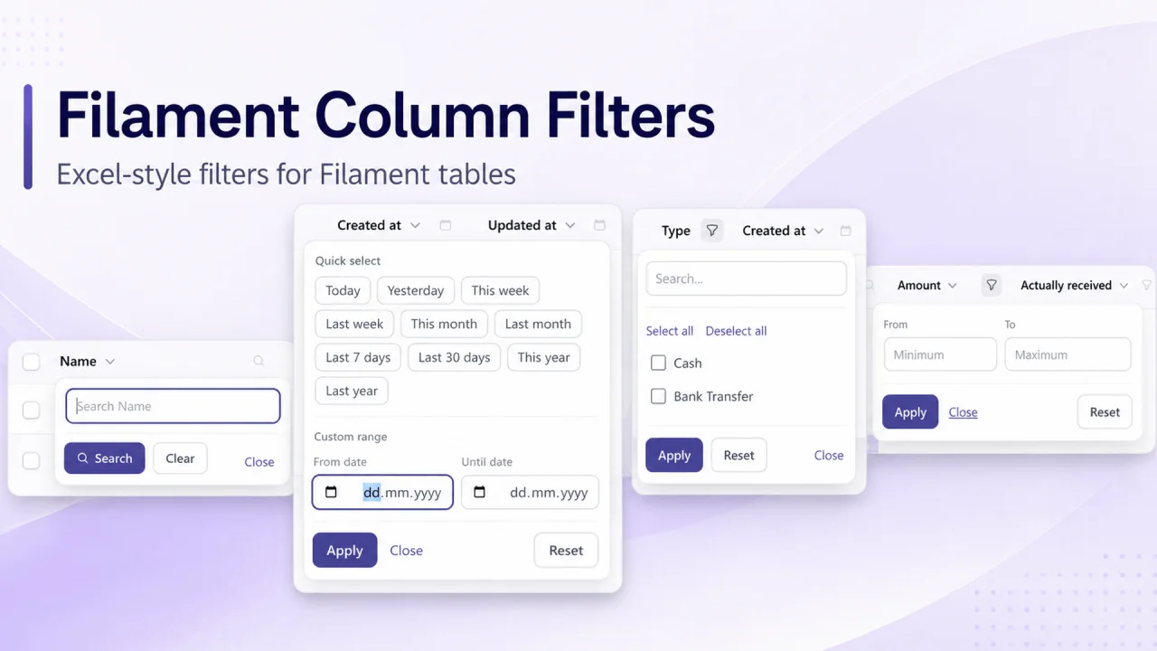
CommunityBring familiar Excel-style filtering to your Filament tables. Add compact filter controls directly to column headers, with support for search, date ranges with quick presets, selectable values, and numeric ranges. Filters integrate with Filament’s native table filter state, indicators, and existing filters.
 Author:
zvizvi
Author:
zvizvi
Package health
Automated checks of this plugin's Composer package
15 checks
- Passed: GitHub Actions pinned to SHA
- Skipped: GitLab CI includes pinned to SHA
- Passed: Open security advisories
- Passed: Dependabot PR responsiveness — No open Dependabot PRs.
- Skipped: Renovate MR responsiveness
- Passed: Dependabot or Renovate configured
- Passed: Dependency update cooldown configured
- Passed: Provides a security policy
- Passed: Abandoned or archived — No consulted source marks the package abandoned (packagist, github).
- Passed: Commit and release recency — Active: last commit 1 days ago; last release 1 days ago.
-
Passed:
composer.lock not committed by library
—
composer.lockis absent from the released dist archive. - Passed: Dist archive is lean
-
Passed:
Current Laravel version supported
—
Package dependencies resolve together with current Laravel
13.0. -
Passed:
Current PHP version supported
—
Constraint
^8.2supports current PHP8.5. - Skipped: Current Symfony version supported
filament/
namespace. Review the source and install at your own risk. Found
malware or an unresolved security issue the author won't
address?
Report it
.
Documentation
Excel-style column header filters for Filament tables.
Adds a small filter icon to the header of any table column. Clicking it opens a popup toolbar — just like the column filters you know from Excel — with a filter type you choose per column:
- Search — a free-text search on the column.
- Date — a date range with quick presets (today, yesterday, this week, last week, this month, last month, last 7 days, last 30 days, this year, last year) and a custom from/until range.
- Select — a single or multi value picker.
- Range — a numeric from/until range with two number inputs side by side.
The header filters are backed by real Filament table filters, so they apply to the table query like any other filter and show the standard filter indicators (with working remove buttons) — but they do not clutter the standard filters dropdown. When you sync with an existing filter you already have on the table (via syncWith()), the popup reads and writes that filter's state, so choosing a value in the header popup updates the regular filter — dropdown included — and vice versa.
RTL is fully supported and Hebrew translations are included.
#Installation
composer require zvizvi/filament-column-filters
Register the plugin on each panel that should have column filters. This is required — the columnFilter() method and the header popups only become available on panels where the plugin is registered:
use Zvizvi\FilamentColumnFilters\FilamentColumnFiltersPlugin;

public function panel(Panel $panel): Panel
{
    return $panel->plugin(FilamentColumnFiltersPlugin::make());
}
#Usage
Attach a filter to any table column with the columnFilter() method:
use Filament\Tables\Columns\TextColumn;
use Zvizvi\FilamentColumnFilters\Filters\ColumnFilter;

public function table(Table $table): Table
{
    return $table
        ->columns([
            TextColumn::make('user_name')
                ->label('User Name')
                ->columnFilter(ColumnFilter::search()),

            TextColumn::make('created_at')
                ->label('Date')
                ->date()
                ->columnFilter(ColumnFilter::date()),

            TextColumn::make('status')
                ->columnFilter(
                    ColumnFilter::select()
                        ->options([
                            'open' => 'Open',
                            'closed' => 'Closed',
                        ])
                        ->multiple(),
                ),
        ]);
}
That's it. Each configured column gets a filter icon in its header, and a matching filter is automatically registered on the table behind the scenes. The auto-registered filter shows up as a regular filter indicator when active (removable as usual), but it does not appear in the standard filters dropdown — the popup is its only editing UI. If you want it in the dropdown too, define a regular filter yourself and connect the two with syncWith().
#Filter types
#Search
ColumnFilter::search()
    ->placeholder('Search Name') // optional, defaults to "Search {label}"
Performs a LIKE %value% search on the column.
#Date
ColumnFilter::date()
    ->presets(['today', 'yesterday', 'this_week', 'last_7_days']) // optional, defaults to all presets
    ->weekStartsOn(0) // 0 = Sunday (default), 1 = Monday
Filters records between the chosen from / until dates (each side optional). The quick-select presets fill the custom range for you.
#Select
ColumnFilter::select()
    ->options(['a' => 'Option A', 'b' => 'Option B']) // array or closure
    ->multiple() // default: true; pass false for single select
    ->searchable() // force the option search field on (or off with false)
    ->searchThreshold(8) // options count above which the search field shows automatically (default: 8)
When there are many options, a search field appears at the top of the popup to filter the option list (client-side).
#Range
TextColumn::make('amount')
    ->columnFilter(
        ColumnFilter::range()
            ->step(0.01), // optional step for the number inputs
    ),
Filters records between the entered minimum / maximum values (each side optional).
#Syncing with an existing table filter
If the table already has a regular Filament filter for the same value, the column filter syncs with it instead of registering its own — the header popup reads and writes that filter's state, so both stay in sync and only one indicator shows.
This happens automatically when a regular filter matches the column: a filter named exactly like the column, or — for select filters — any SelectFilter on the same attribute. In that case options and single/multiple mode are read from the existing filter too, and no configuration is needed:
$table
    ->columns([
        TextColumn::make('status')
            ->columnFilter(ColumnFilter::select()), // auto-syncs with the "status" filter below
    ])
    ->filters([
        SelectFilter::make('status')
            ->options([...])
            ->multiple(),
    ]);
When the names don't line up (or the filter's state keys differ), point the column filter at the right filter by name with syncWith():
use Filament\Tables\Filters\SelectFilter;

$table
    ->columns([
        TextColumn::make('status')
            ->columnFilter(ColumnFilter::select()->syncWith('status')),
    ])
    ->filters([
        SelectFilter::make('status')
            ->options([
                'open' => 'Open',
                'closed' => 'Closed',
            ])
            ->multiple(),
    ]);
For a select sync, the options and single/multiple mode are read automatically from the existing SelectFilter (you can still override with ->options()).
For filters with custom form field names, map the popup's fields to your filter's state keys:
TextColumn::make('created_at')
    ->columnFilter(
        ColumnFilter::date()->syncWith('created', [
            'from' => 'created_from',
            'until' => 'created_until',
        ]),
    ),

// with a regular filter like:
Filter::make('created')
    ->schema([
        DatePicker::make('created_from'),
        DatePicker::make('created_until'),
    ])
    ->query(/* ... */),
The search filter maps its single field the same way: ->syncWith('name', ['value' => 'q']).
#Common options
All filter types support:
ColumnFilter::search()
    ->filterName('my_filter')        // name of the auto-registered filter (default: "cf_{column}")
    ->attribute('some_column')       // database column / dotted relation path (default: the column name)
    ->label('Custom label')          // label used for the filter + indicators
    ->applyUsing(fn (Builder $query, array $data) => $query->where(/* ... */)), // custom query logic
Columns whose name contains a dot (e.g. author.name) are filtered through the relationship automatically using whereHas().
#Tables built outside a Livewire request
The plugin registers its generated filters from Livewire's mount, hydrate, call and render events, which covers every path Filament itself takes. It does not cover code that builds the table headlessly — instantiating the page class and reading getTable() with no Livewire request behind it, which is how a custom endpoint or a table-driving package may work. There, none of those events fire, the generated filters never reach the table, and applying one fails with The filter [cf_name] does not exist.
Add the trait to such a page:
use Zvizvi\FilamentColumnFilters\Concerns\HasColumnFilters;

class ListDonors extends ListRecords
{
    use HasColumnFilters;
}
It registers (and decorates) from the component's own boot, which both paths run. Everything stays idempotent, so a normal request does no extra work. Apply it to the page class itself rather than a parent — Livewire resolves these hooks in class_uses_recursive() order, and being last is what guarantees the table already exists.
#Styling
Every colour is exposed as a CSS variable, so you can restyle the trigger and the panel without overriding rules. Declare the ones you want in a stylesheet loaded after the plugin's:
:root {
    --fcf-accent: #7c3aed;               /* defaults to the panel's primary colour */
    --fcf-trigger-color: #d1d5db;        /* header icon, idle */
    --fcf-trigger-color-hover: #4b5563;  /* header icon, hovered / focused */
}

.dark {
    --fcf-trigger-color: #6b7280;
    --fcf-panel-bg: #1f2937;
}
Most variables derive from --fcf-accent, so overriding that alone recolours the active icon, the dot, the primary button, the links, the checkboxes and the active date presets.
All available variables
| Variable | Purpose |
|---|---|
--fcf-accent / --fcf-accent-hover |
Accent colour and its hover shade |
--fcf-accent-contrast |
Text on top of the accent |
--fcf-accent-soft / --fcf-accent-soft-text |
Tinted background and text for active presets |
--fcf-trigger-color / --fcf-trigger-color-hover |
Header icon, idle and hovered |
--fcf-trigger-bg-hover |
Header icon hover background |
--fcf-trigger-color-active / --fcf-trigger-color-active-hover |
Header icon while the filter is active |
--fcf-trigger-color-open / --fcf-trigger-bg-open |
Header icon while its panel is open |
--fcf-dot-bg |
Active-filter dot |
--fcf-panel-bg / --fcf-panel-text / --fcf-panel-border / --fcf-panel-shadow |
Panel surface |
--fcf-divider |
Section and footer separators |
--fcf-muted-text / --fcf-empty-text |
Section titles, field labels, empty states |
--fcf-input-bg / --fcf-input-text / --fcf-input-border |
Inputs |
--fcf-input-border-focus / --fcf-input-ring-focus |
Focused inputs |
--fcf-control-accent |
Checkboxes and radios |
--fcf-option-bg-hover |
Hovered option row |
--fcf-chip-bg / --fcf-chip-bg-hover / --fcf-chip-border / --fcf-chip-text |
Date presets |
--fcf-chip-active-bg / --fcf-chip-active-border / --fcf-chip-active-text |
Selected date preset |
--fcf-btn-bg / --fcf-btn-bg-hover / --fcf-btn-border / --fcf-btn-text |
Secondary buttons |
--fcf-btn-primary-bg / --fcf-btn-primary-bg-hover / --fcf-btn-primary-border / --fcf-btn-primary-text |
Primary button |
--fcf-link-color |
Text links |
#Translations
English and Hebrew translations are included. Publish them to customize:
php artisan vendor:publish --tag=filament-column-filters-translations
#Development
npm install
npm run build   # build resources/dist assets
composer test   # run the test suite
#License
The MIT License (MIT). Please see License File for more information.
The author
From the same author
Notifications Tabs
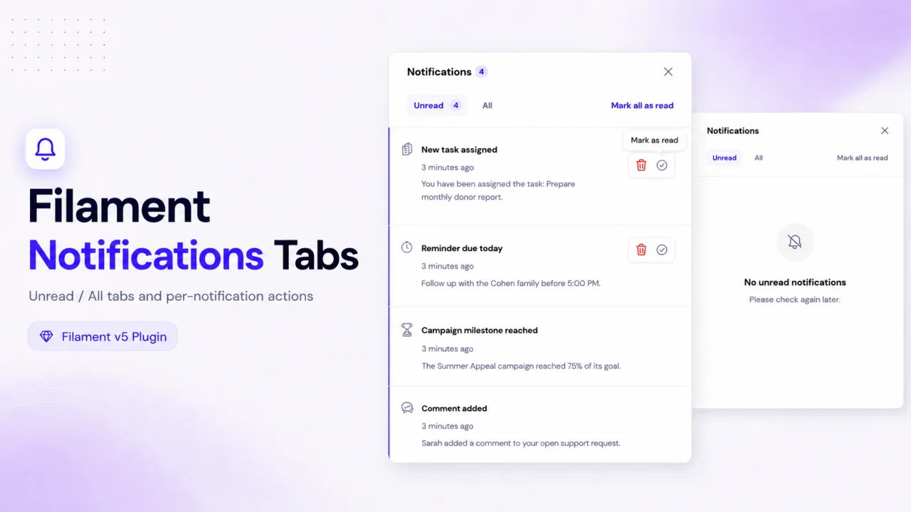
Notifications Tabs adds a cleaner notification workflow to Filament by separating unread and all notifications into dedicated tabs. It also adds per-notification actions, allowing users to quickly mark each notification as read or unread, or delete it directly from the notifications modal.
Author:
zvizvi
Relation Manager Repeater
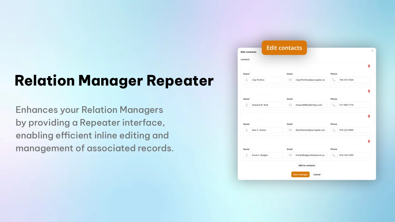
A Filament plugin that enhances Relation Managers by providing a Repeater interface, enabling efficient inline editing and management of associated records.
Author:
zvizvi
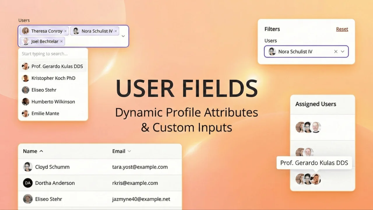
User Fields
Visually enhance your user selection fields by adding avatar support. This plugin upgrades standard Select inputs, Table Columns, and Filters to display user profile photos alongside names, making user identification faster and more intuitive.
Author:
zvizvi
Featured Plugins
A selection of plugins curated by the Filament team
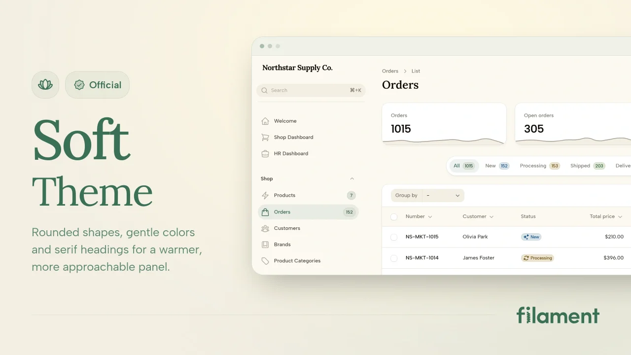
Soft Theme
A theme that gives panels a warm, approachable look with rounded shapes, gentle colors, and serif headings.
 Filament
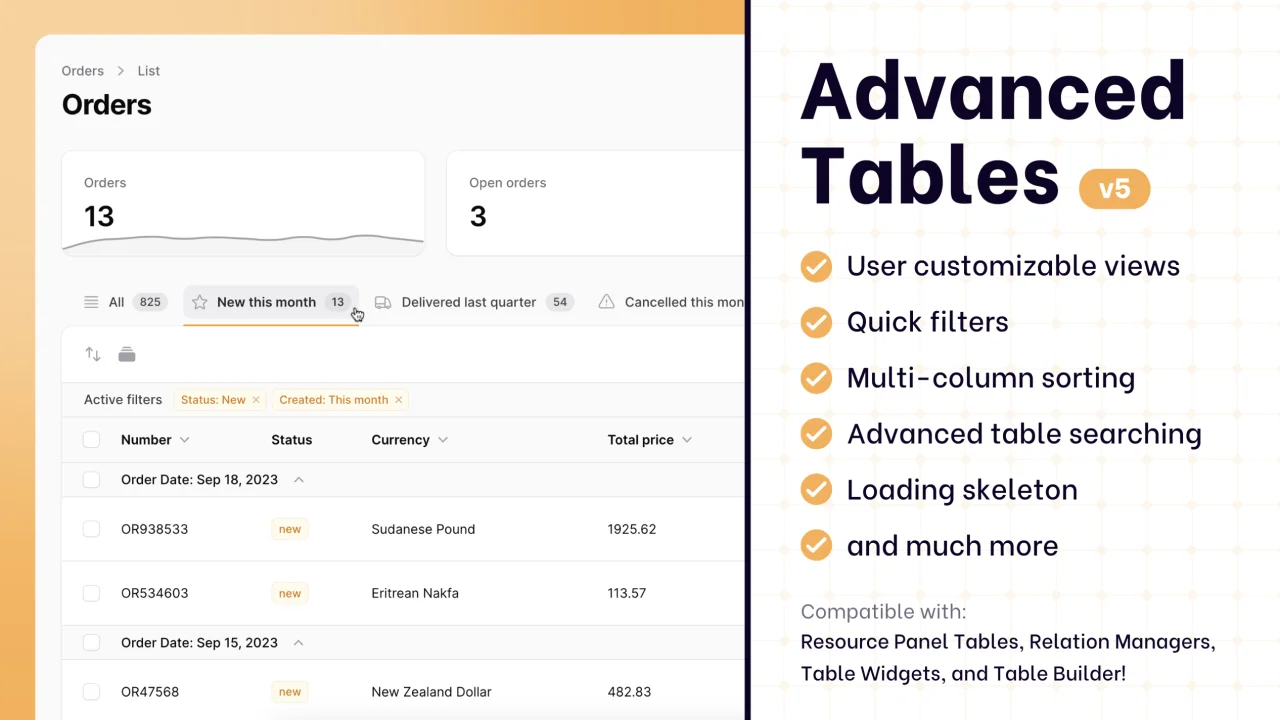
Advanced Tables (formerly Filter Sets)
Supercharge your tables with powerful features like user-customizable views, quick filters, multi-column sorting, advanced table searching, convenient view management, and more. Compatible with Resource Panel Tables, Relation Managers, Table Widgets, and Table Builder!
 Kenneth Sese
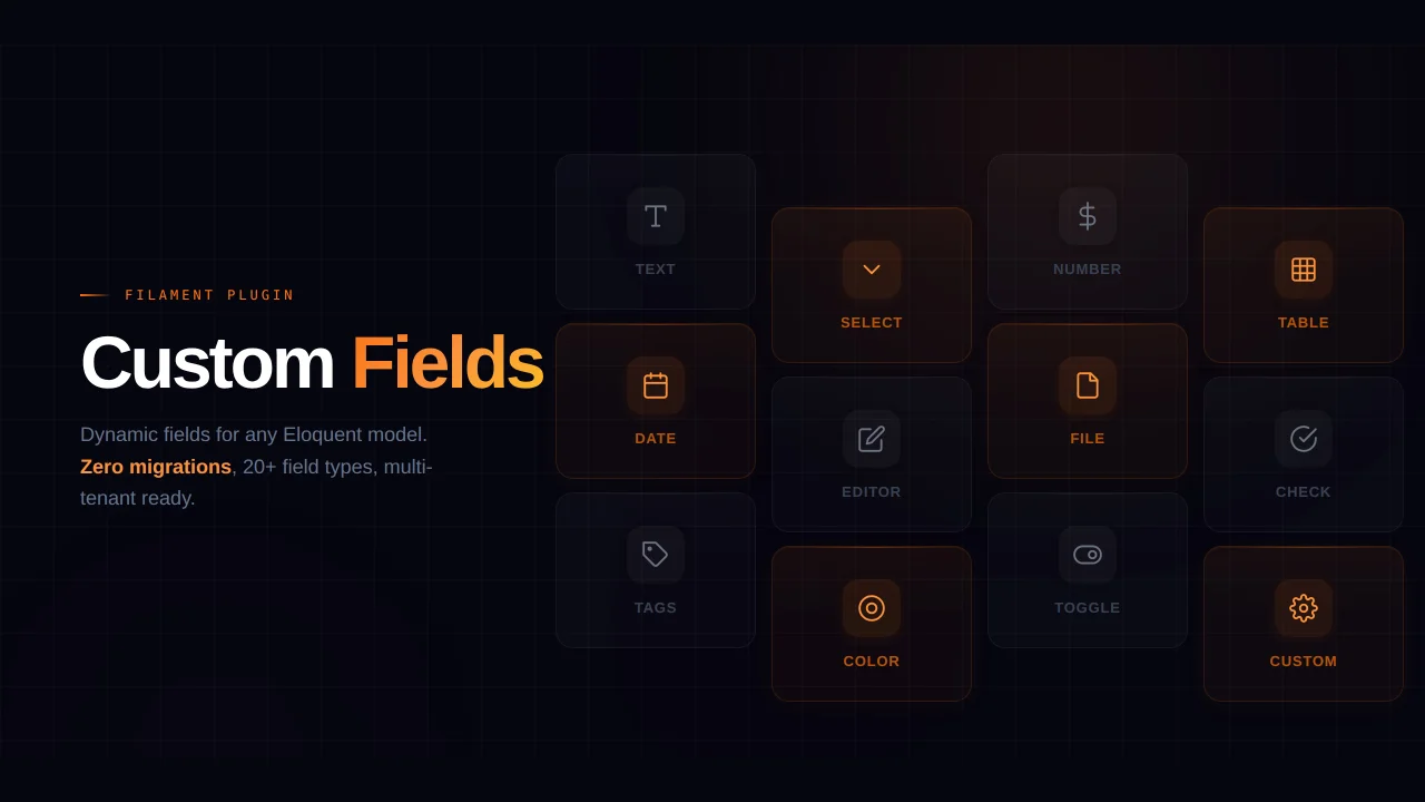
Custom Fields
Eliminate custom field migrations forever. Let your users create and manage form fields directly in Filament admin panels with 20+ built-in field types, validation, and zero database changes.
 Relaticle