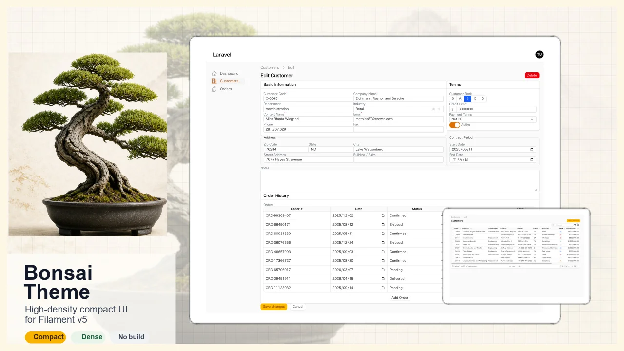
Bonsai Theme
CommunityHigh-density, compact UI theme for Filament v5. Inspired by Japanese business applications (sales, inventory, order management) that prioritize information density, Bonsai Theme reduces padding, gaps, and font sizes across all Filament components to fit more data on screen. No Tailwind build required. The theme ships as pre-compiled CSS and is loaded automatically.
filament/
namespace. Review the source and install at your own risk. Found
malware or an unresolved security issue the author won't
address?
Report it
.
 Author:
Yuichi Okada
Author:
Yuichi Okada
Documentation
- Installation
- Usage
- Screenshots
- Features
- What It Changes
- Supported Filament Components
- Requirements
- License
High-density, compact UI theme for Filament v5.
Inspired by Japanese business applications (sales, inventory, order management) that prioritize information density, Bonsai Theme reduces padding, gaps, and font sizes across all Filament components to fit more data on screen.
#Installation
composer require qalainau/bonsai-theme
#Usage
Register the plugin in your panel provider:
use Qalainau\BonsaiTheme\BonsaiThemePlugin;

public function panel(Panel $panel): Panel
{
    return $panel
        // ...
        ->plugin(BonsaiThemePlugin::make());
}
No Tailwind build required. The theme ships as pre-compiled CSS and is loaded automatically.
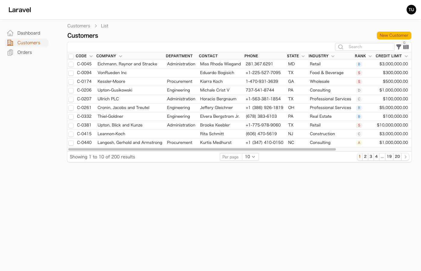
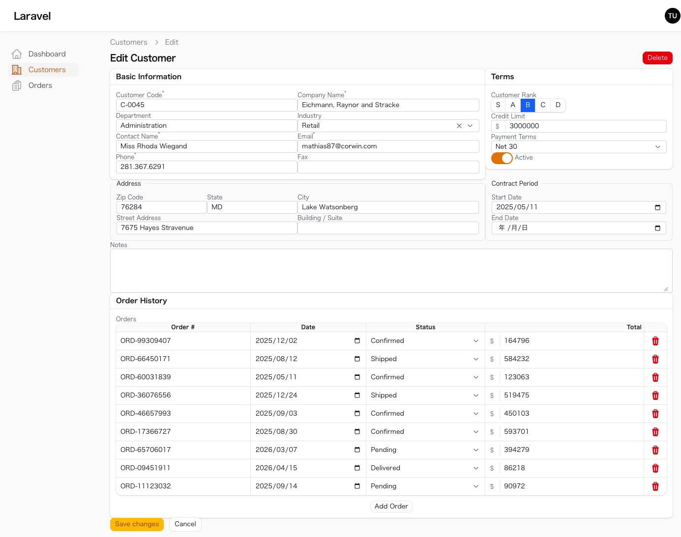
#Screenshots
#Table List
#Edit Form
#Features
- Zero-gap form fields — No spacing between fields for maximum information density
- Compact inputs — Reduced padding (
2px 8px) and font size (13px) across all input types - Tight field labels — 12px labels with zero gap to input
- Solid input borders — 1px solid border, 4px radius, no box-shadow
- Borderless repeater table inputs — Inputs inside table repeaters have no border for a clean spreadsheet look
- Compact repeater tables — Minimal cell padding in table-layout repeaters
- Compact sections — Reduced padding (12px) in Section, Fieldset, and Tabs
- Dense tables — Minimal cell padding (
2px 4px), 11px uppercase headers, compact row height - Compact table chrome — Tight toolbar, filter panels, pagination, and indicators
- Small buttons & badges — Reduced padding and font size (badges: 11px)
- Compact sidebar — Tight nav items (
2px 6pxpadding), 13px font, uppercase group labels - Compact page headers — Reduced heading (18px) and subheading (13px) sizes
- Compact dropdowns — 13px font size in dropdown menus
- Compact modals — Reduced content padding (12px)
- Compact repeaters — Minimal gap and padding for inline editing
- Dark mode support — All overrides include dark mode variants
#What It Changes
#Form Fields
| Component | Default | Bonsai |
|---|---|---|
| Field gap | gap-6 |
0 |
| Input padding | py-1.5 px-3 |
py-0.125rem px-0.5rem |
| Input font | text-sm (14px) |
13px |
| Input border | ring-based | 1px solid, no shadow |
| Label font | text-sm |
12px |
| Label-to-input gap | gap-y-2 |
0 |
| Section content | p-6 |
0.75rem |
| Fieldset padding | p-6 |
0.75rem |
| Input border-radius | rounded-lg |
rounded (4px) |
#Repeater Table
| Component | Default | Bonsai |
|---|---|---|
| Header padding | 8px 12px |
2px 6px |
| Cell padding | 4px 0 |
1px 2px |
| Compact header | — | 1px 4px |
| Compact cell | — | 0 1px |
| Input borders | visible | none |
#Tables
| Component | Default | Bonsai |
|---|---|---|
| Column padding | py-4 px-3 |
2px 4px |
| Header padding | py-3.5 px-3 |
2px 4px |
| Header font | text-sm |
11px uppercase |
| Text column | text-sm |
13px |
| Toolbar padding | p-4 sm:px-6 |
4px 8px |
| Pagination | py-3 px-3 |
4px 8px |
| Container radius | rounded-xl |
rounded-md (6px) |
#Global
| Component | Default | Bonsai |
|---|---|---|
| Base font | 14px | 13px |
| Page heading | 24px | 18px |
| Page subheading | 14px | 13px |
| Page content gap | gap-y-8 |
gap-y-2 |
| Button font | 14px | 13px |
| Badge font | — | 11px |
| Sidebar item | 8px padding |
2px 6px, 13px font |
| Dropdown items | 14px | 13px |
| Modal content | p-6 |
0.75rem |
#Supported Filament Components
All standard Filament form fields and table columns are styled:
Form Fields: TextInput, Select (native & JS), Textarea, DatePicker, DateTimePicker, Toggle, Checkbox, Radio, ToggleButtons, CheckboxList, ColorPicker, TagsInput, Slider, KeyValue, RichEditor, MarkdownEditor, CodeEditor, FileUpload, Repeater (standard & table layout)
Table Columns: TextColumn, IconColumn, ColorColumn, ToggleColumn, CheckboxColumn, ImageColumn
Layout: Section, Fieldset, Tabs, Grid, Flex
#Requirements
- PHP 8.2+
- Filament v5
- Laravel 13.x
#License
MIT
The author
From the same author
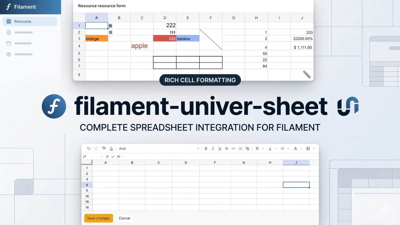
Univer Sheet
Integrate Univer Sheet into Filament — full spreadsheet editor for forms, read-only display for infolists, and compact preview for table columns.
Author:
Yuichi Okada
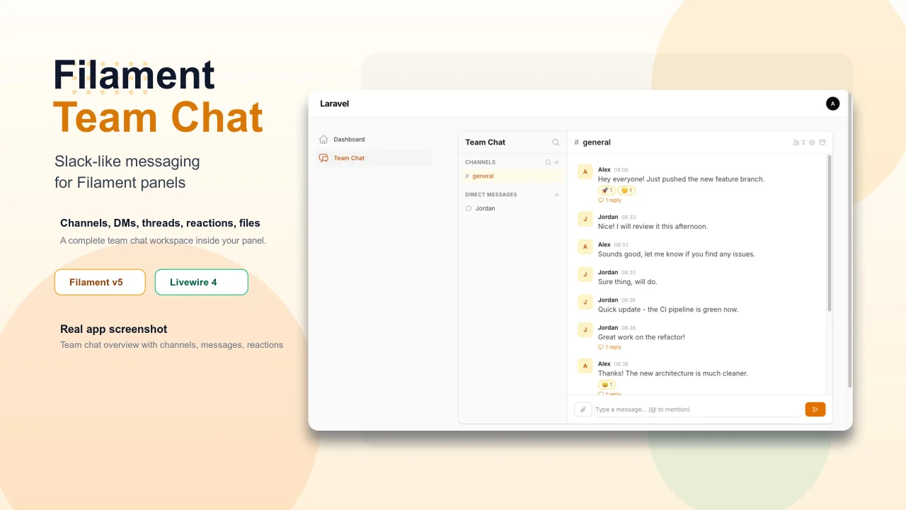
Team Chat
Add Slack-like team chat to any Filament panel — channels, DMs, threads, reactions, @mentions, file sharing, and unread tracking, all self-hosted with zero external dependencies.
Author:
Yuichi Okada
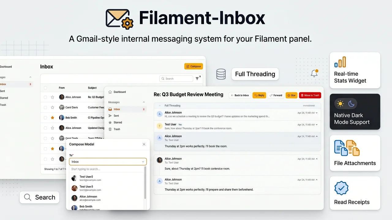
Inbox
A Gmail-style internal messaging system for your Filament panel. Provides inbox, sent, starred, and trash pages with full message threading, reply/reply all, forwarding, read receipts, rich text editing, file attachments, bulk actions, search & filters, database notifications, stats widget, dark mode, multi-tenancy support, and i18n (8 languages). Built natively for Filament v5 with Laravel events, configurable user model, and test factories included.
Author:
Yuichi Okada
Featured Plugins
A selection of plugins curated by the Filament team
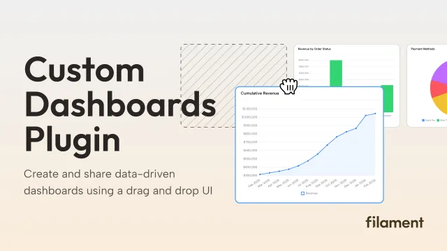
Custom Dashboards
Let your users build and share their own dashboards with a drag-and-drop interface. Define your data sources in PHP and let them do the rest.
 Filament
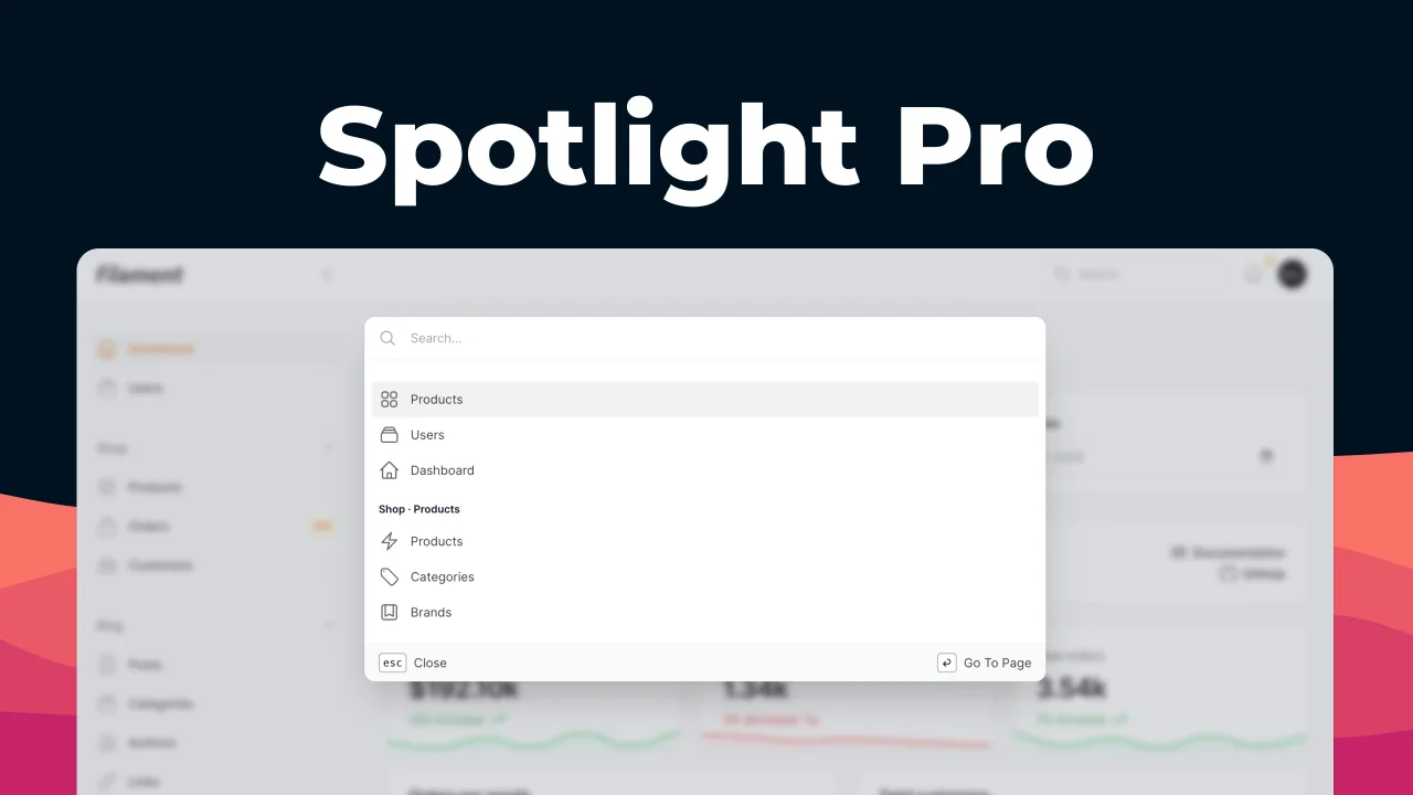
Spotlight Pro
Browse your Filament Panel with ease. Filament Spotlight Pro adds a Spotlight/Raycast like Command Palette to your Filament Panel.
 Dennis Koch
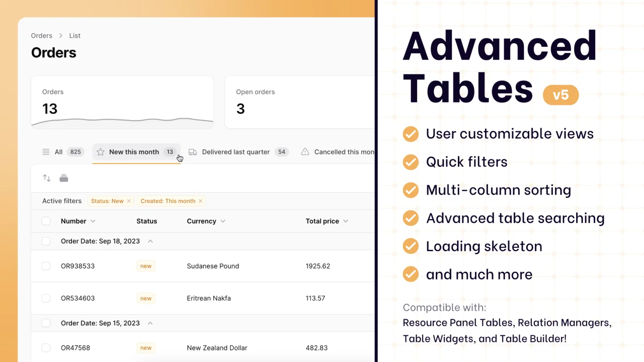
Advanced Tables (formerly Filter Sets)
Supercharge your tables with powerful features like user-customizable views, quick filters, multi-column sorting, advanced table searching, convenient view management, and more. Compatible with Resource Panel Tables, Relation Managers, Table Widgets, and Table Builder!
 Kenneth Sese