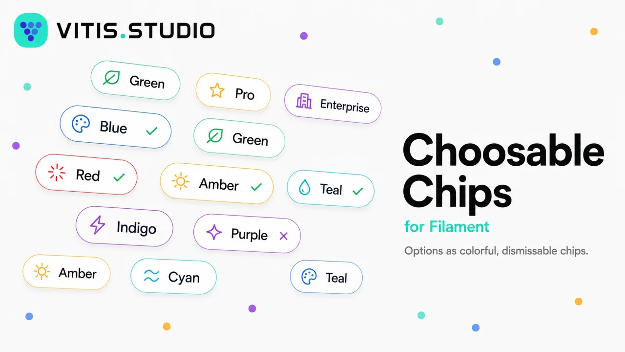
Choosable Chips
CommunityA FilamentPHP v5 form field that renders checkbox/radio options as dismissable, colorable, icon-bearing badge chips. The API is patterned after Select/ToggleButtons, so per-option labels, colors, and icons are supplied through the same fluent option map you already know. Each chip is a native Filament badge, so it inherits Filament's theme out of the box.
 Author:
Vitis Studio
Author:
Vitis Studio
Package health
BetaAutomated checks of this plugin's Composer package
15 checks
- Failed: GitHub Actions pinned to SHA — View details on Plumb
- Skipped: GitLab CI includes pinned to SHA
- Passed: Open security advisories
- Passed: Dependabot PR responsiveness — No open Dependabot PRs.
- Skipped: Renovate MR responsiveness
- Passed: Dependabot or Renovate configured
- Warning: Dependency update cooldown configured — Cooldown of 1 day(s) is below the recommended 3 days.
- Failed: Provides a security policy — View details on Plumb
- Passed: Abandoned or archived — No consulted source marks the package abandoned (packagist, github).
- Passed: Commit and release recency — Active: last commit 0 days ago; last release 0 days ago.
-
Passed:
composer.lock not committed by library
—
composer.lockis absent from the released dist archive. - Passed: Dist archive is lean
-
Passed:
Current Laravel version supported
—
Package dependencies resolve together with current Laravel
13.0. -
Passed:
Current PHP version supported
—
Constraint
^8.4supports current PHP8.5. - Skipped: Current Symfony version supported
filament/
namespace. Review the source and install at your own risk. Found
malware or an unresolved security issue the author won't
address?
Report it
.
Documentation
- Features
- Requirements
- Installation
- Usage
- API
- Publishing the views
- Example app
- Testing
- Upgrading
- Changelog
- Contributing
- Security Vulnerabilities
- Credits
- License
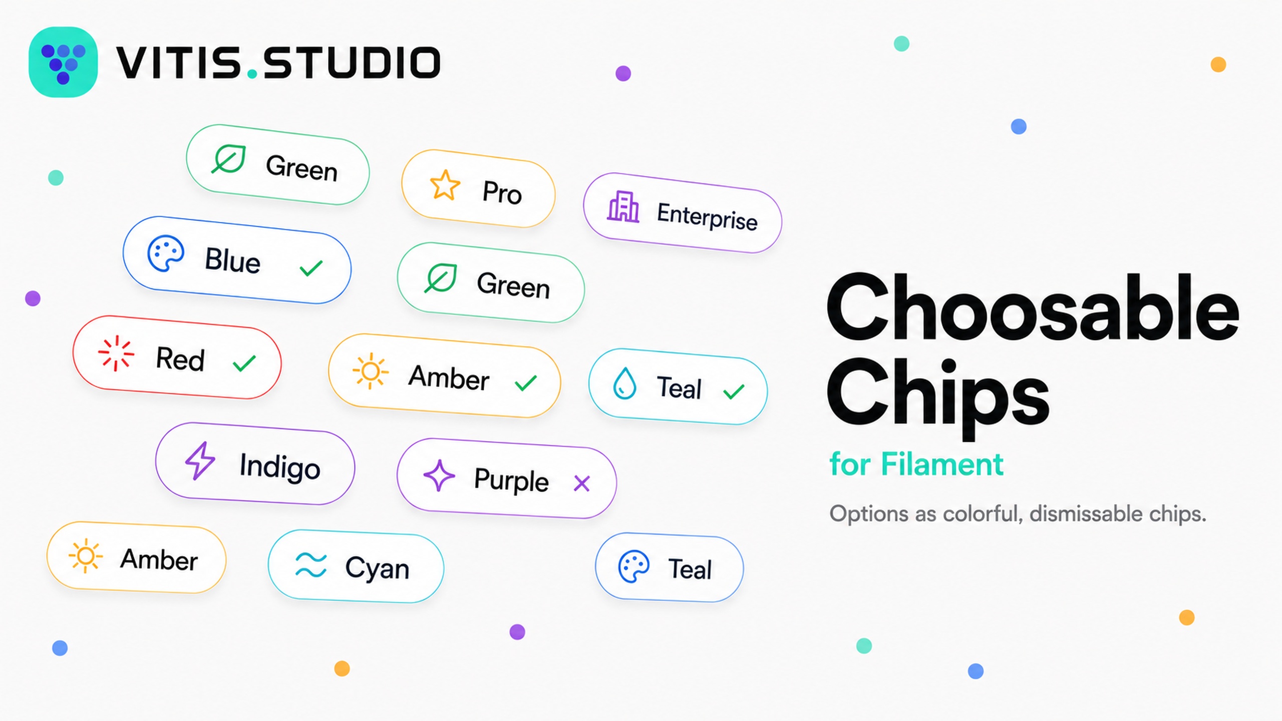



A FilamentPHP v5 form field that renders checkbox/radio options as dismissable, colorable, icon-bearing badge chips. The API is patterned after Select/ToggleButtons, so per-option labels, colors, and icons are supplied through the same fluent option map you already know. Each chip is a native Filament badge, so it inherits Filament's theme out of the box.
#Features
- Single or multi select from one field — radio semantics by default, checkbox semantics with
->multiple(). - Per-option color, icon, and description, keyed by option value (same shape as
Select::options()). - Dismissable chips using the badge's built-in delete button — click a chip to toggle it, or click the × to clear it.
- Selected check marks with
->checkSelected(), colored independently of the chip. - Reuses the Filament badge component and color tokens, so it matches your panel with no extra CSS.
- Enum support and an
invalidation rule derived from the enabled options, like the built-in option fields.
#Requirements
- PHP 8.4+
- Filament v5 (
filament/forms^5.0)
#Installation
Install the package via Composer:
composer require vitisstudio/filament-choosable-chips
That's all that's required — the field uses Filament's existing badge styles, so there is nothing to publish or build for the default look.
If you use a custom panel theme, register the package views as a Tailwind source in your theme's CSS so the chip utility classes are compiled:
@source '../../../../vendor/vitisstudio/filament-choosable-chips/resources/views';
Then rebuild your theme (npm run build).
#Usage
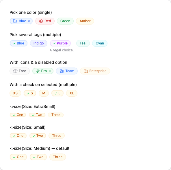
Use the field anywhere you build a Filament schema (a resource form, a custom page, a relation manager, an action, etc.). Single-select (radio semantics) is the default — the field stores a single scalar value:
use VitisStudio\FilamentChoosableChips\Forms\Components\ChoosableChips;

ChoosableChips::make('color')
    ->options([
        'blue' => 'Blue',
        'red' => 'Red',
        'green' => 'Green',
        'amber' => 'Amber',
    ])
    ->colors([
        'blue' => 'info',
        'red' => 'danger',
        'green' => 'success',
        'amber' => 'warning',
    ])
    ->icons([
        'blue' => \Filament\Support\Icons\Heroicon::OutlinedSwatch,
        'red' => \Filament\Support\Icons\Heroicon::OutlinedFire,
    ]);

#Multiple selection
Call ->multiple() for checkbox semantics. The field then stores an array of values (cast the underlying Eloquent attribute as array):
ChoosableChips::make('tags')
    ->multiple()
    ->options([
        'blue' => 'Blue',
        'indigo' => 'Indigo',
        'purple' => 'Purple',
        'teal' => 'Teal',
        'cyan' => 'Cyan',
    ])
    ->colors([
        'blue' => 'info',
        'purple' => 'purple',
    ])
    ->descriptions([
        'purple' => 'A regal choice.',
    ]);

#Icons and disabled options
Per-option icons accept a Heroicon enum case or an icon name. Disable individual options with ->disableOptionWhen():
use Filament\Support\Icons\Heroicon;

ChoosableChips::make('plan')
    ->options([
        'free' => 'Free',
        'pro' => 'Pro',
        'team' => 'Team',
        'enterprise' => 'Enterprise',
    ])
    ->icons([
        'free' => Heroicon::OutlinedGift,
        'pro' => Heroicon::OutlinedBolt,
        'team' => Heroicon::OutlinedUsers,
        'enterprise' => Heroicon::OutlinedBuildingOffice2,
    ])
    ->disableOptionWhen(fn (string $value): bool => $value === 'enterprise');

#Check on selected
Call ->checkSelected() to prepend a check mark to selected chips. The check is colored with ->selectedColor() (defaults to success). When you don't configure checkSelected() explicitly, it turns on automatically for fields that have no per-option icons(), so it never collides with a leading icon. While the check is shown it replaces the dismiss × (the check already signals selection, and clicking the chip clears it):
ChoosableChips::make('sizes')
    ->multiple()
    ->checkSelected()                 // also auto-on when no icons() are set
    ->selectedColor('success')        // color of the check (default: success)
    ->options([
        'sm' => 'S',
        'md' => 'M',
        'lg' => 'L',
    ]);

#Sizes
Set the chip size with ->size(), passing a Size enum (or its string value). The default is Size::Medium. Filament's badge styles only render xs and sm distinctly — md, lg, and xl share the base size.
use Filament\Support\Enums\Size;

ChoosableChips::make('a')->size(Size::ExtraSmall);   // or ->size('xs')
ChoosableChips::make('b')->size(Size::Small);        // or ->size('sm')
ChoosableChips::make('c')->size(Size::Medium);       // default
To change the size for every chip field at once, set a default in a service provider:
use VitisStudio\FilamentChoosableChips\Forms\Components\ChoosableChips;

ChoosableChips::configureUsing(fn (ChoosableChips $component) => $component->size('sm'));



#Enums
Pass a backed enum to options(). Labels, colors, and icons are read automatically from the enum when it implements Filament's HasLabel, HasColor, and HasIcon contracts:
ChoosableChips::make('status')
    ->options(OrderStatus::class);
#API
| Method | Description |
|---|---|
options(array | Arrayable | string | Closure) |
The value => label option map (or an enum class string). |
multiple(bool | Closure = true) |
Switch to multi-select (checkbox) mode. Default is single-select. |
colors(array | Arrayable | Closure) |
Per-option color map keyed by value (any Filament color token). |
icons(array | Arrayable | Closure) |
Per-option icon map keyed by value (Heroicon or icon name). |
descriptions(array | Arrayable | Closure) |
Per-option helper text keyed by value. |
disableOptionWhen(Closure) |
Disable specific options; disabled chips can't be selected or removed. |
dismissible(bool | Closure = true) |
Show a × on selected chips to clear them. Enabled by default, but suppressed while the selected check is shown. |
checkSelected(bool | Closure = true) |
Prepend a check mark to selected chips. Auto-on when no icons() are set. |
selectedColor(string | Closure | null) |
Color of the selection check. Defaults to success. |
checkIcon(string | BackedEnum | Closure) |
Icon used to mark selected chips. Defaults to a check mark. |
size(Size | string | Closure) |
Badge size (Size enum or its string value, e.g. 'sm'). |
defaultColor(string | Closure | null) |
Color used for options with no explicit color. Defaults to primary. |
gridDirection(GridDirection | string | Closure) |
Lay chips out by column (default) or row. |
#Publishing the views
The default look needs no publishing. To customise the chip markup, publish the view and edit it:
php artisan vendor:publish --tag="filament-choosable-chips-views"
The view is published to resources/views/vendor/filament-choosable-chips/.
#Example app
A full Filament v5 panel using the field lives in example/. It links this package via a Composer path repository, so it always runs against your local copy. See example/README.md for setup; in short:
cd example
composer install && npm install && npm run build
cp .env.example .env && php artisan key:generate
touch database/database.sqlite && php artisan migrate
php artisan serve
#Testing
composer test
To preview the field in a browser without a full app, the package ships a Testbench workbench app:
composer serve
#Upgrading
This package follows semantic versioning. Review the changelog before upgrading across a major version.
#Changelog
Please see CHANGELOG for more information on what has changed recently.
#Contributing
Please see CONTRIBUTING for details.
#Security Vulnerabilities
If you discover a security vulnerability, please email dan@vitis.studio rather than using the issue tracker.
#Credits
#License
The MIT License (MIT). Please see License File for more information.
The author
From the same author
Header Schema
Build rich Filament page headers with a schema instead of a Blade view.
Author:
Vitis Studio
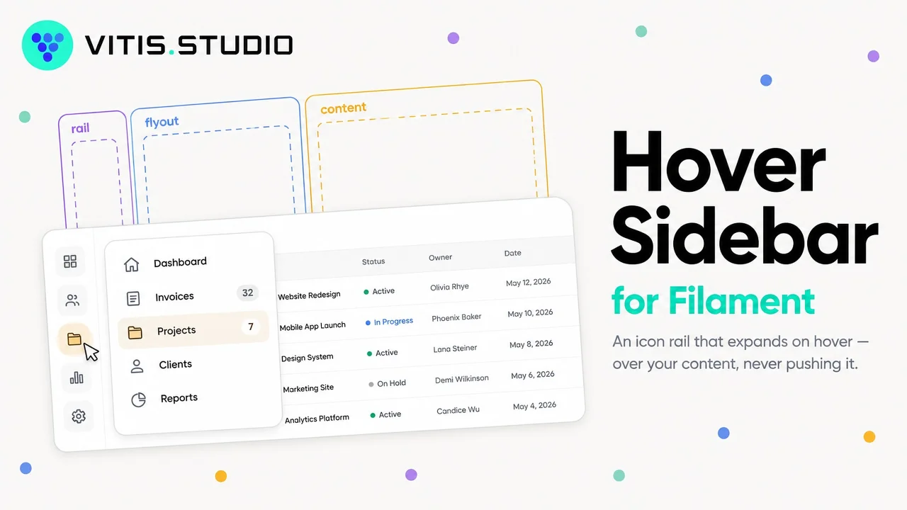
Hover Sidebar
An icon-only sidebar for Filament panels that expands on hover, flies out over the content instead of pushing it, and can be pinned open as a normal drawer.
Author:
Vitis Studio
Featured Plugins
A selection of plugins curated by the Filament team
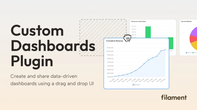
Custom Dashboards
Let your users build and share their own dashboards with a drag-and-drop interface. Define your data sources in PHP and let them do the rest.
 Filament
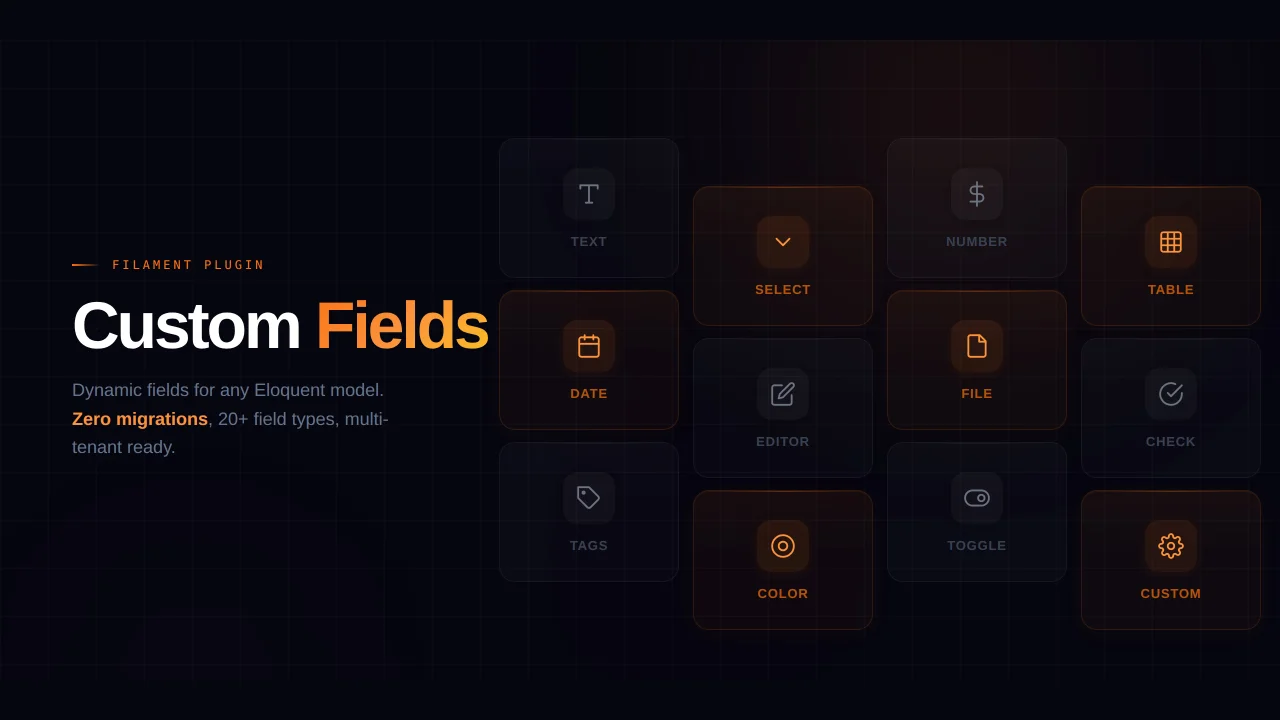
Custom Fields
Eliminate custom field migrations forever. Let your users create and manage form fields directly in Filament admin panels with 20+ built-in field types, validation, and zero database changes.
 Relaticle
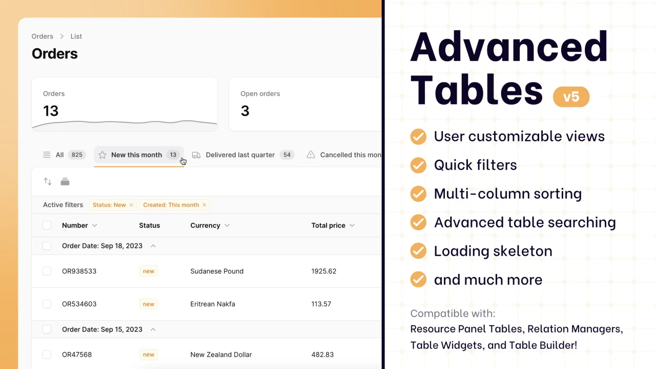
Advanced Tables (formerly Filter Sets)
Supercharge your tables with powerful features like user-customizable views, quick filters, multi-column sorting, advanced table searching, convenient view management, and more. Compatible with Resource Panel Tables, Relation Managers, Table Widgets, and Table Builder!
 Kenneth Sese