
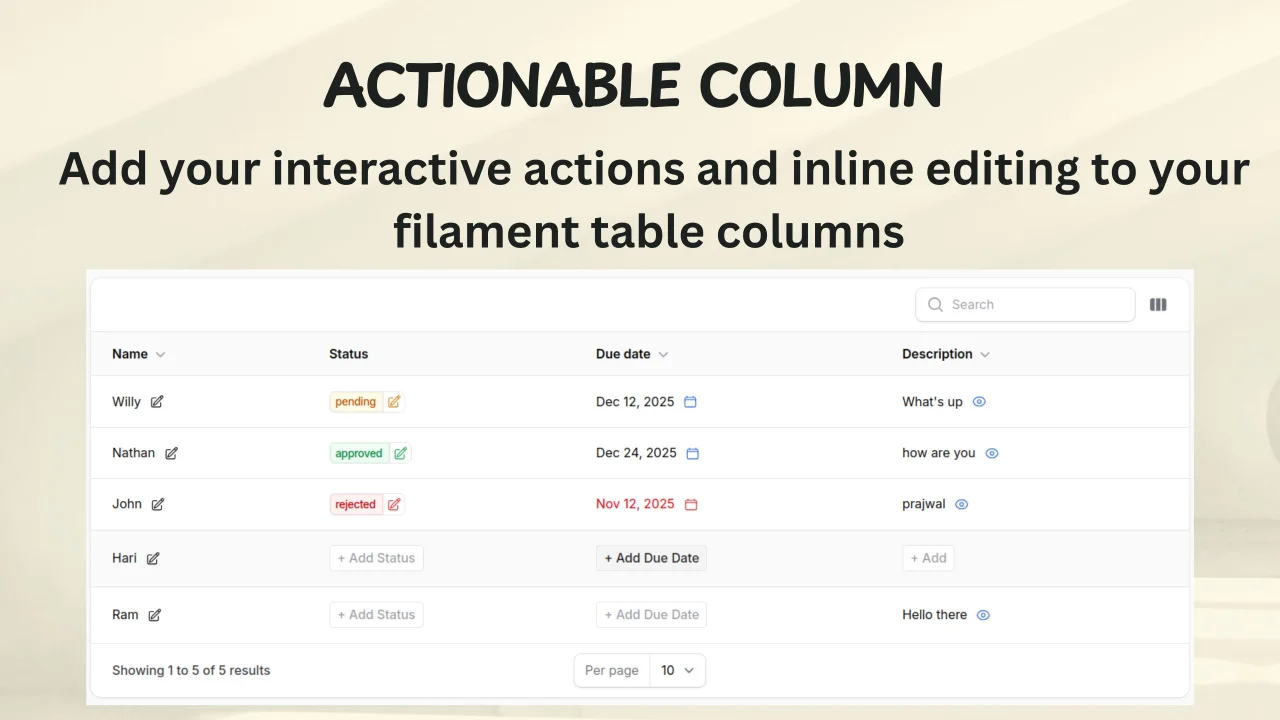
Actionable Column by Shreejan Pandit
CommunityThe Actionable Column plugin allows you to transform table columns with embedded action buttons—show text or badges paired with clickable actions using Filament's native system.
 Author:
Shreejan Pandit
Author:
Shreejan Pandit
Package health
Automated checks of this plugin's Composer package
15 checks
- Skipped: GitHub Actions pinned to SHA
- Skipped: GitLab CI includes pinned to SHA
- Passed: Open security advisories
- Passed: Dependabot PR responsiveness — No open Dependabot PRs.
- Skipped: Renovate MR responsiveness
- Failed: Dependabot or Renovate configured — No dependency updater configuration found. View details on Plumb
- Skipped: Dependency update cooldown configured
- Failed: Provides a security policy — View details on Plumb
- Passed: Abandoned or archived — No consulted source marks the package abandoned (packagist, github).
- Warning: Commit and release recency — Low activity: last commit 91 days ago; last release 227 days ago.
-
Passed:
composer.lock not committed by library
—
composer.lockis absent from the released dist archive. - Passed: Dist archive is lean
-
Warning:
Current Laravel version supported
—
Package does not co-install with current Laravel
13.0; the newest co-installable line is12.0, which receives security patches only (until 2027-02-24). -
Passed:
Current PHP version supported
—
Constraint
^8.4supports current PHP8.5. - Skipped: Current Symfony version supported
filament/
namespace. Review the source and install at your own risk. Found
malware or an unresolved security issue the author won't
address?
Report it
.
Documentation
The Actionable Column plugin allows you to add interactive action buttons to Filament table columns. Display text or badges with seamlessly connected action buttons using Filament's native Action system.
Compatible with Filament v4 and v5
#Features
- Badge mode with connected action button
- Simple text mode with side-by-side action button
- Customizable action icons and colors
- Entire column clickable option
- Empty state "+ Add" button
- Support for any Filament Action type (edit, delete, approve, etc.)
- Independent icon and badge/text colors
- Seamless integration with Filament tables
#Installation
You can install the package via composer:
composer require shreejan/actionable-column
#Usage
use Shreejan\ActionableColumn\Tables\Columns\ActionableColumn;
use Filament\Actions\Action;
use Filament\Forms\Components\Select;
use Filament\Support\Icons\Heroicon;

ActionableColumn::make('status')
    ->badge()                                    // Display as badge (or remove for simple text)
    ->color('success')                           // Badge/text color: success, danger, warning, info, primary
    ->actionIcon(Heroicon::PencilSquare)         // Action button icon (Heroicon enum or string)
    ->actionIconColor('warning')                 // Icon color (independent from badge color)
    ->clickableColumn()                          // Make entire column clickable (or remove for button-only)
    ->tapAction(
        Action::make('changeStatus')              // Any Filament Action: edit, delete, approve, etc.
            ->label('Change Status')
            ->tooltip('Click to change status')
            ->schema([
                Select::make('status')
                    ->options([
                        'pending' => 'Pending',
                        'approved' => 'Approved',
                        'rejected' => 'Rejected',
                    ])
                    ->required(),
            ])
            ->fillForm(fn ($record) => [
                'status' => $record->status,
            ])
            ->action(function ($record, array $data) {
                $record->update($data);
            })
    )
#Configuration Options
| Method | Description | Default |
|---|---|---|
tapAction(Action|Closure) |
Set any Filament Action (edit, delete, approve, etc.) | - |
badge() |
Display as badge (connected to action button) | Simple text mode |
color(string) |
Set badge/text color: success, danger, warning, info, primary |
- |
actionIcon(Heroicon|string) |
Set action button icon | heroicon-o-pencil-square |
actionIconColor(string) |
Set icon color (independent from badge color) | - |
actionIconSize(IconSize|string) |
Set icon size: xs, sm, md, lg, xl, 2xl |
sm |
actionLabel(string) |
Custom "+ Add" button label for empty state | "Add" |
clickableColumn() |
Make entire column clickable (not just button) | Button only |
showActionIcon(bool) |
Show/hide action button (empty state button always shows) | true |
All standard TextColumn methods are available: searchable(), sortable(), limit(), date(), formatStateUsing(), etc.
#CSS Customization
To customize styles without losing changes during composer install or composer update:
Default location: Create resources/css/actionable-column-custom.css (auto-detected)
Custom location: Set ACTIONABLE_COLUMN_CUSTOM_CSS_PATH in .env or config/actionable-column.php
The custom CSS loads after the default styles, allowing overrides without modifying published assets.
#Credits
#Security
If you discover a security vulnerability within this package, please send an e-mail to shreezanpandit@gmail.com. All security vulnerabilities will be promptly addressed.
#Contributing
Contributions are welcome! Please feel free to submit a Pull Request.
#📄 License
The MIT License (MIT). Please see License File for more information.
Made with ❤️ by Shreejan
The author
From the same author

Featured Plugins
A selection of plugins curated by the Filament team
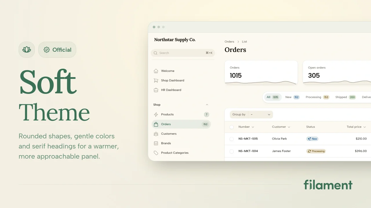
Soft Theme
A theme that gives panels a warm, approachable look with rounded shapes, gentle colors, and serif headings.
 Filament
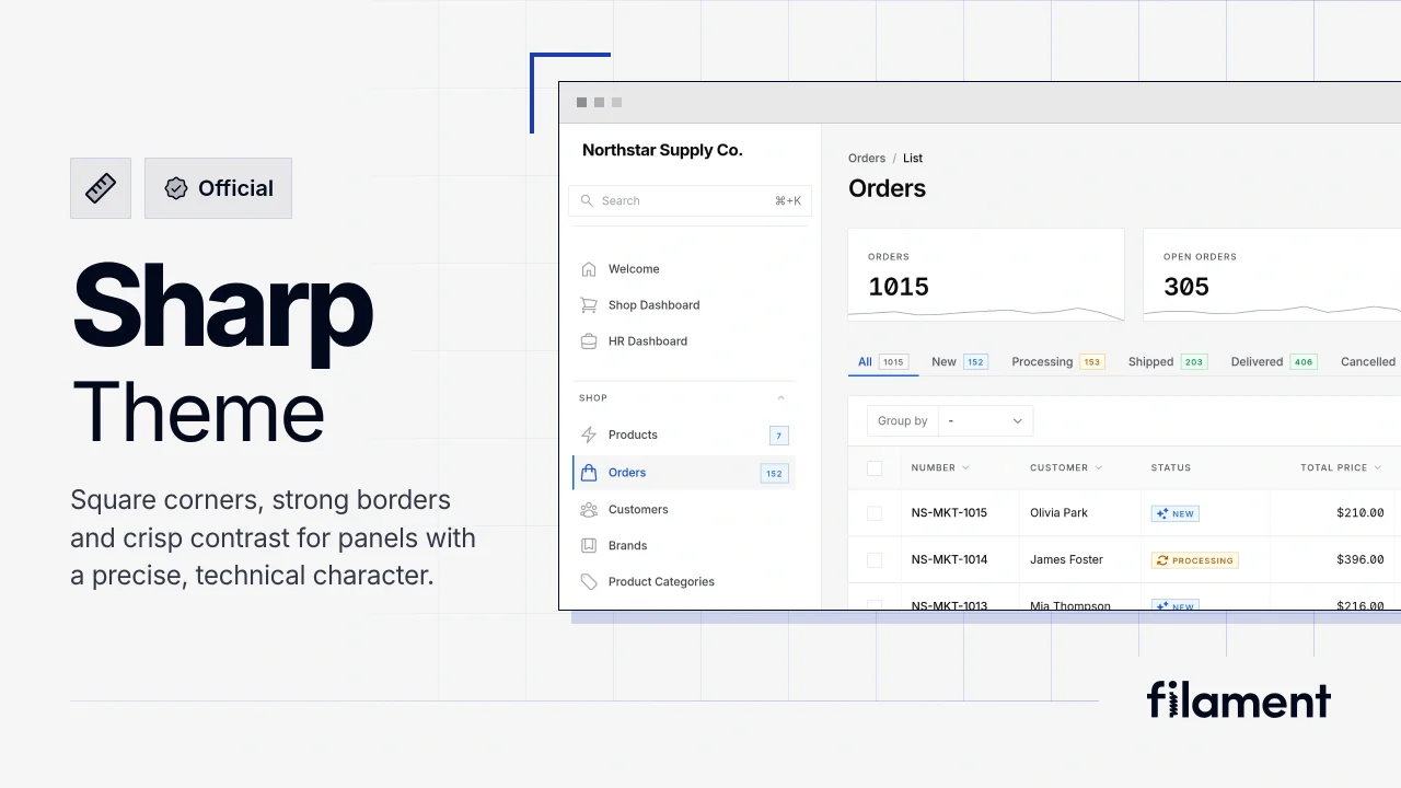
Sharp Theme
A theme that gives panels a precise, technical look with square corners, strong borders, and clear contrast.
Filament
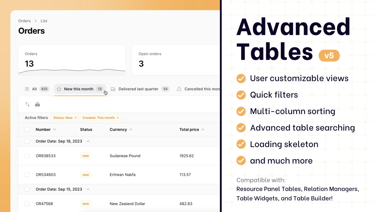
Advanced Tables (formerly Filter Sets)
Supercharge your tables with powerful features like user-customizable views, quick filters, multi-column sorting, advanced table searching, convenient view management, and more. Compatible with Resource Panel Tables, Relation Managers, Table Widgets, and Table Builder!
 Kenneth Sese