Model States
CommunitySeamlessly integrate model states and transitions into the Filament.
filament/
namespace. Review the source and install at your own risk. Found
malware or an unresolved security issue the author won't
address?
Report it
.
 Author:
Maarten Paauw
Author:
Maarten Paauw
Documentation
- Introduction
- Example
- Features
- Installation
- Setup
- Usage
- Advanced
- Need Assistance?
- Licensing Information
#Introduction
The Model States for Filament plug-in is a powerful tool that seamlessly integrates model states and transitions into the Filament UI. It supports Spatie Laravel Model States out-of-the-box, which makes transitioning, listing, and filtering states effortless tasks.
#Example
Consider a scenario where you're managing an e-commerce platform with various order states
like new, processing, shipped, delivered, and canceled. With this plug-in, you can effortlessly list all
products based on their states, apply filters to quickly locate specific orders in each state, and seamlessly transition
between states directly within Filament's intuitive interface. For instance, you can move an order from processing
to shipped with just a few clicks, streamlining your workflow and enhancing productivity.
This plug-in leverages the robust capabilities of Filament PHP and the support of Spatie Laravel Model States out-of-the-box, providing a seamless solution for managing model states and transitions with efficiency and ease.
#Demo video

Check out this video demonstrating how straightforward it is to transition from one valid state to another using Filament, with the following transitions in mind:
stateDiagram-v2
  [*] --> New
  New --> Processing
  New --> Canceled
  Processing --> Shipped
  Processing --> Canceled
  Shipped --> Delivered
  Delivered --> [*]
  Canceled --> [*]
#Features
Model States for Filament comes packed with a range of features to enhance your experience:
- Listing states within tables and exports.
- Filtering records by states.
- Grouping records by states.
- Transitioning to valid states using select or toggle button components.
- Transitioning to valid states using page and table actions.
- Bulk transition to valid states using bulk actions.
- Out-of-the-box support for the Spatie Laravel Model States package.
- Compatible with dark mode.
#Installation
Thank you for choosing Model States for Filament!
Here's a comprehensive guide to installing and utilizing this plug-in. If you encounter any issues, have questions, need support, or want to request a feature, please feel free to contact me at filamentphp@paauw.dev.
#Requirements
- PHP
^8.2 - Laravel
^11.0or^12.0 - Filament
^3.2.39 - Spatie Laravel model states
^2.11.1
Additionally, make sure you have configured at least one Spatie Laravel model state in your project. For more information, refer to the official Spatie documentation.
#Installation steps
#Install with Composer
To begin, add the private registry to your composer.json:
{
  "repositories": [
    {
      "type": "composer",
      "url": "https://model-states-for-filament.composer.sh"
    }
  ]
}
Once the repository is added, you can install Model States for Filament like any other composer package:
composer require maartenpaauw/model-states-for-filament
You will be prompted to provide your username and password. The username will be your email address and the password
will be equal to your license key, followed by a colon (:), followed by the domain you are activating. For example,
let's say we have the following licensee and license activation:
- Contact email:
john.doe@example.com - License key:
8c21df8f-6273-4932-b4ba-8bcc723ef500 - Activation fingerprint:
example.com
This will require you to enter the following information when prompted for your credentials:
Loading composer repositories with package information
Authentication required (model-states-for-filament.composer.sh):
Username: john.doe@example.com
Password: 8c21df8f-6273-4932-b4ba-8bcc723ef500:example.com
To clarify, the license key and fingerprint should be separated by a colon (:).
#Publishing
The plug-in offers English and Dutch translations. You can publish the language files if needed:
php artisan vendor:publish --tag="model-states-for-filament-translations"
You can publish the config file with the following command and change the default configuration based on your needs.
php artisan vendor:publish --tag="model-states-for-filament-config"
#Deploying
It is not advised to store your auth.json file inside your project's version control repository. To store your
credentials on your deployment server you may create a Composer auth.json file in your project directory using the
following command:
composer config http-basic.model-states-for-filament.composer.sh your_account_email your_license_key:fingerprint_domain
You can see your credentials in your Anystack.sh account: Anystack -> Transactions -> View details next to Model States for Filament.
[!IMPORTANT] Make sure the
auth.jsonfile is in.gitignoreto avoid leaking credentials into your git history.
If you are using Laravel Forge, you don't need to create the auth.json file manually.
Instead, you can set the credentials on the Composer Package Authentication screen of your server.
#Setup
In this paragraph, we list the steps you need to follow to get up and running with the out-of-the-box supported Spatie integration.
#Spatie
Make sure you have configured at least one Spatie Laravel model state. For more information, refer to the official Spatie documentation.
#State Preparation
When utilizing Spatie Laravel Model States, you'll have several abstract state classes. These abstract classes
require certain modifications. To properly integrate them, it's necessary to implement the FilamentSpatieState
interface and utilize the ProvidesSpatieStateToFilament trait.
Here's an example of the OrderState abstract class with the necessary modifications already applied.
<?php

namespace App\States;

use App\Models\Order;
use Maartenpaauw\Filament\ModelStates\Concerns\ProvidesSpatieStateToFilament;
use Maartenpaauw\Filament\ModelStates\Contracts\FilamentSpatieState;
use Spatie\ModelStates\State;
use Spatie\ModelStates\StateConfig;

/**
 * @extends State<Order>
 *
 * @implements FilamentSpatieState<Order>
 */
abstract class OrderState extends State implements FilamentSpatieState
{
    use ProvidesSpatieStateToFilament;

    public static function config(): StateConfig
    {
        return parent::config()
            ->default(NewState::class)
            ->allowTransition(NewState::class, ProcessingState::class)
            ->allowTransition(ProcessingState::class, ShippedState::class)
            ->allowTransition(ShippedState::class, DeliveredState::class)
            ->allowTransition([NewState::class, ProcessingState::class], CancelledState::class, ToCancelled::class);
    }
}
[!TIP] More information about state configuration can be found in the official Spatie documentation.
#Transition Preparation
Spatie Laravel model states offer support for custom transition classes. All custom transition classes must implement
the FilamentSpatieTransition interface and use the ProvidesSpatieTransitionToFilament trait before they can be used
within Filament.
Here is an example of the ToCancelled transition class with the necessary modifications in place.
<?php

namespace App\States;

use App\Models\Order;
use Maartenpaauw\Filament\ModelStates\Concerns\ProvidesSpatieTransitionToFilament;
use Maartenpaauw\Filament\ModelStates\Contracts\FilamentSpatieTransition;
use Spatie\ModelStates\Transition;

/**
 * @implements FilamentSpatieTransition<Order>
 */
final class ToCancelled extends Transition implements FilamentSpatieTransition
{
    use ProvidesSpatieTransitionToFilament;

    public function __construct(
        private readonly Order $order,
    ) {
    }

    public function handle(): Order
    {
        $this->order->state = new CancelledState($this->order);
        $this->order->cancelled_at = now();

        $this->order->save();

        return $this->order;
    }
}
[!TIP] For more information about transition configuration, refer to the official Spatie documentation.
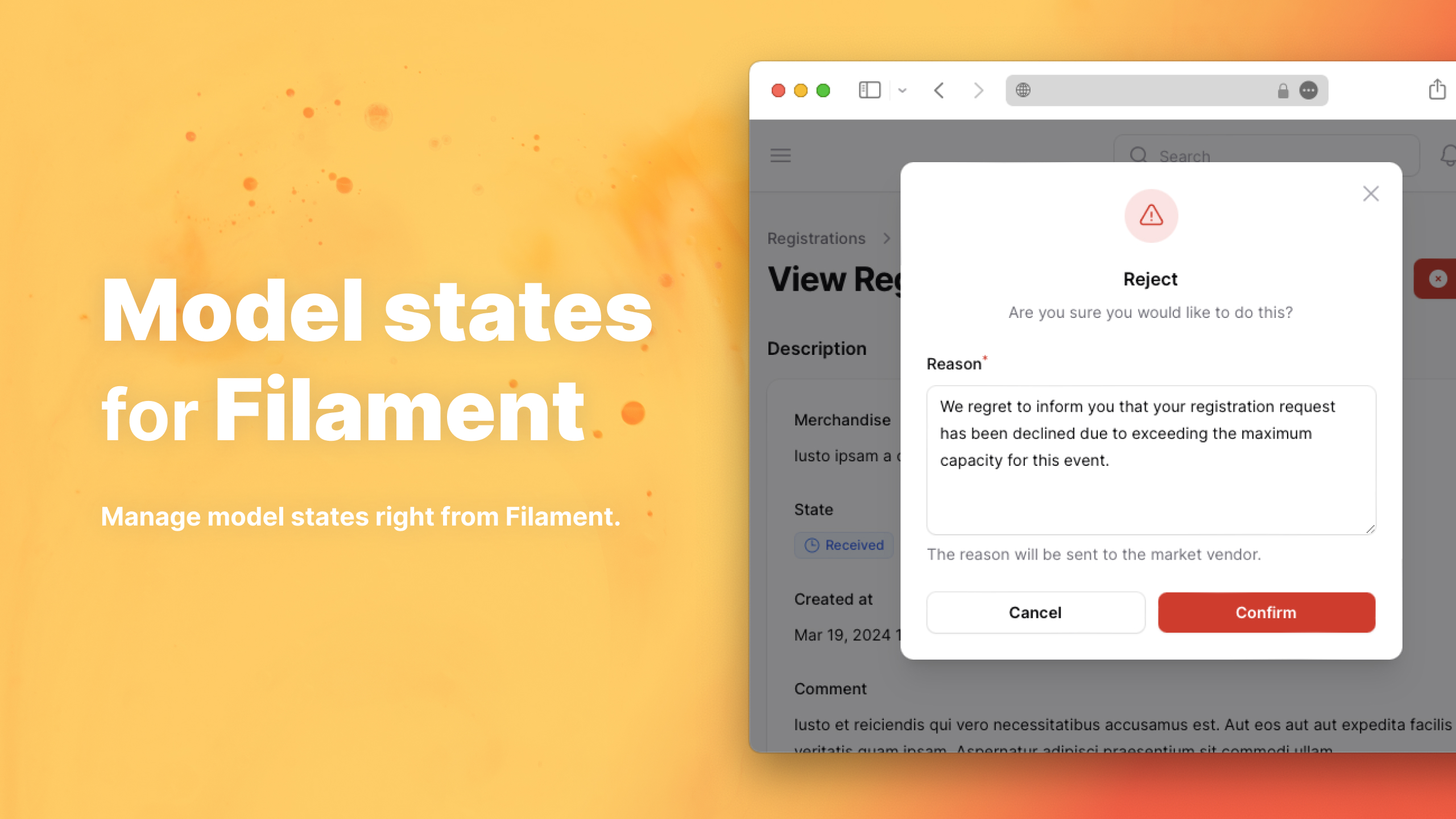
#Additional Transition Data
Most of the time, additional data is needed before transitioning to a new state. Considering the ToCancelled
transition, it would be beneficial to store a reason explaining why the state transitioned to cancelled state. By adding
a form method to the transition class, a form will be displayed when initiating the transition.
Here is an example ToCancelled transition class with the form is place. This transition will display a reason
textarea when the StateAction or StateTableAction button is clicked.
<?php

namespace App\States;

use App\Models\Order;
use Maartenpaauw\Filament\ModelStates\Concerns\ProvidesSpatieTransitionToFilament;
use Maartenpaauw\Filament\ModelStates\Contracts\FilamentSpatieTransition;
use Spatie\ModelStates\Transition;

/**
 * @implements FilamentSpatieTransition<Order>
 */
final class ToCancelled extends Transition implements FilamentSpatieTransition
{
    use ProvidesSpatieTransitionToFilament;

    public function __construct(
        private readonly Order $order,
        private readonly string $reason = '',
    ) {
    }

    public function handle(): Order
    {
        $this->order->state = new CancelledState($this->order);
        $this->order->cancelled_at = now();
        $this->order->cancellation_reason = $this->reason;

        $this->order->save();

        return $this->order;
    }

    public function schema(): array | Closure | null
    {
        return [
            Textarea::make('reason')
                ->required()
                ->minLength(1)
                ->maxLength(1000)
                ->rows(5)
                ->helperText(__('This reason will be sent to the customer.')),
        ];
    }
}
[!WARNING] Since the plug-in needs to create transition instances to determine if there is a form, all constructor properties, except for the model, must have default values.
By default, this plug-in will map the form component names to their constructor property names. Considering the
previous ToCancelled transition, the reason textarea input will correspond to the constructor property $reason. If
you want to make any modifications before creating the transition instance, you can override the static method fill.
For example, you can prefix the reason:
<?php

namespace App\States;

use App\Models\Order;
use Illuminate\Support\Arr;
use Maartenpaauw\Filament\ModelStates\Concerns\ProvidesSpatieTransitionToFilament;
use Maartenpaauw\Filament\ModelStates\Contracts\FilamentSpatieTransition;
use Spatie\ModelStates\Transition;

/**
 * @implements FilamentSpatieTransition<Order>
 */
final class ToCancelled extends Transition implements FilamentSpatieTransition
{
    use ProvidesSpatieTransitionToFilament;

    public function __construct(
        private readonly Order $order,
        private readonly string $reason = '',
    ) {
    }

    public static function fill(Model $model, array $formData): SpatieTransition
    {
        return new self(
            order: $model,
            reason: 'The order is cancelled because: ' . Arr::get($formData, 'reason'),
        );
    }

    public function handle(): Order
    {
        $this->order->state = new CancelledState($this->order);
        $this->order->cancelled_at = now();
        $this->order->cancellation_reason = $this->reason;

        $this->order->save();

        return $this->order;
    }

    public function form(): array | Closure | null
    {
        return [
            Textarea::make('reason')
                ->required()
                ->minLength(1)
                ->maxLength(1000)
                ->rows(5)
                ->helperText(__('This reason will be sent to the customer.')),
        ];
    }
}
#Optional Label, Description, Color and Icon
By default, the name of the state class is used as a label (for example, CancelledState will have the
label Cancelled), without any assigned description, color or icon. If you desire a different label, description,
color, or icon, you must implement the HasLabel, HasDescription, HasColor, or HasIcon interface.
Here is an example of the Cancelled state with HasLabel, HasDescription, HasColor, and HasIcon implemented.
<?php

namespace App\States;

use Filament\Support\Colors\Color;
use Filament\Support\Contracts\HasColor;
use Filament\Support\Contracts\HasDescription;
use Filament\Support\Contracts\HasIcon;
use Filament\Support\Contracts\HasLabel;

final class CancelledState extends OrderState implements HasDescription, HasColor, HasIcon, HasLabel
{
    public function getLabel(): string
    {
        return __('Order Cancelled');
    }

    public function getColor(): array
    {
        return Color::Red;
    }

    public function getIcon(): string
    {
        return 'heroicon-o-x-circle';
    }

    public function getDescription(): ?string
    {
        return 'Order cancelled, transaction reversed.';
    }
}
[!NOTE] The description is used when utilizing the
StateRadiocomponent.
By default, "Transition to" followed by the name of the destination state is used as the transition label. Like states,
it has no color or icon. If you want a different label, or if you want to use a color or icon; you have to implement
the HasLabel, HasColor or HasIcon interface.
Here is an example ToCancelled transtition with HasLabel, HasColor and HasIcon implemented.
<?php

namespace App\States;

use App\Models\Order;
use Filament\Support\Colors\Color;
use Filament\Support\Contracts\HasColor;
use Filament\Support\Contracts\HasIcon;
use Filament\Support\Contracts\HasLabel;
use Maartenpaauw\Filament\ModelStates\Concerns\ProvidesSpatieTransitionToFilament;
use Maartenpaauw\Filament\ModelStates\Contracts\FilamentSpatieTransition;
use Spatie\ModelStates\Transition;

/**
 * @implements FilamentSpatieTransition<Order>
 */
final class ToCancelled extends Transition implements FilamentSpatieTransition, HasLabel, HasColor, HasIcon
{
    use ProvidesSpatieTransitionToFilament;

    public function __construct(
        private readonly Order $order,
        private readonly string $reason = '',
    ) {
    }

    public function handle(): Order
    {
        $this->order->state = new CancelledState($this->order);
        $this->order->cancelled_at = now();
        $this->order->cancellation_reason = $this->reason;

        $this->order->save();

        return $this->order;
    }

    public function getLabel(): string
    {
        return __('Mark as Cancelled');
    }

    public function getColor(): array
    {
        return Color::Red;
    }

    public function getIcon(): string
    {
        return 'heroicon-o-x-circle';
    }

    public function form(): array | Closure | null
    {
        return [
            Textarea::make('reason')
                ->required()
                ->minLength(1)
                ->maxLength(1000)
                ->rows(5)
                ->helperText(__('This reason will be sent to the customer.')),
        ];
    }
}
#Migrating Away from Enum States
For each enum case, you have to create a state class. When you used string-backed enums, don't forget to add the public
static string $name property. This is because, by default, Spatie Model States uses the fully qualified class name as
the state representation and stores it in the database. To be backward compatible with the old enum values, you have to
implement the static string property.
[!TIP] More information about state serializing can be found in the official Spatie documentation.
#Usage
In this paragraph, all available components and their features are listed.
#State Column
The StateColumn will display the related model state within a table.

State column with color and icon.
use Maartenpaauw\Filament\ModelStates\StateColumn;

// ...

StateColumn::make('state')
    ->badge();
When utilizing the StateColumn component, this plug-in will automatically generate a label for the current state. If
you desire a custom label, you can implement the HasLabel interface.
Because the StateColumn component is based on the TextColumn component, all the familiar TextColumn modifiers can
be used (e.g., badge()).
[!TIP] For more information about columns, refer to the official Filament documentation.
#State Entry
The StateEntry will display the related model state within an infolist.

State entry with color and icon.
use Maartenpaauw\Filament\ModelStates\StateEntry;

// ...

StateEntry::make('state')
    ->badge();
When utilizing the StateEntry component, this plug-in will automatically generate a label for the current state. If
you desire a custom label, you can implement the HasLabel interface.
Because the StateEntry component is based on the TextEntry component, all the familiar TextEntry modifiers can be
used (e.g., badge()).
[!TIP] For more information about entries, refer to the official Filament documentation.
#State Select Column
[!CAUTION] When using a state select column in combination with the Spatie integration, states aren't transitioned using the
Transitionclasses and are directly saved to the database like regular fields. Only use this select when you are sure you are not relying onTransitionclasses andStateChangedevents.
The StateSelectColumn is a table component that enables selecting valid state transitions, disabling all other invalid
state transitions. This component is intended for basic state transitions that do not require additional form fields.

State select column with disabled invalid transitions.
use Maartenpaauw\Filament\ModelStates\StateSelectColumn;

// ...

StateSelectColumn::make('state');
When utilizing the StateSelectColumn component, this plug-in will automatically list all states using their generated
class name label. If you desire a custom label, you can implement the HasLabel interface.
Because the StateSelectColumn is based on the SelectColumn component, all the familiar Select modifiers can be
used (e.g., label()).
[!TIP] For more information about select columns, refer to the official Filament documentation.
#State Select
[!CAUTION] When using a state select in combination with the Spatie integration, states aren't transitioned using the
Transitionclasses and are directly saved to the database like regular fields. Only use this select when you are sure you are not relying onTransitionclasses andStateChangedevents.
The StateSelect is a form component that enables selecting valid state transitions, disabling all other invalid state
transitions. This component is intended for basic state transitions that do not require additional form fields.

State select with disabled invalid transitions.
use Maartenpaauw\Filament\ModelStates\StateSelect;

// ...

StateSelect::make('state')
    ->native(false);
When utilizing the StateSelect component, this plug-in will automatically list all states using their generated class
name label. If you desire a custom label, you can implement the HasLabel interface.
Because the StateSelect is based on the Select component, all the familiar Select modifiers can be used (
e.g., native()).
[!TIP] For more information about selects, refer to the official Filament documentation.
#State Toggle Buttons
[!CAUTION] When using a state toggle button in combination with the Spatie integration, states aren't transitioned using the
Transitionclasses and are directly saved to the database like regular fields. Only use this toggle button when you are sure you are not relying onTransitionclasses andStateChangedevents.
Similar to the StateSelect, the StateToggleButtons is a form component that enables selecting valid state
transitions, disabling all other invalid state transitions. This component is intended for basic state transitions that
do not require additional form fields.

State toggle buttons with disabled invalid transitions.
use Maartenpaauw\Filament\ModelStates\StateToggleButtons;

// ...

StateToggleButtons::make('state')
    ->inline();
When utilizing the StateToggleButtons component, this plug-in will automatically list all states using their generated
class name label. If you desire a custom label, you can implement the HasLabel interface.
Because the StateToggleButtons is based on the ToggleButtons component, all the familiar ToggleButtons modifiers
can be used (e.g., inline()).
[!TIP] For more information about toggle buttons, refer to the official Filament documentation.
#State Radio
[!CAUTION] When using a state radio in combination with the Spatie integration, states aren't transitioned using the
Transitionclasses and are directly saved to the database like regular fields. Only use this radio when you are sure you are not relying onTransitionclasses andStateChangedevents.
The StateRadio is a form component that enables choosing valid state transitions, disabling all other invalid state
transitions. When the state class implements the HasDescription interface, the description is displayed underneath the
state label. This component is intended for basic state transitions that do not require additional form fields.

State radio with disabled invalid transitions.

State radio with description and disabled invalid transitions.
use Maartenpaauw\Filament\ModelStates\StateRadio;

// ...

StateRadio::make('state')
    ->inline();
When utilizing the StateRadio component, this plug-in will automatically list all states using their generated class
name label. If you desire a custom label, you can implement the HasLabel interface.
Because the StateRadio is based on the Radio component, all the familiar Radio modifiers can be used (
e.g., inline()).
[!TIP] For more information about the radio input, refer to the official Filament documentation.
#State Action
The StateAction component allows you to transition a state to another valid state. Basic transitions will only show a
confirmation dialogue, while advanced state transitions display an additional form before the transition can be
performed. This component works seamlessly on both pages and tables.

Simple state transition action.

Advanced state transition action with additional form.

Simple state transition action in a table.

Advanced state transition action with additional form in a table.
use App\States\CancelledState;
use Maartenpaauw\Filament\ModelStates\StateAction;

// ...

StateAction::make('cancel')
    ->transitionTo(CancelledState::class);
When utilizing the StateAction component, this plug-in will automatically generate a label for the transition. By
default, "Transition to" followed by the name of the destination state is used as the transition label. If you desire a
custom label, you can publish the language files and change the transition_to_state translation, or you can implement
the HasLabel interface.
Because the StateAction component is based on the Action component, all the familiar Action modifiers can be
used (e.g., closeModalByClickingAway()).
[!TIP] For more information about actions, refer to the official Filament documentation and table actions documentation.
#Relationship Support
The StateAction component supports transitioning states within a related model using relationships. This functionality
is helpful when your state resides in a related model instead of the primary model being worked on.
To transition a state within a related model, you can use the stateRelationship() method. This method specifies the
relationship on the primary model that points to the related model holding the state.
use App\States\CancelledState;
use Maartenpaauw\Filament\ModelStates\StateAction;

// ...

StateAction::make('cancel')
    ->stateRelationship('order')
    ->transitionTo(CancelledState::class);
#Different Attribute Name
By default, this plug-in assumes the attribute where the state is stored is named state. If you wish to use a
different attribute name, you can configure it using the attribute() method. For example, the following code uses the
attribute status to store the model state.
use App\States\CancelledState;
use Maartenpaauw\Filament\ModelStates\StateAction;

// ...

StateAction::make('cancel')
    ->attribute('status')
    ->transitionTo(CancelledState::class);
#State Bulk Action
The StateBulkAction component enables bulk transitioning a state to another valid state. Basic transitions will only
display a confirmation dialogue, while advanced state transitions will show an additional form before the transition can
be completed.

Simple state bulk transition action.

Advanced state bulk transition action with additional form.
use App\States\NewState;
use App\States\CancelledState;
use Maartenpaauw\Filament\ModelStates\StateBulkAction;

// ...

StateBulkAction::make('cancel')
    ->transition(NewState::class, CancelledState::class);
When utilizing the StateBulkAction component, this plug-in will automatically generate a label for the transition. By
default, "Transition to" followed by the name of the destination state is used as the transition label. If you desire a
custom label, you can publish the language files and change the transition_to_state translation, or you can implement
the HasLabel interface.
It's important to note that when executing the bulk action, it only transitions records whose state matches the
configured from state and where the to state is a valid transition. The other records are simply ignored.
Because the StateBulkAction component is based on the BulkAction component, all the familiar Action modifiers can
be used (e.g., deselectRecordsAfterCompletion()).
[!TIP] For more information about bulk actions, refer to the official Filament documentation.
#Relationship Support
The StateBulkAction component supports transitioning states within a related model using relationships. This
functionality is helpful when your state resides in a related model instead of the primary model being worked on.
To transition a state within a related model, you can use the stateRelationship() method. This method specifies the
relationship on the primary model that points to the related model holding the state.
use App\States\NewState;
use App\States\CancelledState;
use Maartenpaauw\Filament\ModelStates\StateBulkAction;

// ...

StateBulkAction::make('cancel')
    ->stateRelationship('order')
    ->transition(NewState::class, CancelledState::class);
#Different Attribute Name
By default, this plug-in assumes the attribute where the state is stored is named state. If you wish to use a
different attribute name, you can configure it using the attribute() method. For example, the following code uses the
attribute status to store the model state.
use App\States\NewState;
use App\States\CancelledState;
use Maartenpaauw\Filament\ModelStates\StateBulkAction;

// ...

StateBulkAction::make('cancel')
    ->attribute('status')
    ->transition(NewState::class, CancelledState::class);
#State Select Filter
The StateSelectFilter component filters table records by the selected state.

State select filter will all states listed.
use Maartenpaauw\Filament\ModelStates\StateSelectFilter;

// ...

StateSelectFilter::make('state')
    ->multiple();
When utilizing the StateSelectFilter component, this plug-in will automatically list all states using their generated
class name label. If you desire a custom label, you can implement the HasLabel interface.
Because the StateSelectFilter is based on the SelectFilter component, all the familiar SelectFilter modifiers can
be used (e.g., multiple()).
[!TIP] For more information about select filters, refer to the official Filament documentation.
#Relationship Support
The StateSelectFilter component supports filtering based on states within related models. This feature is particularly
useful when you need to filter records based on the state of a related model instead of the primary model.
To filter by the state of a related model, use the stateRelationship() method to specify the relationship on the
primary model that points to the related model holding the state. For example:
use Maartenpaauw\Filament\ModelStates\StateSelectFilter;

// ...

StateSelectFilter::make('state')
    ->stateRelationship('order')
    ->multiple();
#Hide State Filter
The HideStateFilter component adds a toggle filter which hides a specific state when enabled.

Toggle filter which hides the cancelled state.
use App\States\CancelledState;
use Maartenpaauw\Filament\ModelStates\HideStateFilter;

// ...

HideStateFilter::make('hide_cancelled')
    ->hiddenState(CancelledState::class);
When utilizing the HideStateFilter component, this plug-in will automatically generate a label for the filter. By
default, "Hide" followed by the name of the state is used as the filter label. If you desire a custom label, you can
publish the language files and change the hide_state translation.
Because the HideStateFilter is based on the Filter component, all the familiar Filter modifiers can be used (
e.g., default()).
[!TIP] For more information about filters, refer to the official Filament documentation.
#Relationship Support
The HideStateFilter component supports filtering based on states within related models. This feature is particularly
useful when you need to filter records based on the state of a related model instead of the primary model.
To filter by the state of a related model, use the stateRelationship() method to specify the relationship on the
primary model that points to the related model holding the state. For example:
use App\States\CancelledState;
use Maartenpaauw\Filament\ModelStates\HideStateFilter;

// ...

HideStateFilter::make('hide_cancelled')
    ->stateRelationship('order')
    ->hiddenState(CancelledState::class);
#State Select Constraint
The StateSelectConstraint component filters table records by the selected state.

State select constraint will all states listed.
use Maartenpaauw\Filament\ModelStates\StateSelectConstraint;

// ...

StateSelectConstraint::make('state')
    ->multiple();
When utilizing the StateSelectConstraint component, this plug-in will automatically list all states using their
generated class name label. If you desire a custom label, you can implement the HasLabel interface.
Because the StateSelectConstraint is based on the SelectConstraint component, all the familiar SelectConstraint
modifiers can be used (e.g., inverse()).
[!TIP] For more information about select constraints, refer to the official Filament documentation.
#State Group
The StateGroup adds functionality to group table records based on their status.

State group with label.
use Maartenpaauw\Filament\ModelStates\StateGroup;

// ...

StateGroup::make('state')
    ->label('State');
When utilizing the StateGroup component, this plug-in will automatically generate a label for the current state. If
you desire a custom label, you can implement the HasLabel interface.
Because the StateGroup component is based on the Group component, all the familiar Group modifiers can be used (
e.g., label()).
[!TIP] More information about groups can be found on the official Filament documentation.
#State Tabs
[!CAUTION] When using state tabs in combination with the Spatie integration, states need to be serialized. Otherwise, when using the fully qualified state name as a value, the backslashes will be removed, resulting in an invalid URL. For more information about state serialization, refer to the official Spatie documentation.
The StateTabs component can be used to filter records using tabs. In addition to the state tabs, there will also be
an "All" tab to list all records. The state tabs are alphabetically ordered.

State tabs with icon.
use Maartenpaauw\Filament\ModelStates\StateTabs;

// ...

public function getTabs(): array
{
    return StateTabs::make($this->getModel())->toArray();
}
#All Tab
If you prefer not to include the "All" tab mentioned above, you can chain the includeAllTab(false) method.
use Maartenpaauw\Filament\ModelStates\StateTabs;

// ...

public function getTabs(): array
{
    return StateTabs::make($this->getModel())
        ->includeAllTab(false)
        ->toArray();
}
[!TIP] For more information about state tabs, refer to the official
Filament documentation.
#Relationship Support
The StateTabs component supports filtering based on states within related models. This feature is particularly useful
when you need to filter records based on the state of a related model instead of the primary model.
To filter by the state of a related model, use the stateRelationship() method to specify the relationship on the
primary model that points to the related model holding the state. For example:
use Maartenpaauw\Filament\ModelStates\StateTabs;

// ...

public function getTabs(): array
{
    return StateTabs::make($this->getModel())
      ->stateRelationship('order')
      ->toArray();
}
#State Export Column
The StateExportColumn will add a column to Excel or CSV export with the related model state as the value.

State label in cell.
use Maartenpaauw\Filament\ModelStates\StateExportColumn;

// ...

StateExportColumn::make('state')
    ->label('State');
When utilizing the StateExportColumn component, this plug-in will automatically generate a label for the current
state. If you desire a custom label, you can implement the HasLabel interface.
Because the StateExportColumn component is based on the ExportColumn component, all the familiar ExportColumn
modifiers can be used (e.g., label()).
[!TIP] For more information about exports, refer to the official Filament documentation.
#Advanced
#Custom State Driver
Would you like to use an alternative model state driver instead of Spatie Laravel model state? You can certainly do so.
Simply create your own driver by creating a class that implements the following Driver interface.
<?php

declare(strict_types=1);

namespace Maartenpaauw\Filament\ModelStates\Contracts;

use Illuminate\Contracts\Validation\ValidationRule;
use Illuminate\Database\Eloquent\Scope;
use Illuminate\Support\Collection;
use Maartenpaauw\Filament\ModelStates\Operator;

/**
 * Manages state transitions and validation for models.
 */
interface Driver
{
    /**
     * Get the current state of the model.
     */
    public function currentState(Config $config): State;

    /**
     * Get the default state of the model.
     */
    public function defaultState(Config $config): ?State;

    /**
     * Get all possible states for the model.
     *
     * @return Collection<string, State>
     */
    public function allStates(Config $config): Collection;

    /**
     * Transform a mixed value into a state instance.
     */
    public function transformState(Config $config, mixed $state): State;

    /**
     * Get the transition instance for a given pending transition.
     */
    public function getTransition(Config $config, PendingTransition $pendingTransition): Transition;

    /**
     * Check if a pending transition is valid.
     */
    public function isValidPendingTransition(Config $config, PendingTransition $pendingTransition): bool;

    /**
     * Check if a pending transition is invalid.
     */
    public function isInvalidPendingTransition(Config $config, PendingTransition $pendingTransition): bool;

    /**
     * Execute a pending transition.
     */
    public function executePendingTransition(Config $config, PendingTransition $pendingTransition): void;

    /**
     * Apply a scope to a query based on the given states and operator.
     *
     * @param  array<array-key, State>|State  $states
     */
    public function scope(Config $config, State | array $states, Operator $operator): Scope;

    /**
     * Get the validation rule for a state attribute.
     */
    public function validationRule(Config $config, bool $required = true): ValidationRule;
}
After creating a custom driver, you need to extend the state manager by adding the following code to a service provider:
use App\States\CustomDriver;
use Maartenpaauw\Filament\ModelStates\Contracts\Driver;
use Maartenpaauw\Filament\ModelStates\Facades\StateManager;

// ...

StateManager::extend('custom-driver', static fn (): Driver => new CustomDriver());
After extending the state manager, you can specify which driver to use by changing the default configuration, simply by
adding the following line of code to your .env file:
MODEL_STATES_DRIVER=custom-driver
If you wish to hardcode the default driver, you can export the plugin's configuration using the following command and
replace the value of driver.
php artisan vendor:publish --tag="model-states-for-filament-config"
With the previous example in mind, your config will look like this:
<?php

declare(strict_types=1);

return [
    'driver' => 'custom-driver',
];
If your custom driver is only for a single component, you can change the driver by calling the stateDriver() method.
For example, when using the StateAction, you can chain the ->stateDriver('custom-driver') method after creating an
instance of StateAction.
use App\States\CustomManager;
use App\States\CancelledState;
use Maartenpaauw\Filament\ModelStates\StateAction;

// ...

StateAction::make('cancel')
    ->stateDriver('custom-driver')
    ->transitionTo(CancelledState::class);
#Custom State Sorting Strategy
To create a custom state sorting strategy , start by implementing the StateSortingStrategy interface. This interface
requires you to define two methods: withConfig and compare. Here's an example:
<?php

declare(strict_types=1);

namespace App\Sorting;

use Maartenpaauw\Filament\ModelStates\Contracts\StateSortingStrategy;
use Maartenpaauw\Filament\ModelStates\Config;
use Maartenpaauw\Filament\ModelStates\State;

final class CustomStateSortingStrategy implements StateSortingStrategy
{
    private Config $config;

    public function withConfig(Config $config): self
    {
        $this->config = $config;

        return $this;
    }

    public function compare(State $a, State $b): int
    {
        // TODO: Custom sorting logic goes here...
    }
}
After implementing the strategy, configure it by setting the state_sorting_strategy to your custom class:
<?php

declare(strict_types=1);

return [
    // ...

    'spatie' => [
        'state_sorting_strategy' => \App\States\Sorting\CustomStateSortingStrategy::class,
    ],

    // ...
];
With this configuration, your custom sorting strategy will be used wherever states are sorted in the plug-in.
#Need Assistance?
Questions, bugs, feature requests, or suggestions? Feel free to contact me at filamentphp@paauw.dev. Your feedback is invaluable.
#Licensing Information
#Single Project License
The Single Project license allows for the utilization of Model States for Filament within a single project hosted on one domain or subdomain. It is suitable for personal websites or websites tailored to specific clients.
If you intend to incorporate Model States for Filament into a SaaS application, you must obtain an Unlimited Projects or Lifetime license.
Under the Single Project license, you are authorized to activate Model States for Filament up to 4 times (development, test, staging and production).
You will receive updates and bug fixes for one year from the purchase date. If you choose not to renew your license, you can only install the plug-in up to the latest version available before the license expiration. Renewing the license at a discounted rate allows you to continue receiving updates and new features.
#Unlimited Projects License
The Unlimited Projects license permits the utilization of Model States for Filament across multiple domains, subdomains, and even in SaaS applications.
You will receive updates and bug fixes for one year from the purchase date. If you choose not to renew your license, you can only install the plug-in up to the latest version available before the license expiration. Renewing the license at a discounted rate allows you to continue receiving updates and new features.
#Lifetime License
The Lifetime License affords the licensee the same privileges as the Unlimited License.
You will receive updates for the lifetime of the product.
#Code Distribution
Please note that the licenses for Model States for Filament prohibit the public distribution of its source code. Hence, you cannot build and distribute applications using Model States for Filament's source code on open-source platforms.
#Questions About Licensing?
If you're uncertain about which license is appropriate for your needs, don't hesitate to reach out. Contact me at filamentphp@paauw.dev, and I'll be glad to assist you.
The author
From the same author
Pennant feature flags
Seamlessly integrate feature flags from Laravel Pennant into Filament.
Author:
Maarten Paauw
Cashier Billing Provider
Integrate Laravel Cashier Stripe support into multi-tenant panels.
Author:
Maarten Paauw
Featured Plugins
A selection of plugins curated by the Filament team
Custom Dashboards
Let your users build and share their own dashboards with a drag-and-drop interface. Define your data sources in PHP and let them do the rest.
 Filament
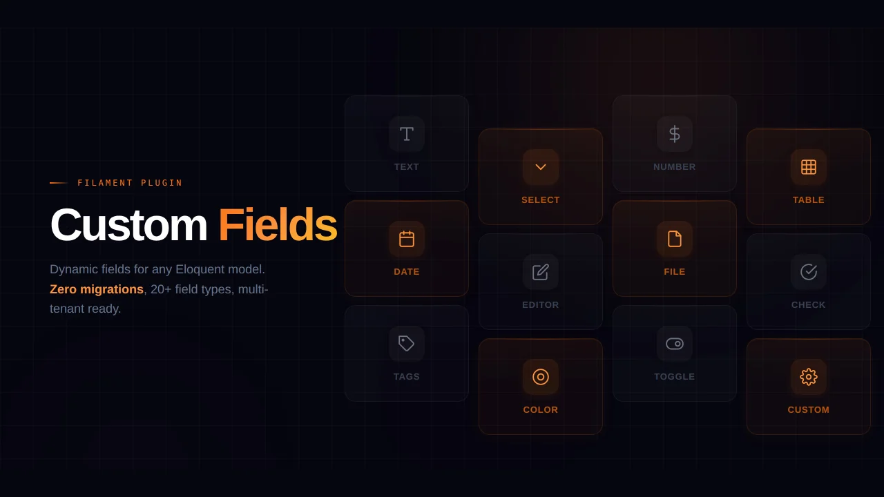
Custom Fields
Eliminate custom field migrations forever. Let your users create and manage form fields directly in Filament admin panels with 20+ built-in field types, validation, and zero database changes.
 Relaticle
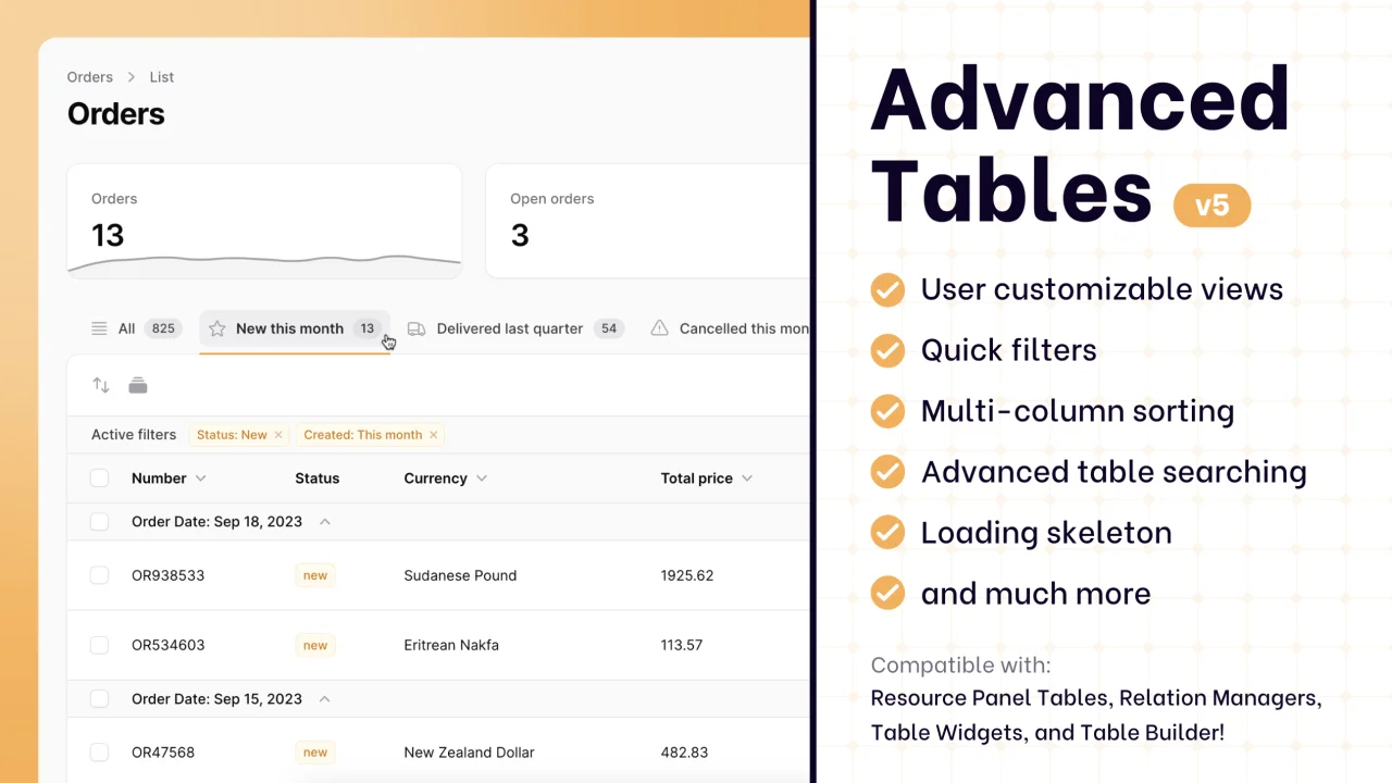
Advanced Tables (formerly Filter Sets)
Supercharge your tables with powerful features like user-customizable views, quick filters, multi-column sorting, advanced table searching, convenient view management, and more. Compatible with Resource Panel Tables, Relation Managers, Table Widgets, and Table Builder!
 Kenneth Sese