Mía Theme
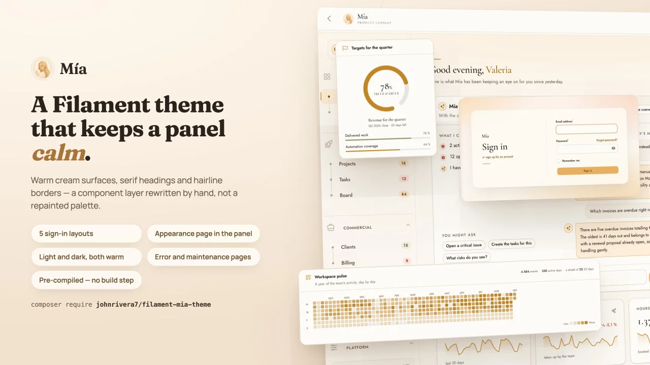
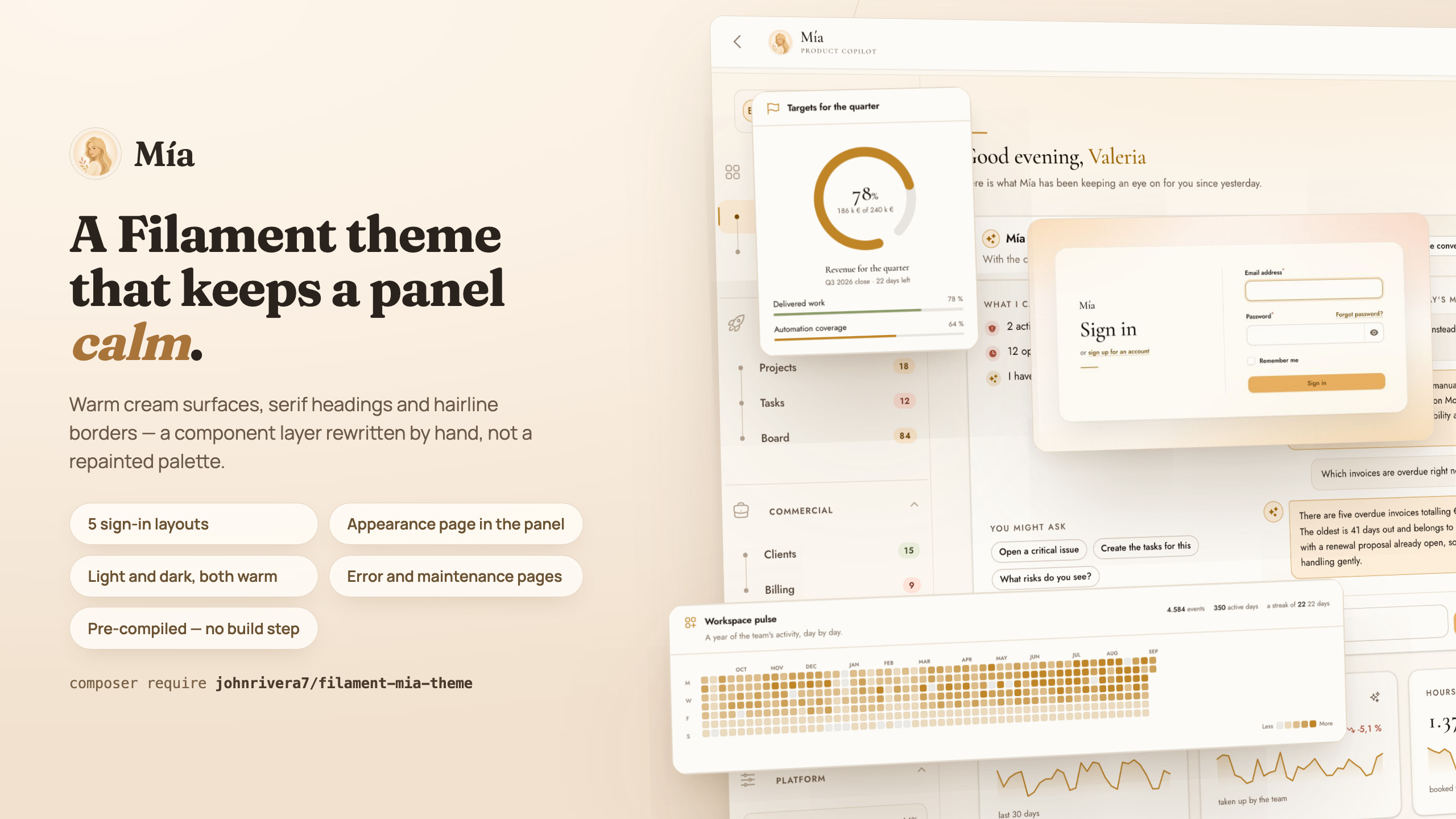
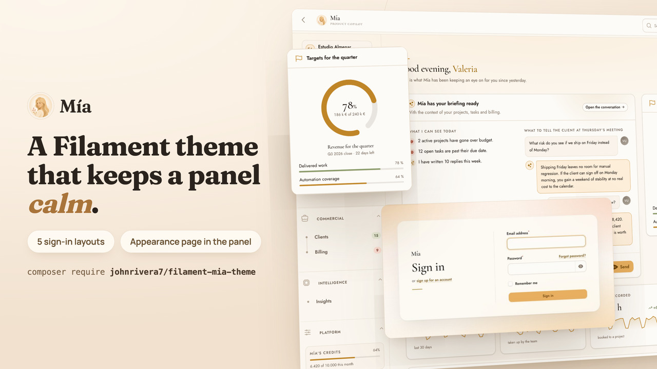
CommunityA warm theme for Filament v5 that looks after the parts other themes leave bare — empty states that say why a list is empty, error and maintenance pages that still feel like your panel, five sign-in layouts and an in-panel appearance page — over cream surfaces and serif headings, shipped pre-compiled with no build step.
 Author:
John Michael Rivera Gonzalez
Author:
John Michael Rivera Gonzalez
Package health
BetaAutomated checks of this plugin's Composer package
15 checks
- Passed: GitHub Actions pinned to SHA
- Skipped: GitLab CI includes pinned to SHA
- Passed: Open security advisories
- Passed: Dependabot PR responsiveness — No stale Dependabot PRs.
- Skipped: Renovate MR responsiveness
- Passed: Dependabot or Renovate configured
- Passed: Dependency update cooldown configured
- Passed: Provides a security policy
- Passed: Abandoned or archived — No consulted source marks the package abandoned (packagist, github).
- Passed: Commit and release recency — Active: last commit 0 days ago; last release 1 days ago.
-
Passed:
composer.lock not committed by library
—
composer.lockis absent from the released dist archive. - Passed: Dist archive is lean
-
Passed:
Current Laravel version supported
—
Package dependencies resolve together with current Laravel
13.0. -
Passed:
Current PHP version supported
—
Constraint
^8.4supports current PHP8.5. - Skipped: Current Symfony version supported
filament/
namespace. Review the source and install at your own risk. Found
malware or an unresolved security issue the author won't
address?
Report it
.
Documentation
- A warm theme for Filament v5
- What this is
- Screenshots
- Project status
- Requirements
- Installation
- Configuration
- Options at a glance
- Reference
- accentColor()
- secondaryColor()
- neutralColor()
- statusColors()
- font()
- monoFont()
- serifHeadings()
- roundness()
- density()
- elevation()
- motion()
- darkMode()
- sidebarWidth()
- viteStylesheets()
- loginLayout()
- loginTagline()
- customizer()
- customizerAuthorization()
- customizerNavigation()
- localeSwitcher()
- pageBuilder()
- pageBuilderAuthorization()
- pageBuilderNavigation()
- The collapsed sidebar
- Sign-in compositions
- The appearance page
- Languages
- The page builder
- Error pages and maintenance
- Accessibility
- Overridden Filament views
- Troubleshooting
- Development
- Where this is going
- Changelog
- Credits
- License

#A warm theme for Filament v5
It looks after the parts other themes leave bare — empty states that say why a
list is empty, error and maintenance pages that still feel like your panel,
five sign-in layouts, an in-panel appearance page and an optional builder for
the public page in front of it — over cream surfaces and serif headings,
shipped pre-compiled with no build step.








#What this is
Mía is not a palette swap. Feeding an accent colour into Filament's defaults changes the hue and leaves the rest of the design intact. Here every surface is set by hand — type scale, spacing, hierarchy, borders, shadows, motion, focus rings, empty states — and the stylesheet rewrites Filament's component layer rather than tinting it. Three things carry the result.
A real editorial voice. Headings are set in a high-contrast display serif and content in a geometric humanist sans. Column headings, group labels and stat captions are small, in caps and widely tracked. The result is a genuine typographic hierarchy instead of one weight repeated at three sizes.
A dark mode that is actually warm. Not a cool grey inversion — espresso, taupe and deep umber, built from the same neutral ramp as the light mode, so the two read as one design rather than two.
Restraint as a feature. Hairline borders at very low contrast, wide diffuse shadows tinted with the neutral rather than black, generous radii, and motion slow enough to feel deliberate. Empty states carry an illustration drawn for the theme instead of a stock outline icon.
It ships pre-compiled. There is no Node, Tailwind or build step to install.
#Screenshots
Every image on this page comes from the preview panel bundled with the package, on invented records seeded from a fixed number. Clone the repository and two commands reproduce the lot — including this page's frames, which is the point: a gallery that needs a separate application to regenerate stops matching the code it advertises.
#Before signing in
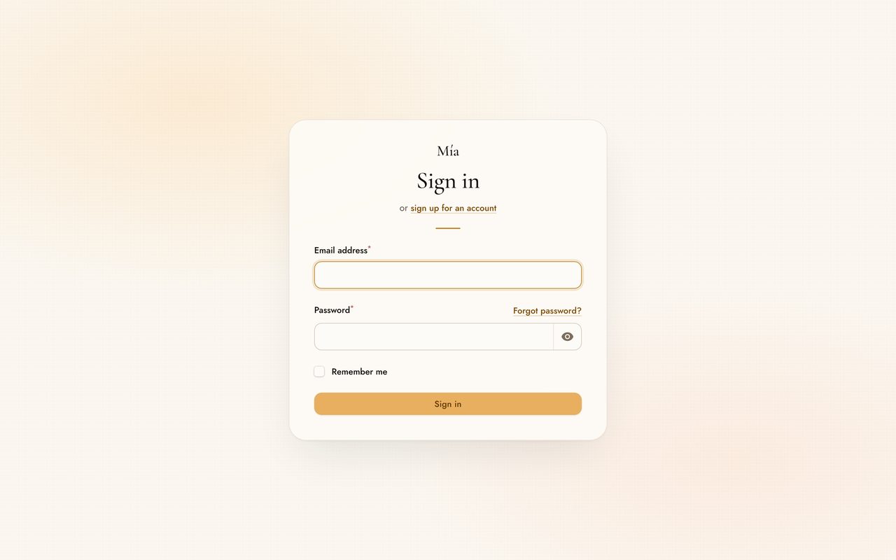
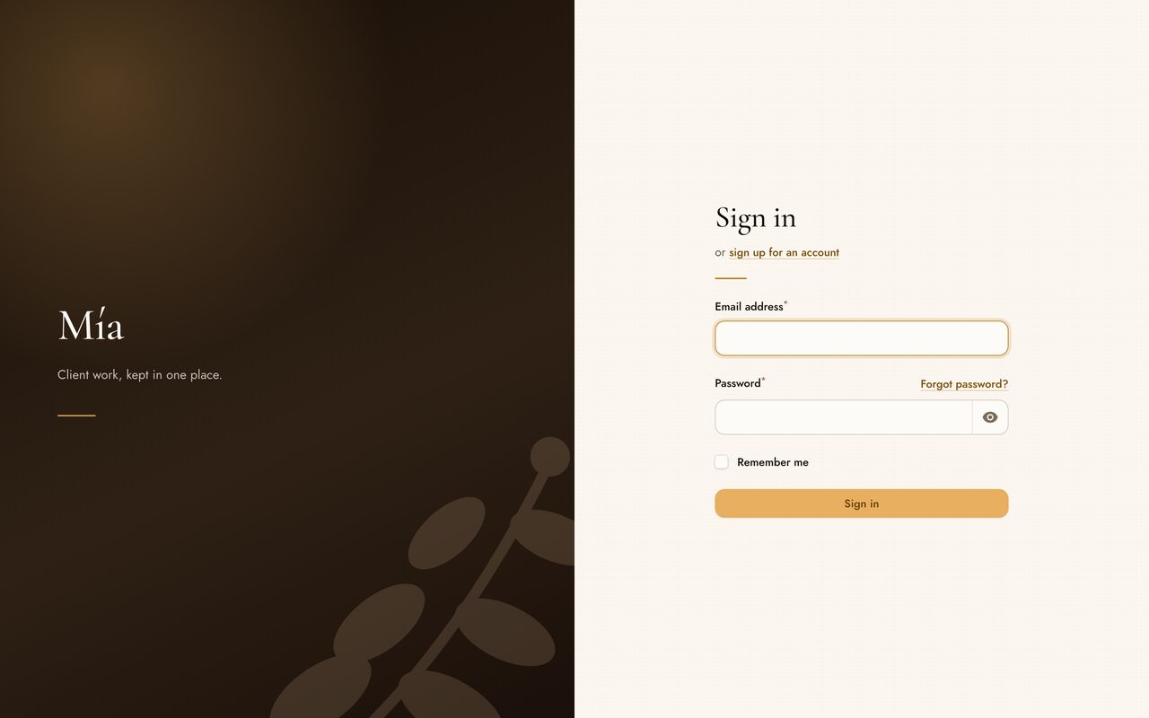
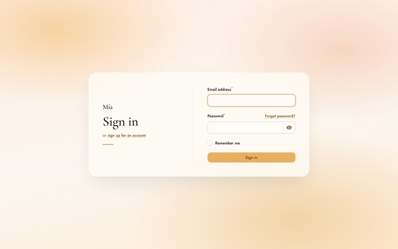
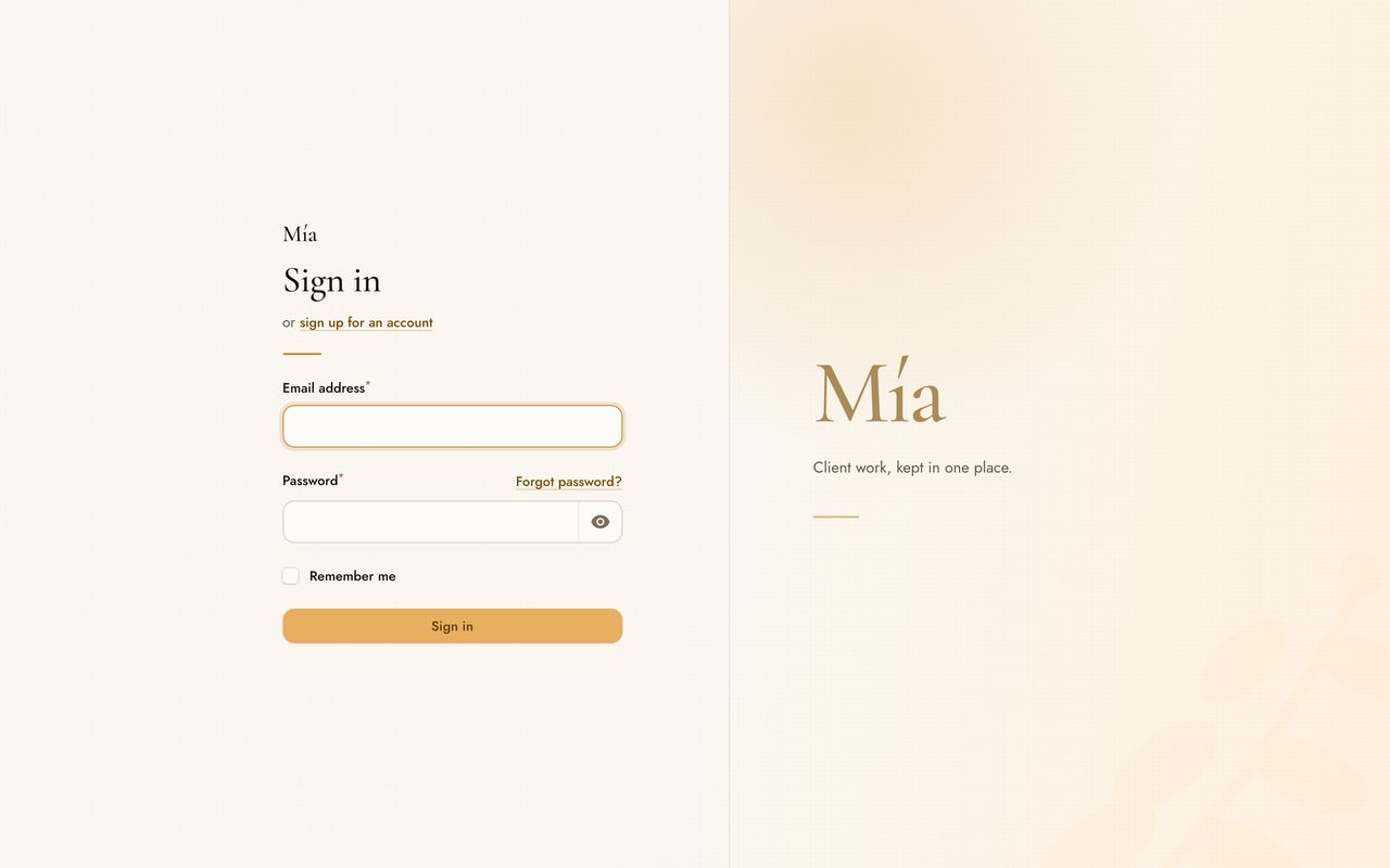
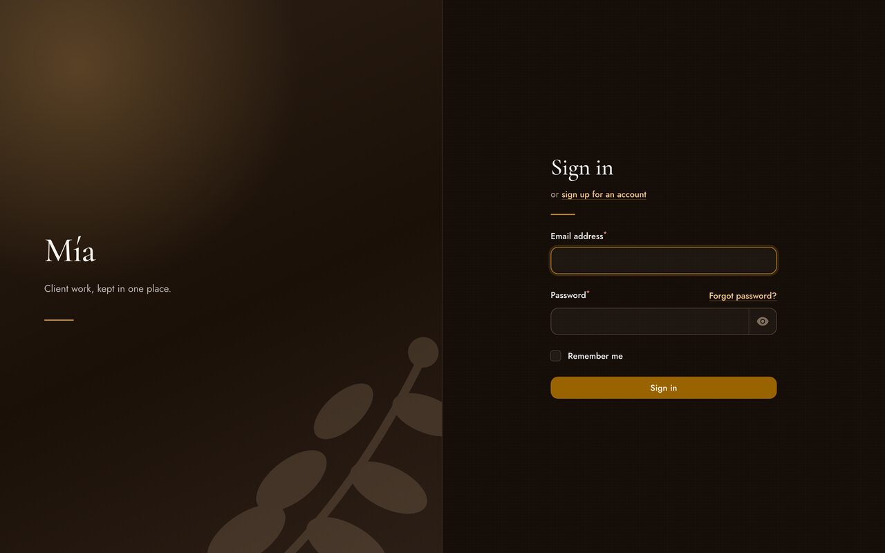
The sign-in screen is the only part of a panel a visitor sees without an account, so the theme ships five stagings of it. They differ in composition, not in identity — pick one in a line of configuration or from the appearance page.
 |
 |
| Centred card A single card on the canvas, over two soft pools of warm light. |
Split stage Two columns, one of them brand territory in a deep warm field. |
 |
 |
| Full bleed A warm field to every edge, the panel laid out across the screen on frosted glass. |
Editorial Asymmetric and print-like, with the facing side left as air. |
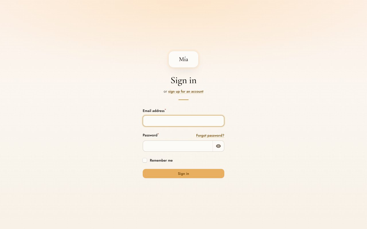 |
 |
| Portal A narrow, tall column with a brand medallion and no card edge. |
Dark mode The same composition in the warm dark palette. |
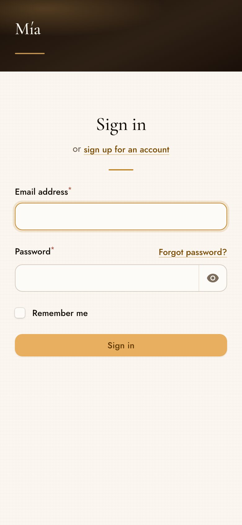
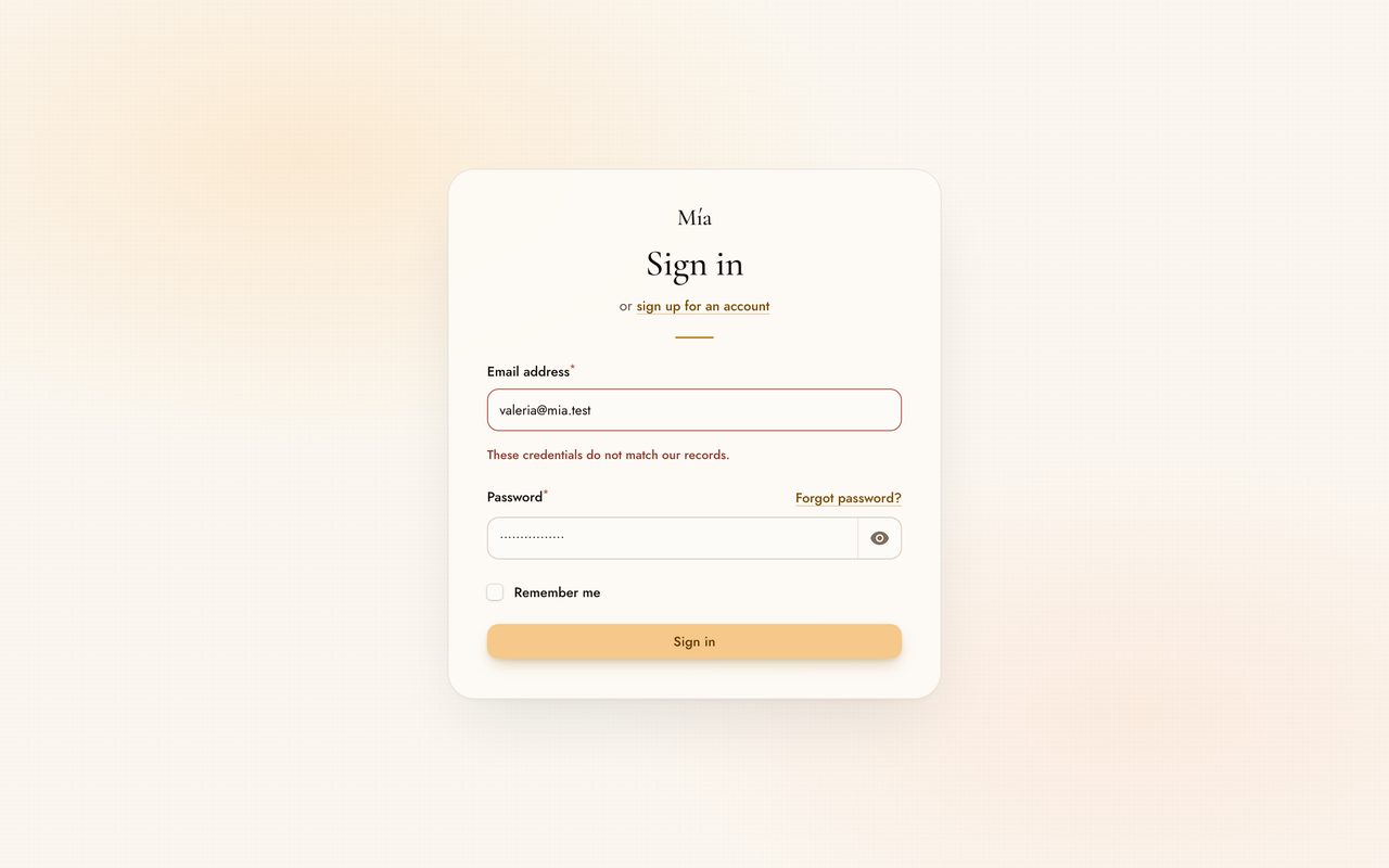
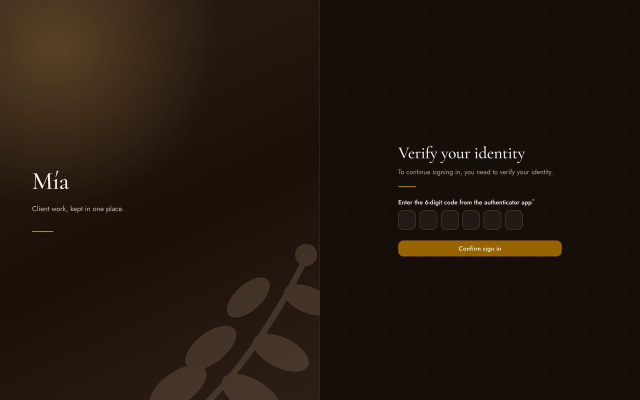
Every composition holds its shape in the states that actually happen — a validation error, a phone, a two-step challenge:
 |
 |
 |
| Folded The brand column becomes a banner. |
Wrong credentials The message takes a line; nothing reflows. |
Two steps The challenge keeps the staging. |
#Inside the panel
 |
 |
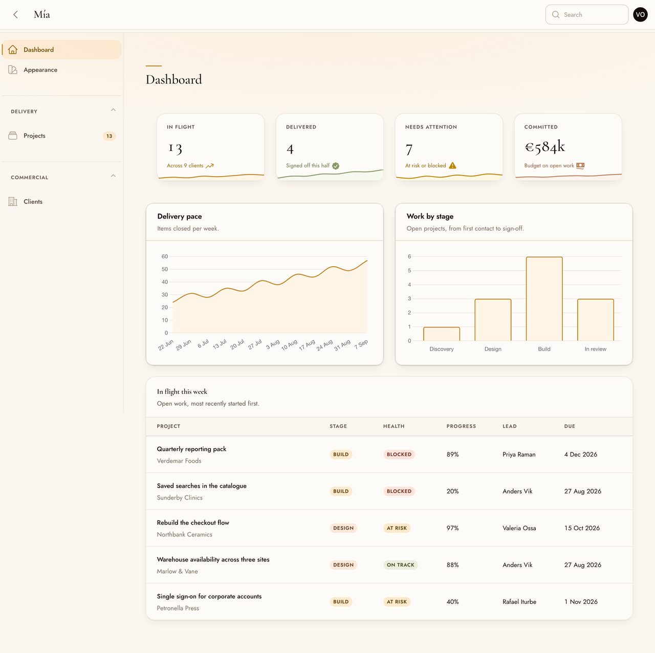
| Dashboard Widgets on barely differentiated surfaces, stat figures set in the display serif. |
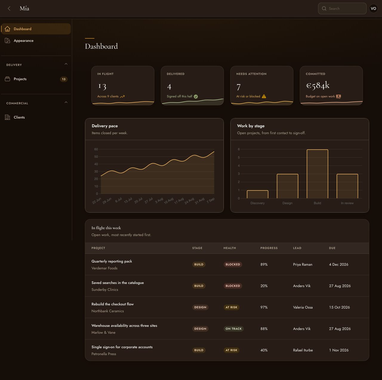
The same, dark Espresso and umber, built from the same neutral ramp as the light mode. |
 |
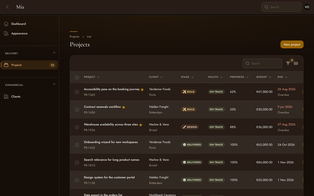 |
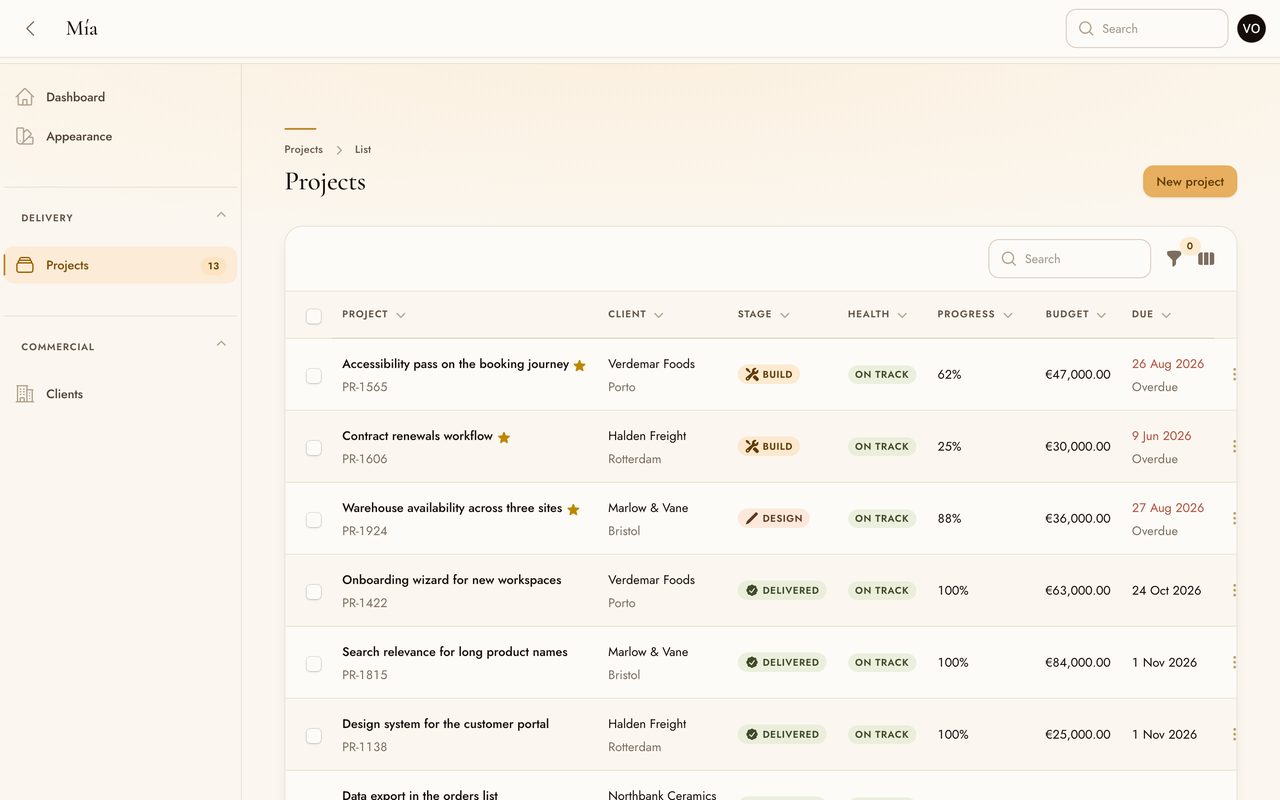
| Tables Column headings in small tracked caps, tabular figures, badges as tinted washes rather than pale pills. |
Density is a setting Row height and padding follow density(), so the same table can be airy or tight. |
 |
 |
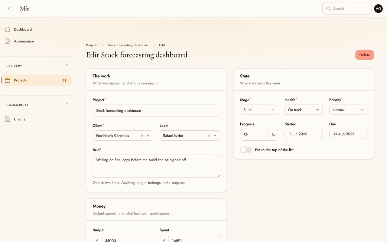
| Forms Inputs carry a hairline and a soft halo on focus, in place of Filament's ring. |
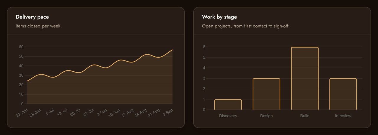
Charts Grid, axes and legend take the palette too, not just the series. How that works. |
 |
 |
 |
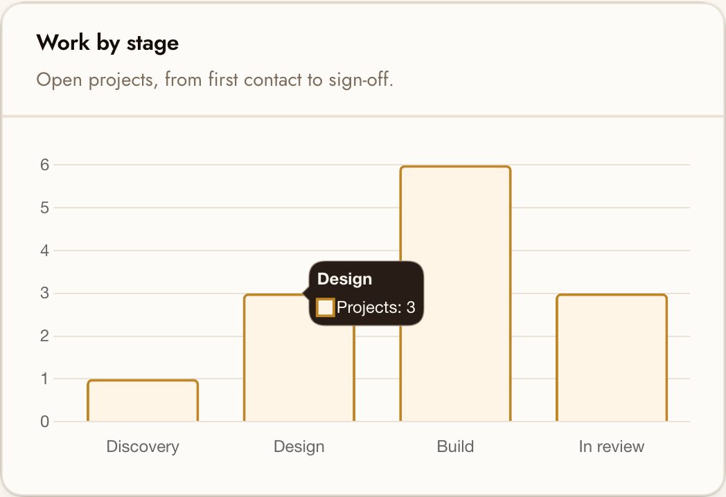
| Chart tooltip The same warm chip as every other tooltip, with corners from roundness(). |
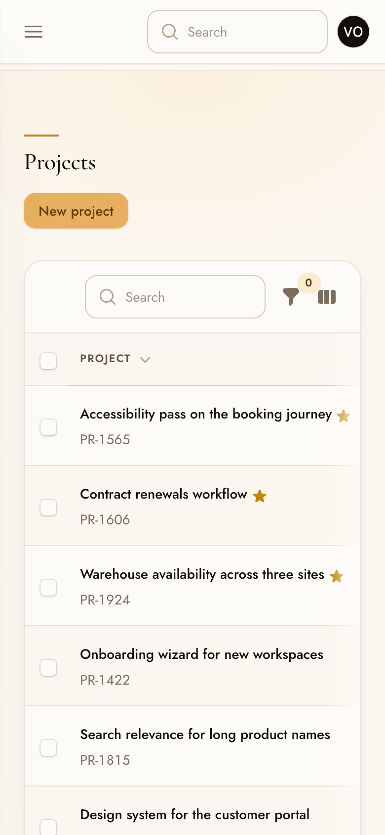
On a phone The sidebar collapses; the layout keeps its air. |
Tables on a phone Horizontal scroll, with the header treatment intact. |
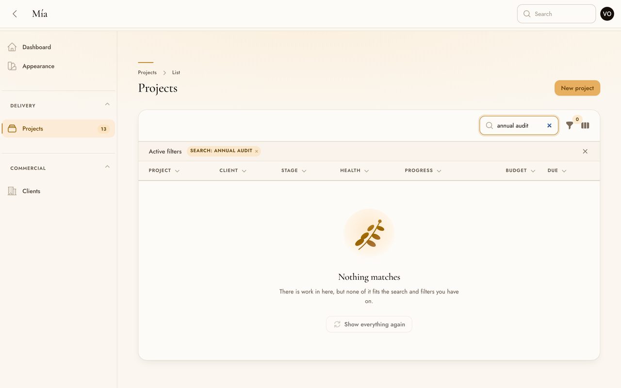
An empty state is a screen most panels meet and few design. This one is a list emptied by a search rather than by having nothing in it, which is the version that needs a way back rather than a way to start:
#When something goes wrong
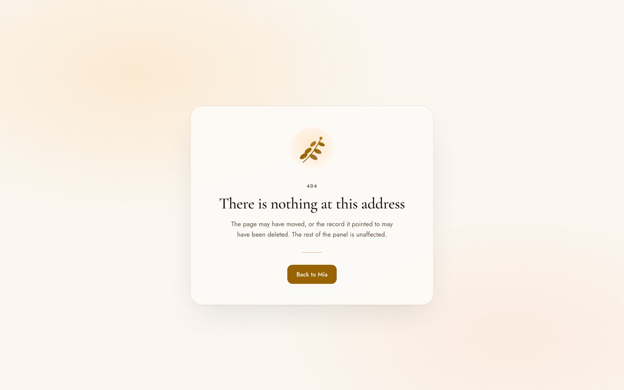
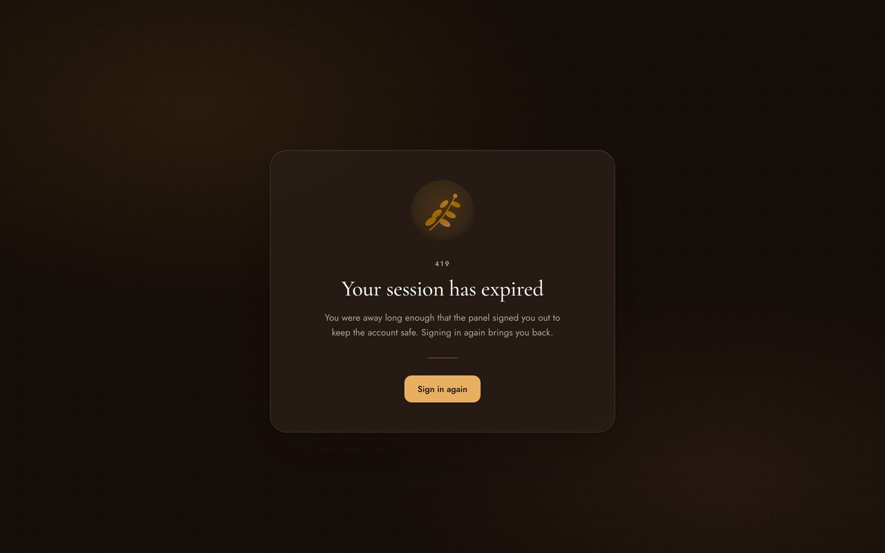
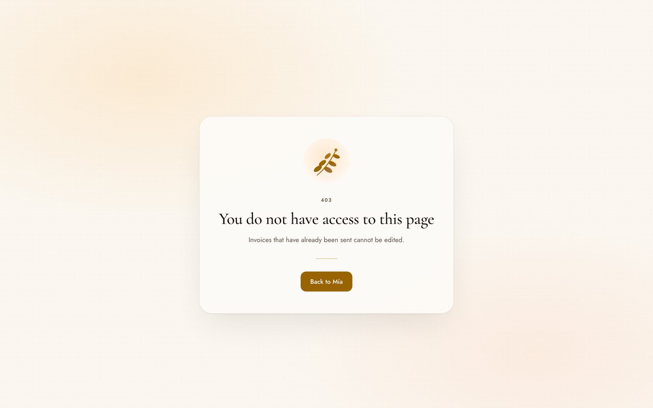
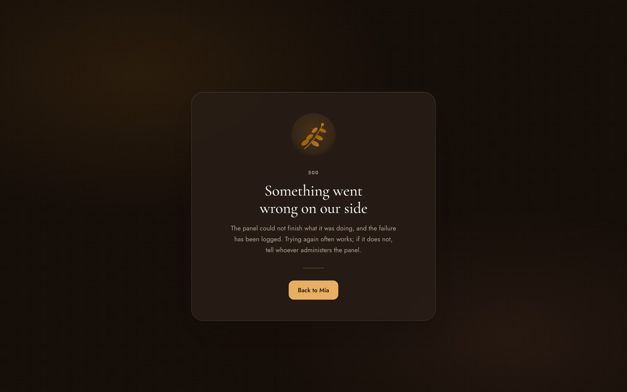
The screens a panel only shows on its worst day. Each one says what happened, whether anything was lost, and what to do next — and each carries its own way back, because an error page is the one place in a Filament application with no navigation around it. How to turn these on.
 |
 |
| 404 A missing address. The way back is labelled with the panel's own brand name. |
419, dark The session is gone, so this one points at the sign-in screen rather than the panel. |
 |
 |
| 403 When an AuthorizationException carries a message written for the person refused, it replaces the generic line. |
500, dark Nothing about the failure reaches the reader. A request identifier does, when the infrastructure set one. |
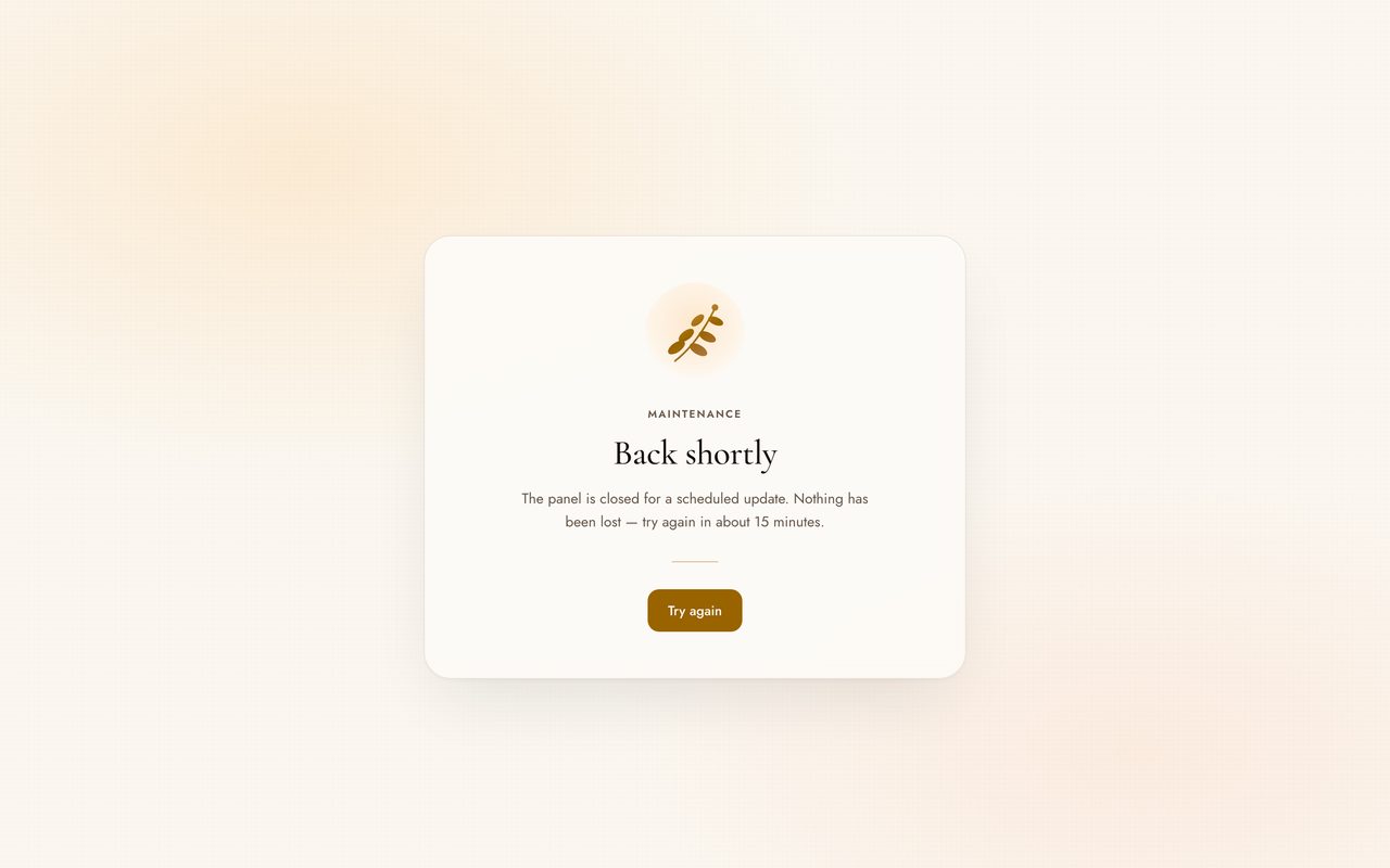
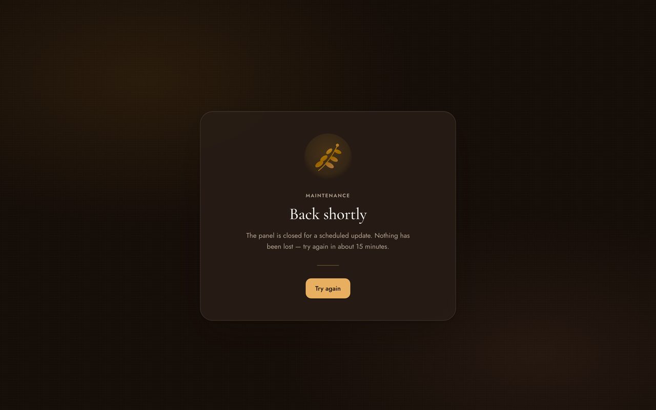
The maintenance page is the same card, served by an application that is not running:
 |
 |
Maintenance--retry in seconds becomes a sentence rather than a header nobody reads. |
The same, dark From prefers-color-scheme: there is no saved preference to read at this point. |
#The appearance page
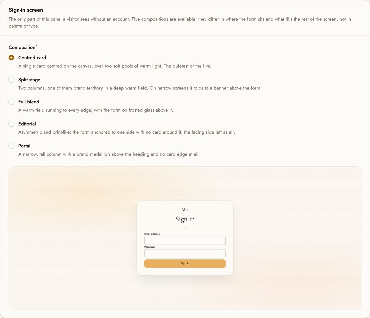
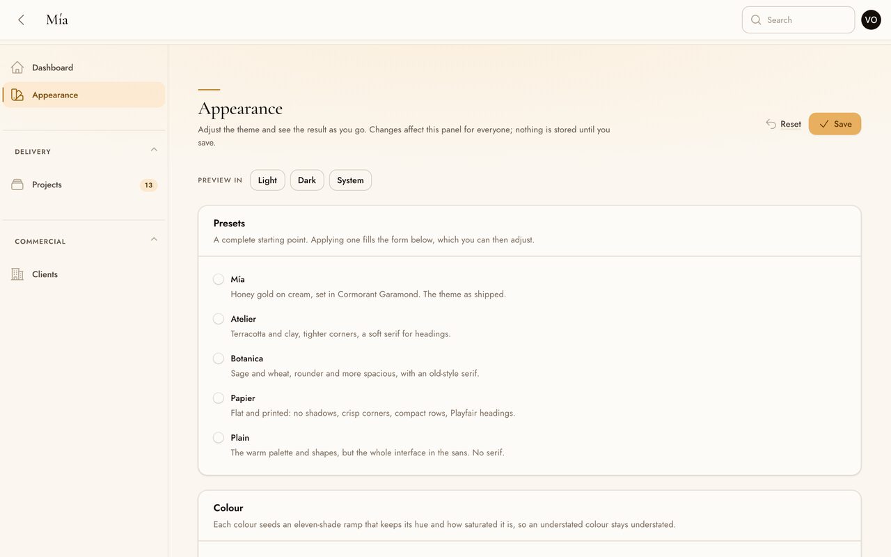
Colour, type, roundness, density and elevation, edited in the panel with a live preview. The sign-in composition is chosen here too, and previewed as the real layout rather than a diagram of one:
#Project status
Mía is a young project in active development, currently in the 0.x series.
What that means in practice. The theme is complete and usable: light and dark
mode are both finished, the configuration API is stable enough to build on, the
stylesheet ships pre-compiled and the suite runs against PHP 8.4 and 8.5.
What it does not mean is a frozen surface. Until 1.0 the option names, the
CSS custom properties and the set of restyled components may still change, and
minor releases can carry breaking changes. Each one is listed in the
changelog.
Iteration is frequent and feedback shapes it. If a component looks wrong in your panel, or a token you need is not exposed, open an issue — that is the fastest way to influence what lands next.
#Requirements
| PHP | 8.4 or 8.5 |
| Laravel | 11.28, 12 or 13 |
| Filament | 5.7 or later |
The constraint is ^8.4. Both versions in that range are tested rather than
assumed: every push runs the suite against 8.4 and 8.5, on the oldest and the
newest resolvable dependencies, with error_reporting=-1 so a deprecation,
notice or warning raised in the package fails the build. Deprecations from
inside Laravel or Filament are ignored, since they say nothing about this
package.
A live panel render was also exercised under PHP 8.5.8 under the same error reporting, which the suite alone does not cover.
The stylesheet is compiled with Tailwind CSS v4.3 and committed to the repository. Tailwind is a development dependency of this package only — your application never needs it.
#Installation
composer require johnrivera7/filament-mia-theme
Renamed from johnrivera7/filament-mia
The package was johnrivera7/filament-mia up to and including v0.1.0, and
was renamed before it had any installations. If you are one of the few who
took the old name, change it in composer.json and republish the stylesheet,
which now lands under the new package's directory:
composer remove johnrivera7/filament-mia
composer require johnrivera7/filament-mia-theme
php artisan filament:assets
Nothing else changes. The PHP namespace is still JohnRivera7\FilamentMia,
and the config file, the view and translation namespaces, the publish tags and
the plugin's own identifier are all untouched — so imports, published
overrides and saved appearance settings carry over as they are.
Not on Packagist under the new name yet
Until the rename is submitted, add the repository directly:
composer config repositories.filament-mia vcs https://github.com/Johnrivera7/filament-mia-theme
composer require johnrivera7/filament-mia-theme
Publish the compiled stylesheet into public/:
php artisan filament:assets
Register the plugin on your panel:
use JohnRivera7\FilamentMia\MiaTheme;

public function panel(Panel $panel): Panel
{
    return $panel
        // ...
        ->plugin(MiaTheme::make());
}
Then add the published directory to your .gitignore, since it is build output
that filament:assets regenerates:
/public/css/johnrivera7
If your panel calls
->viteTheme(...), remove it. Filament givesviteThemeunconditional precedence overtheme, so the theme is silently ignored while it is there. See Troubleshooting.
#Configuration
Every option is available fluently on the plugin, and as a default in a config file. The fluent call wins.
->plugin(
    MiaTheme::make()
        ->accentColor('#C9A227')
        ->secondaryColor('#E8C4C0')
        ->font('Jost', 'Cormorant Garamond')
        ->roundness('soft')
        ->density('comfortable')
        ->elevation(0.75)
        ->motion()
        ->darkMode(),
)
To set project-wide defaults instead:
php artisan vendor:publish --tag=filament-mia-config
#Options at a glance
| Method | Default | Config key |
|---|---|---|
accentColor() |
#D9A14E |
colors.accent |
secondaryColor() |
#E4A987 |
colors.secondary |
neutralColor() |
null — the theme's warm ramp |
colors.neutral |
statusColors() |
warmed defaults | colors.danger colors.info colors.success colors.warning |
font() |
Jost, Cormorant Garamond |
fonts.sans fonts.serif |
monoFont() |
null — the system stack |
fonts.mono |
serifHeadings() |
true |
typography.serif_headings |
roundness() |
soft |
roundness |
density() |
comfortable |
density |
elevation() |
1.0 |
elevation |
motion() |
true |
motion |
darkMode() |
true |
dark_mode |
sidebarWidth() |
17rem |
sidebar_width |
viteStylesheets() |
[] |
vite_stylesheets vite_build_directory |
loginLayout() |
card |
login.layout |
loginTagline() |
null |
login.tagline |
customizer() |
false |
customizer.enabled |
customizerAuthorization() |
null — anyone who can reach the panel |
— |
customizerNavigation() |
ungrouped | customizer.navigation_group customizer.navigation_sort |
localeSwitcher() |
false — no switcher |
locales |
pageBuilder() |
false |
page_builder.enabled page_builder.path |
pageBuilderAuthorization() |
null — anyone who can reach the panel |
— |
pageBuilderNavigation() |
ungrouped | page_builder.navigation_group page_builder.navigation_sort |
#Reference
Everywhere a colour is accepted, the accepted formats are hex (#RGB or
#RRGGBB), rgb(r, g, b), a bare r, g, b triplet, or oklch(l c h).
Anything else throws InvalidThemeOption at boot.
#accentColor()
public function accentColor(string $color): static
The accent that carries buttons, links, focus rings and active states.
MiaTheme::make()->accentColor('#C9A227')
#secondaryColor()
public function secondaryColor(string $color): static
A supporting colour, available to any component as ->color('secondary').
MiaTheme::make()->secondaryColor('#E8C4C0')
#neutralColor()
public function neutralColor(?string $color): static
Page backgrounds, surfaces, borders and body copy are all built from the
neutral. null keeps the theme's curated warm ramp, which is tuned so light
mode reads as cream and dark mode as espresso — replace it only if you want a
different temperature throughout.
MiaTheme::make()->neutralColor('#8A7D6D')
#statusColors()
public function statusColors(
    ?string $danger = null,
    ?string $info = null,
    ?string $success = null,
    ?string $warning = null,
): static
Status colours, warmed by default so they sit inside the palette instead of cutting across it with stock blues and greens. Any argument left out keeps its default. Use named arguments.
MiaTheme::make()->statusColors(danger: '#C1614F', success: '#8A9A6B')
#font()
public function font(string $sans, ?string $serif = null): static
The interface sans, and optionally the display serif. Families are served from Bunny Fonts, which sets no cookies and logs no IP addresses. Give plain family names as spelled there, without quotes or CSS fallbacks.
MiaTheme::make()->font('Outfit', 'Fraunces')
Only the configured families are downloaded. Filament links its own Inter stylesheet on every page and there is no supported way for a theme to withdraw it, so that request remains — but nothing in the theme references Inter, so the browser fetches no Inter binary. On a page set to the defaults that is three files: two weights of Jost and one of Cormorant Garamond.
#monoFont()
public function monoFont(?string $family): static
An optional monospace family. null keeps the system stack.
MiaTheme::make()->monoFont('JetBrains Mono')
#serifHeadings()
public function serifHeadings(bool $condition = true): static
Whether page, modal, brand and empty-state headings use the serif family.
false keeps the whole interface in the sans, for a quieter panel.
MiaTheme::make()->serifHeadings(false)
#roundness()
public function roundness(Roundness|string $roundness): static
Accepts sharp, subtle, soft or round, or the matching
Roundness enum case. Applied over Tailwind's own --radius-* scale, so it
retunes every rounded-* utility already compiled into the stylesheet.
use JohnRivera7\FilamentMia\Enums\Roundness;

MiaTheme::make()->roundness(Roundness::Sharp)
#density()
public function density(Density|string $density): static
Accepts compact, comfortable or spacious, or the matching Density enum
case. Scales padding, gaps and table row height together.
MiaTheme::make()->density('compact')
#elevation()
public function elevation(float $scale): static
Multiplier for the shadow system, from 0.0 to 2.0. Shadows stay wide,
diffuse and tinted with the neutral rather than black at any value. 0.0
declares no shadow at all, for a completely flat interface.
MiaTheme::make()->elevation(0.0)
#motion()
public function motion(bool $condition = true): static
Entry animations and hover micro-interactions. Independent of
prefers-reduced-motion, which the theme always honours regardless of this
setting.
MiaTheme::make()->motion(false)
#darkMode()
public function darkMode(bool $condition = true): static
Whether the panel offers the light and dark switch.
MiaTheme::make()->darkMode(false)
#sidebarWidth()
public function sidebarWidth(string $width): static
Any CSS length. The default 17rem is narrower than Filament's 20rem, which
crowds the content column on smaller laptops.
MiaTheme::make()->sidebarWidth('19rem')
#viteStylesheets()
public function viteStylesheets(string|array $paths, ?string $buildDirectory = null): static
One or more of your application's own Vite entrypoints, loaded after the theme and alongside it. See Tailwind utilities in your own views for why this exists and what to put in the file.
MiaTheme::make()->viteStylesheets('resources/css/filament/admin/utilities.css')
#loginLayout()
public function loginLayout(LoginLayout|string $layout): static
Which of the five sign-in compositions the panel uses.
Accepts a case of JohnRivera7\FilamentMia\Enums\LoginLayout or its string
value: card, split, bleed, editorial, portal. Anything else throws
InvalidThemeOption at boot.
The setting covers the whole authentication flow — sign-in, registration, password reset and the multi-factor challenge — so a panel does not change shape halfway through logging in.
MiaTheme::make()->loginLayout('split')
#loginTagline()
public function loginTagline(?string $tagline): static
A line of copy for the brand stage. Only the split and editorial
compositions have somewhere to put it; the others ignore it. Whitespace is
collapsed to a single line and the value is capped at 120 characters, because
it shares its space with type set at display size.
MiaTheme::make()->loginLayout('split')->loginTagline('Client work, kept in one place.')
#customizer()
public function customizer(bool $condition = true): static
Adds the appearance page to the panel. Off by default.
MiaTheme::make()->customizer()
#customizerAuthorization()
public function customizerAuthorization(Closure $callback): static
Decides who may open the appearance page. Without it, anyone who can reach the panel can open it, and what they save applies to everyone. The callback runs on every navigation build, so keep it cheap.
MiaTheme::make()
    ->customizer()
    ->customizerAuthorization(fn (): bool => auth()->user()?->isAdmin() ?? false)
#customizerNavigation()
public function customizerNavigation(
    string|UnitEnum|null $group = null,
    ?int $sort = null,
    string|BackedEnum|null $icon = null,
): static
Where the page sits in the navigation. The icon defaults to a swatch.
MiaTheme::make()
    ->customizer()
    ->customizerNavigation(group: 'Settings', sort: 90)
#localeSwitcher()
public function localeSwitcher(array|bool $locales = ['en', 'es']): static
Offers a language switcher in the user menu and applies the choice to the panel. Off by default. See Languages for what it changes and when to leave it off.
MiaTheme::make()->localeSwitcher()                          // English, Español
MiaTheme::make()->localeSwitcher(['en', 'es', 'pt_BR'])
MiaTheme::make()->localeSwitcher(['en' => 'English (US)', 'es'])
#pageBuilder()
public function pageBuilder(bool $condition = true, ?string $path = null): static
Adds the page builder to the panel and serves what it
builds at $path. Off by default; see that section before switching it on,
because this is the one option that adds a table and a public address.
MiaTheme::make()->pageBuilder()                 // served at /
MiaTheme::make()->pageBuilder(path: 'welcome')  // served at /welcome
#pageBuilderAuthorization()
public function pageBuilderAuthorization(Closure $callback): static
Decides who may edit the public page. Without it, anyone who can reach the panel can publish to the open internet, which is rarely what you want. The callback runs on every navigation build, so keep it cheap.
MiaTheme::make()
    ->pageBuilder()
    ->pageBuilderAuthorization(fn (): bool => auth()->user()?->isAdmin() ?? false)
#pageBuilderNavigation()
public function pageBuilderNavigation(
    string|UnitEnum|null $group = null,
    ?int $sort = null,
    string|BackedEnum|null $icon = null,
): static
Where the page sits in the navigation. The icon defaults to a globe.
MiaTheme::make()
    ->pageBuilder()
    ->pageBuilderNavigation(group: 'Settings', sort: 80)
#The collapsed sidebar
A panel registered with sidebarCollapsibleOnDesktop() has a second
navigation layout, not a narrower version of the first one. At the collapsed
width there is room for one centred target per row and for nothing else, so
the question each piece of sidebar content has to answer is not whether it
fits but whether it is a target.
The theme answers it the same way for everything in the rail:
- Navigation reduces to icons, all on the rail's centre line — including the expand control in the header, the user menu and the notification bell, which are laid out from the same centre rather than from their own.
- A navigation group with an icon keeps its items, in the dropdown Filament opens beside the rail.
- Anything an application adds through
SIDEBAR_START,SIDEBAR_NAV_START,SIDEBAR_NAV_ENDorSIDEBAR_FOOTERis not shown.
The last one is the deliberate part. A credit meter, a workspace switcher or a search field has a label, a figure and a control in it, and none of the three survive being squeezed into the rail: they wrap into a column one word wide and paint the remainder over the canvas. It is also the answer Filament already gives its own non-target chrome — the logo, the tenant menu and sidebar global search all disappear when the sidebar closes — so the rail ends up with one criterion instead of two.
Nothing becomes unreachable. The expand control is in the topbar, or in the sidebar header itself when the panel has no topbar, and the block is back one click later.
#Giving a block a rail form
Where a compact form does make sense, supply one. The theme reads two classes:
| Class | In the rail | Expanded |
|---|---|---|
fi-mia-rail-only |
Shown, centred and clipped to the rail | Hidden |
fi-mia-rail-hidden |
Hidden | Shown |
{{-- Both live in the same SIDEBAR_FOOTER hook. --}}
<div class="px-4 pb-4 pt-2">
    {{-- The full meter: label, figures, progress bar. --}}
</div>

<div class="fi-mia-rail-only">
    <span class="mia-kicker">64%</span>
</div>
The full block needs no class of its own if it is what the render hook
returns, since it is hidden by the rule above. fi-mia-rail-hidden is for the
case where it sits nested inside a wrapper that has to stay.
Both classes are plain CSS in the theme's stylesheet, so they work in a pre-compiled theme without a build step of your own.
bin/responsive-shots.mjs is what checks this. It walks a phone in both
orientations, a tablet, a narrow desktop and a wide one, collapses and expands
the sidebar at each, and reports every element inside the sidebar whose box
ends past the rail's edge along with the centre line each of its targets sits
on — a rail with more than one centre line is the symptom that some of its
content is still being laid out for the expanded column.
#Sign-in compositions
The sign-in screen is the only part of a panel a visitor sees without an account, so the theme ships five stagings of it rather than one. They differ in composition — where the form sits and what occupies the rest of the viewport — not in identity. Palette, type pairing and shape treatment are the same across all five.
| Value | Composition |
|---|---|
card |
A single card centred on the canvas, over two soft pools of warm light. The quietest of the five, and the default. |
split |
Two columns. One is brand territory — a deep warm field carrying the logo, the panel name and an optional line of copy — and the other holds the form, uncarded, on the cream canvas. |
bleed |
A warm field running to every edge. The panel is laid out across the screen on frosted glass: brand and heading in one half, fields in the other, divided by a hairline. |
editorial |
Asymmetric and print-like. The form is anchored to one side with no card around it, and the facing side is left as air with the panel name at display size. |
portal |
A narrow, tall column, centred, with a brand medallion above the heading and no card edge at all. The canvas grades vertically. |
Choose one when registering the plugin:
->plugin(
    MiaTheme::make()
        ->loginLayout('split')
        ->loginTagline('Client work, kept in one place.'),
)
Or from the appearance page, which previews the choice before it is saved. The preview is the real layout rather than a diagram of one: it renders the same markup with the same stylesheet, so what is on screen is what visitors will get.
The choice applies to the whole authentication flow. Registration, password recovery and the multi-factor challenge all take the same staging, so a panel does not change shape between entering a password and confirming a code.
Nothing needs configuring. With no settings at all the panel gets the
card composition, which is already a long way from Filament's default box.
#What happens on a phone
The two-column compositions are the ones that break on narrow screens, so each states what it does rather than leaving it to the grid:
splitfolds the brand column into a short banner above the form, keeping the logo, the panel name and the accent rule, and dropping the tagline and the botanical mark — both need width to read as anything but clutter.editorialdrops the facing side entirely. It is ornament, and stacking it under the form would only add scroll.bleedbecomes a single column, and the glass panel returns to a card.cardandportalare single-column already.
The carded compositions keep their corner radius at phone widths, with a small margin to show it against, where Filament runs the card edge to edge.
#Accessibility of the compositions
Contrast on these screens is measured from rendered pixels rather than calculated from the palette. Two of the compositions put text over a gradient and one puts it over frosted glass, and a ratio computed against a nominal background would not be a measurement of anything.
bin/contrast-login.mjs walks all five in both colour modes, with a validation
error on screen, and for every piece of text takes the computed colour, hides
the glyphs, photographs the box they occupied and averages what is behind them.
48 pairs, all clearing WCAG AA — headings against the 3:1 that 1.4.3 allows
large text, everything else against 4.5:1.
That measurement is also what caught the two failures it now guards against: muted text and link actions both sat around 4.1:1 on the cream once the warm gradients behind the page were actually painted, while passing comfortably against the flat background the palette-level report assumes.
Entry motion is a single fade and rise, disabled under prefers-reduced-motion
along with everything else the theme animates. The backgrounds are static
gradients — nothing animates continuously.
#The appearance page
An optional page inside the panel for editing the theme and saving the result, for the case where whoever decides how the panel looks is not the person who deploys it.
It edits accent, secondary and status colours; the interface and heading families; roundness, density and elevation; the sign-in composition and its line of copy; and it carries five presets — Mía, Atelier, Botanica, Papier and Plain. A specimen of the components the settings affect most sits below the form.
The sign-in composition is the one setting whose result is not visible from the page, since it changes a screen only people who are not signed in ever see, so it gets a live preview of its own. That preview renders the real simple layout with the real marker element, under the compiled stylesheet — not a wireframe of it — and it redraws as the choice changes without waiting for a round trip.
The font list is short on purpose. The theme sets headings at sizes and tracking that most families do not survive, so the page offers ten of each, all confirmed to be served by Bunny Fonts:
| Interface | Jost, Outfit, Manrope, Nunito Sans, DM Sans, Figtree, Plus Jakarta Sans, Urbanist, Karla, Work Sans |
| Headings | Cormorant Garamond, Playfair Display, Fraunces, EB Garamond, Lora, Crimson Pro, Bodoni Moda, DM Serif Display, Spectral, Newsreader |
This list constrains the page only. font() accepts any family Bunny
Fonts serves.
Turn it on with customizer() and restrict it with
customizerAuthorization().
->plugin(
    MiaTheme::make()
        ->customizer()
        ->customizerAuthorization(fn (): bool => auth()->user()?->isAdmin() ?? false)
        ->customizerNavigation(group: 'Settings'),
)
#The preview is the result
Every control writes a custom property the compiled stylesheet already reads, and the same code paints the preview and the saved panel, so what is on screen before saving is what the panel becomes after. Nothing in the page can generate a Tailwind class — that is the constraint that makes a pre-compiled theme configurable at all.
#Where the settings are stored, and for whom
Per panel, shared by everyone who uses it. How a panel looks is a property of the panel, in the same way its logo is; it is not a per-user preference. Two panels in one application keep separate records.
The exception is light and dark mode, which Filament already stores per browser and which the page only offers as a way to preview both.
Records are written as JSON under storage/app/filament-mia/, one file per
panel. That is the default because it needs no migration: the package installs
into an existing project and works. The trade-off is local disk, so on several
application servers, or on a platform with an ephemeral filesystem, bind your
own repository:
use JohnRivera7\FilamentMia\Settings\Contracts\SettingsRepository;

$this->app->singleton(SettingsRepository::class, DatabaseSettingsRepository::class);
The contract is three methods — get(), put() and forget(), all keyed by
panel id — so storing settings per user, per tenant or in a shared cache is a
matter of implementing it.
#Precedence
A saved record wins over both the config file and the fluent API. It has to: it is the most recent deliberate decision, and a panel that ignored what an administrator just saved would be broken. The page's reset action discards the record and returns the panel to your code.
A saved record applies whether or not the page is currently enabled, so turning the page off freezes the appearance rather than reverting it. A record that has been hand-edited into an invalid state is ignored rather than thrown, so a bad value cannot lock you out of the page that would fix it.
#How the options reach the browser
Colours are resolved per request and emitted as OKLCH custom properties, and
non-colour settings as --mia-* properties scoped to .fi-panel-{id}. Nothing
here requires a rebuild, and two panels in one application can be configured
differently.
The panel below is the same page, and the same compiled stylesheet, as the light mode screenshot above — reconfigured with nothing but a fluent call:
MiaTheme::make()
    ->accentColor('#7C6A9C')
    ->roundness('sharp')
    ->density('compact')
    ->elevation(0.0)
    ->serifHeadings(false)
#Custom properties
These are part of the theme's public surface. Read them to make your own
components match, or redeclare them on .fi-body to adjust something the
options do not cover. All are set for both colour modes.
| Property | What it holds |
|---|---|
--mia-canvas |
The page background |
--mia-surface |
Cards, tables, modals |
--mia-surface-sunken |
Recessed areas — modal footers, fieldsets |
--mia-surface-raised |
Floating surfaces — dropdowns, notifications |
--mia-ink |
Body copy and headings |
--mia-ink-muted |
Secondary and supporting text |
--mia-hairline |
Decorative borders and dividers |
--mia-hairline-strong |
Borders on interactive controls, which must clear 3:1 |
--mia-accent-wash |
The tinted background of active and selected states |
--mia-accent-line |
The accent at border strength |
--mia-radius-xs … --mia-radius-3xl |
The radius scale, set by roundness() |
--mia-density |
The spacing multiplier, set by density() |
--mia-row-height |
Minimum table row height |
--mia-section-gap |
Vertical rhythm between sections |
--mia-shadow-sm … --mia-shadow-xl |
The shadow scale, set by elevation() |
--mia-ease |
The theme's easing curve |
--mia-duration |
Standard transition duration |
--mia-duration-slow |
Slower transitions, for larger movements |
--mia-anim-duration |
Entry animations |
--mia-heading-font |
The heading family, set by serifHeadings() |
--mia-heading-weight |
Heading weight |
--mia-heading-tracking |
Heading letter-spacing |
--mia-chart-line-tension |
Curvature of a chart line, set by roundness() |
--mia-chart-bar-radius |
Bar corner radius in pixels, set by roundness() |
--mia-chart-tooltip-radius |
Chart tooltip corner radius in pixels, set by roundness() |
--mia-chart-legend-swatch-radius |
Legend swatch corner radius in pixels, set by roundness() |
Reference them with a fallback, as the theme's own stylesheet does, so your component still renders if a property is ever renamed:
.my-panel {
    background-color: var(--mia-surface);
    border: 1px solid var(--mia-hairline);
    border-radius: var(--mia-radius-2xl, 1.25rem);
    box-shadow: var(--mia-shadow-md);
    transition: box-shadow var(--mia-duration, 260ms) var(--mia-ease, ease);
}
#Charts
A chart is painted onto a bare canvas, so no stylesheet reaches it directly. Filament bridges that with a set of empty elements whose computed colour the chart component reads and hands to Chart.js, reapplying it when the colour mode changes. The theme claims them, which puts the grid, the axes, the legend and the tooltip in its own palette instead of Filament's greys — the difference is most obvious in dark mode.
Two of those elements are deliberately left alone: -bg-color and
-border-color carry the colour of each individual widget, so a theme that
overrode them would paint every series in a panel the same.
The numbers Chart.js reads are derived from roundness() rather than fixed, so
bars, line curvature, legend swatches and the chart tooltip follow the corner
treatment of everything around them — including a change made from the
appearance page, with no rebuild.
roundness() |
Line tension | Bar radius | Tooltip radius |
|---|---|---|---|
sharp |
0 |
0 |
4 |
subtle |
0.2 |
2 |
8 |
soft |
0.35 |
4 |
12 |
round |
0.45 |
8 |
18 |
Override any of it per widget in the usual way, from getOptions(), which
takes precedence over the properties the theme sets.
#Skeleton placeholders
The theme also publishes one class, for loading states in your own views. It
carries the warm shimmer used by Filament's deferred sections, and stops
animating under prefers-reduced-motion:
<div class="fi-skeleton" style="height: 1rem; width: 60%"></div>
A colour you pass is expanded into an eleven-shade ramp that preserves its hue and its saturation character, so an understated colour stays understated rather than being pushed to full chroma.
Invalid input throws InvalidThemeOption at boot. This is deliberate:
Filament converts colours without validating them, so an unparseable value
would otherwise produce a black palette and no error at all.
#Tailwind utilities in your own views
A pre-compiled theme can only contain the utility classes Filament itself uses. It cannot know about classes in your Blade views, because those files do not exist when the theme is built. If you write Tailwind utilities in your own Filament views, compile them yourself and hand the entrypoint over:
->plugin(
    MiaTheme::make()->viteStylesheets('resources/css/filament/admin/utilities.css'),
)
/* resources/css/filament/admin/utilities.css */
@import 'tailwindcss/theme.css' layer(theme);
@import 'tailwindcss/utilities.css' layer(utilities);

@source '../../../../app/Filament';
@source '../../../../resources/views/filament';
Only the theme and utility layers are imported: pulling in the whole of
tailwindcss would re-apply Preflight on top of the theme's base layer. The
stylesheet is emitted after the theme and alongside it — do not use
Panel::viteTheme() for this, as it would replace the theme outright.
#Languages
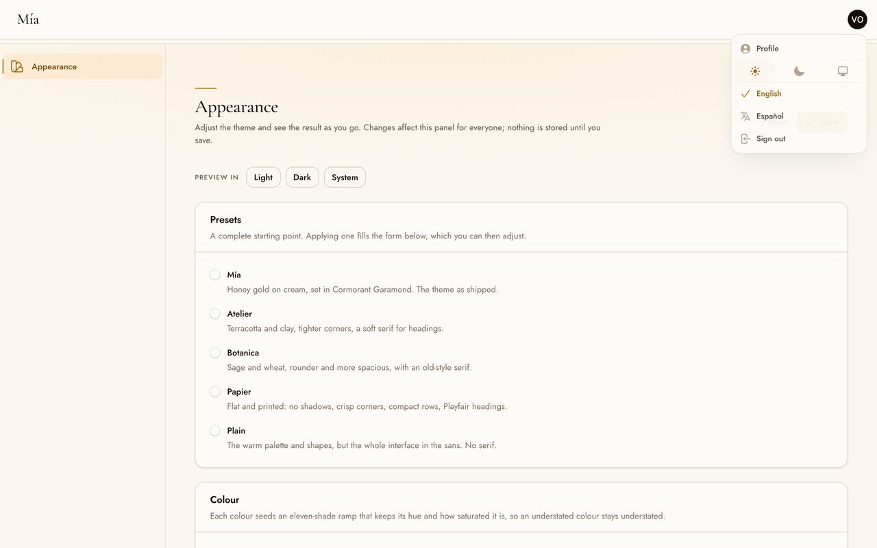
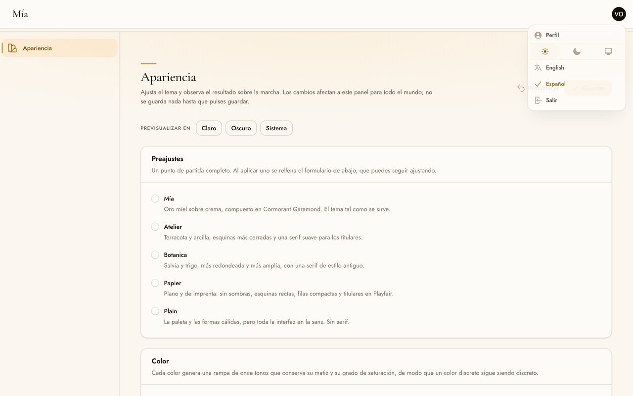
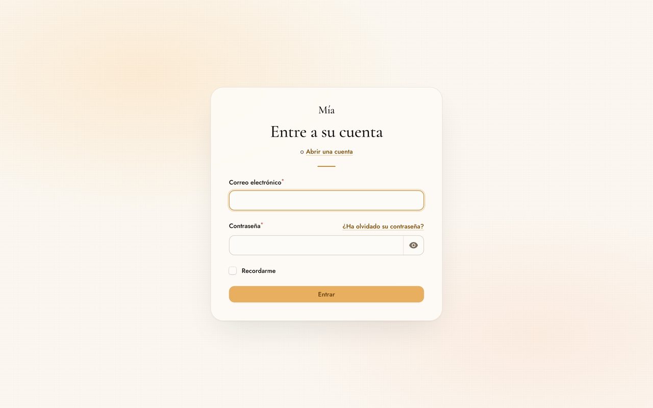
The theme ships English and Spanish, and it can put a language switcher in the user menu, below the light/dark switch.
 |
 |
| The switcher One item per language, in the language's own name, next to the light/dark switch. |
Chosen The whole panel follows, including Filament's own copy. |
#What is translated
The theme itself only labels one surface: the appearance page, including the names and descriptions of the presets. That is fully translated into both languages, and the two files are checked for key parity in the test suite. Nothing else in the theme carries copy: the sign-in compositions render your brand name and your own tagline, and the switcher labels languages with their own name, which is not translated by design.
Everything else in a panel comes from elsewhere, and the switcher changes it too:
- Filament's own copy — headings, buttons, table and form messages — ships in more than sixty languages, Spanish among them.
- Your resources, pages and fields are yours to translate. A switcher over untranslated copy leaves a panel half in one language, which reads worse than one language throughout. Check this before turning it on.
#Turning the switcher on
->plugin(
    MiaTheme::make()->localeSwitcher(['en', 'es']),
)
Codes must match the directories in your lang folder. Languages are labelled
with their own name; pass a label to override one:
MiaTheme::make()->localeSwitcher(['en' => 'English (US)', 'es', 'pt_BR'])
It is a list rather than a button that cycles, so the name of every option stays on screen — which is the point when the visitor cannot read the language the interface is currently in — and so that adding a third language changes nothing about how it works.
The choice is stored in a long-lived cookie, filament_mia_locale, written by
Laravel's cookie jar like any other. That is where the light/dark choice lives
too, and for the same reason: it belongs to the browser, not to the sign-in. It
survives a reload, a new page, an expired session and a sign-out, so a visitor
who chose Spanish yesterday meets the sign-in screen in Spanish today.
One limit worth stating: the switcher lives in the user menu, which does not exist before signing in. A first-time visitor gets the application's default language on the sign-in screen. Panels that need the language chosen from the sign-in screen itself should set the locale from the URL or the request, which is the application's job rather than the theme's.
#Adding a language
Nothing has to be contributed upstream. Laravel's package translations are overridable per application, so a fourth or a fortieth language is a folder in your own project:
lang/vendor/filament-mia/fr/customizer.php
Copy vendor/johnrivera7/filament-mia-theme/resources/lang/en/customizer.php as a
starting point, or publish both bundled languages first:
php artisan vendor:publish --tag=filament-mia-translations
Then offer it:
MiaTheme::make()->localeSwitcher(['en', 'es', 'fr'])
You will also want Filament's own translations for that language, which are
published with php artisan vendor:publish --tag=filament-translations.
#Turning the switcher off
It is off until you ask for it, and localeSwitcher(false) turns it off again
— useful for disabling it on one panel while a config-file default enables it
everywhere else.
Off is the default on purpose. Setting the locale is not a visual decision: it
changes Filament's copy, your application's copy, and anything else reading
app()->getLocale() for the length of the request. Plenty of applications
already decide the language from the user record, the subdomain or an
Accept-Language header, and installing a theme should not quietly take that
over.
When you do turn it on, this is what the theme does and does not touch:
- The locale is applied by middleware registered on that panel only. Every other route in your application, and every panel where the switcher is off, is untouched.
- The middleware is added after the ones your panel provider registers, so
inside that panel the visitor's choice wins over an earlier
setLocale(). That is the point of enabling it. If your own locale logic must win instead, leave the switcher off, or register your middleware on the panel after the plugin. - Nothing is applied until a visitor picks a language. Without the cookie the
theme never calls
setLocale()at all, so an untouched panel behaves exactly as it did before. - The cookie is validated against the languages that panel offers, so a value another panel wrote is ignored rather than trusted.
#The page builder
The public page in front of the panel, composed from the panel. Sections are added from a picker, reordered by dragging, hidden without losing their content, and published when they are ready — and because they are drawn from the theme's own tokens, the page uses the same palette, type and spacing as the panel it was built in.
Off by default, and more emphatically than everything else here. This is the one option that adds a table to your database and answers on a public address, and neither is something a theme should acquire by being installed:
MiaTheme::make()->pageBuilder()
Until that call is made there is no route, no page in the navigation, no query and no migration. A panel that never switches it on behaves exactly as it did before.
#Turning it on
Publish the migration and run it. It is a stub rather than a loaded migration, for the same reason the feature is off by default:
php artisan vendor:publish --tag=filament-mia-migrations
php artisan migrate
Then switch it on in the panel:
use JohnRivera7\FilamentMia\MiaTheme;

$panel->plugin(
    MiaTheme::make()
        ->pageBuilder()
        ->pageBuilderAuthorization(fn (): bool => auth()->user()?->isAdmin() ?? false)
        ->pageBuilderNavigation(group: 'Settings', sort: 80)
);
pageBuilderAuthorization() is worth setting rather than leaving to the
default. Without it, anyone who can reach the panel can publish to the open
internet.
#Where the page is served
At / unless you say otherwise:
MiaTheme::make()->pageBuilder(path: 'welcome')
If your application already answers at that path, it keeps it. The theme
registers its route after every provider has booted, and Laravel matches the
first route that answers a path, so an application serving its own / is never
displaced — the builder simply has nowhere to publish to until you give it a
free path.
The draft has an address of its own, /filament-mia/page-preview, which asks
anyone who is not signed in to the panel for credentials first. Keeping it off
a query string means a published page can be cached at the edge without a
parameter that would bypass the cache.
#The sections
Eleven, and a catalogue rather than a blank canvas. A canvas has to own layout, and once anything can be placed anywhere, the type scale, the contrast ratios and the behaviour at 320px stop being the theme's problem and become the editor's:
| Section | What it is for |
|---|---|
| Navigation bar | Brand, links, an optional light/dark switch and up to two actions. Sticky if you want it. |
| Hero | The headline, a lead, actions, and either an image or a sample card built from markup. |
| Features | Two to four columns of short entries, each with an optional icon from a curated list. |
| How it works | Numbered steps, because the order is the meaning. |
| Comparison | Two columns of the same criteria, as stacked definition lists rather than a table that would have to scroll on a phone. |
| Figures | Two to four numbers with a caption each. |
| Testimonials | Quotes with an attribution and an optional role. |
| Pricing | Plans with a price, a benefit per line, and one plan highlighted. |
| Questions | An FAQ that opens and closes without JavaScript. |
| Call to action | One heading and one action. |
| Footer | Brand, a line about what this is, links and a legal line. |
Every section carries the same three fields: whether it is visible, an anchor for other sections to link to, and which of the theme's four surfaces it sits on — canvas, warm, raised or the deep band. Those three are what let a page's rhythm be composed from the panel, and because the surfaces are the theme's own tokens, no combination can fall outside the palette.
A new page starts from a starter layout that describes a product in the
abstract, one section per shape, with copy that says what each section is for.
Testimonials and pricing are left out of it on purpose: inventing a quote
nobody said or a price nobody charges is the one kind of placeholder worse than
an empty section. Restore the starter page brings it back at any time.
#Draft and published
Saving and publishing are separate. Save draft writes without validating, because a half-finished section is a normal state to leave the builder in. Publish changes validates and copies the draft over what visitors read.
The preview beside the form is an iframe of the draft at its real address, in a real viewport, with the real stylesheet — so what it shows is what will be published, including the responsive behaviour that a scaled-down component preview gets wrong. Three widths, a refresh, and a Live toggle that is off by default because it costs a round trip per keystroke.
The published page is cached indefinitely and the cache is dropped on every write, so a visit costs no query once it is warm. If you clear caches from elsewhere, nothing breaks — the next visit refills it.
#Changing how it looks
The page reads config/filament-mia.php, so recolouring the theme recolours
the page with it and the two never drift apart. If you need to go further than
the tokens allow, publish the views:
php artisan vendor:publish --tag=filament-mia-views
Each section is one Blade partial under
resources/views/vendor/filament-mia/page-builder/blocks/, and the stylesheet
they read is inlined by Support\PageSheet rather than compiled, so you can
edit a partial without a Node toolchain anywhere in the project.
#Error pages and maintenance
Five screens a panel shows on its worst day: 404, 403, 419, 500 and the
maintenance page. They are drawn with no panel around them, so they carry their
own stylesheet inlined into the document — nothing to compile, nothing to
publish, no asset to serve.
#Turning the error pages on
They are off by default, and that is deliberate. Error views in Laravel are application-wide rather than panel-scoped, so switching them on restyles every error in the application, including the ones raised by routes that have nothing to do with a panel. That is your decision, not something a theme should take over by being installed.
// config/filament-mia.php
'error_pages' => true,
This is a config-file option with no fluent equivalent, for the same reason: there is nothing panel-scoped about it to hang off a panel's plugin.
Your own views still win. The theme appends its view directory to
config('view.paths'), and Laravel's exception handler rebuilds the errors
namespace from that list — application paths first — immediately before it
renders. So a file at resources/views/errors/404.blade.php, hand-written or
published from Laravel, takes precedence, and the theme only answers for a
status nobody else has claimed. It ships four; a 418 keeps falling through to
whatever the framework or your application already does.
To change the wording or the markup, take a copy:
php artisan vendor:publish --tag=filament-mia-errors
That writes into resources/views/errors, which is the first place Laravel
looks. The copies keep including the layout from the package, so editing one
does not freeze the shell around it.
The copy on each page is translated through the filament-mia::http lines, in
both bundled languages. The 403 is the one page that prefers the exception's
own message when there is one: an AuthorizationException carrying "invoices
that have already been sent cannot be edited" says more than the generic line,
while Laravel's own placeholder does not and is ignored.
Two notes on what these pages will and will not show you:
- With
APP_DEBUG=truea500never reaches an error view at all — Laravel renders its trace page instead. The other three still arrive in the theme. - In Laravel 13 a stale CSRF token no longer produces a
419for an ordinary same-origin form.PreventRequestForgerychecks the request origin before the token and lets a same-originPOSTthrough without comparing them. The419page still has work to do — cross-site posts and clients that send noSec-Fetch-Siteheader reach the token check, and Laravel raises the status from other places too — but it is a rarer screen than it used to be.
#The maintenance page
php artisan down --render="filament-mia::maintenance" --retry=900
php artisan up
--retry in seconds is turned into a sentence — "try again in about 15
minutes" — as well as the Retry-After header. Leave it out and the page says
so in general terms.
The reason this page is built the way it is: Laravel renders it once, when
that command runs, and stores the HTML as a string in storage/framework/down.
Every request that arrives afterwards is answered by
storage/framework/maintenance.php, which public/index.php requires before
the Composer autoloader. At the moment this page is served there is no
container, no configuration, no session, no database and no view factory —
there is a web server, a JSON file and an echo.
So the page cannot link a stylesheet, because there is no asset URL helper to
build one and the compiled theme's colours are emitted by a Filament panel
render it does not have either. Everything is inlined. Light and dark are
settled in the browser: prefers-color-scheme in the CSS, refined by the
choice Filament keeps in localStorage, which is client-side and therefore
still readable when the server is not answering.
The trade is worth stating plainly. Palette, type and shape come from
config/filament-mia.php, read while the framework is still up, and not
from anything the appearance page saved — those settings belong to one panel
and cannot be reached from here. Re-run php artisan down after changing the
config file, or the page will keep showing the old one.
#Accessibility
Contrast is computed with Filament's own colour maths and checked in the test suite, so a change to the ramps that broke accessibility fails the build.
| Pair | Light | Dark |
|---|---|---|
| Body text on the page | 18.97:1 | 19.58:1 |
| Body text on a card | 19.58:1 | 17.03:1 |
| Muted text on a card | 6.97:1 | 7.29:1 |
| Link and accent text on a card | 4.88:1 | 9.07:1 |
| Button label on the accent | 5.04:1 | 5.04:1 |
| Input border on a card | 4.79:1 | 7.29:1 |
| Focus ring on a card | 4.88:1 | 9.07:1 |
Text pairs clear the 4.5:1 that WCAG AA asks of body copy, and controls clear the 3:1 that WCAG 1.4.11 asks of user interface components. The sign-in screens are measured separately, from rendered pixels, because their backgrounds are gradients; see Accessibility of the compositions. The error and maintenance pages are measured the same way and for the same reason — their card is 88% opaque over two gradient pools — across all five palettes the appearance page can apply, in both modes: 40 pairs, none below AA, the narrowest being the button label at 4.65:1 under the Botanica accent. Decorative hairlines are deliberately below that: they carry no information, and WCAG 1.4.11 explicitly exempts elements that do not.
Beyond contrast:
- Focus is always visible, drawn as two layers — an inner ring in the surface colour and an outer ring in the accent — so it stays legible on light surfaces, dark surfaces and coloured buttons alike.
- Row actions are never hidden until hover. They rest at reduced opacity instead, because hiding them removes them from keyboard navigation and puts them out of reach on touch entirely.
prefers-reduced-motionis honoured for every animation and transition the theme adds. Durations collapse to0.01msrather than to zero, sotransitionendstill fires and Alpine's transitions continue to resolve.- Numbers use tabular figures with slashed zeroes, so numeric columns line
up and
0andOstay distinguishable.
#Overridden Filament views
None. The theme is implemented in CSS and two render hooks:
PanelsRenderHook::STYLES_AFTERemits the runtime custom properties.PanelsRenderHook::SIMPLE_LAYOUT_STARTemits the marker element that selects a sign-in composition, and the brand stage for the two compositions that use one.
No Blade view is published or replaced, so Filament upgrades cannot silently revert to an old copy of a framework template. The simple layout in particular is one of the files most likely to change between releases, and a published copy of it would stop tracking upstream without saying so.
The language switcher is the same story from the other side: it
appears in the user menu through Panel::userMenuItems(), Filament's own
extension point for that menu, rather than by publishing the menu's view.
#Troubleshooting
#The theme has no effect at all
Check for ->viteTheme(...) on the panel and remove it. Filament resolves the
active theme by returning viteTheme first if it is set, regardless of where
either call appears in the chain, so it overrides ->theme() with no error or
warning. A plugin theme and viteTheme cannot coexist.
If you need your own Tailwind utilities as well, use
viteStylesheets(), which loads them
alongside the theme rather than instead of it.
#The panel is not using the fonts I configured
If the interface falls back to a system sans, or headings render in Georgia
rather than the configured serif, an application stylesheet is redeclaring
Tailwind's font tokens on :root.
It happens when the file passed to viteStylesheets()
imports tailwindcss/theme.css, which is the normal way to give Tailwind the
tokens it needs to compile utilities. That file declares --font-sans and
--font-serif without Filament's leading var(--font-family), and because
your stylesheet loads after the theme it wins.
The theme now restates those tokens on the panel's own <body> and sets
font-family there explicitly, so this resolves itself on upgrade. Nothing to
change in your stylesheet.
#Some of my own components lost their styling
Your views are using Tailwind utilities that the pre-compiled theme does not contain. See Tailwind utilities in your own views.
#The stylesheet does not update after upgrading
php artisan filament:assets copies the file into public/, and Filament
serves it with a version query string. Re-run it after every composer update,
and add it to your deployment script:
php artisan filament:assets
#Headings are not in the serif
Confirm the family is available on Bunny Fonts and
spelled as it is there. ->font('Jost', 'Fraunces') takes plain family names,
without quotes or CSS fallbacks, and rejects anything else at boot. Pass
->serifHeadings(false) to keep headings in the sans deliberately.
#Development
composer install
npm install

npm run build     # compile resources/dist/mia.css
npm run dev       # rebuild on change
composer test     # run the test suite
composer lint     # apply the code style
The test suite runs with error_reporting=-1 and fails on any deprecation,
notice or warning raised by the package, with those from Laravel and Filament
ignored — a dependency's deprecation says nothing about this package.
One gap worth naming: the suite does not render the appearance page. Rendering any Filament page under Orchestra Testbench currently fails inside Livewire's validation support, for Filament's own shipped pages as much as for this one, so a test there would report on the harness rather than on the package. The page's wiring, storage, precedence and preview output are covered; the rendered page is checked by hand against a running application.
#Looking at it locally
The package carries its own panel, so no application is needed to see the theme:
php vendor/bin/testbench workbench:build
php vendor/bin/testbench serve
That serves a panel at /admin with sign-in, registration, password recovery
and a multi-factor challenge, against one invented account
(valeria@mia.test / password). Behind it is a small worked example — a
projects list, a client list, a dashboard of stats and charts, and the
appearance page — seeded from a fixed number, so the same records come back in
the same order on every build. Every screenshot in this README is taken from
it:
node bin/shots.mjs             # all five compositions, both modes, both widths
node bin/panel-shots.mjs       # the panel interior: dashboard, lists, form, charts
node bin/locale-shots.mjs      # the language switcher, and the choice surviving
node bin/contrast-login.mjs    # measured contrast for the same set
php bin/contrast-report.php    # palette-level contrast
The example panel is deliberately in English, which is also how the theme's translation coverage gets checked: anything the theme itself labels shows up in those frames, so a string left in another language is visible in the picture rather than buried in a language file.
Three conventions keep the repository honest:
resources/dist/mia.cssis rebuilt and committed on its own. It is committed so the package installs without a build step, and marked as generated in.gitattributesso it stays out of diffs. Rebuild it withnpm run buildand commit it in a change of its own, never mixed with the source CSS that produced it. Because->theme()replaces Filament's stylesheet outright, that file contains Filament's own compiled core, and is built against the version incomposer.lock— currently Filament 5.8. CI rebuilds it on every push and fails if the result differs from what is committed.- Raising the Filament version and rebuilding the stylesheet are one commit. See Upgrading Filament below. This is the one rule that is easy to miss, because nothing in a local checkout goes wrong when it is broken.
- A change to the public surface updates the README and the changelog in the same commit. Any new or altered option, chainable method, published custom property, overridden view, requirement or command belongs in the diff that introduces it. This README is the product page, and documenting afterwards reliably leaves options undocumented and examples that no longer match the code.
- Every image comes from the bundled preview panel or the demo
application. Both run on invented data.
.gitignoreblocks the filenames screenshots tend to get by default, because an image of a real system can carry personal data and a blob pushed to a public repository stays reachable by SHA long after the file is deleted.
#Upgrading Filament
composer.lock is committed, which is unusual for a library and deliberate
here. The theme's stylesheet imports Filament's core CSS and scans Filament's
Blade views for the utilities they use, so the compiled output moves with the
installed version of the framework — a patch release that adds a class to one
view makes resources/dist/mia.css a few hundred bytes bigger with no change
to this repository at all. The lock is what makes "rebuild and compare" a
statement about the source instead of about what Filament published that
morning. It is marked export-ignore in .gitattributes, so it never ships
inside the Packagist archive — only the repository and CI see it.
So raising the version is one commit, with both halves in it:
composer update filament/filament --with-all-dependencies
npm run build

vendor/bin/phpunit
vendor/bin/pint --test

git add composer.lock resources/dist/mia.css
Leaving out the rebuild is the failure this is arranged to catch: the
Compiled stylesheet is current job installs from the lock, so it will
recompile against the Filament you just locked and report the stylesheet as out
of date. Applications installing the package ignore this lock, as they do any
library's, and composer.json still allows the whole ^5.7 range.
The rest of CI is not held to the lock. The test matrix resolves lowest and
highest, so a Filament release that genuinely breaks the package is still
caught on the next push whether or not anyone has run composer update here.
#Where this is going
Mía starts as a theme. The direction is a design system for Filament: the stylesheet is the first layer, not the whole of it.
Concretely, what is in and what is not.
Today. A pre-compiled stylesheet, a configuration API for colour, typography, roundness, density and elevation, warm light and dark modes, five sign-in compositions, illustrated empty states, loading states, measured contrast, error and maintenance pages, an in-panel appearance page that edits and persists all of it, an optional builder for the public page in front of the panel, and English and Spanish with an optional switcher.
Next. The rest of the panel rephotographed from the bundled preview panel. Presets shipped as named palettes beyond the five the appearance page carries. More bundled languages, taken from what people actually ask for.
Later, and deliberately vaguer because it is not built. Blade components that use the tokens directly, for building custom pages that match the panel. Exporting a saved appearance back out as configuration, so a look tuned in one environment can be committed. Coverage for the Filament plugins that carry their own UI.
Dates are not promised. The 0.x series is where this gets worked out in the
open; see Project status.
#Changelog
See CHANGELOG.md.
#Credits
#License
The MIT License (MIT). See LICENSE.md.
The author
I am a full-stack developer focused on building reliable web platforms for education, enterprise, and business operations. I work mainly with Laravel and Filament, creating admin panels, reusable packages, and integrations that solve real production needs.
I also have a background in cybersecurity as an ethical hacker, which shapes how I design and review software: secure authentication flows, proper access control, hardening production environments, and thinking about real-world attack surfaces before they become problems.
I contribute to the Filament ecosystem by developing open-source panel plugins, with a strong focus on authentication, enterprise SSO, and tools that help teams manage complex workflows from a clean admin interface. I follow official Filament standards and aim to publish practical, well-documented packages that developers can adopt with confidence.
Beyond Filament, I develop Moodle plugins and customizations for e-learning platforms, including integrations, Microsoft Teams modules, learning activities, custom course formats, and automated cloud backup solutions. I also build Laravel applications for insurance, commercial, corporate, and agricultural management systems.
My infrastructure work includes high-availability setups with PostgreSQL clusters, GlusterFS, Nginx, and Consul, as well as Odoo ERP and POS implementations. I enjoy working across the full stack—from backend architecture and DevOps automation to polished admin interfaces and end-user workflows.
I publish open-source packages on Packagist and GitHub, and I plan to keep expanding my contributions to Filament with new panel plugins over time.
From the same author
Antivirus
Antivirus for Filament: ClamAV upload scanning, quarantine, incident log and file security dashboard for Laravel.
Author:
John Michael Rivera Gonzalez
Cybersecurity
A read-only security posture dashboard that audits your Laravel environment, routes, Redis, queues, PHP runtime, and risky Composer packages, then scores findings with remediation guidance. Versions: 5.x
Author:
John Michael Rivera Gonzalez
Flow
Integrate Flow (Chile) payments into Filament with a credentials UI, HMAC signing helpers, and checkout redirects.
Author:
John Michael Rivera Gonzalez
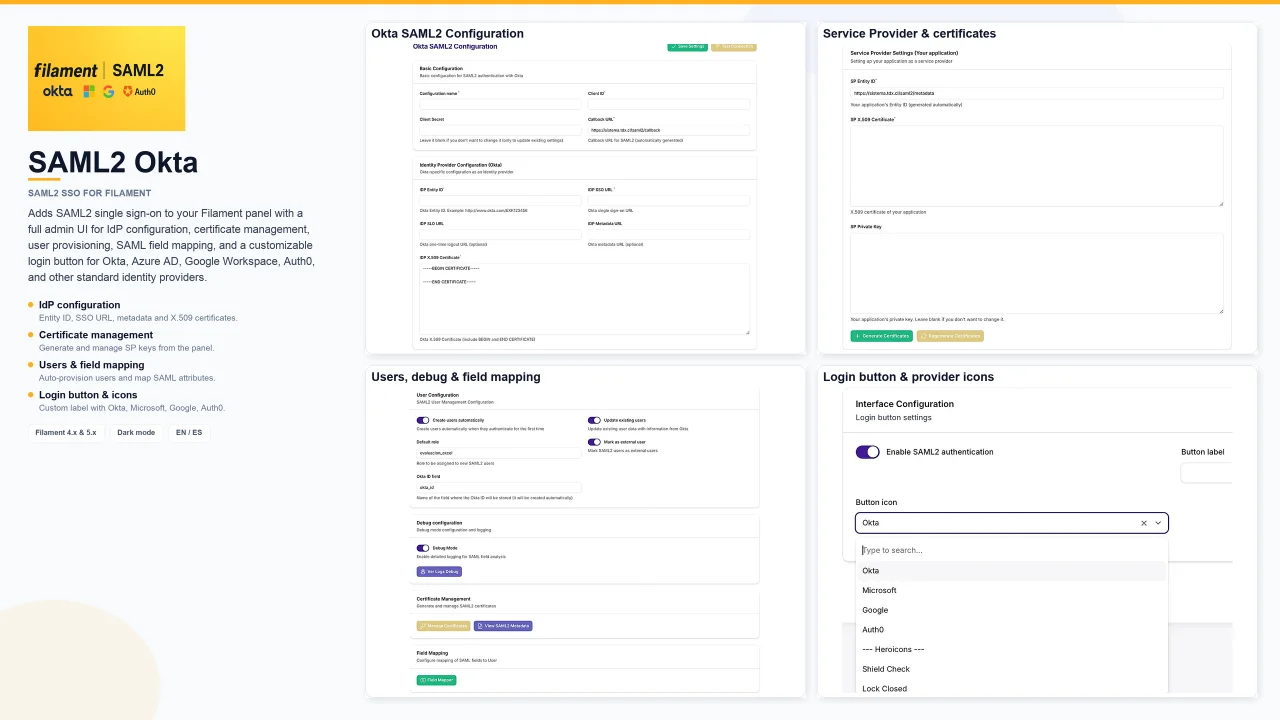
SAML2 Okta
Adds SAML2 single sign-on to your Filament panel with a full admin UI for IdP configuration, certificate management, user provisioning, SAML field mapping, and a customizable login button for Okta, Azure AD, Google Workspace, Auth0, and other standard identity providers.
Author:
John Michael Rivera Gonzalez
Featured Plugins
A selection of plugins curated by the Filament team

Blueprint
Filament Blueprint is a premium Laravel Boost extension that helps AI agents produce accurate, detailed implementation plans and security reports for Filament apps.
 Filament
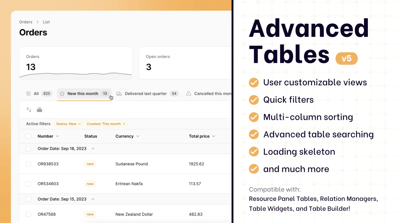
Advanced Tables (formerly Filter Sets)
Supercharge your tables with powerful features like user-customizable views, quick filters, multi-column sorting, advanced table searching, convenient view management, and more. Compatible with Resource Panel Tables, Relation Managers, Table Widgets, and Table Builder!
 Kenneth Sese
Custom Dashboards
Let your users build and share their own dashboards with a drag-and-drop interface. Define your data sources in PHP and let them do the rest.
Filament