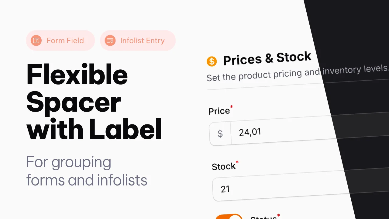
Spacer with Label
A Filament component that adds a flexible spacer with optional label, slots, and divider to Forms and Infolists.
 Author:
Joost Meijerink
Author:
Joost Meijerink
Documentation
- Version Compatibility
- Features
- Installation
- Usage
- Available Methods
- Examples
- Full Example
- Filament 3 (v3 branch)
- License
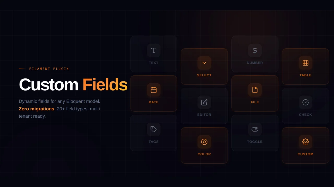
A flexible spacer component with optional label, slots, and divider for Filament Forms and Infolists.
#Version Compatibility
- Filament 4: Use
v4branch or^4.0version - Filament 3: Use
v3branch or^3.0version
#Features
- Customizable spacing - Control space above and below with CSS values or pixels
- Optional label - Add section headers with configurable size and weight
- Label slots (v4) - Insert content above, before, after, or below the label
- Hint support (v3) - Add hints with icons, colors, and tooltips
- Divider line - Optional bottom border for visual separation
- Helper text (v3) - Add descriptive text below the spacer
- Full-width by default - Automatically spans all columns in grid layouts
- Works in Forms and Infolists - Same API for both contexts
- Dark mode support - Fully compatible with Filament's dark mode
- Closure support - All properties accept closures for dynamic values
#Installation
This package is distributed via Anystack. To install it, you need to add the private repository to your composer.json file and authenticate with your license credentials.
#Step 1: Add the Private Repository
Add the following repository configuration to your composer.json:
{
  "repositories": [
    {
      "type": "composer",
      "url": "https://spacer-with-label.composer.sh"
    }
  ]
}
#Step 2: Install the Package
Install the package via composer based on your Filament version:
#For Filament 4.x
composer require joost-meijerink/spacer-with-label:^4.0
#Step 3: Authentication
When you run the composer require command, you will be prompted for authentication:
Loading composer repositories with package information
Authentication required (spacer-with-label.composer.sh):
Username: [licensee-email]
Password: [license-key]
Enter your credentials as follows:
- Username: Your email address associated with the license
- Password: Your license key
#License with Fingerprint
If your license requires a fingerprint, append it to your license key separated by a colon (:).
Example:
- Email:
user@example.com - License key:
8c21df8f-6273-4932-b4ba-8bcc723ef500 - Fingerprint:
example.com
Authentication:
Username: user@example.com
Password: 8c21df8f-6273-4932-b4ba-8bcc723ef500:example.com
#Unassigned License
If your license is not assigned to a specific licensee, you can use unlock as the username:
Username: unlock
Password: [license-key]
#Usage
#In Forms
use JoostMeijerink\SpacerWithLabel\Forms\Components\Spacer;

public function form(Form $form): Form
{
    return $form
        ->schema([
            // Your fields...

            Spacer::make()
                ->label('Section Title')
                ->divider(),

            // More fields...
        ]);
}
#In Infolists
use JoostMeijerink\SpacerWithLabel\Infolists\Components\Spacer;

public function infolist(Infolist $infolist): Infolist
{
    return $infolist
        ->schema([
            // Your entries...

            Spacer::make()
                ->label('Section Title')
                ->divider(),

            // More entries...
        ]);
}
#Available Methods
#Spacing
Spacer::make()
    ->space('2rem')        // Space above (default: '1rem')
    ->spaceBelow('1rem')   // Space below
You can use any valid CSS value ('1rem', '24px', etc.) or an integer which will be converted to pixels.
#Label
use JoostMeijerink\SpacerWithLabel\Enums\LabelSize;
use Filament\Support\Enums\FontWeight;

Spacer::make()
    ->label('Section Title')
    ->labelSize(LabelSize::Large)      // or 'xs', 'sm', 'md', 'lg', 'xl', '2xl'
    ->labelWeight(FontWeight::Bold)    // or 'thin', 'light', 'normal', 'medium', 'semibold', 'bold', 'extrabold', 'black'
Label Sizes:
| Enum | String | CSS Class |
|---|---|---|
LabelSize::ExtraSmall |
'xs' |
text-xs |
LabelSize::Small |
'sm' |
text-sm (default) |
LabelSize::Medium |
'md', 'base' |
text-base |
LabelSize::Large |
'lg' |
text-lg |
LabelSize::ExtraLarge |
'xl' |
text-xl |
LabelSize::TwoExtraLarge |
'2xl' |
text-2xl |
Label Weights:
| Enum | String |
|---|---|
FontWeight::Thin |
'thin' |
FontWeight::ExtraLight |
'extralight' |
FontWeight::Light |
'light' |
FontWeight::Normal |
'normal' |
FontWeight::Medium |
'medium' (default) |
FontWeight::SemiBold |
'semibold' |
FontWeight::Bold |
'bold' |
FontWeight::ExtraBold |
'extrabold' |
FontWeight::Black |
'black' |
#Slots
The spacer component provides slots around the label where you can insert additional content. Slots can accept text, schema components (like Icon, Text), actions, and action groups.
Available slots:
aboveLabel()- Content displayed above the labelbeforeLabel()- Content displayed before (left of) the labelafterLabel()- Content displayed after (right of) the labelbelowLabel()- Content displayed below the label
use Filament\Schemas\Components\Icon;
use Filament\Support\Icons\Heroicon;

Spacer::make()
    ->label('Section Title')
    ->beforeLabel(Icon::make(Heroicon::Star))
    ->afterLabel('Required')
You can also pass arrays of mixed content:
use Filament\Actions\Action;
use Filament\Schemas\Components\Icon;
use Filament\Support\Icons\Heroicon;

Spacer::make()
    ->label('Section Title')
    ->afterLabel([
        Icon::make(Heroicon::InformationCircle),
        'More info',
        Action::make('help'),
    ])
All slot methods also accept closures for dynamic content:
Spacer::make()
    ->label('Section Title')
    ->afterLabel(fn () => $this->record->is_required ? 'Required' : null)
#Divider
Spacer::make()
    ->divider()    // Adds a bottom border
#Examples
#Section Title with Icon and Fields
Use the spacer as a section header with an icon and fields below:
use JoostMeijerink\SpacerWithLabel\Forms\Components\Spacer;
use JoostMeijerink\SpacerWithLabel\Enums\LabelSize;
use Filament\Support\Enums\FontWeight;
use Filament\Forms\Components\TextInput;
use Filament\Schemas\Components\Icon;
use Filament\Support\Icons\Heroicon;

Spacer::make('personal-info')
    ->label('Personal Information')
    ->labelSize(LabelSize::Large)
    ->labelWeight(FontWeight::SemiBold)
    ->beforeLabel(Icon::make(Heroicon::User))
    ->divider(),

TextInput::make('first_name')
    ->required(),

TextInput::make('last_name')
    ->required(),

TextInput::make('email')
    ->email()
    ->required(),
#Section with Status Badge
Use slots to add a status indicator:
use JoostMeijerink\SpacerWithLabel\Forms\Components\Spacer;
use Filament\Schemas\Components\Text;

Spacer::make('billing-info')
    ->label('Billing Information')
    ->afterLabel(
        Text::make('Required')
            ->color('danger')
            ->weight(FontWeight::Bold)
    )
    ->divider(),
#Description Text Below Label
Use the belowLabel() slot to show descriptive text:
use JoostMeijerink\SpacerWithLabel\Forms\Components\Spacer;
use Filament\Schemas\Components\Text;

Spacer::make()
    ->label('Address Information')
    ->belowLabel(Text::make('Fill in your postal code and house number.'))
    ->divider(),
Or simply pass a string:
Spacer::make()
    ->label('Address Information')
    ->belowLabel('Fill in your postal code and house number.')
    ->divider(),
#Full Example
use JoostMeijerink\SpacerWithLabel\Forms\Components\Spacer;
use JoostMeijerink\SpacerWithLabel\Enums\LabelSize;
use Filament\Support\Enums\FontWeight;
use Filament\Schemas\Components\Icon;
use Filament\Schemas\Components\Text;
use Filament\Support\Icons\Heroicon;

Spacer::make('section-header')
    ->space('1.5rem')
    ->spaceBelow('0.5rem')
    ->label('Personal Information')
    ->labelSize(LabelSize::Large)
    ->labelWeight(FontWeight::SemiBold)
    ->beforeLabel(Icon::make(Heroicon::User))
    ->afterLabel(
        Text::make('Required fields')
            ->color('danger')
    )
    ->belowLabel('Please provide your personal details below.')
    ->divider()
#Filament 3 (v3 branch)
The v3 branch is compatible with Filament 3.x and has a slightly different way of configuring.
#Installation (v3)
composer require joost-meijerink/spacer-with-label:^3.0
#Hints (v3 only)
In v3, you can add hints to the right of the label:
Spacer::make()
    ->label('Section Title')
    ->hint('Required')
    ->hintColor('danger')
    ->hintIcon('heroicon-o-exclamation-triangle')
    ->hintIconTooltip('Please fill in all required fields')
#Helper Text (v3 only)
In v3, you can add helper text:
Spacer::make()
    ->label('Section Title')
    ->helperText('This is helper text.')
With HTML support:
use Illuminate\Support\HtmlString;

Spacer::make()
    ->label('Section Title')
    ->helperText(new HtmlString('Your <strong>formatted</strong> helper text.'))
#v3 Full Example
use JoostMeijerink\SpacerWithLabel\Forms\Components\Spacer;
use JoostMeijerink\SpacerWithLabel\Enums\LabelSize;
use Filament\Support\Enums\FontWeight;

Spacer::make('section-header')
    ->space('1.5rem')
    ->spaceBelow('0.5rem')
    ->label('Personal Information')
    ->labelSize(LabelSize::Large)
    ->labelWeight(FontWeight::SemiBold)
    ->hint('Required')
    ->hintColor('danger')
    ->hintIcon('heroicon-o-user')
    ->helperText('Please provide your personal details below.')
    ->divider()
#License
This is a commercial plugin.
The author
From the same author
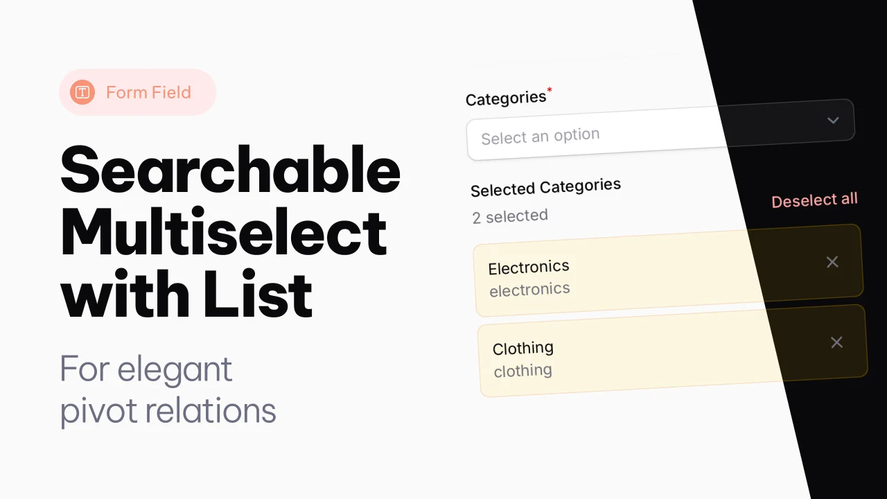
Searchable Multiselect with List
A searchable multiselect with list view for selected items.
Author:
Joost Meijerink

Text Column with List
An extension of the text column, to show pivot relations directly in a modal, from the table.
Author:
Joost Meijerink
Featured Plugins
A selection of plugins curated by the Filament team
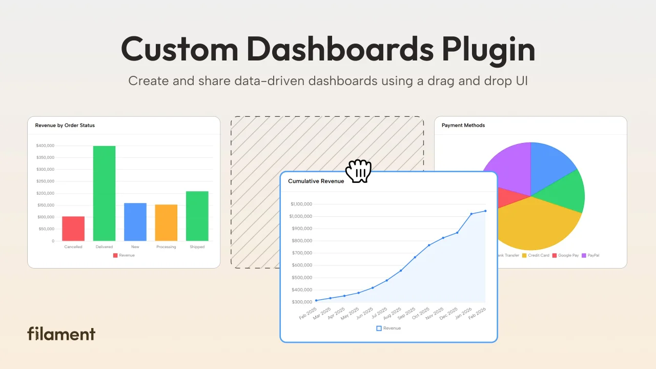
Custom Dashboards
Let your users build and share their own dashboards with a drag-and-drop interface. Define your data sources in PHP and let them do the rest.
 Filament
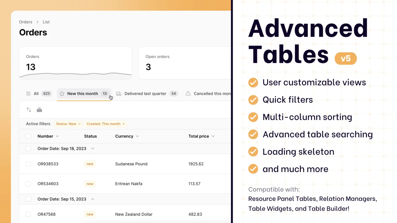
Advanced Tables (formerly Filter Sets)
Supercharge your tables with powerful features like user-customizable views, quick filters, multi-column sorting, advanced table searching, convenient view management, and more. Compatible with Resource Panel Tables, Relation Managers, Table Widgets, and Table Builder!
 Kenneth Sese

Spotlight Pro
Browse your Filament Panel with ease. Filament Spotlight Pro adds a Spotlight/Raycast like Command Palette to your Filament Panel.
 Dennis Koch