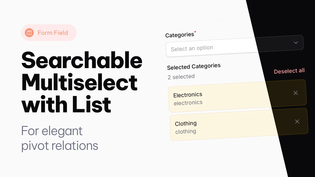
Searchable Multiselect with List
A searchable multiselect with list view for selected items.
 Author:
Joost Meijerink
Author:
Joost Meijerink
Documentation
- Version Compatibility
- Features
- Installation
- Usage
- Available Methods
- Tailwind CSS Configuration
- Customization
- Examples
- Requirements
- Credits
A searchable multiselect form component with a list view for Filament.
This component extends Filament's Select field to provide a better user experience for multiple selections, showing selected items in a clear list format below the select field.
#Version Compatibility
- Filament 4: Use
v4branch or^4.0version - Filament 3: Use
v3branch or^3.0version
#Features
- Searchable multiselect dropdown - Built on Filament's Select component
- Selected items list view - Clear display of selected items with remove buttons
- Async label loading - Efficiently loads labels for selected items
- Skeleton loading states - Smooth loading experience
- HTML content support - Display rich HTML in option labels
- Show search icon - Optional search icon in the input field
- Selection counter - Shows number of selected items in list
- Bulk deselect - Remove all selections at once
- Dark mode support - Fully compatible with Filament's dark mode
- Responsive design - Works on all screen sizes
Note for Filament 3: Due to Choices.js limitations in Filament 3, the placeholder cannot be dynamically updated to show selection count. The placeholder will always show the value set with
->placeholder(). This feature is only available in Filament 4.
#Installation
Install the package via composer based on your Filament version:
#For Filament 4.x
composer require joost-meijerink/searchable-multiselect-with-list:^4.0
#For Filament 3.x
composer require joost-meijerink/searchable-multiselect-with-list:^3.0
Note: The package will automatically install the correct version based on your Filament version constraints if you don't specify a version, but it's recommended to explicitly specify the version for clarity.
#Usage
The SearchableMultiSelectWithList component can be used just like any other Filament form field. It extends the standard Select field, so all Select methods are available.
#Basic Usage
use JoostMeijerink\SearchableMultiselectWithList\Forms\Components\SearchableMultiSelectWithList;

SearchableMultiSelectWithList::make('users')
    ->label('Select Users')
    ->options(User::all()->pluck('name', 'id'))
    ->searchable()
#Advanced Usage with Dynamic Search
SearchableMultiSelectWithList::make('products')
    ->label('Products')
    ->placeholder('Search products')
    ->searchable()
    ->showSearchIcon() // Shows search icon in the field
    ->listLabel('Selected Products')
    ->getSearchResultsUsing(function ($search) {
        return Product::query()
            ->where('name', 'like', "%{$search}%")
            ->orWhere('description', 'like', "%{$search}%")
            ->limit(20)
            ->get()
            ->mapWithKeys(function ($product) {
                return [
                    $product->id => view('components.product-option', [
                        'product' => $product,
                    ])->render(),
                ];
            })
            ->toArray();
    })
    ->getOptionLabelsUsing(function ($values) {
        return Product::whereIn('id', $values)
            ->get()
            ->mapWithKeys(function ($product) {
                return [
                    $product->id => view('components.product-option', [
                        'product' => $product,
                    ])->render(),
                ];
            })
            ->toArray();
    })
    ->allowHtml() // Enable HTML content in labels
    ->reactive()
#With Relationships
SearchableMultiSelectWithList::make('categories')
    ->relationship('categories', 'name')
    ->listLabel('Selected Categories')
    ->showCountSelected(true)
    ->searchable()
    ->preload()
#Available Methods
All methods from Filament's Select component are available, plus:
#listLabel(?string $label)
Set a label for the selected items list section.
->listLabel('Selected Items')
#showCountSelected(bool $condition = true)
Toggle the display of the selection count next to the "Deselect all" button.
->showCountSelected(false) // Hide the count
#showSearchIcon(bool $condition = true)
Show a search icon in the input field to indicate search functionality.
->showSearchIcon()
#showCountInPlaceholder(bool $condition = true)
Show the number of selected items in the placeholder text. Default is true.
->showCountInPlaceholder(false) // Disable count in placeholder
Note: This feature is only available in Filament 4. In Filament 3, the placeholder cannot be dynamically updated due to Choices.js limitations.
#allowHtml()
Allow HTML content in option labels (inherited from Select).
->allowHtml()
#Tailwind CSS Configuration
Important: This plugin uses Tailwind CSS classes including theme-specific classes like bg-primary-*. Your main project needs to scan the plugin's views to compile these classes.
#Add Plugin Views to Tailwind Config
For Tailwind v3 (tailwind.config.js):
module.exports = {
    content: [
        // ... your existing paths
        './vendor/joost-meijerink/searchable-multiselect-with-list/resources/views/**/*.blade.php',
    ],
    // ... rest of your config
}
For Tailwind v4 (resources/css/app.css):
@import '../../vendor/filament/filament/resources/css/theme.css';

/* Content sources for Tailwind v4 */
@source '../views/**/*.blade.php';
@source '../../vendor/joost-meijerink/searchable-multiselect-with-list/resources/views/**/*.blade.php';
/* ... other sources */
After adding this configuration, rebuild your CSS:
npm run build
#Theme Classes Used
The component uses the following theme-dependent classes:
bg-primary-100/50,ring-primary-600/20- Selected item stylingdark:bg-primary-400/10,dark:ring-primary-400/30- Dark mode variants
Make sure your Filament panel has a primary color configured, or these will use Filament's default primary color.
#Customization
#Translations
The component comes with English translations. You can publish and customize them:
php artisan vendor:publish --tag="searchable-multiselect-with-list-translations"
This will publish the translation files to resources/lang/vendor/searchable-multiselect-with-list/.
#Styling
The component uses Filament's design system and is fully compatible with dark mode. The selected items are displayed with:
- Primary color background (light blue by default)
- Rounded corners
- Remove buttons using Filament's icon button component
- Smooth skeleton loading animations
#Examples
#Simple Options
SearchableMultiSelectWithList::make('tags')
    ->options([
        'php' => 'PHP',
        'laravel' => 'Laravel',
        'filament' => 'Filament',
        'livewire' => 'Livewire',
        'alpine' => 'Alpine.js',
    ])
    ->listLabel('Selected Tags')
#With Custom Validation
SearchableMultiSelectWithList::make('members')
    ->options(User::all()->pluck('name', 'id'))
    ->listLabel('Team Members')
    ->required()
    ->minItems(2)
    ->maxItems(10)
    ->searchable()
#Reactive with Dependencies
SearchableMultiSelectWithList::make('cities')
    ->options(function (Get $get) {
        $countryId = $get('country_id');

        if (!$countryId) {
            return [];
        }

        return City::where('country_id', $countryId)
            ->pluck('name', 'id');
    })
    ->listLabel('Selected Cities')
    ->reactive()
    ->searchable()
    ->disabled(fn (Get $get) => !$get('country_id'))
#Custom HTML in Dropdown Results
You can render custom HTML for each option in the dropdown. Create a Blade component and use it in your form field.
Blade Component (resources/views/components/category-option.blade.php):
<div class="flex flex-col py-1">
    <div class="font-bold text-gray-950 dark:text-white">
        {{ $category->name }}
    </div>
    <div class="text-sm text-gray-500 dark:text-gray-400">
        {{ $category->slug }}
    </div>
</div>
Form Field:
SearchableMultiSelectWithList::make('categories')
    ->label('Categories')
    ->placeholder('Search categories')
    ->searchable()
    ->showSearchIcon()
    ->listLabel('Selected Categories')
    ->getSearchResultsUsing(function ($search) {
        return Category::query()
            ->where('name', 'like', "%{$search}%")
            ->orWhere('slug', 'like', "%{$search}%")
            ->limit(20)
            ->get()
            ->mapWithKeys(function ($category) {
                return [
                    $category->id => view('components.category-option', [
                        'category' => $category,
                    ])->render(),
                ];
            })
            ->toArray();
    })
    ->getOptionLabelsUsing(function ($values) {
        return Category::whereIn('id', $values)
            ->get()
            ->mapWithKeys(function ($category) {
                return [
                    $category->id => view('components.category-option', [
                        'category' => $category,
                    ])->render(),
                ];
            })
            ->toArray();
    })
    ->allowHtml()
    ->reactive()
#Requirements
#For v4.0.0 (Filament 4)
- PHP 8.1 or higher
- Filament 4.0 or higher
- Laravel 11.0 or higher
#For v3.0.0 (Filament 3)
- PHP 8.1 or higher
- Filament 3.0 or higher
- Laravel 10.0 or higher
#Credits
The author
From the same author
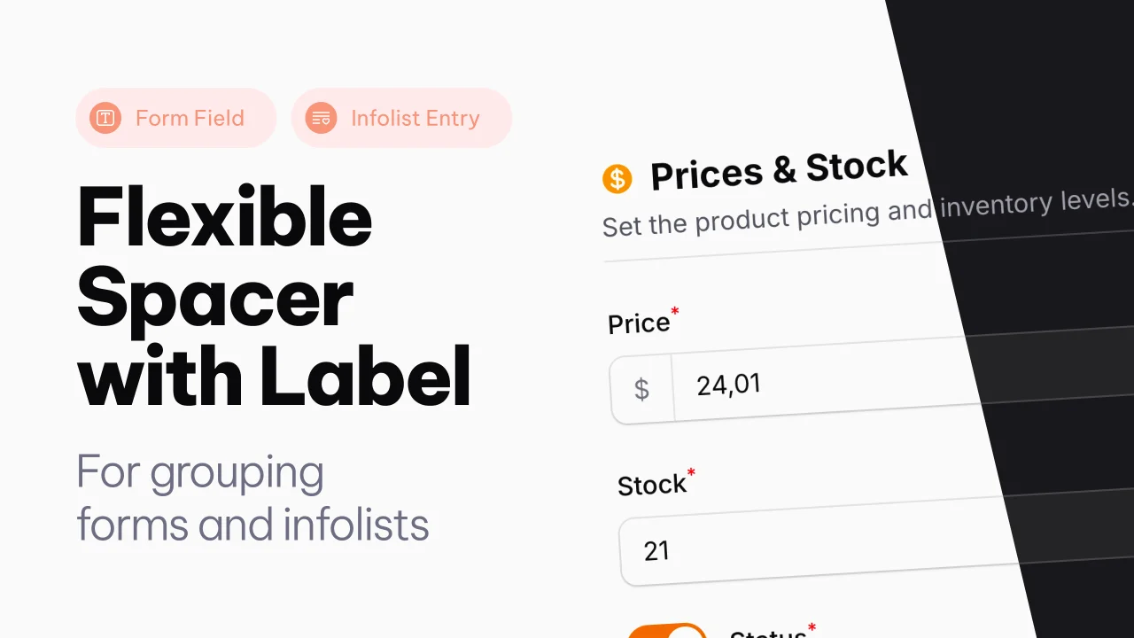
Spacer with Label
A Filament component that adds a flexible spacer with optional label, slots, and divider to Forms and Infolists.
Author:
Joost Meijerink

Text Column with List
An extension of the text column, to show pivot relations directly in a modal, from the table.
Author:
Joost Meijerink
Featured Plugins
A selection of plugins curated by the Filament team
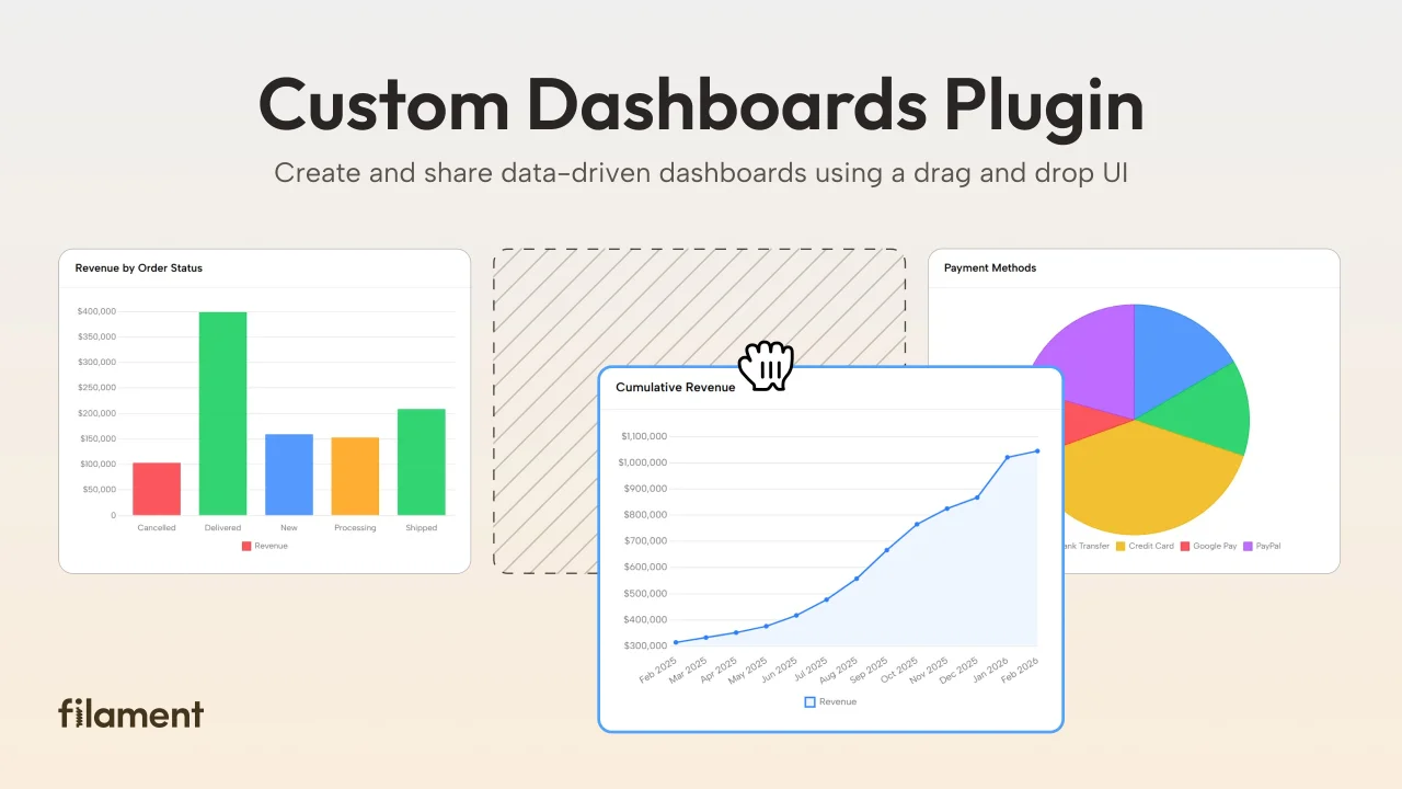
Custom Dashboards
Let your users build and share their own dashboards with a drag-and-drop interface. Define your data sources in PHP and let them do the rest.
 Filament
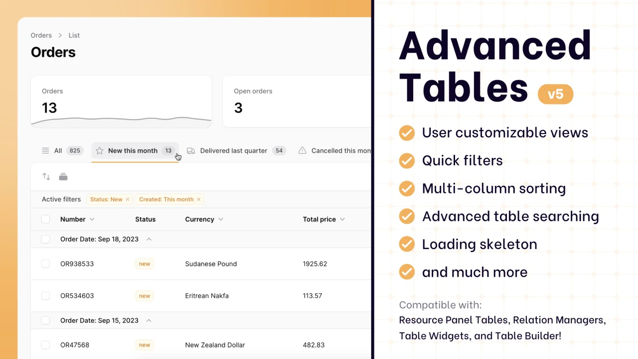
Advanced Tables (formerly Filter Sets)
Supercharge your tables with powerful features like user-customizable views, quick filters, multi-column sorting, advanced table searching, convenient view management, and more. Compatible with Resource Panel Tables, Relation Managers, Table Widgets, and Table Builder!
 Kenneth Sese

Spotlight Pro
Browse your Filament Panel with ease. Filament Spotlight Pro adds a Spotlight/Raycast like Command Palette to your Filament Panel.
 Dennis Koch