Advanced Choice by CodeWithDennis
CommunityA beautifully styled, fully customizable set of radio group components for FilamentPHP.
 Author:
CodeWithDennis
Author:
CodeWithDennis
Package health
Automated checks of this plugin's Composer package
15 checks
- Failed: GitHub Actions pinned to SHA — View details on Plumb
- Skipped: GitLab CI includes pinned to SHA
- Passed: Open security advisories
- Passed: Dependabot PR responsiveness — No open Dependabot PRs.
- Skipped: Renovate MR responsiveness
- Failed: Dependabot or Renovate configured — No dependency updater configuration found. View details on Plumb
- Skipped: Dependency update cooldown configured
- Passed: Provides a security policy
- Passed: Abandoned or archived — No consulted source marks the package abandoned (packagist, github).
- Passed: Commit and release recency — Active: last commit 0 days ago; last release 7 days ago.
-
Passed:
composer.lock not committed by library
—
composer.lockis absent from the released dist archive. - Passed: Dist archive is lean
-
Passed:
Current Laravel version supported
—
Package dependencies resolve together with current Laravel
13.0. -
Passed:
Current PHP version supported
—
Constraint
^8.1supports current PHP8.5. - Skipped: Current Symfony version supported
filament/
namespace. Review the source and install at your own risk. Found
malware or an unresolved security issue the author won't
address?
Report it
.
Documentation
- Requirements
- Installation
- The fields
- Describing your options
- Inherited behaviour
- Customization
- Putting it together
- Screenshots
- Contributing
- Security
- License


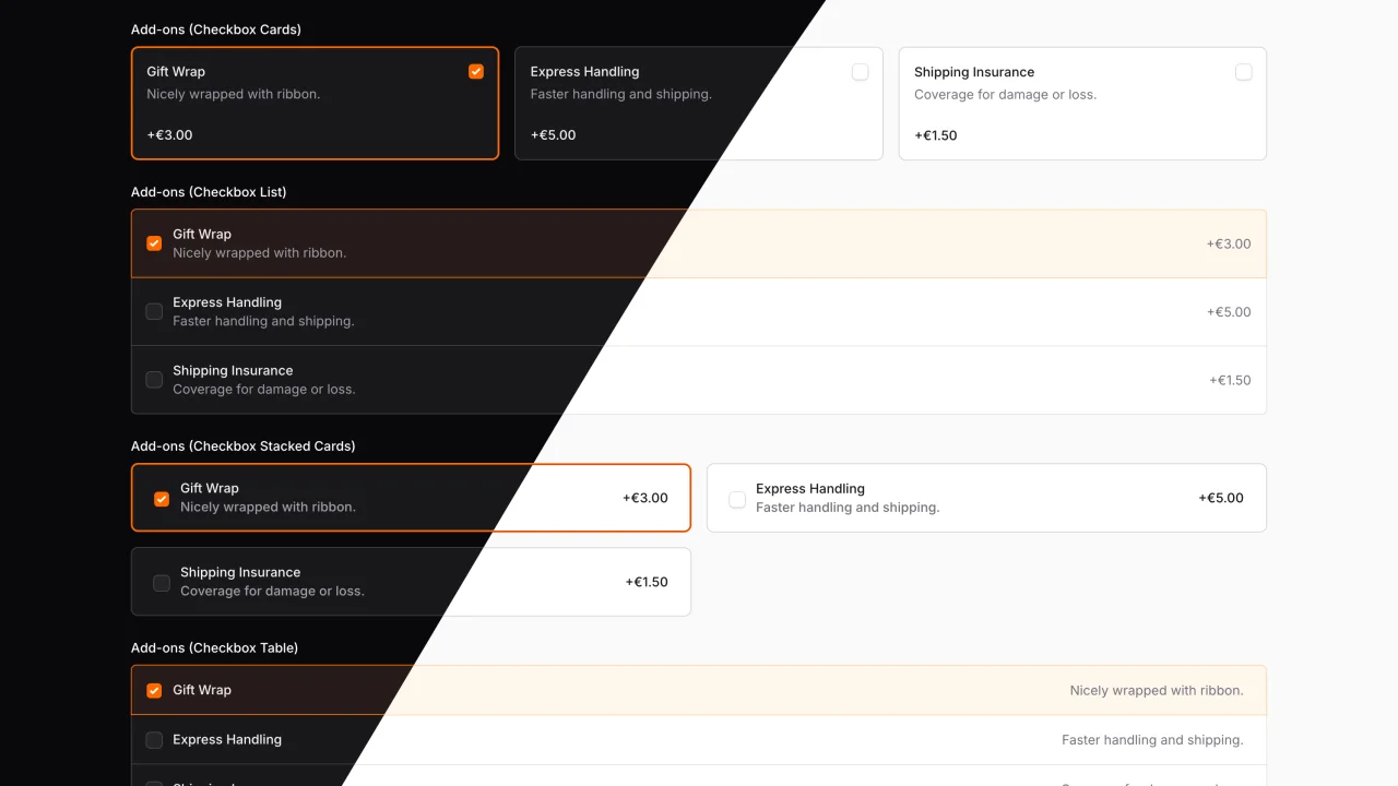
Eight form fields that turn a plain radio or checkbox list into something worth clicking: cards, stacked cards, tables and richer lists, each able to carry a description and an extra column of information.
Four fields extend Filament's Radio for single choice, four extend CheckboxList for multiple choice. They inherit the full API of the field they extend, so searchable(), bulkToggleable(), disableOptionWhen(), validation and state handling all work exactly as you already know them.
use CodeWithDennis\FilamentAdvancedChoice\Filament\Forms\Components\RadioCard;

RadioCard::make('plan')
    ->options([
        'hobby' => 'Hobby',
        'pro' => 'Pro',
        'team' => 'Team',
    ])
    ->descriptions([
        'hobby' => 'For side projects and experiments.',
        'pro' => 'For freelancers shipping client work.',
        'team' => 'For teams that need shared billing.',
    ])
    ->extras([
        'hobby' => 'Free',
        'pro' => '$29 / month',
        'team' => '$99 / month',
    ]);
Screenshots of every layout are at the bottom of this page.
#Requirements
- Filament 4.x or 5.x
#Installation
1. Install the package:
composer require codewithdennis/filament-advanced-choice
2. Register the views as a Tailwind source in your custom Filament theme, so the utility classes these fields use end up in your CSS:
@source '../../../../vendor/codewithdennis/filament-advanced-choice/resources/**/*.blade.php';
3. Rebuild the theme:
npm run build
Important
Skipping step 2 is the most common reason fields render unstyled. If a field looks like a plain list of checkboxes, the theme has not picked up these views yet. The same applies after upgrading: run npm run build again so new utility classes are compiled.
#The fields
All eight live in CodeWithDennis\FilamentAdvancedChoice\Filament\Forms\Components.
| Field | Selection | Layout |
|---|---|---|
RadioList |
Single | Vertical list |
RadioTable |
Single | Table, one option per row |
RadioCard |
Single | Grid of cards, 3 columns by default |
RadioStackedCard |
Single | Cards stacked full width |
CheckboxList |
Multiple | Vertical list |
CheckboxTable |
Multiple | Table, one option per row |
CheckboxCard |
Multiple | Grid of cards, 3 columns by default |
CheckboxStackedCard |
Multiple | Cards stacked full width |
Note
The plural class names (RadioCards, RadioStackedCards, CheckboxCards, CheckboxStackedCards) still exist as deprecated aliases. Use the singular names in new code.
#Describing your options
Every field takes the same three pieces of content, all keyed by option value.
| Method | Shows as |
|---|---|
options() |
The label |
descriptions() |
A subtitle under the label |
extras() |
A trailing column, ideal for a price, count or hint |
descriptions() and extras() are optional and can be used independently.
use CodeWithDennis\FilamentAdvancedChoice\Filament\Forms\Components\CheckboxStackedCard;

CheckboxStackedCard::make('delivery_type')
    ->options([
        'standard' => 'Standard delivery',
        'express' => 'Express delivery',
        'overnight' => 'Overnight delivery',
    ])
    ->descriptions([
        'standard' => 'Arrives within 5 to 7 business days.',
        'express' => 'Arrives within 2 to 3 business days.',
        'overnight' => 'Arrives the next business day.',
    ])
    ->extras([
        'standard' => '$5.00',
        'express' => '$10.00',
        'overnight' => '$20.00',
    ]);
#Using an enum instead
Pass a backed enum to options() and every field reads its content from the enum itself. Implement the contract for each piece you need:
| Contract | Provides |
|---|---|
Filament\Support\Contracts\HasLabel |
The label |
Filament\Support\Contracts\HasDescription |
The description |
CodeWithDennis\FilamentAdvancedChoice\Filament\Interfaces\HasExtra |
The extras column |
Filament\Support\Contracts\HasColor |
A colour for that single option, overriding the field colour. Honoured by the four Radio based fields only. |
CheckboxStackedCard::make('delivery_type')
    ->options(DeliveryType::class);
The enum behind that example
<?php

declare(strict_types=1);

namespace App\Enums;

use CodeWithDennis\FilamentAdvancedChoice\Filament\Interfaces\HasExtra;
use Filament\Support\Contracts\HasDescription;
use Filament\Support\Contracts\HasLabel;

enum DeliveryType: string implements HasDescription, HasExtra, HasLabel
{
    case Standard = 'standard';
    case Express = 'express';
    case Overnight = 'overnight';

    public function getLabel(): string
    {
        return match ($this) {
            self::Standard => __('Standard delivery'),
            self::Express => __('Express delivery'),
            self::Overnight => __('Overnight delivery'),
        };
    }

    public function getDescription(): string
    {
        return match ($this) {
            self::Standard => __('Arrives within 5 to 7 business days.'),
            self::Express => __('Arrives within 2 to 3 business days.'),
            self::Overnight => __('Arrives the next business day.'),
        };
    }

    public function getExtra(): ?string
    {
        return match ($this) {
            self::Standard => __('$5.00'),
            self::Express => __('$10.00'),
            self::Overnight => __('$20.00'),
        };
    }
}
You can still override individual pieces: extras() passed explicitly wins over getExtra() on the cases.
#Inherited behaviour
These come straight from Filament's Radio and CheckboxList, unchanged.
#Searching
Available on all eight fields. The search box filters on labels and descriptions.
CheckboxTable::make('delivery_type')
    ->options(DeliveryType::class)
    ->searchable()
    ->searchPrompt('Search delivery types...')
    ->noSearchResultsMessage('No delivery type matches your search.');
#Selecting everything at once
Multiple choice fields only.
CheckboxCard::make('delivery_type')
    ->options(DeliveryType::class)
    ->bulkToggleable();
#Disabling individual options
Disabled options are dimmed, unclickable and keep the not-allowed cursor.
CheckboxList::make('delivery_type')
    ->options(DeliveryType::class)
    ->disableOptionWhen(fn (string $value): bool => $value === 'overnight');
#Limiting how many can be picked
Multiple choice fields only.
CheckboxCard::make('delivery_type')
    ->options(DeliveryType::class)
    ->minItems(1)
    ->maxItems(3);
#Customization
#Columns
The card layouts arrange their options in a grid. RadioCard and CheckboxCard default to three columns, CheckboxStackedCard to one. Pass a number, or an array keyed by breakpoint.
RadioCard::make('delivery_type')
    ->options(DeliveryType::class)
    ->columns(4);

RadioCard::make('delivery_type')
    ->options(DeliveryType::class)
    ->columns([
        'default' => 1,
        'md' => 2,
        'xl' => 4,
    ]);
Use gridDirection(GridDirection::Column) to fill the grid top to bottom instead of left to right.
#Colour
Every field is primary by default. Any Filament colour works.
use Filament\Support\Colors\Color;

CheckboxCard::make('delivery_type')
    ->options(DeliveryType::class)
    ->color(Color::Rose);
#Hiding the native inputs
The whole option is clickable, so the checkbox or radio dot is often redundant. hiddenInputs() removes it while keeping the option selectable and accessible: a transparent input is stretched across the option instead.
CheckboxCard::make('delivery_type')
    ->options(DeliveryType::class)
    ->hiddenInputs();
Supported by the card and list layouts. RadioTable and CheckboxTable always show their native inputs and ignore this method.
On the four card layouts you can pair it with hiddenInputIcon(), which marks the selected card with an icon in its top right corner:
RadioCard::make('delivery_type')
    ->options(DeliveryType::class)
    ->hiddenInputs()
    ->hiddenInputIcon('heroicon-s-check-circle');
Note
There is no default icon. Without hiddenInputIcon(), a selected card is marked by its outline alone.
visibleInputs() reverses hiddenInputs().
#Cursor
Because the entire option is clickable, all eight fields show a pointer cursor by default. Opt out per field with defaultCursor():
CheckboxCard::make('delivery_type')
    ->options(DeliveryType::class)
    ->defaultCursor();
cursorPointer() reverses defaultCursor(). Both accept a boolean or a Closure, so the cursor can follow other state:
RadioCard::make('delivery_type')
    ->options(DeliveryType::class)
    ->defaultCursor(fn (): bool => ! auth()->user()->canChooseDelivery());
Disabled options keep the not-allowed cursor either way.
#Putting it together
A single choice field driven by an enum, laid out as cards without native inputs:
use App\Enums\DeliveryType;
use CodeWithDennis\FilamentAdvancedChoice\Filament\Forms\Components\RadioCard;
use Filament\Schemas\Schema;
use Filament\Support\Colors\Color;

public static function configure(Schema $schema): Schema
{
    return $schema
        ->components([
            RadioCard::make('delivery_type')
                ->label('How should we ship this?')
                ->options(DeliveryType::class)
                ->default(DeliveryType::Standard->value)
                ->required()
                ->columns(3)
                ->color(Color::Indigo)
                ->hiddenInputs()
                ->hiddenInputIcon('heroicon-s-check-circle')
                ->columnSpanFull(),
        ]);
}
#Screenshots
Each example below uses the same options, descriptions and extras, so the layouts can be compared directly.
#Single choice
RadioList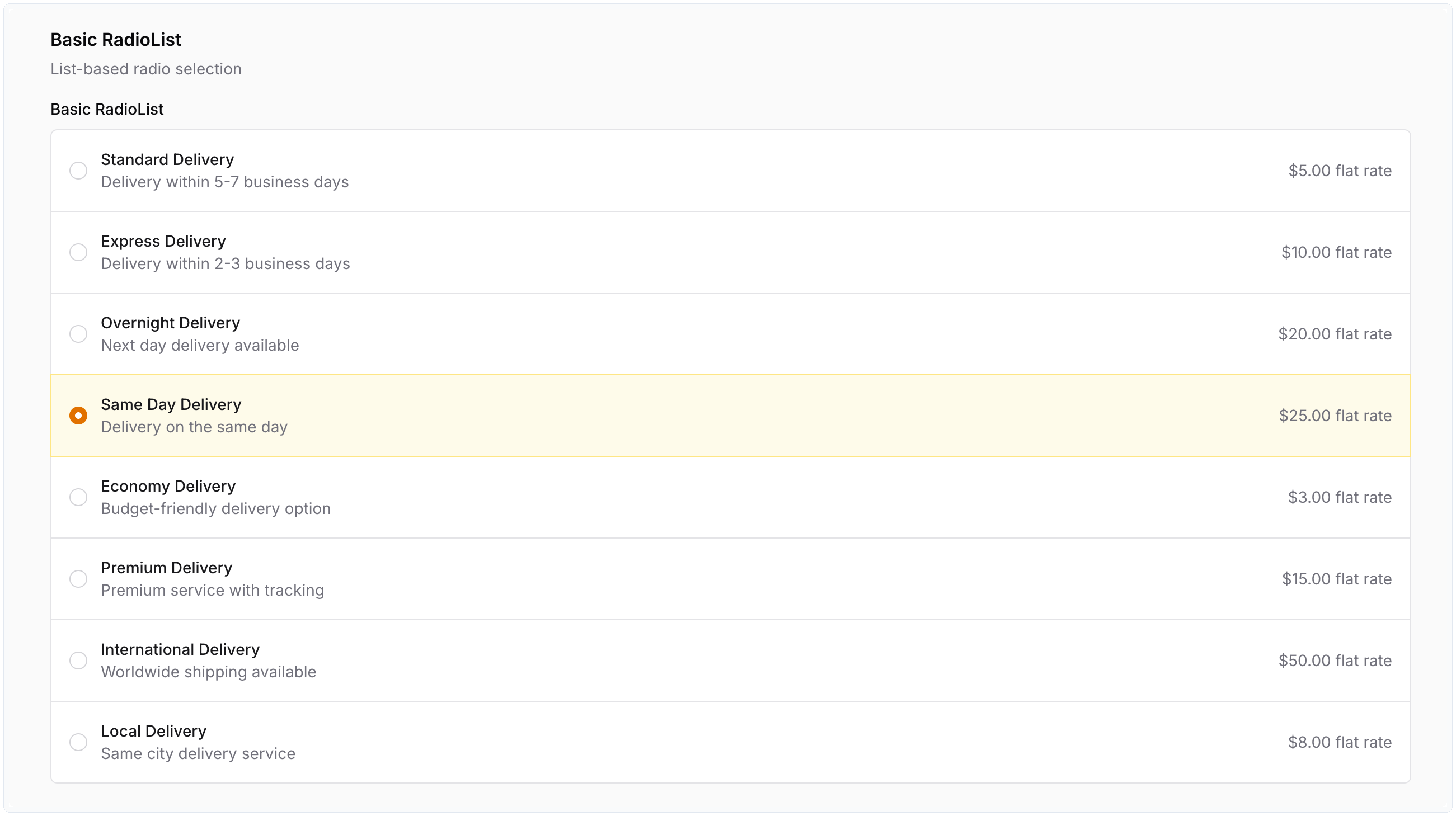 |
RadioTable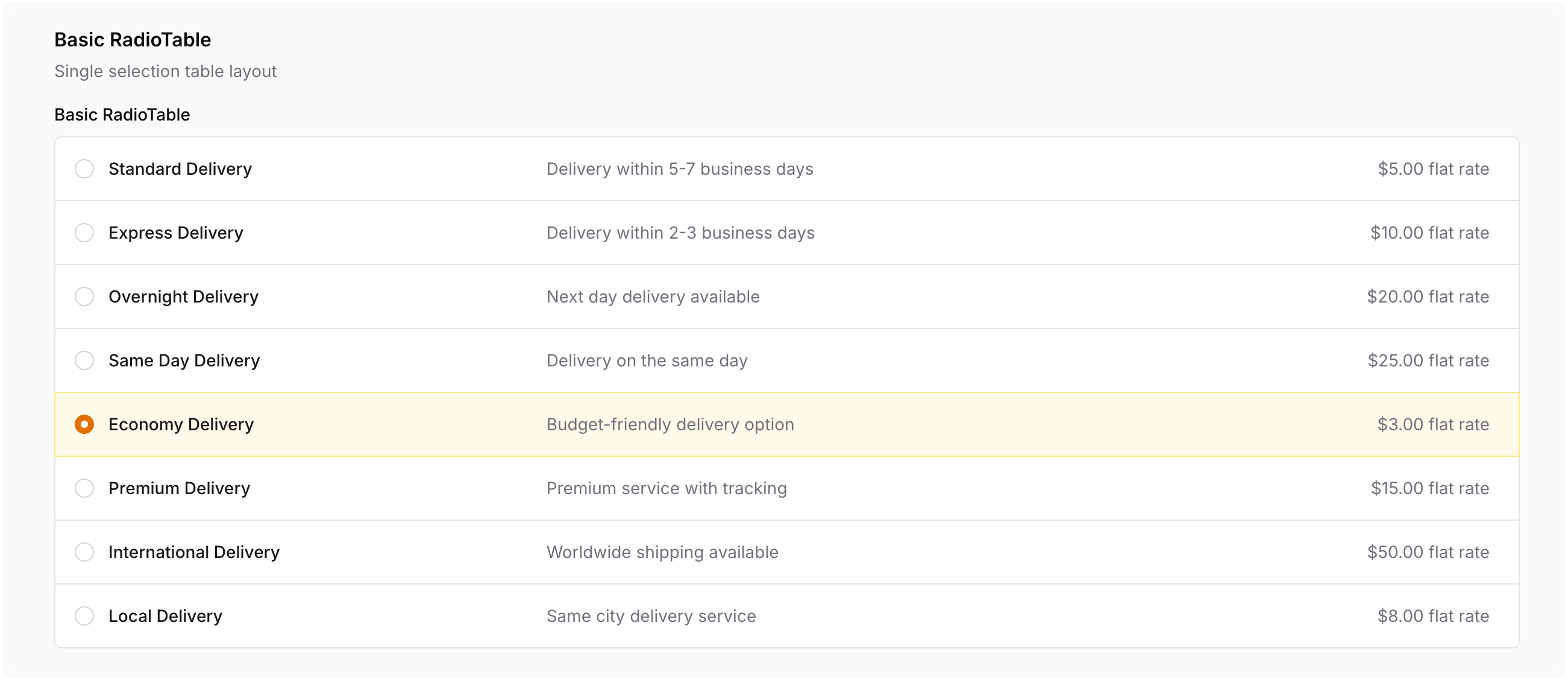 |
RadioCard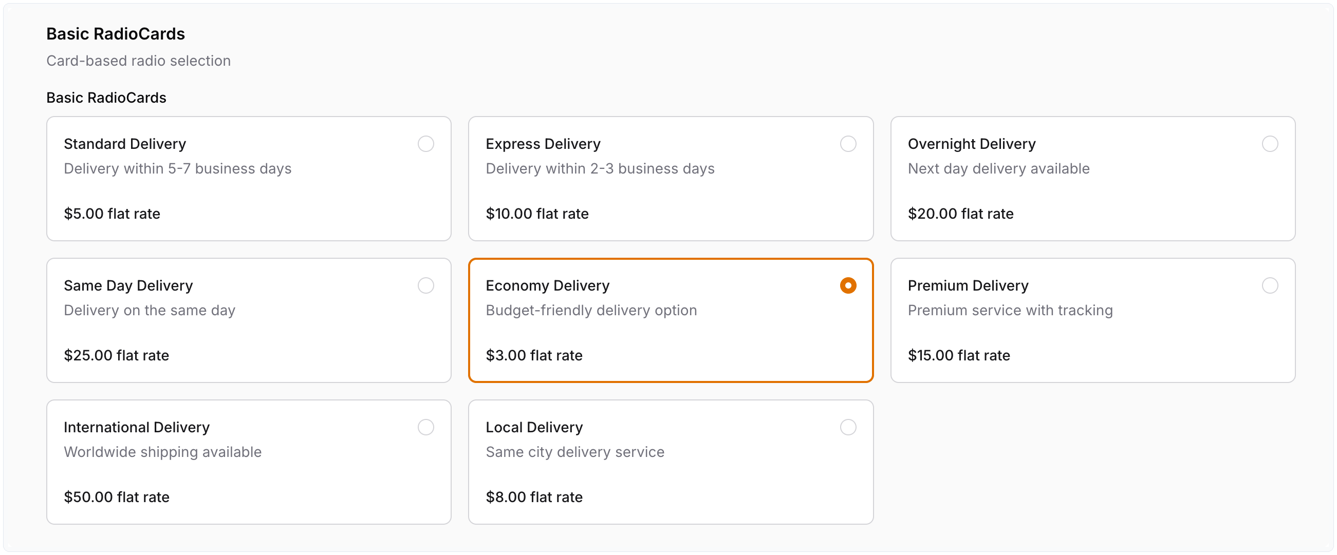 |
RadioStackedCard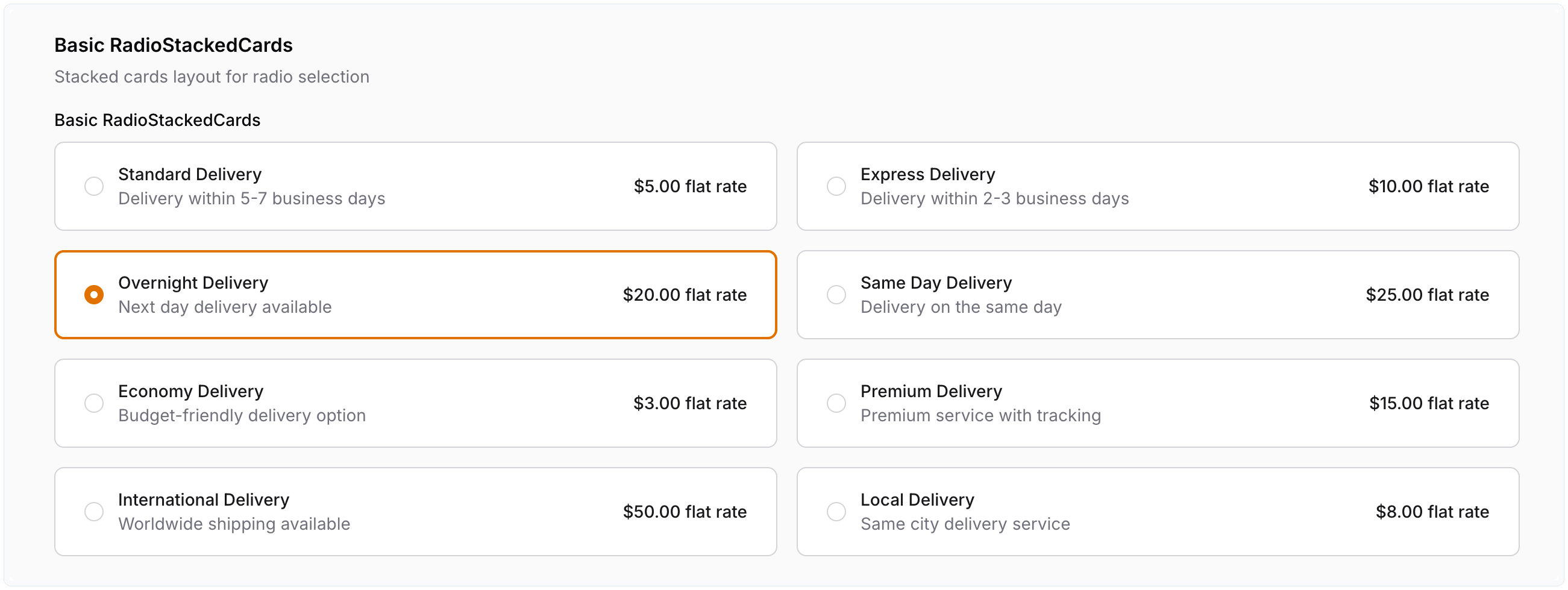 |
#Multiple choice
CheckboxList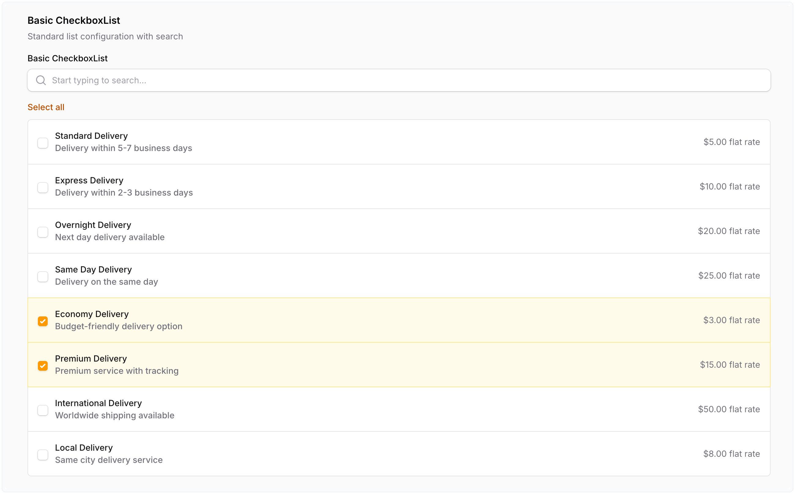 |
CheckboxTable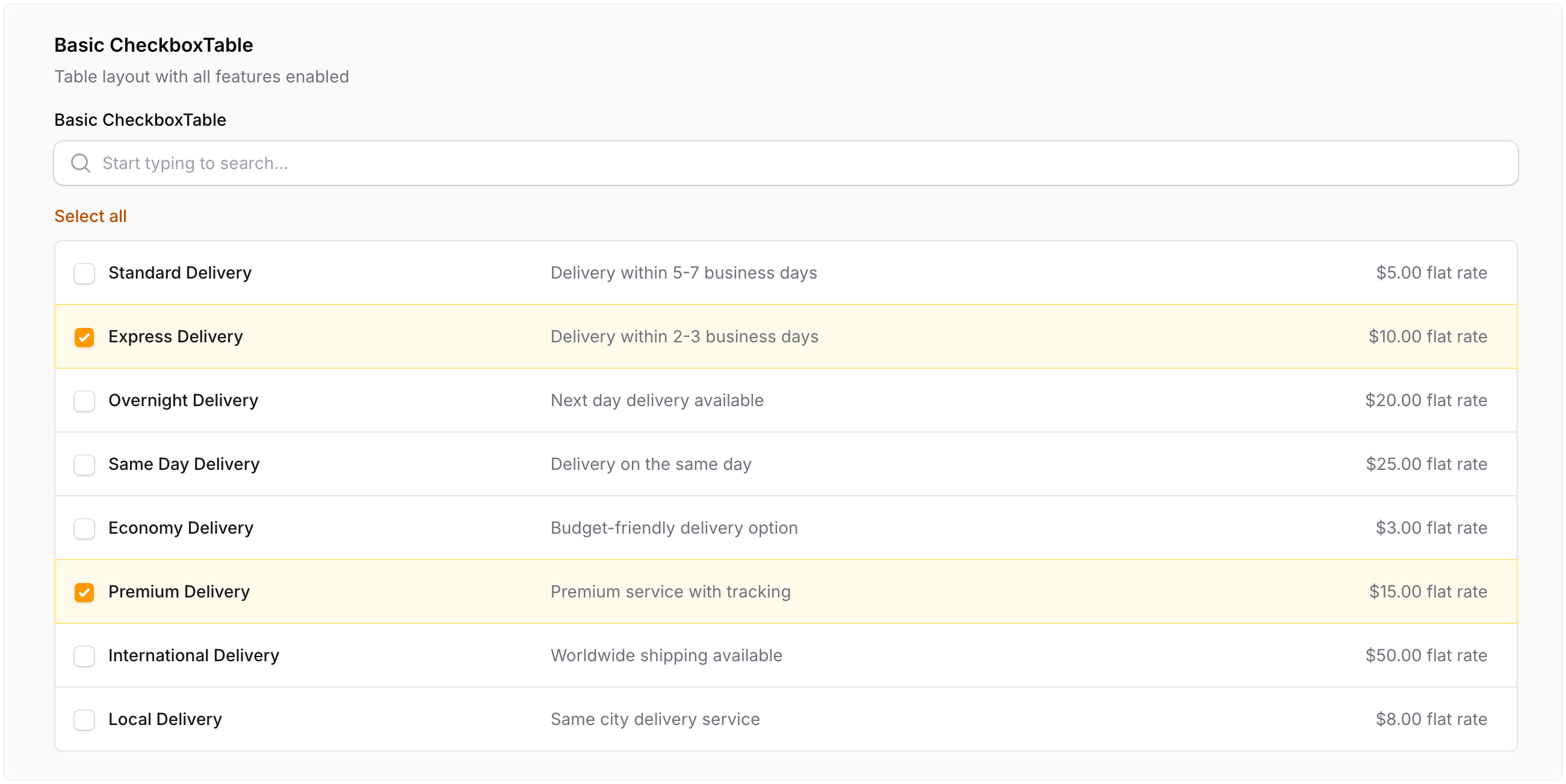 |
CheckboxCard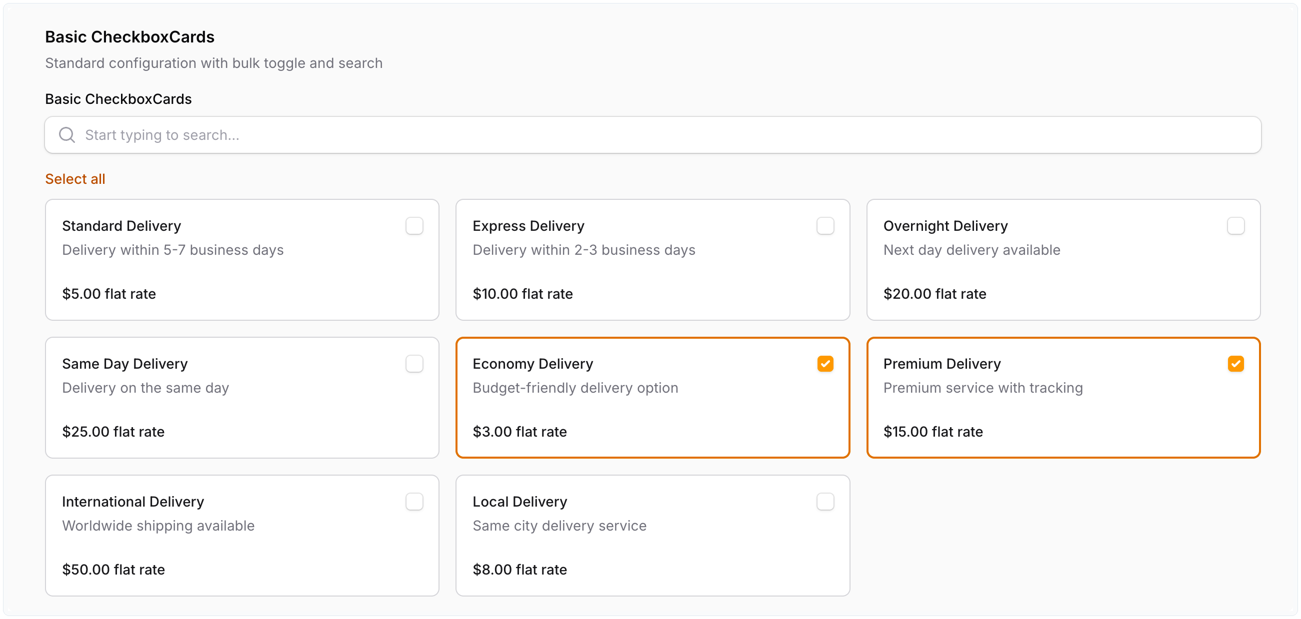 |
CheckboxStackedCard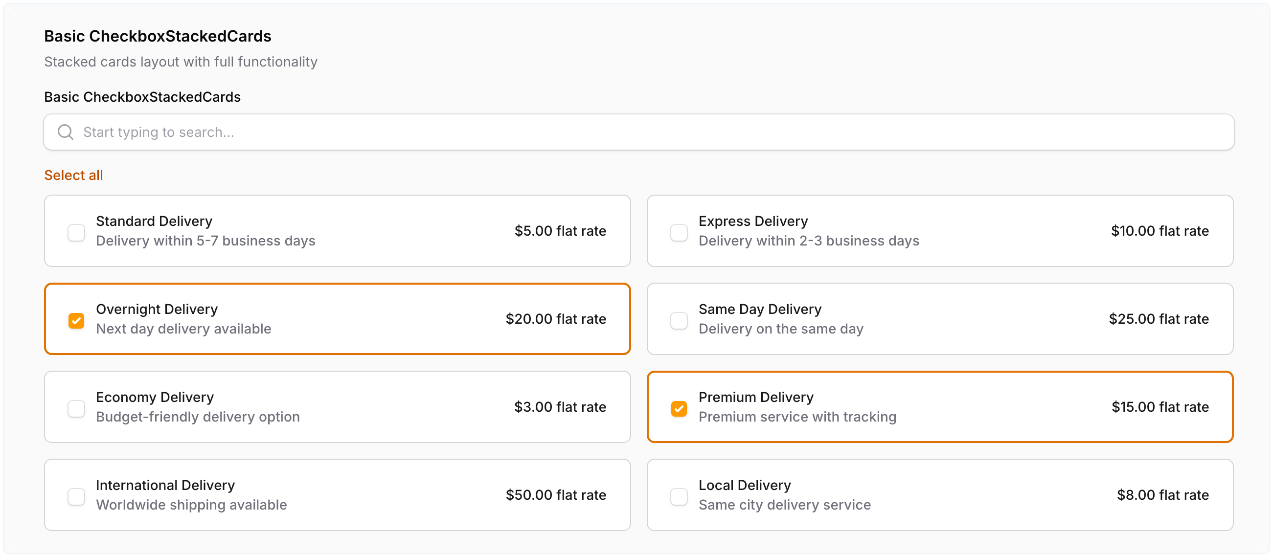 |
#Contributing
Contributions and pull requests are always welcome. If you want to discuss a bigger idea first, open an issue, but you do not have to. Running composer format before you open a PR helps keep CI green.
#Security
Report suspected vulnerabilities per .github/SECURITY.md. Do not post exploit details in a public issue.
#License
This package is released under the MIT License. The complete terms are in LICENSE.
The author
I build Laravel & FilamentPHP plugins, tinker with code, and game way too much when I’m off the clock.
From the same author

Larament
Kickstart your project and save time with Larament! This time-saving starter kit includes a Laravel project with FilamentPHP already installed and set up, along with extra features.
Author:
CodeWithDennis

Theme Inspector
Easily see the fi- class of any element on the page by hovering over it. A tooltip displays the class name, and you can copy it with a click!
Author:
CodeWithDennis

Simple Map
This package provides a simple and user-friendly map display action component for your Filament application.
Author:
CodeWithDennis

Simple Alert
A plugin for adding straightforward alerts to your Filament pages.
Author:
CodeWithDennis
Featured Plugins
A selection of plugins curated by the Filament team
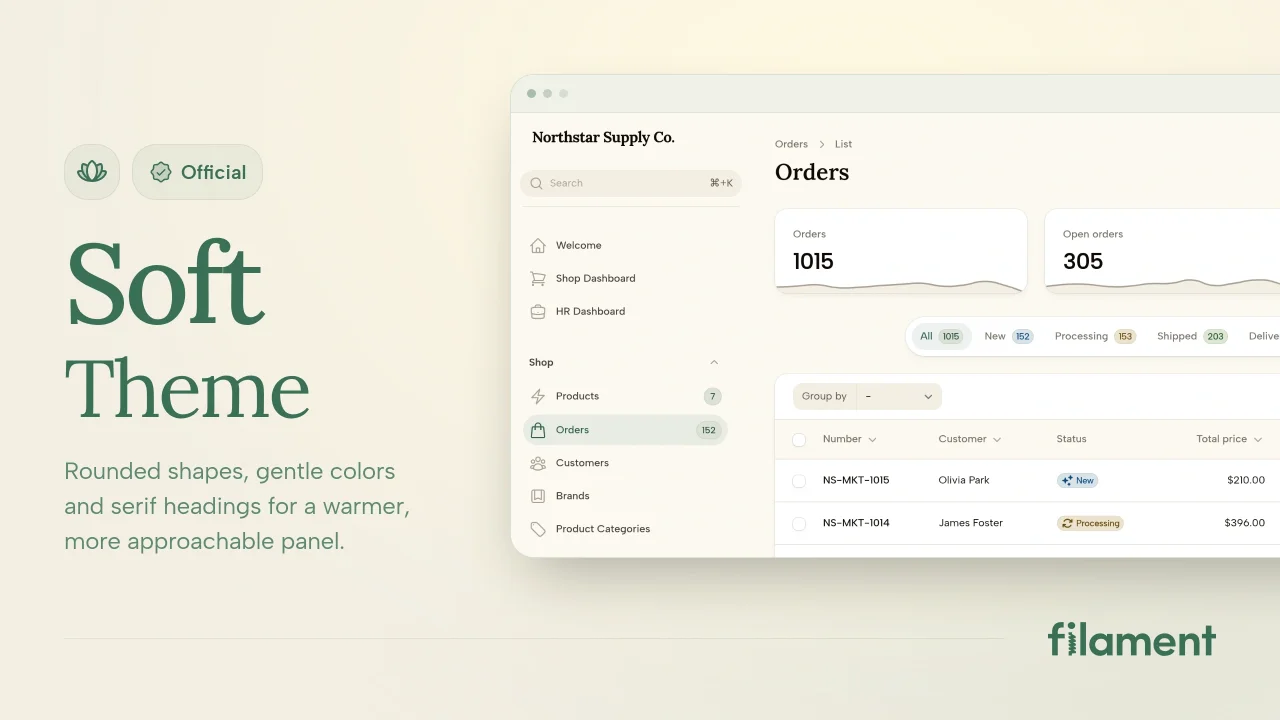
Soft Theme
A theme that gives panels a warm, approachable look with rounded shapes, gentle colors, and serif headings.
 Filament
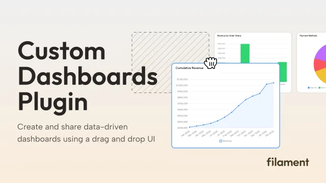
Custom Dashboards
Let your users build and share their own dashboards with a drag-and-drop interface. Define your data sources in PHP and let them do the rest.
Filament
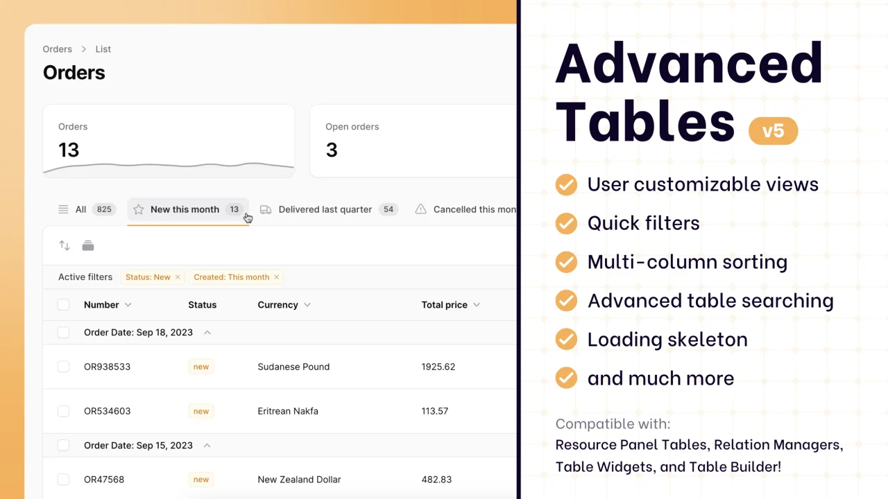
Advanced Tables (formerly Filter Sets)
Supercharge your tables with powerful features like user-customizable views, quick filters, multi-column sorting, advanced table searching, convenient view management, and more. Compatible with Resource Panel Tables, Relation Managers, Table Widgets, and Table Builder!
 Kenneth Sese