Advanced Components
CommunityThis plugin extends existing FilamentPHP components with advanced features and enhanced functionality.
filament/
namespace. Review the source and install at your own risk. Found
malware or an unresolved security issue the author won't
address?
Report it
.
 Author:
CodeWithDennis
Author:
CodeWithDennis
Documentation
- Licences
- Table of Contents
- Installation
- Getting Started
- Code Distribution
This plugin extends existing FilamentPHP components with advanced features and enhanced functionality, offering more powerful and flexible options for your projects.
#Licences
You can buy a license for the plugin on the AnyStack website.
#Table of Contents
- Licences
- Installation
- Getting Started
- Code Distribution
#Installation
To install the plugin, you need to add the repository to your composer.json file.
{
    "repositories": [
        {
            "type": "composer",
            "url": "https://filament-advanced-components.composer.sh"
        }
    ]
}
Once the repository has been added to the composer.json file, you can install the plugin using the following command.
composer require codewithdennis/filament-advanced-components:^3.0
If you are using Filament v4.x you can install the plugin using the following command.
composer require codewithdennis/filament-advanced-components:^4.0
You will be prompted to provide your username and password. The username will be the email address and the password will be equal to your license key.
Loading composer repositories with package information
Authentication required (filament-advanced-components.composer.sh):
Username: [licensee-email]
Password: [license-key]
#Custom Theme
You will need a custom theme to use the plugin.
#Filament 3
Make sure you add the following to your `tailwind.config.js file.
'./vendor/codewithdennis/filament-advanced-components/resources/**/*.blade.php',
Include the following import in your theme stylesheet.
@import '/vendor/codewithdennis/filament-advanced-components/resources/css/index.css';
#Filament 4
If you are using Filament v4.x, you will need to add the following to your theme stylesheet.
@import '../../../../vendor/codewithdennis/filament-advanced-components/resources/css/index.css';
@source '../../../../vendor/codewithdennis/filament-advanced-components/resources/views/filament/**/*';
#Getting Started
#Image
You can add a suffix or prefix image to the following components; AdvancedCheckboxList, AdvancedSelect, AdvancedSelectFilter, AdvancedTextColumn and AdvancedTextEntry.
->suffixImage(fn (Model $record): string => asset('images/'.$record->image))
->prefixImage(fn (Model $record): string => asset('images/'.$record->image))
#Image size
->suffixImageSize(32)
->prefixImageSize(32)
#Image extra attributes
->suffixImageExtraAttributes([
    'class' => 'pr-4',
]),
->prefixImageExtraAttributes([
    'class' => 'pr-4',
]),
#Mailable
Mailable works with the following components; AdvancedTextColumn and AdvancedTextEntry, This will make the value a clickable mailto link.
->mailable()
If you want to apply a mailable based on a condition, you can pass a closure that returns a boolean value.
->mailable(fn (string $state): bool => str($state)->endsWith('.com'))
#Callable
Callable works with the following components; AdvancedTextColumn and AdvancedTextEntry, This will make the value a clickable tel link.
->callable()
If you want to apply a callable based on a condition, you can pass a closure that returns a boolean value.
->callable(fn (string $state): bool => str($state)->startsWith('+'))
#WhatsApp-able
WhatsApp-able works with the following components; AdvancedTextColumn and AdvancedTextEntry, This will make the value a clickable WhatsApp link.
->whatsappable()
If you want to apply a WhatsApp-able based on a condition, you can pass a closure that returns a boolean value.
->whatsappable(fn (string $state): bool => str($state)->startsWith('+'))
#Masked
Masked works with the following components; AdvancedTextColumn and AdvancedTextEntry, This will mask the value.
->masked()
If you want to apply a mask based on a condition, you can pass a closure that returns a boolean value.
->masked(fn (string $state): bool => ! auth()->user()->is_admin)
#Mask Characters
You can change the mask character by passing a maskCharacters option to the component.
->maskCharacters('█')
#Mask Index
If you want to start the mask from a specific index, you can add a maskIndex option to the component.
->maskIndex(5)
#Mask Length
The length of the mask can be changed by adding a maskLength option to the component. When the length is set to null (default), the mask will be applied to the whole value.
->maskLength(5)
#Bold
Bold works with the following components; AdvancedTextColumn and AdvancedTextEntry, This will make the value bold.
->bold()
#Underline
Underline works with the following components; AdvancedTextColumn and AdvancedTextEntry, This will underline the value.
->underline()
#Italic
Italic works with the following components; AdvancedTextColumn and AdvancedTextEntry, This will italicize the value.
->italic()
#Strikethrough
Strikethrough works with the following components; AdvancedTextColumn and AdvancedTextEntry, This will strikethrough the value.
->strikethrough()
#Badges
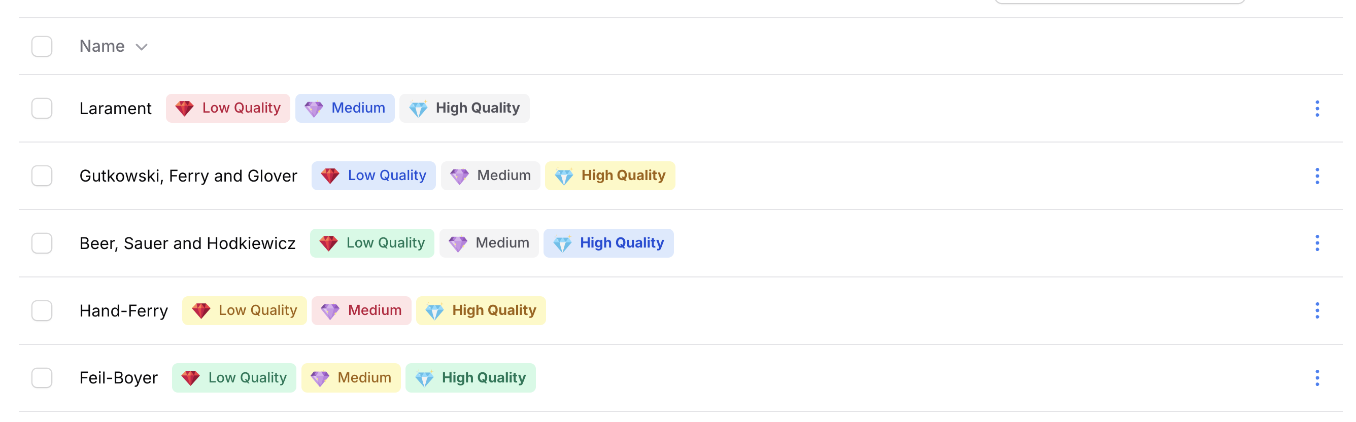
Badges works with the following components; AdvancedTextColumn and AdvancedTextEntry.
->badges([
    AdvancedBadge::make('example'),
])
#Border
If you want to have a border on your badge you can use the border method.
->border()
#Pulse
If you want to make a badge pulse you can use the pulse method.
->pulse()
#Bounce
If you want to make a badge bounce you can use the bounce method.
->bounce()
#Border radius
If you want to change the border radius of the badge you can use the borderRadius method (in px).
->borderRadius(5)
#Color
If you want to change the color of the badge you can use the color method.
->color('danger')
#Character count
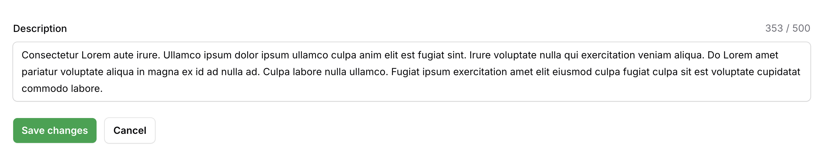
Character count works with the following components; AdvancedTextColumn and AdvancedTextarea, This will count the characters and display the count.
->characterCount()
#Character limit
[!WARNING]
This is only visual and does not enforce the limit.
Character limit works with the following components; AdvancedTextColumn and AdvancedTextarea, This will display a limit.
->characterLimit(100)
#Character limit color
If you want to change the color of the character limit you can use the characterLimitColor method.
->characterLimitColor('danger'),
#Character limit border color
By default, the border color will not change when the limit is reached. You can change this by passing a second parameter.
->characterLimitColor(color: 'danger', border: true),
#Character limit icon
If you want to change the icon of the character limit you can use the characterLimitIcon method.
->characterLimitIcon('heroicon-s-exclamation'),
#Border color
If you want to change the border color of AdvancedTextInput, AdvancedSelect or AdvancedTextarea you can use the borderColor method.
->borderColor('primary')
#Filters
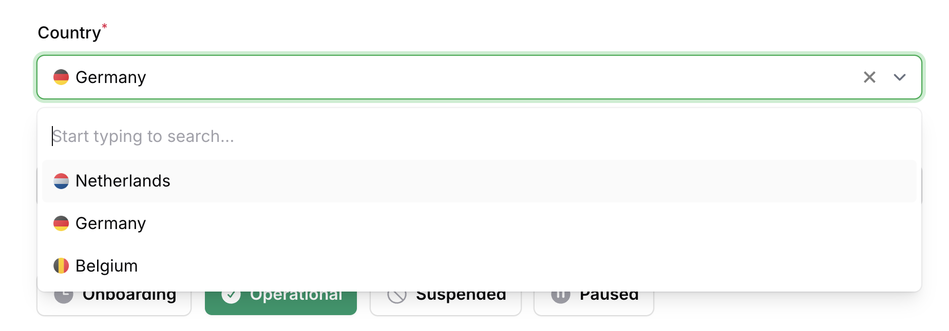
#Advanced Select Filter
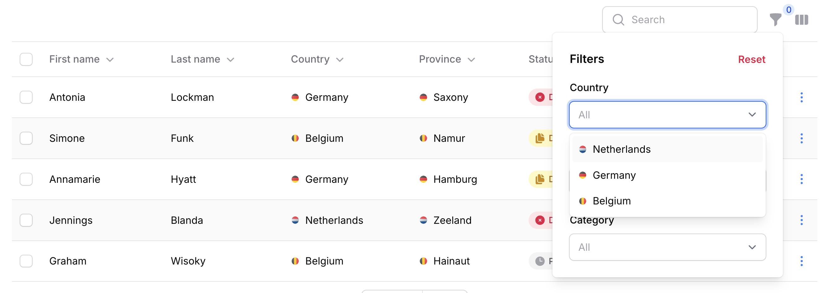
->filters([
    AdvancedSelectFilter::make('country.name')
        ->relationship('country', 'name')
])
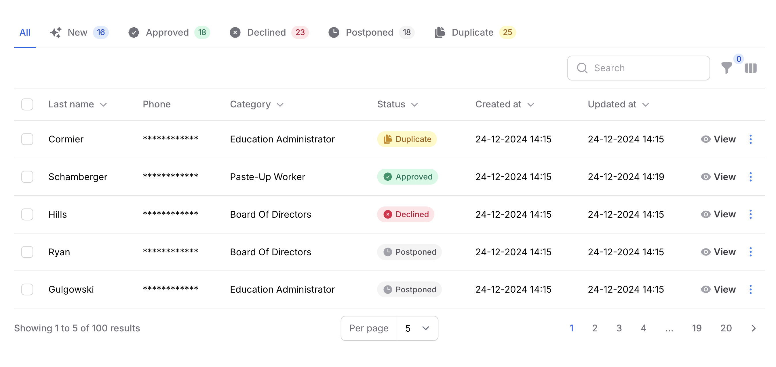
#Toggle Buttons Filter
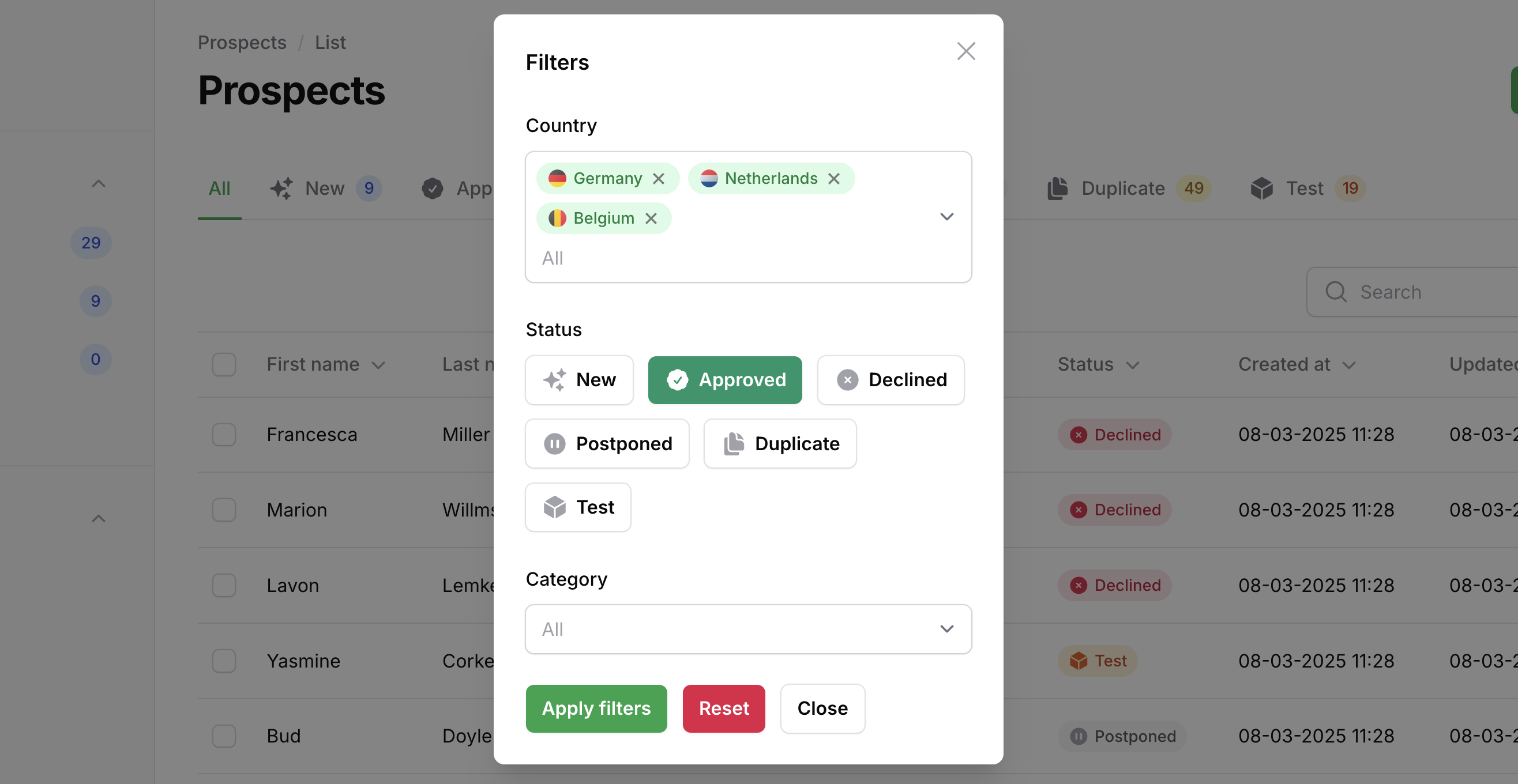
Similar to the ToggleButtons form component, the AdvancedToggleButtonsFilter allows you to filter using toggle buttons.
->filters([
    AdvancedToggleButtonsFilter::make('status')
        ->options(CompanyStatus::class)
        ->inline(),
])
#Code Distribution
Licenses strictly prohibit the public distribution of its source code. This means you are not permitted to use Filament Advanced Components to build an application and then distribute that application publicly through open-source repositories, hosting platforms, or any other code-sharing platforms.
The author
I build Laravel & FilamentPHP plugins, tinker with code, and game way too much when I’m off the clock.
From the same author
Advanced Choice
A beautifully styled, fully customizable set of radio group components for FilamentPHP.
Author:
CodeWithDennis

Larament
Kickstart your project and save time with Larament! This time-saving starter kit includes a Laravel project with FilamentPHP already installed and set up, along with extra features.
Author:
CodeWithDennis

Theme Inspector
Easily see the fi- class of any element on the page by hovering over it. A tooltip displays the class name, and you can copy it with a click!
Author:
CodeWithDennis

Simple Map
This package provides a simple and user-friendly map display action component for your Filament application.
Author:
CodeWithDennis
Featured Plugins
A selection of plugins curated by the Filament team

Blueprint
Filament Blueprint is a premium Laravel Boost extension that helps AI agents produce accurate, detailed implementation plans and security reports for Filament apps.
 Filament
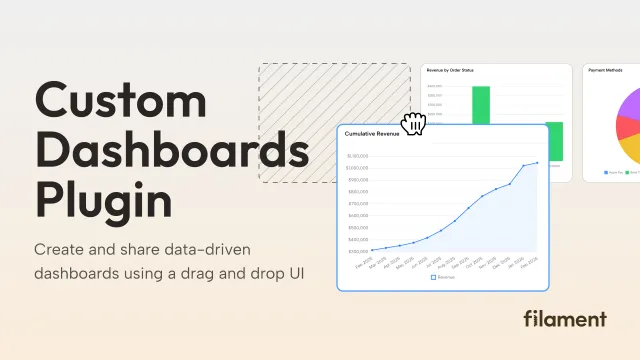
Custom Dashboards
Let your users build and share their own dashboards with a drag-and-drop interface. Define your data sources in PHP and let them do the rest.
Filament
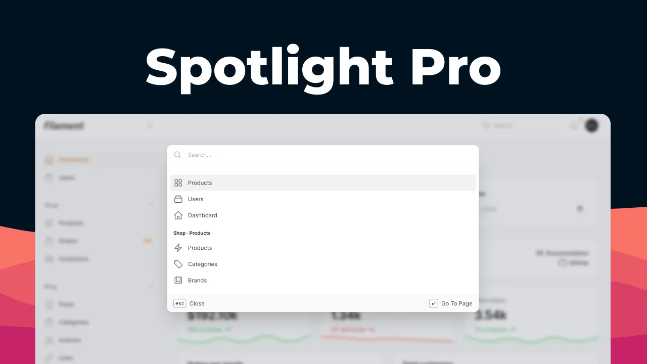
Spotlight Pro
Browse your Filament Panel with ease. Filament Spotlight Pro adds a Spotlight/Raycast like Command Palette to your Filament Panel.
 Dennis Koch