TextInput Entry
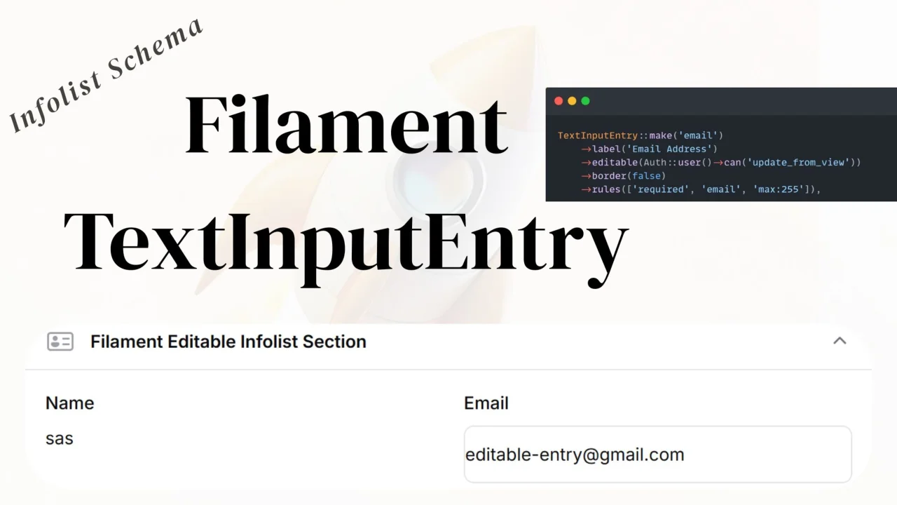
CommunityAn editable text input entry that allows users to edit text fields directly in the infolist view without navigating to an edit page.
filament/
namespace. Review the source and install at your own risk. Found
malware or an unresolved security issue the author won't
address?
Report it
.
 Author:
Anish Regmi
Author:
Anish Regmi
Documentation
A Filament plugin that provides an editable text input entry component for infolists. This component allows users to edit text fields directly in the infolist view without navigating to an edit page.
#Features
- ✨ Inline editing directly in infolist views
- 🎨 Customizable border styling
- ✅ Built-in validation support
- 🔔 Instant success notifications
- 🎯 Icon support (before/after)
- 🌈 Color customization
- �� Responsive design
- 🔄 Compatible with Filament v3, v4, and v5
#Requirements
- PHP 8.1+
- Filament 3.0+, 4.0+, or 5.0+
- Laravel 10+
#Installation
You can install the package via Composer:
composer require anish/text-input-entry
#Setup
#1. Install Assets
After installing the package, publish and build the assets:
npm install
npm run build
#2. Use the Trait in Your View Page
Add the TextInputEntryTrait to your Filament resource's view page:
<?php

namespace App\Filament\Resources\Users\Pages;

use Filament\Resources\Pages\ViewRecord;
use Anish\TextInputEntry\Traits\TextInputEntryTrait;

class ViewUser extends ViewRecord
{
    use TextInputEntryTrait;

    protected static string $resource = UserResource::class;
}
#3. Use the Component in Your Infolist
Use TextInputEntry in your infolist schema:
<?php

namespace App\Filament\Resources\Users\Schemas;

use Filament\Schemas\Schema;
use Anish\TextInputEntry\Infolists\Components\TextInputEntry;
use Filament\Support\Enums\TextSize;
use Illuminate\Support\Facades\Auth;

class UserInfolist
{
    public static function configure(Schema $schema): Schema
    {
        return $schema
            ->components([
                TextInputEntry::make('name')
                    ->editable(true)
                    ->size(TextSize::Large)
                    ->rules(['required', 'string', 'max:255'])
                    ->border(true),

                TextInputEntry::make('email')
                    ->editable(Auth::user()->can('update email'))
                    ->label('Email address')
                    ->rules(['required', 'email'])
                    ->border(true),
            ]);
    }
}
#Usage
#Basic Usage
TextInputEntry::make('field_name')
    ->editable(true)
    ->border(true)
#With Validation
TextInputEntry::make('email')
    ->rules(['required', 'email', 'max:255'])
    ->editable(true)
#With Custom Update Callback
TextInputEntry::make('name')
    ->updateStateUsing(function ($value, $record) {
        $record->name = $value;
        $record->save();

        // Custom logic here
        Log::info("Name updated to: {$value}");
    })
#Without Border
TextInputEntry::make('name')
    ->border(false) // Hides the border, shows as plain text until focused
#With Icon
TextInputEntry::make('email')
    ->icon('heroicon-o-envelope')
    ->iconPosition('before')
#Conditional Editing
TextInputEntry::make('name')
    ->editable(fn ($record) => auth()->user()->can('update', $record))
#Available Methods
editable(bool|Closure $editable)- Enable/disable editingborder(bool|Closure $showBorder)- Show/hide border (default: true)rules(array|string|Closure $rules)- Validation rulesupdateStateUsing(Closure $callback)- Custom update callbacksize(TextSize $size)- Text size (Small, Medium, Large)color(string|array $color)- Text coloricon(string $icon)- Icon nameiconPosition(string $position)- Icon position ('before' or 'after')placeholder(string $placeholder)- Input placeholder
#Compatibility
This package supports:
- ✅ Filament v3.0+
- ✅ Filament v4.0+
- ✅ Filament v5.0+
The package automatically detects and works with all supported versions.
#License
MIT
#Author
anishregmi17
The author
I am Anish Regmi, a full-stack web developer from Nepal. I have a strong foundation in PHP, Laravel, Filament, and JavaScript, and I specialize in building modern, scalable web applications. I enjoy creating clean, maintainable code and delivering seamless user experiences across both frontend and backend development.
From the same author

ClearField Action
An action that allows users to quickly reset all form fields with customizable confirmation dialogs and notifications.
Author:
Anish Regmi
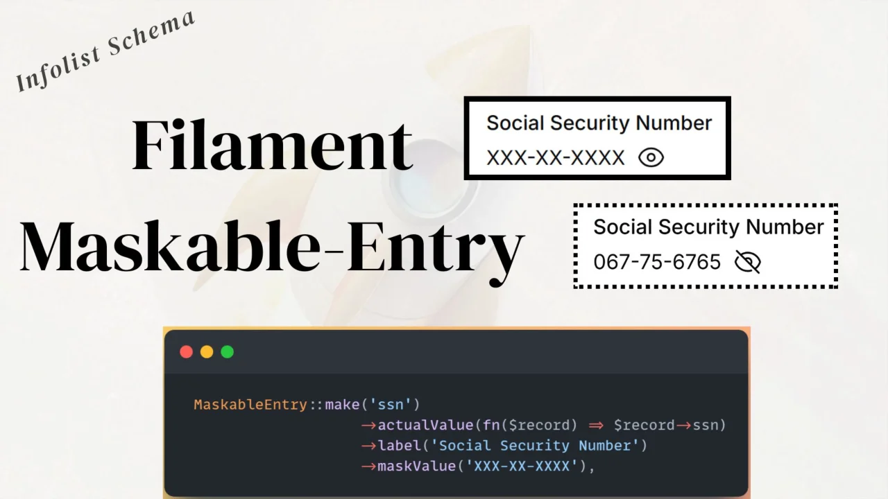
Maskable Entry
A reusable maskable entry component for Filament Infolists to hide and toggle sensitive values.
Author:
Anish Regmi
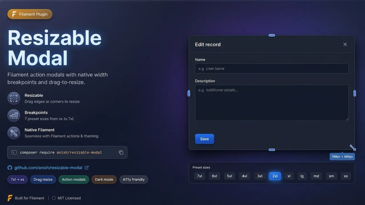
Resizable Modal
Filament plugin that adds drag-to-resize handles to action modals, snapping widths to Filament's native Width breakpoints for seamless ->modalWidth() compatibility.
Author:
Anish Regmi
Featured Plugins
A selection of plugins curated by the Filament team

Blueprint
Filament Blueprint is a premium Laravel Boost extension that helps AI agents produce accurate, detailed implementation plans and security reports for Filament apps.
 Filament

Spotlight Pro
Browse your Filament Panel with ease. Filament Spotlight Pro adds a Spotlight/Raycast like Command Palette to your Filament Panel.
 Dennis Koch
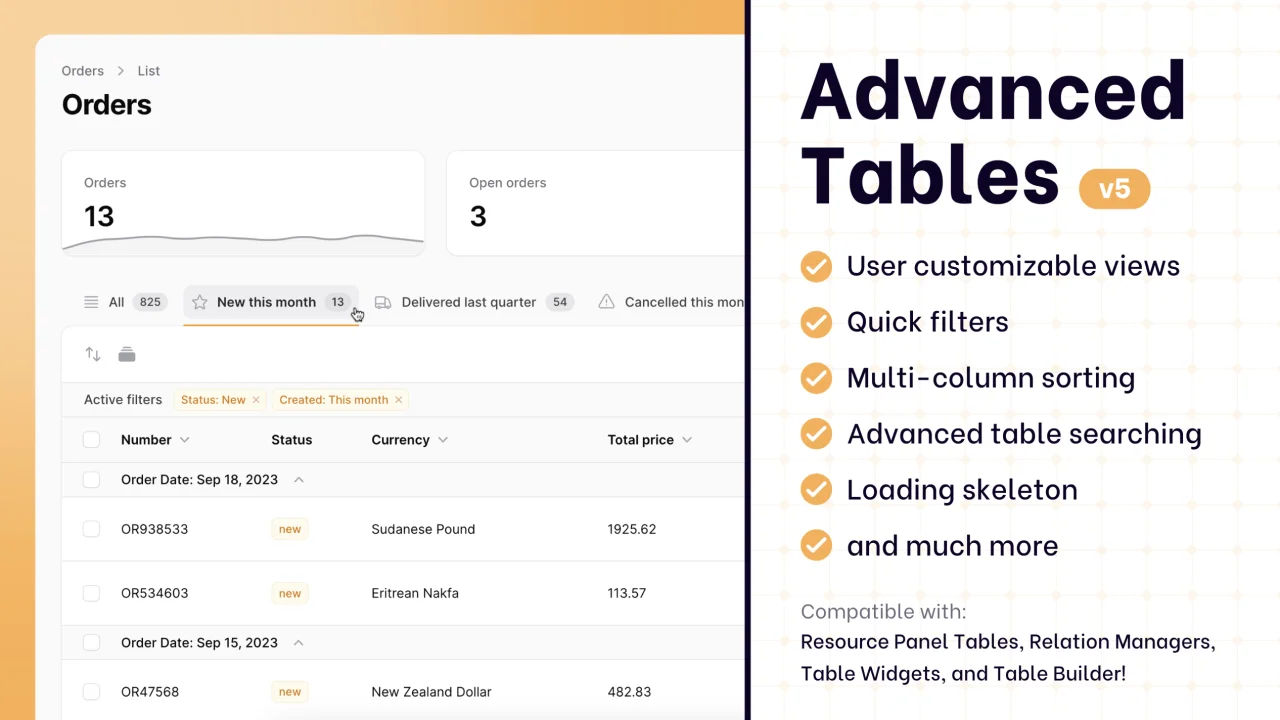
Advanced Tables (formerly Filter Sets)
Supercharge your tables with powerful features like user-customizable views, quick filters, multi-column sorting, advanced table searching, convenient view management, and more. Compatible with Resource Panel Tables, Relation Managers, Table Widgets, and Table Builder!
 Kenneth Sese