DropdownCheckboxList
CommunityA compact, searchable dropdown version of Filament's CheckboxList — selected values display as removable badges, with support for server-side search on large datasets.
filament/
namespace. Review the source and install at your own risk. Found
malware or an unresolved security issue the author won't
address?
Report it
.
 Author:
Alona
Author:
Alona
Documentation
- Features
- Requirements
- Installation
- Usage
- Isolated search state (optional)
- Publishing assets
- Adding translations
- License
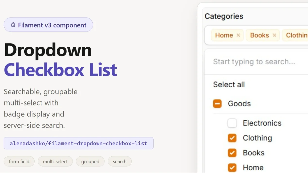
A searchable dropdown CheckboxList component for Filament v3.
Wraps a standard CheckboxList inside a dropdown trigger with badge-style selected value display, server-side search support, and persistent selection state.
#Features
- Dropdown trigger showing selected values as badges (up to 3), then a counter
- Server-side search via a callback
- Client-side search (default, no callback needed)
- Selected options always visible in the list regardless of search query
- Grouped options (nestable to any depth) with a per-group checkbox that toggles all of its descendants, with collapsible groups
- Bulk toggle (select all / deselect all) scoped to visible options
- Options limit to prevent rendering thousands of items
- Full dark mode support
- Translatable strings (English and Polish included)
#Requirements
- PHP 8.1+
- Filament 3.x
#Installation
composer require alenadashko/filament-dropdown-checkbox-list
#Usage
#Client-side search (simple)
Options are loaded once, filtering happens in the browser:
use AlenaDashko\DropdownCheckboxList\Components\DropdownCheckboxList;

DropdownCheckboxList::make('tags')
    ->options(Tag::pluck('name', 'id'))
#Server-side search
Options are loaded from a callback on each search query. Use this for large datasets:
DropdownCheckboxList::make('products')
    ->searchUsing(fn (string $search) => Product::where('name', 'like', "%{$search}%")
        ->limit(50)
        ->pluck('name', 'id')
        ->toArray()
    )
    ->selectedOptionLabelsUsing(fn (array $values) => Product::whereIn('id', $values)
        ->pluck('name', 'id')
        ->toArray()
    )
selectedOptionLabelsUsing is required when using searchUsing — it fetches labels
for already-selected values so they remain visible when the search query changes.
#Grouped options
Render options split into groups. Each group has its own checkbox that selects or deselects all of its child options at once (with an indeterminate state when only some children are selected):
DropdownCheckboxList::make('permissions')
    ->groupedOptions([
        'Users' => [
            'users.view'   => 'View users',
            'users.create' => 'Create users',
            'users.delete' => 'Delete users',
        ],
        'Posts' => [
            'posts.view'   => 'View posts',
            'posts.create' => 'Create posts',
        ],
    ])
The state is still a flat array of the selected child values (e.g.
['users.view', 'posts.create']) — the group checkbox is only a UI control. Search
matches both child labels and group labels (typing a group name reveals the whole
group). Grouped options are intended for the default client-side mode and ignore
optionsLimit.
#Nested groups
Groups can be nested to any depth. A node whose value is an array is a (sub)group; a node whose value is a scalar is a selectable option. Every group, at every level, gets its own checkbox that toggles all of its descendant options and its own collapse toggle (collapsing a parent hides the whole subtree):
DropdownCheckboxList::make('categories')
    ->groupedOptions([
        'Goods' => [
            'Electronics' => [
                'phones'  => 'Phones',
                'laptops' => 'Laptops',
            ],
            'Clothing' => [
                'shirts' => 'Shirts',
                'shoes'  => 'Shoes',
            ],
        ],
        'Services' => [
            'Repair' => [
                'car-repair'   => 'Car repair',
                'phone-repair' => 'Phone repair',
            ],
        ],
    ])
Search matches leaf labels as well as any ancestor group/subgroup name, and reveals the matching branch.
Groups are collapsible: clicking a group's title (or its chevron) toggles its child list, while the group checkbox keeps toggling the selection. An active search query temporarily expands every matching group. To render groups collapsed initially:
DropdownCheckboxList::make('permissions')
    ->groupedOptions([...])
    ->collapseGroupsByDefault()
#Server-side searched groups
For large, database-backed grouped datasets, use searchGroupedOptionsUsing(). The
callback receives the current $search string and returns the grouped structure on
each query (filtering happens on the server):
DropdownCheckboxList::make('permissions')
    ->searchGroupedOptionsUsing(fn (string $search) => Permission::query()
        ->when($search, fn ($q) => $q->where('label', 'like', "%{$search}%"))
        ->get()
        ->groupBy('group')
        ->map(fn ($items) => $items->pluck('label', 'id')->all())
        ->all()
    )
    ->selectedOptionLabelsUsing(fn (array $values) => Permission::whereIn('id', $values)
        ->pluck('label', 'id')
        ->toArray()
    )
As with flat server-side search, selectedOptionLabelsUsing() keeps labels for
already-selected values that fall outside the current search results.
#Using in table filters
Inside a table filter form, call ->live() so the table re-queries immediately
when the selection changes. Without it, the component's state is only synced into
Livewire's data bag and the filter won't apply until the next request (e.g. a page
reload):
use AlenaDashko\DropdownCheckboxList\Components\DropdownCheckboxList;
use Filament\Tables\Filters\Filter;
use Illuminate\Database\Eloquent\Builder;

Filter::make('subdepartments')
    ->form([
        DropdownCheckboxList::make('subdepartments')
            ->live()
            ->groupedOptions(/* ... */)
            ->searchable(),
    ])
    ->query(fn (Builder $query, array $data): Builder => $query->when(
        $data['subdepartments'] ?? null,
        fn (Builder $query, $value): Builder => $query->whereIn('subdepartment', $value),
    ))
#Options limit
Prevents rendering too many options at once (default: 50):
DropdownCheckboxList::make('categories')
    ->options(Category::pluck('name', 'id'))
    ->optionsLimit(100)
#Isolated search state (optional)
By default the component stores search state in a Livewire property named
{statePath}_search. If your Livewire component uses table filters and you want
to prevent the search from interfering with them, add the HasDropdownSearch trait:
use AlenaDashko\DropdownCheckboxList\Concerns\HasDropdownSearch;

class MyListResource extends Component
{
    use HasDropdownSearch;
}
This stores search state in a dedicated filterSearches array instead.
#Publishing assets
Publish views to customise the template:
php artisan vendor:publish --tag=dropdown-checkbox-list-views
Publish translations:
php artisan vendor:publish --tag=dropdown-checkbox-list-lang
#Adding translations
After publishing, add a new language file at:
lang/vendor/dropdown-checkbox-list/{locale}/messages.php
return [
    'placeholder'    => 'Select...',
    'selected_count' => 'selected',
    'no_results'     => 'No results found',
    'select_all'     => 'Select all',
    'deselect_all'   => 'Deselect all',
];
#License
MIT
Featured Plugins
A selection of plugins curated by the Filament team
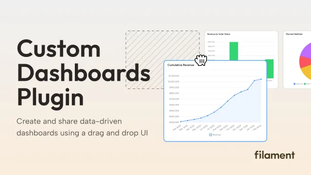
Custom Dashboards
Let your users build and share their own dashboards with a drag-and-drop interface. Define your data sources in PHP and let them do the rest.
 Filament

Blueprint
Filament Blueprint is a premium Laravel Boost extension that helps AI agents produce accurate, detailed implementation plans and security reports for Filament apps.
Filament
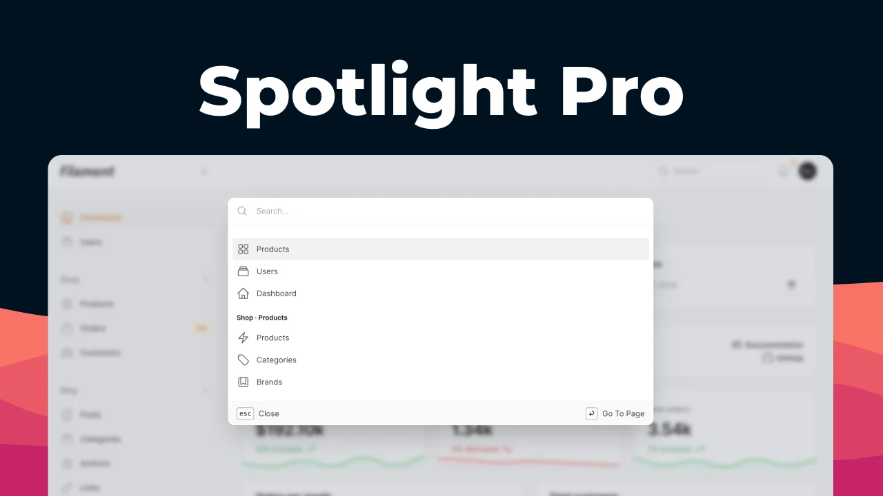
Spotlight Pro
Browse your Filament Panel with ease. Filament Spotlight Pro adds a Spotlight/Raycast like Command Palette to your Filament Panel.
 Dennis Koch