App Version
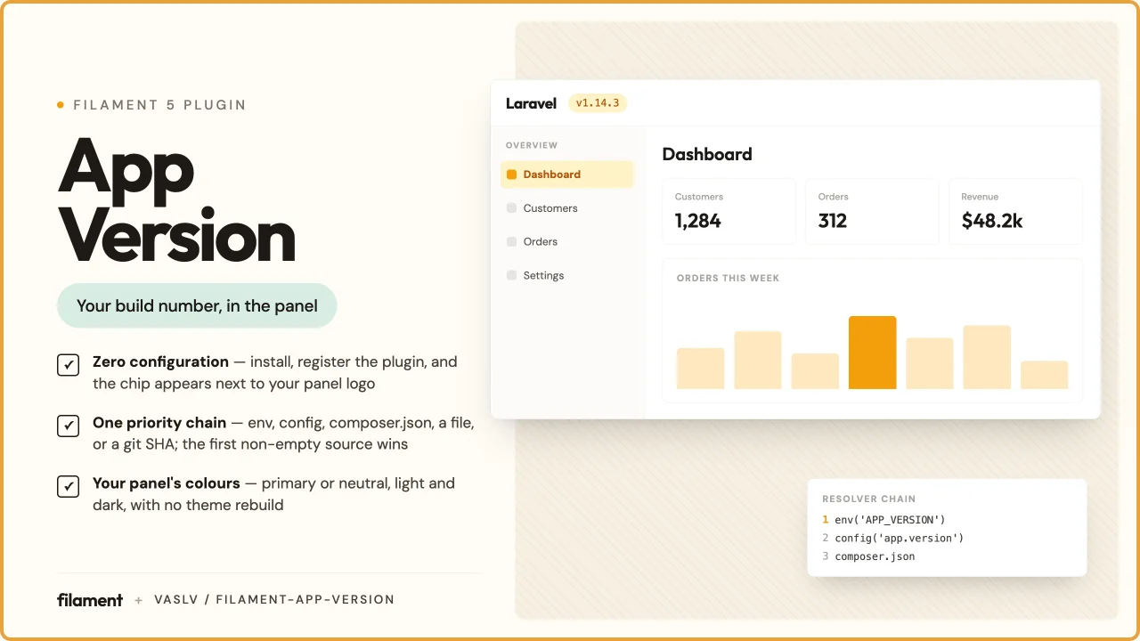
CommunityShows your application's version as a small chip next to the Filament panel logo, sourced from a configurable priority chain and hidden from guests by default.
 Author:
Andrei Vasilev
Author:
Andrei Vasilev
Package health
BetaAutomated checks of this plugin's Composer package
15 checks
- Passed: GitHub Actions pinned to SHA
- Skipped: GitLab CI includes pinned to SHA
- Passed: Open security advisories
- Passed: Dependabot PR responsiveness — No open Dependabot PRs.
- Skipped: Renovate MR responsiveness
- Passed: Dependabot or Renovate configured
- Passed: Dependency update cooldown configured
- Passed: Provides a security policy
- Passed: Abandoned or archived — No consulted source marks the package abandoned (packagist, github).
- Passed: Commit and release recency — Active: last commit 0 days ago; last release 0 days ago.
-
Passed:
composer.lock not committed by library
—
composer.lockis absent from the released dist archive. - Passed: Dist archive is lean
-
Passed:
Current Laravel version supported
—
Package dependencies resolve together with current Laravel
13.0. -
Passed:
Current PHP version supported
—
Constraint
^8.4supports current PHP8.5. - Skipped: Current Symfony version supported
filament/
namespace. Review the source and install at your own risk. Found
malware or an unresolved security issue the author won't
address?
Report it
.
Documentation
- Requirements
- Installation
- Where the version comes from
- Configuration
- Using the version outside the panel
- Testing & code quality
- Changelog
- Credits
- License



English · Русский
A Filament 5 plugin that shows your application's version as a small chip next to the panel logo — in the topbar on desktop and in the sidebar drawer header on mobile, so it is visible at any width.

- 🔗 Works with no configuration — if your app already exposes
config('app.version')or carries aversionfield incomposer.json, install and register the plugin and you are done - 🧩 Several sources, one priority chain — the first non-empty one wins
- 🎨 Takes its colour from your panel — the primary colour by default, the neutral grey on request, in both light and dark themes, with no custom theme and no Tailwind rebuild
- 🔒 Hidden from guests by default — a build number on a public login page is a free hint to anyone looking up CVEs; showing it is one explicit method call
#Requirements
- PHP 8.4+
- Laravel ^13.0
- Filament ^5.0
#Installation
composer require vaslv/filament-app-version
Register the plugin in your panel provider:
use Vaslv\FilamentAppVersion\AppVersionPlugin;

public function panel(Panel $panel): Panel
{
    return $panel
        // ...
        ->plugin(AppVersionPlugin::make());
}
That is the whole setup. Publish the config only if you need to change the chain:
php artisan vendor:publish --tag=filament-app-version-config
#Where the version comes from
Sources are tried in order and the first non-empty one wins:
1. config('filament-app-version.version')   ← env('APP_VERSION'), the CI injection point
2. config('app.version')                    ← the Laravel convention
3. composer.json → "version"
→  fallback 'dev'
To keep the version in the repository instead, add a version field to your application's composer.json and bump it at release time — that is link 3, and nothing else is needed.
#Injecting the version from CI
Set APP_VERSION in your environment and the first link of the chain picks it up:
APP_VERSION=1.19.16
Do not reach for EnvVersionResolver for this. The package config file calls env('APP_VERSION') inside a config file, which is the only placement that survives php artisan config:cache — with a cached config Laravel never loads .env, so an env() call at runtime returns null in production while working fine on your laptop.
#Configuration
use Filament\Panel;
use Filament\Support\Enums\Size;
use Filament\Support\Enums\VerticalAlignment;
use Filament\View\PanelsRenderHook;
use Vaslv\FilamentAppVersion\AppVersionPlugin;
use Vaslv\FilamentAppVersion\Resolvers\ConfigVersionResolver;
use Vaslv\FilamentAppVersion\Resolvers\FileVersionResolver;
use Vaslv\FilamentAppVersion\Resolvers\GitVersionResolver;

->plugin(
    AppVersionPlugin::make()
        ->resolvers([
            ConfigVersionResolver::make('app.release'),
            FileVersionResolver::make(base_path('VERSION')),
            GitVersionResolver::make(),
        ])
        ->fallback('dev')
        ->prefix('v')
        ->badge()
        ->neutral()
        ->size(Size::Small)
        ->verticalAlignment(VerticalAlignment::Center)
        ->renderHooks([
            PanelsRenderHook::TOPBAR_LOGO_AFTER,
            PanelsRenderHook::SIDEBAR_LOGO_AFTER,
        ])
        ->tooltip(fn (): string => __('Application version'))
        ->visible(fn (Panel $panel): bool => auth()->user()?->can('viewAppVersion') ?? false)
        ->view('filament.my-own-chip')
        ->extraAttributes(['data-testid' => 'app-version']),
)
| Method | Default | Notes |
|---|---|---|
resolvers(array) |
the global chain | Overrides the chain for this panel's chip only |
fallback(?string) |
'dev' |
null renders no chip at all when nothing resolves |
prefix(string) |
'v' |
Never doubled: a version that already starts with v is left alone |
badge(bool) |
false |
Draws the version as a pill with a tint and a hairline ring instead of bare text |
neutral(bool) |
false |
Uses the panel's neutral grey instead of its primary colour |
size(Size|string) |
Size::Medium |
xs … xl. Scales the text, and the pill along with it — see Size |
verticalAlignment(VerticalAlignment|string) |
VerticalAlignment::Center |
start, center or end — see Vertical placement |
renderHooks(array) |
topbar + sidebar header | Any PanelsRenderHook — see Hook order |
tooltip(string|Closure|null) |
translated "Application version" | Becomes the title attribute. null removes it entirely rather than falling back to the default. Pass a closure if the text is translated — see below |
visible(bool|Closure) |
authenticated only | Has the last word, over the default and over showToGuests() |
showToGuests(bool) |
false |
See Visibility |
view(string) |
package chip | See Custom view |
extraAttributes(array) |
[] |
style is concatenated with the package's, everything else overrides — see below |
Closures passed to visible() and tooltip() receive the Panel as their first argument; zero-argument closures keep working.
Pass a closure to tooltip() whenever the text is translated. A panel provider runs once, before the locale middleware and once per Octane worker, so a bare __() freezes one language for every user.
#Appearance
By default the chip is bare text in the panel's primary colour — the same one Filament uses for the active menu item. Two switches change that:
AppVersionPlugin::make()->badge()     // a pill: tinted background + hairline ring
AppVersionPlugin::make()->neutral()   // the grey of an ordinary menu item
| Light | Dark | |
|---|---|---|
| default |  |
 |
neutral() |
 |
 |
badge() |
 |
 |
badge()->neutral() |
 |
 |
The panel above passes Color::Amber to ->colors(); the chip is amber because the panel is, not because the package picked a colour.
prefix() is part of the same text — a v unless you say otherwise:
AppVersionPlugin::make()->badge()->prefix('build ')

Nothing is hard-coded. The colours come from the panel's own --primary-* and --gray-* variables, so the chip follows whatever palette you passed to ->colors(). The light and dark shades are picked by CSS light-dark(), which works because Filament declares color-scheme on the dark root — so there is no class to register and no stylesheet to rebuild.
#Size
use Filament\Support\Enums\Size;

AppVersionPlugin::make()->size(Size::Small)   // or ->size('sm')
Takes Filament's own Size or its string value.
size() |
Text | Pill, badge() only |
|---|---|---|
xs |
0.625rem / 0.875rem |
padding 0 0.25rem, radius 0.25rem |
sm |
0.6875rem / 1rem |
padding 0.0625rem 0.375rem, radius 0.25rem |
md (default) |
0.75rem / 1rem — Tailwind's text-xs, the size Filament's own .fi-badge uses |
padding 0.125rem 0.5rem, radius 0.375rem |
lg |
0.875rem / 1.25rem — text-sm |
padding 0.25rem 0.625rem, radius 0.375rem |
xl |
1rem / 1.5rem — text-base |
padding 0.375rem 0.75rem, radius 0.5rem |
All five with badge() on, cropped identically so the steps are comparable:
xs |
 |
sm |
 |
md |
 |
lg |
 |
xl |
 |
md is exactly what the chip was before size() existed, so upgrading changes nothing until you call it. Every padding is a Tailwind spacing token; two of the radii are Filament's own — rounded-md on the badge-sized steps and the button's rounded-lg at the top — and the bottom two are Tailwind's rounded-sm, one step under the badge, because 0.375rem on a 0.625rem line reads as a lozenge. The two steps below md leave the Tailwind type scale, which bottoms out at text-xs, because "smaller than a badge" is the whole point of asking for xs next to a logo.
Without badge() only the text scales: there is no pill to scale.
#Vertical placement
use Filament\Support\Enums\VerticalAlignment;

AppVersionPlugin::make()->verticalAlignment(VerticalAlignment::Start)   // or ->verticalAlignment('start')
start pins the chip to the top, end to the bottom, center is the default. The three below are the sidebar drawer header, where the box is a fixed 4rem and the difference is at its widest:
start |
 |
center (default) |
 |
end |
 |
The reference is the row the chip renders into, not the whole bar. In the topbar that row is as tall as the logo, so start levels the chip with the top of the logo. The sidebar drawer header is a fixed 4rem (.fi-sidebar-header is h-16), so there start and end hug the header's own edges — the same setting is tighter on desktop than it is in the mobile drawer.
center adds nothing to the markup at all: it renders exactly what the chip rendered before this method existed, and the container goes on placing it — which in both default hooks is the middle. Only start and end write anything, because nothing but align-self can move an item off its container's align-items.
They write it twice, as align-self and as vertical-align, because the hook decides which one is live. A hook lands the chip in one of three kinds of container: a flex row (.fi-topbar-start and .fi-sidebar-header, the two defaults), a grid (every schema hook, AUTH_LOGIN_FORM_AFTER among them — Filament renders a schema container through its own grid() macro), or a block, which is a hook of your own rendering into running text. In the first two align-self moves the chip and vertical-align is inert; in the third it is the other way round. Each declaration is a no-op where the other one works.
There is a fourth container, and it is the one caveat: a flex column — .fi-sidebar-nav and .fi-sidebar, which carry SIDEBAR_NAV_START, SIDEBAR_NAV_END, SIDEBAR_START and SIDEBAR_FOOTER — reads align-self on the horizontal axis. On those hooks start and end move the chip sideways rather than up and down. That is the axis CSS gives them, not a decision this package can make; it is also why center, the value every chip has without asking for it, writes nothing.
An unrecognised string in either method is ignored — the previous value stays — with a warning in the log when APP_DEBUG is on. A mistyped size is a cosmetic detail, and the package does not take a panel down over one.
#extraAttributes() and escaping
Values and attribute names you pass here reach the HTML unescaped — Laravel's own ComponentAttributeBag behaviour, which this package does not diverge from. A value carrying a double quote closes the attribute, so escape anything that is not a literal you wrote yourself.
// Fine — a literal.
->extraAttributes(['data-testid' => 'app-version'])

// Escape it — the value comes from outside your code.
->extraAttributes(['data-tenant' => e($tenant->name)])
style is the restyling route that needs no custom view — here a monospaced chip, still a badge() in the panel's own colour:
->badge()->extraAttributes(['style' => 'font-family:ui-monospace,SFMono-Regular,monospace;letter-spacing:0.02em'])

Two exceptions: style is folded into the package's own merged default and Laravel escapes it for you, and tooltip() goes through the escaped path, so ->tooltip($somethingUntrusted) is safe.
#Sources
| Resolver | Reads |
|---|---|
ConfigVersionResolver::make('app.version') |
A config value by dot path |
ComposerJsonVersionResolver::make() |
The version field of the application's composer.json |
FileVersionResolver::make(base_path('VERSION')) |
A plain-text file. A second argument — make(base_path('build.json'), 'version') — switches it to JSON with a dot path |
GitVersionResolver::make() |
The seven-character SHA of HEAD, read straight out of .git with no shell calls and no tag detection |
CallbackVersionResolver::make(fn () => …) |
Anything — Redis, Vault, a table |
EnvVersionResolver::make('APP_RELEASE') |
A process environment variable — read the warning below |
EnvVersionResolver only sees a variable that really is in the process environment: compose's environment:/env_file:, a Kubernetes Deployment, a systemd unit. A variable that lives only in a .env file is invisible to it once the config is cached, which is why the supported route for an environment variable is the package config file.
#Visibility
| guest | authenticated | |
|---|---|---|
| default | hidden | shown |
showToGuests() |
shown | shown |
visible(fn) |
the closure's result | the closure's result |
Setting visible() together with showToGuests() logs a warning when APP_DEBUG is on, so the contradiction surfaces rather than being guessed at.
The default is conservative because hooks such as AUTH_LOGIN_FORM_AFTER render before login, where a precise build number tells an attacker which CVEs to try.
#Hook order
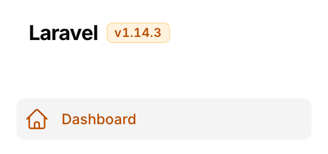
The two default hooks are complementary by breakpoint, not by menu state: above 64rem Filament hides the sidebar header, below it the topbar. So the topbar chip is what you see on desktop, the sidebar one after opening the drawer on mobile, and on desktop the sidebar copy sits in the DOM without being painted.
TOPBAR_LOGO_AFTER — desktop |
SIDEBAR_LOGO_AFTER — the mobile drawer |
|---|---|
|
 |
On the sidebar hook the package emits one CSS rule alongside the chip. Filament gives that header's logo container flex: 1 1 0%, and SIDEBAR_LOGO_AFTER is the header's last child, so without it the chip lands against the opposite edge instead of next to the logo. The rule travels with the chip — nothing on other hooks, nothing when the chip is hidden, and no stylesheet to rebuild — and it selects the chip through data-filament-app-version, an attribute every chip carries and your own CSS or tests are free to use.
Output on a shared hook follows registration order, so where ->plugin() sits in your panel provider chain decides whether the chip lands before or after another plugin's output on the same hook:
->plugin(AppVersionPlugin::make())      // logo → version → menu
->plugin(TopbarMenuPlugin::make())
Swap those two lines and you get logo → menu → version.
#Custom view
->view() replaces the chip entirely. Your view receives exactly four variables, and that set is covered by semver:
| Variable | Type | Notes |
|---|---|---|
$version |
string |
Exactly what the source gave, trimmed |
$prefix |
string |
Already resolved — empty when disabled or when $version starts with it |
$tooltip |
?string |
The title that ended up in the markup, or null |
$attributes |
ComponentAttributeBag |
Your extraAttributes() merged with the package's style and data-filament-app-version, plus title when a tooltip is set |
<span {{ $attributes }}>{{ $prefix }}{{ $version }}</span>
To restyle rather than replace, you do not need ->view() at all — size() and verticalAlignment() cover the usual two, and ->extraAttributes(['style' => 'font-size:0.7rem;']) overrides the package's own declarations for everything else. Inside a custom view, {{ $attributes->except('style') }} drops the package's styling, along with anything you passed through extraAttributes(['style' => …]).
The package view also emits a visually-hidden "<tooltip>: " before the version, because the chip is a non-focusable <span> whose title is unreachable by keyboard. A custom view that omits it announces a bare v1.19.16 to a screen reader.
Print {{ $attributes }} on the chip's own element, or at least keep data-filament-app-version on it. The sidebar header rule selects on that attribute, and a custom view that drops it puts the chip back against the far edge of the mobile drawer.
#Using the version outside the panel
use Vaslv\FilamentAppVersion\Facades\AppVersion;

AppVersion::get(); // '1.19.16' or null
Handy as a theme cache-buster:
->theme(asset('css/filament/admin/theme.css').'?v='.AppVersion::get())
The facade always reads the global chain from the config, never a panel's ->resolvers() — in the example above ->theme() runs before ->plugin(), so at that moment the plugin does not exist yet.
#Testing & code quality
composer check       # lint:test + analyse + test
composer test        # Pest
composer analyse     # PHPStan, level max
composer lint        # Pint, autofix
composer.lock is not committed, so every run resolves its own dependency set. To reproduce CI without a local PHP runtime:
make test            # one PHP version, 8.4 by default
make test-matrix     # 8.4 and 8.5, highest and lowest dependencies, in Docker
CI runs the same four combinations, plus Pint and PHPStan.
#Changelog
See CHANGELOG.md.
#Credits
#License
MIT. See LICENSE.
The author
From the same author
Featured Plugins
A selection of plugins curated by the Filament team
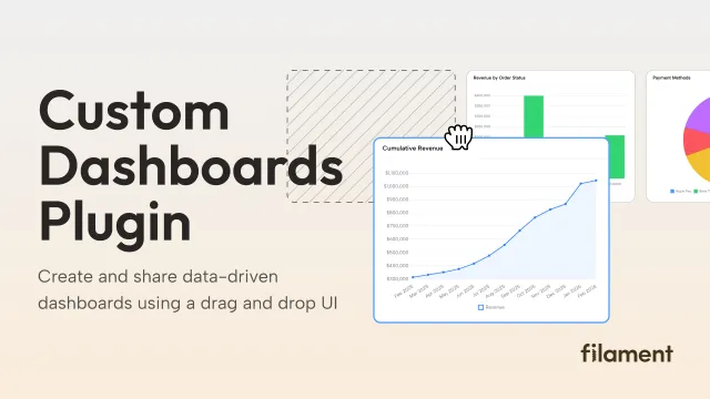
Custom Dashboards
Let your users build and share their own dashboards with a drag-and-drop interface. Define your data sources in PHP and let them do the rest.
 Filament
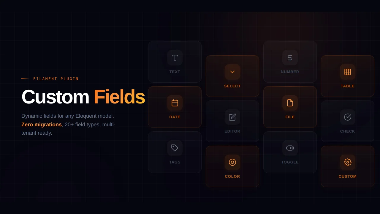
Custom Fields
Eliminate custom field migrations forever. Let your users create and manage form fields directly in Filament admin panels with 20+ built-in field types, validation, and zero database changes.
 Relaticle
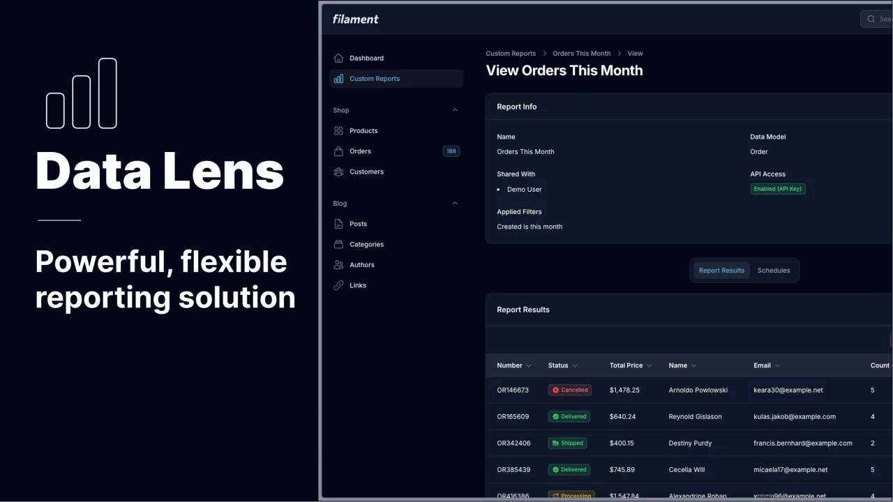
Data Lens
Advanced Data Visualization for Laravel Filament - a premium reporting solution enabling custom column creation, sophisticated filtering, and enterprise-grade data insights within admin panels.
 Padmission