Spiggle Theme
CommunityA polished Filament admin shell you can restyle from the panel — palettes, layouts, brand, and icons — without fighting CSS.
filament/
namespace. Review the source and install at your own risk. Found
malware or an unresolved security issue the author won't
address?
Report it
.
 Author:
Spiggle
Author:
Spiggle
Documentation
- Features
- Hosted demo
- Get a license
- Screenshots
- Installation
- Language support
- Theme settings
- Demo navigation
- FAQ
- Security
- License
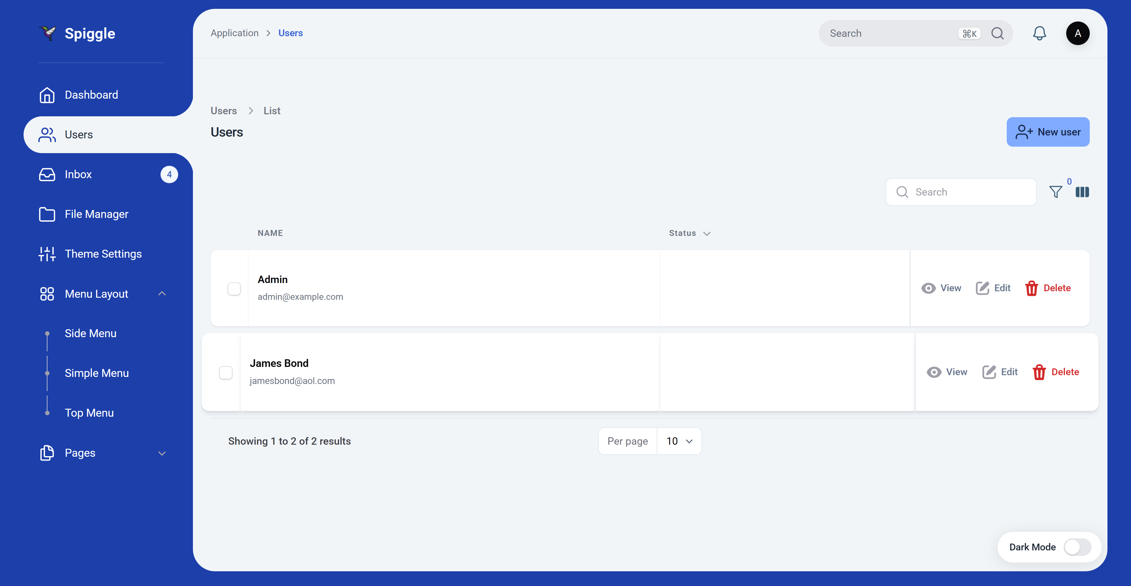
A Laravel Filament PHP admin theme: deep blue sidebar, rounded content card, active-nav cutout, Roboto typography, and a full appearance settings page. Compatible with Laravel Filament v3, v4, and v5 (v5 is the primary target). Laravel-13 · Filament 5.
Current version: 2.0.50
#Features
- Layout:
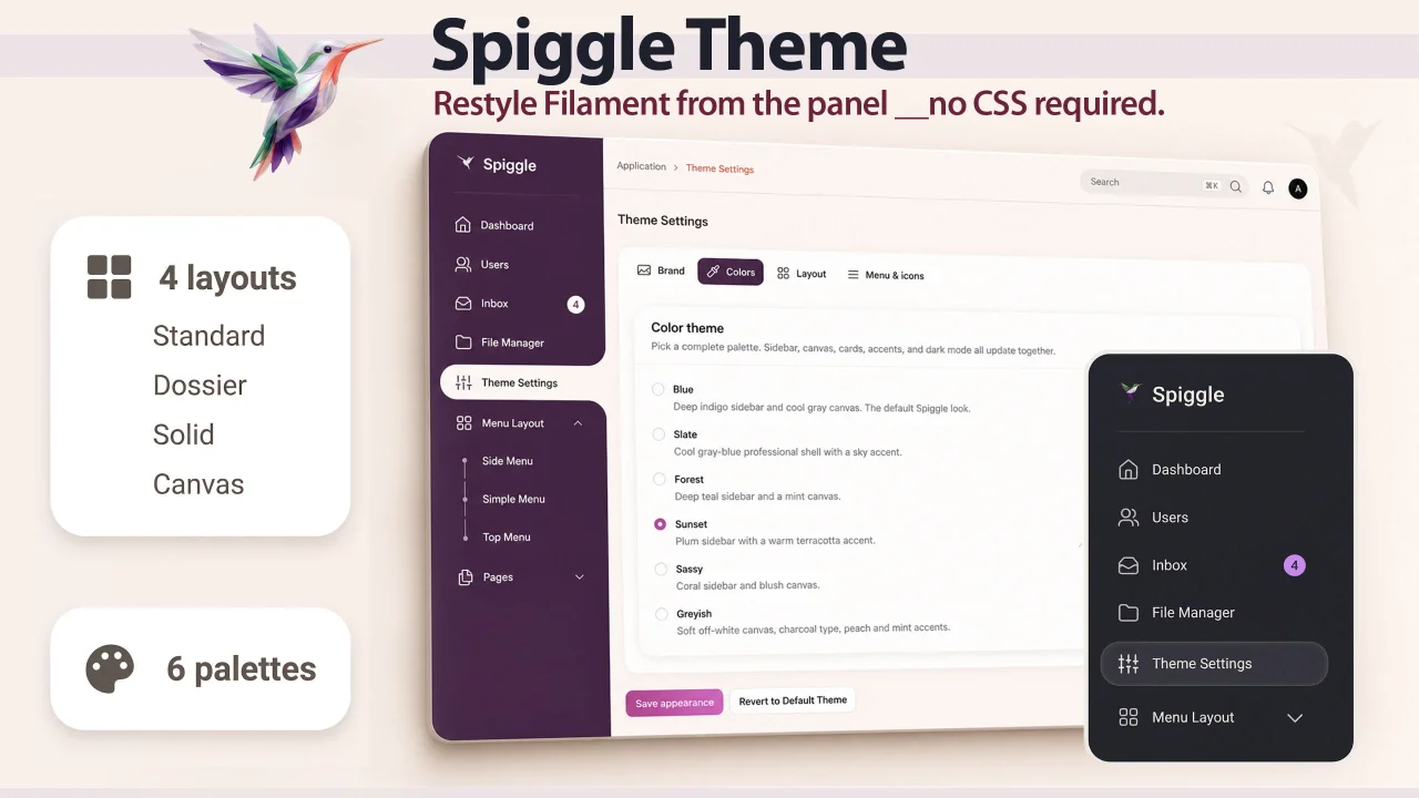
#1C3FAAsidebar,#F1F5F8content canvas, ~30px content radius, ~20px cards - Sidebar styles: Standard (active item cut into the content card), Dossier (stacked file tabs), Solid (opaque column flush with the pane), Canvas (nested menus; cards sit on the page background)
- Palettes: Blue, Slate, Forest, Sunset, Sassy, Greyish
- Light and dark mode (floating Dark Mode pill + Laravel Filament theme store)
- Settings page: brand, palettes, shape, density, backgrounds, fonts, menu size, icon pack
- Translations: English ships with the package; publish strings to customize them or add another locale
- Responsive sidebar with desktop collapse and mobile overlay
- Table rows and View/Edit actions open in a lightbox; loading uses the old-theme bars indicator
#Hosted demo
| URL | skillbobby.com/larafill/public/admin/login |
demo@user.net |
|
| Password | password |
#Get a license
Buy a lifetime licensed copy — $9.99 once, unlimited sites.
Public page: skillbobby.github.io/spiggle/filament-theme
#Screenshots
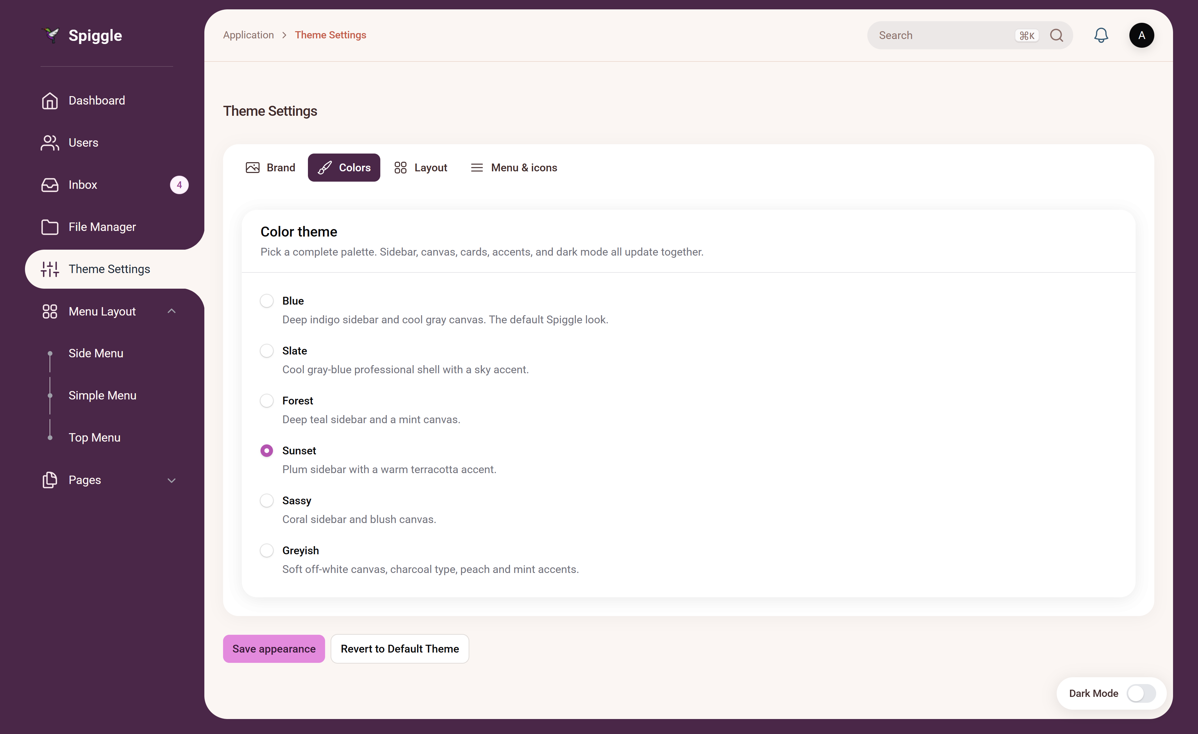
#Standard
Standard cuts the open item into the content card.
| Blue | Sassy | Sunset |
|---|---|---|
|
 |
 |
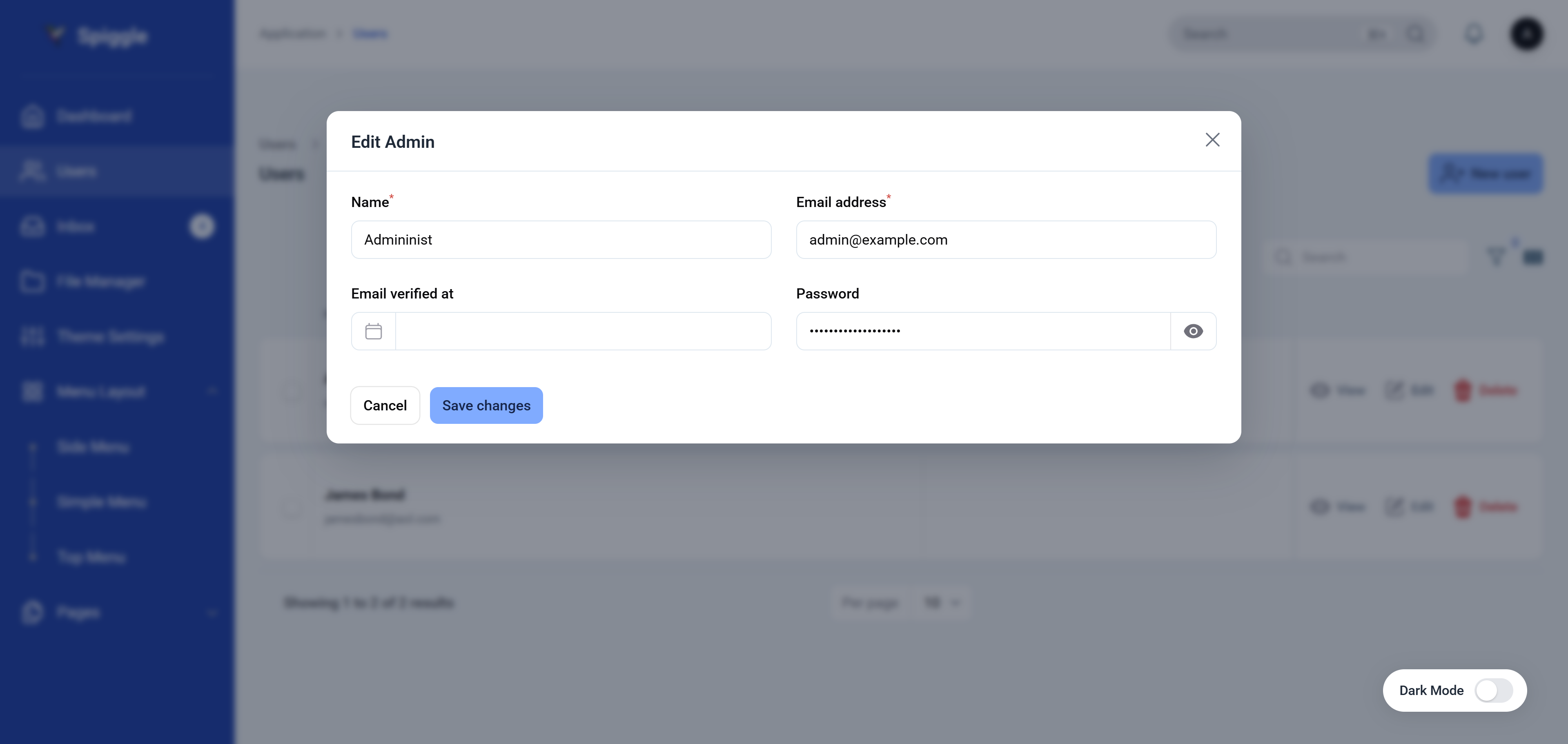
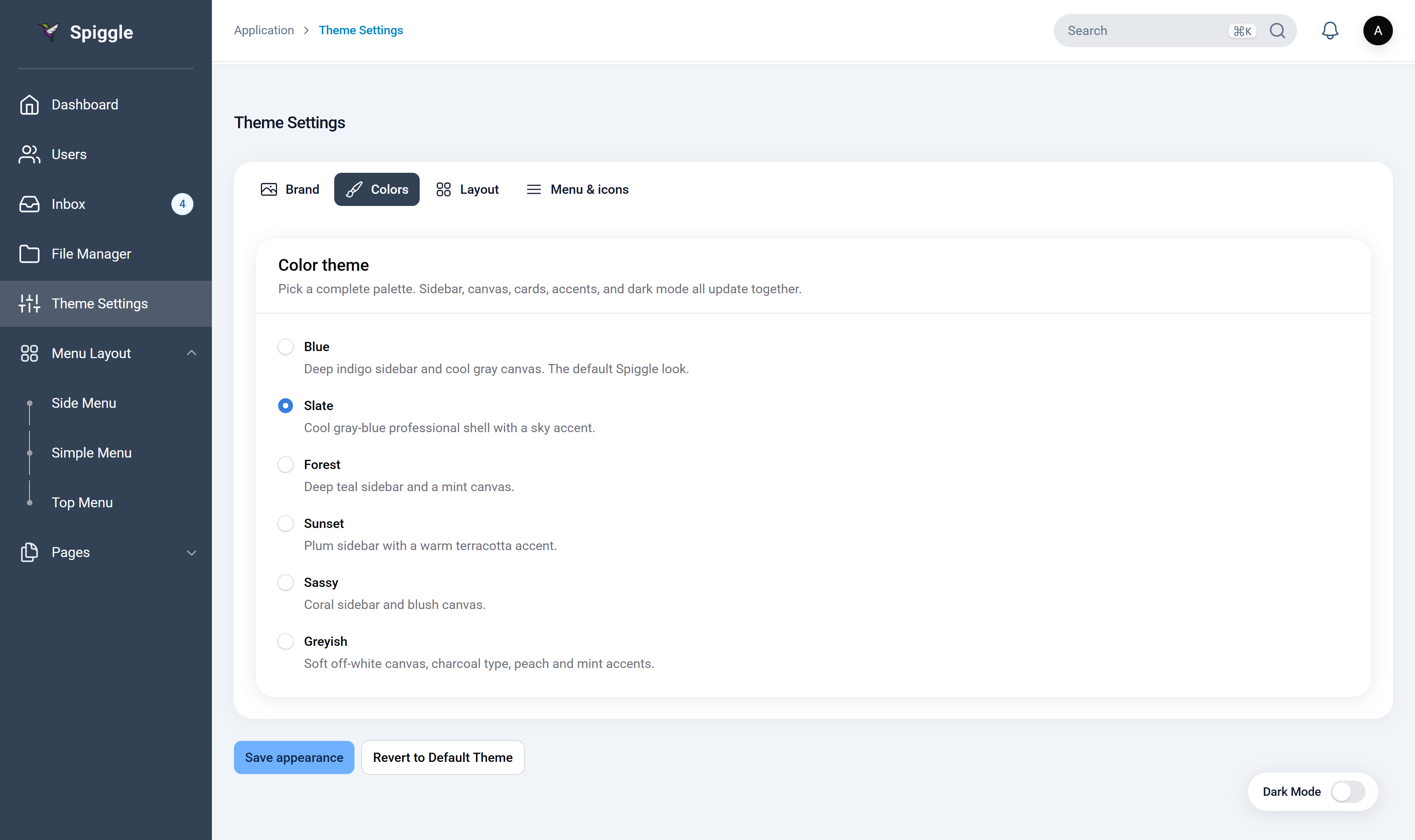
#Solid
Solid is an opaque menu column flush against the pane. Table rows still open in a lightbox.
| Blue | Slate |
|---|---|
 |
 |
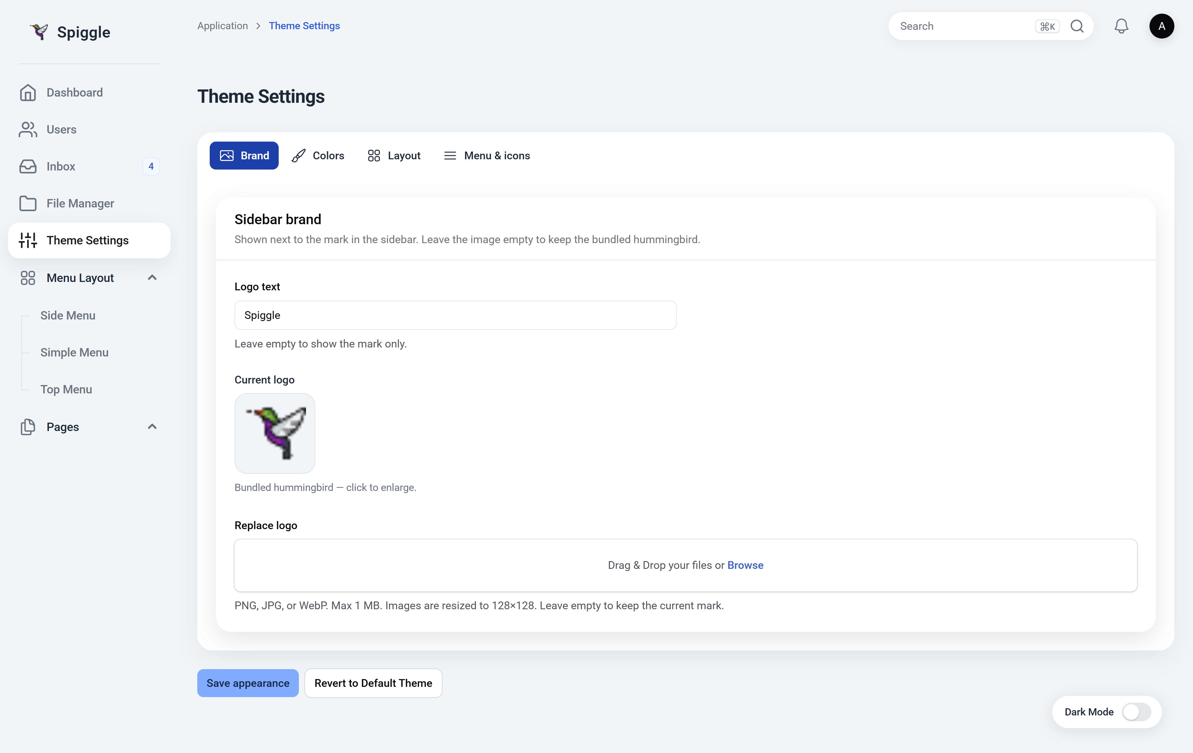
#Canvas
Canvas drops the wrapping content card. Nested menus sit on a light rail; sections and tables sit on the page background.
| Light | Dark |
|---|---|
 |
 |
#Installation
composer require spiggle/filament-spiggle-theme
The plugin auto-registers on every Laravel Filament panel. To register it yourself instead:
use Spiggle\FilamentSpiggleTheme\FilamentSpiggleThemePlugin;

$panel->plugin(FilamentSpiggleThemePlugin::make());
Then set auto_register to false in the published config.
Publish the config (optional):
php artisan vendor:publish --tag=filament-spiggle-theme-config
#Language support
Theme UI strings (Theme Settings, demo navigation, breadcrumbs, the dark-mode pill, and the logo preview) go through Laravel’s translator (filament-spiggle-theme::theme.*). English is bundled.
To edit copy or add a language:
php artisan vendor:publish --tag=filament-spiggle-theme-translations
Files land in lang/vendor/filament-spiggle-theme/{locale}/theme.php. Copy en/theme.php into a folder named for your locale (for example nl or fr) and set APP_LOCALE (or Laravel Filament’s locale) to match. Untranslated keys fall back to English.
#Theme settings
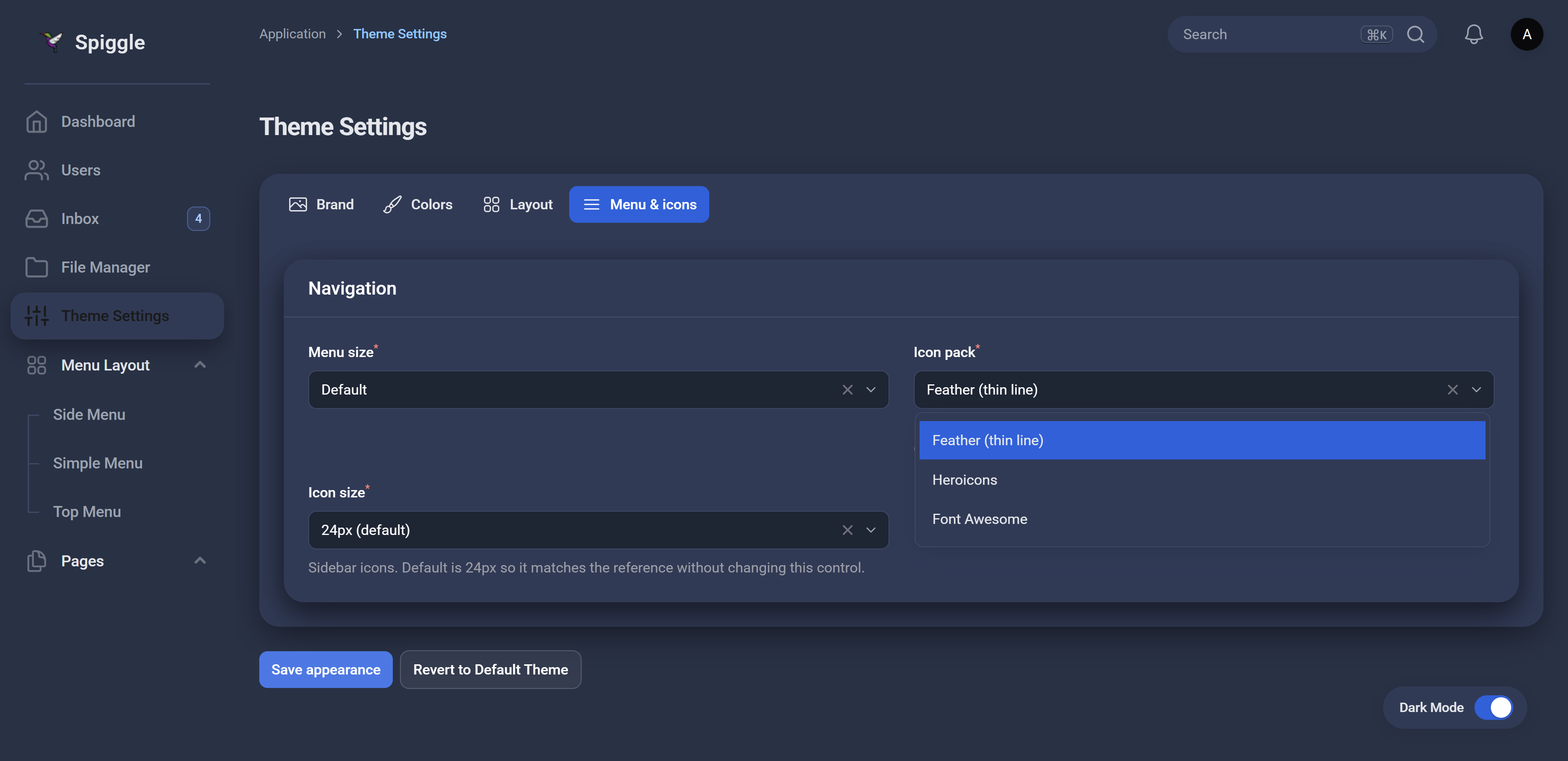
Open Theme Settings in the sidebar. Changes are stored in storage/app/filament-spiggle-theme.json so they survive cache clears. Save appearance applies the form; Revert to Default Theme restores the bundled palette and layout.
The page has four tabs: Brand, Colors, Layout, and Menu & icons.
#Brand
| Option | What it does |
|---|---|
| Logo text | Wordmark next to the mark. Default Spiggle. Leave empty to show the mark only. |
| Replace logo | PNG, JPG, or WebP, max 1 MB. Resized to 128×128. Leave empty to keep the bundled hummingbird. |
#Colors
Pick one palette. Sidebar, canvas, cards, accents, and dark mode update together.
| Palette | Description |
|---|---|
| Blue | Deep indigo sidebar and cool gray canvas. The default Spiggle look. |
| Slate | Cool gray-blue professional shell with a sky accent. |
| Forest | Deep teal sidebar and a mint canvas. |
| Sunset | Plum sidebar with a warm terracotta accent. |
| Sassy | Coral sidebar and blush canvas. |
| Greyish | Soft off-white canvas, charcoal type, peach and mint accents. |
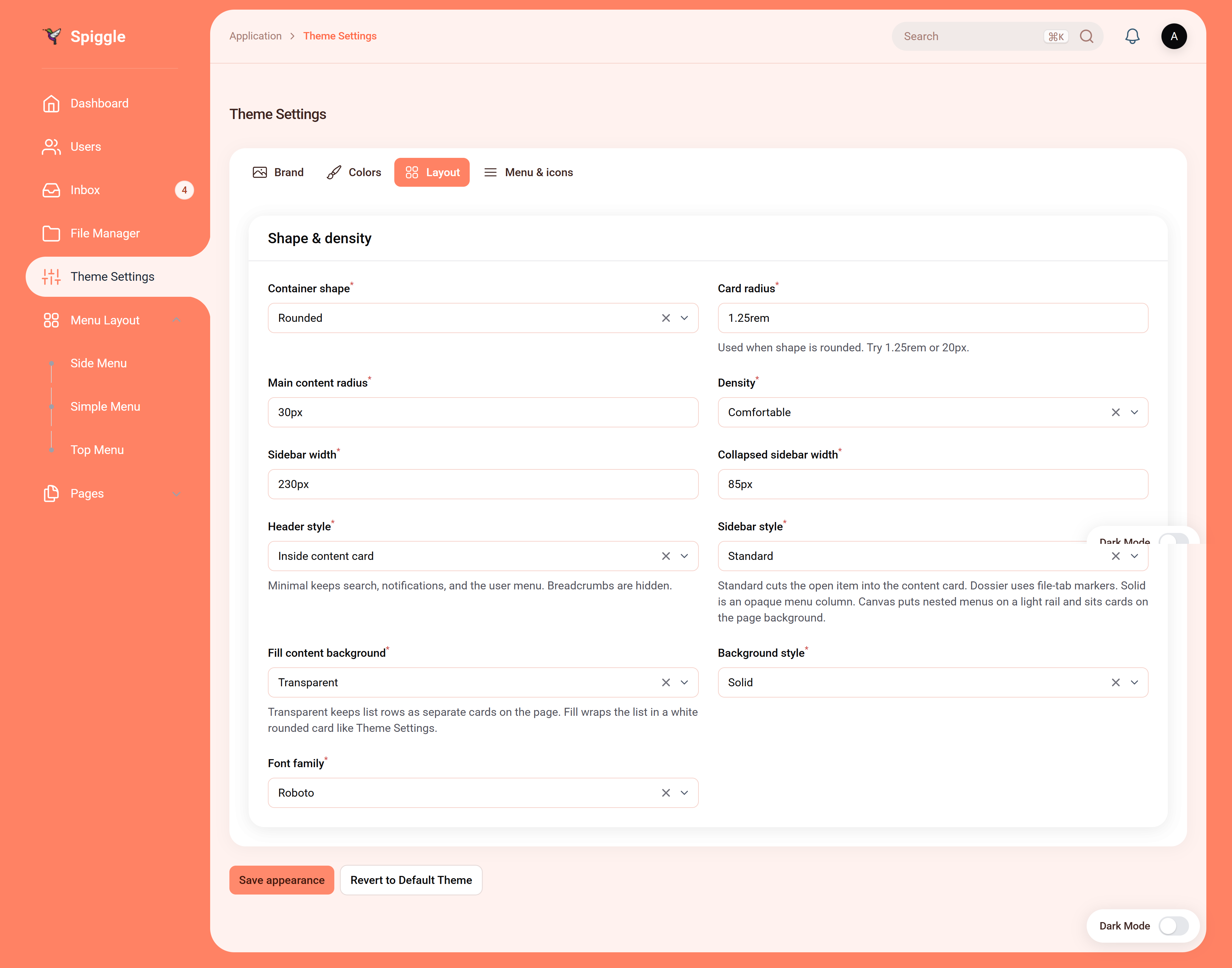
#Layout
| Option | Values | Default |
|---|---|---|
| Container shape | Rounded, Square, Rhombus / cut corners | Rounded |
| Card radius | CSS length (used when shape is rounded) | 1.25rem |
| Main content radius | CSS length | 30px |
| Density | Compact, Comfortable, Spacious | Comfortable |
| Sidebar width | CSS length | 230px |
| Collapsed sidebar width | CSS length | 85px |
| Header style | Inside content card, Minimal header | Inside content card |
| Sidebar style | Standard, Dossier, Solid, Canvas | Standard |
| Fill content background | Transparent, Fill card | Transparent |
| Background style | Solid, Gradient, Dotted, Custom image | Solid |
| Font family | Roboto, Poppins, Outfit | Roboto |
Header style: Minimal keeps search, notifications, and the user menu. Breadcrumbs are hidden.
Sidebar style: Standard cuts the open item into the content card. Dossier uses file-tab markers. Solid is an opaque menu column. Canvas puts nested menus on a light rail and sits cards on the page background.
Fill content background: Transparent keeps list rows as separate cards on the page. Fill wraps the list in a white rounded card like Theme Settings.
Background image (when style is Custom image): PNG, JPG, or WebP, max 2 MB. Large files are resized to 1920×1080.
#Menu & icons
| Option | Values | Default |
|---|---|---|
| Menu size | Compact, Default, Large | Default |
| Icon pack | Feather (thin line), Heroicons, Font Awesome | Feather |
| Icon size | Small (20px), 24px (default), Large (28px) | 24px |
Feather and Font Awesome replace sidebar and header icons. Heroicons keep Laravel Filament’s defaults.
#Demo navigation
Set SPIGGLE_DEMO_NAVIGATION=true (or demo_navigation in the config) to load sample nested menus (Menu Layout, Pages) so you can compare the four sidebar styles without wiring your own resources first. Leave it off in production.
Use Laravel Filament navigationGroup / child items on your own resources to populate Canvas and Dossier submenus.
#FAQ
#What does this plugin do?
Spiggle Theme restyles your Laravel Filament admin panel: sidebar layouts, color palettes, dark mode, brand, fonts, and icons. You change those from Theme Settings in the panel — no custom CSS. It does not add resources or replace your forms and tables.
#Security
Please report vulnerabilities privately — see SECURITY.md. Do not open a public issue for security problems.
#License
This theme is proprietary commercial software. It is not free or open source. Use, copying, and distribution require a paid license.
Get a lifetime licensed copy — or see LICENSE and contact skillbobby@outlook.com.
The author
From the same author
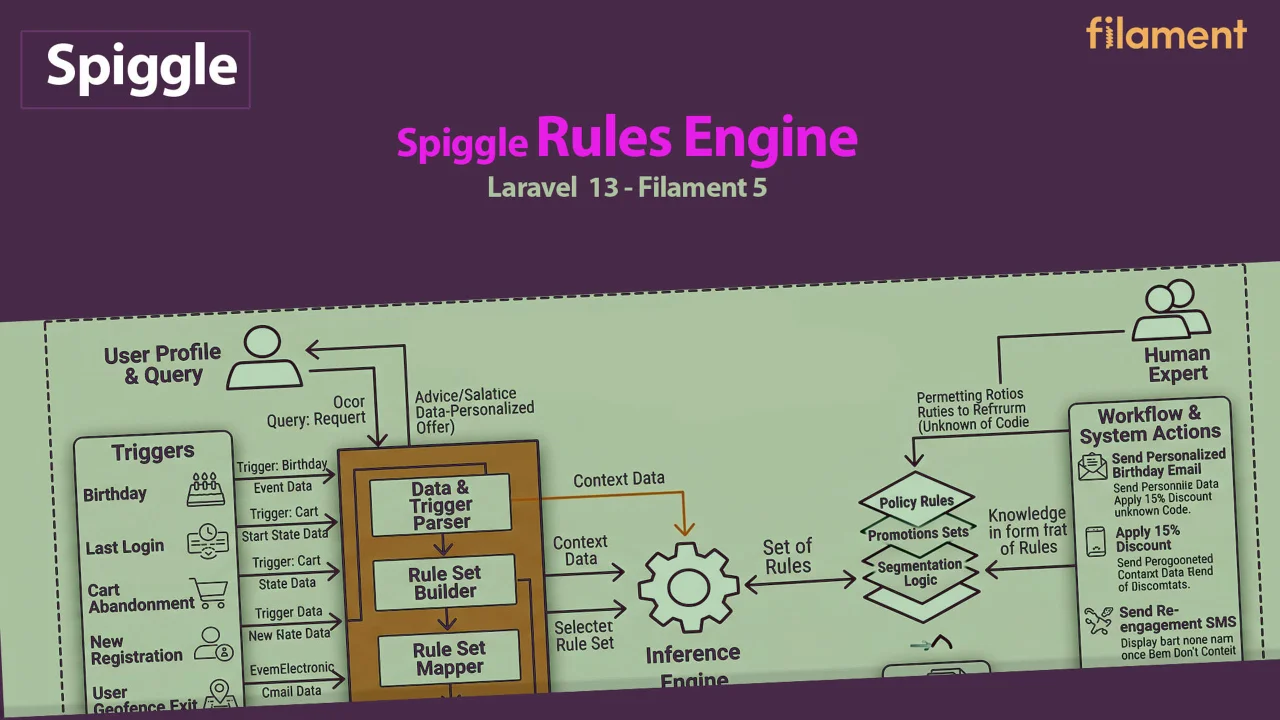
Spiggle Rules Engine
Tenant-scoped lifecycle rules for Laravel Filament — fire actions when members hit age milestones, tenure, inactivity, or spend thresholds.
Author:
Spiggle
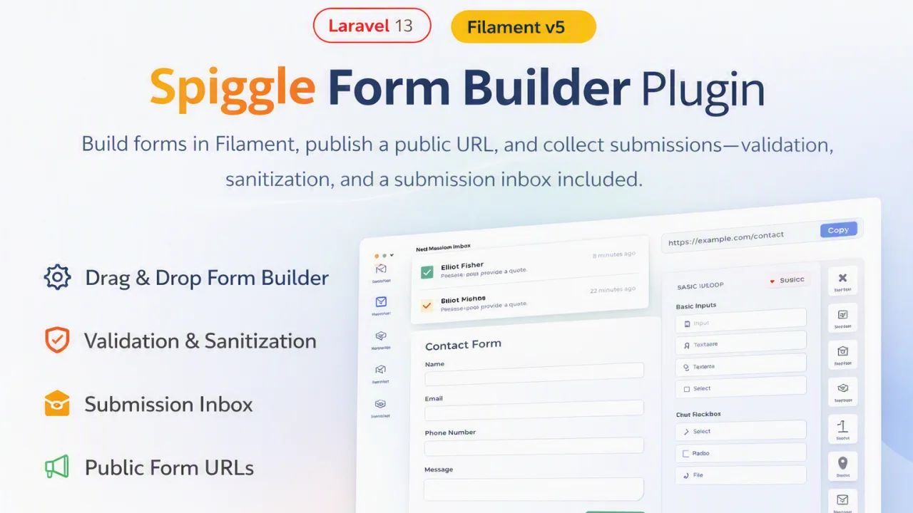
Spiggle Form Builder
A lightweight, open-source package that brings powerful, database-driven form generation to your Laravel and Filament applications.
Author:
Spiggle
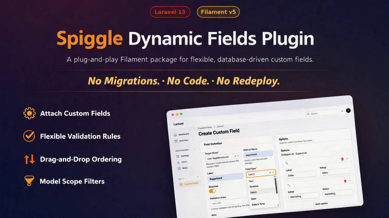
Spiggle Dynamic Fields
A plug-and-play Filament package that attaches custom fields and validation rules to any Eloquent model.
Author:
Spiggle
Featured Plugins
A selection of plugins curated by the Filament team
Blueprint
Filament Blueprint is a premium Laravel Boost extension that helps AI agents produce accurate, detailed implementation plans and security reports for Filament apps.
 Filament
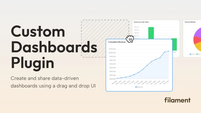
Custom Dashboards
Let your users build and share their own dashboards with a drag-and-drop interface. Define your data sources in PHP and let them do the rest.
Filament
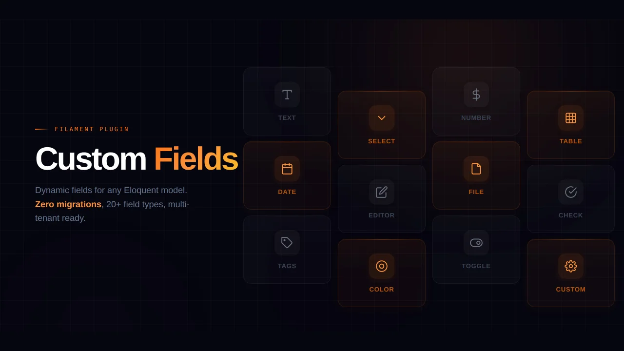
Custom Fields
Eliminate custom field migrations forever. Let your users create and manage form fields directly in Filament admin panels with 20+ built-in field types, validation, and zero database changes.
 Relaticle