Small Business Theme by Spiggle
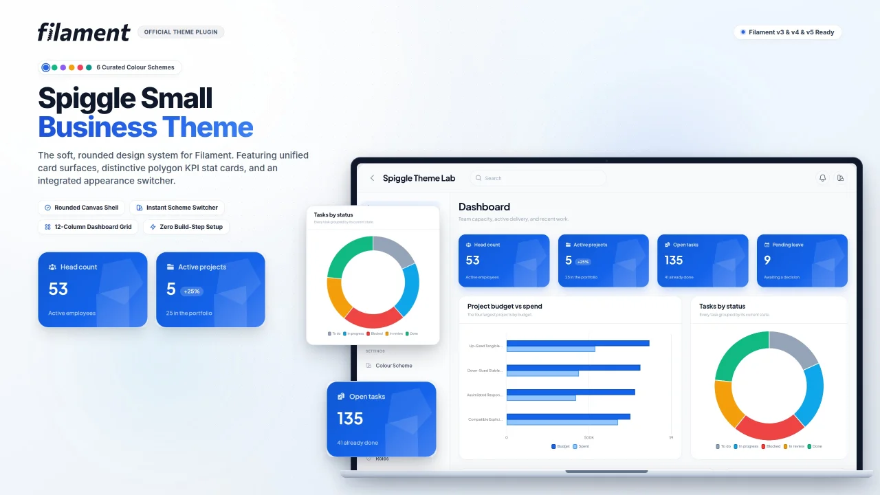
CommunityA Filament panel theme with six colour schemes, an appearance switcher, and a soft rounded frame. It restyles every screen and includes the cards for a modern dashboard.
filament/
namespace. Review the source and install at your own risk. Found
malware or an unresolved security issue the author won't
address?
Report it
.
 Author:
Spiggle
Documentation
- Preview
- Installation
- Colour schemes
- Comfortable or compact
- Display type
- Features that suit the theme
- Customizing the theme
- Support
A theme that gives panels a settled look: one rounded frame, six colour schemes, and the cards to build a dashboard.
It restyles every screen you already have, including forms, tables, modals and the sign-in page. The stylesheet ships prebuilt, so there is no Node build.
Product page: https://skillbobby.github.io/spiggle/small-business-theme/
Live demo: https://spiggle.skillbobby.com ([email protected] / password)
Buy a lifetime license — $19 once, unlimited sites.
Current version: 2.5
PHP 8.3+ · Laravel 13 · Filament 5
#Preview
The panel sits on a quiet canvas as a single rounded surface. Sidebar, topbar and content share that frame. Cards, buttons and navigation follow the active scheme.
Click a screenshot to open it full size.
| Dashboard | Employees |
|---|---|
 |
 |
| Appearance | Forms |
 |
 |
#Installation
composer require spiggle/small-business-theme
php artisan filament:assets
Register the plugin on the panel:
use Spiggle\Theme\SpiggleThemePlugin;

$panel->plugin(SpiggleThemePlugin::make());
That registers the stylesheet, the font, the colour schemes, the switcher and the appearance page.
Your brand name, logo and navigation stay yours:
$panel
    ->brandName('Northwind')
    ->brandLogo(asset('images/logo.svg'))
    ->plugin(SpiggleThemePlugin::make());
#Colour schemes
Six schemes ship with the theme: Electric Blue, Emerald, Violet, Amber, Rose and Teal. Each is a full palette, and the active one becomes the panel primary.
Set the default, and drop any scheme you do not want to offer:
// config/spiggle-theme.php
'default_scheme' => 'emerald',
'schemes' => ['electric-blue', 'emerald', 'teal'],
Publish that file with php artisan vendor:publish --tag=spiggle-theme-config.
People pick a scheme from the topbar, and from the Appearance page. A choice is stored on the user when the model implements Spiggle\Theme\Contracts\HasColorScheme, and in the session otherwise.
use Spiggle\Theme\Contracts\HasColorScheme;
use Spiggle\Theme\Enums\ColorScheme;

class User extends Authenticatable implements HasColorScheme
{
    public function getColorScheme(): ?ColorScheme
    {
        return ColorScheme::tryFrom($this->color_scheme);
    }

    public function setColorScheme(?ColorScheme $scheme): void
    {
        $this->forceFill(['color_scheme' => $scheme?->value])->save();
    }
}
#Comfortable or compact
comfortable is the default. compact tightens the type and the gaps, which suits a panel that is mostly tables.
'density' => 'compact',
#Display type
Headings and the interface use Plus Jakarta Sans. Inter is the fallback. Set another family and the panel picks it up:
'font' => [
    'family' => 'Inter',
    'fallback' => 'Inter',
],
#Features that suit the theme
#Use a sidebar-only layout
Hiding the topbar gives the frame more room for the work. Filament moves search, the user menu and database notifications into the sidebar:
$panel->topbar(false);
The theme already keeps the identity block at the foot of the sidebar when a topbar is present.
#Build the dashboard
Extend the theme's dashboard so the page is a twelve-column grid, and remove Filament's account and info widgets. Four metric cards share a row when each one spans three columns at xl.
use Spiggle\Theme\Filament\Pages\Dashboard as BaseDashboard;

class Dashboard extends BaseDashboard
{
    public function getWidgets(): array
    {
        return [
            ActiveClients::class,
            MonthlyRevenue::class,
        ];
    }
}
use Spiggle\Theme\Filament\Widgets\StatCard;

class ActiveClients extends StatCard
{
    protected function label(): string
    {
        return 'Active clients';
    }

    protected function value(): string
    {
        return number_format($this->count);
    }

    protected function delta(): ?float
    {
        return 12.0;
    }

    protected function caption(): ?string
    {
        return 'Last 30 days';
    }
}
The figures are yours. The card, the gradient and the grid are the theme's.
#Customizing the theme
Set these on :root in a stylesheet that loads after the theme. An override on .dark changes dark mode only.
| Variable | Used for | Default |
|---|---|---|
--st-frame-radius |
The frame's corners | 1.75rem |
--st-frame-inset |
Gap around the frame | 1.25rem |
--st-canvas |
Colour around the frame | #e9edf3, #060b14 in dark mode |
--spiggle-card-radius |
Cards, buttons and fields | 20px |
#Changing the radius
Smaller values make the theme less rounded. 0 squares the corners.
:root {
    --st-frame-radius: 1rem;
}
Card corners come from config, which the theme writes onto --spiggle-card-radius:
'shell' => [
    'card_radius' => 12,
],
#Changing the font
'font' => [
    'family' => 'Figtree',
],
#The canvas
The colour around the frame is --st-canvas. Match it to the brand, and give dark mode its own value:
:root {
    --st-canvas: #e7efe9;
}

.dark {
    --st-canvas: #07110d;
}
To keep the colours and the type without the frame, set shell.register to false.
#Support
Open an issue on the theme repository. To report a vulnerability, see SECURITY.md.
The author
From the same author
Form Builder
A lightweight, open-source package that brings powerful, database-driven form generation to your Laravel and Filament applications.
Author:
Spiggle
Rules Engine
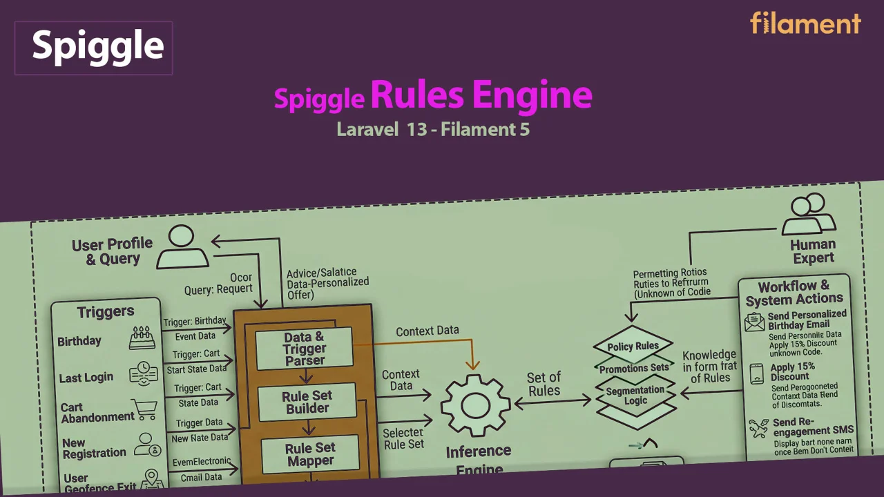
Tenant-scoped lifecycle rules for Laravel Filament — fire actions when members hit age milestones, tenure, inactivity, or spend thresholds.
Author:
Spiggle
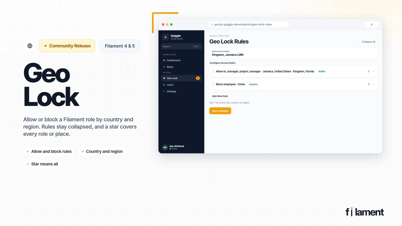
Geo Lock
Spiggle Geo Lock adds location-aware access control to your application, allowing you to restrict features, content, or entire areas based on a user's geographic location. Simple to configure, flexible to extend, and designed to integrate seamlessly into modern Filament panels.
Author:
Spiggle
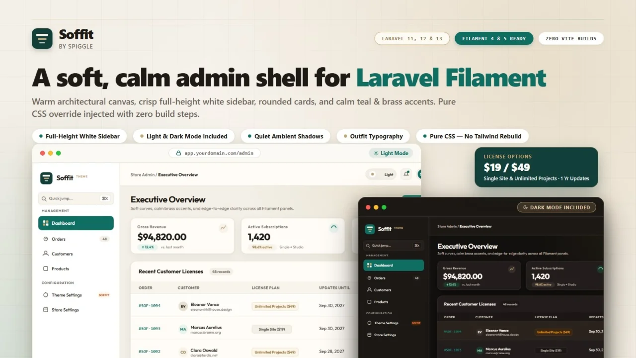
Soffit Theme
A soft, calm admin shell for Laravel Filament. Soffit softens the Filament experience with a full-height white sidebar, rounded cards, quiet ambient shadows, and warm teal & brass accents.
Author:
Spiggle
Featured Plugins
A selection of plugins curated by the Filament team
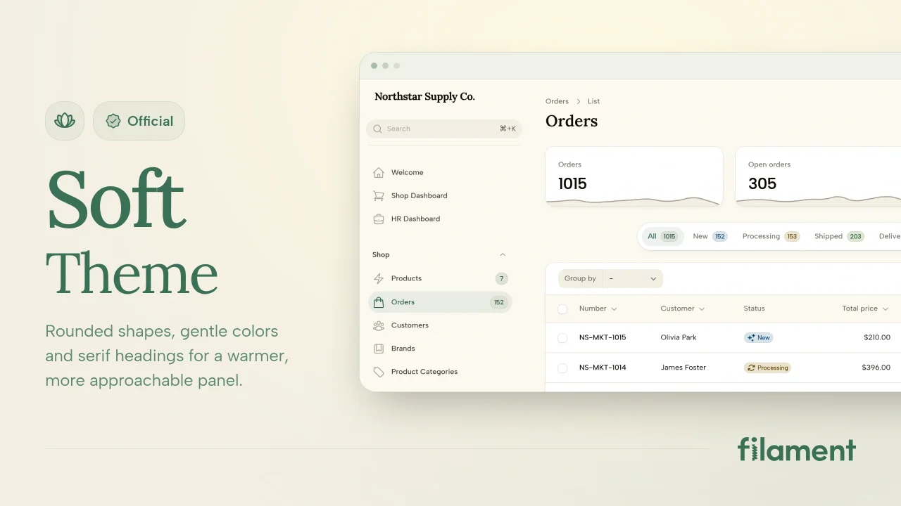
Soft Theme
A theme that gives panels a warm, approachable look with rounded shapes, gentle colors, and serif headings.
 Filament
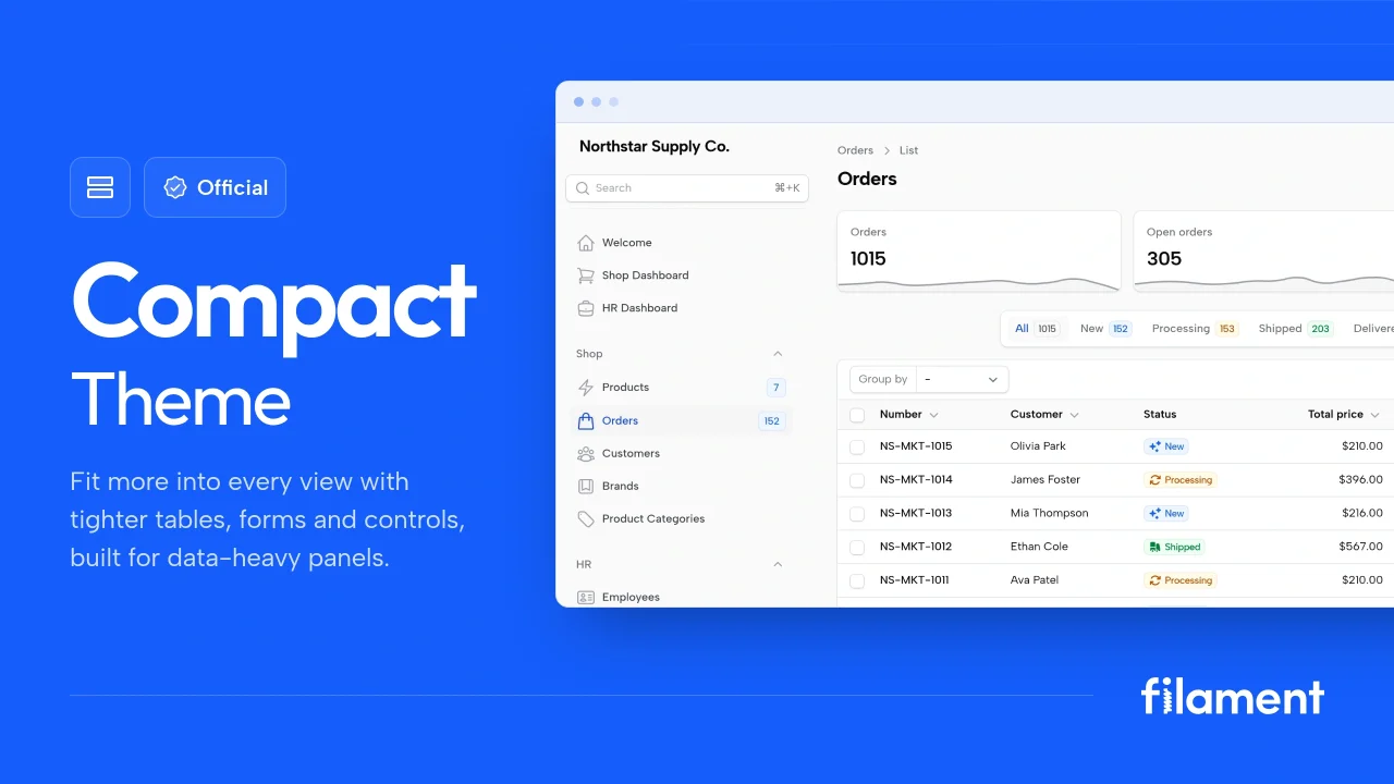
Compact Theme
A theme that makes data-heavy panels easier to scan by fitting more useful information on each screen.
Filament
Spotlight Pro
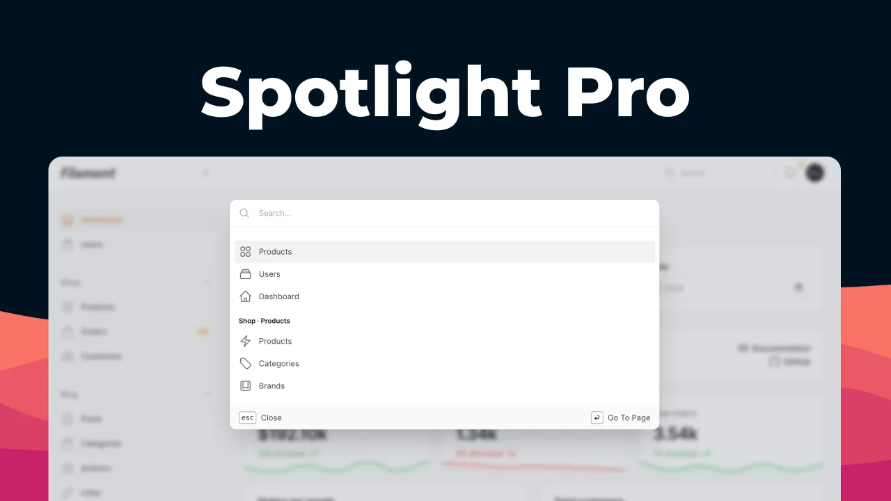
Browse your Filament Panel with ease. Filament Spotlight Pro adds a Spotlight like Command Palette to your Filament Panel.
 Dennis Koch