Stature Theme by Shuvro Roy
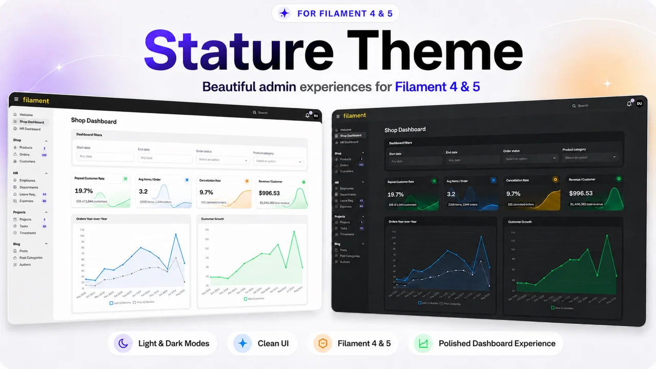
CommunityA polished, compact control panel theme for Filament 4 & 5 with thoughtfully crafted light and dark modes.
filament/
namespace. Review the source and install at your own risk. Found
malware or an unresolved security issue the author won't
address?
Report it
.
 Author:
Shuvro Roy
Author:
Shuvro Roy
Documentation
- Video walkthrough
- Screenshots
- Highlights
- Requirements
- Purchase and package access
- Installation instructions
- Customization
- Styled surfaces
- Updating
- Troubleshooting
- Frequently asked questions
- Package development
- License
- Support
Stature is a polished, Statamic-inspired admin theme for Filament 4 and 5. It brings compact navigation, a dark global toolbar, an inset workspace, layered cards, and carefully paired light and dark modes to content-heavy control panels.
It styles Filament's existing components instead of replacing them. The package ships as a compiled, panel-scoped stylesheet, so the consuming application does not need a custom Tailwind build, Vite entry, published Blade views, or a separate icon set.
#Video walkthrough
Watch the complete Stature experience beginning with the Admin sidebar and its core interface surfaces, followed by the nested Admin top-navigation flyout, tenant-aware sidebar settings, and the tenant top-navigation switcher. The walkthrough also covers tables, contextual actions, centered modals, global search, notifications, forms, date pickers, slide-overs, the animated sidebar toggle, and coordinated light and dark modes.
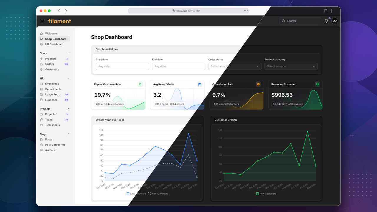
Watch or download the 1080p MP4 walkthrough
#Screenshots
The gallery combines complete application views with focused component crops from the Shop and HR areas of the Filament application used to test the theme. It is grouped by interface surface so visual details are easier to compare. Every example is shown in light and dark mode using hosted release copies.
#Stats
Stats cards scale from concise resource totals to richer dashboard KPIs with icons, supporting values, semantic colors, and optional chart backgrounds. These focused crops show the component without the surrounding page chrome.
#Shop dashboard stats
Four commerce KPIs combine semantic icons, supporting values, and full-card chart backgrounds.
| Light mode | Dark mode |
|---|---|
 |
 |
#HR dashboard stats
Four workforce KPIs with compact header icons and supporting-value pills.
| Light mode | Dark mode |
|---|---|
 |
 |
#Product stats
Simple resource totals using the same card structure without icons or charts.
| Light mode | Dark mode |
|---|---|
 |
 |
#Order stats
Mixed stat cards demonstrate how chart-backed and plain values remain aligned within one responsive row.
| Light mode | Dark mode |
|---|---|
 |
 |
#Tables
Filament tables receive a complete Stature treatment across their toolbars, headers, records, filters, selection controls, pagination, empty states, and contextual actions. These focused examples use Products and Orders, with the Brands table demonstrating drag-and-drop reordering.
#Product table overview
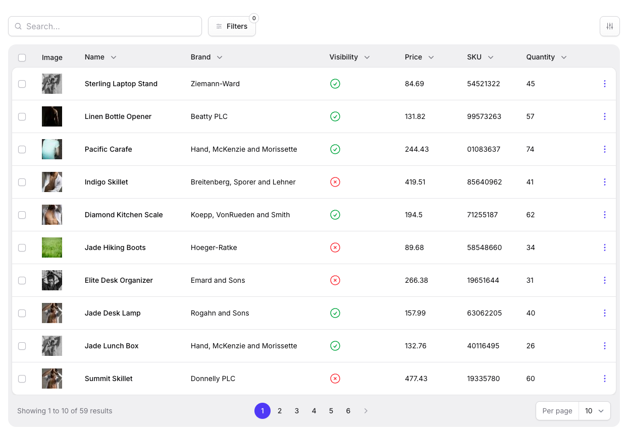
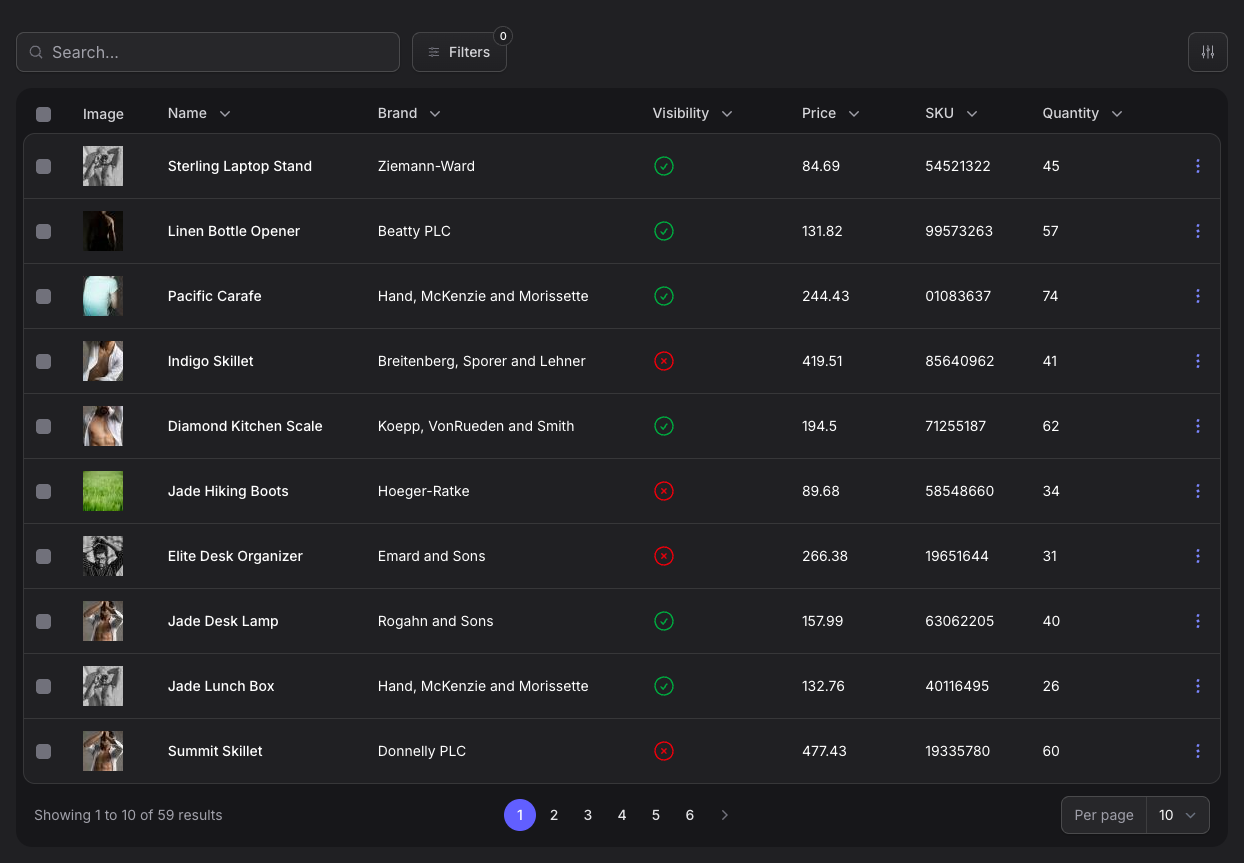
The default resource table combines search, filters, column controls, sortable headers, selection checkboxes, badges, row actions, and pagination.
| Light mode | Dark mode |
|---|---|
 |
 |
#Grouped columns
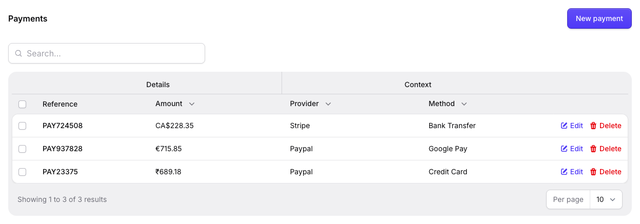
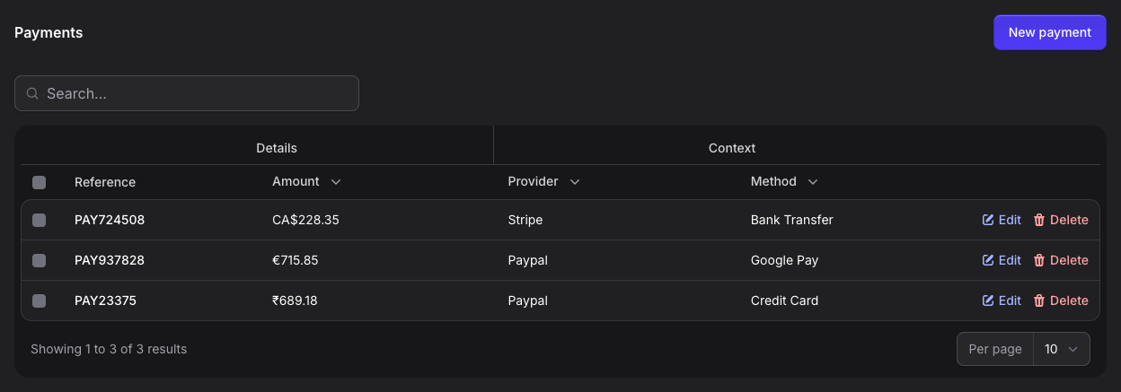
Order payments demonstrate multi-level table headers, keeping related Details and Context columns visually organized without compromising row actions, selection controls, search, or pagination.
| Light mode | Dark mode |
|---|---|
 |
 |
#Filter popover
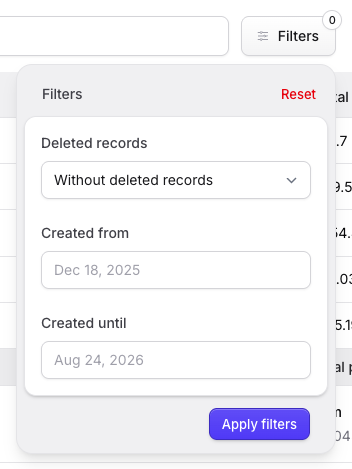
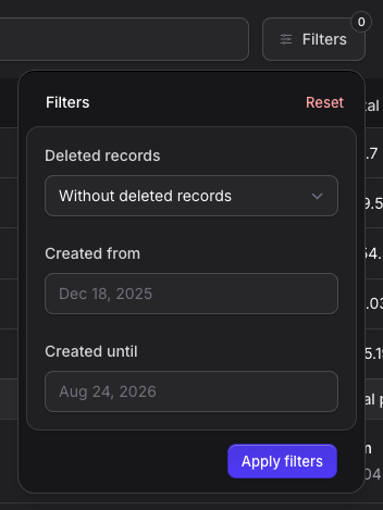
The Orders filter popover shows the compact toolbar trigger, filter count, reset action, select and date controls, and a clearly separated apply action.
| Light mode | Dark mode |
|---|---|
 |
 |
#Query builder
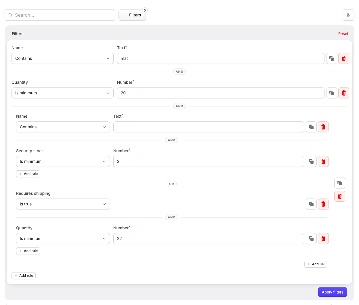
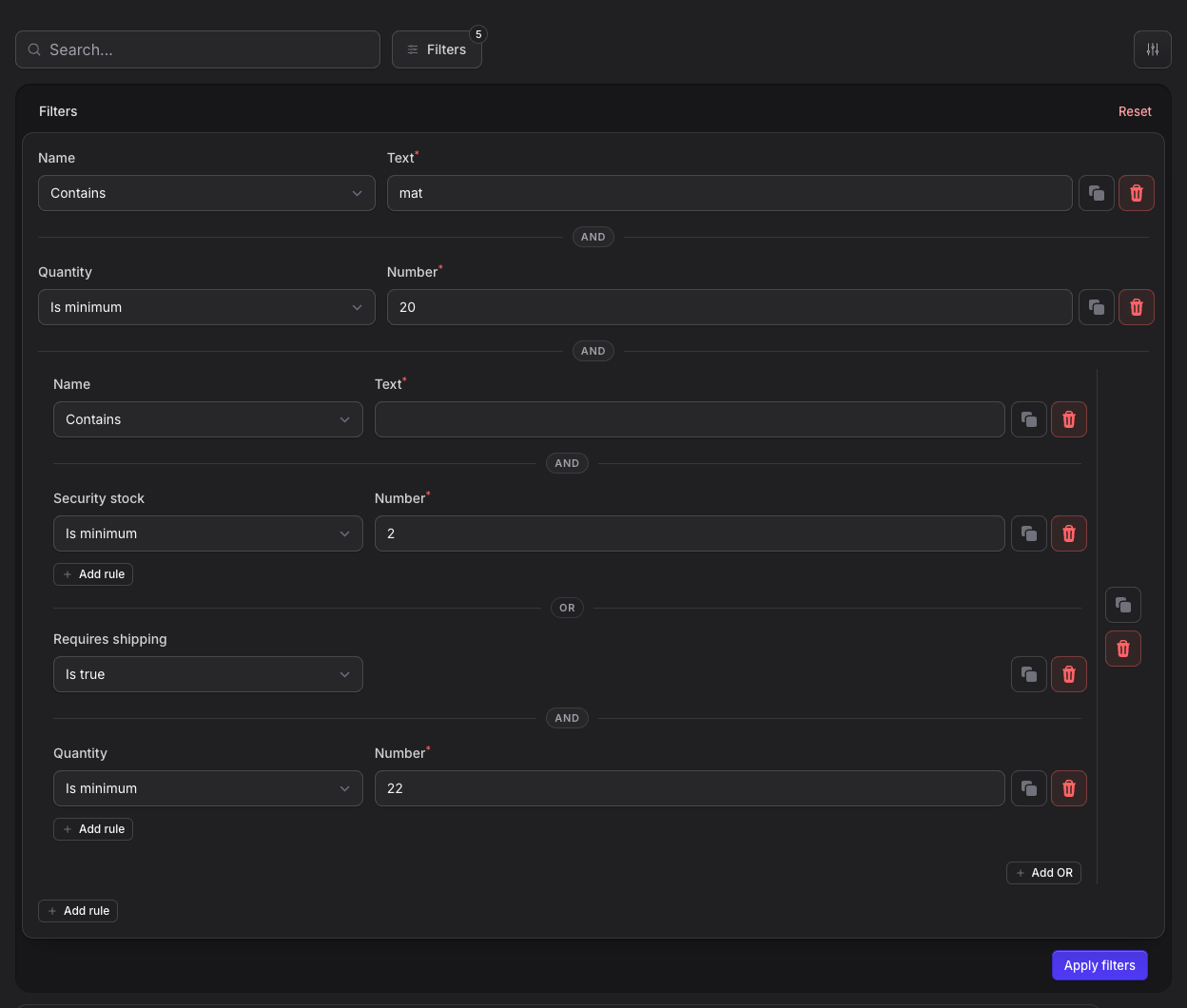
Complex Product filters remain readable with nested AND and OR conditions, aligned form controls, rule actions, and a Statamic-inspired panel footer.
| Light mode | Dark mode |
|---|---|
 |
 |
#Active filters and empty state
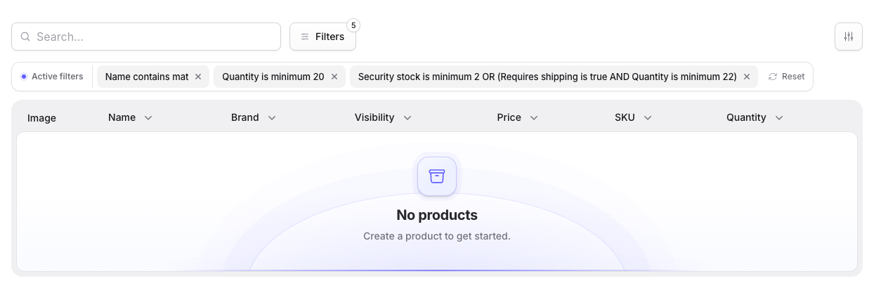
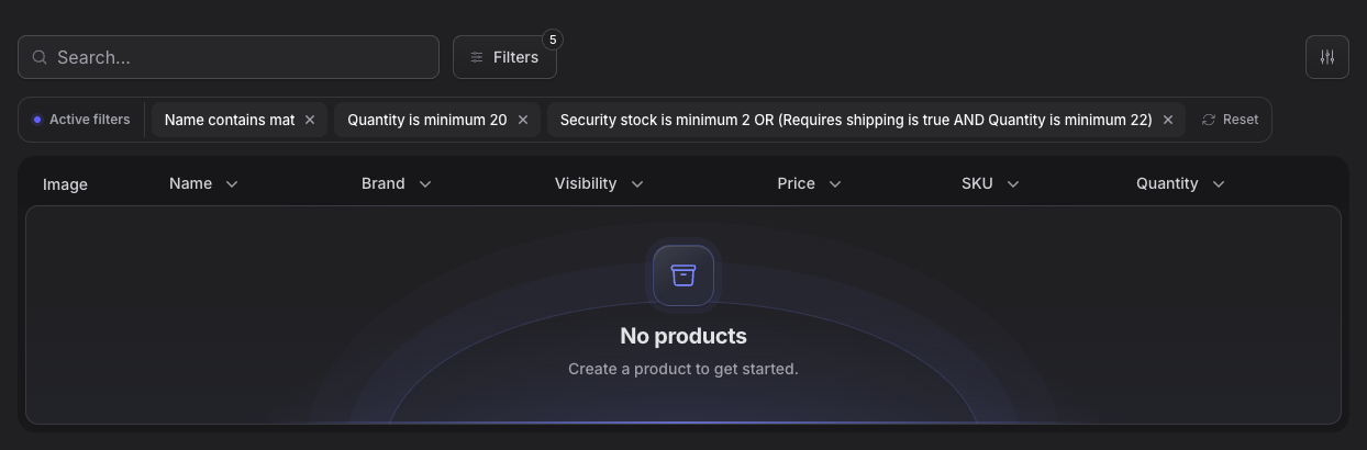
Applied filters become compact, removable chips above the table while the empty state remains visually connected to the table surface.
| Light mode | Dark mode |
|---|---|
 |
 |
#Column manager
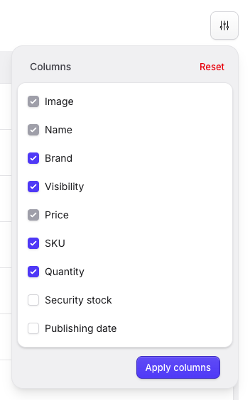
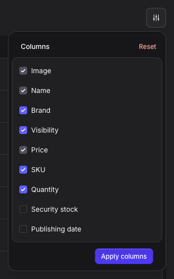
The column manager uses a focused modal with draggable rows, Filament icons, selection states, and aligned reset and save actions.
| Light mode | Dark mode |
|---|---|
 |
 |
#Row actions
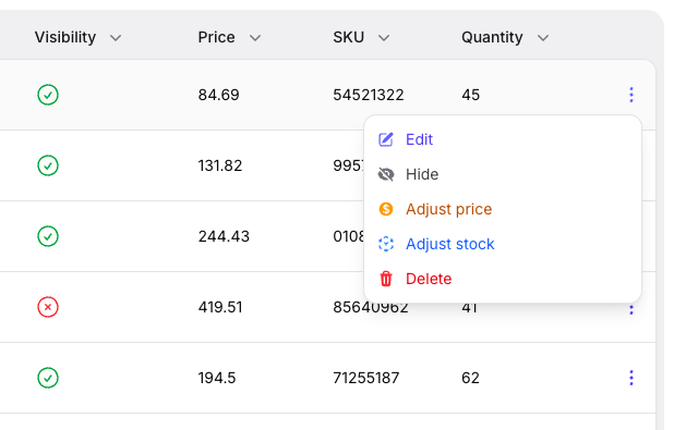
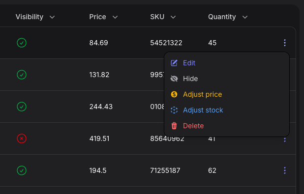
Contextual Product actions use semantic colors, consistent icon alignment, and the same animated layered menu treatment as the user and navigation menus.
| Light mode | Dark mode |
|---|---|
 |
 |
#Bulk actions
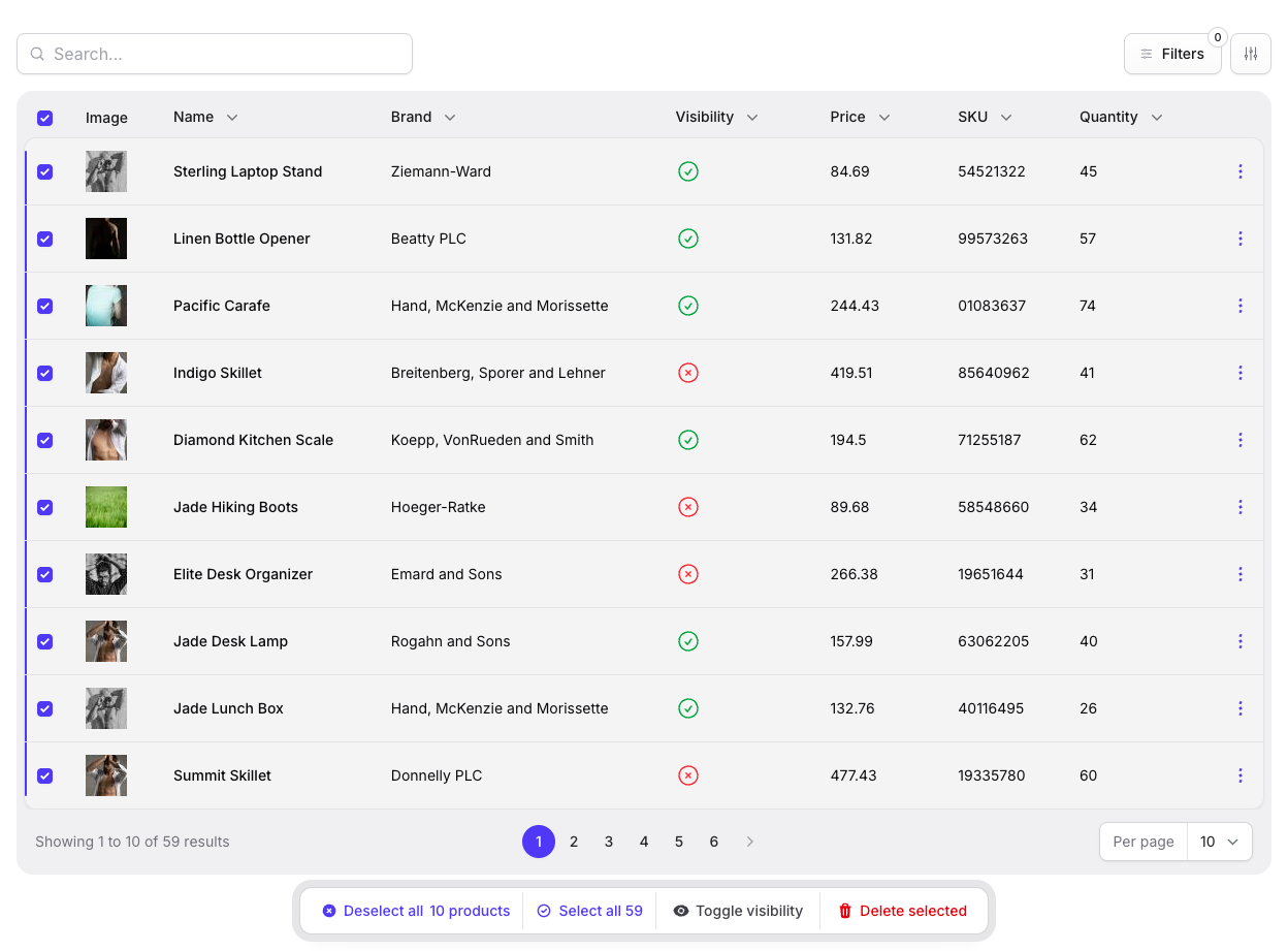
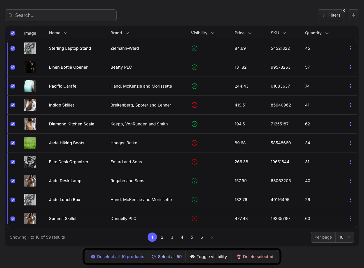
Selecting records reveals a floating action bar with selection controls, semantic actions, icons, and coordinated enter and leave transitions.
| Light mode | Dark mode |
|---|---|
 |
 |
#Grouped records and summaries
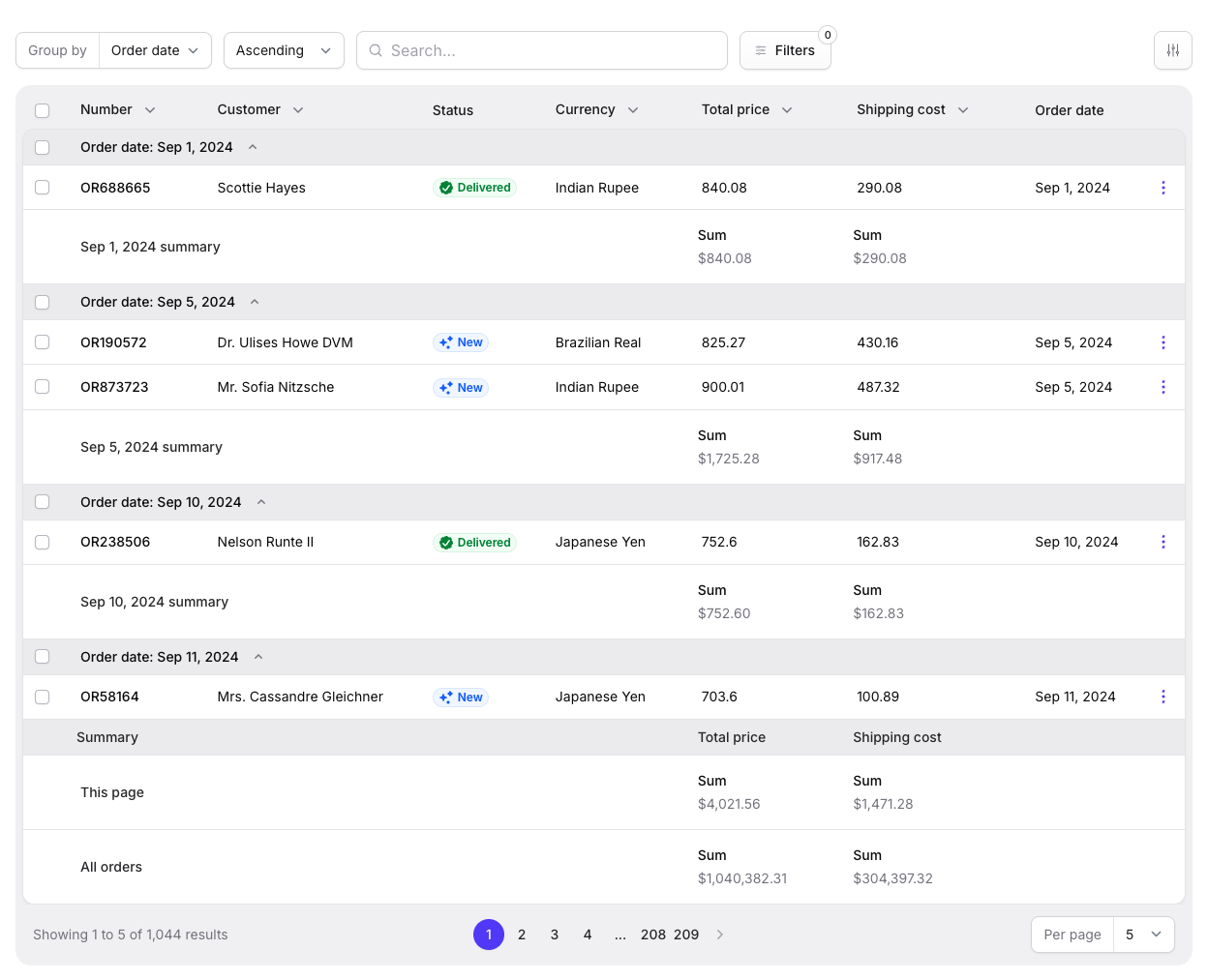
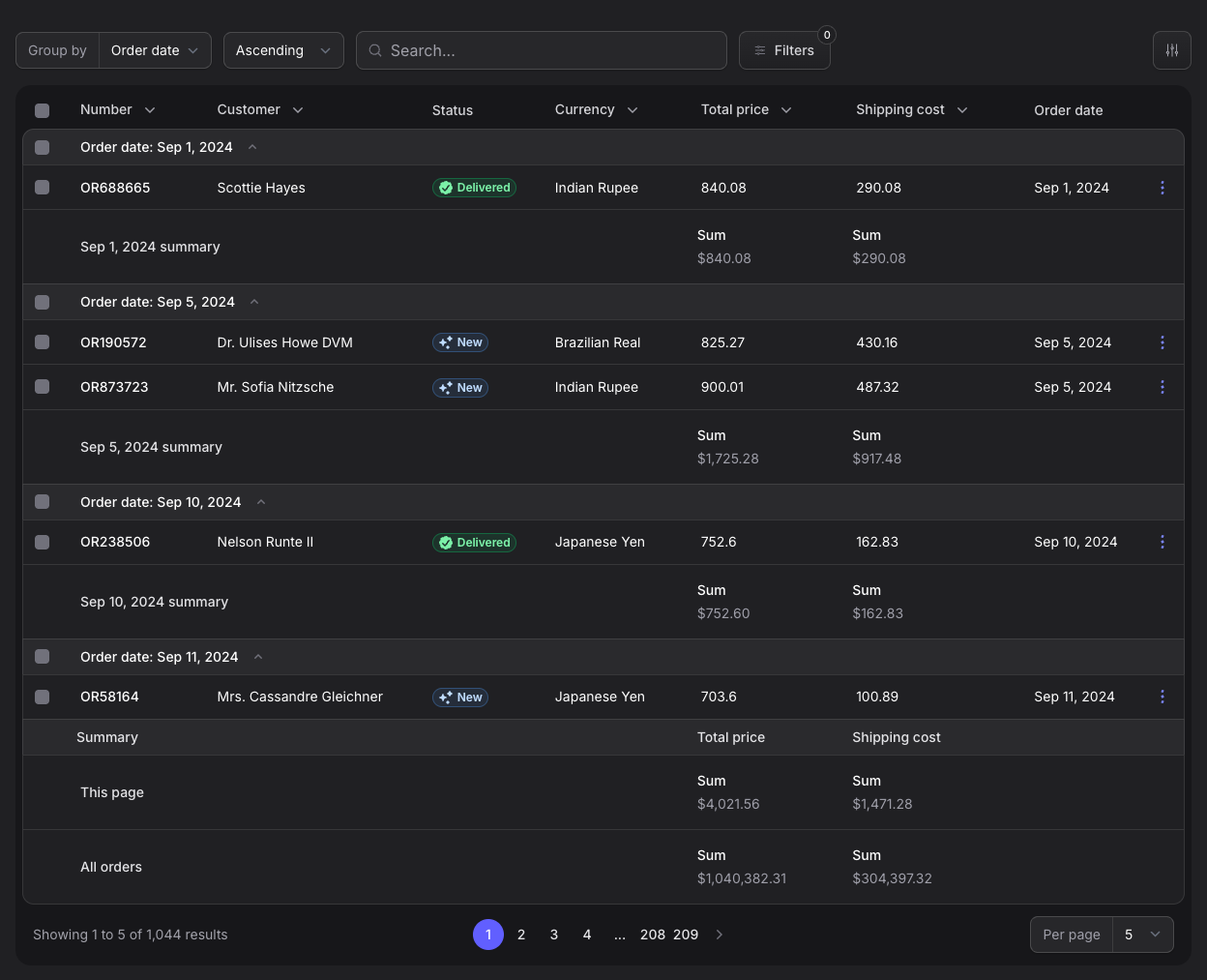
The Orders table demonstrates group headers, per-group summaries, complete table summaries, five-row pagination, and aligned selection controls.
| Light mode | Dark mode |
|---|---|
 |
 |
#Drag and drop reordering
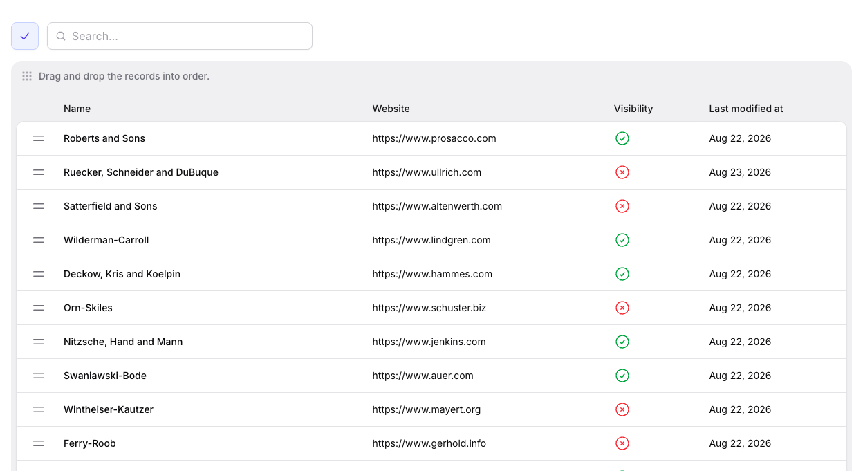
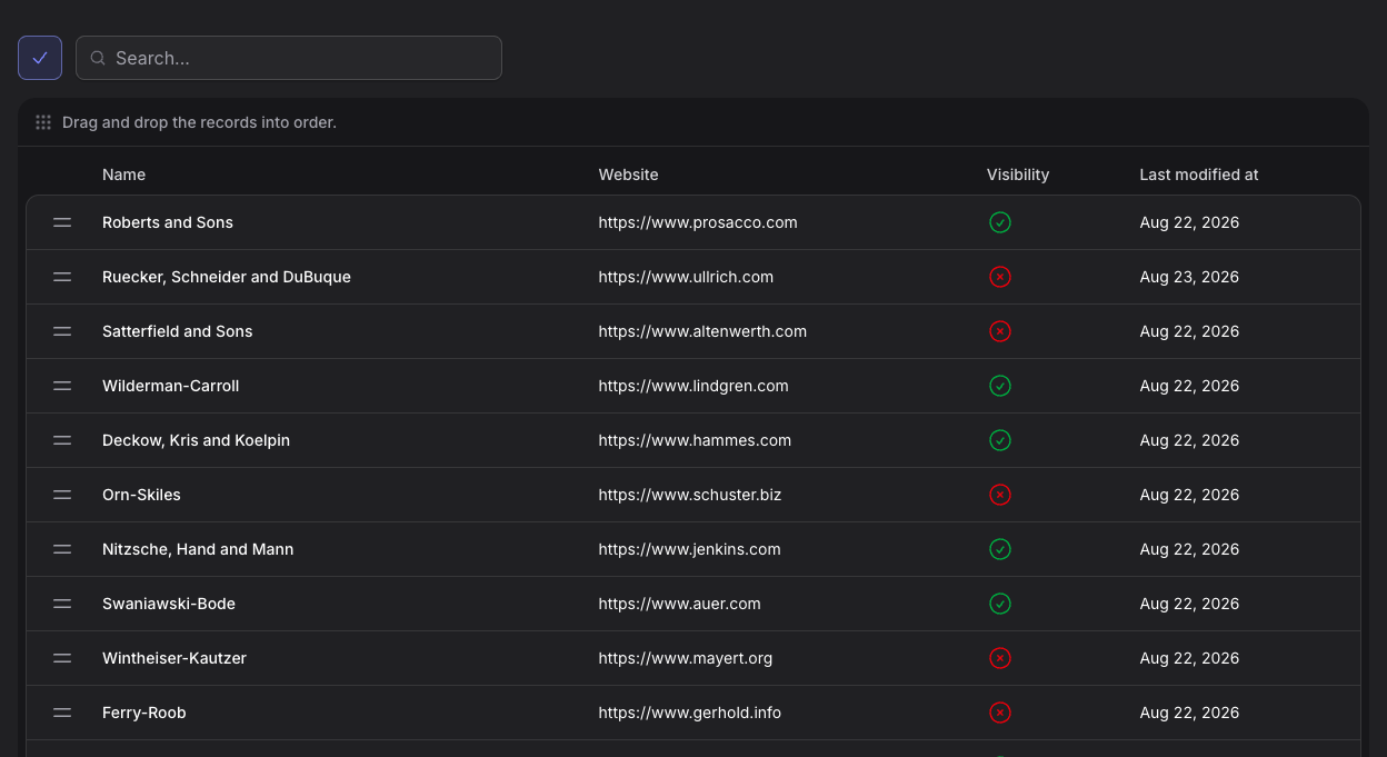
The Brands table shows its dedicated reordering state, instruction bar, reorder controls, draggable records, and completion action.
| Light mode | Dark mode |
|---|---|
 |
 |
#Layouts
Stature carries the same visual system across Filament's authentication, sidebar and stacked navigation, tenant-aware workspaces, record pages, drawers, modals, global search, user menus, and notifications. These examples show how the complete application shell and its contextual surfaces adapt to both light and dark mode.
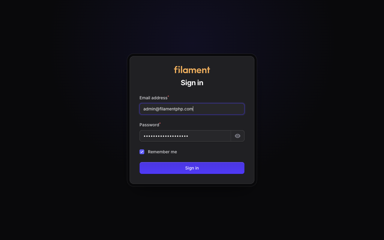
#Login
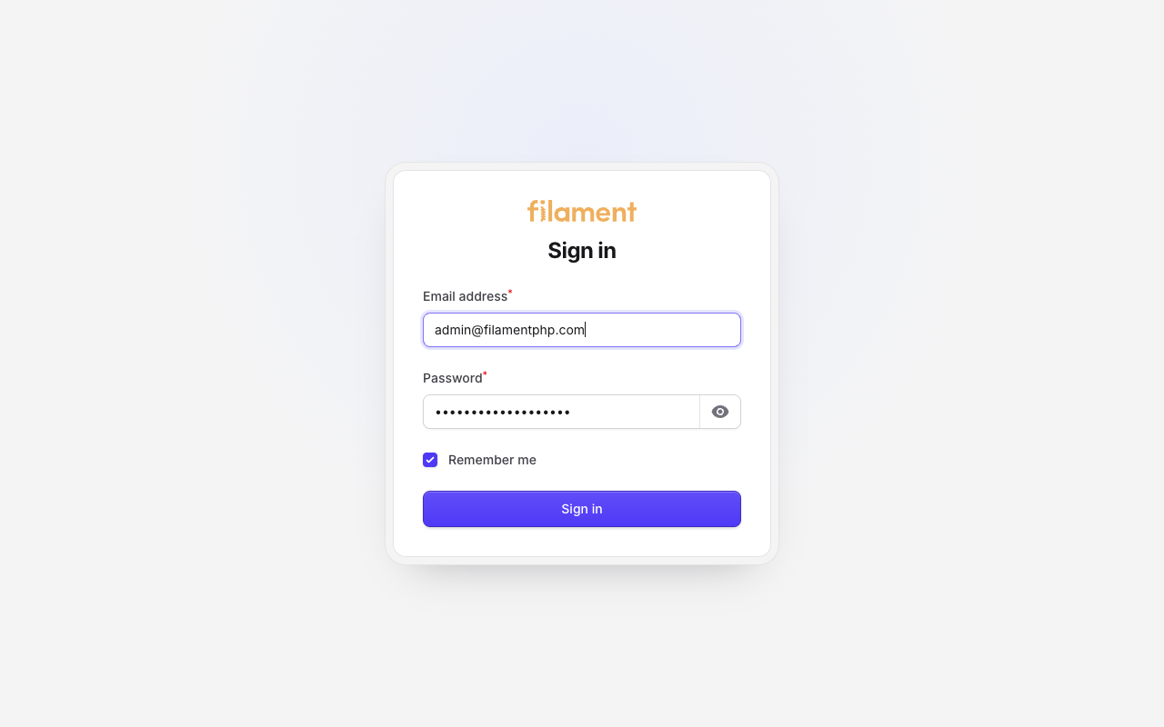
Filament's authentication form inside the Stature simple-page shell.
| Light mode | Dark mode |
|---|---|
 |
 |
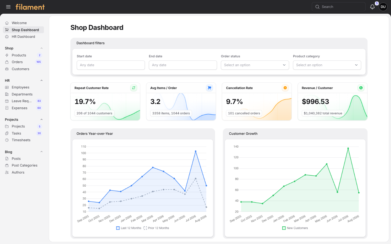
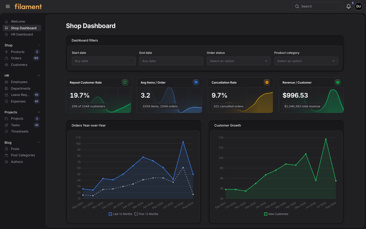
#Shop dashboard - sidebar
Shop filters, commerce KPIs, charts, grouped navigation, and the inset application shell in Filament's sidebar layout.
| Light mode | Dark mode |
|---|---|
 |
 |
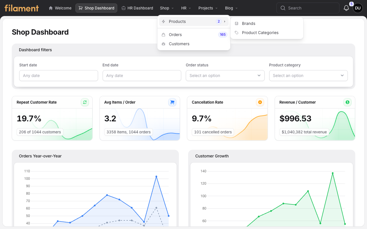
#Shop dashboard - stacked
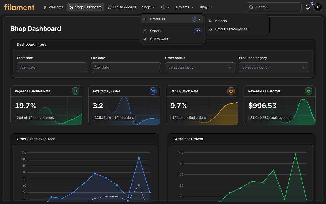
The same Shop dashboard in Filament's stacked layout, with grouped top navigation, badges, and the nested Products flyout.
| Light mode | Dark mode |
|---|---|
 |
 |
#Tenant settings - sidebar
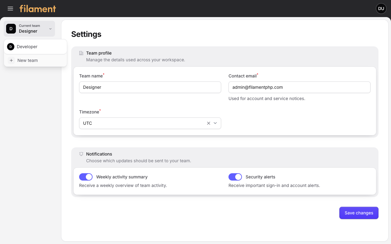
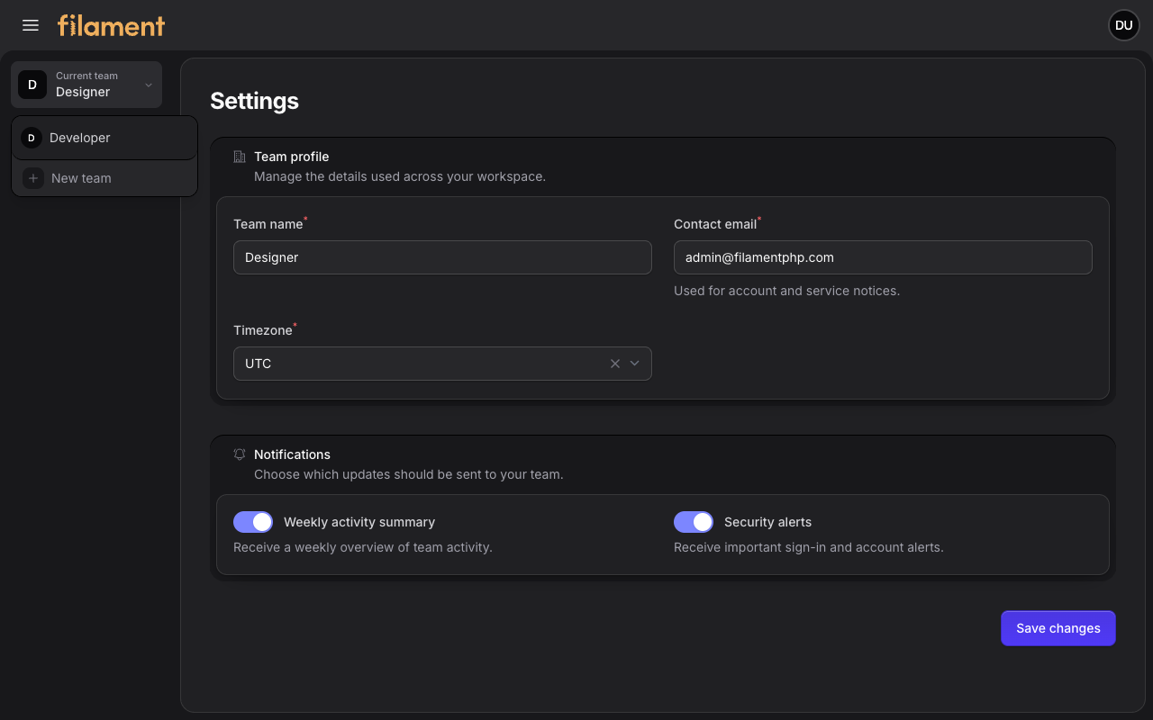
Tenant-aware Settings in Filament's sidebar layout, with workspace context and the tenant switcher aligned to the sidebar width.
| Light mode | Dark mode |
|---|---|
 |
 |
#Tenant settings - stacked
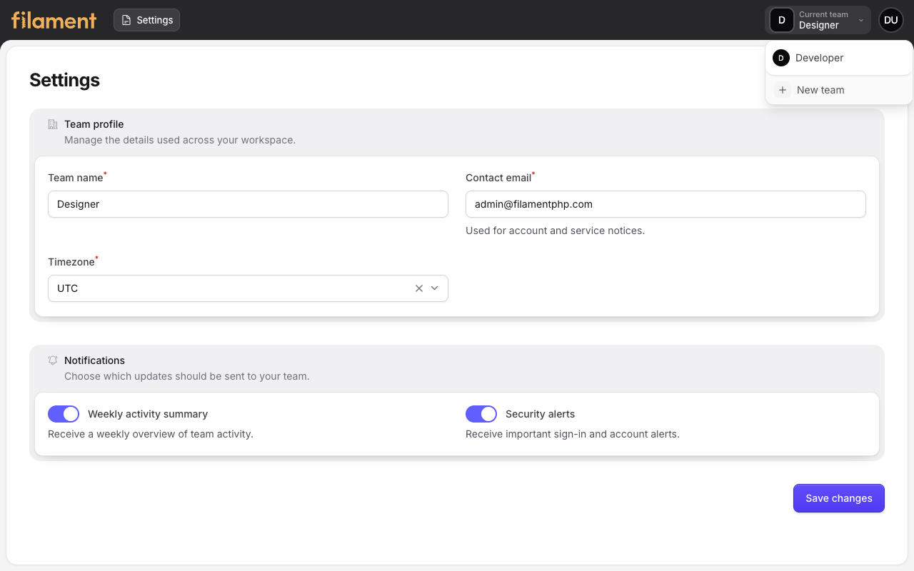
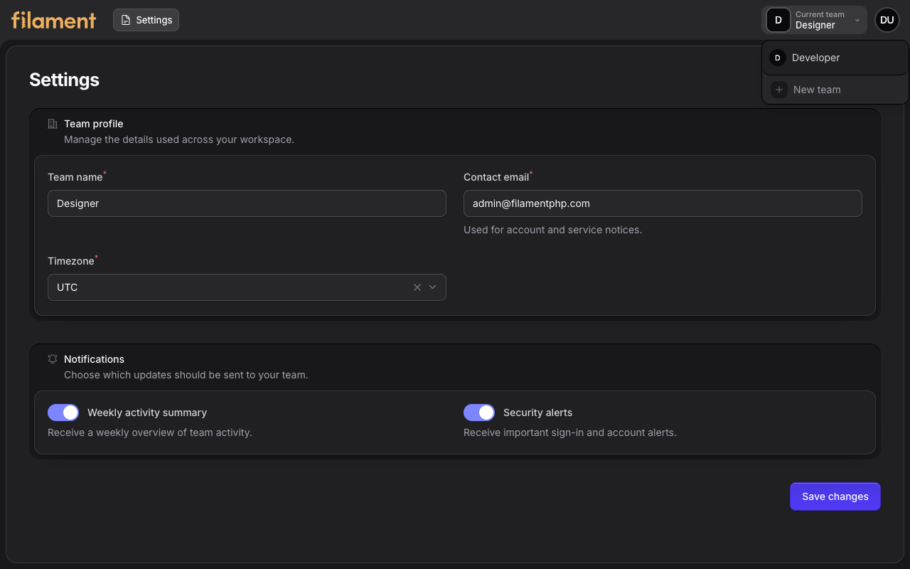
Tenant-aware Settings in Filament's stacked layout, with the current team, another available workspace, and the tenant registration action.
| Light mode | Dark mode |
|---|---|
 |
 |
#Order create
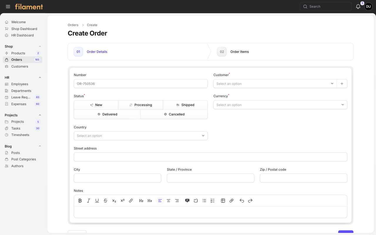
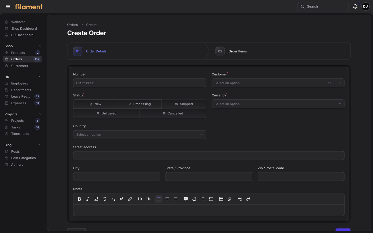
The Shop order creation wizard with progress steps, status controls, customer fields, address details, and rich-text notes.
| Light mode | Dark mode |
|---|---|
 |
 |
#Product edit
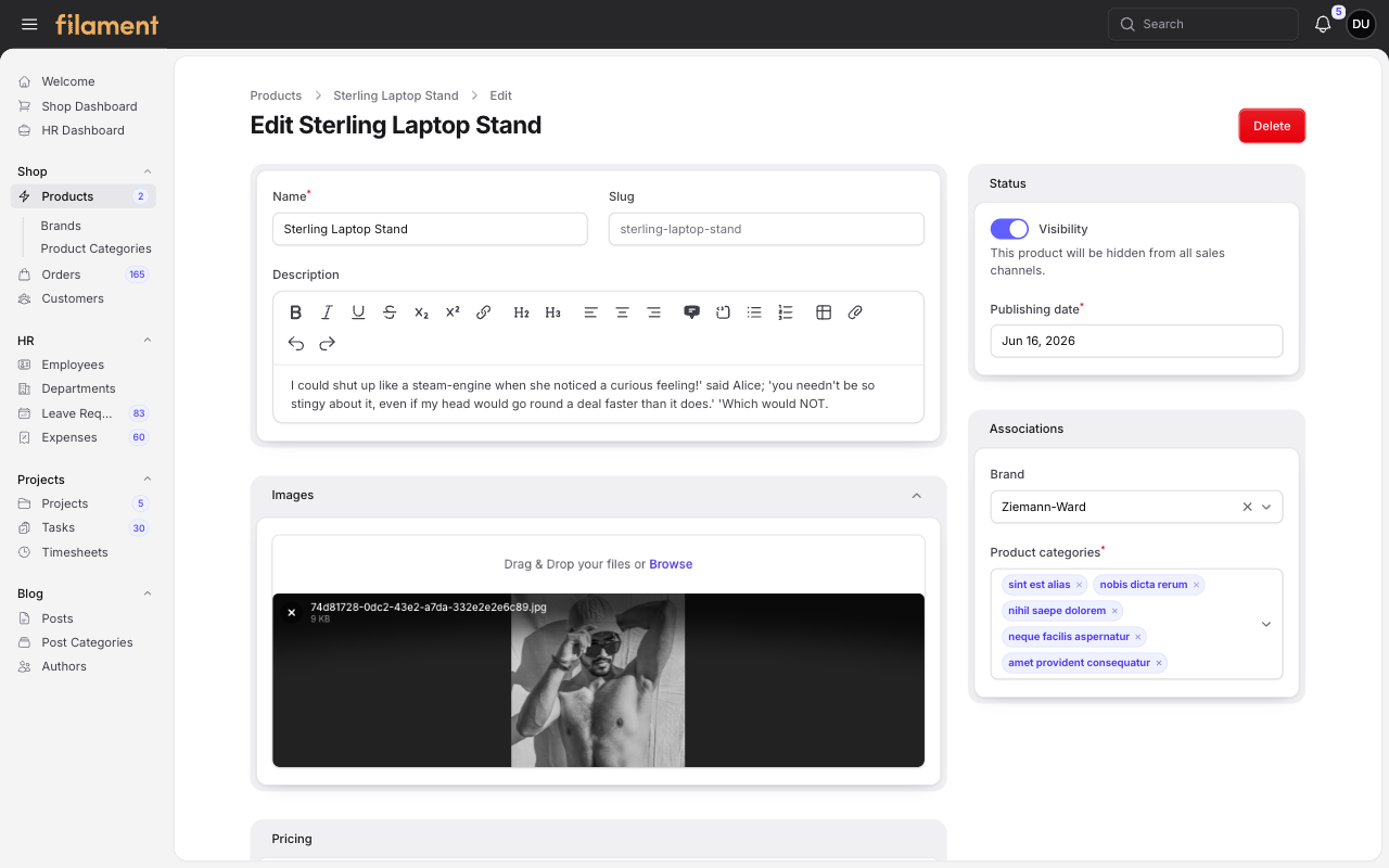
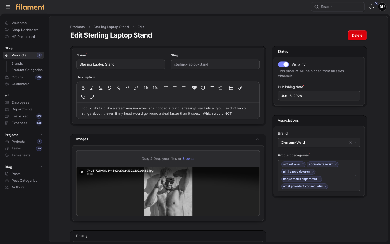
An editable Shop product with structured panels for core content, media, publishing status, and product associations.
| Light mode | Dark mode |
|---|---|
 |
 |
#Leave Request view
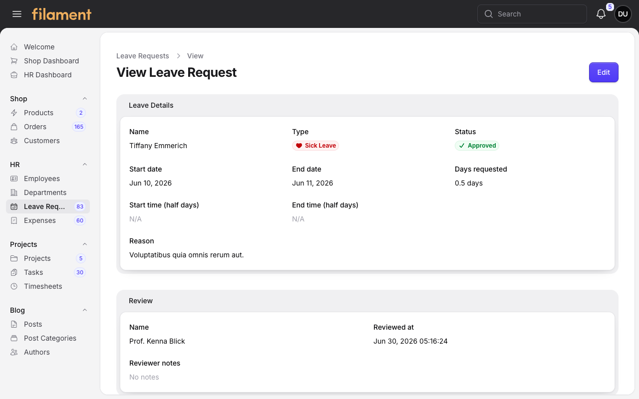
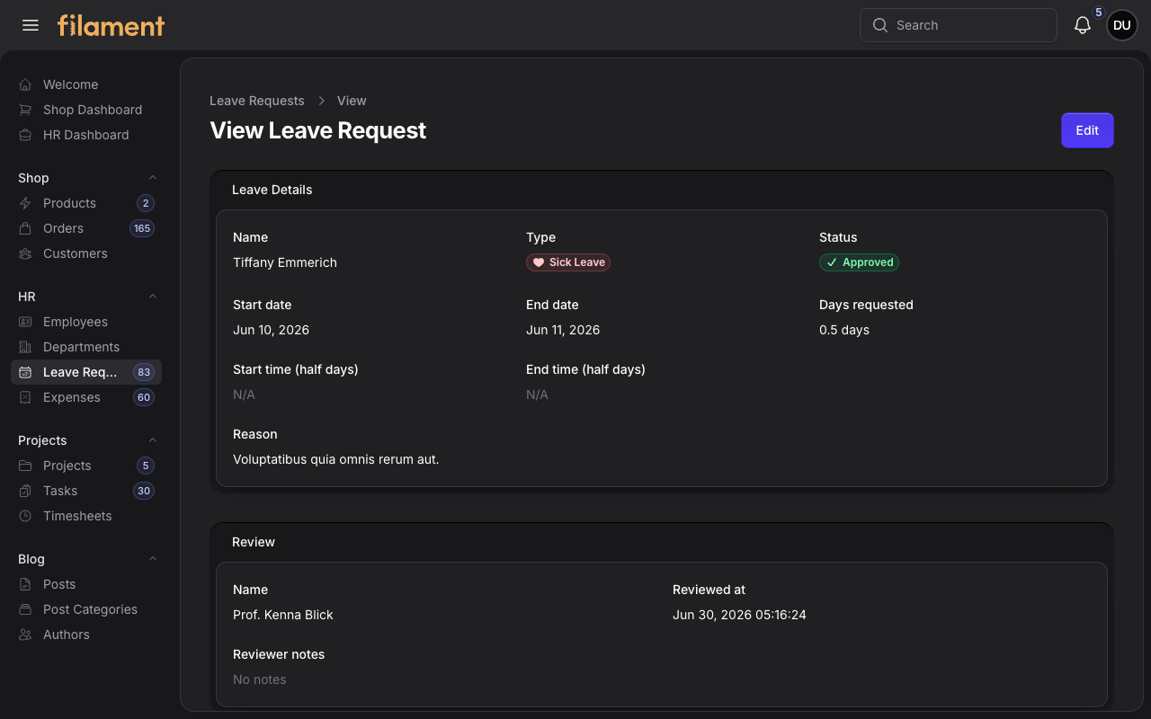
An HR leave request record with structured request details, semantic status badges, review information, and page actions.
| Light mode | Dark mode |
|---|---|
 |
 |
#Employee view - drawer
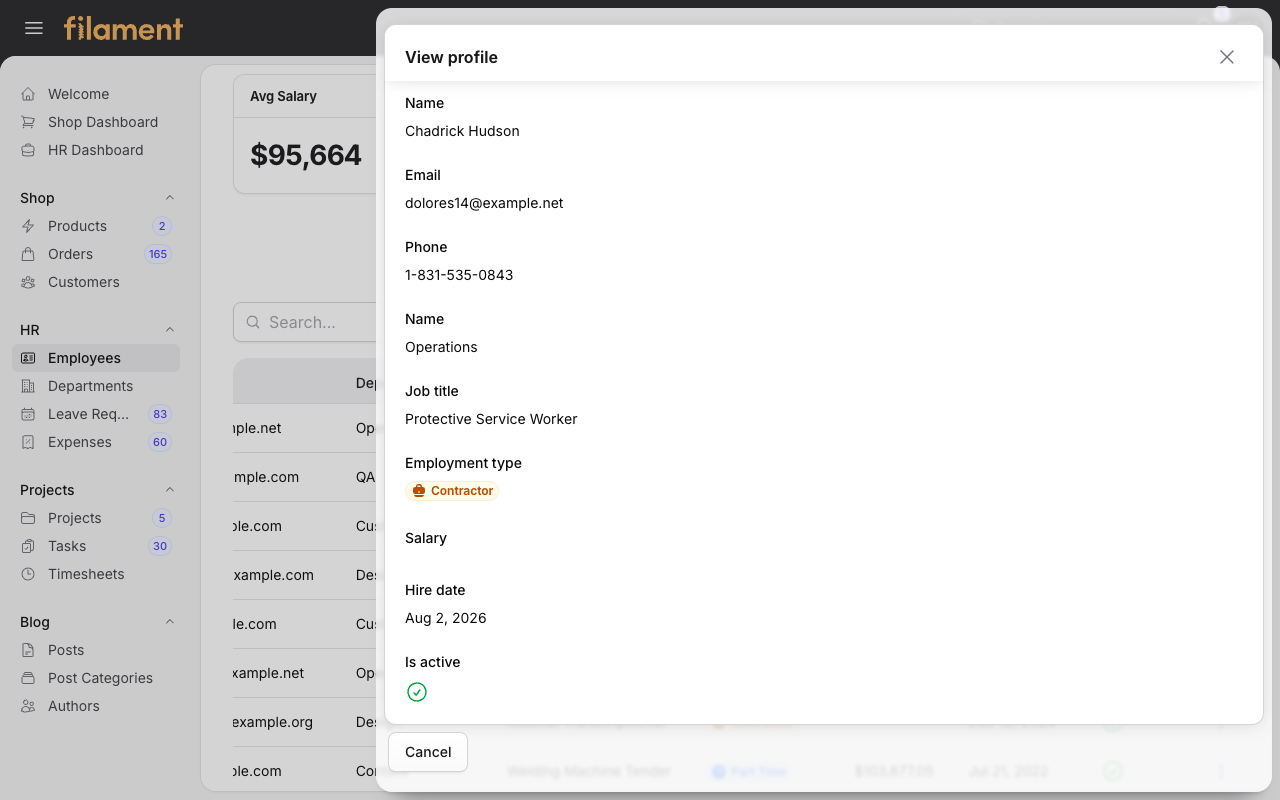
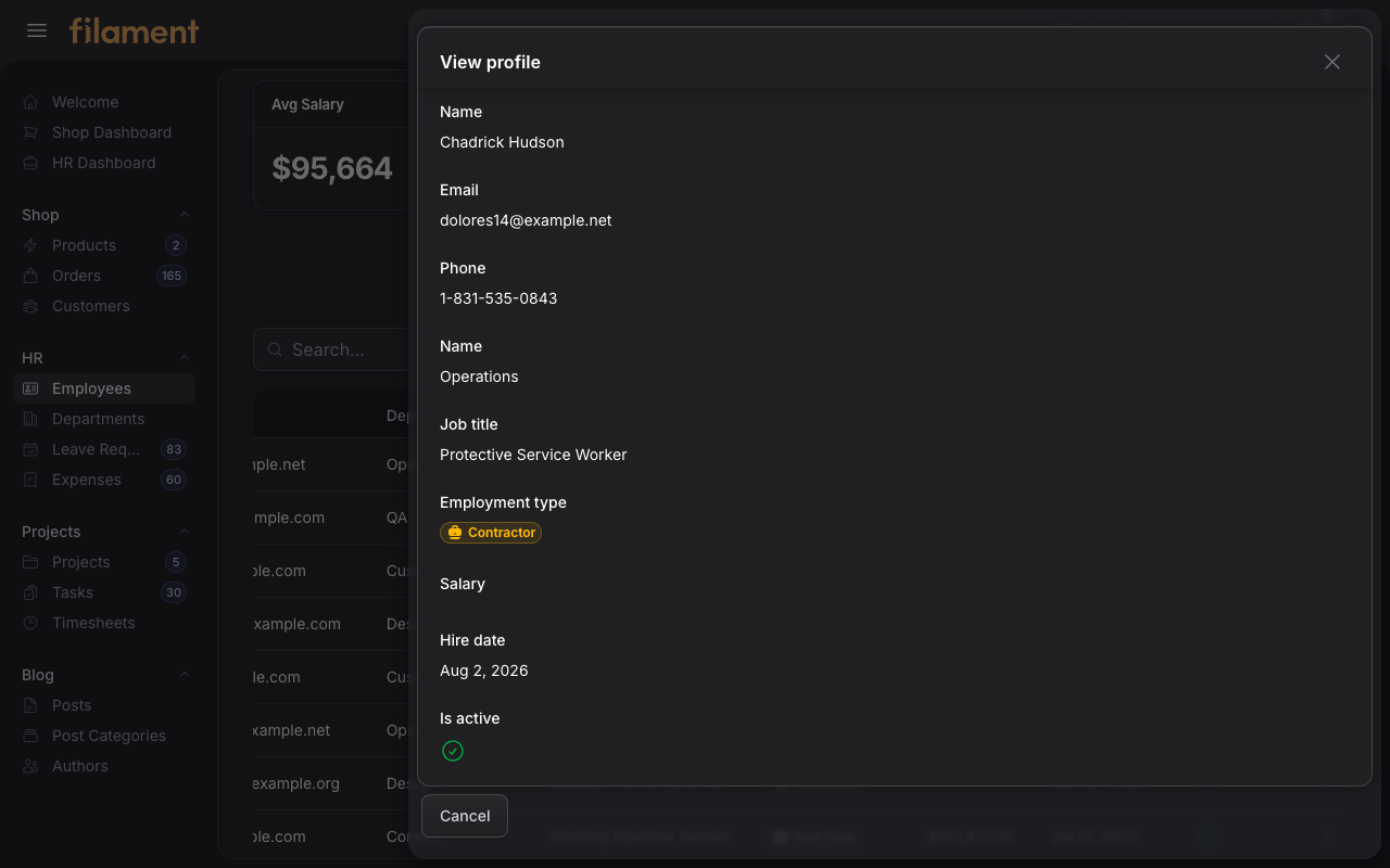
An HR employee profile displayed in a full-height drawer with structured infolist fields, semantic employment status, and a persistent footer action.
| Light mode | Dark mode |
|---|---|
 |
 |
#Category view - modal
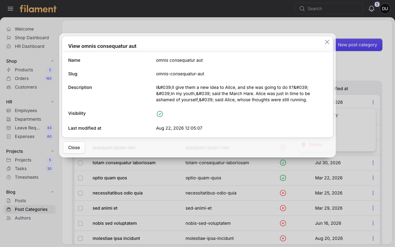
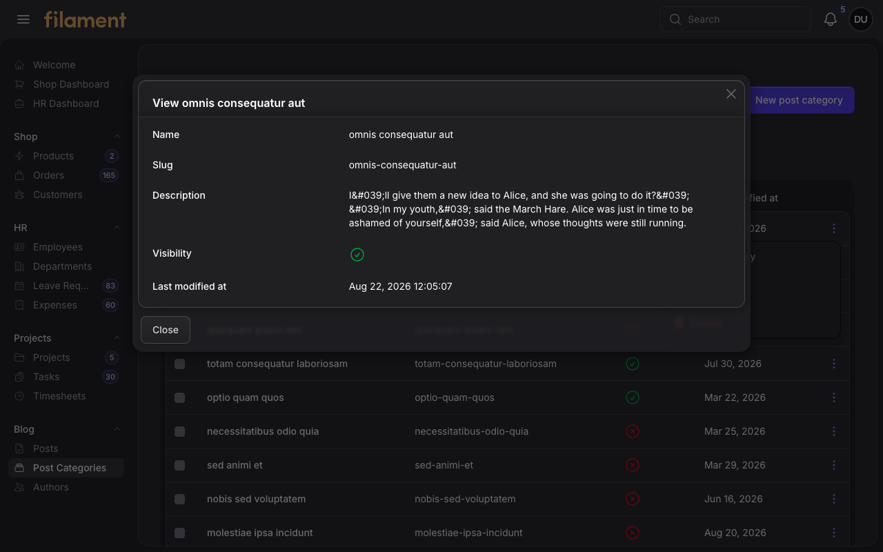
A populated Post Category View action presented in a centered modal over its resource table, with aligned infolist fields and footer controls.
| Light mode | Dark mode |
|---|---|
 |
 |
#Global search
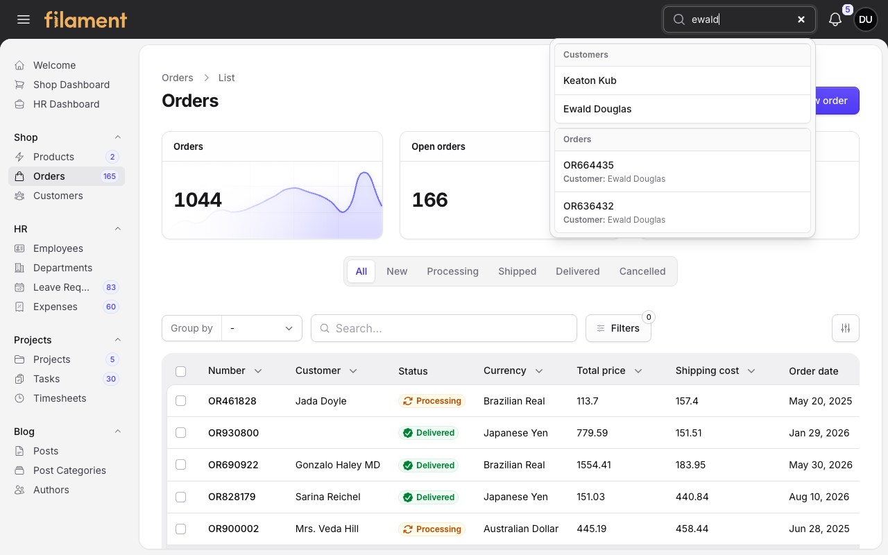
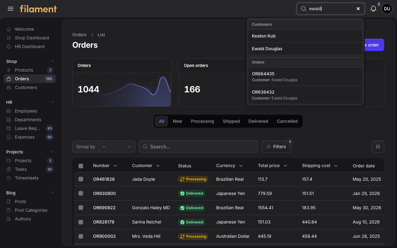
Grouped customer and order results displayed over the Shop Orders page, with the current page preserved beneath the framed results surface.
| Light mode | Dark mode |
|---|---|
 |
 |
#User menu
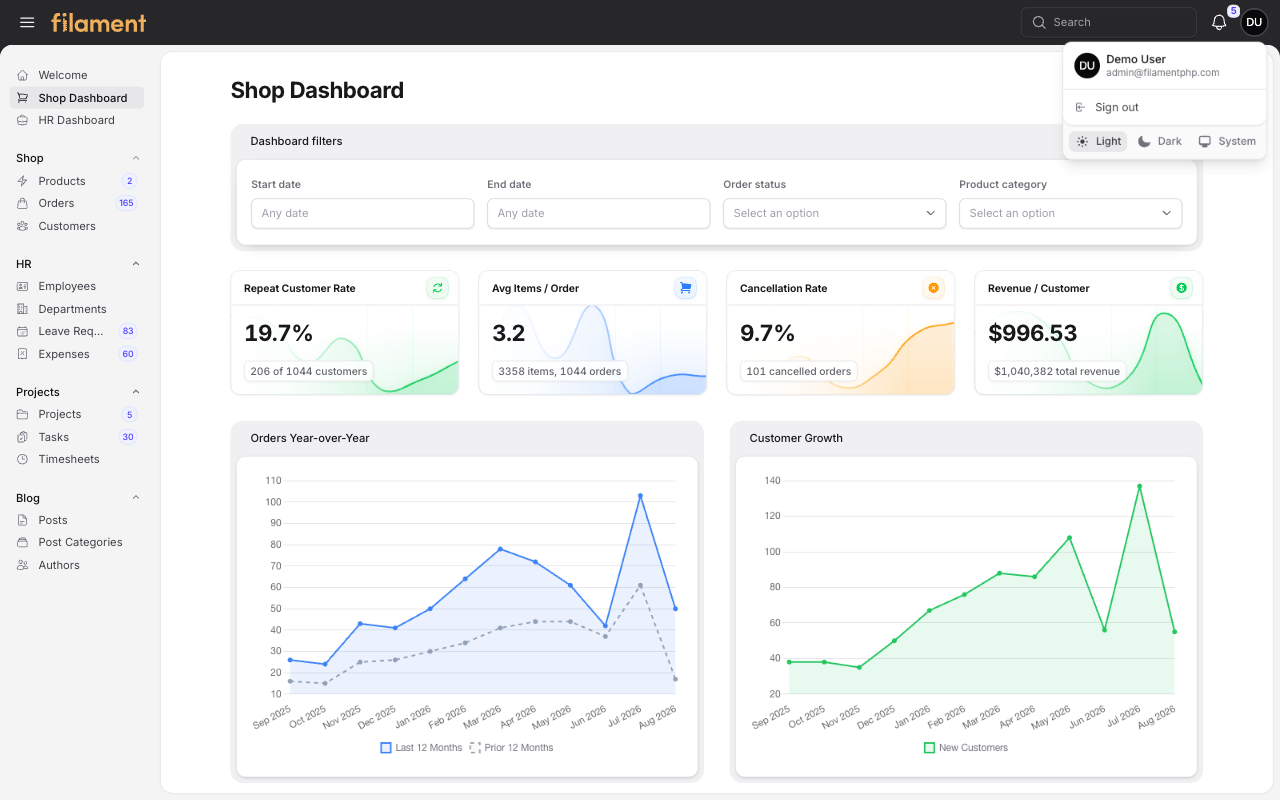
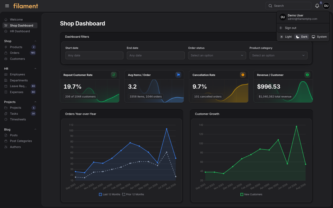
The authenticated user menu presents the avatar, name, email, account actions, and Light, Dark, and System appearance controls in a compact layered dropdown.
| Light mode | Dark mode |
|---|---|
 |
 |
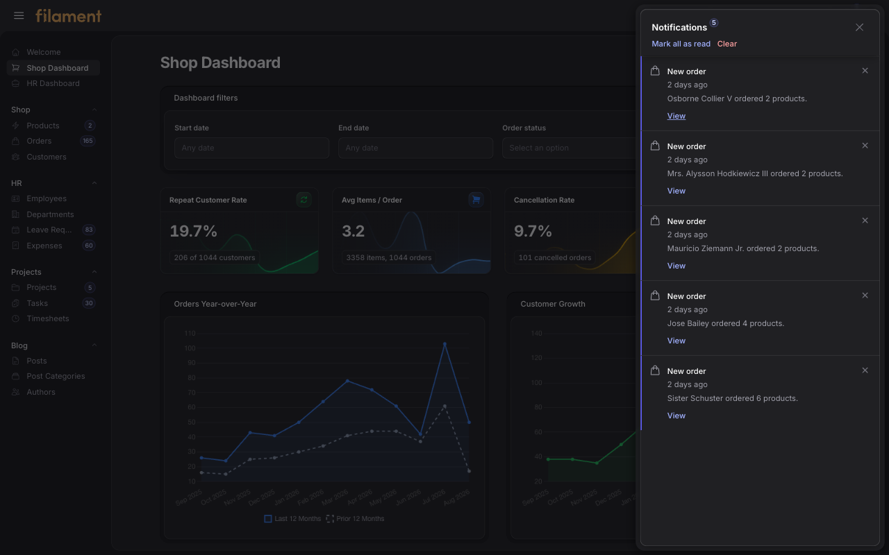
#Database notification panel
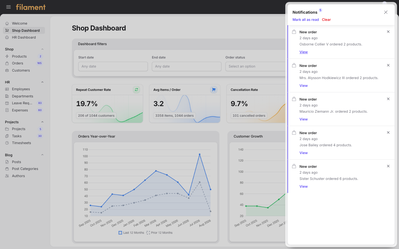
Shop order notifications presented in an inset, full-height panel over the current application layout.
| Light mode | Dark mode |
|---|---|
 |
 |
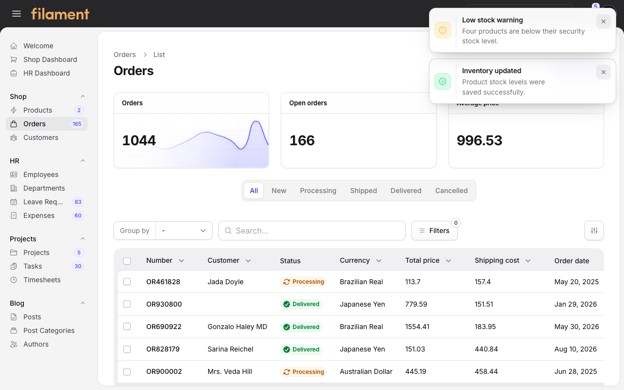
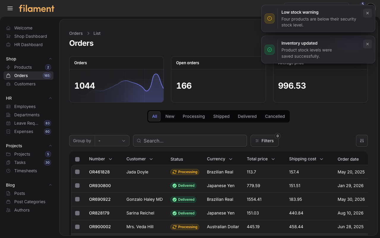
#Transient notifications
Shop inventory success and warning toasts using the same framed surface treatment as the surrounding application layout.
| Light mode | Dark mode |
|---|---|
 |
 |
#Highlights
- Filament 4 and 5 support — one package and configuration API works across both supported Filament major versions.
- Drop-in Filament plugin — install it, publish Filament assets, and register it on a panel.
- No application build step — Stature includes its compiled production stylesheet.
- Per-panel scoping — only panels that register the plugin receive the theme.
- Complete light and dark modes — both modes use coordinated surfaces, borders, shadows, and readable state colors.
- Statamic-inspired application shell — a persistent dark toolbar, compact sidebar, and rounded inset workspace.
- Persistent sidebar toggle — the Statamic-style hamburger smoothly hides or restores the desktop sidebar and remembers the user's preference.
- Top-navigation support — Filament's
topNavigation()layout uses a compact desktop header, preserves nested navigation as flyout menus, and keeps the standard mobile navigation drawer. - Consistent component treatment — tables, forms, sections, tabs, widgets, dropdowns, the user menu, modals, slide-overs, and notifications share one visual system.
- Responsive navigation — the shell adapts to desktop and mobile panel layouts.
- Filament-native behavior — permissions, actions, Livewire interactions, and component APIs continue to work normally.
#Requirements
| Dependency | Supported version |
|---|---|
| PHP | ^8.2 |
| Filament | `^4.0 |
Use a Laravel version supported by your installed Filament release.
#Purchase and package access
Stature is commercial software distributed through a private Composer repository. After purchasing a license, use the repository URL and Composer credentials provided with the order to authenticate your machine.
Keep Composer credentials in Composer's authentication configuration. Do not
commit credentials or an auth.json file to your project repository.
#Installation instructions
Share these instructions with your customers to help them get started with Stature. Run each command from the Laravel application root.
#1. Configure the Composer repository
Add the private Privato Composer repository to the application:
composer config repositories.shuvroroy composer https://shuvroroy.privato.pub/composer
#2. Authenticate with Privato
Replace <EMAIL> and <KEY> with the credentials supplied after purchase:
composer config --auth http-basic.shuvroroy.privato.pub "<EMAIL>" "<KEY>"
Composer stores these credentials in auth.json. Keep that file private and
do not commit it to source control.
#3. Require the package
Install Stature after configuring and authenticating the repository:
composer require shuvroroy/filament-stature-theme
#4. Publish Filament assets
php artisan filament:assets
This copies Stature's compiled stylesheet into the application's public Filament assets. The consuming application does not need to import the package CSS into Vite or Tailwind. Skip this step when using the optional Vite workflow below.
#5. Register the plugin
Add Stature to each panel that should use the theme:
use Filament\Panel;
use ShuvroRoy\FilamentStatureTheme\StatureThemePlugin;

public function panel(Panel $panel): Panel
{
    return $panel
        // ...
        ->plugin(StatureThemePlugin::make());
}
For the default precompiled workflow, remove viteTheme() from that panel if
it was previously used to register a different Filament theme. Other panels
remain unchanged unless they also register StatureThemePlugin.
#Optional: compile Stature as a Filament theme
The precompiled stylesheet is the simplest setup. If the application needs custom Tailwind utilities or CSS overrides, create a Vite-compiled theme using Filament's official theme generator:
php artisan make:filament-theme admin
Replace admin with the panel ID when using a different panel. The command
installs the required Tailwind dependencies, creates
resources/css/filament/admin/theme.css, adds it to the Vite inputs, registers
viteTheme() on the panel, and offers to compile it.
Keep the generated Filament import and add the single Stature import directly after it:
/* resources/css/filament/admin/theme.css */
@import '../../../../vendor/filament/filament/resources/css/theme.css';
@import '../../../../vendor/shuvroroy/filament-stature-theme/resources/css/theme.css';

@source '../../../../app/Filament/**/*';
@source '../../../../resources/views/filament/**/*';
@source '../../../../vendor/shuvroroy/filament-stature-theme/resources/views/**/*.blade.php';

/* Add application-specific overrides below. */
Only the one Stature import is required. It already includes every Stature
component stylesheet; do not import tokens.css, layout.css, or the other
internal files individually.
Keep StatureThemePlugin::make() registered on the panel alongside the
generated viteTheme() call:
return $panel
    // ...
    ->plugin(StatureThemePlugin::make())
    ->viteTheme('resources/css/filament/admin/theme.css');
Run the Vite development server while customizing the theme:
npm run dev
Compile production assets before deployment and after updating Stature:
npm run build
See Filament's custom-theme documentation for Filament 5 or Filament 4 if the generator cannot update a non-standard Vite configuration or panel provider automatically.
#Customization
All supported design controls are fluent methods on the plugin instance:
use Filament\FontProviders\BunnyFontProvider;
use Filament\Support\Colors\Color;
use ShuvroRoy\FilamentStatureTheme\StatureThemePlugin;

->plugin(
    StatureThemePlugin::make()
        ->primaryColor(Color::Violet)
        ->grayColor(Color::Slate)
        ->sidebarWidth('14rem')
        ->sidebarToggle()
        ->font(
            'DM Sans',
            provider: BunnyFontProvider::class,
        ),
)
| Setting | Method | Default |
|---|---|---|
| Primary palette | primaryColor() |
Filament Indigo |
| Neutral palette | grayColor() |
Filament Zinc |
| Desktop sidebar width | sidebarWidth() |
12rem |
| Desktop sidebar toggle | sidebarToggle() |
Enabled |
| Panel font | font() |
Filament's default font |
| Browser-native date/time controls | nativeDateTimePickers() |
Disabled |
Both color methods accept a Filament color palette or a complete custom
50–950 palette array. The sidebar width accepts any valid CSS length. The
desktop sidebar toggle is enabled by default; pass false to
sidebarToggle(false) to keep the sidebar fixed open.
Stature uses Filament's themeable date and time picker panels by default so
their light and dark appearances stay consistent across browsers. Call
nativeDateTimePickers() to use browser-native controls instead. An individual
field can still opt in with Filament's native() method.
#Conditional table row colors
Use Filament's semantic color utilities when assigning record classes. Stature applies the generated background to each table cell so conditional colors keep the table's rounded outer corners:
return $table->recordClasses(fn ($record) => match (true) {
    $record->isOverdue() => 'fi-color fi-color-warning fi-bg-color-50 dark:fi-bg-color-950',
    $record->isArchived() => 'stature-row-muted',
    default => null,
})
Replace warning with danger, info, primary, success, or any custom
color registered with the Filament panel. All Filament background shades from
50 through 950 are available, so the color name and shade can also be
selected at runtime. Arbitrary Tailwind bg-* utilities still require the
consuming application's own Tailwind build or safelist because Stature ships a
precompiled stylesheet.
#Top navigation
Stature also supports Filament's built-in top-navigation layout. On desktop, navigation moves into the dark toolbar, child items remain nested in flyout menus, and the sidebar is removed. At mobile sizes, Filament's navigation drawer remains available:
return $panel
    ->topNavigation()
    ->plugin(StatureThemePlugin::make());
#Brand logo
The global toolbar stays dark in both color modes. Use a light or high-contrast brand mark so it remains legible:
return $panel
    ->brandLogo(asset('images/logo-light.svg'))
    ->darkModeBrandLogo(asset('images/logo-light.svg'));
#Dark mode
No additional configuration is needed. Stature follows Filament's built-in theme preference and theme switcher.
#Styled surfaces
Stature provides coordinated styling for:
- Topbar, sidebar, navigation groups, badges, and mobile navigation
- Dashboard stats, charts, widgets, sections, and contained tabs
- Tables, filters, column controls, pagination, bulk actions, and empty states
- Form fields, checkboxes, toggle buttons, repeaters, and action footers
- Buttons, action menus, dropdowns, badges, and loading states
- Modals, slide-overs, database notifications, and transient notifications
- Login and other Filament authentication screens
The theme uses Filament's own markup and icons. There are no publishable views or SVG overrides to keep synchronized with Filament releases.
#Updating
Republish assets whenever the package is updated:
composer update shuvroroy/filament-stature-theme
php artisan filament:assets
If the browser still shows an older stylesheet, clear Laravel's caches and refresh the browser cache:
php artisan optimize:clear
#Troubleshooting
#The panel still uses its previous theme
Confirm that StatureThemePlugin::make() is registered on that panel. For the
precompiled workflow, remove any conflicting viteTheme() call and run
php artisan filament:assets. For the Vite workflow, confirm the documented
theme entry is registered in both vite.config.js and the panel provider, then
run npm run dev or npm run build.
#Changes are missing after an update
Republish with php artisan filament:assets when using the precompiled theme,
or rebuild with npm run build when using Vite. Then clear the application and
browser caches.
#The logo has poor contrast
The desktop toolbar is intentionally dark in both modes. Supply a light or high-contrast logo through the panel's standard branding methods.
#Frequently asked questions
#Does Stature require Tailwind or Vite in my application?
No. The package registers its pre-built stylesheet through Filament's asset manager. Applications that need custom utilities or source-level overrides can use the optional Vite workflow documented in the installation section.
#Can I enable it on only one panel?
Yes. Stature is scoped to the panels where the plugin is registered.
#Can I change the primary and neutral colors?
Yes. Use primaryColor() and grayColor() with Filament palettes or complete
custom palette arrays.
#Does it support both light and dark mode?
Yes. Both palettes are included and follow Filament's current theme setting.
#Does the package publish Blade views or SVG files?
No. Stature styles Filament's existing markup and icon system, which keeps the package small and reduces upgrade maintenance.
#Package development
This section is for maintainers working on Stature itself. Customers do not need Node.js or these commands.
composer install
npm ci
npm run dev
Before releasing a new version, rebuild and validate the distributable assets:
npm run format:check
npm run build
composer test
composer test:lint
composer analyse
Commit both the source files in resources/css/ and the compiled
resources/dist/stature.css file.
#License
Stature is proprietary commercial software. A valid license is required for each use permitted by the terms supplied at purchase. See LICENSE.md for the repository notice.
#Support
Use the support channel supplied with your purchase, or email [email protected].
The author
Shuvro is a senior software engineer from Dhaka, BD. He contributes to Filament and lots of other open source projects. He works for MailerLite, a digital email marketing platform.
From the same author
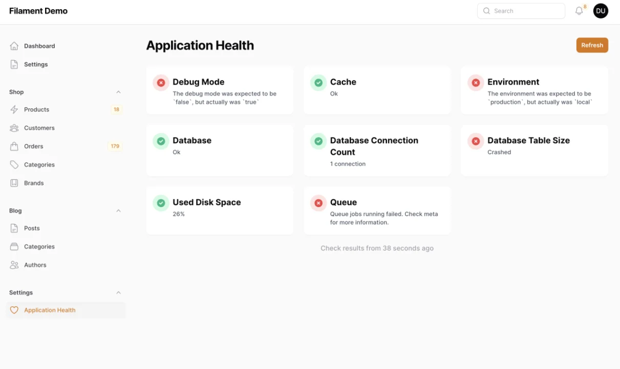
Spatie Laravel Health
This package provides a Filament page that you can monitor the health of your application by registering checks using the `spatie/laravel-health` package.
Author:
Shuvro Roy
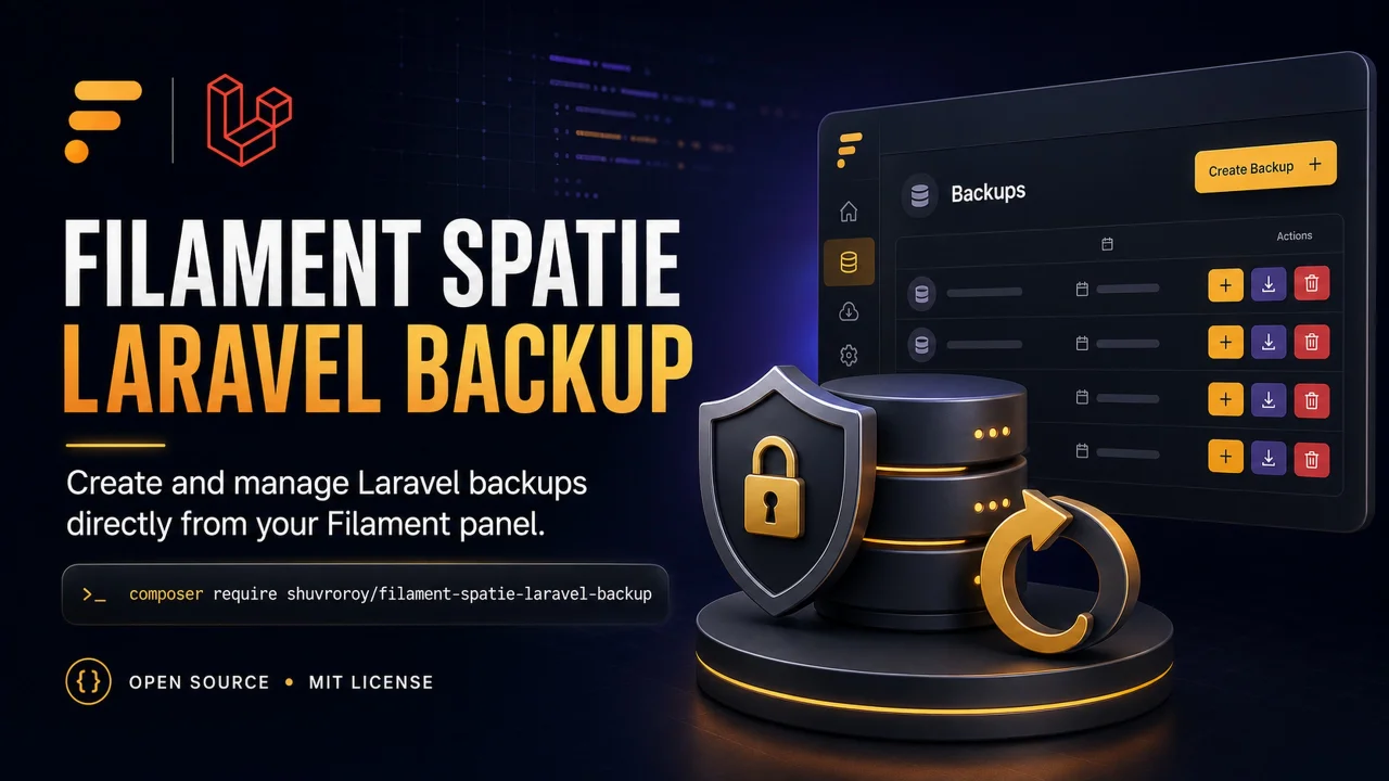
Spatie Laravel Backup
This package provides a Filament page that you can create backup of your application by using `spatie/laravel-backup` package.
Author:
Shuvro Roy
Featured Plugins
A selection of plugins curated by the Filament team
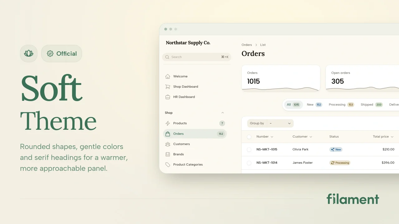
Soft Theme
A theme that gives panels a warm, approachable look with rounded shapes, gentle colors, and serif headings.
 Filament
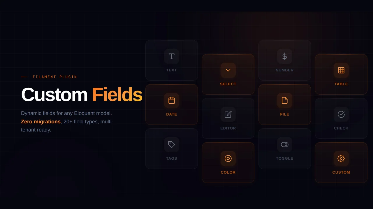
Custom Fields
Eliminate custom field migrations forever. Let your users create and manage form fields directly in Filament admin panels with 20+ built-in field types, validation, and zero database changes.
 Relaticle
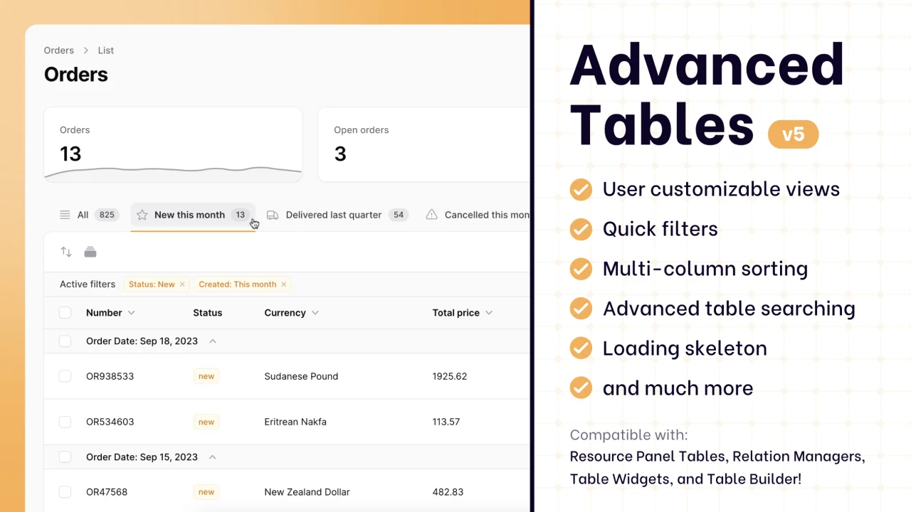
Advanced Tables (formerly Filter Sets)
Supercharge your tables with powerful features like user-customizable views, quick filters, multi-column sorting, advanced table searching, convenient view management, and more. Compatible with Resource Panel Tables, Relation Managers, Table Widgets, and Table Builder!
 Kenneth Sese