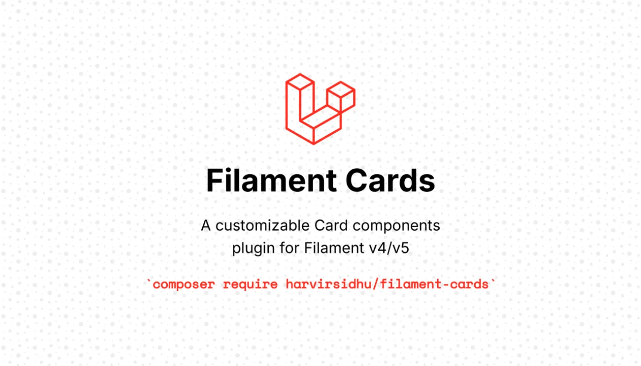
Cards
CommunityA customizable Card components, designed for modern admin panels and multi-tenant SaaS applications.
filament/
namespace. Review the source and install at your own risk. Found
malware or an unresolved security issue the author won't
address?
Report it
.
 Author:
Harvir
Author:
Harvir
Documentation
- Table of Contents
- Why use this?
- Which approach fits your case?
- Requirements
- Installation
- 60-Second Quick Start
- Use Case A — Cluster Front Page (most common)
- Use Case B — Resource Hub
- Use Case C — Standalone Settings Page
- API Reference — CardItem
- API Reference — CardGroup
- API Reference — CardsPage Configuration
- API Reference — Page/Resource Hooks (for auto-discovery)
- Advanced — Dynamic Registration
- Advanced — Custom Discovery Filtering
- Full Example
- Optional — Plugin Registration
- License
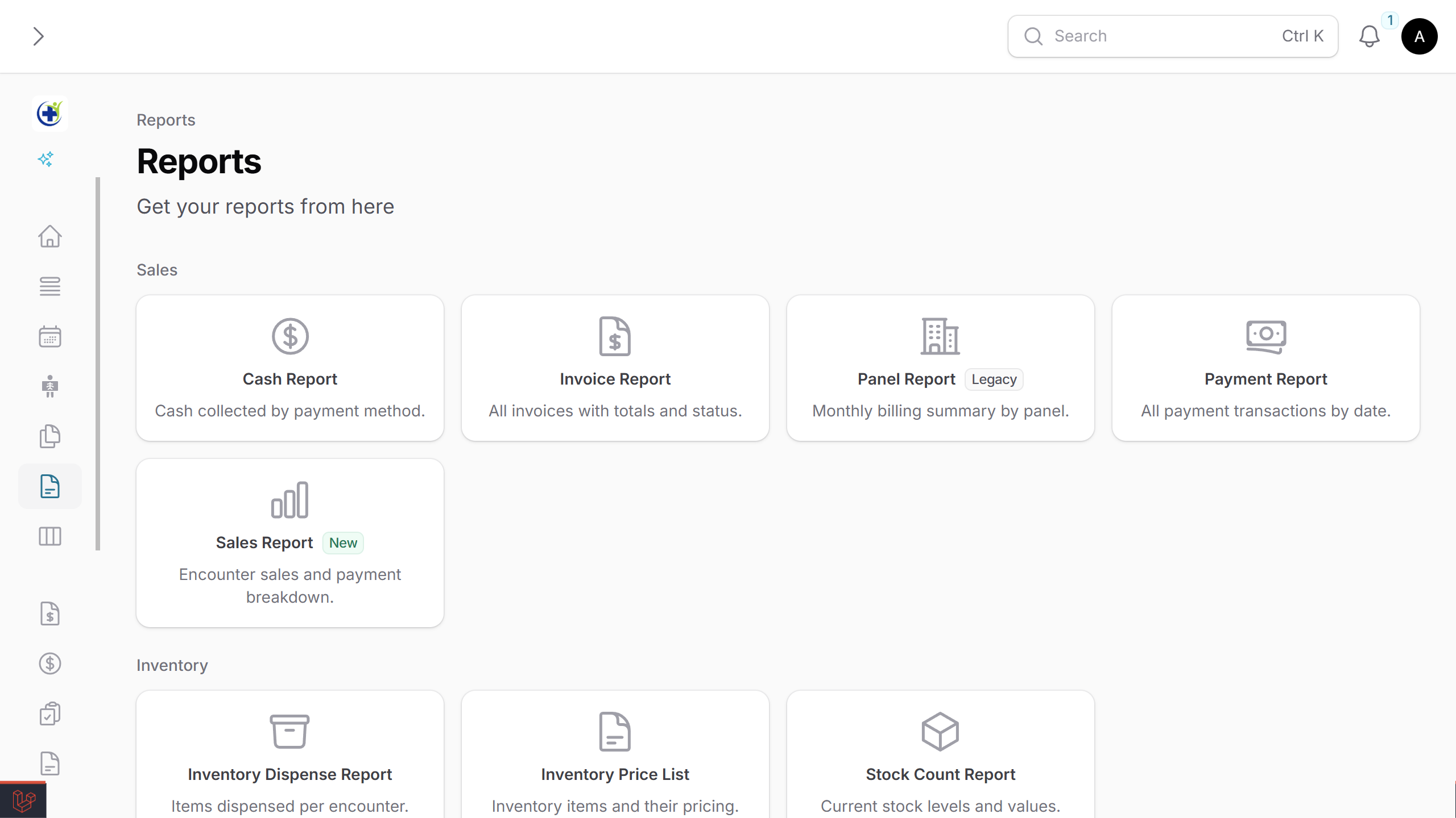
Turn any Filament page into a card-based navigation hub — perfect for Settings hubs, Cluster front pages, Resource dashboards, or any place you want a clean grid of links instead of a sidebar tree.
It feels like part of Filament: same API patterns (label, schema, columnSpan, visible/hidden), respects your existing navigation config, and auto-discovers Cluster/Resource pages with full authorization checks.
#Table of Contents
- Why use this?
- Which approach fits your case?
- Requirements
- Installation
- 60-Second Quick Start
- Use Case A — Cluster Front Page (most common)
- Use Case B — Resource Hub
- Use Case C — Standalone Settings Page
- API Reference —
CardItem - API Reference —
CardGroup - API Reference —
CardsPageConfiguration - API Reference — Page/Resource Hooks (for auto-discovery)
- Advanced — Dynamic Registration
- Advanced — Custom Discovery Filtering
- Full Example
- Optional — Plugin Registration
- License
#Why use this?
| Feature | What it gives you |
|---|---|
| Auto-discovery | Reads pages/resources in a Cluster (or Resource) and creates cards automatically — no manual list to maintain. |
| Filament-native API | label, description, schema, visible, hidden, columnSpan — same patterns you already use. |
| Authorization-aware | Calls canAccess() on each component before rendering. |
| Grouping & layout | CardGroup, columns, spans, compact mode, collapsible sections. |
| Flexible visibility | Per-card or per-page hooks; central exclude lists; closure-based conditions. |
| Manual + discovered | Mix auto-discovered cards with hand-crafted ones (e.g., external links). |
| Dynamic registration | Add cards from service providers — useful for modular apps and packages. |
| Client-side search | Optional live search that filters by label, description, badge, and custom keywords. |
#Which approach fits your case?
| Your situation | Use this |
|---|---|
| You have a Cluster with several pages and want a landing page | Cluster Front Page |
| You have a Resource with many custom pages | Resource Hub |
| You just want a generic settings/control panel with manual cards | Standalone Page |
| You want to add cards from a package or module | Dynamic Registration |
#Requirements
- PHP 8.2+
- Laravel 11+
- Filament v4 or v5
#Installation
Install the package via Composer:
composer require harvirsidhu/filament-cards
#Theme setup (required for styling)
The plugin uses Tailwind classes, so add its views to your Filament theme so Tailwind picks them up.
In your theme.css, add:
@source '../../../../vendor/harvirsidhu/filament-cards/resources/views';
Then rebuild assets:
npm run build
#60-Second Quick Start
The smallest possible cards page:
namespace App\Filament\Pages;

use Harvirsidhu\FilamentCards\CardItem;
use Harvirsidhu\FilamentCards\Filament\Pages\CardsPage;

class ControlPanel extends CardsPage
{
    protected static ?string $navigationIcon = 'heroicon-o-squares-2x2';

    protected static function getCards(): array
    {
        return [
            CardItem::make(CompanySettings::class),
            CardItem::make(BillingSettings::class),
        ];
    }
}
That's it — Filament will pick up your new page, and clicking each card navigates to the linked page.
#Use Case A — Cluster Front Page (most common)
The most powerful pattern: a CardsPage that automatically lists every page and resource in its Cluster.
#Step 1 — Define the Cluster
namespace App\Filament\Clusters;

use Filament\Clusters\Cluster;

class Settings extends Cluster
{
    protected static ?string $navigationIcon = 'heroicon-o-cog-8-tooth';
}
#Step 2 — Create the front-page CardsPage
namespace App\Filament\Clusters\Settings\Pages;

use App\Filament\Clusters\Settings;
use Harvirsidhu\FilamentCards\Filament\Pages\CardsPage;

class SettingsHub extends CardsPage
{
    protected static ?string $cluster = Settings::class;
    protected static ?int $navigationSort = -1; // Show first in the cluster

    protected static function getCards(): array
    {
        return static::discoverClusterCards();
    }
}
#Step 3 — Your other Cluster pages need no changes
Your existing pages just work. To add a description on the card, add a single property:
class CompanySettings extends Page
{
    protected static ?string $cluster = Settings::class;
    protected static ?string $navigationIcon = 'heroicon-o-building-office';

    public static ?string $navigationDescription = 'Manage company name, address, and branding.';
}
Breadcrumbs (Dashboard > Settings > Company Settings) work automatically.
#What discoverClusterCards() does
In order, for every component registered to the Cluster:
- Skips the CardsPage itself.
- Calls
canAccess()(respects authorization). - Checks
showInFilamentCards()/$showInFilamentCards— falls back toshouldRegisterNavigation(). - Reads
$navigationLabel,$navigationIcon, and the resolved URL. - Reads
getNavigationBadge()/getNavigationBadgeColor()if defined. - Reads
$navigationDescription(orgetNavigationDescription()) if defined. - Groups by
getFilamentCardsGroup()/$filamentCardsGroup— falls back to$navigationGroup. - Sorts each group by
$navigationSort.
#Hiding a card from auto-discovery
Option 1 — on the Page/Resource (recommended):
class InternalToolsPage extends Page
{
    public static function showInFilamentCards(): bool
    {
        return false;
    }
}

// or as a property
class AuditLogsResource extends Resource
{
    public static bool $showInFilamentCards = false;
}
To force-show a page that's hidden from the sidebar:
class HiddenFromSidebarPage extends Page
{
    public static function shouldRegisterNavigation(): bool
    {
        return false;
    }

    public static function showInFilamentCards(): bool
    {
        return true;
    }
}
Option 2 — central exclude list on the CardsPage:
class SettingsHub extends CardsPage
{
    protected static array $excludedClusterComponents = [
        AuditLogsResource::class,
        InternalToolsPage::class,
    ];
}
#Custom group name (different from the sidebar)
class CompanySettings extends Page
{
    public static function getFilamentCardsGroup(): ?string
    {
        return 'Business Settings';
    }
}

// or property form
class BillingResource extends Resource
{
    public static ?string $filamentCardsGroup = 'Finance';
}
#Mixing discovered cards with manual ones
protected static function getCards(): array
{
    return [
        ...static::discoverClusterCards(),

        CardGroup::make('External Links')
            ->schema([
                CardItem::make('https://docs.example.com')
                    ->label('Documentation')
                    ->icon('heroicon-o-book-open')
                    ->openUrlInNewTab(),
            ]),
    ];
}
#Use Case B — Resource Hub
When a Resource has many custom pages, use discoverResourceCards() to auto-create a card for each:
namespace App\Filament\Resources\UserResource\Pages;

use App\Filament\Resources\UserResource;
use Harvirsidhu\FilamentCards\Filament\Pages\CardsPage;

class UserSettingsHub extends CardsPage
{
    protected static string $resource = UserResource::class;

    protected static function getCards(): array
    {
        return static::discoverResourceCards();
    }
}
Same hooks (showInFilamentCards, $navigationDescription, etc.) work here. To exclude specific pages:
protected static array $excludedResourcePages = [
    UserResource\Pages\DangerZone::class,
];
#Use Case C — Standalone Settings Page
No Cluster, no Resource — just a manually-curated cards page:
use Harvirsidhu\FilamentCards\CardGroup;
use Harvirsidhu\FilamentCards\CardItem;
use Harvirsidhu\FilamentCards\Filament\Pages\CardsPage;

class ControlPanel extends CardsPage
{
    protected static ?string $navigationIcon = 'heroicon-o-squares-2x2';

    protected static function getCards(): array
    {
        return [
            CardGroup::make('General')
                ->icon('heroicon-o-cog')
                ->description('Core settings')
                ->schema([
                    CardItem::make(CompanySettings::class)->color('primary'),
                    CardItem::make(BillingSettings::class)->color('success'),
                ]),

            CardItem::make('/external/docs')
                ->label('Documentation')
                ->icon('heroicon-o-document-text')
                ->openUrlInNewTab(),
        ];
    }
}
#API Reference — CardItem
CardItem represents a single clickable card. Pass a Filament Page class, Resource class, or a URL string:
CardItem::make(CompanySettings::class)  // Filament Page
CardItem::make(UserResource::class)     // Filament Resource
CardItem::make('/custom/path')          // Internal URL
CardItem::make('https://example.com')   // External URL
When given a Page/Resource class, the card auto-resolves label, icon, badge, badgeColor, and url from the class's navigation properties.
#Method overview
| Method | Purpose |
|---|---|
label() |
Override the card title |
description() |
Subtitle below the title |
badge() |
Right-aligned badge |
badgeColor() |
Badge color |
icon() |
Override the card icon |
url() / openUrlInNewTab() |
Override target URL |
alignment() |
Text alignment inside the card |
color() |
Color accent on the card |
visible() / hidden() |
Conditional rendering |
disabled() |
Render but make non-clickable |
sort() |
Order within a group |
columnSpan() / columnSpanFull() |
Grid span |
searchKeywords() |
Extra terms for the search bar |
extraAttributes() |
Custom HTML attributes |
#label()
Override the card title. Accepts a string or Closure:
CardItem::make(CompanySettings::class)
    ->label('Company')

CardItem::make(CompanySettings::class)
    ->label(fn () => __('settings.company'))
#description()
Add a subtitle below the title:
CardItem::make(CompanySettings::class)
    ->description('Manage company name, address, and branding')
Auto-discovery shortcut: add
public static ?string $navigationDescriptionto the page/resource anddiscoverClusterCards()/discoverResourceCards()will pick it up automatically.
#badge() / badgeColor()
CardItem::make(CompanySettings::class)
    ->badge('Beta')
    ->badgeColor('primary')
Auto-discovery: read from
getNavigationBadge()/getNavigationBadgeColor()when present on the discovered Page/Resource.
#icon()
CardItem::make('/path')
    ->icon('heroicon-o-building-office')
#url() / openUrlInNewTab()
CardItem::make(CompanySettings::class)
    ->url('https://custom-url.com')
    ->openUrlInNewTab()
#alignment()
Text alignment inside the card. Options: Start, Center, End, Justify.
use Filament\Support\Enums\Alignment;

CardItem::make(CompanySettings::class)
    ->alignment(Alignment::Center)
#color()
Color accent on the card. Available: primary, success, danger, warning, info, gray.
CardItem::make(BillingSettings::class)->color('success')
CardItem::make(DangerZone::class)->color('danger')
visible() / hidden()
Boolean or Closure:
CardItem::make(BillingSettings::class)
    ->visible(fn () => auth()->user()->can('manage-billing'))

CardItem::make(DangerZone::class)
    ->hidden(fn () => ! auth()->user()->isAdmin())
#disabled()
Render the card but make it non-clickable with reduced opacity:
CardItem::make(DangerZone::class)
    ->disabled(fn () => ! auth()->user()->isAdmin())
#sort()
Order cards within a group:
CardItem::make(CompanySettings::class)->sort(1)
CardItem::make(BillingSettings::class)->sort(2)
#columnSpan() / columnSpanFull()
CardItem::make(CompanySettings::class)->columnSpan(2)
CardItem::make(NotificationPrefs::class)->columnSpanFull()

// Responsive
CardItem::make(CompanySettings::class)->columnSpan([
    'default' => 1,
    'md' => 2,
    'lg' => 3,
])
#searchKeywords()
Extra terms used by the page's search bar (when $searchable = true on the CardsPage). Useful for aliases and jargon — the keywords are not displayed.
CardItem::make(BillingSettings::class)
    ->searchKeywords(['invoices', 'payments', 'subscriptions', 'finance'])

CardItem::make(CompanySettings::class)
    ->searchKeywords('organisation') // single string ok

CardItem::make(LegacyTools::class)
    ->searchKeywords(fn () => $this->resolveLegacyAliases())
Auto-discovery: declare on the page/resource directly:
public static array $filamentCardsSearchKeywords = ['organisation', 'org'];

// …or as a method
public static function getFilamentCardsSearchKeywords(): array
{
    return ['organisation', 'org'];
}
#extraAttributes()
Custom HTML attributes on the card element:
CardItem::make(CompanySettings::class)
    ->extraAttributes([
        'data-analytics' => 'company-settings',
        'id' => 'company-card',
    ])
#API Reference — CardGroup
Groups organize cards under a (collapsible) header — like Filament's Section.
#Method overview
| Method | Purpose |
|---|---|
schema() |
Cards inside the group |
label() / description() / icon() |
Header customization |
columns() |
Override grid columns for this group |
collapsible() / collapsed() |
Collapse behavior |
compact() |
Tighter padding/gaps |
visible() / hidden() |
Hide the whole group |
#schema()
CardGroup::make('General')
    ->schema([
        CardItem::make(CompanySettings::class),
        CardItem::make(BillingSettings::class),
    ])
#label() / description() / icon() (group)
CardGroup::make('General')
    ->label('General Settings')
    ->description('Core application configuration')
    ->icon('heroicon-o-cog')
    ->schema([...])
#columns()
Integer or responsive array (Filament widget style):
CardGroup::make('Wide Cards')
    ->columns(2)
    ->schema([...])

CardGroup::make('Wide Cards')
    ->columns([
        'md' => 2,
        'xl' => 4,
    ])
    ->schema([...])
#collapsible() / collapsed()
CardGroup::make('Advanced')->collapsible()->schema([...])

// Starts collapsed (implicitly collapsible)
CardGroup::make('Advanced')->collapsed()->schema([...])

CardGroup::make('Advanced')
    ->collapsed(fn () => ! auth()->user()->isAdmin())
    ->schema([...])
#compact()
CardGroup::make('Quick Links')
    ->compact()
    ->schema([...])
Group-level visible() / hidden()
CardGroup::make('Admin Only')
    ->hidden(fn () => ! auth()->user()->isAdmin())
    ->schema([...])
#API Reference — CardsPage Configuration
Configure the whole page with static properties.
| Property | Type | Default | Purpose |
|---|---|---|---|
$columns |
int|string|array |
3 |
Grid columns (responsive supported) |
$itemsAlignment |
Alignment |
Center |
Alignment of card content |
$iconSize |
IconSize |
Medium |
Card icon size |
$iconInlined |
bool |
false |
Inline icon with title (vs stacked) |
$iconPosition |
IconPosition |
Before |
Icon before or after the label |
$searchable |
bool |
false |
Show a client-side search bar |
$searchPlaceholder |
?string |
null ('Search…') |
Placeholder text for the search input |
$excludedClusterComponents |
array |
[] |
Skip these classes in discoverClusterCards() |
$excludedResourcePages |
array |
[] |
Skip these classes in discoverResourceCards() |
#$columns
protected static string|int|array $columns = 4;

// Responsive
protected static string|int|array $columns = [
    'md' => 2,
    'xl' => 4,
];
#$itemsAlignment
use Filament\Support\Enums\Alignment;

protected static Alignment $itemsAlignment = Alignment::Center;
#$iconSize
use Filament\Support\Enums\IconSize;

protected static IconSize $iconSize = IconSize::Small;
#$iconInlined
protected static bool $iconInlined = true;
#$iconPosition
use Filament\Support\Enums\IconPosition;

protected static IconPosition $iconPosition = IconPosition::After;
#$searchable
Renders a search bar at the top right. Filters cards live by label, description, badge, and any searchKeywords(). Empty groups are auto-hidden. Filtering happens client-side via Alpine.js — no server round-trips.
protected static bool $searchable = true;
#$searchPlaceholder
protected static bool $searchable = true;
protected static ?string $searchPlaceholder = 'Find a tool...';
#$excludedClusterComponents
protected static array $excludedClusterComponents = [
    AuditLogsResource::class,
    InternalToolsPage::class,
];
#$excludedResourcePages
protected static array $excludedResourcePages = [
    UserResource\Pages\DangerZone::class,
];
#API Reference — Page/Resource Hooks (for auto-discovery)
These are read off your existing Pages and Resources by discoverClusterCards() / discoverResourceCards(). You add them only to pages you want discovered.
| Hook | Form | Purpose |
|---|---|---|
$navigationDescription |
public static ?string |
Subtitle text on the card |
getNavigationDescription() |
public static function (): ?string |
Same as above (method form) |
$showInFilamentCards |
public static bool |
Whether to include in cards |
showInFilamentCards() |
public static function (): bool |
Same (method form) |
$filamentCardsGroup |
public static ?string |
Override group name (otherwise $navigationGroup) |
getFilamentCardsGroup() |
public static function (): ?string |
Same (method form) |
$filamentCardsSearchKeywords |
public static array |
Extra search terms |
getFilamentCardsSearchKeywords() |
public static function (): array |
Same (method form) |
getNavigationBadge() |
Filament built-in | Read by discovery for the card badge |
getNavigationBadgeColor() |
Filament built-in | Read by discovery for the badge color |
$navigationLabel / $navigationIcon / $navigationSort / $navigationGroup |
Filament built-in | Used as defaults for label/icon/order/group |
#Advanced — Dynamic Registration
Add cards from outside the class — useful for modular apps and packages. Call from a service provider's boot():
use App\Filament\Pages\ControlPanel;
use Harvirsidhu\FilamentCards\CardItem;

ControlPanel::addCards([
    CardItem::make(UserManagement::class)
        ->label('User Accounts')
        ->icon('heroicon-o-users')
        ->description('Manage roles, permissions, and user accounts'),
]);
#Advanced — Custom Discovery Filtering
Override shouldIncludeDiscoveredCard() for centralized inclusion logic that goes beyond exclude lists:
protected static function shouldIncludeDiscoveredCard(string $component): bool
{
    if (! parent::shouldIncludeDiscoveredCard($component)) {
        return false;
    }

    return $component !== BetaFeaturePage::class;
}
#Full Example
Everything together — auto-discovery, manual cards, groups, conditional visibility, and an external link:
use Filament\Support\Enums\Alignment;
use Filament\Support\Enums\IconPosition;
use Filament\Support\Enums\IconSize;
use Harvirsidhu\FilamentCards\CardGroup;
use Harvirsidhu\FilamentCards\CardItem;
use Harvirsidhu\FilamentCards\Filament\Pages\CardsPage;

class SettingsHub extends CardsPage
{
    protected static ?string $navigationIcon = 'heroicon-o-cog-8-tooth';
    protected static int $columns = 3;
    protected static Alignment $itemsAlignment = Alignment::Center;
    protected static IconSize $iconSize = IconSize::Medium;
    protected static IconPosition $iconPosition = IconPosition::Before;

    protected static function getCards(): array
    {
        return [
            CardGroup::make('General')
                ->icon('heroicon-o-cog')
                ->description('Core application settings')
                ->collapsible()
                ->schema([
                    CardItem::make(CompanySettings::class)
                        ->color('primary'),

                    CardItem::make(BillingSettings::class)
                        ->visible(fn () => auth()->user()->can('manage-billing'))
                        ->color('success')
                        ->sort(2),

                    CardItem::make(NotificationPrefs::class)
                        ->description('Email, SMS & push notification preferences')
                        ->columnSpanFull(),
                ]),

            CardGroup::make('Danger Zone')
                ->icon('heroicon-o-exclamation-triangle')
                ->collapsed()
                ->columns(2)
                ->schema([
                    CardItem::make(DangerZone::class)
                        ->color('danger')
                        ->disabled(fn () => ! auth()->user()->isAdmin()),
                ]),

            CardItem::make('https://docs.example.com')
                ->label('Documentation')
                ->icon('heroicon-o-book-open')
                ->openUrlInNewTab()
                ->extraAttributes(['data-track' => 'docs']),
        ];
    }
}
#Optional — Plugin Registration
Not required, but you can register the plugin in your panel provider for clarity:
use Harvirsidhu\FilamentCards\FilamentCardsPlugin;

public function panel(Panel $panel): Panel
{
    return $panel
        ->plugins([
            FilamentCardsPlugin::make(),
        ]);
}
#License
MIT — see License File.
The author
From the same author
Action Overflow
Action Overflow lets you designate a primary header action while collapsing the rest into a clean overflow menu. Simple to set up, configurable, and compatible with Filament v4 and v5.
Author:
Harvir
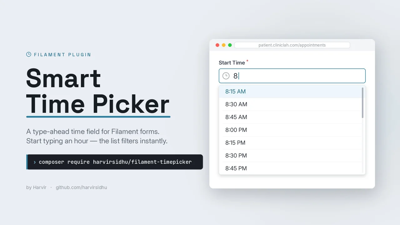
Smart Time Picker
A smart, type-ahead time picker field for Filament. Type freely (3p, 330, 3:30 PM) with a filterable, keyboard-navigable suggestion dropdown.
Author:
Harvir
Featured Plugins
A selection of plugins curated by the Filament team

Blueprint
Filament Blueprint is a premium Laravel Boost extension that helps AI agents produce accurate, detailed implementation plans and security reports for Filament apps.
 Filament
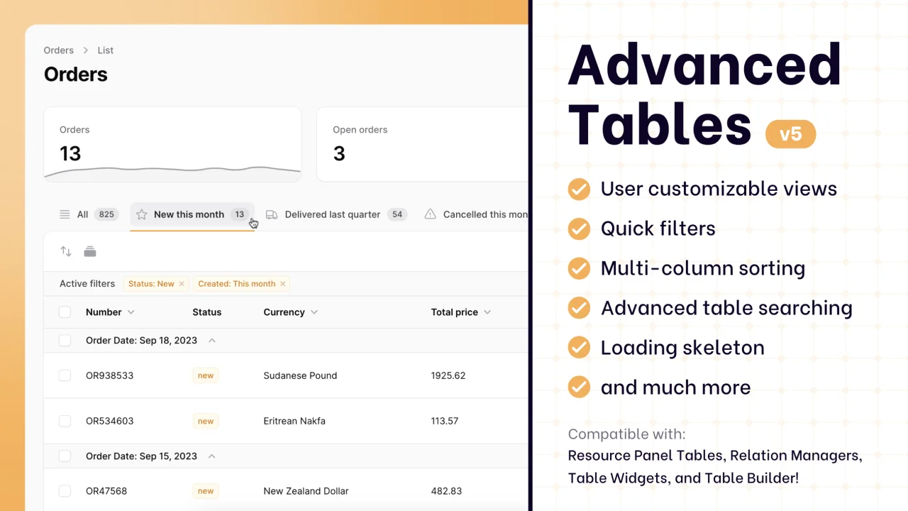
Advanced Tables (formerly Filter Sets)
Supercharge your tables with powerful features like user-customizable views, quick filters, multi-column sorting, advanced table searching, convenient view management, and more. Compatible with Resource Panel Tables, Relation Managers, Table Widgets, and Table Builder!
 Kenneth Sese
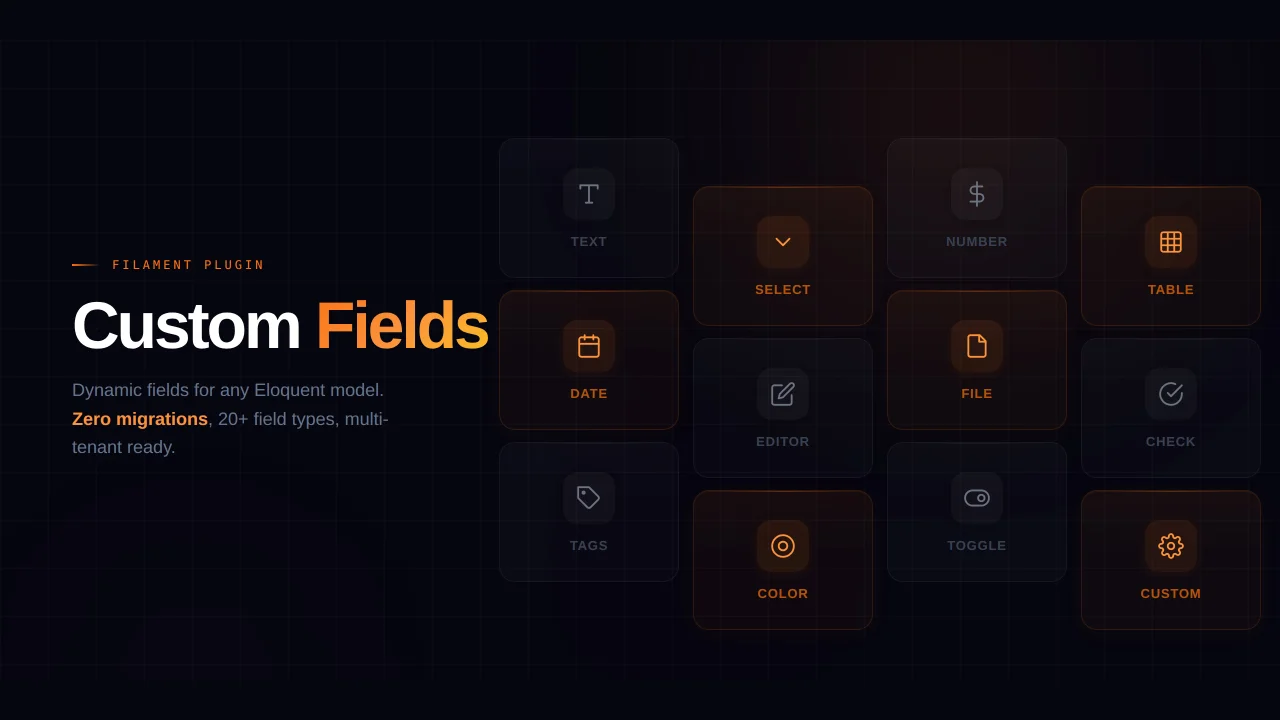
Custom Fields
Eliminate custom field migrations forever. Let your users create and manage form fields directly in Filament admin panels with 20+ built-in field types, validation, and zero database changes.
 Relaticle