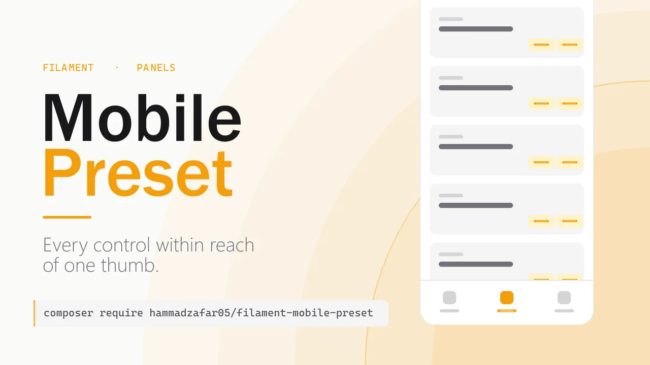
Mobile Preset
CommunityMakes a standard Filament panel usable on a phone with a bottom navigation bar, tables that stack into cards, actions within thumb reach, slide-over modals, and larger touch targets.
 Author:
Hammad Zafar
Author:
Hammad Zafar
Package health
BetaAutomated checks of this plugin's Composer package
15 checks
- Passed: GitHub Actions pinned to SHA
- Skipped: GitLab CI includes pinned to SHA
- Passed: Open security advisories
- Passed: Dependabot PR responsiveness — No open Dependabot PRs.
- Skipped: Renovate MR responsiveness
- Passed: Dependabot or Renovate configured
- Passed: Dependency update cooldown configured
- Passed: Provides a security policy
- Passed: Abandoned or archived — No consulted source marks the package abandoned (packagist, github).
- Passed: Commit and release recency — Active: last commit 1 days ago; last release 2 days ago.
-
Passed:
composer.lock not committed by library
—
composer.lockis absent from the released dist archive. - Passed: Dist archive is lean
-
Passed:
Current Laravel version supported
—
Package dependencies resolve together with current Laravel
13.0. -
Passed:
Current PHP version supported
—
Constraint
^8.2supports current PHP8.5. - Skipped: Current Symfony version supported
filament/
namespace. Review the source and install at your own risk. Found
malware or an unresolved security issue the author won't
address?
Report it
.
Documentation
- Requirements
- Installation
- What it does
- Configuration
- Deployment notes
- Customising the stylesheet
- Testing
- Design notes
- Changelog
- Contributing
- Security Vulnerabilities
- Credits
- License
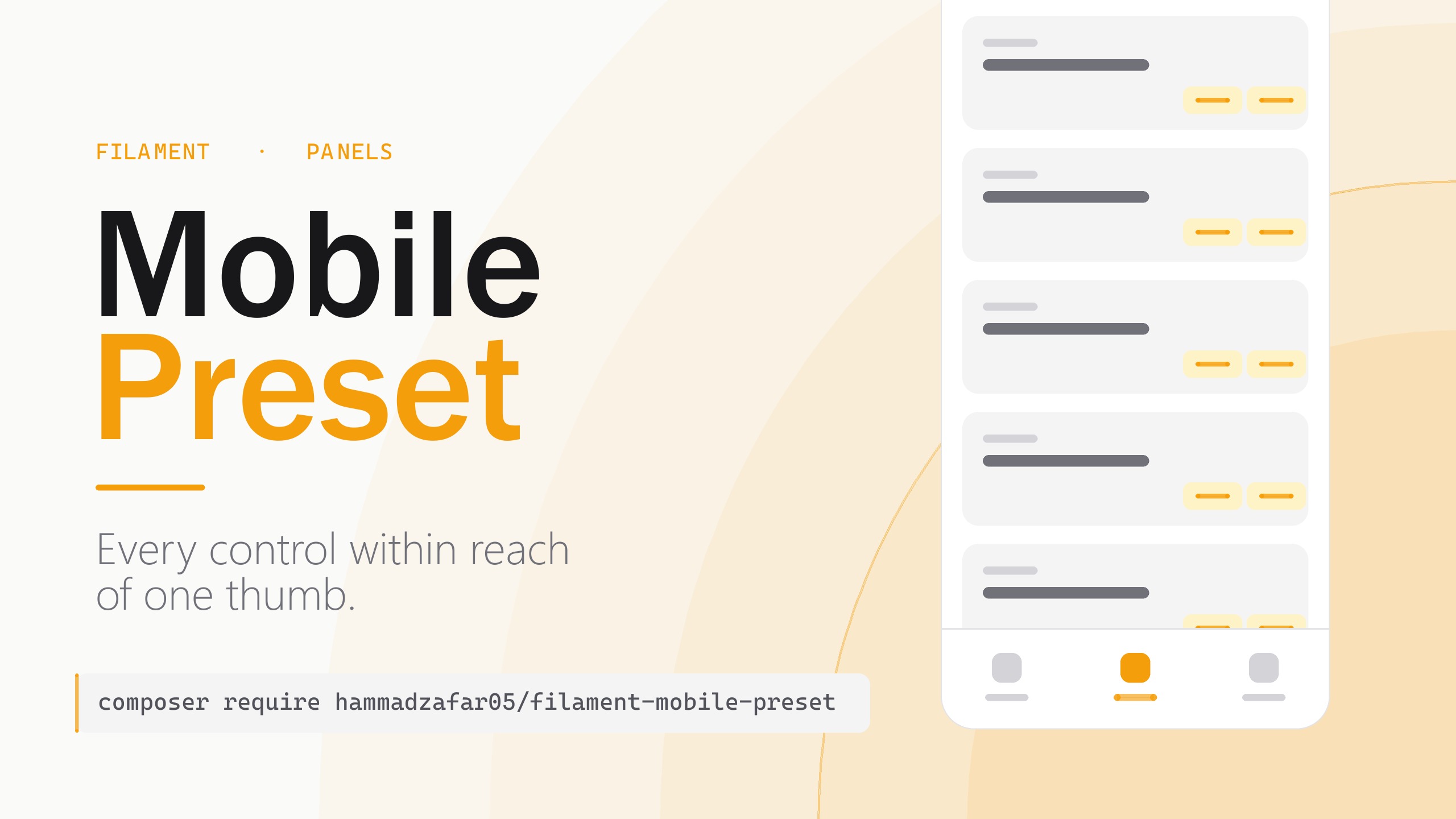




Mobile-first defaults for Filament panels, in one plugin. Adds a bottom navigation bar, pulls action buttons into thumb reach, opens modals as slide-overs, removes "Create & create another", and enlarges touch targets.
Every default is a single fluent call away from being turned off.
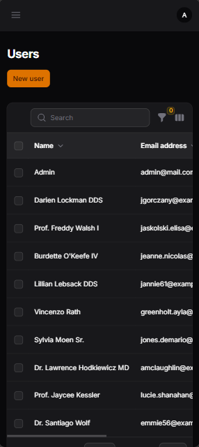
| Without the preset | With the preset |
|---|---|
 |
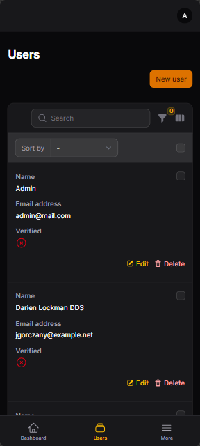 |
| Sideways scroll, clipped values, row actions out of reach | Stacked cards, actions in reach, bottom navigation |
#Requirements
PHP 8.2+, and Filament 4.11.5+ or 5.6.5+. (Why those floors?)
#Installation
composer require hammadzafar05/filament-mobile-preset
Register it on a panel:
use Hammadzafar05\FilamentMobilePreset\FilamentMobilePresetPlugin;

public function panel(Panel $panel): Panel
{
    return $panel
        // ...
        ->plugin(FilamentMobilePresetPlugin::make());
}
That's it. No custom theme, no Tailwind @source line, no npm build. The stylesheet is plain
CSS injected into the panel's <head>.
#What it does
| Default | Turn off with | Mechanism | Applies on desktop? |
|---|---|---|---|
| Bottom navigation bar | bottomNav(false) |
Registers mobile-bottom-nav on the panel |
No. hidden above 1024px |
| Tables stack into labelled cards | stackedTables(false) |
Table::stackedOnMobile() |
No. table again above 640px |
| No "Create & create another" | createAnother() |
CreateAction::createAnother(false) + CreateRecord::disableCreateAnother() |
Yes |
| Modal footer actions right-aligned | thumbAlignment(false) |
Action::modalFooterActionsAlignment(Alignment::End) |
Yes |
| Form actions right-aligned | thumbAlignment(false) |
BasePage::formActionsAlignment(Alignment::End) |
Yes |
| Modals open as slide-overs | slideOverModals(false) |
Action::slideOver(); confirmation dialogs stay centred |
Yes |
| Page header + table actions right-aligned | thumbAlignment(false) |
CSS | No. below 1024px only |
| 44px touch targets | always on | CSS @media (pointer: coarse) |
Touch devices only |
viewport-fit=cover for iOS safe areas |
always on | Emits a second viewport meta tag | n/a |
Four of these apply at every screen size, not just on mobile. See why some defaults apply on desktop too.
#Configuration
use Hammadzafar05\MobileBottomNav\MobileBottomNav;

FilamentMobilePresetPlugin::make()
    ->bottomNav(MobileBottomNav::make()->fromNavigation(5))  // or ->bottomNav(false)
    ->thumbAlignment(false)
    ->slideOverModals(false)
    ->createAnother()          // restores "Create & create another"
| Method | Default | Effect |
|---|---|---|
bottomNav(bool|MobileBottomNav) |
true |
Registers the bottom bar. Pass a configured instance to customise it, or false to skip. Skipped automatically if you already registered MobileBottomNav yourself. |
stackedTables(bool) |
true |
Renders table rows as stacked, labelled cards below 640px instead of scrolling sideways. |
thumbAlignment(bool) |
true |
Right-aligns page header, form and modal footer actions. |
slideOverModals(bool) |
true |
Opens action modals as slide-overs. |
createAnother(bool) |
false |
Restores the "Create & create another" action. |
Touch-target sizing and the safe-area fix are unconditional: an accessibility baseline and a bug fix, not preferences.
#Keeping the topbar hamburger
The hamburger is hidden for you, by
mobile-bottom-nav rather than by this
package (why?). To keep it, tell the bottom bar:
FilamentMobilePresetPlugin::make()
    ->bottomNav(MobileBottomNav::make()->hideSidebarToggle(false))
#Opting out of stacking, per table
public static function table(Table $table): Table
{
    return $table->stackedOnMobile(false);
}
#Re-enabling create-another on one page
CreateRecord::disableCreateAnother() writes to a static property shared by every create page.
To bring it back for a single page, redeclare the property on that page class:
class CreatePost extends CreateRecord
{
    protected static bool $canCreateAnother = true;
}
#Deployment notes
#Content Security Policy
The stylesheet is injected inline, so a panel using this preset needs style-src 'unsafe-inline'
, the same allowance
mobile-bottom-nav already requires, and
the reason neither package needs a custom theme or a build step.
It requires no script-src allowance. The safe-area fix is a meta tag rather than the
one-line script it could have been, precisely so that installing this package does not oblige
your app to permit inline scripts. A test asserts the injected head contains no <script.
#Laravel Octane
formActionsAlignment and canCreateAnother are process-global statics set from a per-panel
hook, so a second panel in the same worker inherits them. Under PHP-FPM this cannot happen.
#Customising the stylesheet
php artisan vendor:publish --tag="filament-mobile-preset-views"
Then edit resources/views/vendor/filament-mobile-preset/styles.blade.php.
#Testing
composer test
#Design notes
Why the plugin behaves as it does. None of this is needed to use it.
#Why the version floors
Filament 4.0.0–4.11.4 and 5.0.0–5.6.4 carry four published advisories, including an
unauthenticated temporary file upload on auth pages
(CVE-2026-48500). A plain ^4.0 || ^5.0 would have advertised
support for every one of those versions, and Composer blocks them at install time anyway. The
plugin's own code works fine across both majors; the floors are about what it is reasonable to
tell someone to install.
#Why some defaults apply on desktop too
Filament's own alignment APIs are server-side and have no knowledge of viewport width, so the
options that use them apply at every screen size. Right-aligned modal footers and form actions are
a mainstream convention, so this is a deliberate trade rather than an oversight. Everything that
would be wrong on a desktop is done in a @media query instead.
#Why the safe-area fix is a meta tag
Filament renders <meta name="viewport" content="width=device-width, initial-scale=1"> with no
viewport-fit=cover, which makes env(safe-area-inset-*) resolve to 0 on iOS. This preset
emits a second viewport meta so bottom-anchored UI clears the iPhone home indicator.
This does rely on browsers honouring the last viewport tag when several are present, which is
universally implemented though not formally specified. A script patching the existing tag would be
deterministic, but it would have obliged every consuming app to allow script-src 'unsafe-inline'
to set one attribute. If the fix ever fails, that is the reason to suspect.
#Why the hamburger is not this plugin's job
The bottom bar's "More" button and the topbar hamburger both call $store.sidebar.open(), so
showing both is redundant. Hiding it safely means knowing whether the bar actually rendered (it
bails out for guests, for tenanted panels with no resolved tenant, and for panels whose navigation
items have no icons) and whether the More button is enabled. Both facts only exist at render time
inside mobile-bottom-nav, which is why the behaviour lives there and why ^1.4 is required.
Deciding it from here would strand users behind a bar that never drew.
#Why stacked tables use the 640px breakpoint
stackedOnMobile() switches to cards below sm (640px) and back to a real table above it, so a
tablet in the 640–1023px band still gets a table while the bottom bar is visible. That is
Filament's own breakpoint, left alone deliberately.
#Why slide-overs enable sticky modal chrome
Filament derives sticky modal headers and footers from the slide-over flag, so
slideOverModals() turns both on. That is what you want on a phone; it is also visible on desktop.
#Changelog
Please see the changelog for more information on what has changed recently.
#Contributing
Please see CONTRIBUTING for details.
#Security Vulnerabilities
Please review our security policy on how to report security vulnerabilities.
#Credits
#License
The MIT License (MIT). Please see the license file for more information.
The author
From the same author
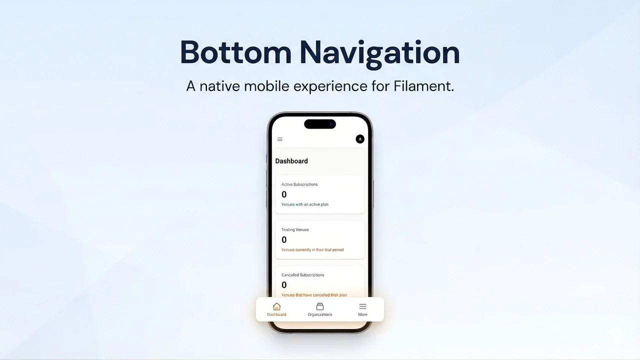
Featured Plugins
A selection of plugins curated by the Filament team
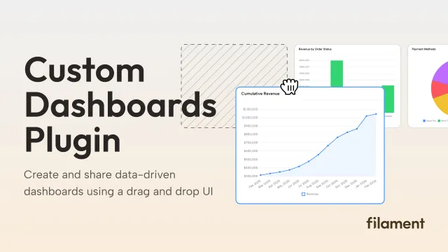
Custom Dashboards
Let your users build and share their own dashboards with a drag-and-drop interface. Define your data sources in PHP and let them do the rest.
 Filament
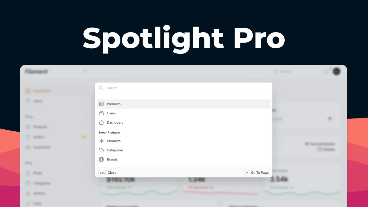
Spotlight Pro
Browse your Filament Panel with ease. Filament Spotlight Pro adds a Spotlight/Raycast like Command Palette to your Filament Panel.
 Dennis Koch

Blueprint
Filament Blueprint is a premium Laravel Boost extension that helps AI agents produce accurate, detailed implementation plans and security reports for Filament apps.
Filament