Knowledge Base
Adds a knowledge-base panel, a place for all your documentation right inside your app.
 Author:
Guava
Documentation
- Version compatibility
- Showcase
- Support us
- Installation
- Prerequisites
- Introduction
- Setup
- Knowledge Base content
- Storage
- Usage
- Cache
- Customization
- Markdown
- Testing
- Changelog
- Contributing
- Security Vulnerabilities
- Credits
- License

Did your filament panel ever get complex real quick? Ever needed a place to document all your features in one place?
Filament Knowledge Base is here for exactly this reason!
Using our Knowledge Base package, you can write markdown documentation files to document every feature of your package and give your users a comprehensive knowledge base tailored for your product. Right inside Filament!
#Version compatibility
| Filament version | Plugin version |
|---|---|
| 3.x | 1.x |
| 4.x | 2.x |
| 5.x | 3.x |
#Showcase


For a better understanding of how it works, please have a look at the video showcase:
#Support us
Your support is key to the continual advancement of our plugin. We appreciate every user who has contributed to our journey so far.
While our plugin is available for all to use, if you are utilizing it for commercial purposes and believe it adds significant value to your business, we kindly ask you to consider supporting us through GitHub Sponsors. This sponsorship will assist us in continuous development and maintenance to keep our plugin robust and up-to-date. Any amount you contribute will greatly help towards reaching our goals. Join us in making this plugin even better and driving further innovation.
#Installation
You can install the package via composer:
composer require guava/filament-knowledge-base
Next, install tailwind/typography if you don't have it already, since we use prose to style the markdown output:
npm install -D @tailwindcss/typography
Make sure to publish the package assets using:
php artisan filament:assets
Optionally you can publish the translations with:
php artisan vendor:publish --tag="filament-knowledge-base-translations"
Optionally you can also publish the config file with:
php artisan vendor:publish --tag="filament-knowledge-base-config"
This is the contents of the published config file:
return [
    'flatfile-model' => \Guava\FilamentKnowledgeBase\Models\FlatfileNode::class,

    'cache' => [
        'prefix' => env('FILAMENT_KB_CACHE_PREFIX', 'filament_kb_'),
        'ttl' => env('FILAMENT_KB_CACHE_TTL', 86400),
    ],

    'icons' => [
        NodeType::Documentation->value => 'heroicon-o-document',
        NodeType::Link->value => 'heroicon-o-link',
        NodeType::Group->value => null,
    ],
];
#Prerequisites
- PHP 8.1+
- Laravel 10+
- Filament 3.2+
#Introduction
This package allows you to add many markdown powered knowledge bases to your filament application.
For this purpose, our package comes with two filament plugins, one for your knowledge base panels and one for your regular panels, which helps to glue them together.
You can turn any of your filament panels into a knowledge base by registering the KnowledgeBasePlugin in your panel's plugins config.
Currently, it is required that you use a separate panel for your knowledge base(s), as they will override your panel navigation.
To learn more about each plugin, please refer to their own documentation pages further below.
#Setup
If you don't have a separate panel yet for your knowledge base, please create one using the built in filament command:
php artisan filament:panel
For example, you might create a panel named knowledge-base.
Next, add the KnowledgeBasePlugin plugin to your knowledge base panel service provider:
use Guava\FilamentKnowledgeBase\Plugins\KnowledgeBasePlugin;

$panel->plugin(KnowledgeBasePlugin::make());
Similarly, add the KnowledgeBaseCompanionPlugin plugin to your regular panel service provider:
use Guava\FilamentKnowledgeBase\Plugins\KnowledgeBaseCompanionPlugin;

$panel->plugin(KnowledgeBaseCompanionPlugin::make()
    ->knowledgeBasePanelId('knowledge-base') // Put your knowledge base panel ID here
);
[!NOTE] A custom filament theme is required for the plugin to work!
If you don't have one, please refer to the filament documentation on how to create a custom theme.
And lastly, add the following to your custom filament theme to correctly build the CSS and use the required tailwind plugins:
@plugin "@tailwindcss/typography";
@source '../../../../vendor/guava/filament-knowledge-base/src/**/*';
@source '../../../../vendor/guava/filament-knowledge-base/resources/views/**/*';
[!IMPORTANT] It is important that both your filament knowledge base panel and your regular panel(s) use a custom theme with these source paths. It's up to you if you want to use the same theme for all panels or different themes for each.
#Knowledge Base content
By default, all your documentation files should live in the docs/<panel-id> directory in the root of your project. You can change this in your knowledge base plugin configuration.
The directory structure needs to strictly adhere to the following structure:
/docs/<panel-id>/<locale>/<markdown-files-here, max 3 levels>
For example:
/docs/knowledge-base/enintro.md/users/intro.md/roles.md/rolesuser.mdadmin.md
/deintro.md/users/intro.md/roles.md/rolesuser.mdadmin.md
The directory structure is fairly limited due to the navigation system of filament and thus is very error prone, although we try to throw meaningful exceptions anytime the structure is wrong.
If you are unsure, make sure these rules are always met:
- You are nested MAXIMALLY 3 levels deep (as in the example above)
- In the top level directory (the language directory), you can have any markdown files and directories.
- In the second level directory, you must have an explicit
<dir>.mdfile for each directory. This is because filament does not support deeply nested groups and thus it needs to be aParent Item. In the example above, you can see that for therolesdirectory there also exists aroles.mddocumentation item which acts as theParent Item.
#Creating documentation pages
To create documentation pages, simply run the docs:make command and follow the instructions:
php artisan docs:make
This will create a basic empty documentation file. To edit it, simply open it in your favorite editor.
An example of a documentation page:
---
title: Introduction
---
# Introduction
This is my first documentation page
If you visit your regular filament panel, you should now see a button at the bottom of your sidebar that will lead you to your knowledge base panel with your first documentation page!
To learn more about the customization possibilities, please refer to the pages of each individual plugin:
#Knowledge base panel
A knowledge base panel is any panel that has the KnowledgeBasePlugin registered.
This is where you will find all your documentation files that you added to this knowledge base.
For detailed information about the knowledge base panel and how to customize it, check out its own documentation here.
#Knowledge Base Companion
The knowledge base companion is a plugin that should be registered in any of your regular filament panels that you want to deeply integrate with a knowledge base.
This will allow you to link your resources and pages with specific documentation pages, so your users can easily find the information they are looking for.
For example, the companion plugin renders a documentation button at the bottom of the sidebar which links to your knowledge base panel.
It also allows you to render a help menu in the top navigation for each resource or page that should be linked with a specific documentation page. For example, you might want to show a help button in your ProductResource and link it to your Product documentation page.
For detailed information about the knowledge base companion plugin and how to customize it, check out its own documentation here.
Add the companion plugin to your regular panel(s):
use Guava\FilamentKnowledgeBase\Plugins\KnowledgeBaseCompanionPlugin;

public function panel(Panel $panel): Panel
{
    return $panel
        ->id('admin')
        ->path('admin')
        // ...
        ->plugins([
            KnowledgeBaseCompanionPlugin::make()
            ->knowledgeBasePanelId('knowledge-base'),
        ]);
}
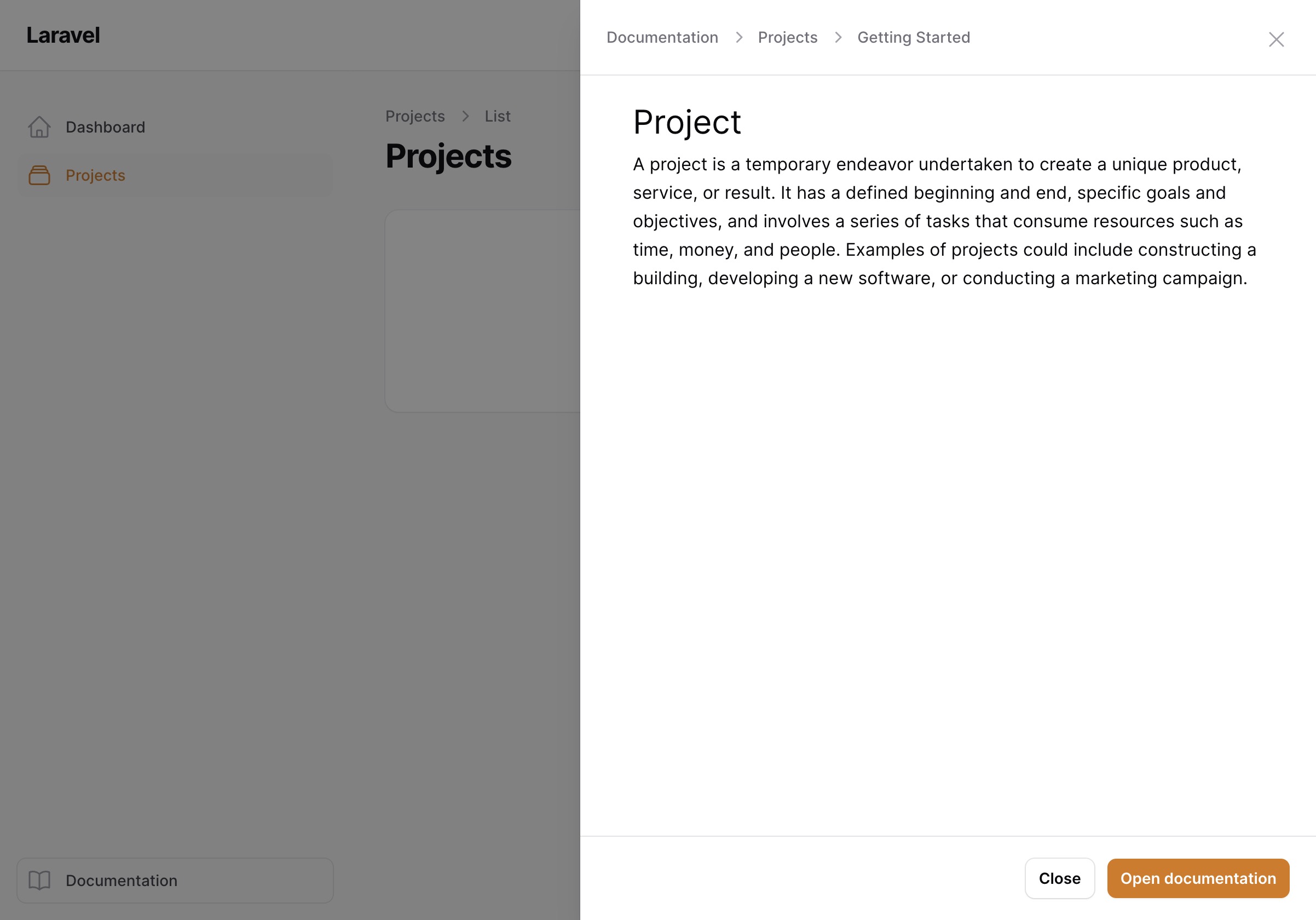
#Modal Previews
Instead of redirecting the user to the documentation immediately, the package offers modal previews, which render the
markdown in a customizable modal with an optional button to open the full documentation page.
You can learn how to enable this feature in the Customizations section.
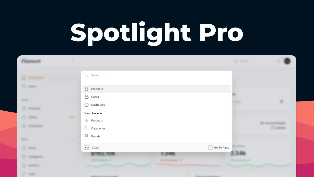
#Global Search
Knowledge base supports global search for all your markdown files and by default looks through the title and
the content of the markdown file. This way your users can quickly find what they are looking for.
#Storage
We currently support flat file (stored inside the source project) storage out of the box.
You can choose to store your documentation in:
- Markdown files (Preferred method)
- PHP classes (for complex cases)
In the future, we plan to also ship a Database Driver so you can store your documentation in the database.
#Usage
#Create a panel
You can turn any filament panel into a knowledge base by registering the KnowledgeBasePlugin in your panel's plugins config.
Currently, it is required that you use a separate panel for your knowledge base(s), as they will override your panel navigation.
To create one, follow the filament documentation on how to create one:
php artisan make:filament-panel knowledge-base
This will create a new panel provider in app/Providers/Filament/KnowledgeBasePanelProvider.php.
#Make sure you have a custom filament theme
Check here how to create one.
You can create one specifically for the knowledge base panel, or you can reuse a custom theme from your other panel(s).
In your custom filament theme, make sure to include the plugin's php and blade files, so the CSS is correctly built:
@plugin "@tailwindcss/typography";
@source '../../../../vendor/guava/filament-knowledge-base/src/**/*';
@source '../../../../vendor/guava/filament-knowledge-base/resources/views/**/*';
#Register plugin
Finally, turn your panel into a knowledge base panel by registering the knowledge base plugin:
use Guava\FilamentKnowledgeBase\Plugins\KnowledgeBasePlugin;

public function panel(Panel $panel): Panel
{
    return $panel
        ->id('knowledge-base')
        ->path('kb')
        // ...
        ->plugins([
            KnowledgeBasePlugin::make(),
        ]);
}
And that's it! Now you can access the knowledge base under /kb or whatever you configured in the path option of the panel.
#Create documentation
Right now your knowledge base panel should be quite empty.
To create your first documentation, run the docs:make command, such as:
php artisan docs:make
This will create a file in /docs/<kb-panel-id>/en/prologue/getting-started.md.
If you want to create the file for a specific locale, you can do so using the --locale option (can be repeated for
multiple locales):
php artisan docs:make knowledge-base prologue.getting-started --locale=de --locale=en
This would create the file for both the de and en locale.
If you don't pass any locale, it will automatically create the documentation file for every locale
in /docs/<kb-panel-id>/{locale}.
#Markdown
After you generate your documentation file, it's time to edit it.
A markdown file consists of two sections, the Front Matter and Content.
#Front Matter
In the front matter, you can customize the documentation page, such as the title, the icon and so on:
---
// Anything between these dashes is the front matter
title: My example documentation
icon: heroicon-o-book-open
---
#Front Matter Options
Below is a list of currently available options in the front matter.
#Group
Allows you to define the group (and it's title) of the documentation page.
---
group: Getting Started
---
#Parent
Allows you to define the parent of the documentation page.
---
parent: my-parent
---
So for a file in docs/en/prologue/getting-started/intro.md, the parent would be getting-started.
And that's it! You've created a simple knowledge base inside Filament.
#Accessing the knowledge base
In every panel you registered the Knowledge Base plugin, we automatically inject a documentation button at the very bottom of the sidebar.

But we offer a deeper integration to your panels.
#Integrating into resources or pages
You will most likely have a section in your knowledge base dedicated to each of your resources (at least to the more complex ones).
To integrate your resource with the documentation, all you need to do is implement the HasKnowledgeBase contract in
your resource or page.
This will require you to implement the getDocumentation method, where you simply return the documentation pages you
want to integrate. You can either return the IDs as strings (dot-separated path inside /docs/{locale}/) or use the
helper to retrieve the model:
use Guava\FilamentKnowledgeBase\Contracts\HasKnowledgeBase;
use Guava\FilamentKnowledgeBase\Facades\KnowledgeBase;
class UserResource extends Resource implements HasKnowledgeBase
{
    // ...

    //
    public static function getDocumentation(): array
    {
        return [
            'users.introduction',
            'users.authentication',
            KnowledgeBase::model()::find('users.permissions'),
        ];
    }
}
This will render a Help menu button at the end of the top navbar.
If you add more than one documentation file, it will render a dropdown menu, otherwise the help button will directly
reference the documentation you linked.

#Opening documentations in modals
From any livewire component where you use the documentation pages (you have rendered the Help Menu), you can create links that will automatically open the documentation
in a modal, by simply adding this fragment to the href attribute of the link:
#modal-
<documentation-id>
such as
<a href="#modal-users.introduction">Open Introduction</a>
#Modal Links
To make it easy to access the documentation from anywhere, this plugin adds intercepts fragment links anywhere in the filament panel in order to open up a modal for a documentation page.
To use modal links, simply add a link in any place in your panel with a fragment in the format #modal-<documentation-id>, such as #modal-intro.getting-started,
for example:
<a href="#modal-intro.getting-started">Open Introduction</a>
As long as a documentation with that ID exists (/docs/en/intro/getting-started.md), it will automatically open a modal with the content of that documentation.
You can even share the URL with someone and it will automatically open the modal upon opening!

#Disabling Modal Links
to disable modal links, simply call disableModalLinks() on the KnowledgeBasePlugin in your panel Service Provider..
#Help Actions
The plugin comes with a neat HelpAction, which can be linked to a specific markdown file or even a partial markdown
file.
For example, the What is a slug? help was added using the following:
use Guava\FilamentKnowledgeBase\Actions\HelpAction;
->hintAction(HelpAction::forDocumentable('projects.creating-projects.slug')
    ->label('What is a slug?')
    ->slideOver(false)
),
#Accessing the documentation models
We use the sushi package in the background to store the documentations. This way, they behave almost like
regular Eloquent models.
#Get model using our helper
To get the model, simply use our helper KnowledgeBase::model():
use \Guava\FilamentKnowledgeBase\KnowledgeBase;

// find specific model
KnowledgeBase::model()::find('<id>');
// query models
KnowledgeBase::model()::query()->where('title', 'Some title');
// etc.
#Cache
By default, the package caches all markdown files to ensure a smooth and fast user experience. If you don't see your changes, make sure to clear the cache:
php artisan cache:clear
#Customization
A lot of the functionalities can be customized to a certain extent.
#Customize the knowledge base panel
You can customize the knowledge base panel to your liking using:
use Guava\FilamentKnowledgeBase\Filament\Panels\KnowledgeBasePanel;

KnowledgeBasePanel::configureUsing(
    fn(KnowledgeBasePanel $panel) => $panel
        // Your options here
);
#Change brand name
For example to change the default brand name/title (displayed in the top left) of the panel, you can do:
use Guava\FilamentKnowledgeBase\Filament\Panels\KnowledgeBasePanel;

KnowledgeBasePanel::configureUsing(
    fn(KnowledgeBasePanel $panel) => $panel
        ->brandName('My Docs')
);
#Custom classes on documentation article
By default, the documentation article (the container where the markdown content is rendered) has a gu-kb-article class, which you can use to target and modify. You can
also add your own class(es) using:
use Guava\FilamentKnowledgeBase\Filament\Panels\KnowledgeBasePanel;

KnowledgeBasePanel::configureUsing(
    fn(KnowledgeBasePanel $panel) => $panel
        ->articleClass('max-w-2xl')
);
#Disable default classes
To disable the default styling altogether, you can use:
use Guava\FilamentKnowledgeBase\Filament\Panels\KnowledgeBasePanel;

KnowledgeBasePanel::configureUsing(
    fn(KnowledgeBasePanel $panel) => $panel
        ->disableDefaultClasses()
);
#Disable the knowledge base panel button
When in a panel where the Knowledge Base plugin is enabled, we render by default in the bottom of the sidebar a button to go to the knowledge base panel. You can disable it if you like:
use \Filament\View\PanelsRenderHook;

$plugin->disableKnowledgeBasePanelButton();
#Disable the back to default panel button
When in the knowledge base panel, a similar button is rendered to go back to the default filament panel. You can disable it likewise:
use Guava\FilamentKnowledgeBase\Filament\Panels\KnowledgeBasePanel;

KnowledgeBasePanel::configureUsing(
    fn(KnowledgeBasePanel $panel) => $panel
        ->disableBackToDefaultPanelButton()
);
#Customize the help menu/button render hook
If you want to place the help menu / button someplace else, you can override the render hook:
use \Filament\View\PanelsRenderHook;

$plugin->helpMenuRenderHook(PanelsRenderHook::TOPBAR_START);
#Enable modal previews
If you want to open documentations in modal previews instead of immediately redirecting to the full pages, you can enable it like this:
$plugin->modalPreviews();

#Slide overs
If you prefer to use slide overs, you can additionally also enable them:
$plugin->slideOverPreviews();
#Enable breadcrumbs in modal preview titles
When using modal previews, by default the title shows just that, the title of the documentation page.
If you'd rather show the full breadcrumb to the documentation page, you may enable it like so:
$plugin->modalTitleBreadcrumbs();

#Open documentation links in new tab
When you open a documentation, by default it will be opened in the same tab.
To change this, you can customize your plugin:
$plugin->openDocumentationInNewTab()
#Markdown
We use CommonMark as the markdown parser and the league/commonmark php implementation. Check their respective websites for a reference on how to use markdown.
We also added some custom parsers/extensions to the Markdown Parser, described below.
#Markers support
In order to mark some words with your primary theme color, you can use the following syntax:
In this example, ==this text== will be marked.
The result looks like this, depending on your primary color:

#Tables support
You can use the regular markdown syntax to render tables styled to match filament tables.
| Syntax     |             Description (center)              |     Foo (right) | Bar (left)      |
|------------|:---------------------------------------------:|----------------:|:----------------|
| Header     |                     Title                     |       Something | Else            |
| Paragraphs |  First paragraph. <br><br> Second paragraph.  | First paragraph | First paragraph |

#Quotes support
Using the regular markdown syntax for quotes, you can render neat banners such as:
> ⚠️ **Warning:** Make sure that the slug is unique!

#Syntax Highlighting
We offer syntax highlighting through shiki (requires NodeJS on the server)
Note: Because of the additional installation steps, syntax highlighting is disabled by default.
To enable it, you MUST have both the npm package shiki and spatie/shiki-php installed.
Which versions of the shiki packages to choose depends on you. I highly recommend going with the latest versions, but if you encounter some issues due to incompatibility with other packages, you might need to downgrade.
Check the table below for compatible versions.
| Shiki PHP Version | Shiki JS Version |
|---|---|
| ^2.0 | ^1.0 |
| ^1.3 | ^0.14 |
#Installing spatie/shiki-php:
composer require spatie/shiki-php:"^2.0"
#Installing shiki:
npm install shiki@^1.0
#When using a Node Version Manager:
If you use Herd or another NVM, you will most likely need to create a symlink to your node version. Please follow the instructions here.
Then you can enable syntax highlighting using:
use Guava\FilamentKnowledgeBase\Filament\Panels\KnowledgeBasePanel;

KnowledgeBasePanel::configureUsing(
    fn(KnowledgeBasePanel $panel) => $panel
        ->syntaxHighlighting()
);

#Vite assets support
You can use the default image syntax to include vite assets, as long as you provide the full path from your root project directory:

#Including other files
We support including markdown files within other files. This is especially useful if you want to organize your markdown or display snippets of a whole documentation as a help button without duplicating your markdown files.
The syntax is as follows:
@include(prologue.getting-started)
This is extremely helpful when you want to display help buttons for a concrete component or field, but don't want to deal with duplicated information.
You can simply extract parts of your markdown into smaller markdown files and include them in your main file. That way
you can only display the partials in your Help Actions.
#Testing
composer test
#Changelog
Please see CHANGELOG for more information on what has changed recently.
#Contributing
Please see CONTRIBUTING for details.
#Security Vulnerabilities
Please review our security policy on how to report security vulnerabilities.
#Credits
- Lukas Frey
- All Contributors
- Spatie - Our package skeleton is a modified version of Spatie's Package Tools
- Spatie shiki and markdown packages
#License
The MIT License (MIT). Please see License File for more information.
The author
From the same author
Icons
Install and use any blade icon pack and generate enum classes for any icon sets.
 Author:
Guava
Nested Resources
Adds support for nested resources
 Author:
Guava
Clusters
Plugin that allows you to visually cluster multiple fields together.
 Author:
Guava
Tutorials
Tool for creating tutorials, walkthroughs and onboarding experiences for your users.
 Author:
Guava
Featured Plugins
A selection of plugins curated by the Filament team
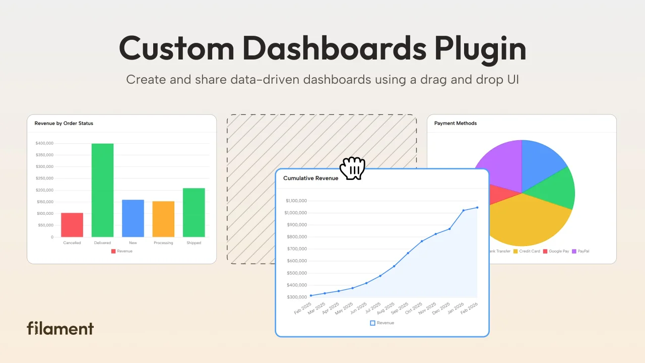
Custom Dashboards
Let your users build and share their own dashboards with a drag-and-drop interface. Define your data sources in PHP and let them do the rest.
 Filament
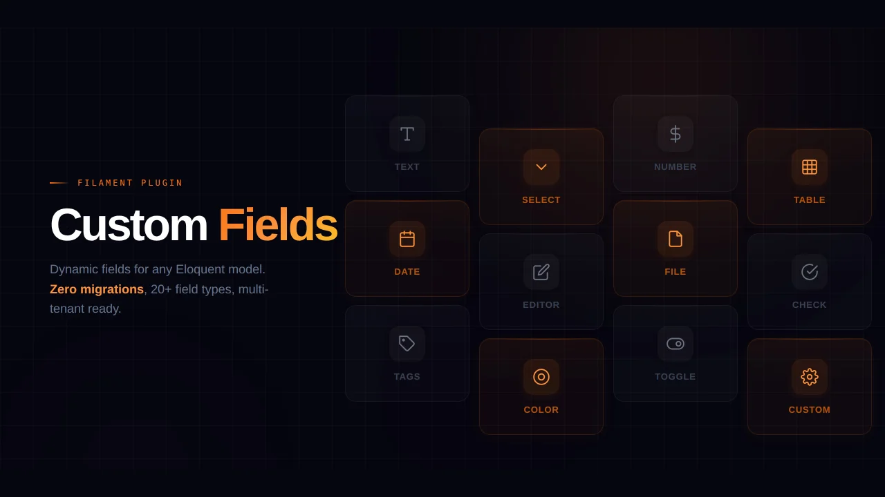
Custom Fields
Eliminate custom field migrations forever. Let your users create and manage form fields directly in Filament admin panels with 20+ built-in field types, validation, and zero database changes.
 Relaticle
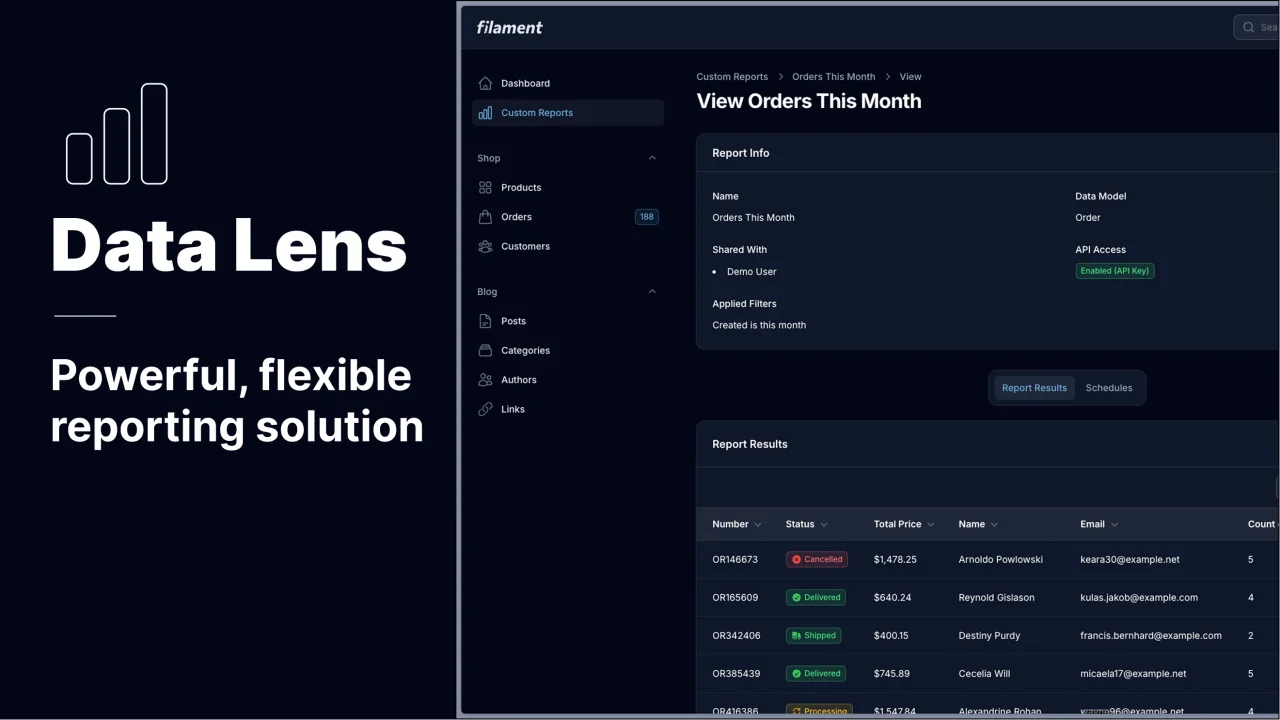
Data Lens
Advanced Data Visualization for Laravel Filament - a premium reporting solution enabling custom column creation, sophisticated filtering, and enterprise-grade data insights within admin panels.
 Padmission


