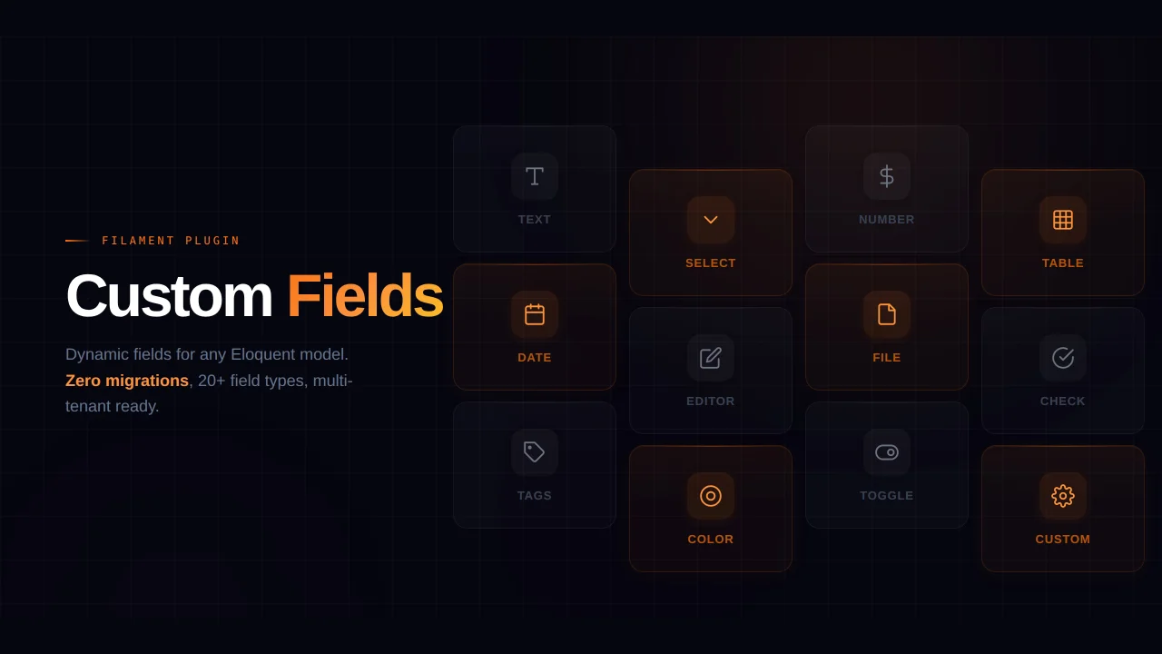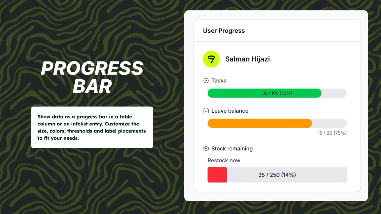
Progress Bar
Reusable and customizable progress bar components for Filament 5 tables and infolists.
 Author:
Devletes
Author:
Devletes
Documentation
- Requirements
- Installation
- Quick start
- Providing data
- Display
- Thresholds and coloring
- Closure parameters
- Recipes
- API reference
- Integration examples
- Need something custom?
- Credits
- License


Reusable progress bar components for Filament 5 tables and infolists.
- Single shared API across
ProgressBarColumnandProgressBarEntry - Three-tier (success / warning / danger) coloring out of the box, with custom colors via CSS values
ascendinganddescendingthreshold directions for low-is-bad metrics (fuel, stock, battery)- Optional threshold map for any number of states with custom names
- Three sizes, two text positions, custom border radius
- Self-contained stylesheet, dark-mode aware
- Proper
role="progressbar"semantics
#Requirements
- PHP
^8.2 - Filament
^5.0
#Installation
composer require devletes/filament-progress-bar
Then publish Filament assets so the package stylesheet is available to your panel:
php artisan filament:assets
The package ships its own stylesheet via Filament's asset manager — there is nothing to add to your custom Tailwind theme.
#Quick start
#Table column
use Devletes\FilamentProgressBar\Tables\Columns\ProgressBarColumn;

ProgressBarColumn::make('used')
    ->maxValue(fn ($record) => $record->quota)
    ->showProgressValue()
    ->showPercentage();
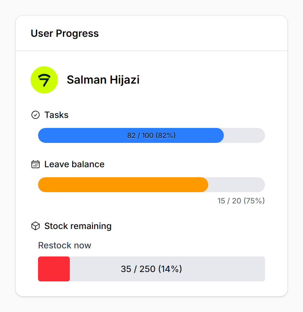
#Infolist entry
use Devletes\FilamentProgressBar\Infolists\Components\ProgressBarEntry;

ProgressBarEntry::make('leave_progress')
    ->label('Sick Leave')
    ->icon('heroicon-o-heart')
    ->iconColor('primary')
    ->getStateUsing(fn ($record) => [
        'progress' => $record->leave_used,
        'total' => $record->leave_total,
    ]);
#Providing data
The component accepts two styles of state:
1. A numeric value paired with maxValue(...):
ProgressBarColumn::make('used')
    ->maxValue(fn ($record) => $record->quota);
2. A structured array containing both the current value and the total:
ProgressBarColumn::make('leave_progress')
    ->state(fn ($record) => [
        'progress' => $record->used_days,
        'total' => $record->allocated_days,
    ]);
When the structured form is used, both keys are looked up flexibly. The first matching key wins:
| Role | Accepted keys |
|---|---|
| Current value | progress, current, value, used |
| Total | total, max, available, quota |
A missing or zero total resolves to 0% rather than throwing.
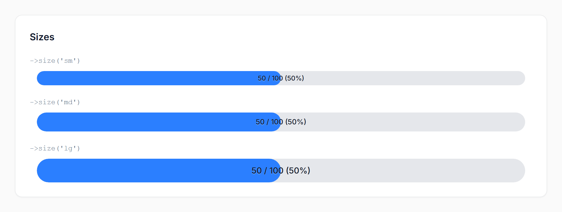
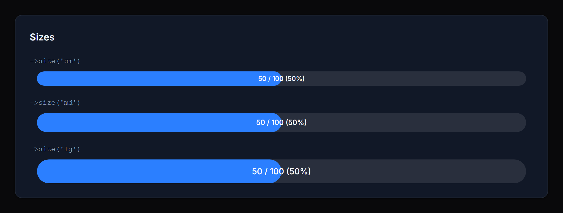
#Display
#Size
Method: size('sm' | 'md' | 'lg')
Controls the bar height and inside-text size. Defaults to sm. Invalid values fall back to the default.
 |
 |
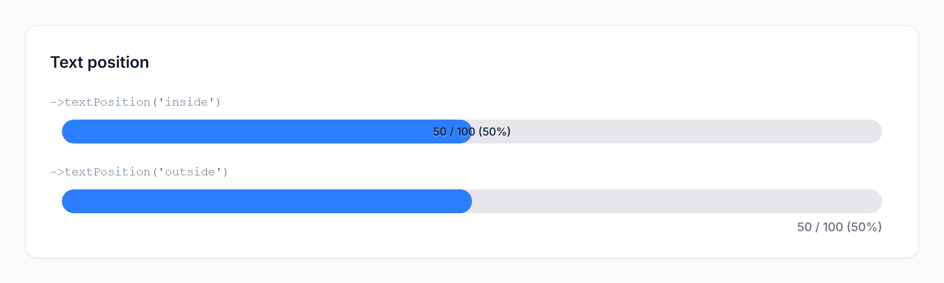
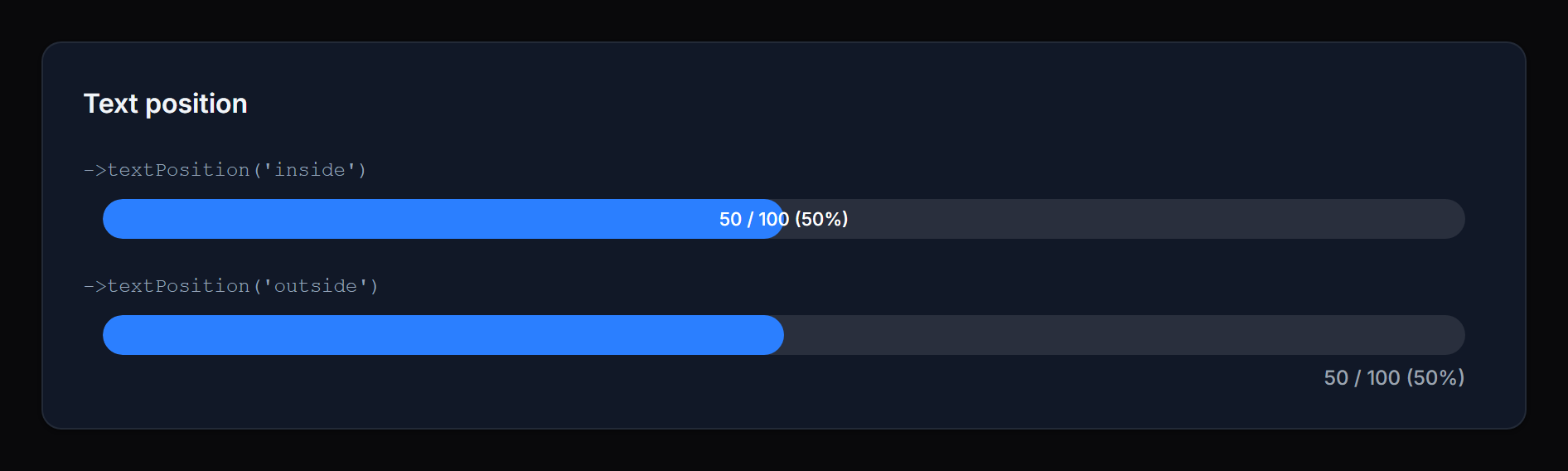
#Text position
Method: textPosition('inside' | 'outside')
inside(default): the value/percentage is rendered on top of the fill, centered horizontally. Best for compact rows where you want the number visually anchored to the bar.outside: the value/percentage is rendered in a row beneath the bar, right-aligned. Best when you want a clean bar visual without text overlap, or when the value would be hard to read at low percentages.
 |
 |
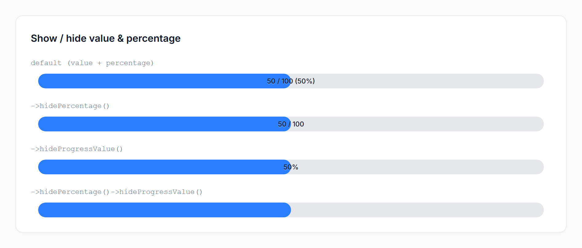
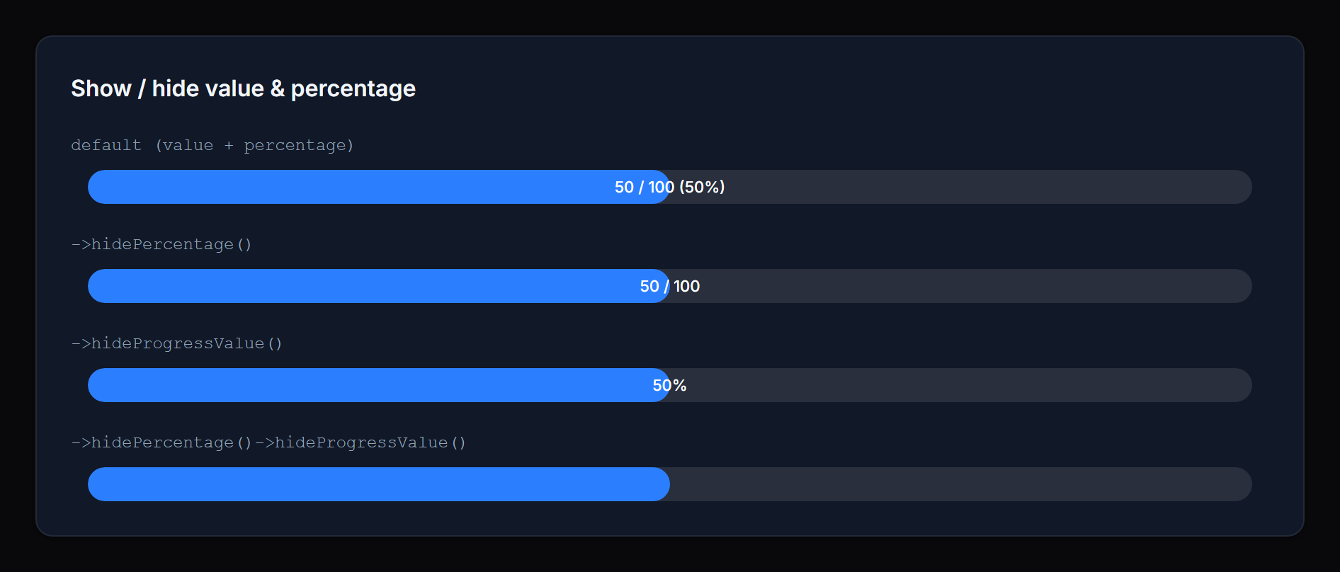
#Show / hide value & percentage
Methods: showPercentage() / hidePercentage() / showProgressValue() / hideProgressValue()
Toggle each portion of the display text independently. When both are visible the text reads value / max (percentage). When only one is visible it appears alone. When both are hidden the bar renders without any text.
 |
 |
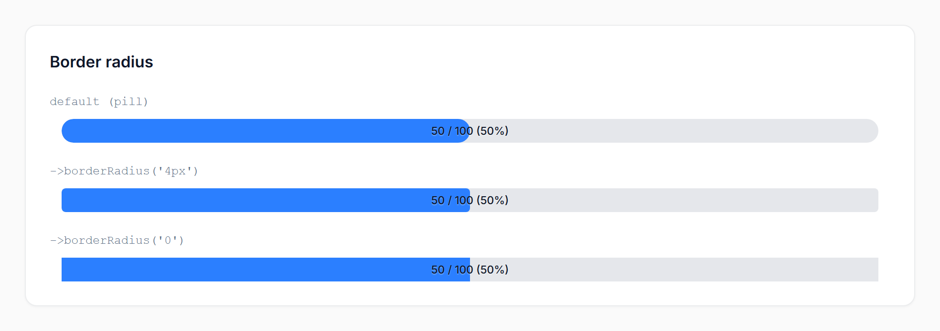
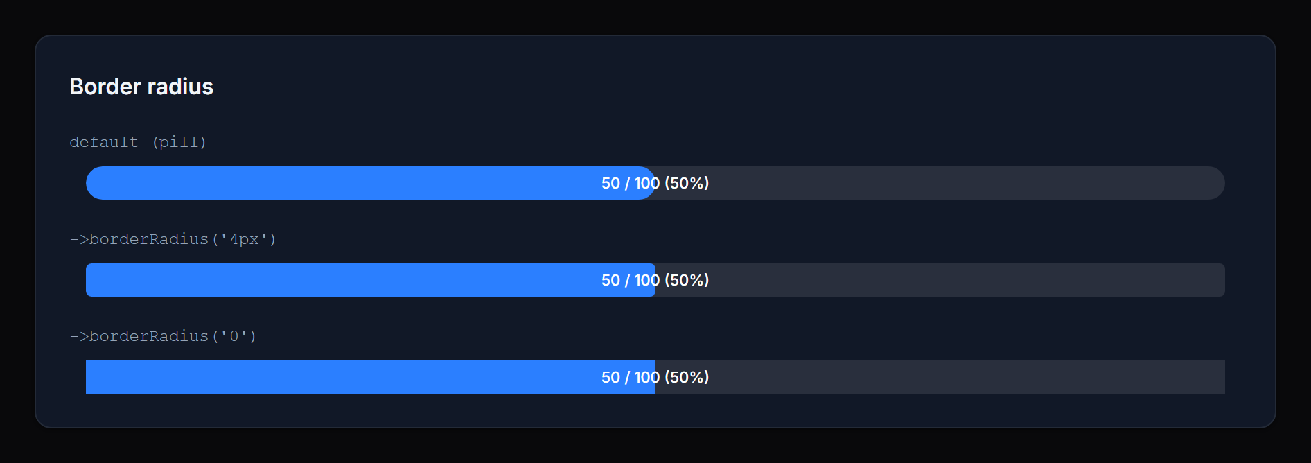
#Border radius
Method: borderRadius(string $value)
Override the bar's corner radius with any valid CSS length — pixels, rems, percentages, custom properties, or calc() expressions:
->borderRadius('4px')
->borderRadius('0.5rem')
->borderRadius('calc(var(--radius) * 2)')
Pass null (or omit the call) to keep the default pill shape (9999px).
 |
 |
Values containing
;,<,>,{,}, or quotes are silently dropped to prevent inline-style injection. Stick to standard CSS length syntax.
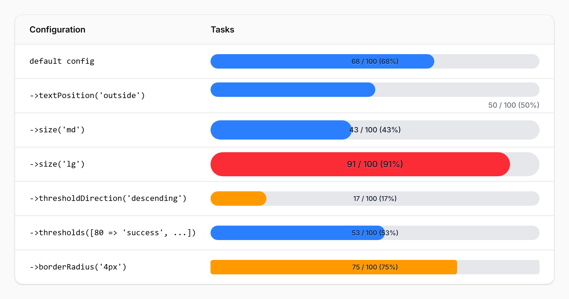
#Thresholds and coloring
The bar resolves a status from the percentage and renders a color for that status. Two threshold APIs are available — start with the simple one and reach for the map only when three states aren't enough.
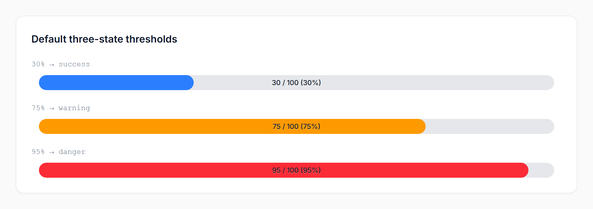
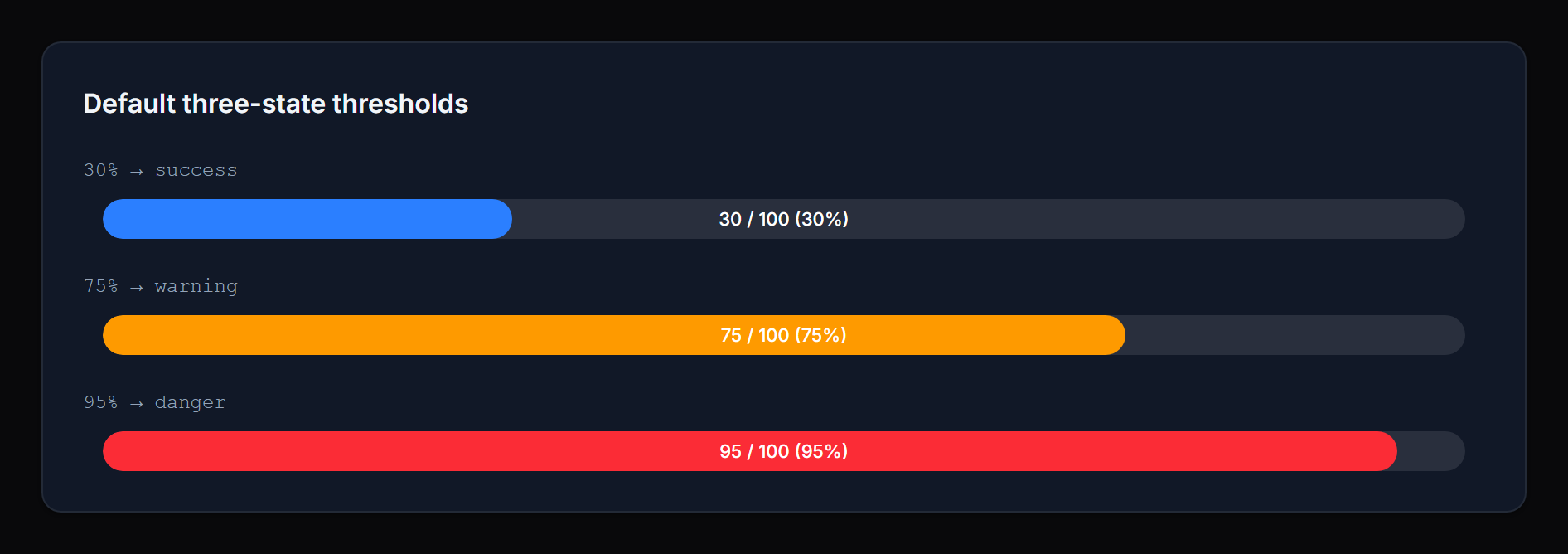
#Three-state mode (default)
success → warning → danger, with thresholds you can tune individually:
ProgressBarColumn::make('cpu')
    ->warningThreshold(70)   // ≥ 70% → warning
    ->dangerThreshold(90);   // ≥ 90% → danger
Defaults: warning = 70, danger = 90.
 |
 |
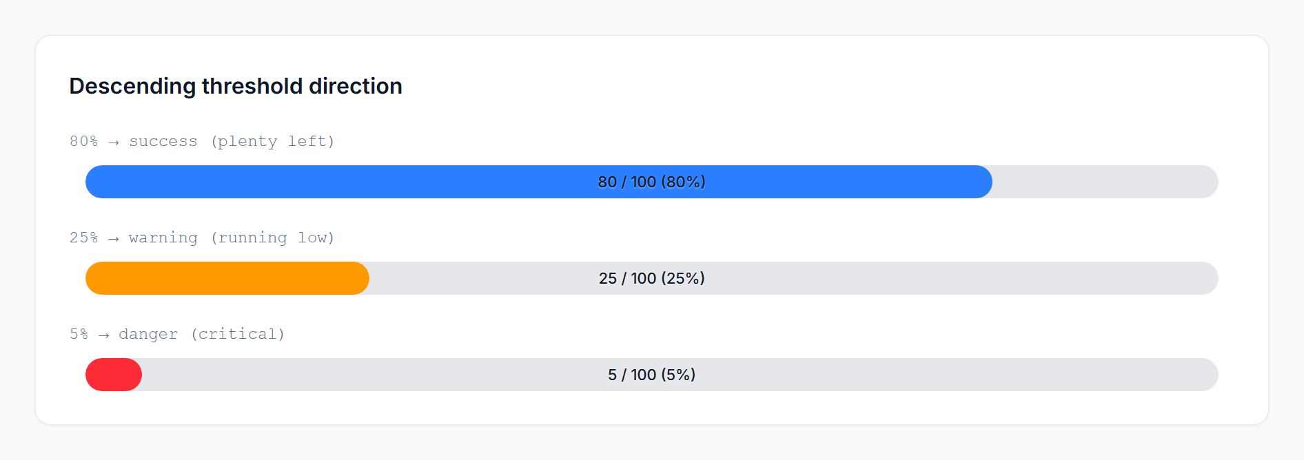
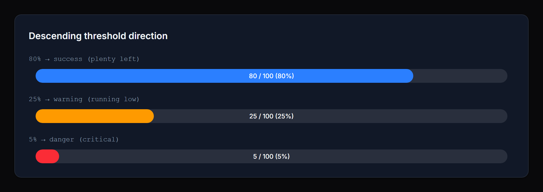
#Threshold direction
By default higher percentages escalate toward danger (CPU, memory, used quota). For metrics where lower is worse (fuel, stock, battery), flip the direction:
ProgressBarColumn::make('battery_percent')
    ->thresholdDirection('descending')
    ->warningThreshold(30)   // ≤ 30% → warning
    ->dangerThreshold(10);   // ≤ 10% → danger
In descending mode the package uses sane defaults (warning = 30, danger = 10) and clamps danger ≤ warning.
 |
 |
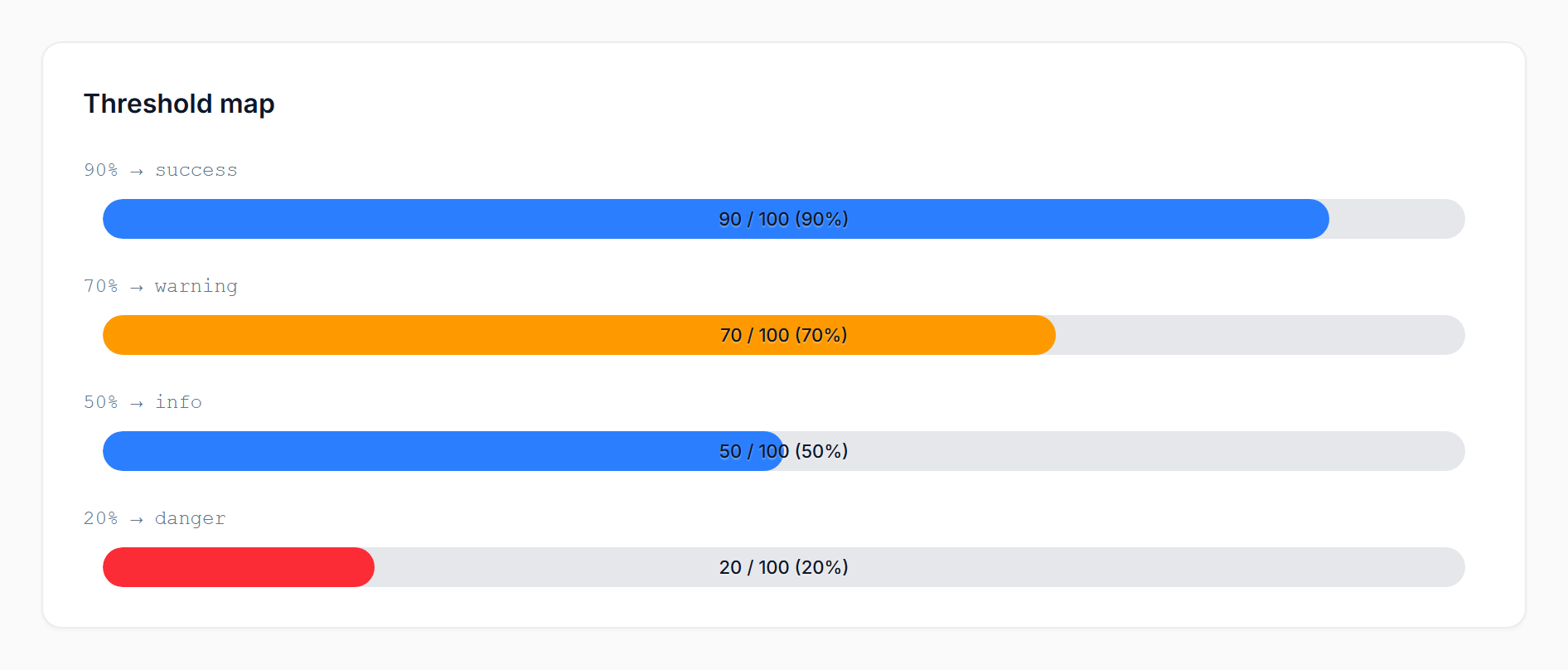
#Threshold map (advanced)
For more than three states, or for non-monotonic mappings, pass a map of floor => status. The status name can be anything you want:
ProgressBarColumn::make('score')
    ->thresholds([
        80 => 'success',
        60 => 'warning',
        40 => 'info',
        0  => 'danger',
    ]);
Keys are interpreted as percentage floors — the highest matching floor wins. The example above maps ≥80 to success, 60–79 to warning, 40–59 to info, and <40 to danger.
 |
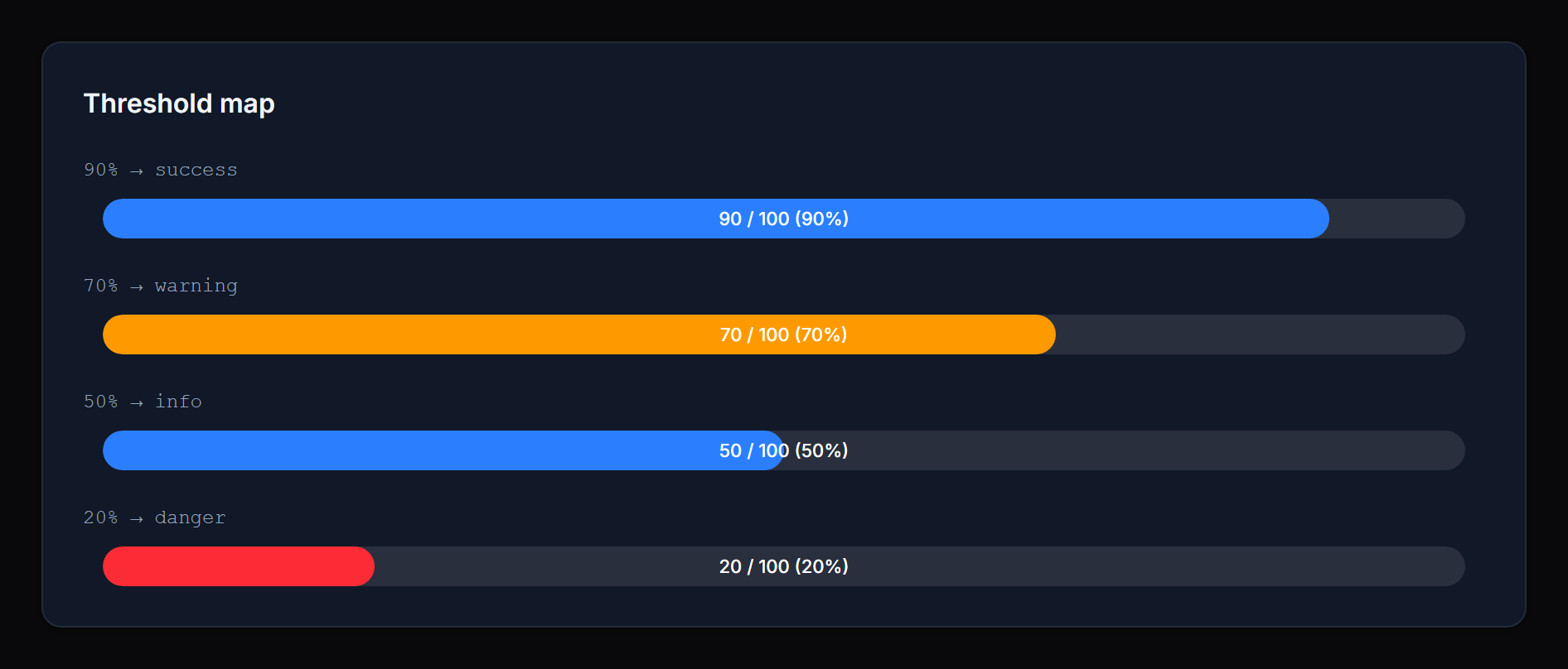 |
If you omit a 0 floor, the lowest-defined status extends down to 0. For example, [80 => 'success', 10 => 'info'] resolves 0–79 to info (no implicit success fallback below the lowest floor).
The three legacy statuses — success, warning, danger — keep their package defaults (var(--primary-500), var(--warning-500), var(--danger-500)). Any other status name (e.g. info, gray, secondary, or a custom one registered via your panel's ->colors([...])) auto-resolves to var(--{status}-500). No extra configuration needed.
For one-off colors that don't map to a Filament color (e.g. you want a specific 'excellent' status to be a particular shade of green), use statusColors([...]):
->statusColors([
    'excellent' => 'rgb(16 185 129)',
])
Likewise, custom labels for any status name go through statusLabels([...]):
->statusLabels([
    'info' => fn (int $percentage) => "Watch ({$percentage}%)",
])
#Colors
Three named setters cover the default statuses. Each accepts any CSS color value or a closure:
->successColor('rgb(16 185 129)')
->warningColor(fn ($record) => $record->is_critical ? '#ff0000' : 'orange')
->dangerColor('var(--my-danger-color)')
Defaults reference Filament's CSS variables (var(--primary-500), var(--warning-500), var(--danger-500)), so the bar inherits your panel's theme automatically.
For custom statuses (map mode), use statusColors([...]). When both statusColors and the named setters define the same status, the map wins — named setters fill in any keys the map omits.
#Labels
Per-status labels are shown above the bar in infolist entries only (table columns intentionally skip them for compact rows). They accept a string or a closure receiving useful context:
->successLabel('On track')
->warningLabel(fn (int $percentage) => "Watch ({$percentage}%)")
->dangerLabel(fn (float $current, ?float $total) => "{$current} / {$total} used")
For custom statuses (map mode), use statusLabels([...]).
#Closure parameters
Most setters accept a closure. The following parameters are injected when present:
$state— the raw column/entry state$record— the Eloquent model$current— the resolved current value (float)$total— the resolved total (float|null)$percentage— the integer percentage (0–100)$status— the resolved status name
The percentage- and status-aware parameters are populated after the bar's value has been resolved, so closures used for colors and labels can branch on the final percentage.
#Recipes
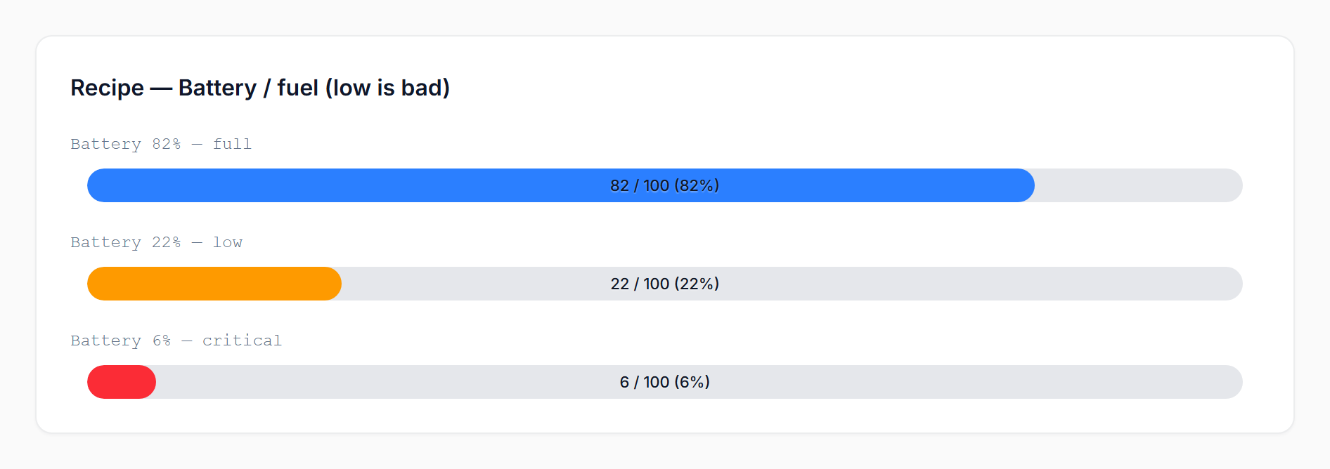
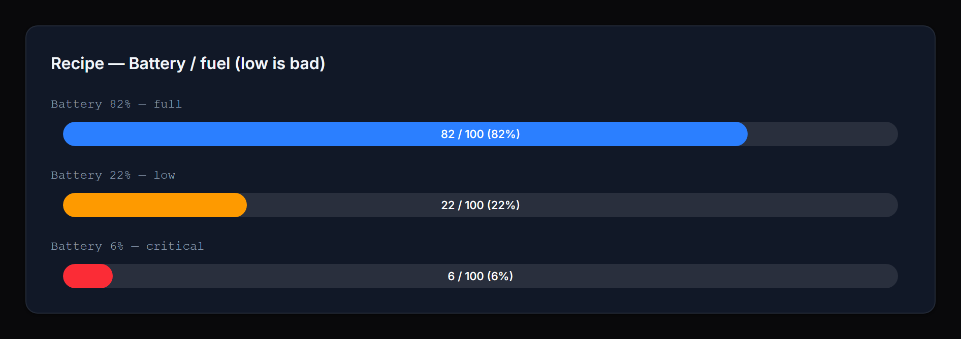
Battery / fuel (low is bad):
ProgressBarColumn::make('battery_percent')
    ->thresholdDirection('descending')
    ->warningThreshold(30)
    ->dangerThreshold(10);
 |
 |
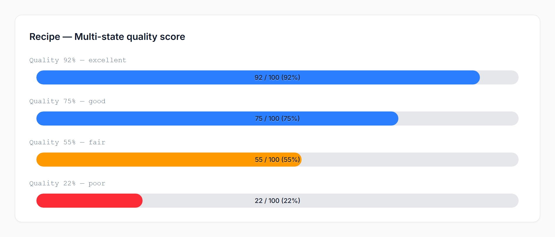
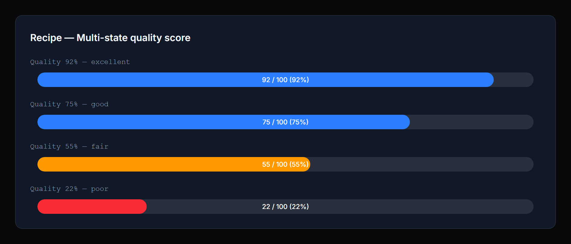
Multi-state quality score (using Filament's built-in colors):
ProgressBarColumn::make('quality')
    ->thresholds([
        90 => 'success',
        70 => 'info',
        40 => 'warning',
        0  => 'danger',
    ]);
 |
 |
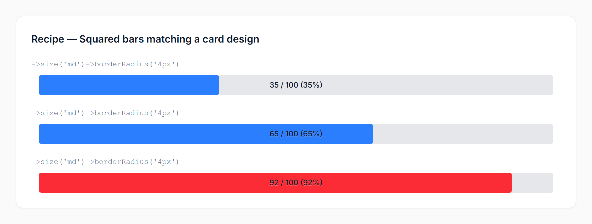
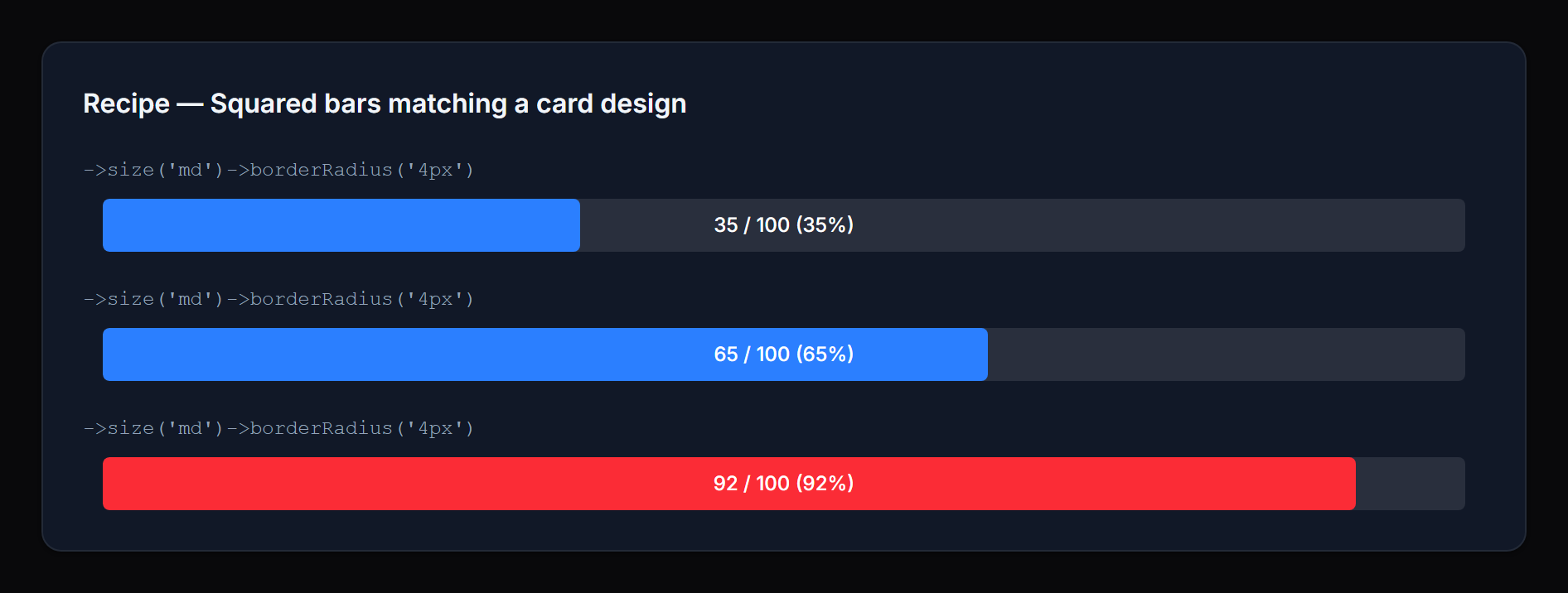
Squared bars matching a card design system:
ProgressBarColumn::make('used')
    ->maxValue(fn ($record) => $record->quota)
    ->borderRadius('4px')
    ->size('md');
 |
 |
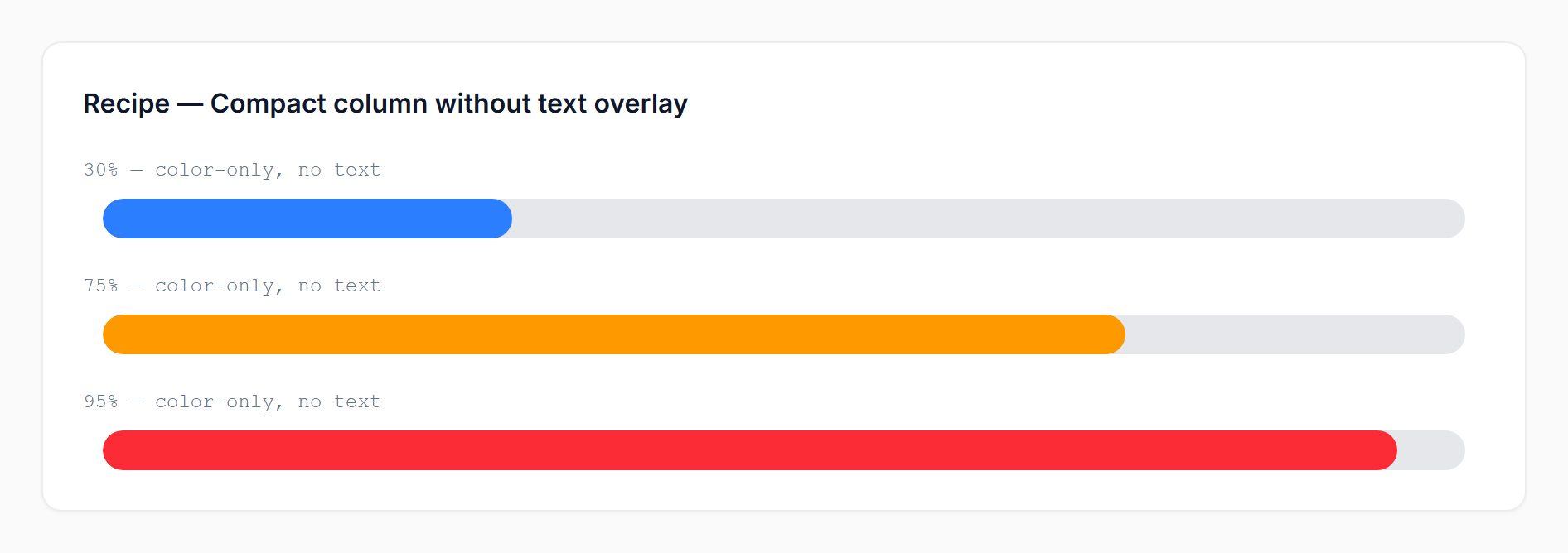
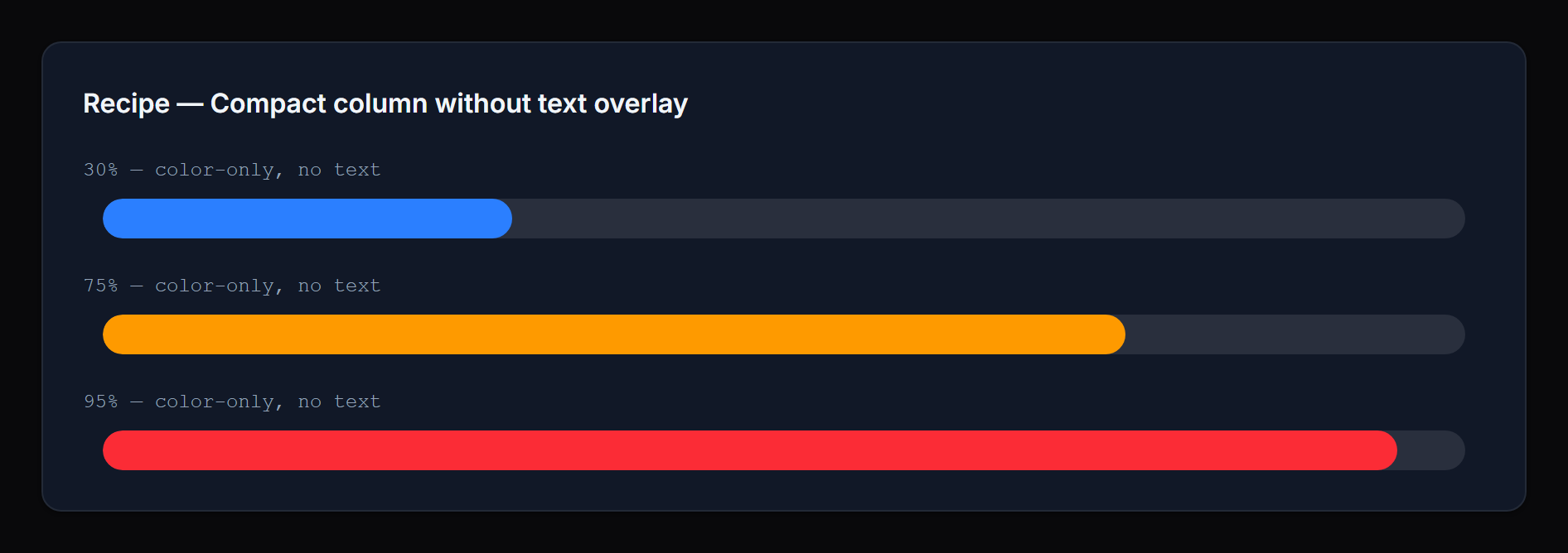
Compact column without any text overlay:
ProgressBarColumn::make('leave_progress')
    ->state(fn ($record) => [
        'progress' => $record->leave_used,
        'total' => $record->leave_total,
    ])
    ->hideProgressValue()
    ->hidePercentage();
 |
 |
Dynamic per-record color:
ProgressBarColumn::make('progress')
    ->successColor(fn ($record) => $record->is_priority ? '#7c3aed' : null);
Infolist entry with icon, inline label, and rich danger text:
ProgressBarEntry::make('inventory')
    ->label('Stock remaining')
    ->icon('heroicon-o-cube')
    ->iconColor('primary')
    ->inlineLabel()
    ->getStateUsing(fn ($record) => [
        'progress' => $record->stock,
        'total' => $record->capacity,
    ])
    ->thresholdDirection('descending')
    ->warningThreshold(40)
    ->dangerThreshold(15)
    ->dangerLabel(fn (float $current, ?float $total) => "Only {$current} left of {$total}");
#API reference
#Value
| Method | Notes |
|---|---|
maxValue(int|float|Closure|null) |
Used with a numeric state value |
state(...) / getStateUsing(...) |
Filament native; pass a structured array for current+total |
#Display
| Method | Notes |
|---|---|
size('sm'|'md'|'lg') |
Default sm |
textPosition('inside'|'outside') |
Default inside |
showPercentage(bool|Closure) / hidePercentage(bool|Closure) |
Default shown |
showProgressValue(bool|Closure) / hideProgressValue(bool|Closure) |
Default shown |
borderRadius(string|Closure|null) |
Any CSS length; default pill |
#Thresholds
| Method | Notes |
|---|---|
warningThreshold(int|float|Closure) |
Default 70 (or 30 in descending) |
dangerThreshold(int|float|Closure) |
Default 90 (or 10 in descending) |
thresholdDirection('ascending'|'descending'|Closure) |
Default ascending |
thresholds(array|Closure) |
Tier overrides OR a [floor => status] map |
#Colors
| Method | Notes |
|---|---|
successColor(string|Closure|null) |
Default var(--primary-500) |
warningColor(string|Closure|null) |
Default var(--warning-500) |
dangerColor(string|Closure|null) |
Default var(--danger-500) |
statusColors(array|Closure|null) |
Map of status => color for custom statuses |
#Labels (infolist entries only)
| Method | Notes |
|---|---|
successLabel(string|Closure|null) |
Hidden by default |
warningLabel(string|Closure|null) |
Hidden by default |
dangerLabel(string|Closure|null) |
Hidden by default |
statusLabels(array|Closure|null) |
Map of status => label for custom statuses |
#Infolist-only
The ProgressBarEntry extends Filament's Entry and supports the standard label(...), inlineLabel(), hiddenLabel(), icon(...), and iconColor(...) methods.
#Integration examples
A ProgressBarColumn rendered inside a Filament resource table:
 |
 |
A ProgressBarEntry inside an infolist with icons, custom labels, and a descending-threshold "Stock remaining" bar:
 |
 |
#Need something custom?
We build production Filament panels and plugins for teams that want to ship fast without compromising on polish. If you need a custom feature, an extended variant of this package, or a fully bespoke component built for your stack, we can help.
- Browse the rest of our Filament work: filament.devletes.com
- Get in touch: salman@devletes.com
Typical engagements: new Filament plugins, custom resources/widgets/actions, theme + UX work, integrations with your existing services, and one-off tailored forks of our open-source packages.
#Credits
#License
MIT. See LICENSE.md.
The author
From the same author
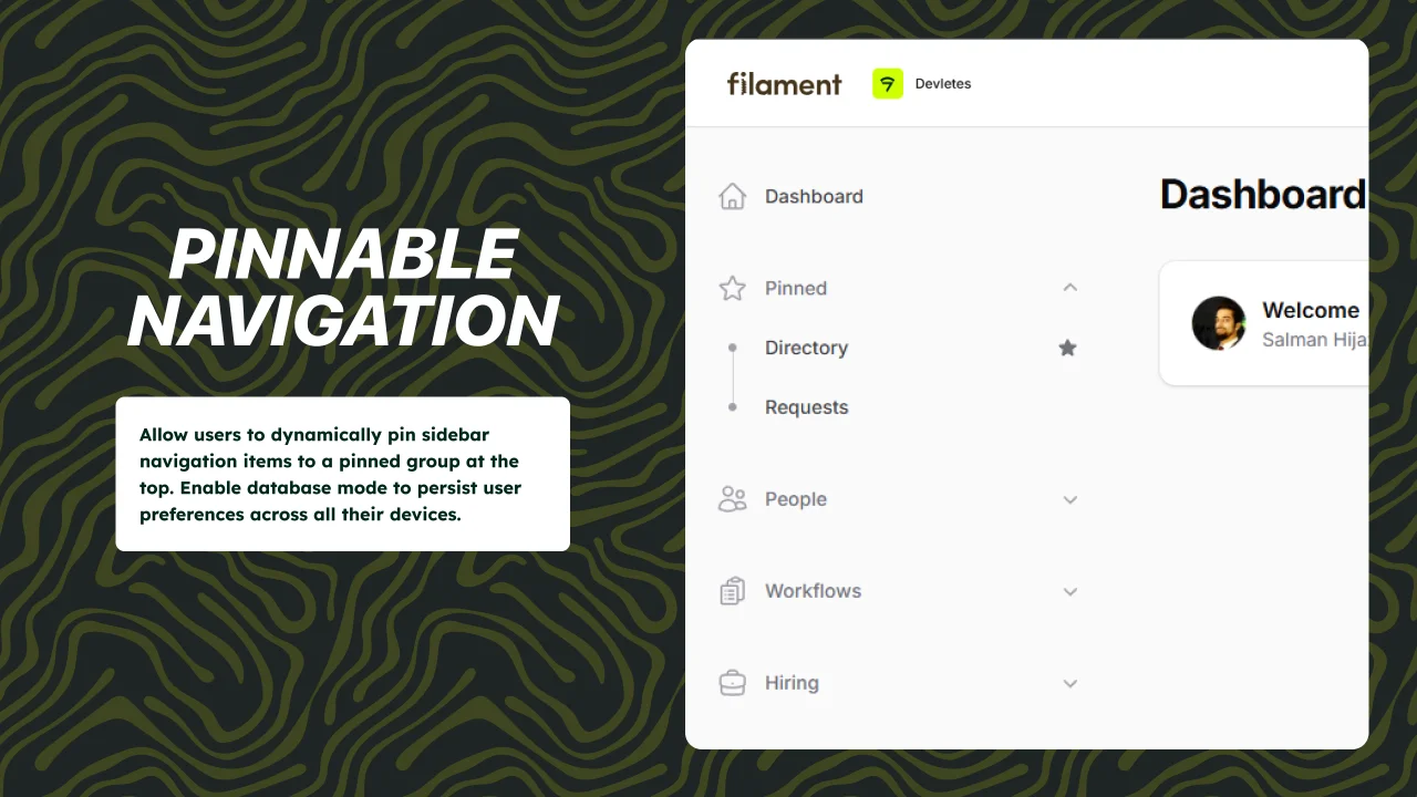
Pinnable Navigation
Pinnable navigation support for Filament 5 panels.
Author:
Devletes
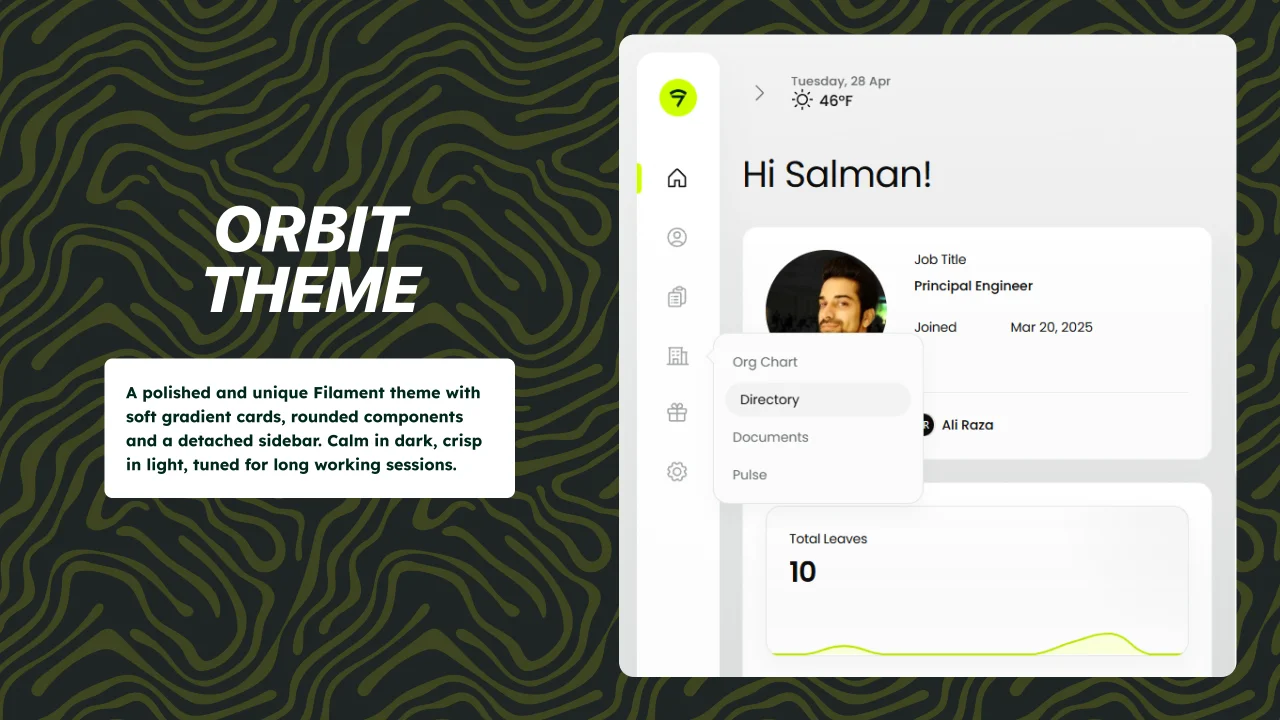
Orbit Theme
A polished and unique Filament theme with soft gradient cards, rounded components and a detached sidebar. Calm in dark, crisp in light, tuned for long working sessions.
Author:
Devletes
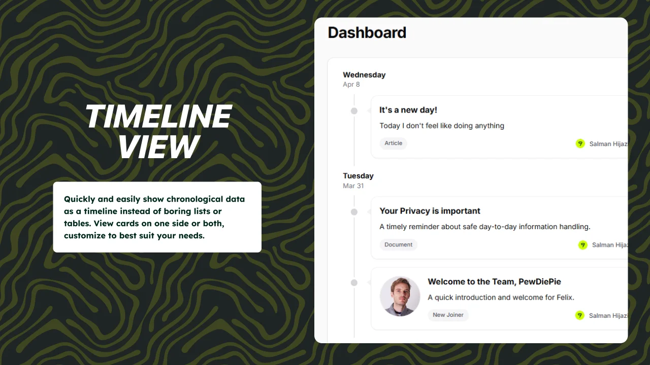
Timeline View
Quickly and easily show chronological data as a timeline instead of boring lists or tables. View cards on one side or both, customize to best suit your needs.
Author:
Devletes
Featured Plugins
A selection of plugins curated by the Filament team
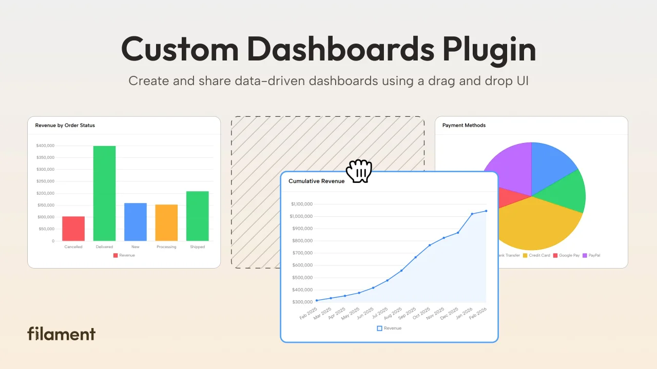
Custom Dashboards
Let your users build and share their own dashboards with a drag-and-drop interface. Define your data sources in PHP and let them do the rest.
 Filament
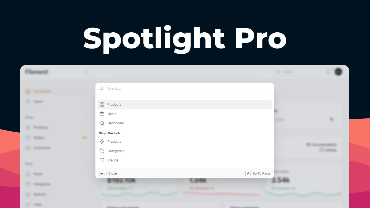
Spotlight Pro
Browse your Filament Panel with ease. Filament Spotlight Pro adds a Spotlight/Raycast like Command Palette to your Filament Panel.
 Dennis Koch
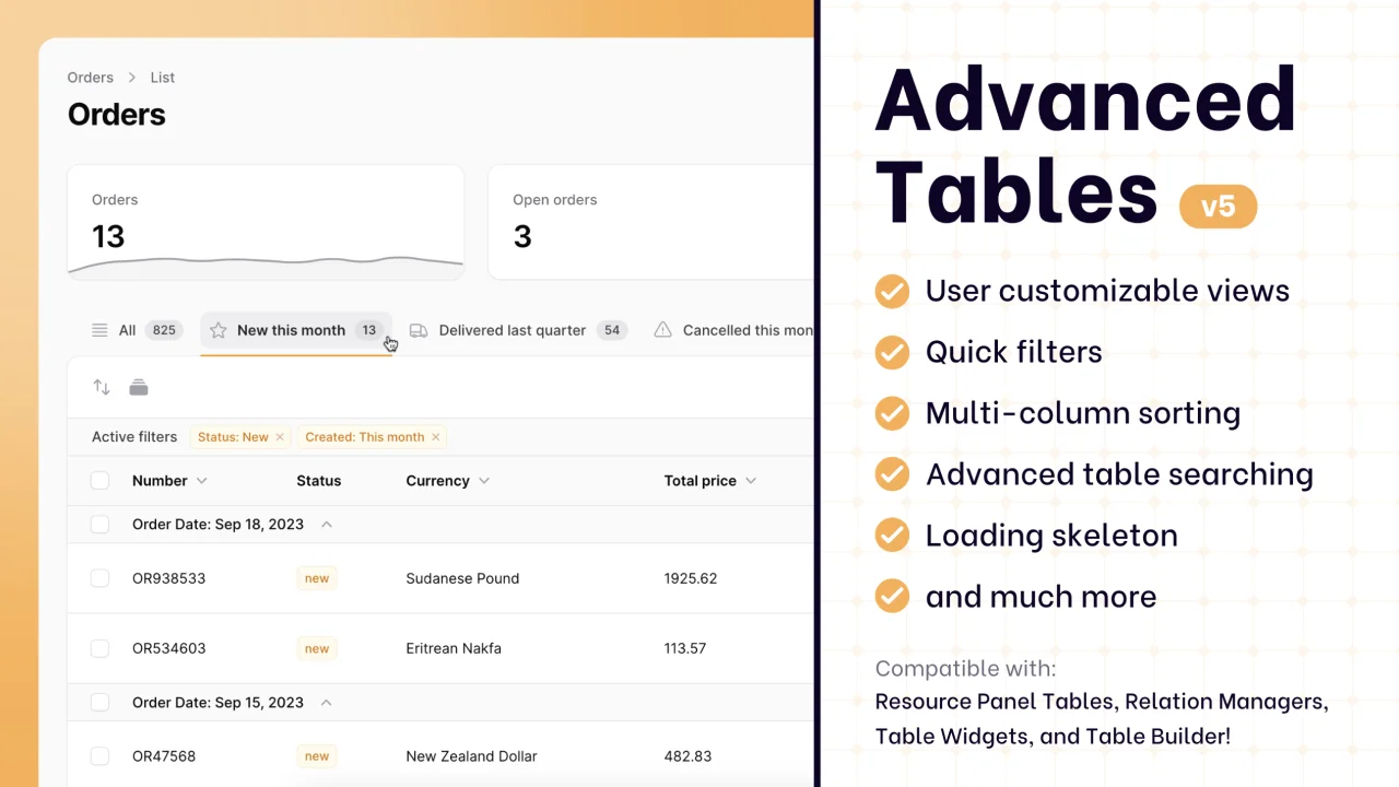
Advanced Tables (formerly Filter Sets)
Supercharge your tables with powerful features like user-customizable views, quick filters, multi-column sorting, advanced table searching, convenient view management, and more. Compatible with Resource Panel Tables, Relation Managers, Table Widgets, and Table Builder!
 Kenneth Sese