Flatpickr
CommunityA DateTime field extension which uses Flatpickr js library, supporting Date Picker, Date-Time Picker, Time Picker, Month Picker and Date Range Picker
filament/
namespace. Review the source and install at your own risk. Found
malware or an unresolved security issue the author won't
address?
Report it
.
 Author:
Sam Maosa
Author:
Sam Maosa
Documentation
- Supported Versions
- Installation
- Usage
- Examples
- Flatpickr Themes (See Flatpickr Docs for more Details)
- State Types
- Screenshots
- Testing
- Changelog
- Contributing
- Security Vulnerabilities
- Credits
- License


Use Flatpickr as your datepicker in the Filament Forms and Panels.
#Supported Versions
| Package Version | Supported Filament Version(s) |
|---|---|
| v2.x | Filament v2 |
| v3.x | Filament v3 |
| v4.x | Filament v3, Filament v4 |
#Installation
Install the package via composer:
composer require coolsam/flatpickr
Run the installation command to publish the assets and config file:
php artisan flatpickr:install
This will publish the config file to config/flatpickr.php and the assets to public/vendor/flatpickr. The command will also ask you if you would like to overwrite the existing assets and config files if they exist.
If you choose to overwrite, the existing files will be replaced with the new ones. This is useful if you want to update the package to the latest version there have been changes to the config file or assets in the latest version.
If you are upgrading from a previous version be sure to run the following to ensure assets are up to date
php artisan filament:upgrade
#Usage
You can do a lot with just one Component: Flatpickr
You can use the Flatpickr component from this package as:
- DatePicker
- TimePicker
- DateTimePicker
- Range Picker
- Week Picker,
- Multiple-Date Picker
- Month Picker
Most of the fluent config methods are similar to Flatpickr's official options in naming.
This package is also an extension of Filament's DateTimePicker, so most of the methods are similar to the ones in the DateTimePicker component. You can use the Flatpickr component as a drop-in replacement for the DateTimePicker component.
Here are some examples of the methods. Refer to Flatpickr's Official Documentation for details on each of the configurations.
use Coolsam\FilamentFlatpickr\Forms\Components\Flatpickr;
// Basic, Date Field
Flatpickr::make('test_field') // Minimal Config as a datepicker
Flatpickr::make('test_field')
->allowInput() // Allow a user to manually input the date in the textbox (make the textbox editable)
->altInput(true) // Enable the use of Alternative Input (See Flatpickr docs)
->altFormat('F j, Y') // Alternative input format
->time(true) // Turn this into a DateTimePicker
->disabledDates(['2023-07-25','2023-07-26']) // Disable specific dates from being selected.
->minDate(fn() => today()->startOfYear()) // Set the minimum allowed date
->maxDate(fn() => today()) // Set the maximum allowed date.
->hourIncrement(1) // Intervals of incrementing hours in a time picker
->minuteIncrement(10) // Intervals of minute increment in a time picker
->seconds(false) // Enable seconds in a time picker
->defaultSeconds(0) //Initial value of the seconds element, when no date is selected
->defaultMinute(0) // Initial value of the minutes element, when no date is selected
->allowInvalidPreload() // Initially check if the selected date is valid
->altInputClass('sample-class') // Add a css class for the alt input format
->format('Y-m-d') // Set the main date format
->ariaDateFormat('Y-m-d') // Aria
->clickOpens(true) // Open the datepicker when the input is clicked.
->closeOnSelect(true) // Close the datepicker once the date is selected.
->conjunction(',') // Applicable only for the MultiDatePicker: Separate inputs using this conjunction. The package will use this conjunction to explode the inputs to an array.
->inline(true) // Display the datepicker inline with the input, instead of using a popover.
->disableMobile(true) // Disable mobile-version of the datepicker on mobile devices.
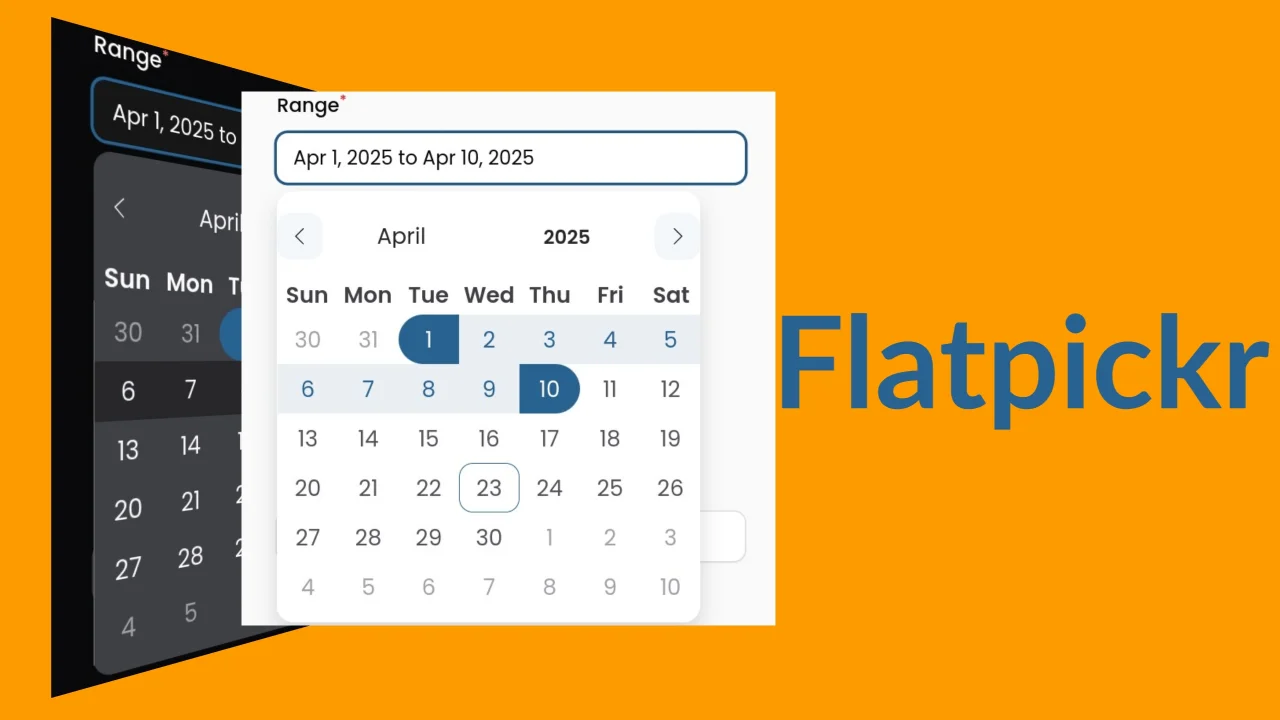
->mode(\Coolsam\FilamentFlatpickr\Enums\FlatpickrMode::RANGE) // Set the mode as single, range or multiple. Alternatively, you can just use ->range() or ->multiple()
->monthSelectorType(\Coolsam\FilamentFlatpickr\Enums\FlatpickrMonthSelectorType::DROPDOWN)
->shorthandCurrentMonth(true)
->noCalendar(true) // use this in conjunction with `time()` to have a timePicker
->position(\Coolsam\FilamentFlatpickr\Enums\FlatpickrPosition::AUTO_CENTER)
->showMonths(1)
->weekNumbers(true)
->time24hr(true)
->timePicker() // Configure a timepicker out of the box
->weekPicker() // configure a week picker out of the box
->monthPicker() // configure a month picker out of the box
->rangePicker() // configure a date range picker out of the box
->multiplePicker() // Configure a multiple date picker out of the box
;
#Examples
// You can also use the component as a DateTimePicker, Range Picker, Week Picker, Month Picker, TimePicker and Multiple Date Picker
\Coolsam\Flatpickr\Forms\Components\Flatpickr::make('start_time')->timePicker(),
\Coolsam\Flatpickr\Forms\Components\Flatpickr::make('week_number')->weekPicker()->format('W Y'),
\Coolsam\Flatpickr\Forms\Components\Flatpickr::make('month')->monthPicker()->format('Y-m')->displayFormat('F Y'),
\Coolsam\Flatpickr\Forms\Components\Flatpickr::make('range')->rangePicker(),
\Coolsam\Flatpickr\Forms\Components\Flatpickr::make('occupied_slots')->multiplePicker()->format('Y-m-d')->displayFormat('F j, Y'),
#Flatpickr Themes (See Flatpickr Docs for more Details)
Note: I highly recommend that you use the DEFAULT theme, which is styled using tailwind to conform to the filament design system. The other themes come with the flatpickr javascript package and may not conform to your Filament themeing, including dark mode.
You can set the package's theme globally under the theme config in the config/flatpickr.php file. The config accepts a \Coolsam\Flatpickr\Enums\FlatpickrTheme enum value.
The \Coolsam\Flatpickr\Enums\FlatpickrTheme::DEFAULT theme is already set by default and conforms to the filament design system.
use Coolsam\FilamentFlatpickr\Enums\FlatpickrTheme;
return [
    'theme' => FlatpickrTheme::AIRBNB,
];
See the screenshots below for the different themes.
#State Types
The package supports the following state types:
stringorCarbonInterfacefor DateTimePicker, DatePicker, TimePicker, WeekPicker, MonthPickerarrayfor RangePicker, MultiplePicker (an array of date strings or CarbonInterface instances)
#Screenshots
#Single Date Picker
#Multiple Date Picker
#Date Range Picker
#Date-Time Picker
#Time-Only Picker
#Show Multiple Months
#Week Picker
#Month Picker
#Flatpickr Themes
DEFAULT
AIRBNB
LIGHT
DARK
CONFETTI
MATERIAL_BLUE
MATERIAL_GREEN
MATERIAL_ORANGE
MATERIAL_RED
#Testing
composer test
#Changelog
Please see CHANGELOG for more information on what has changed recently.
#Contributing
Please see CONTRIBUTING for details.
#Security Vulnerabilities
Please review our security policy on how to report security vulnerabilities.
#Credits
#License
The MIT License (MIT). Please see License File for more information.
The author
Sam Maosa is a Full-Stack software developer and open-source software maintainer with 10+ years of experience, mainly using the TALL stack (Tailwind, Alpine, Laravel & Livewire). His Open source contributions are currently mainly centered around FilamentPHP. He also contributes to other stacks such as Inertia.js, Vue.js, and Node.
Sam resides in Nairobi, Kenya, and is an employee of Strathmore University. His goal is to transition fully into open-source software development and maintenance and to make more contributions to the core packages of the TALL/FLAT stack.
From the same author
Modules
This plugin enables you to easily integrate Filament with your Laravel Modular app powered by nwidart/laravel-modules. Host all your panel's code autonomously in your module!
Author:
Sam Maosa
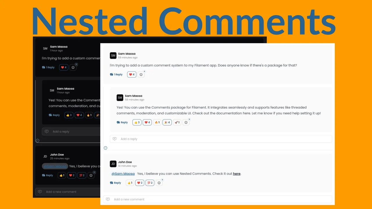
Nested Comments
Add comments, mentions, replies, and emoji reactions to your model and allow your users to interact with them from right in your app.
Author:
Sam Maosa
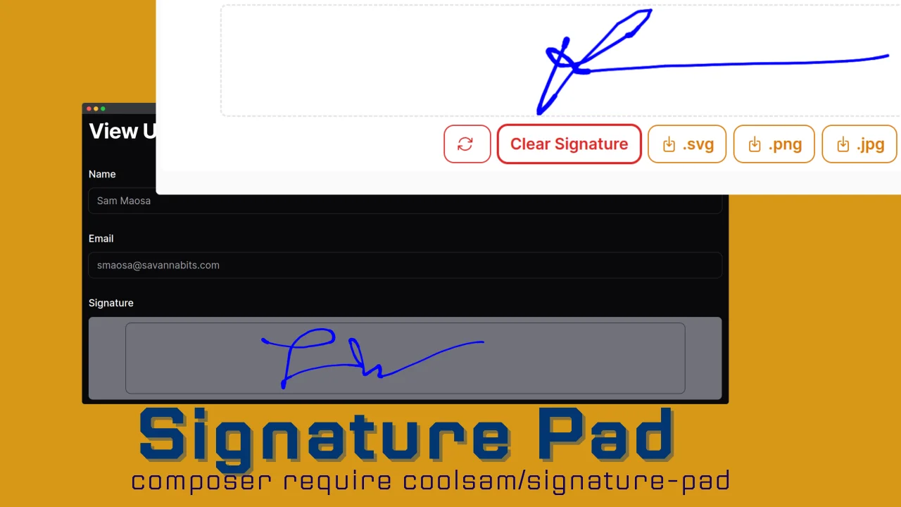
Signature Pad
A beautiful Signature Pad Field for Filamentphp Forms
Author:
Sam Maosa
Featured Plugins
A selection of plugins curated by the Filament team
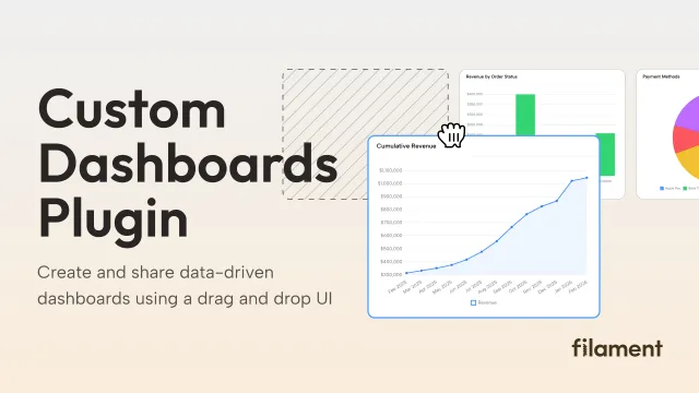
Custom Dashboards
Let your users build and share their own dashboards with a drag-and-drop interface. Define your data sources in PHP and let them do the rest.
 Filament
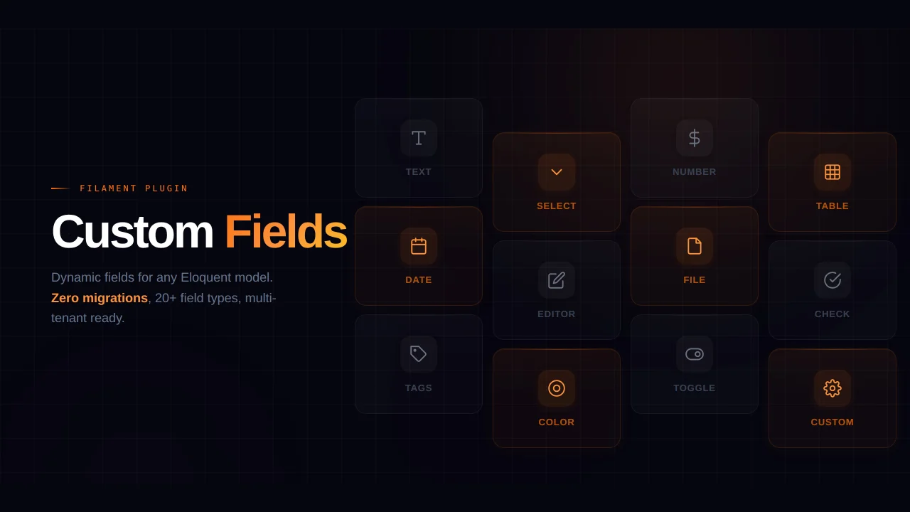
Custom Fields
Eliminate custom field migrations forever. Let your users create and manage form fields directly in Filament admin panels with 20+ built-in field types, validation, and zero database changes.
 Relaticle
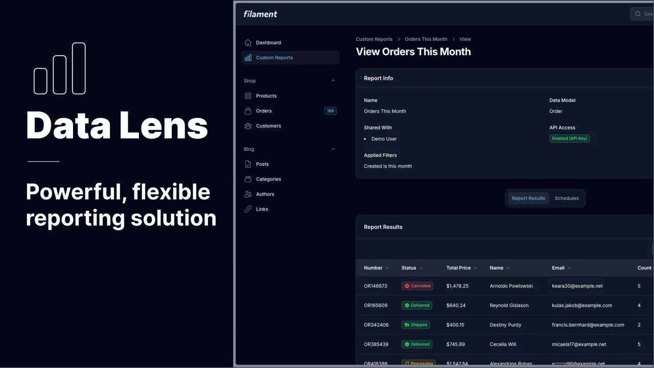
Data Lens
Advanced Data Visualization for Laravel Filament - a premium reporting solution enabling custom column creation, sophisticated filtering, and enterprise-grade data insights within admin panels.
 Padmission