UI Switcher
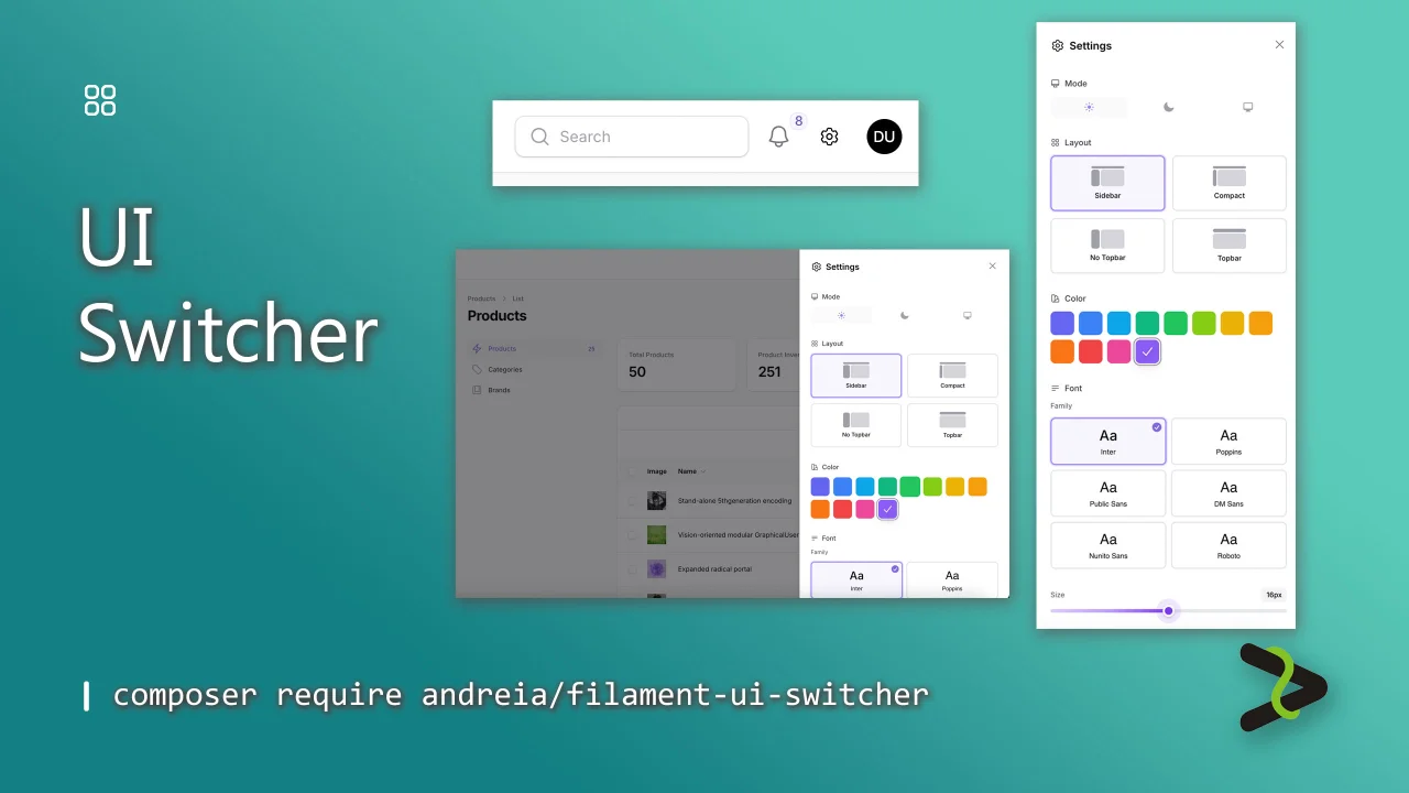
CommunityAdd instant UI customization to your Filament panels. Users can switch between color scheme, select their favorite font, adjust text size, and toggle between the available Filament layouts from a settings icon.
 Author:
Andréia Bohner
Author:
Andréia Bohner
Package health
BetaAutomated checks of this plugin's Composer package
15 checks
- Failed: GitHub Actions pinned to SHA — View details on Plumb
- Skipped: GitLab CI includes pinned to SHA
- Passed: Open security advisories
- Passed: Dependabot PR responsiveness — No open Dependabot PRs.
- Skipped: Renovate MR responsiveness
- Failed: Dependabot or Renovate configured — No dependency updater configuration found. View details on Plumb
- Skipped: Dependency update cooldown configured
- Failed: Provides a security policy — View details on Plumb
- Passed: Abandoned or archived — No consulted source marks the package abandoned (packagist, github).
- Passed: Commit and release recency — Active: last commit 0 days ago; last release 1 days ago.
-
Passed:
composer.lock not committed by library
—
composer.lockis absent from the released dist archive. - Passed: Dist archive is lean
-
Passed:
Current Laravel version supported
—
Package dependencies resolve together with current Laravel
13.0. -
Passed:
Current PHP version supported
—
Constraint
^8.5|^8.4|^8.3|^8.2supports current PHP8.5. - Skipped: Current Symfony version supported
filament/
namespace. Review the source and install at your own risk. Found
malware or an unresolved security issue the author won't
address?
Report it
.
Documentation
- Features
- Requirements
- Installation
- Appearance
- Usage
- Configuration
- Database Storage (Optional)
- Programmatic Access
- Testing
- Changelog
- Contributing
- Security
- Credits
- License


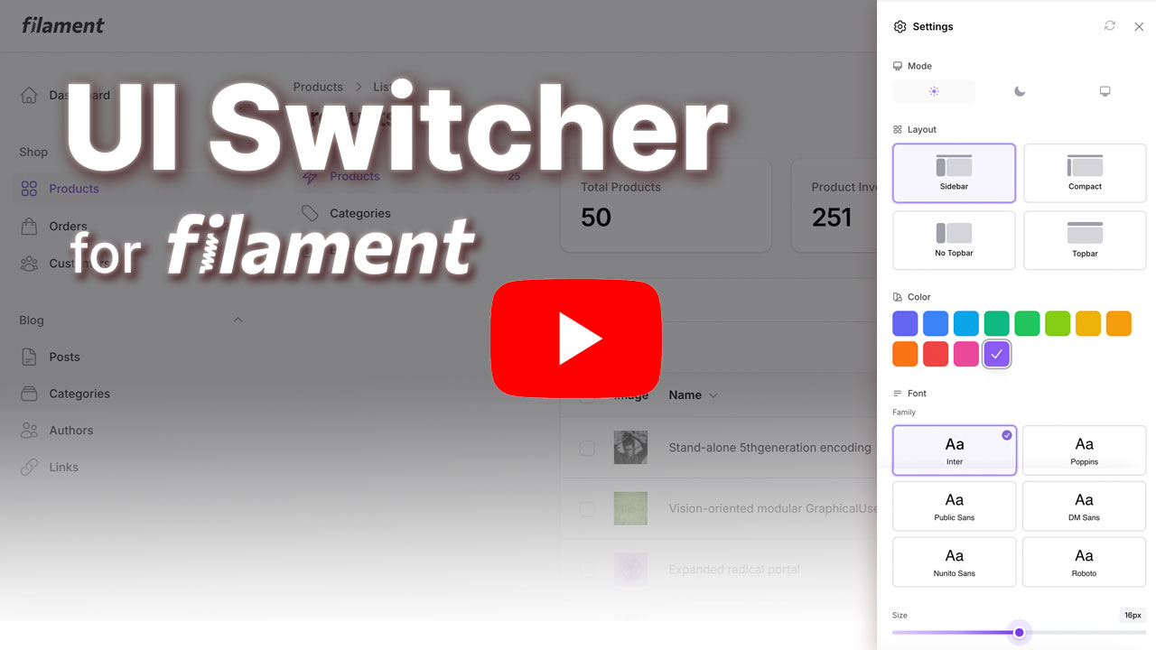
Switch between the available Filament layouts with a customizable UI settings slideover modal accessible from a ⚙️ icon in the topbar.
#Features
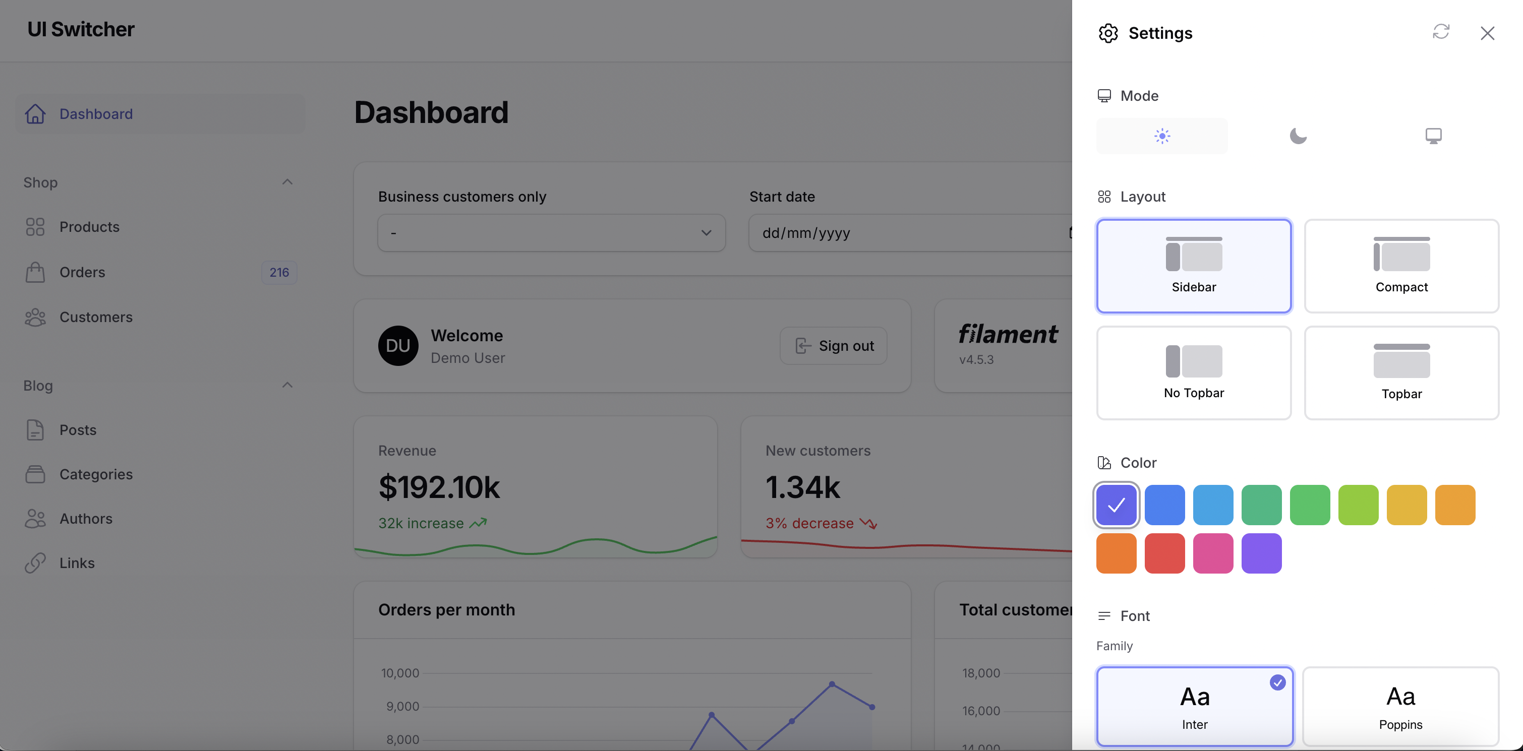
Customization Options:
- Primary Color - Choose from the predefined colors or add your custom colors
- Font Family - Select from 6 popular Google Fonts (Inter, Poppins, Roboto, DM Sans, Nunito Sans, Public Sans)
- Font Size - Adjust base font size (12-20px)
- Layout - Switch between Sidebar, Compact Sidebar, and Topbar navigation
- Mode (optional) - Display Filament's mode switcher (dark, light, and system)
- Reset All - Quickly reset all customizations to default values with a single click
Storage Options:
- Session Storage (default) - Preferences stored in user session
- Database Storage - Persist preferences per user in database
#Requirements
- PHP 8.2 or higher
- Laravel 11.x or 12.x
- Filament 4.1+ or 5.x
- Livewire 3.x or 4.x
Note: While the plugin technically works with Filament 4.0, the "No Topbar" layout option requires Filament 4.1+. Other layout options work on all Filament 4.x versions.
#Installation
#1. Install via Composer
composer require andreia/filament-ui-switcher
The package will auto-register via Laravel's package discovery.
#2. Publish Assets
This package uses Filament's asset management system. After installing, you need to publish the assets:
php artisan filament:assets
This will publish the CSS assets to public/css/andreia/filament-ui-switcher/ where they will be automatically loaded by Filament and cached by your browser for better performance.
Note: If you update the package, run
php artisan filament:assetsagain to get the latest assets.
#3. Publish Config
You can customize the colors, fonts, and more with the config file:
# Publish config
php artisan vendor:publish --tag=filament-ui-switcher-config

# Publish translations
php artisan vendor:publish --tag=filament-ui-switcher-translations
This will create a config/ui-switcher.php file where you can customize:
Default Preferences:
'defaults' => [
    'font' => 'Inter',           // Default font family
    'color' => '#6366f1',      // Default primary color
    'layout' => 'sidebar',       // Default layout
    'font_size' => 16,           // Default font size in pixels
    'density' => 'default',      // Default UI density
],
Available Fonts: Add or remove fonts from the font picker:
'fonts' => [
    'Inter',
    'Poppins',
    'Public Sans',
    'DM Sans',
    'Nunito Sans',
    'Roboto',
    // Add any font supported by your configured Filament font provider:
    // 'Montserrat',
    // 'Open Sans',
],
Use self-hosted fonts with Filament's local font provider:
'defaults' => [
    'font' => 'Inter',
    // ...
],

'font_provider' => \Filament\FontProviders\LocalFontProvider::class,
'font_url' => '/css/fonts.css',

'fonts' => [
    'Inter',
    'Poppins',
],
You can also configure the provider or URL per font:
'fonts' => [
    'inter' => [
        'label' => 'Inter',
        'family' => 'Inter',
        'provider' => \Filament\FontProviders\LocalFontProvider::class,
        'url' => '/css/fonts.css',
    ],
],
Custom Colors: Customize the color palette shown in the color picker:
'custom_colors' => [
    '#6366f1', '#3b82f6', '#0ea5e9', '#10b981',
    '#22c55e', '#84cc16', '#eab308', '#f59e0b',
    '#f97316', '#ef4444', '#ec4899', '#8b5cf6',
    // Add your brand colors:
    // '#yourBrandColor',
],
Custom UI icon: Customize the UI icon modal trigger:
'icon' => 'heroicon-o-cog-6-tooth',
Font Size Range: Set the min and max values for the font size slider:
'font_size_range' => [
    'min' => 12,  // Minimum font size in pixels
    'max' => 20,  // Maximum font size in pixels
],
Available Layouts: Control which layout options are available to users:
'layouts' => [
    'sidebar',               // Full sidebar with icons and labels
    'sidebar-collapsed',     // Collapsed sidebar (icons only)
    'sidebar-no-topbar',     // Sidebar without topbar (Filament v4.1+)
    'topbar',                // Top navigation bar
],
#3. Publish View (Optional)
If you want to customize the view:
# Publish view (optional)
php artisan vendor:publish --tag=filament-ui-switcher-views
#4. Register the Plugin
Add the plugin to your Filament Panel Provider (e.g., app/Providers/Filament/AdminPanelProvider.php):
use Andreia\FilamentUiSwitcher\FilamentUiSwitcherPlugin;

public function panel(Panel $panel): Panel
{
    return $panel
        ->id('admin')
        ->path('admin')
        // ... other config
        ->plugin(FilamentUiSwitcherPlugin::make());
}
#Customize Icon Position
By default, the settings icon appears before the user menu (USER_MENU_BEFORE) on topbar. You can customize where the icon appears using any Filament render hook:
use Andreia\FilamentUiSwitcher\FilamentUiSwitcherPlugin;
use Filament\View\PanelsRenderHook;

->plugin(
    FilamentUiSwitcherPlugin::make()
        ->iconRenderHook(PanelsRenderHook::TOPBAR_END)
)
Available render hooks for the icon:
PanelsRenderHook::USER_MENU_BEFORE(default) - Before the user menuPanelsRenderHook::USER_MENU_AFTER- After the user menuPanelsRenderHook::TOPBAR_START- Start of topbarPanelsRenderHook::TOPBAR_END- End of topbarPanelsRenderHook::GLOBAL_SEARCH_BEFORE- Before global searchPanelsRenderHook::GLOBAL_SEARCH_AFTER- After global search- Or any custom render hook you've defined
#Enable Mode Switcher (Optional)
By default, the mode switcher is hidden. If you want to include Filament's native mode switcher (to switch between light, dark, and system) in the settings modal, enable it using the ->withModeSwitcher() method:
->plugin(
    FilamentUiSwitcherPlugin::make()
        ->withModeSwitcher()
)
#Hide Settings Sections
The font family, font size, color, and layout controls are visible by default. You can hide any of them from the settings modal using the plugin configuration:
->plugin(
    FilamentUiSwitcherPlugin::make()
        ->displayFontFamily(false)
        ->displayFontSize(false)
        ->displayColor(false)
        ->displayLayout(false)
)
#Configure Options in the Panel Provider
The published config file remains the default source of options. You can override any of those values per panel using fluent plugin methods:
use Filament\FontProviders\LocalFontProvider;

->plugin(
    FilamentUiSwitcherPlugin::make()
        ->defaults([
            'font' => 'Inter',
            'color' => '#6366f1',
            'layout' => 'sidebar',
            'font_size' => 16,
            'density' => 'default',
        ])
        ->fonts(
            fonts: [
                'Inter',
                'Poppins',
            ],
            url: asset('css/fonts.css'),
            provider: LocalFontProvider::class,
        )
        ->fontSizeRange(min: 12, max: 20)
        ->layouts([
            'sidebar',
            'topbar',
        ])
        ->customColors([
            '#6366f1',
            '#10b981',
        ])
)
These methods may also receive closures, which are evaluated when the panel renders:
->plugin(
    FilamentUiSwitcherPlugin::make()
        ->fonts(fn (): array => tenant()->fonts ?? ['Inter'])
        ->customColors(fn (): array => tenant()->brand_colors ?? ['#6366f1'])
        ->defaults(fn (): array => [
            'font' => tenant()->font_family ?? 'Inter',
            'color' => tenant()->primary_color ?? '#6366f1',
        ])
)
#5. Add the UI switcher path in your theme file
Filament recommends developers create a custom theme to better support plugin's additional TailwindCSS classes. After you have created your custom theme, add the UI swicher vendor directory to your theme's theme.css file usually located in resources/css/filament/admin/theme.css:
/* ... */

@source '../../../../vendor/andreia/filament-ui-switcher';
and execute:
npm run build
That's it! A ⚙️ settings icon will now appear in your topbar.
#Appearance
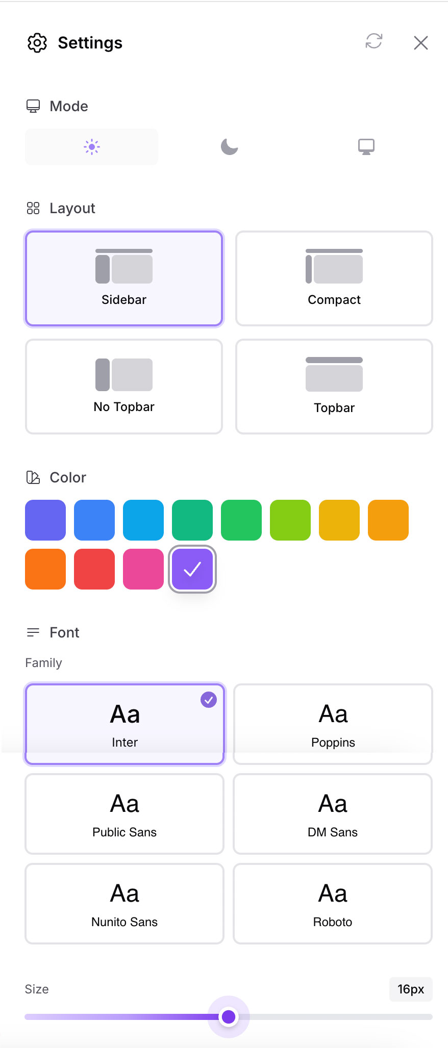
#Usage
#Resetting Preferences
The settings modal includes a reset button in the header that allows users to quickly restore all customizations to their default values. When clicked, it will reset:
- Primary color
- Font family
- Font size
- Layout
- Mode (dark/light/system)
All preferences will be restored to the values defined in your config/ui-switcher.php file under the defaults key.
#Configuration
The config file (config/ui-switcher.php) allows you to choose storage driver:
return [
    /*
    |--------------------------------------------------------------------------
    | Storage Driver
    |--------------------------------------------------------------------------
    | Where to store UI preferences.
    | Options: 'session' (default), 'database'
    */
    'driver' => 'session',

    /*
    |--------------------------------------------------------------------------
    | Database Column
    |--------------------------------------------------------------------------
    | Only used if driver = 'database'.
    | The column on the users table where preferences are stored as JSON.
    */
    'database_column' => 'ui_preferences',
];
#Database Storage (Optional)
If you want to persist preferences per user across sessions and devices:
#Step 1: Publish and Run Migration
php artisan vendor:publish --tag=filament-ui-switcher-migrations
php artisan migrate
This adds a ui_preferences JSON column to your users table.
#Step 2: Add HasUiPreferences Trait to User Model
Update your User model adding the HasUiPreferences trait and a 'ui_preferences' => 'array' cast, like so:
use Andreia\FilamentUiSwitcher\Models\Traits\HasUiPreferences;

class User extends Authenticatable
{
    use HasUiPreferences;

    protected function casts(): array
    {
        return [
            // ...
            'ui_preferences' => 'array',
        ];
    }
}
#Step 3: Update Config
Set the driver to database in config/ui-switcher.php:
'driver' => 'database',
Now preferences are saved per-user and persist across logins!
#Programmatic Access
You can also access and modify preferences programmatically:
use Andreia\FilamentUiSwitcher\Support\UiPreferenceManager;

// Get a preference
$font = UiPreferenceManager::get('ui.font', 'Inter');

// Set a preference
UiPreferenceManager::set('ui.color', '#10b981');
If using database storage with the HasUiPreferences trait:
// Get user's preference
$font = auth()->user()->getUiPreference('ui.font', 'Inter');

// Set user's preference
auth()->user()->setUiPreference('ui.color', '#10b981');
#Testing
composer test
#Changelog
Please see CHANGELOG for more information on what has changed recently.
#Contributing
Contributions are welcome! Please feel free to submit a Pull Request.
#Security
If you discover any security related issues, please email andreiabohner@gmail.com instead of using the issue tracker.
#Credits
#License
The MIT License (MIT). Please see License File for more information.
Made with ❤️ for the Filament community
The author
Andréia is a full-stack web developer and an enthusiastic open-source contributor & maintainer. She loves coding, reading, and learning new things every day! You can learn more about Andréia on her GitHub profile.
From the same author
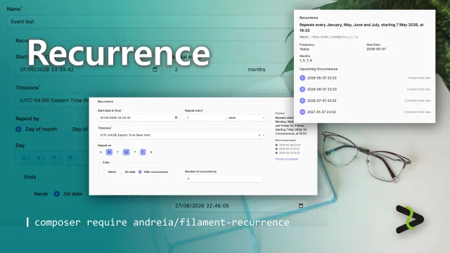
Recurrence
Complete recurring patterns support to your app — beautiful UI components, RFC 5545-compliant rules, and Eloquent integration out of the box.
Author:
Andréia Bohner
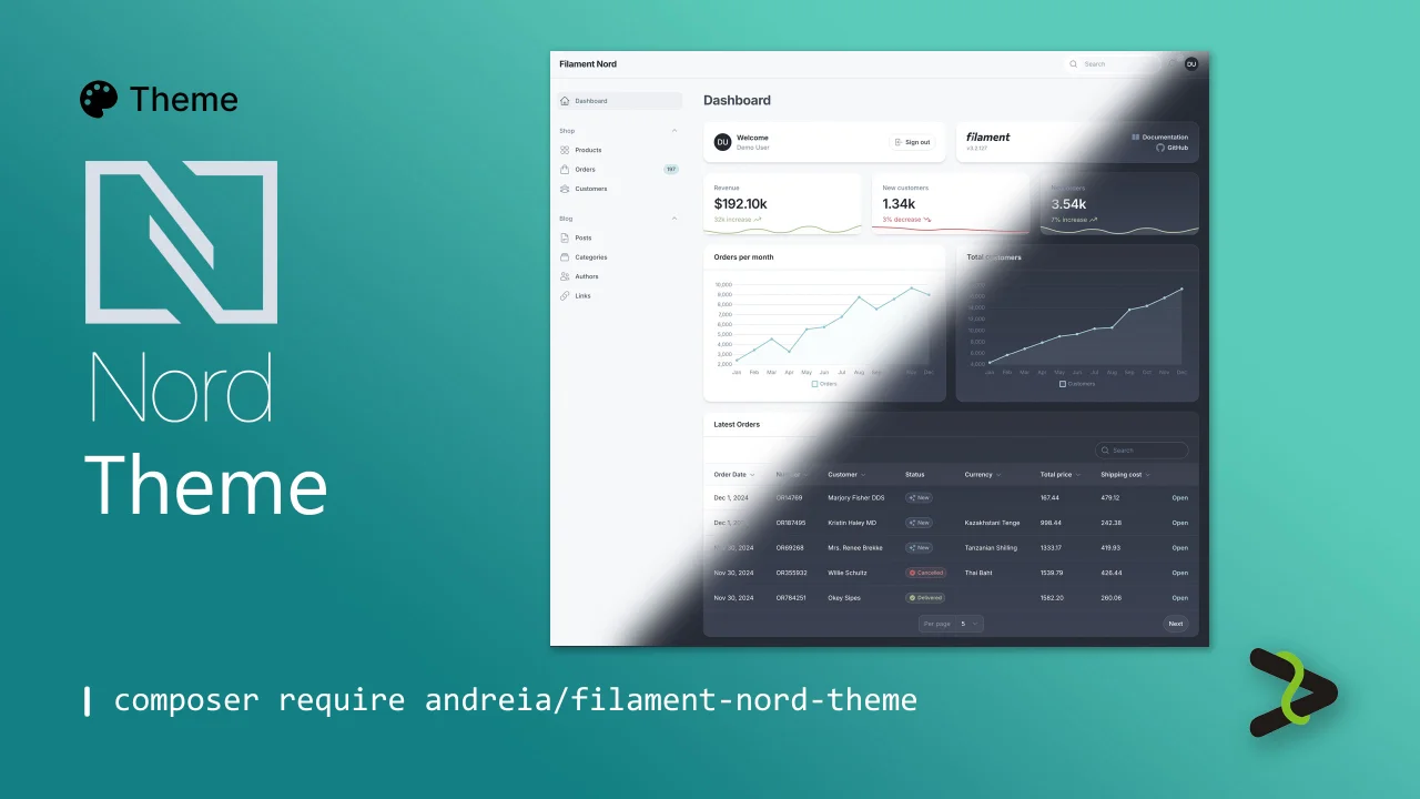
Nord theme
Dark and light arctic Nord theme.
Author:
Andréia Bohner
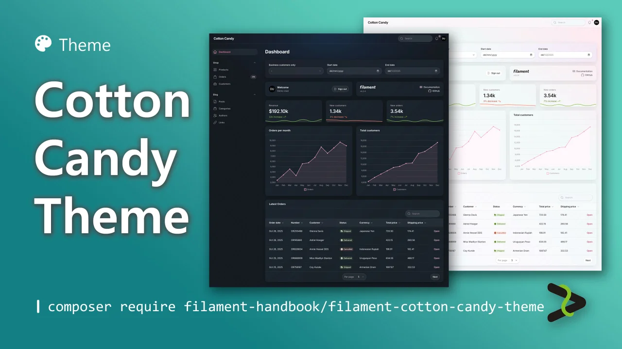
Cotton Candy Theme
A sweet light and dark theme.
Author:
Andréia Bohner
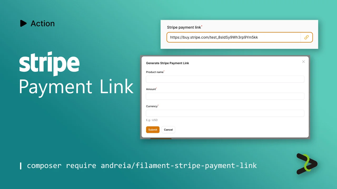
Stripe Payment Link
Action to generate a Stripe Payment Link.
Author:
Andréia Bohner
Featured Plugins
A selection of plugins curated by the Filament team
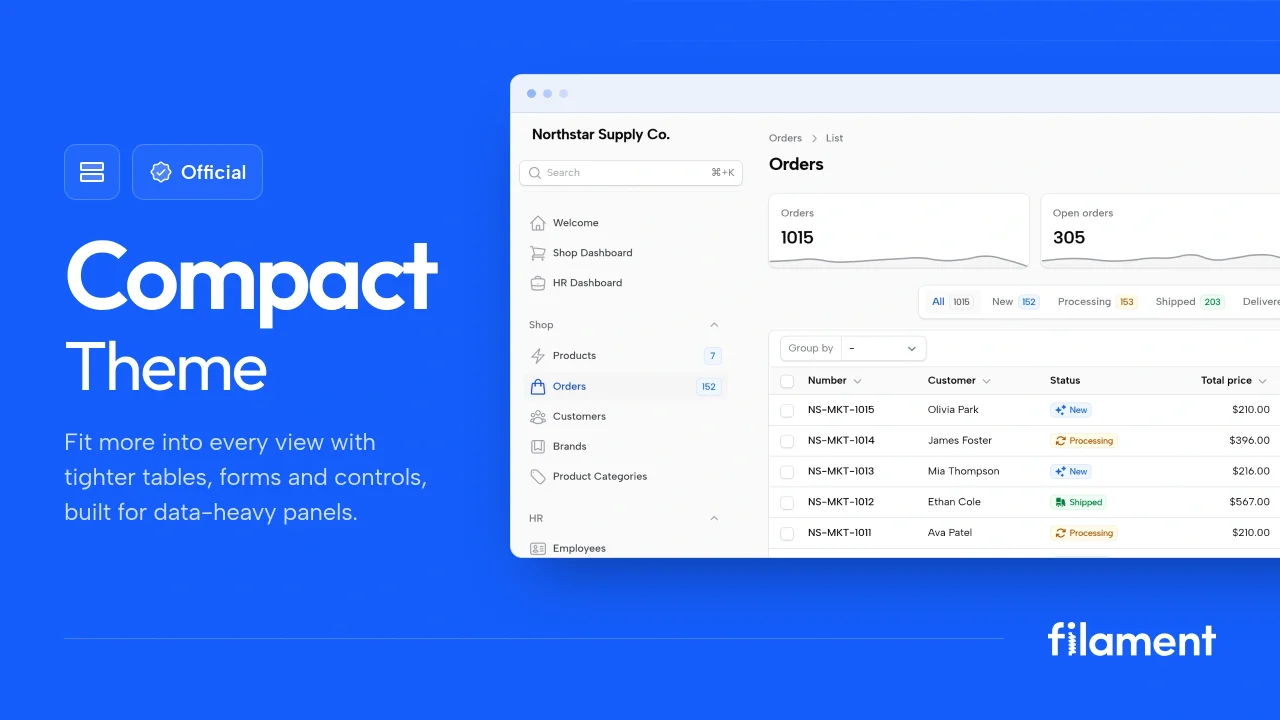
Compact Theme
A theme that makes data-heavy panels easier to scan by fitting more useful information on each screen.
 Filament
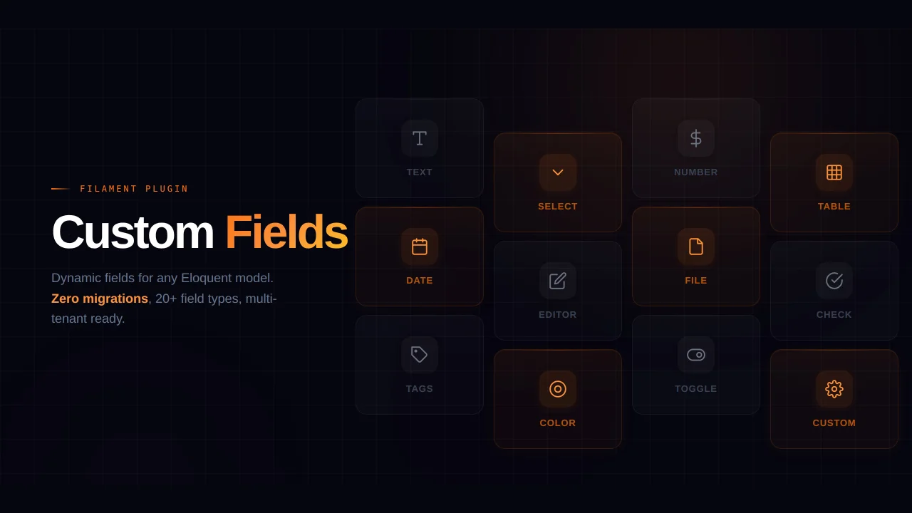
Custom Fields
Eliminate custom field migrations forever. Let your users create and manage form fields directly in Filament admin panels with 20+ built-in field types, validation, and zero database changes.
 Relaticle
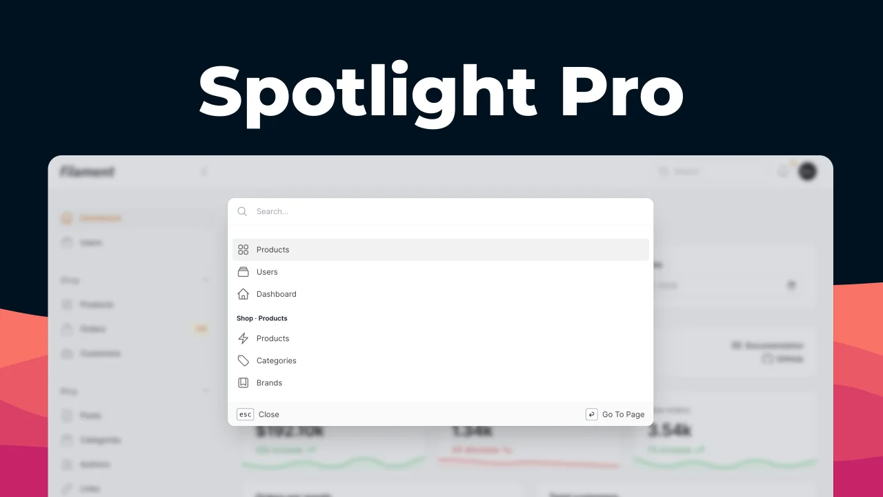
Spotlight Pro
Browse your Filament Panel with ease. Filament Spotlight Pro adds a Spotlight like Command Palette to your Filament Panel.
 Dennis Koch