Panel Kit
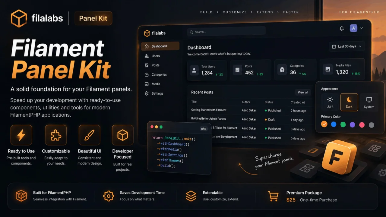
CommunityAn add-on that takes over the appearance of a Filament panel: four themes, a floating layout, branded authentication screens and a runtime appearance switcher.
filament/
namespace. Review the source and install at your own risk. Found
malware or an unresolved security issue the author won't
address?
Report it
.
 Author:
Azad Furkan ŞAKAR
Author:
Azad Furkan ŞAKAR
Documentation
- Screens
- The CSS contract
- Requirements
- Installation
- Themes
- Floating layout
- Authentication screens
- Shape and motion
- Appearance switcher
- How it works
- Customisation
- Tests
- Note on the source
An add-on that takes over the appearance of a Filament panel: four themes, a floating layout, branded authentication screens and a runtime appearance switcher.
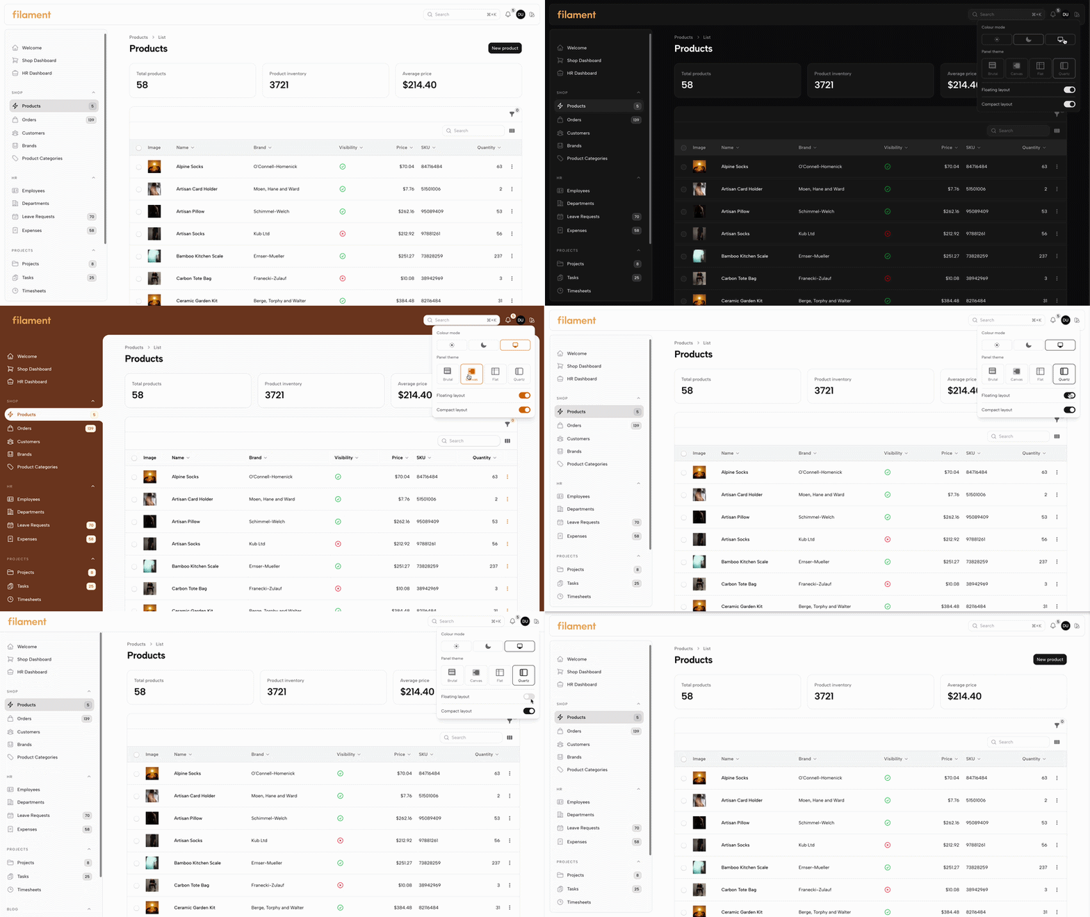
The appearance switcher at work: the theme, the floating layout and the compact layout all change in place — no reload, no request.
#Screens
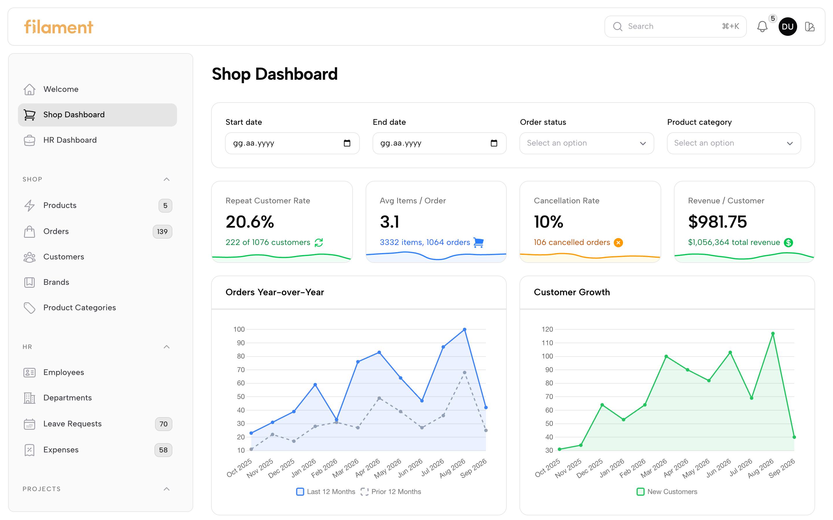
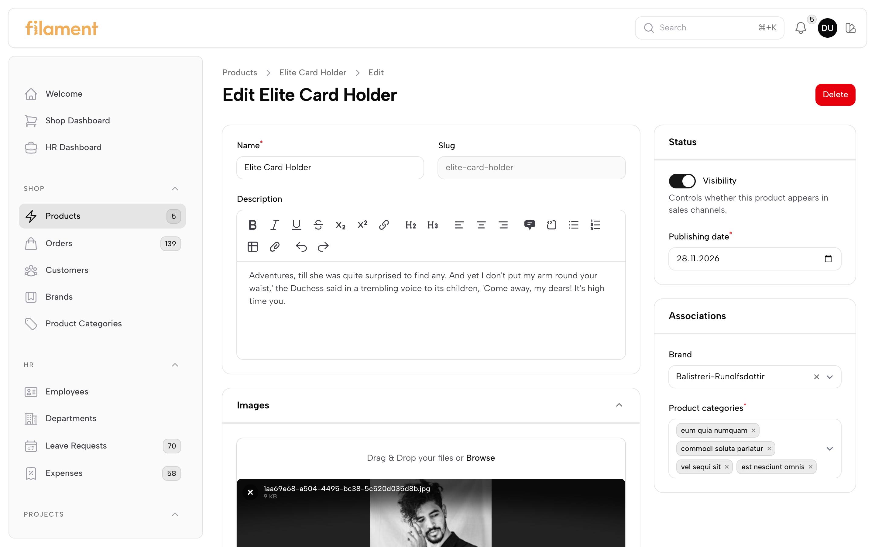
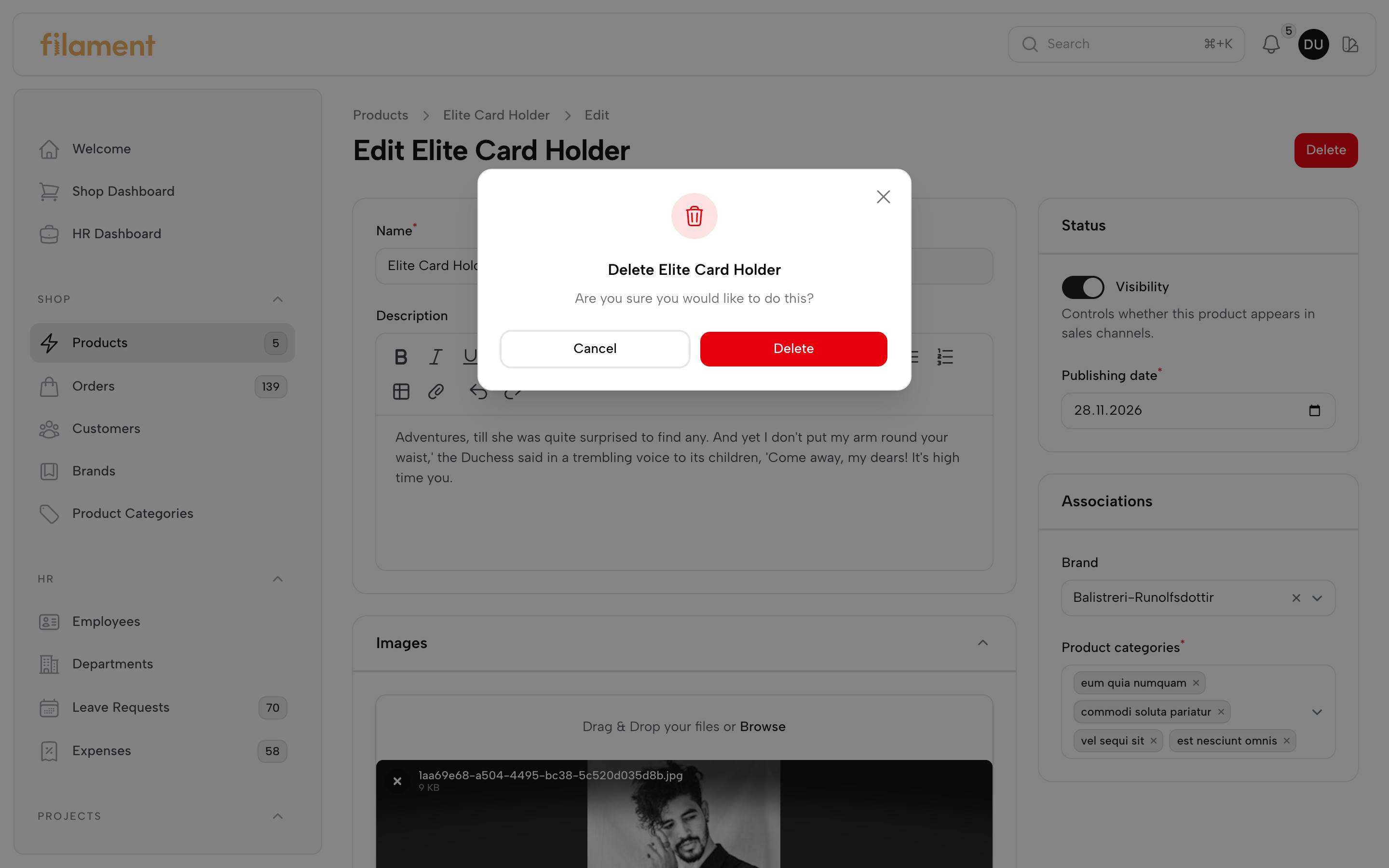
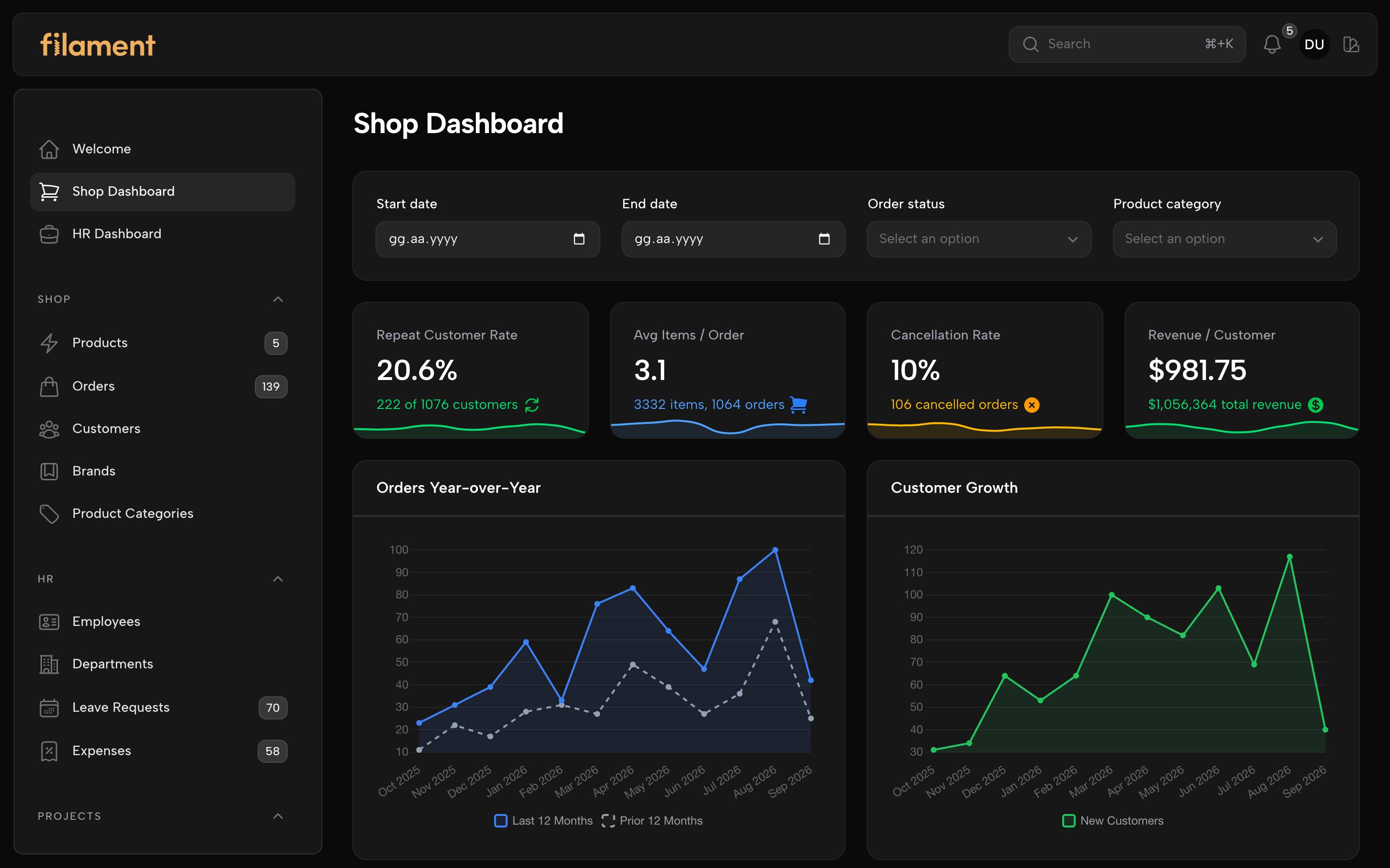
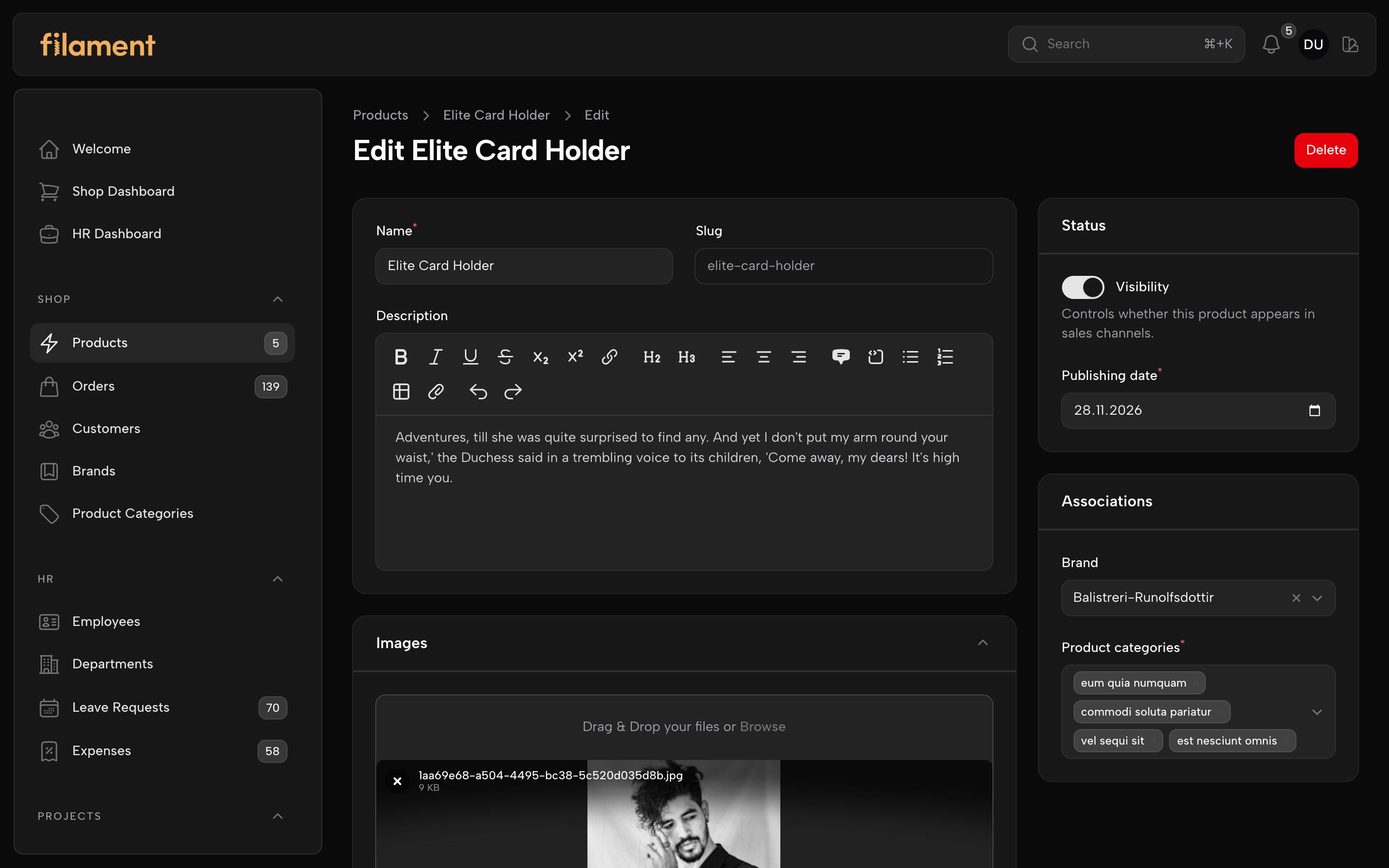
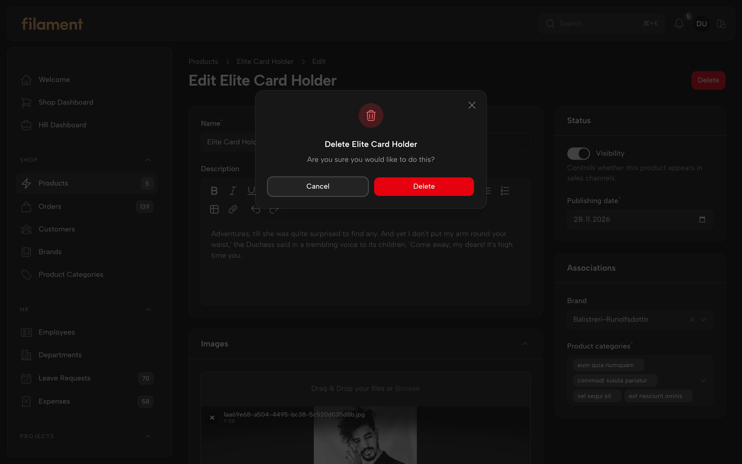
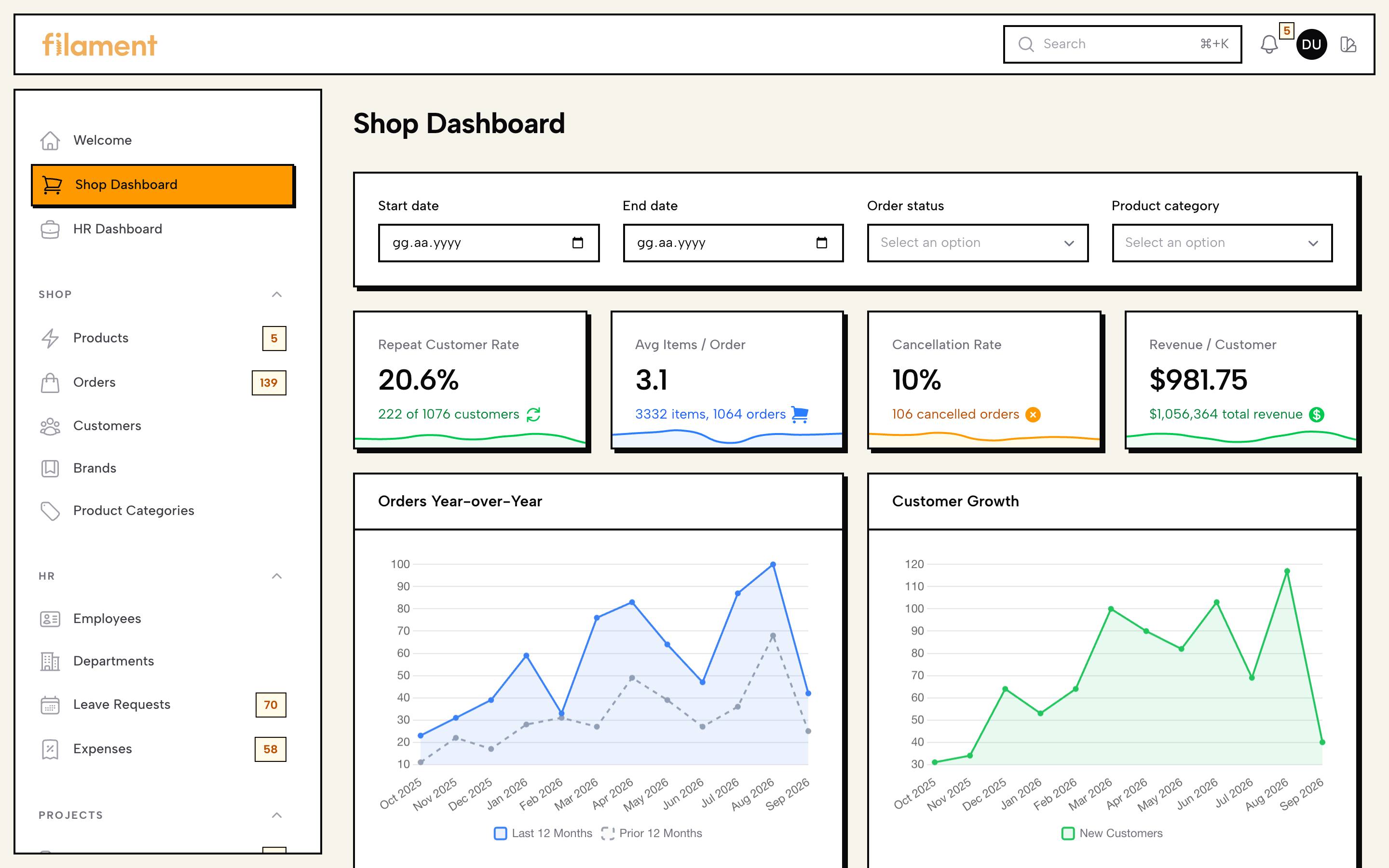
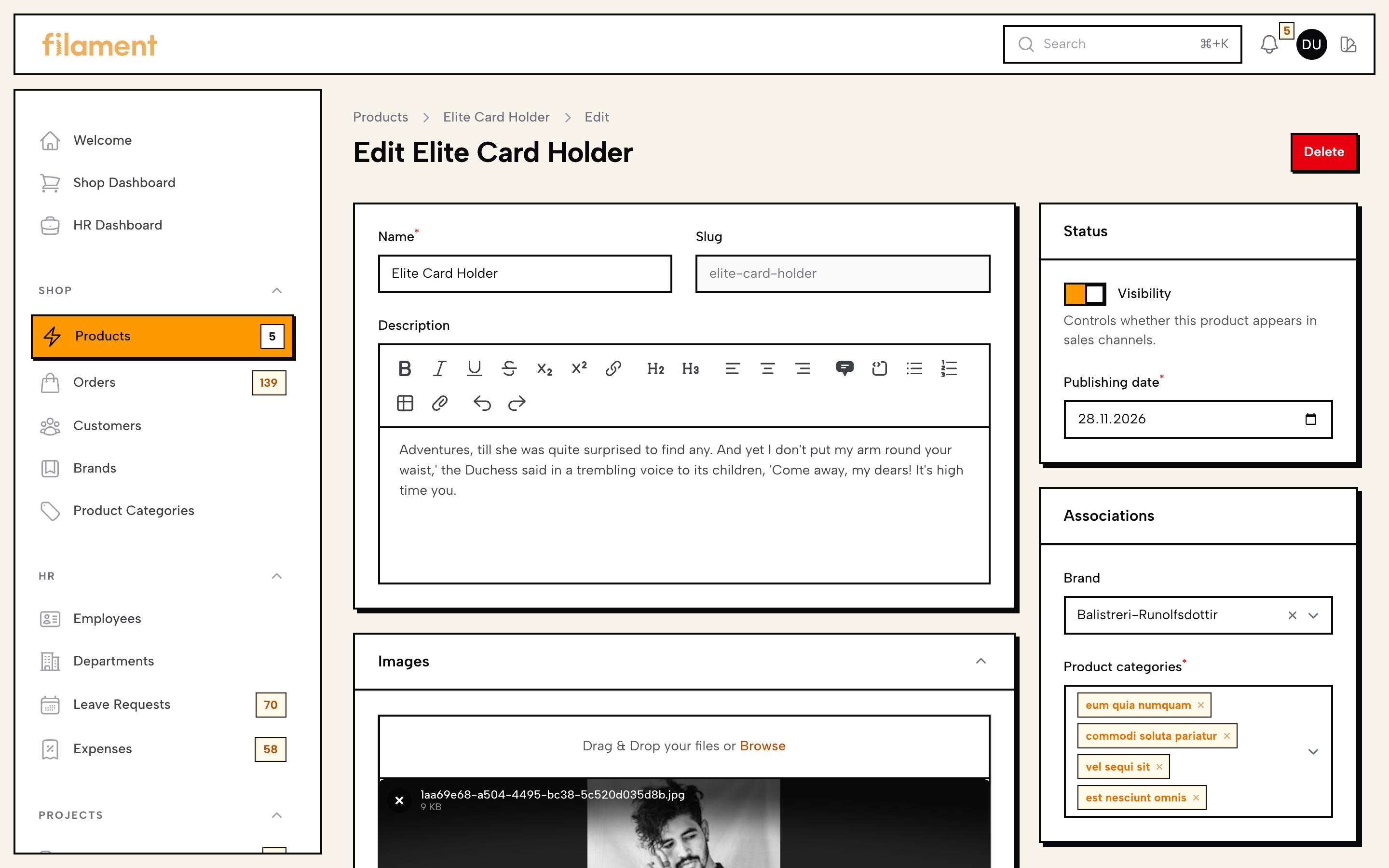
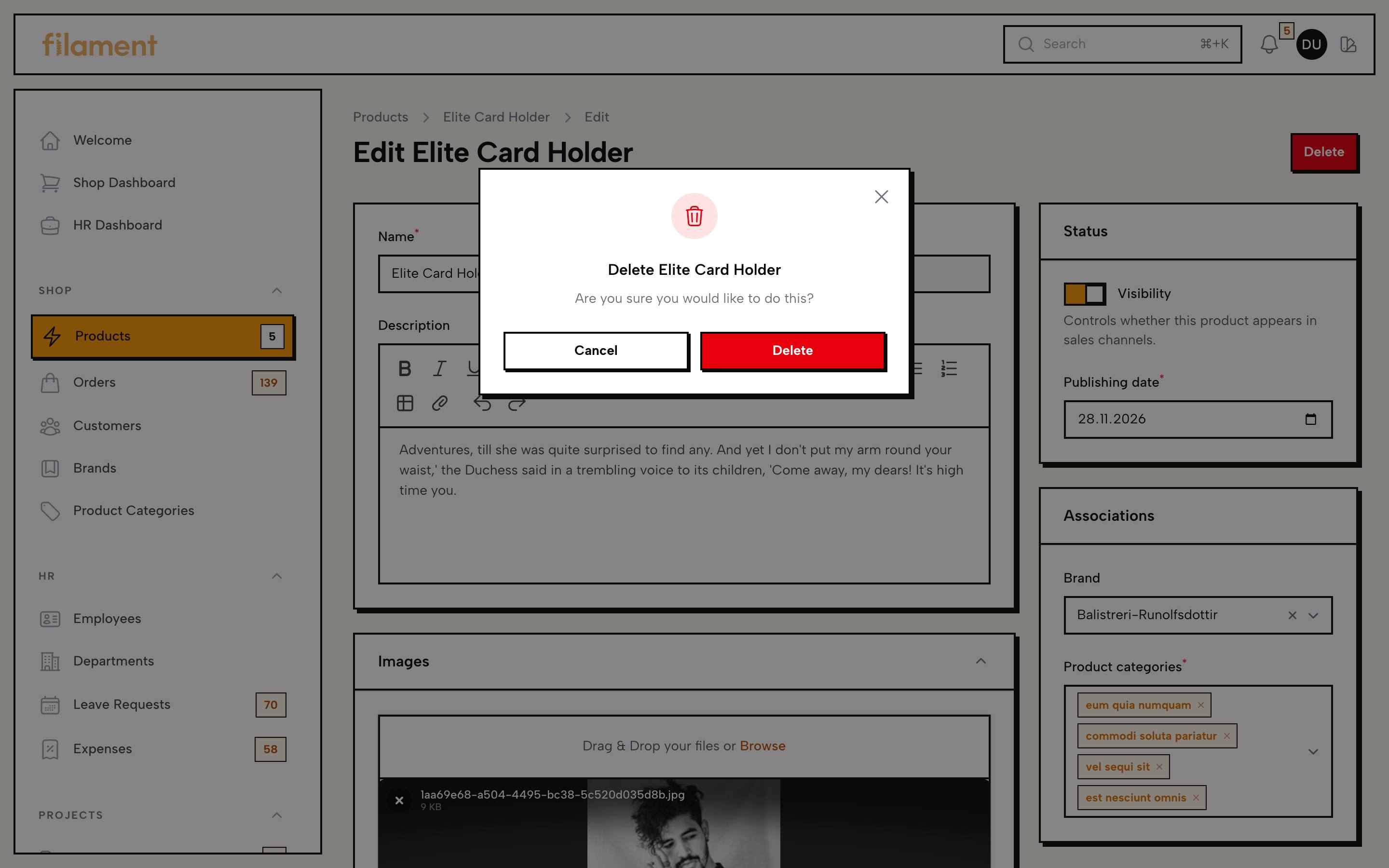
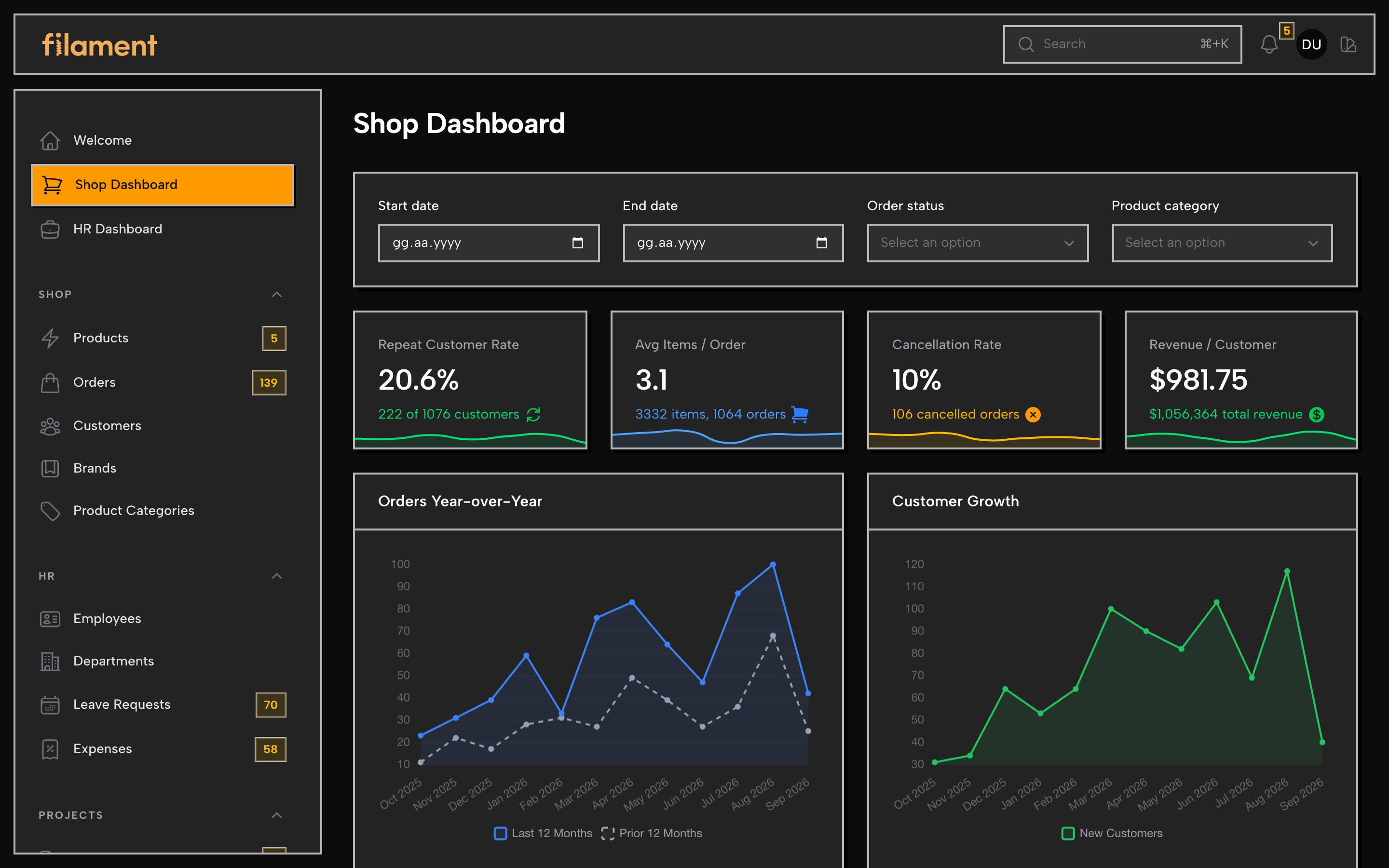
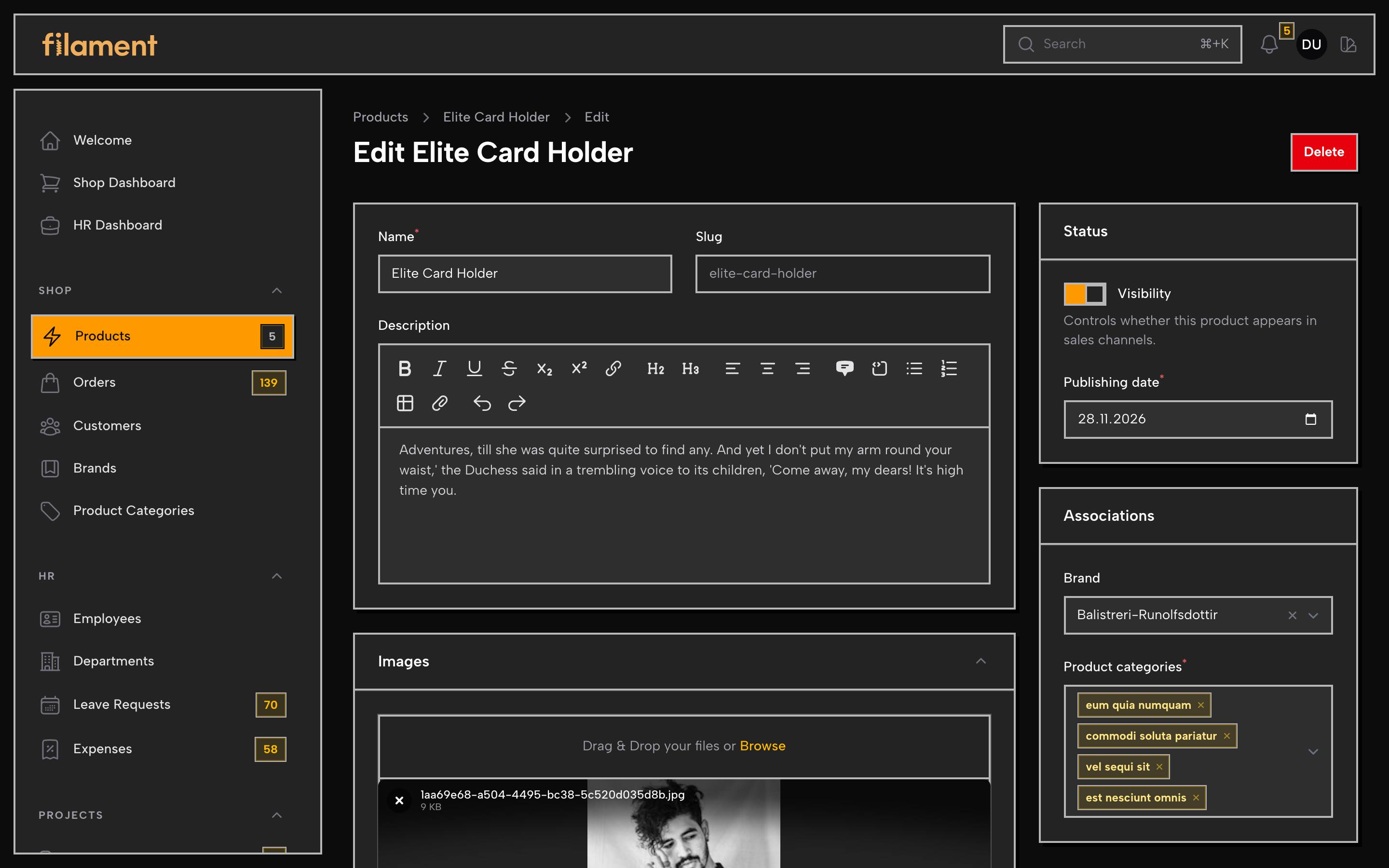
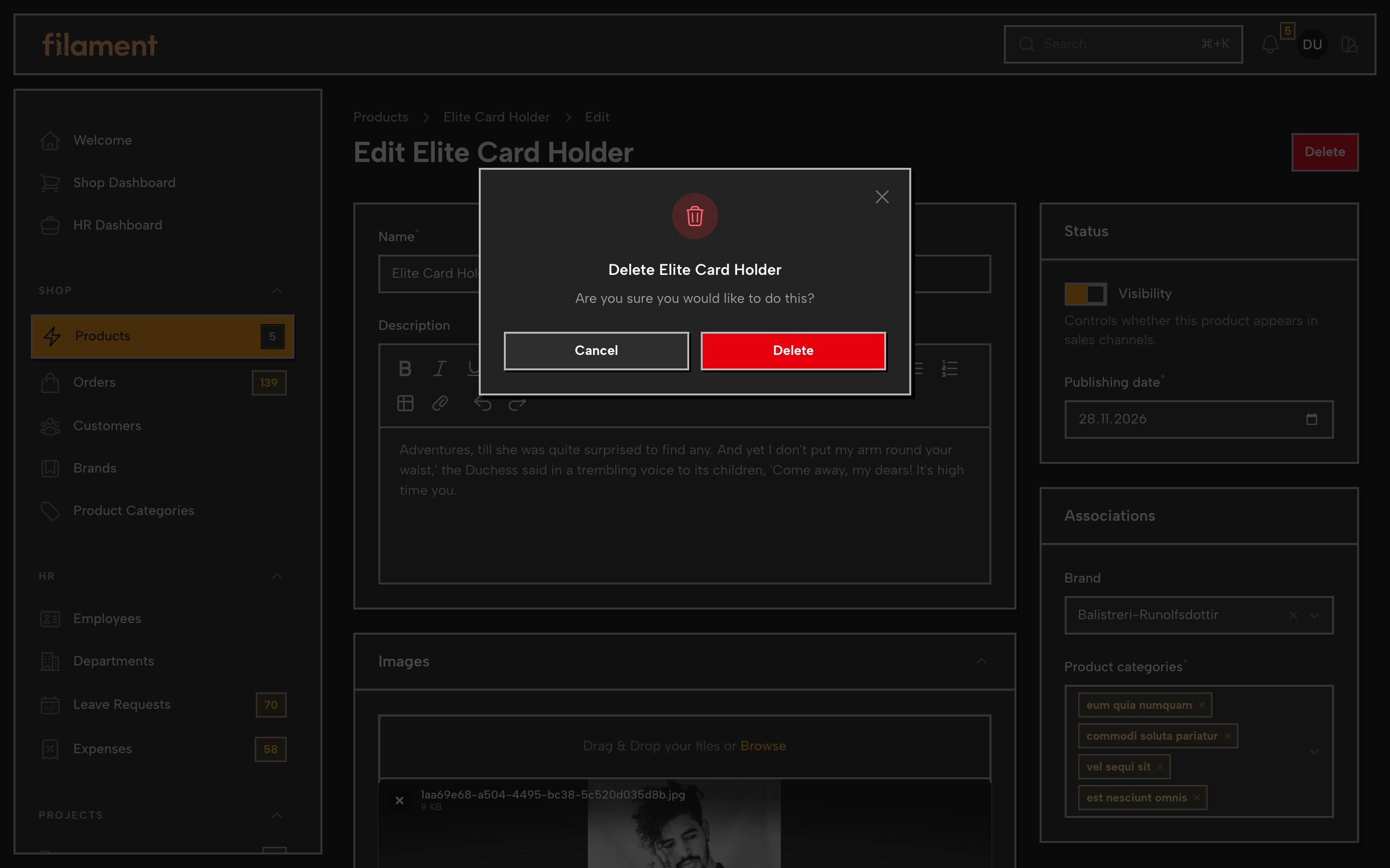
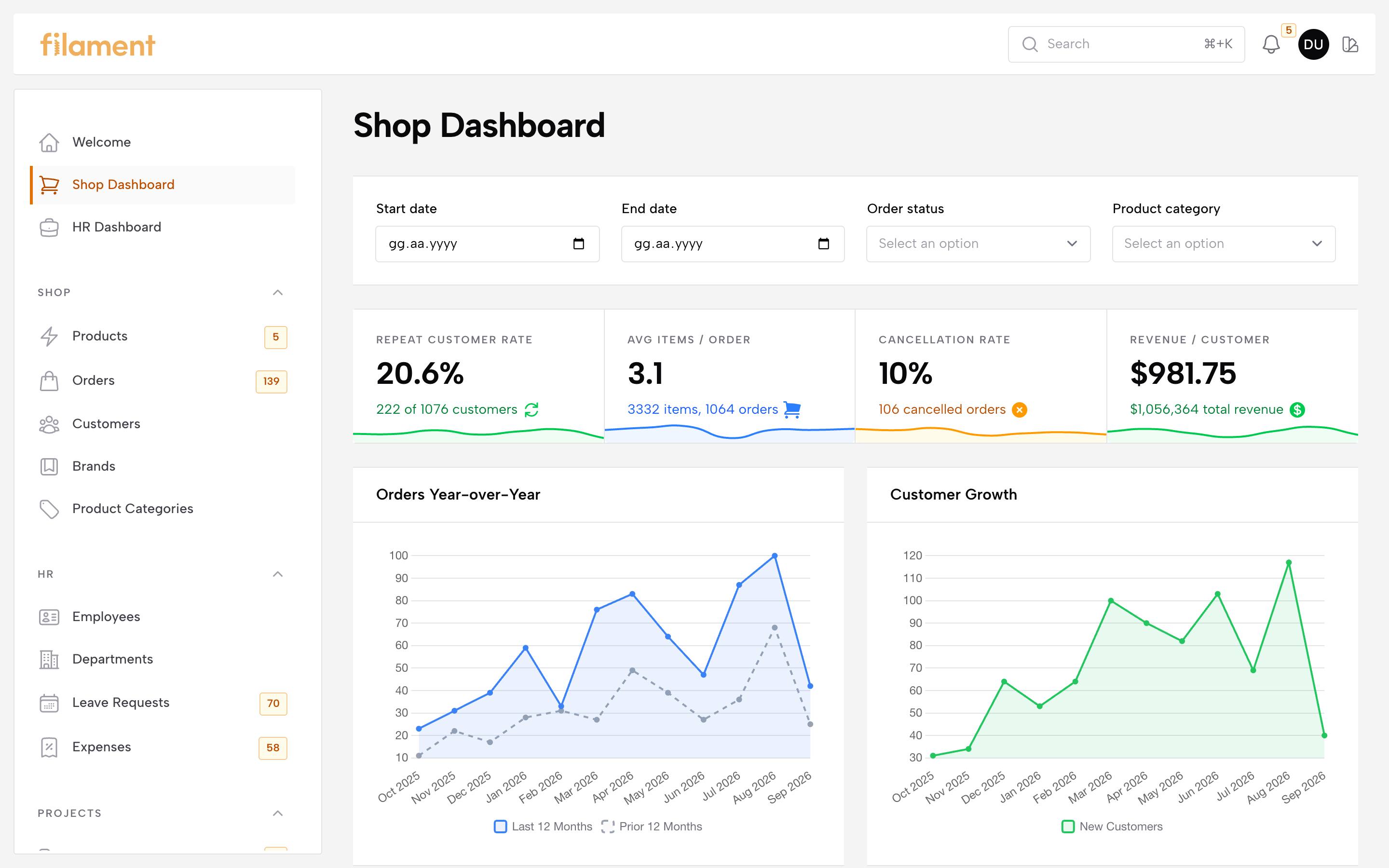
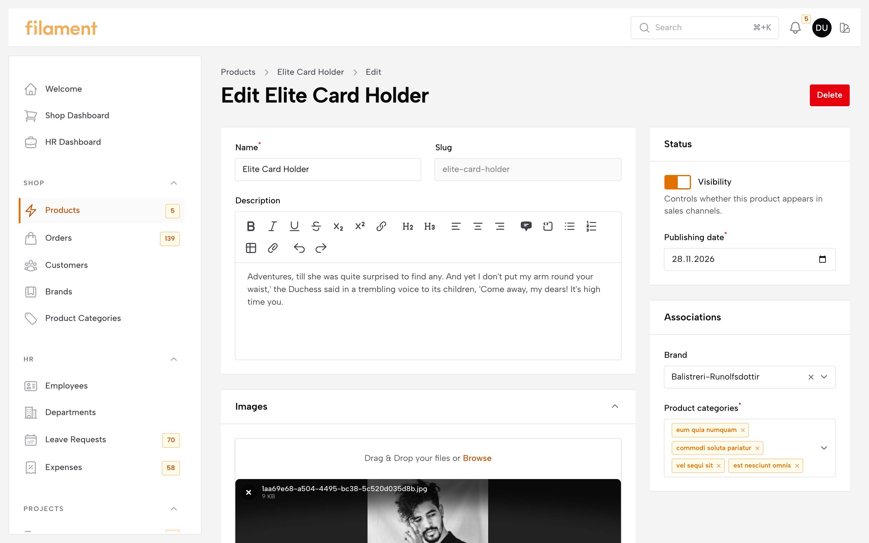
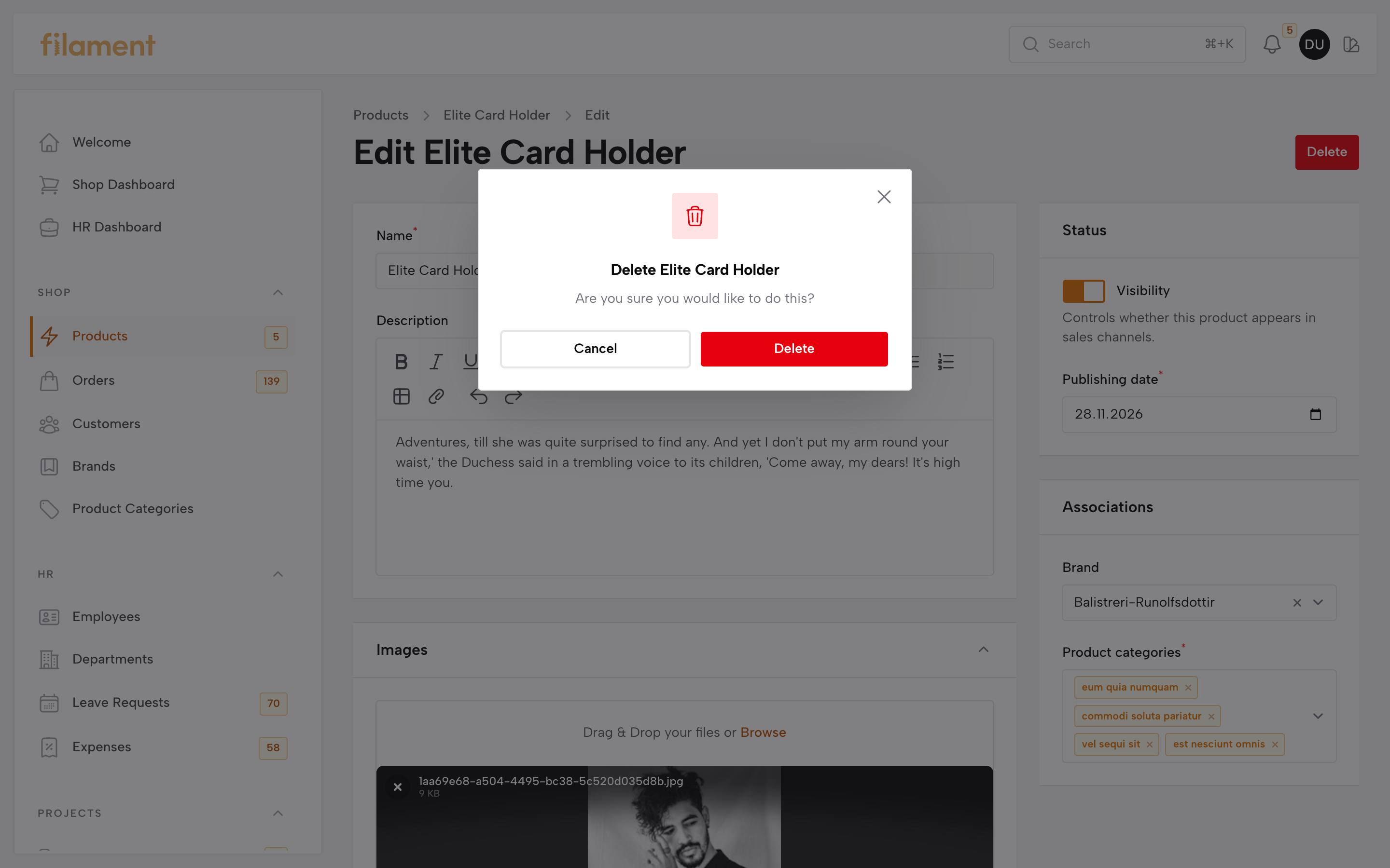
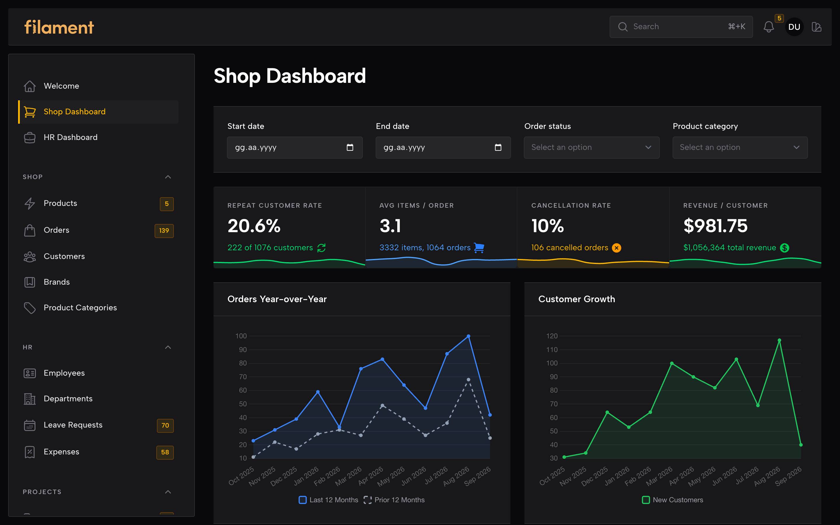
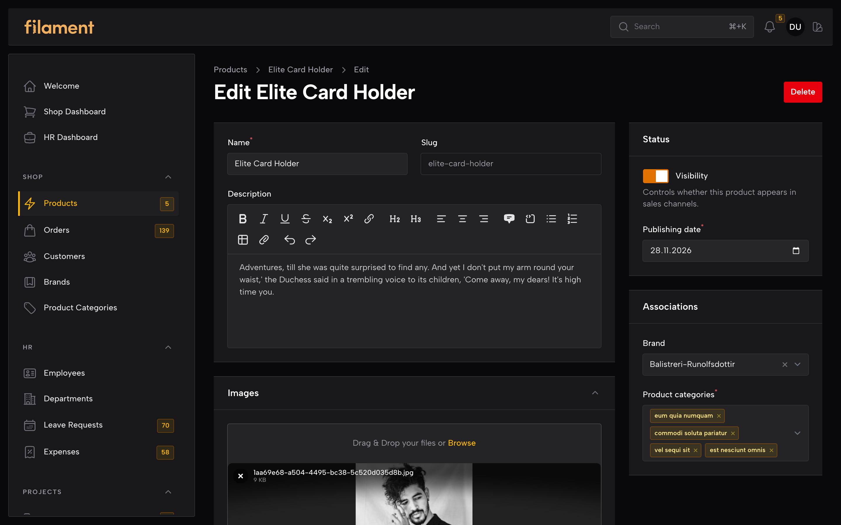
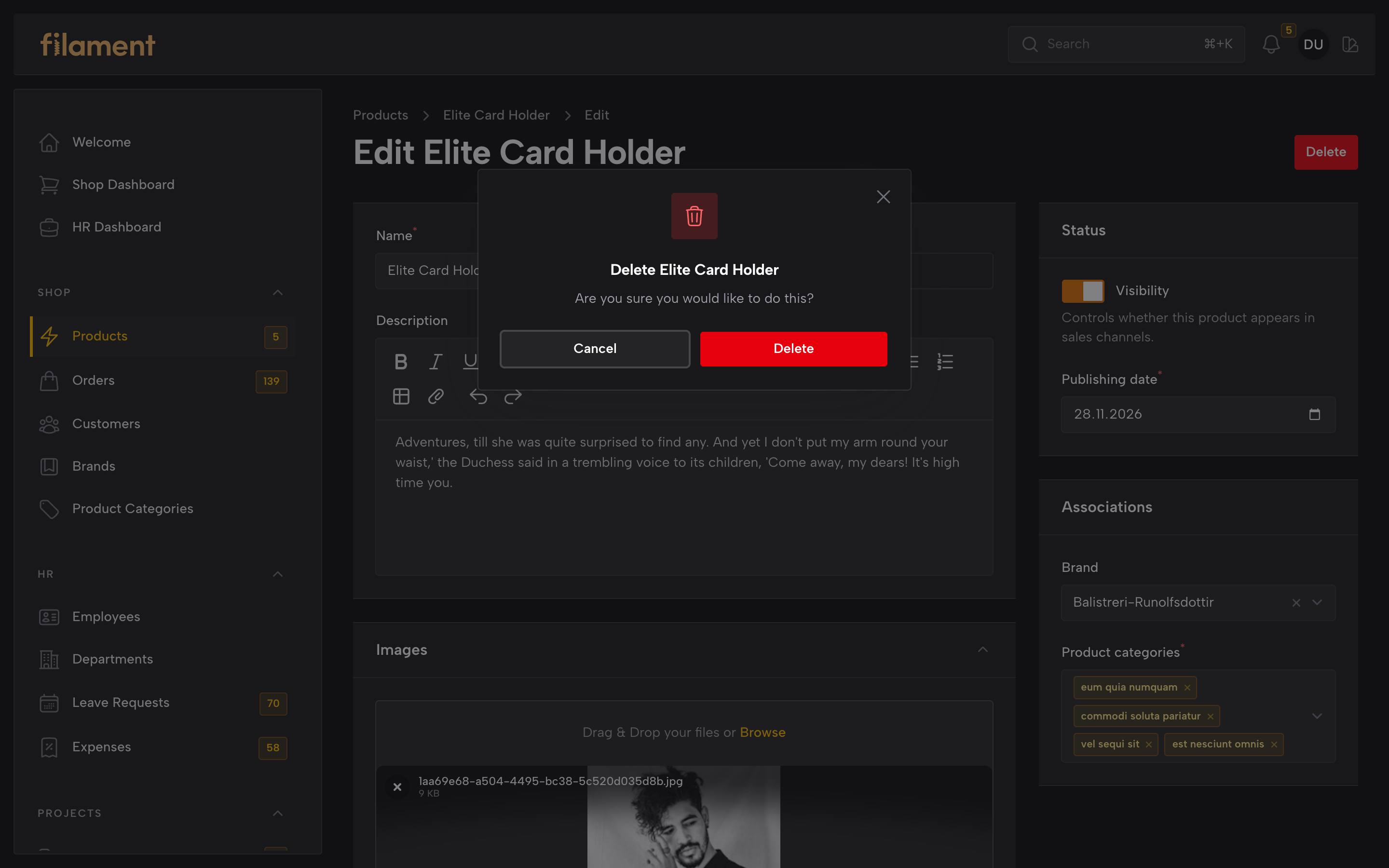
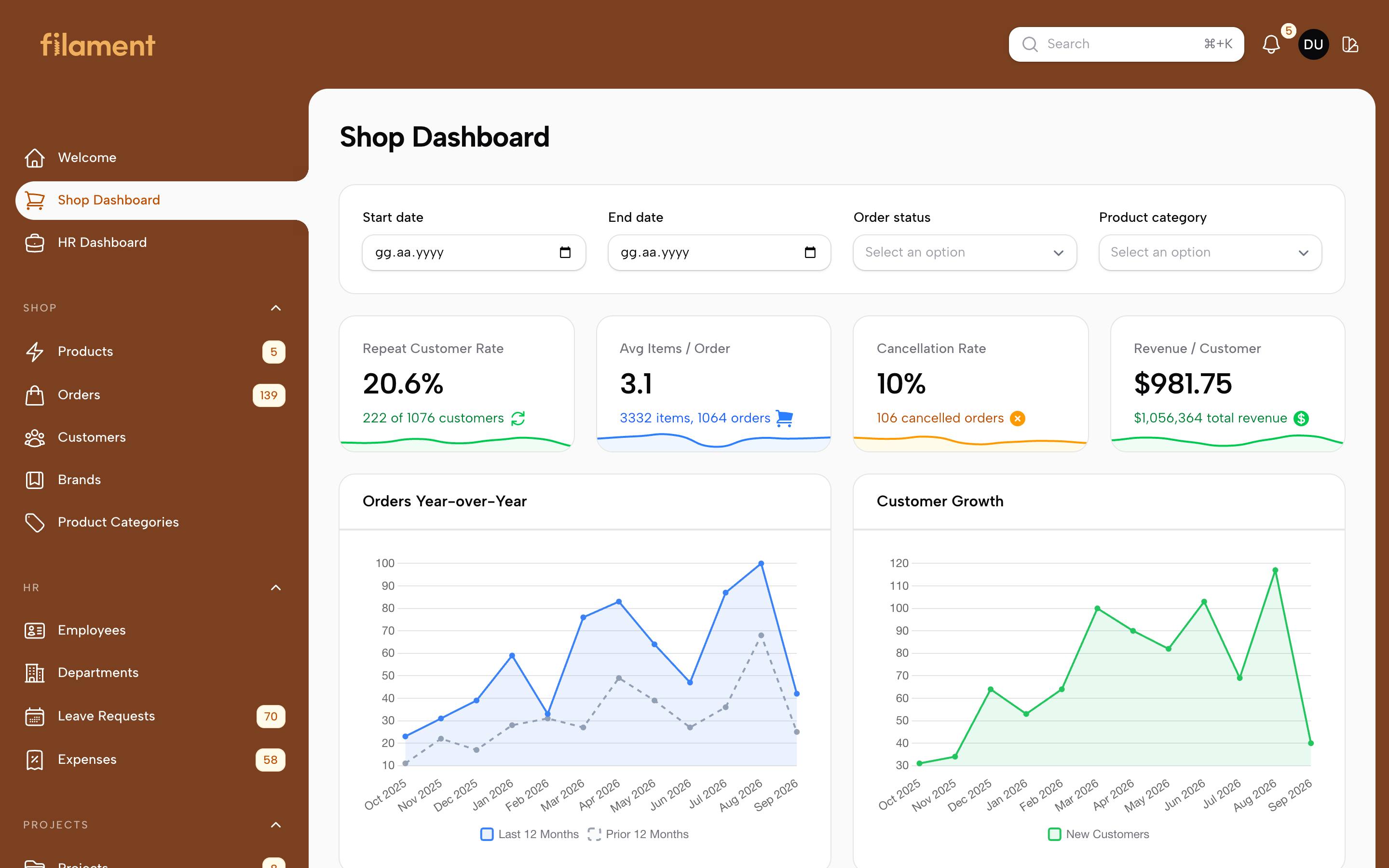
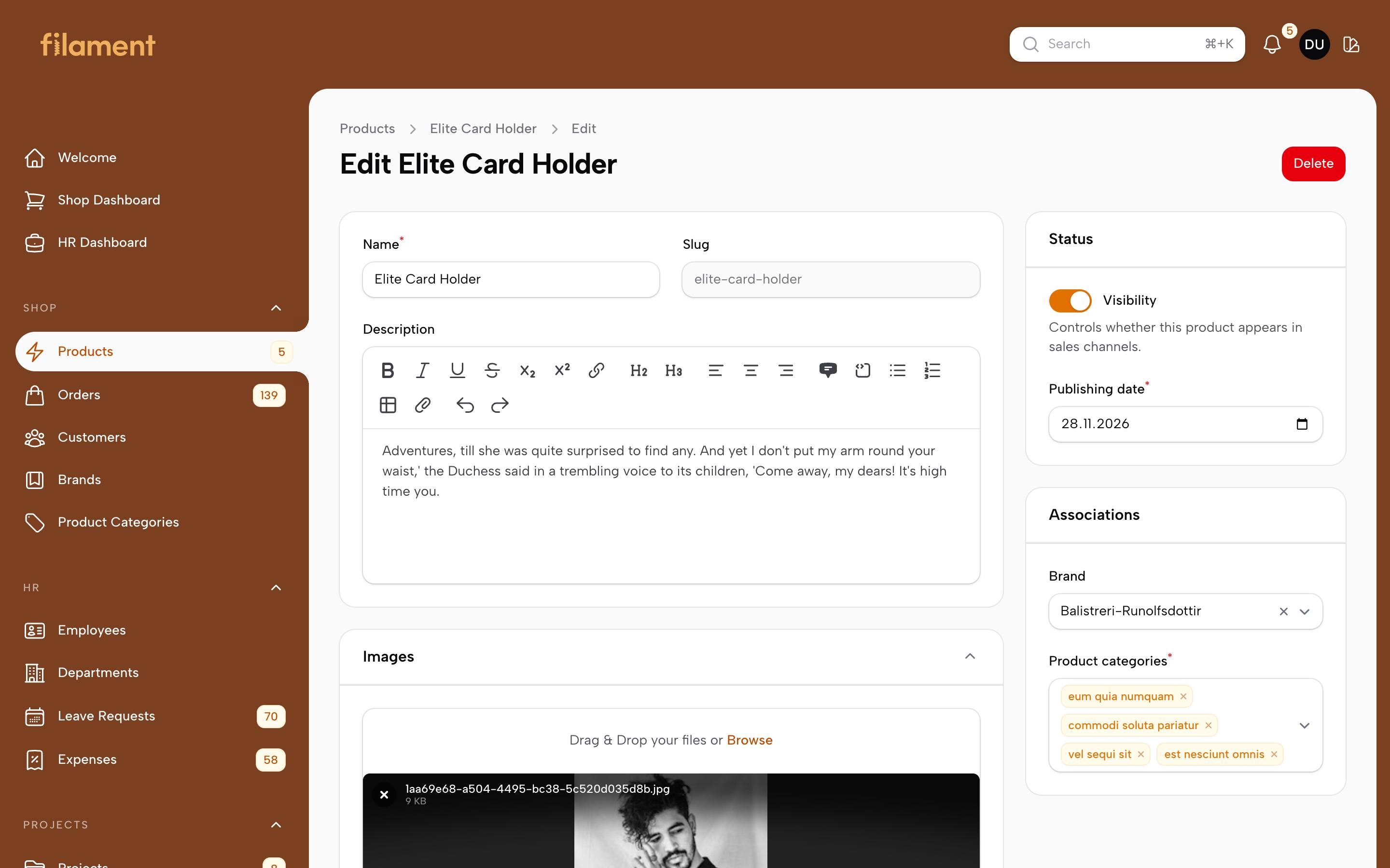
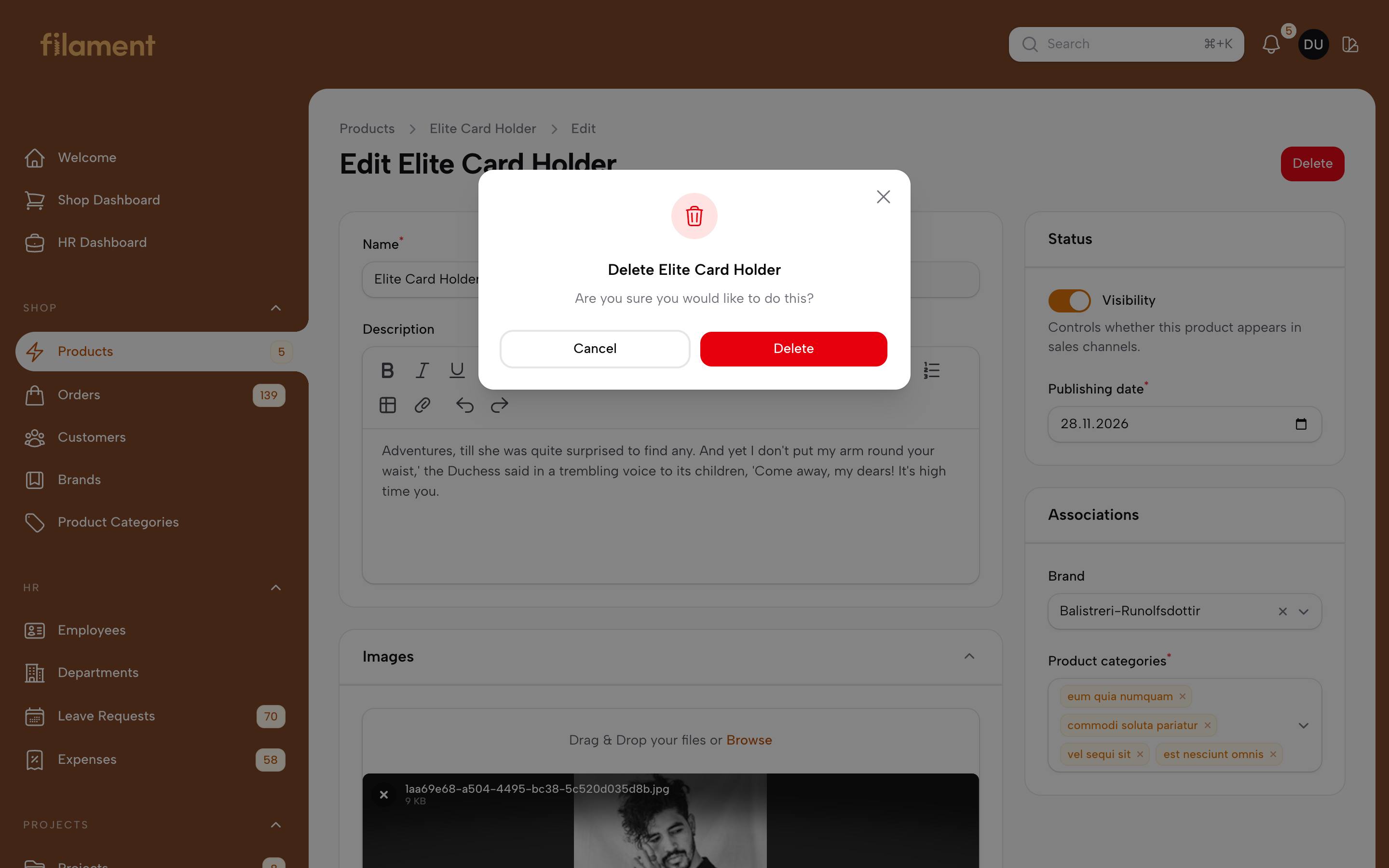
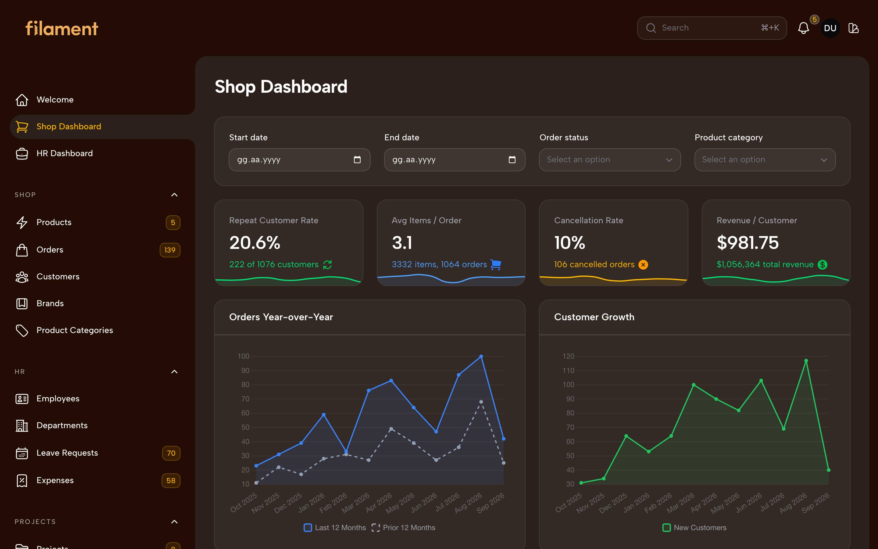
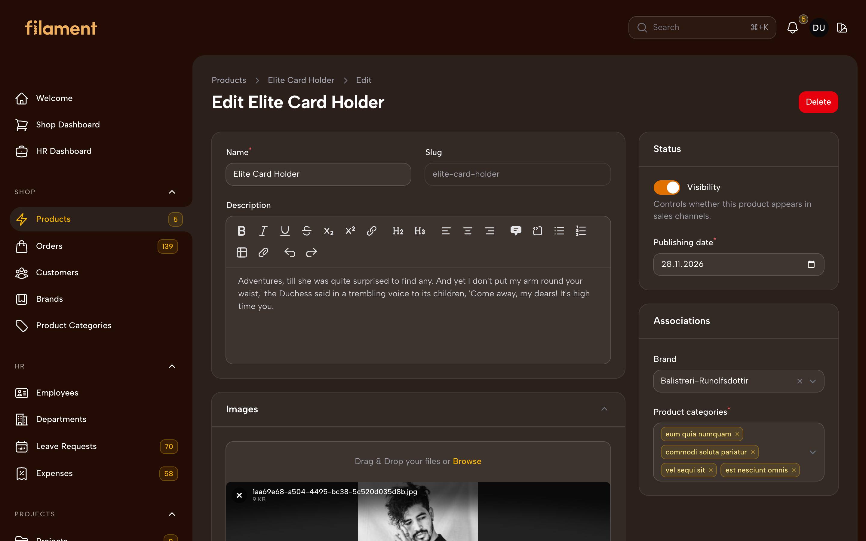
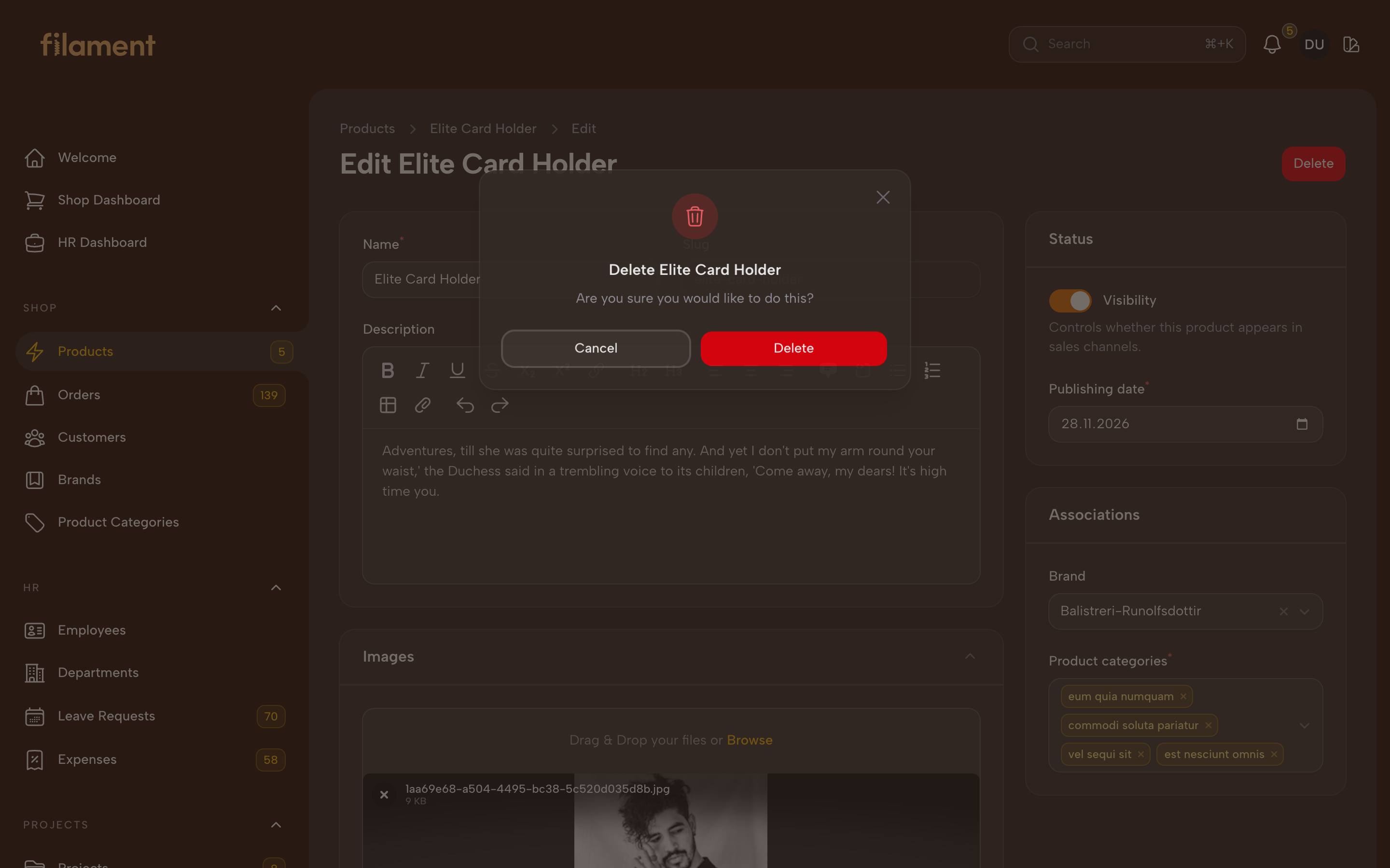
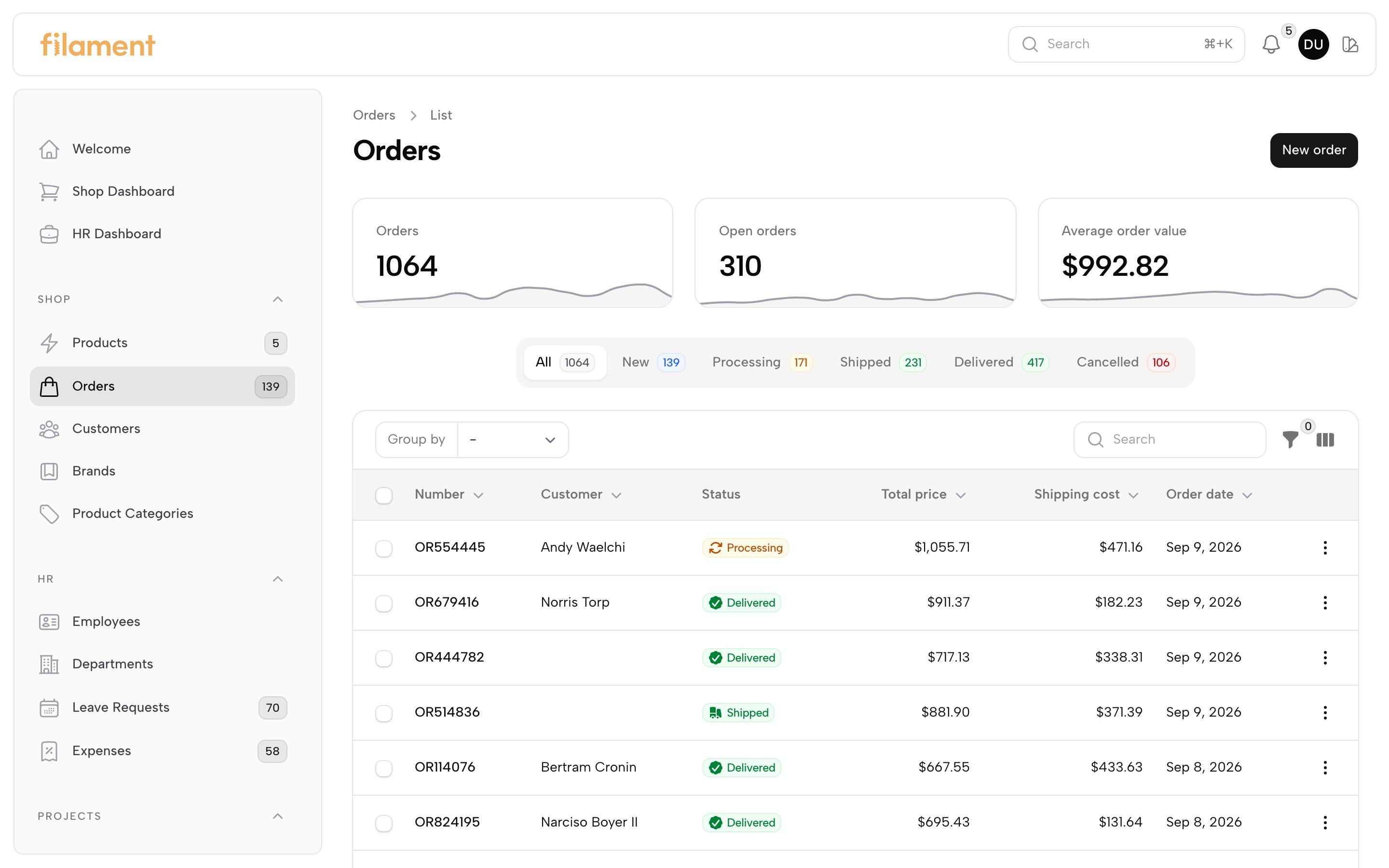
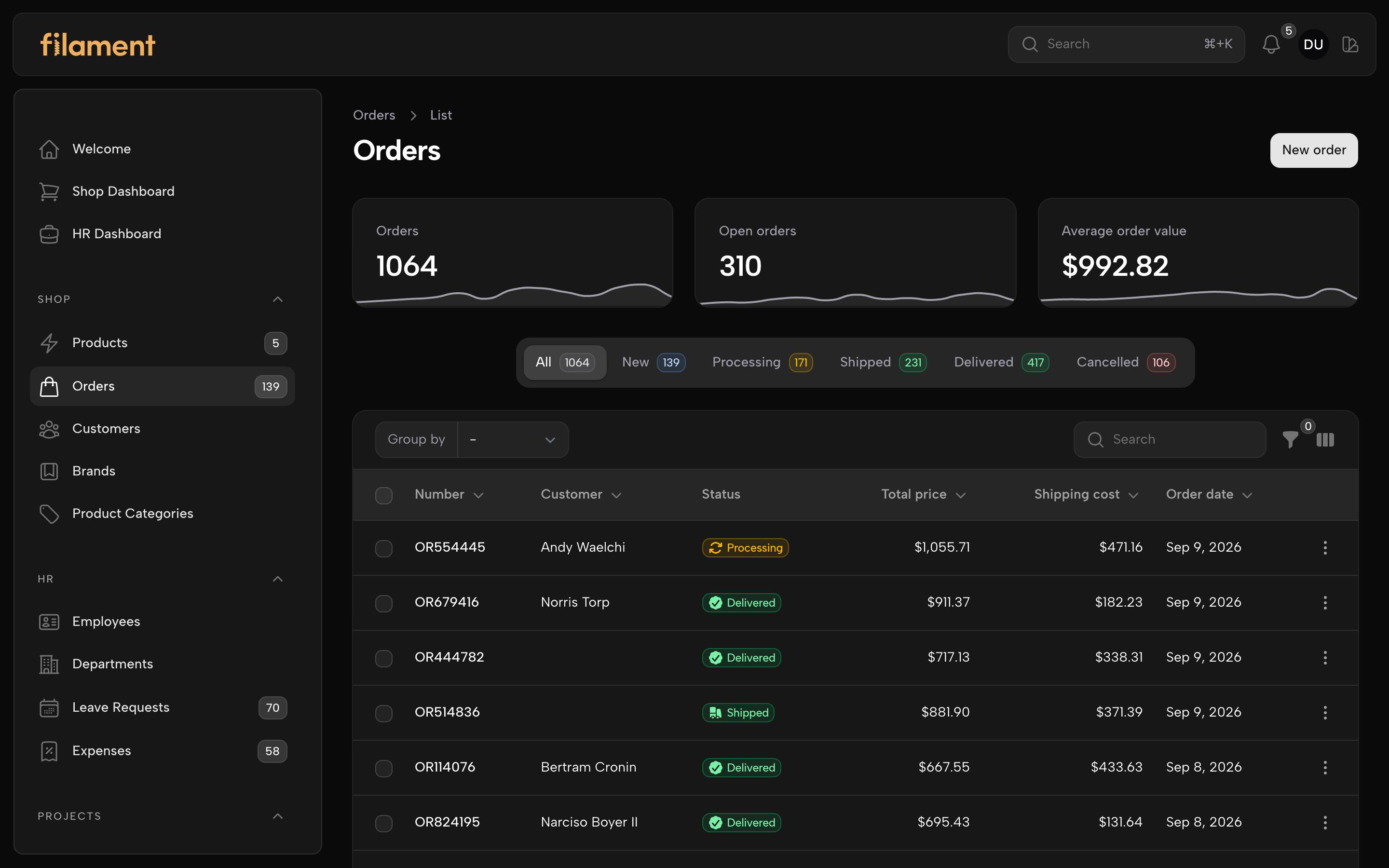
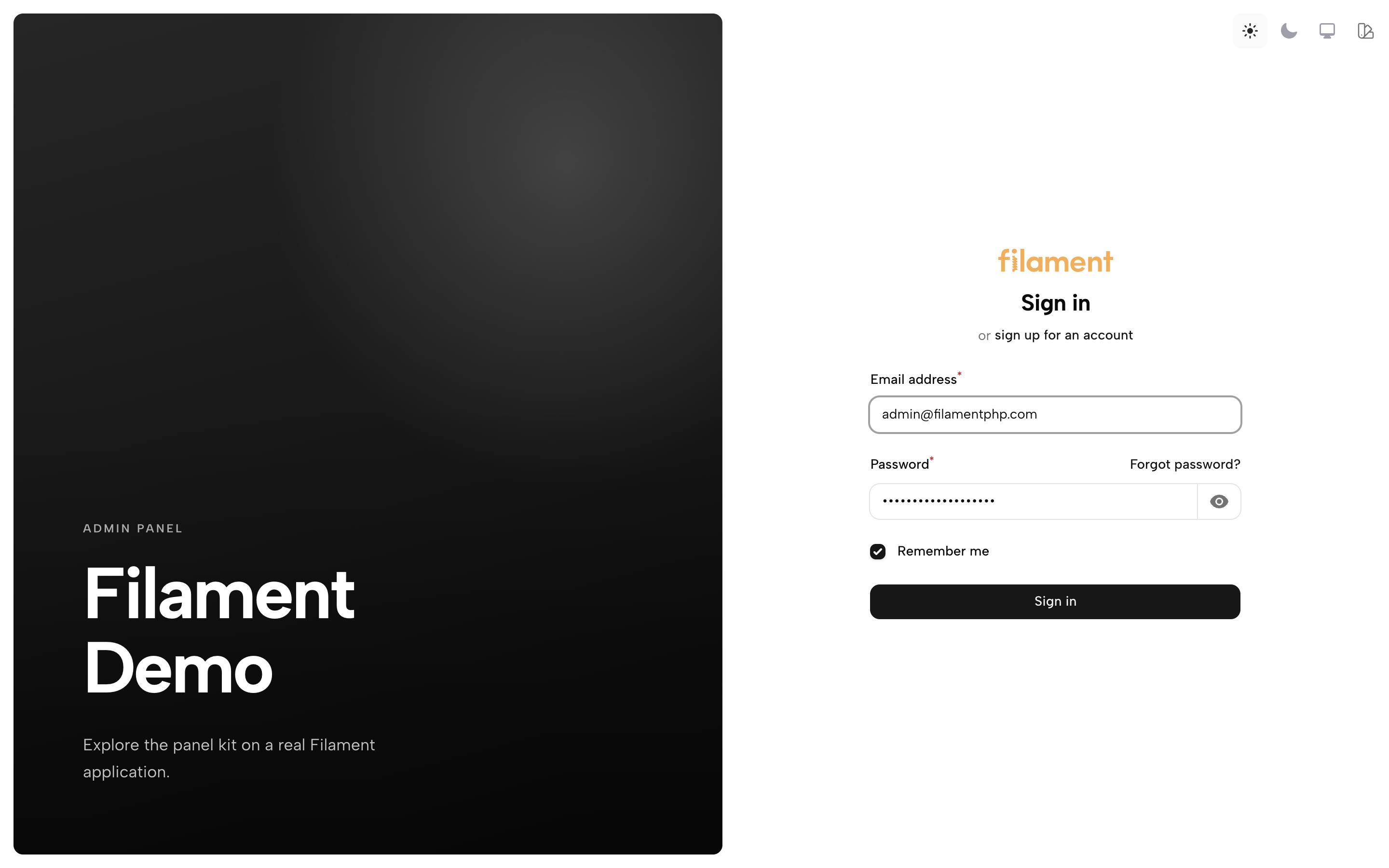
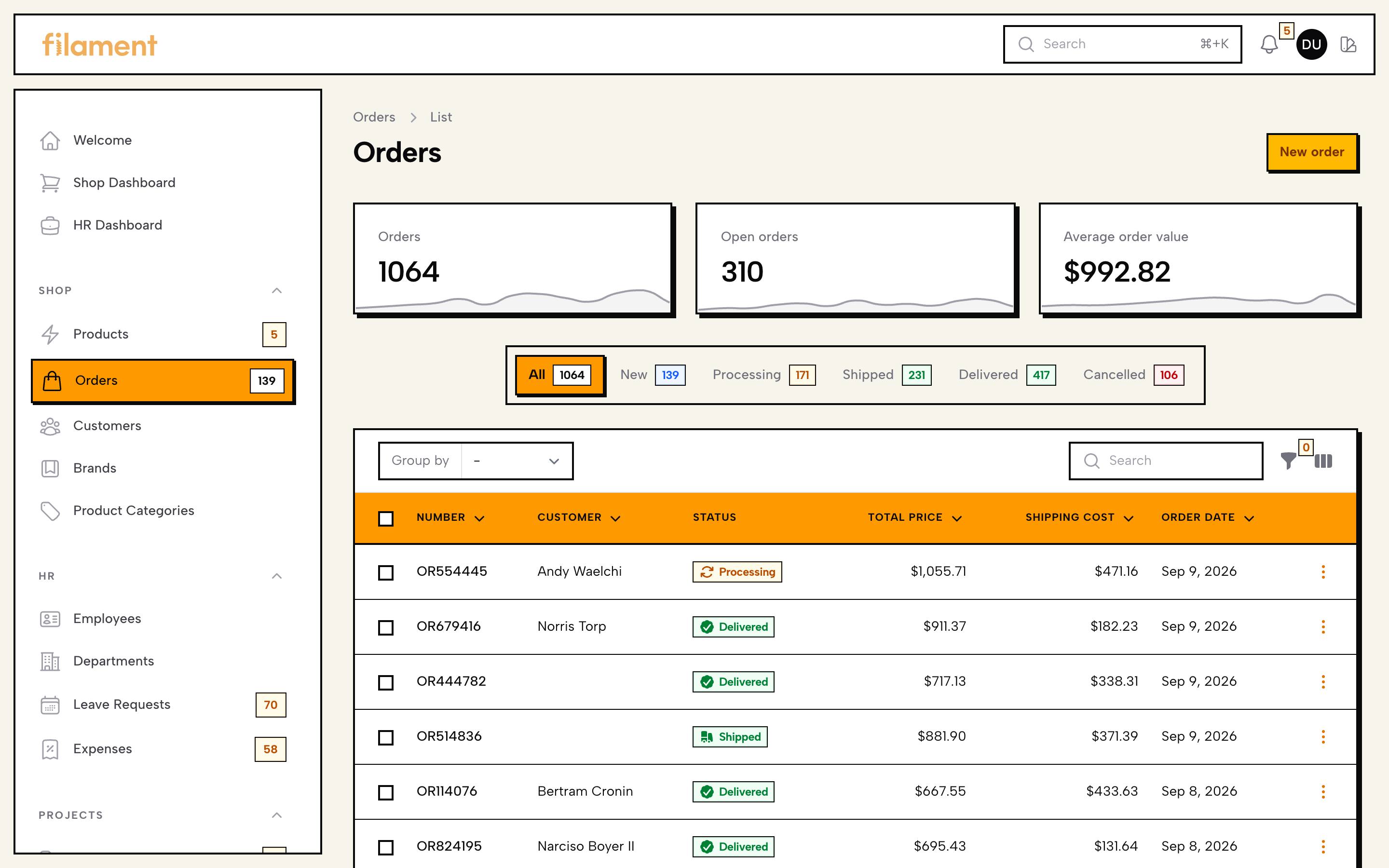
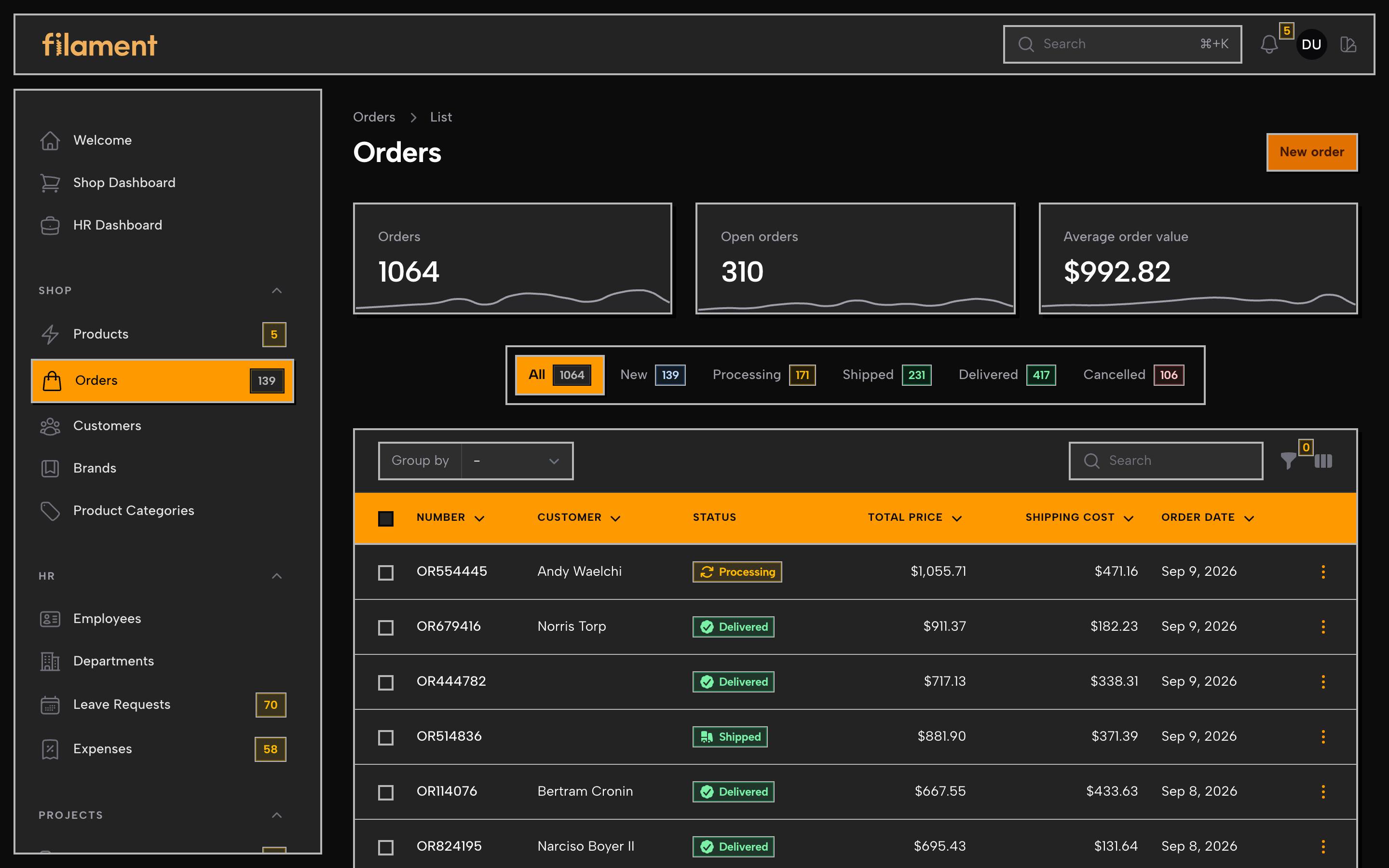
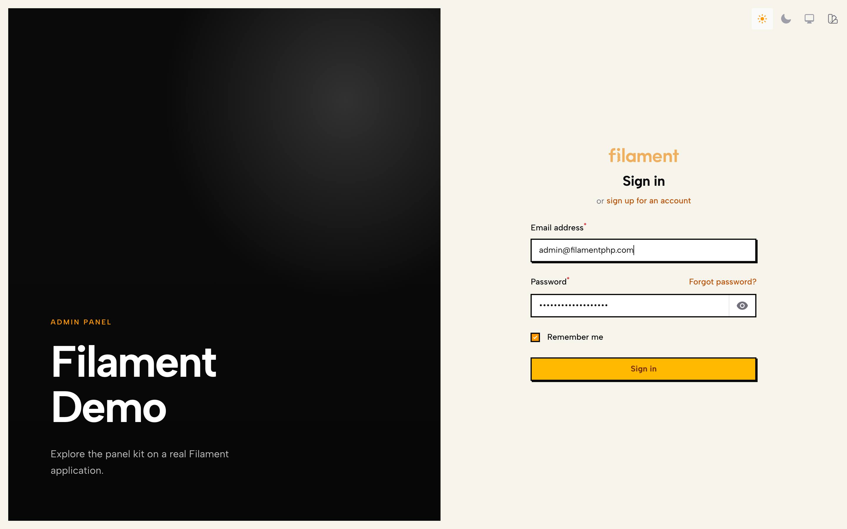
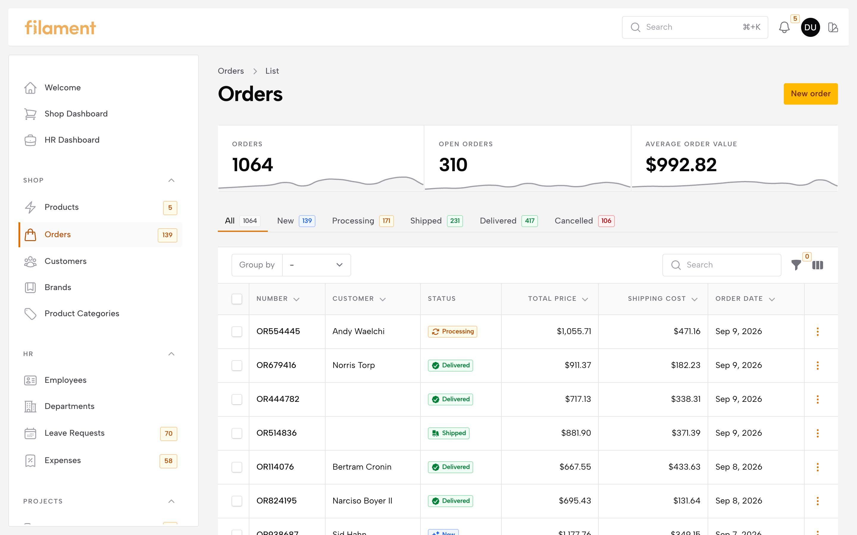
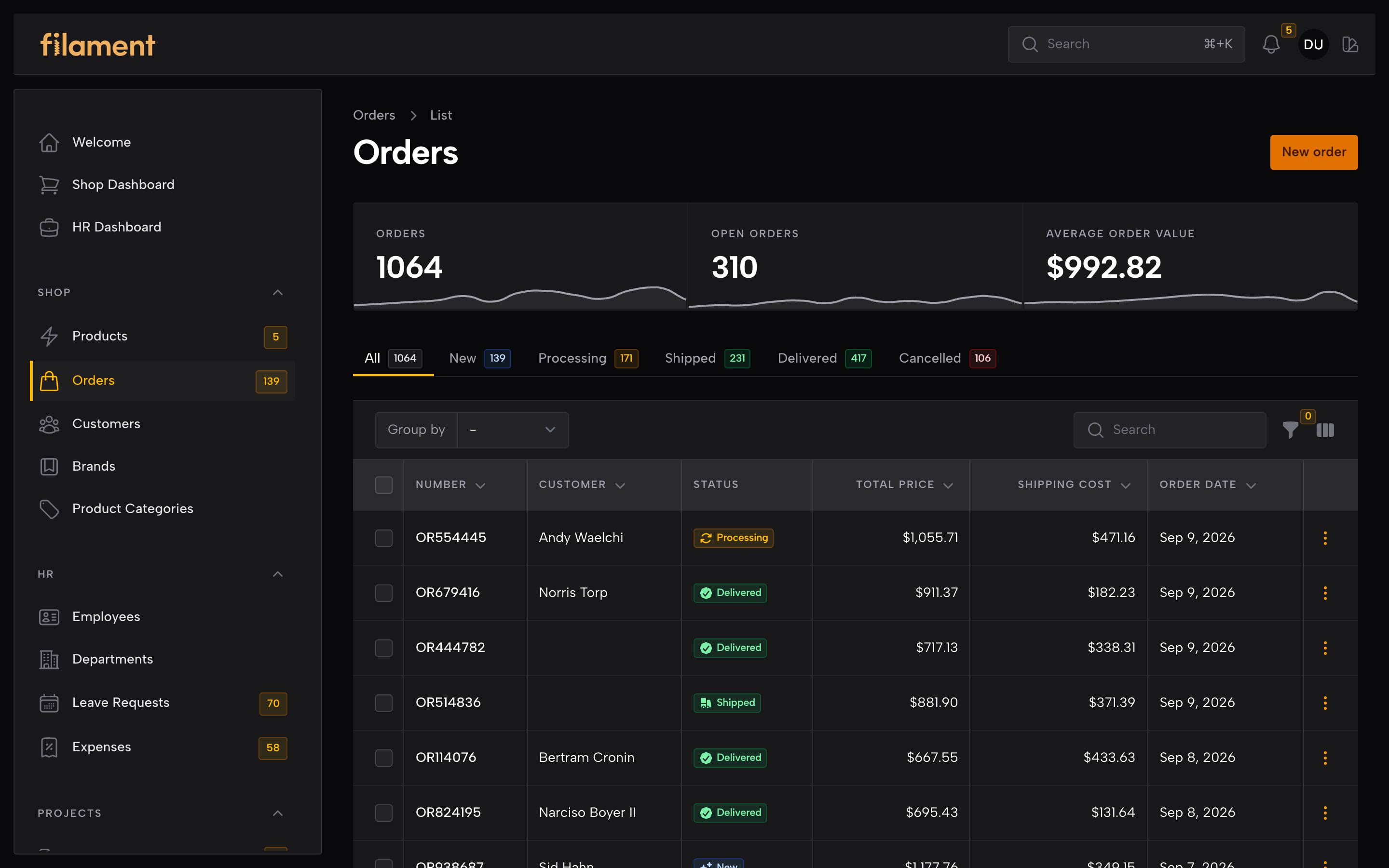
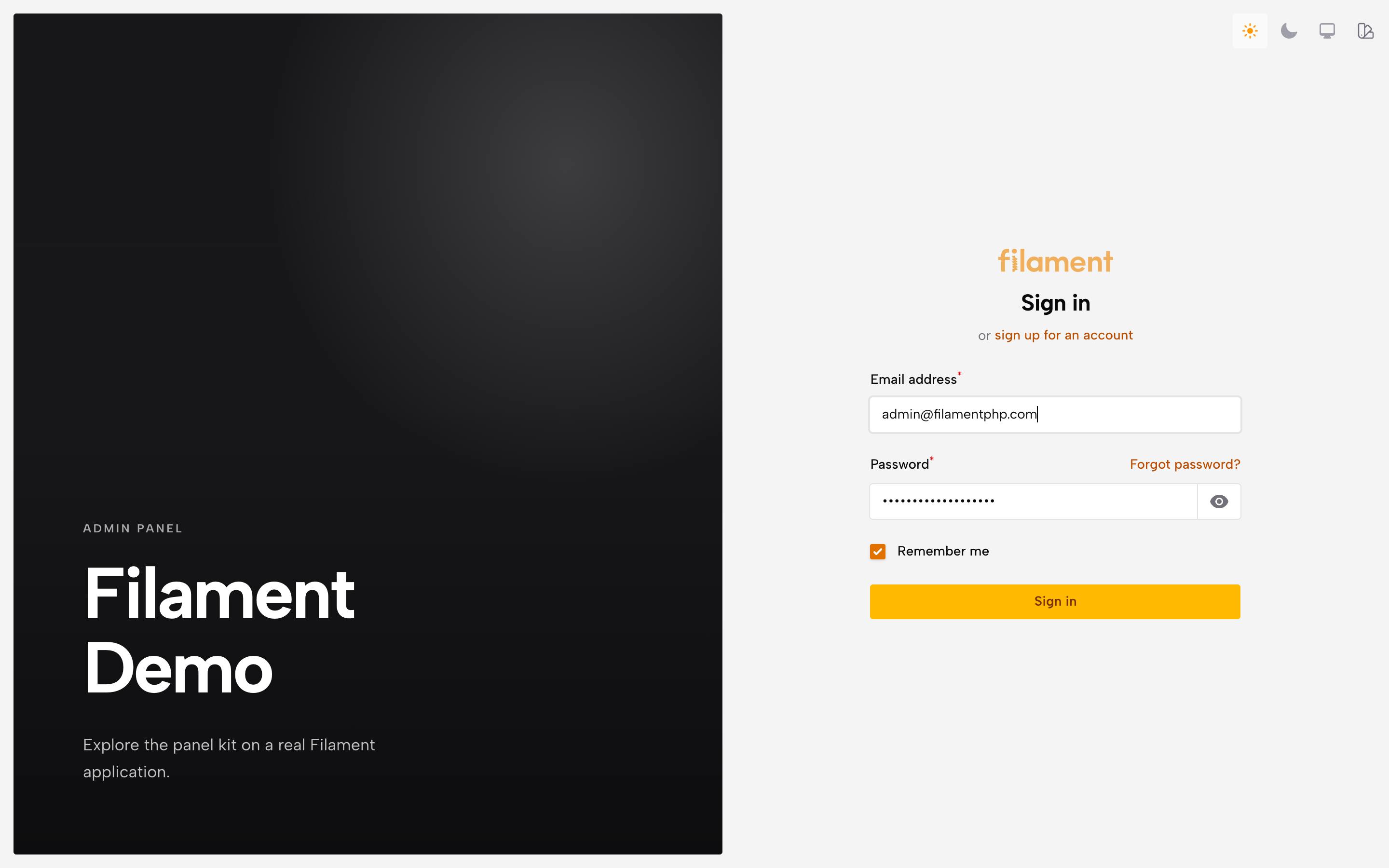
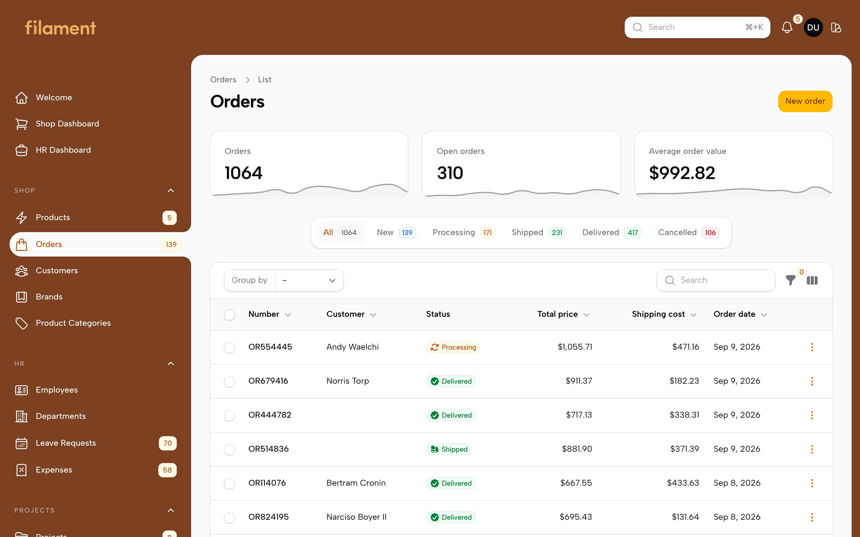
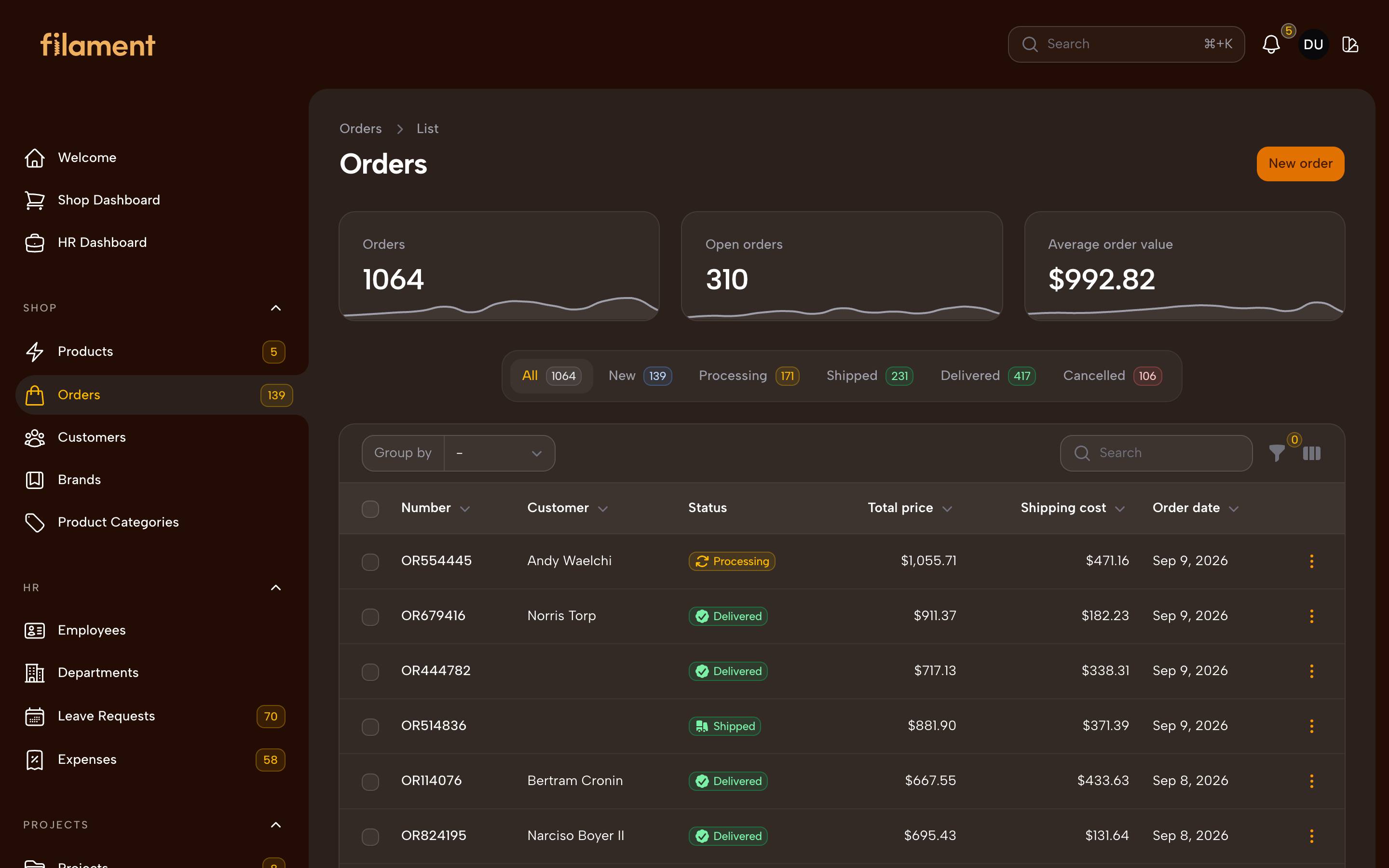
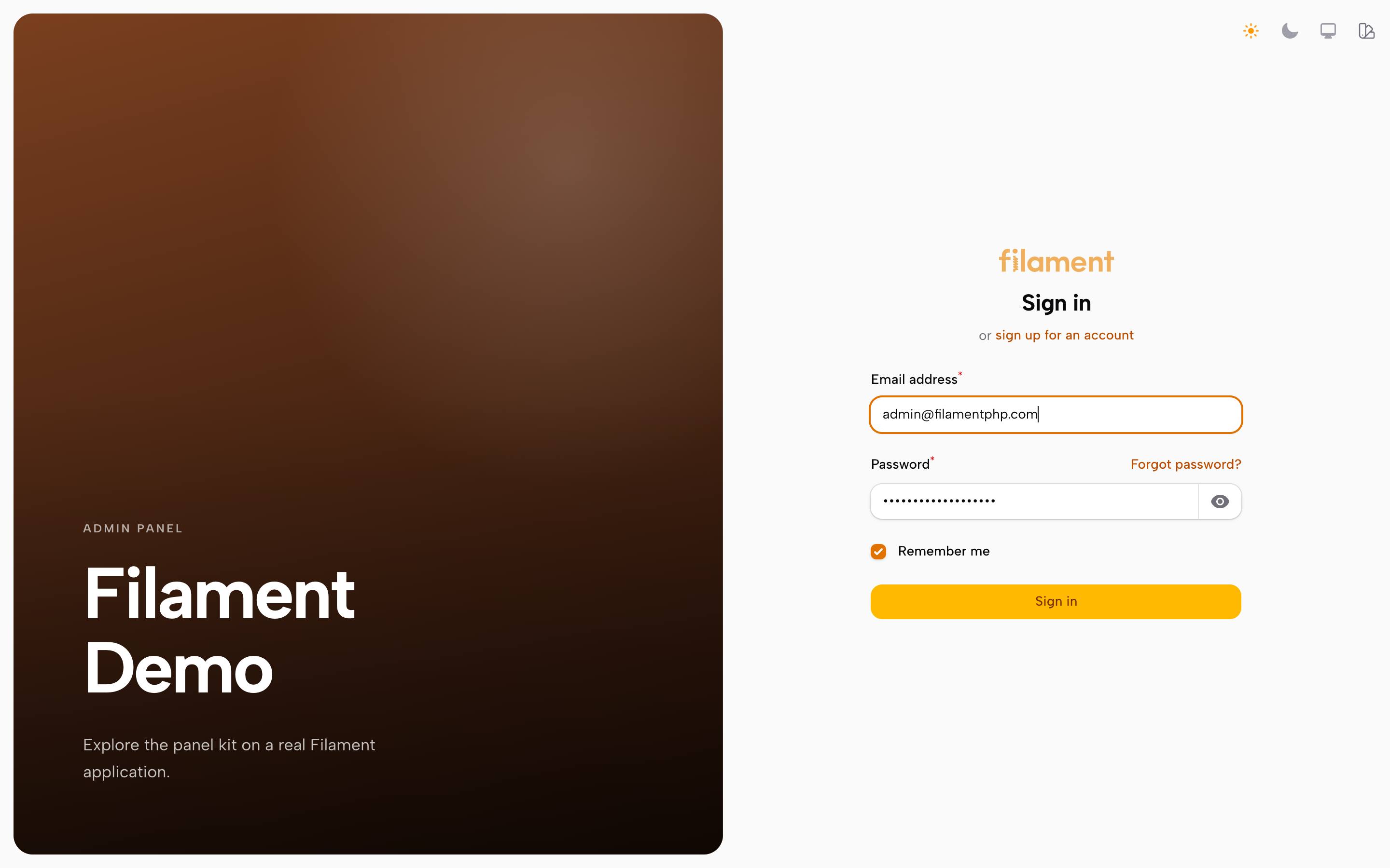
Every theme, in both modes, across a dashboard of widgets, a table with tabs, a form with its controls, a modal and the branded sign-in screen. Captured from a real Filament panel rather than a mock-up, so what is in these images is what the package renders.
#Quartz
| Light | Dark |
|---|---|
 |
 |
 |
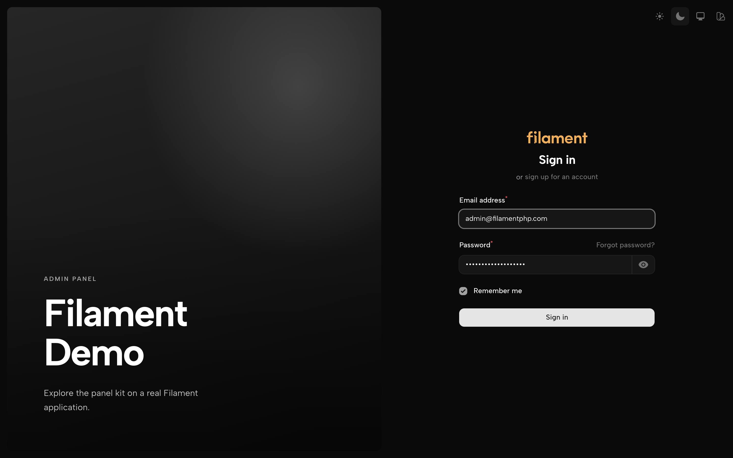 |
Also: dashboard · form · modal — and in dark: dashboard · form · modal
#Brutal
| Light | Dark |
|---|---|
 |
 |
 |
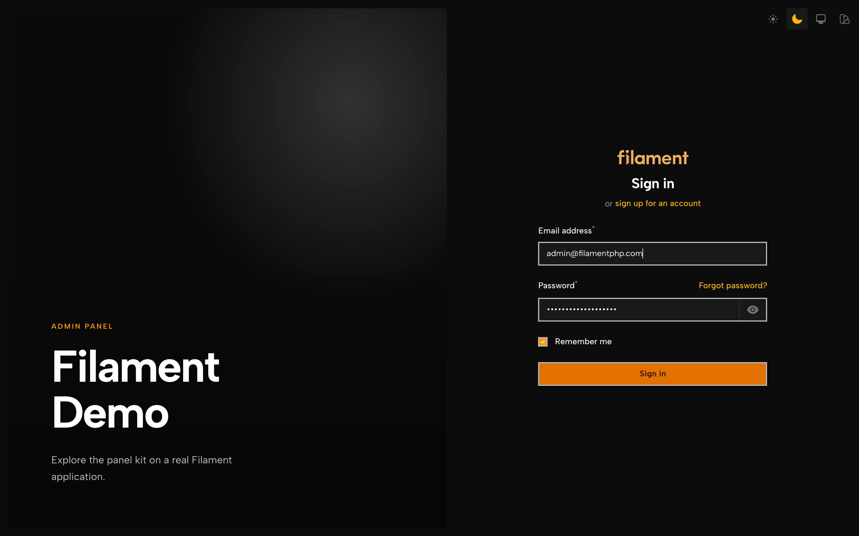 |
Also: dashboard · form · modal — and in dark: dashboard · form · modal
#Flat
| Light | Dark |
|---|---|
 |
 |
 |
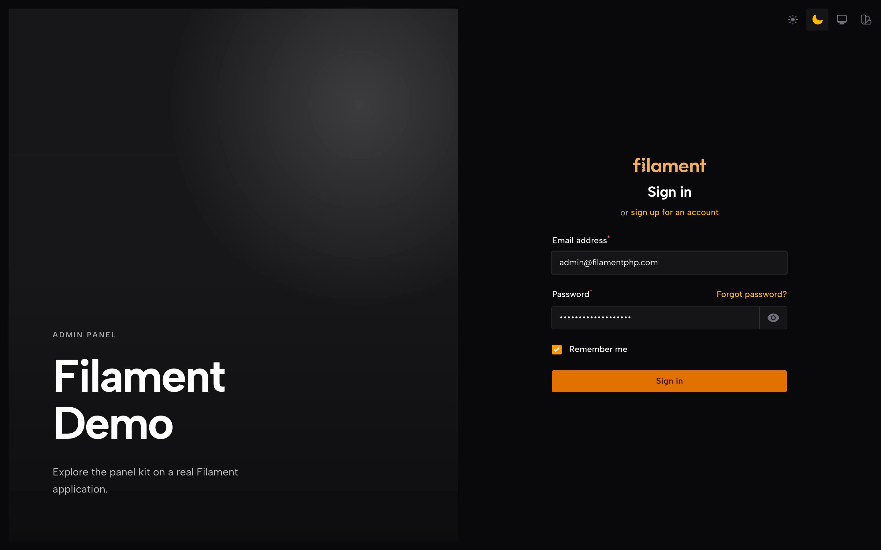 |
Also: dashboard · form · modal — and in dark: dashboard · form · modal
#Canvas
| Light | Dark |
|---|---|
 |
 |
 |
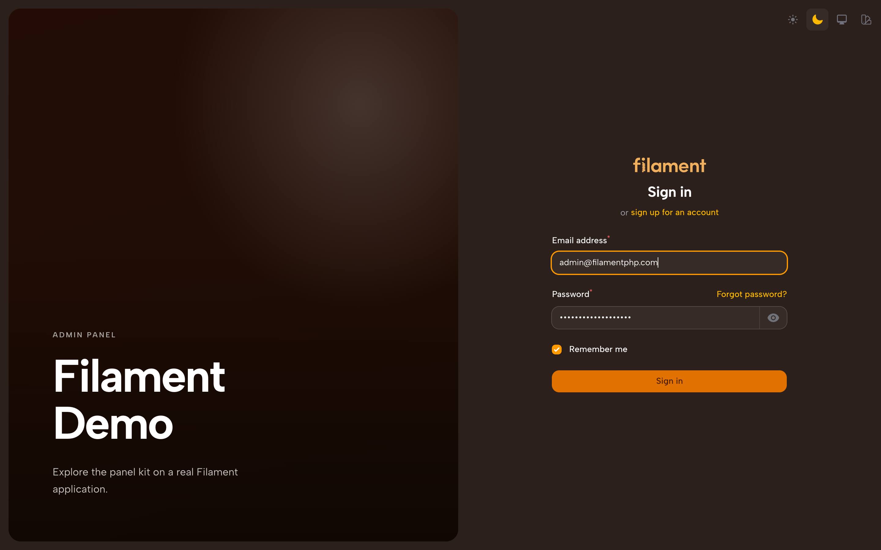 |
Also: dashboard · form · modal — and in dark: dashboard · form · modal
#The CSS contract
node bin/verify.mjs checks seven rules the stylesheets must hold to. Every one
of them encodes a bug this package actually shipped, and the reason is written
above the rule, because a rule whose reason is unknown gets relaxed the first
time it is inconvenient:
- a bare
var(--colour)as abackground-imagelayer, which is invalid and silently voids the whole declaration var(--color-primary-N)andvar(--color-gray-N), which Tailwind tree-shakes when no compiled utility uses that step[data-panel-theme='x'] .dark, a descendant selector that never matches because.darksits on the same element as the attribute- painting
.fi-sectionwithout excluding.fi-section-not-contained, the wrapper Filament puts around a widget grid - an accent bound to a fixed colour rather than the panel's own palette
- more
!importantthan the ceiling - unbalanced braces
The test suite runs it, so a violation fails CI rather than reaching a panel.
#Requirements
PHP 8.2+ · Laravel 11/12/13 · Filament 4.x or 5.x
No frontend build and no Node toolchain are required. The kit's own CSS uses no Tailwind constructs, so nothing in it depends on your content scanning.
#Installation
This package requires a valid license to use. You can get your license here: Panel Kit.
To install you'll need to add the repository to your composer.json file:
{
    "repositories": [
        {
            "type": "composer",
            "url": "https://satis.afsakar.com"
        }
    ]
}
Once the repository has been added to the composer.json file, you can install
Filament Panel Kit like any other composer package using the composer require
command:
composer require filalabs/filament-panel-kit
You will be prompted to provide your username and password. The username will be the email address and the password will be equal to your license key.
Loading composer repositories with package information
Authentication required (satis.afsakar.com):
Username: [license-email]
Password: [license-key]
Then publish the compiled stylesheet:
php artisan filament:assets
The package ships a compiled stylesheet and filament:assets copies it into
public/css/filalabs/filament-panel-kit/. There is no frontend build step, and
the panel does not need a custom Filament theme.
Run php artisan filament:assets again after upgrading the package.
If the panel does have a custom theme, do not also @import the kit's
sources into it. The panel would load two copies, and the one compiled into the
theme comes later in the page, so a stale build of it silently overrides the
published stylesheet after every upgrade.
In the panel provider:
use Filalabs\FilamentPanelKit\Enums\PanelTheme;
use Filalabs\FilamentPanelKit\PanelKitPlugin;

->plugins([
    PanelKitPlugin::make()
        ->theme(PanelTheme::Canvas)
        ->floating()
        ->login(
            heading: 'Admin Panel',
            text: 'Content, media and translations in one place.',
        )
        ->themeSwitcher(),
])
#Themes
All four ship together; data-panel-theme on <html> decides which one applies,
so the rules of an inactive theme never reach the page. The default is
PanelTheme::Quartz — the quietest of the four, and the one that asks least of
a panel it is dropped into.
| Look | |
|---|---|
PanelTheme::Brutal |
Thick borders, zero corners, hard offset shadows with no blur. The accent fills the table header and the active menu item outright. |
PanelTheme::Canvas |
The page is painted in the brand colour and the content sits on a single rounded panel floating above it; the active menu item becomes a tab that merges into that panel. |
PanelTheme::Flat |
Sharp corners, areas divided by a single line, no ornament. |
PanelTheme::Quartz |
Takes its neutrals, borders and corners from the shadcn/ui token contract, so a panel sits inside a product already built with it. It is not affiliated with shadcn/ui; the values are read from that project's published theming documentation, and the theme file records which release it was cut against. |
Flat carries no brand colour — structure is what tells it apart. Brutal
leans on the panel's primary hard: it fills the table header and the active
menu item with it.
Canvas paints the page from the panel's primary palette. Quartz goes the
other way and replaces that palette with a neutral one; see Accent below.
#Accent
Brutal, Canvas and Flat all take their accent from the panel's own
Filament palette; none of them impose a colour of their own, and they don't
read this setting. Quartz is the one theme in the kit that does impose a
colour — by default it overrides Filament's primary palette outright,
near-black in light and near-white in dark, exactly as the source contract's
own primary is defined. A brand-coloured button is the first thing a reader
of that design system notices as foreign, so Quartz's buttons, links, checked
controls and focus rings follow the contract rather than the host's brand.
A host can opt back out with PanelKitPlugin::accent():
PanelKitPlugin::make()
    ->theme(PanelTheme::Quartz)
    ->accent(Accent::Brand)
accent() takes ?Accent $accent = null. The default, null, means "the
theme decides" and changes nothing — Quartz keeps its neutral ramp. Passing
Accent::Brand writes data-panel-accent="brand" onto <html> (the same
pattern the floating and compact settings use), which gates off Quartz's
--primary-* override so Filament's own palette shows through again.
Passing Accent::Neutral is for completeness — it matches Quartz's own
default but also pins the --pk-accent custom property (which otherwise
only feeds the sidebar scrollbar's colour) to the contract's neutral values,
in case a future theme wants to read it too.
#Floating layout
->floating()          // on
->floating(false)     // off
Sits the sidebar, topbar, tab strips and slide-overs inside the page instead of nailing them to the edge of the screen. It touches no colour, typography or shadow of its own; it reads the corner and the line from the theme, which is why it composes with any of them.
#Authentication screens
Visual half on the left, form on the right. Below lg the visual half is not
rendered at all and the screen falls back to Filament's centred card — splitting
a phone screen only narrows the form.
->login(heading: '…', text: '…', background: '/assets/cover.webp')
->registration(heading: '…', text: '…', background: '…')          // Register
->passwordReset()                                                 // enables both password-reset screens
->passwordResetRequest(heading: '…', text: '…', background: '…')  // "forgot your password" screen
->passwordResetUpdate(heading: '…', text: '…', background: '…')   // "choose a new password" screen
->emailVerification(heading: '…', text: '…', background: '…')     // the verification prompt
registration(), passwordReset() and emailVerification() each take
bool $condition = true as their first argument. Like Filament's own panel
methods, calling one both enables the feature and installs the branded page;
login() takes no condition, since a panel always has a sign-in screen, and
calling it installs the branded one. Adopting the themes alone changes no
authentication behaviour.
passwordResetRequest() and passwordResetUpdate() carry no condition of
their own — passwordReset() alone decides whether the flow exists, these two
only set its copy.
Five screens share the visual half: login, registration, the password-reset
request screen, the password-reset update screen, and email verification.
Each can be given its own heading, text and background; anything left
unset falls back to login()'s, and login()'s own heading falls back to
the panel's brand name. A panel that only calls login(...) shows that copy
on all five screens, exactly as before this option existed:
->login(heading: 'Admin Panel', text: 'Content, media and translations in one place.')
->passwordReset()
->passwordResetRequest(heading: 'Forgot your password?', text: 'We will email you a reset link.')
->passwordResetUpdate(heading: 'Choose a new password', text: 'Make it a strong one.')
Here login, registration and email verification all show "Admin Panel", while the two password-reset screens show their own heading and text.
There is deliberately no counterpart to Panel::emailChangeVerification(): that
flow has no page. Its link lands on a controller which verifies, flashes a
notification and redirects, so there is nothing to re-skin — call Filament's own
method for it.
#Shape and motion
These settings are read at runtime rather than compiled in, so changing them takes effect with no rebuild and no republished asset:
PanelKitPlugin::make()
    ->theme(PanelTheme::Flat)
    ->roundness(0.5)          // 1 is the theme's own corner, 0 is square, up to 3
    ->motion(false)           // collapses transitions
    ->compact(scale: 0.9)     // 1 is Filament's own spacing, down to 0.75
roundness() scales whatever corner the active theme chose rather than
imposing a value of its own, so it means different absolute radii in different
themes — which is the point: a theme keeps its character and you decide how far
it goes. It also retunes Filament's own rounded-* utilities, so components the
kit never names follow along.
Animations keep running when motion is off — Filament's loading spinner in particular — so a pending request still looks pending rather than hung; only transitions are collapsed.
compact() is a toggle, not just a setting: the plugin sets its default, but a
viewer can flip it from the appearance menu with no round trip, the same way
they flip the floating layout. scale: tunes how far it goes — it scales the
panel's whole spacing base, so padding, gaps and row heights compact together.
Icons scale with it too, because Tailwind sizes them from that same base — at
0.9 a table row goes from 53px to 48px and a sidebar icon from 24px to
21.6px, which is why the range stops at 0.75. Below that a sidebar icon lands
under 18px and the panel stops being compact and starts being small.
There is deliberately no elevation setting. Filament's compiled stylesheet writes shadows as literals rather than reading a token, so shadow depth cannot be changed without a rule per component.
#Appearance switcher
->themeSwitcher()                                   // TOPBAR_END
->themeSwitcher(app()->isLocal())                   // conditional
->themeSwitcher(renderHook: PanelsRenderHook::TOPBAR_START)
->themeSwitcher(themes: [PanelTheme::Brutal, PanelTheme::Canvas])
A button in the topbar opening the panel's appearance in one place: the colour mode (light, dark, system) at the top, a radio group beneath it in which every theme is drawn by an icon of its own layout, and the floating and compact toggles last. A choice applies with no reload and no request, and is remembered in the browser.
While the switcher is on, Filament's own light/dark/system group leaves the user
menu — the plugin turns off the panel's themeSwitcher() — and the branded
sign-in screens show the appearance menu in its place. The colour mode row
follows Filament's rules: it is absent when the panel has dark mode disabled or
forced. Choosing a mode dispatches the same theme-changed event Filament's
switcher does, so the stored preference and its behaviour are Filament's own.
While the switcher is off its stored preference is never read, so a value left behind by a switcher that used to be enabled cannot bring back a layout the panel no longer offers.
#How it works
An inline script is rendered at HEAD_END and writes data-panel-theme — and,
when enabled, data-panel-floating, data-panel-compact and
data-panel-accent — onto <html>.
Running inline in the head puts the attributes in place before the first
paint, so no unthemed frame ever shows. Filament bootstraps its own dark mode
the same way; the script re-applies itself on livewire:navigated.
The switcher writes to localStorage: panelTheme (the theme key),
panelFloating and panelCompact (each '1' / '0' / absent, meaning the
plugin's own setting).
The runtime settings — roundness, motion, the compact scale and a neutral
accent — are a small <style id="panel-kit-tokens"> block rendered at
STYLES_AFTER, which is why changing them needs no rebuild.
#Customisation
Every theme keeps its settings in variables you can override on :root:
:root[data-panel-theme='canvas'] {
    --canvas-radius: 1.5rem;
    --canvas-inset: 1rem;
}
| Theme | Variables |
|---|---|
| brutal | --brutal-line --brutal-border --brutal-shadow --brutal-shadow-sm --brutal-shadow-color --brutal-ground --brutal-surface --brutal-accent --brutal-on-accent |
| canvas | --canvas-page --canvas-panel --canvas-on-page --canvas-accent --canvas-line --canvas-radius --canvas-inset --canvas-notch |
| flat | --flat-surface --flat-ground --flat-line --flat-radius --flat-accent --flat-muted --flat-grid |
| quartz | --quartz-page --quartz-surface --quartz-sidebar --quartz-muted --quartz-muted-fg --quartz-line --quartz-ring --quartz-radius --quartz-accent |
The floating add-on reads its corner, line and surface from three variables:
--panel-radius, --panel-line, --panel-surface. Every theme binds them to its
own tokens — Flat leaves --panel-surface on the add-on's default, which is
already its card colour. Bind them in your own theme too, or the add-on falls
back to square corners and a neutral grey line.
Views live under panel-kit::, translations under filament-panel-kit::panel-kit.*.
To publish either:
php artisan vendor:publish --tag=panel-kit-views
php artisan vendor:publish --tag=filament-panel-kit-translations
(The two prefixes differ: the view namespace is set by hand, while the translation namespace is derived from the package name.)
Turkish and English translations ship with the package.
#Tests
composer install
vendor/bin/pest
#Note on the source
Code comments throughout the package explain why a rule or a decision exists — often the bug it prevents and how that was measured — which matters most when a Filament upgrade changes the ground underneath. They live in the sources; the compiled stylesheet is minified and carries none of them.
The author
I'm a former Civil Engineer turned Backend Developer, specializing in Laravel. I develop and maintain scalable web applications at Penta Yazılım, delivering efficient backend solutions.
From the same author
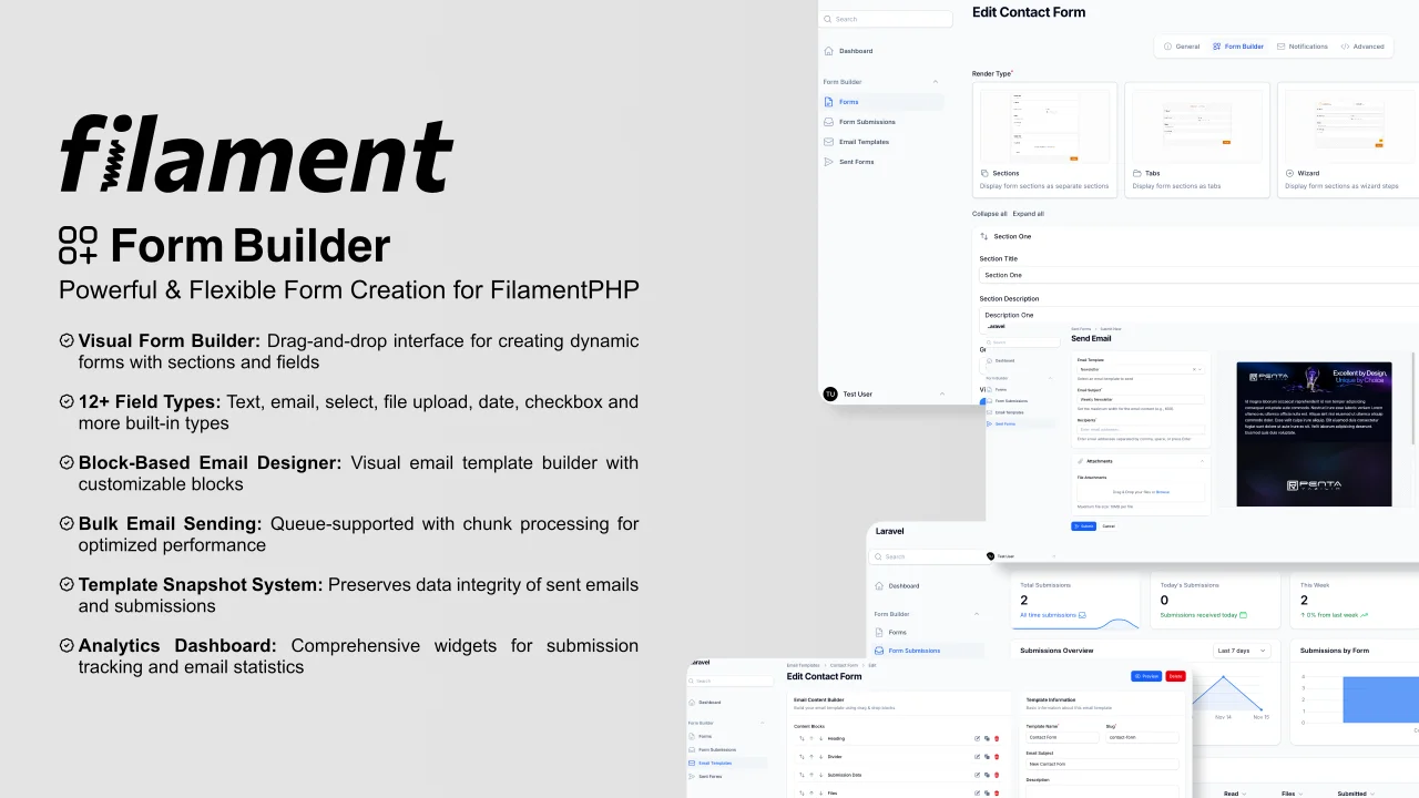
Form Builder
A powerful, flexible form builder package for FilamentPHP that enables you to create, manage, and process dynamic forms with advanced features including custom field types, email templates, bulk sending capabilities, and comprehensive submission tracking.
Author:
Azad Furkan ŞAKAR
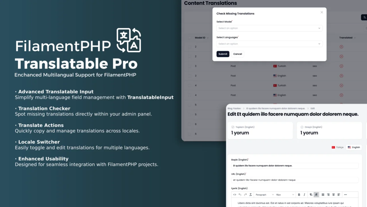
Translatable Pro
Streamlines multi-language management in FilamentPHP projects, enabling developers to build immersive, multilingual applications with ease.
Author:
Azad Furkan ŞAKAR
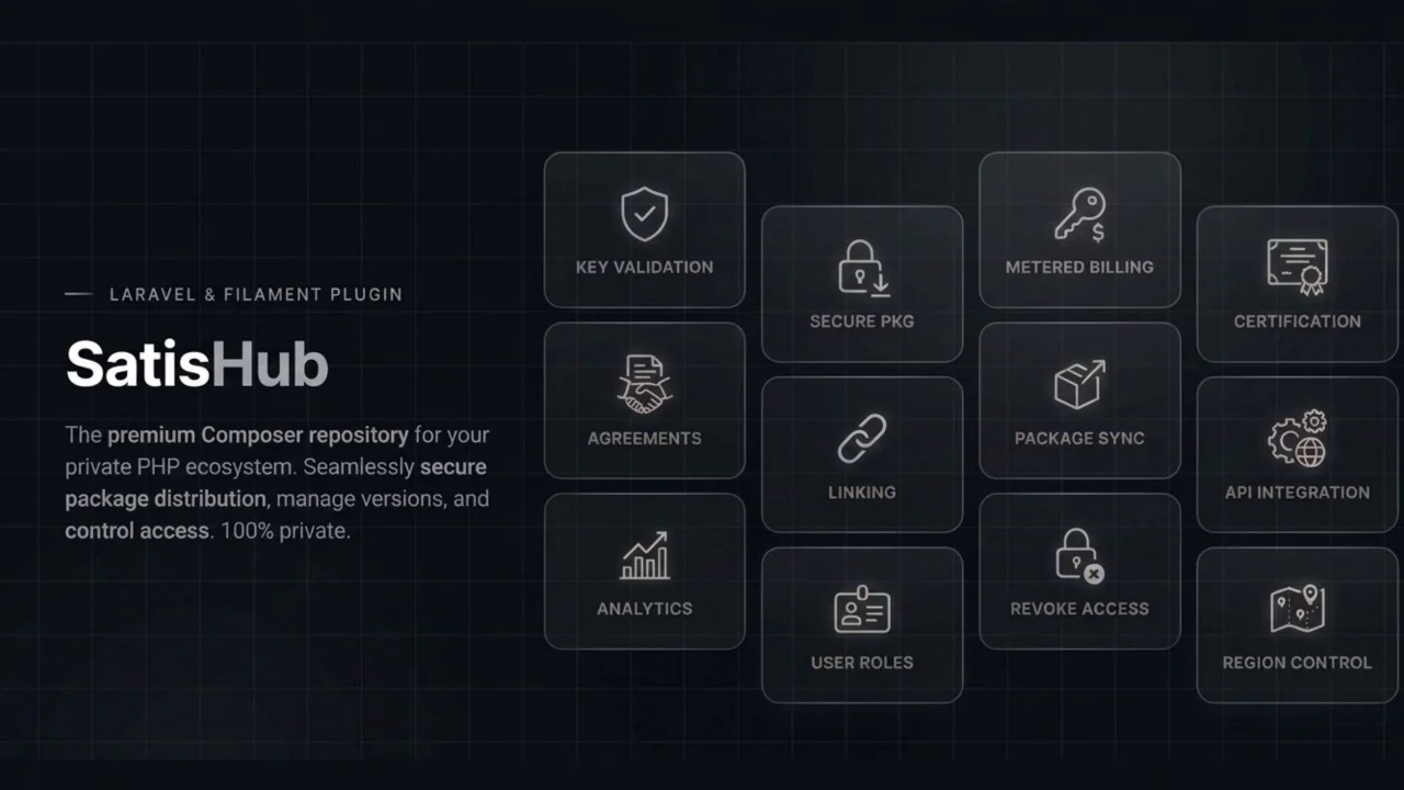
SatisHub
SatisHub is a Laravel package for selling private Composer packages with license-based access control with FilamentPHP.
Author:
Azad Furkan ŞAKAR
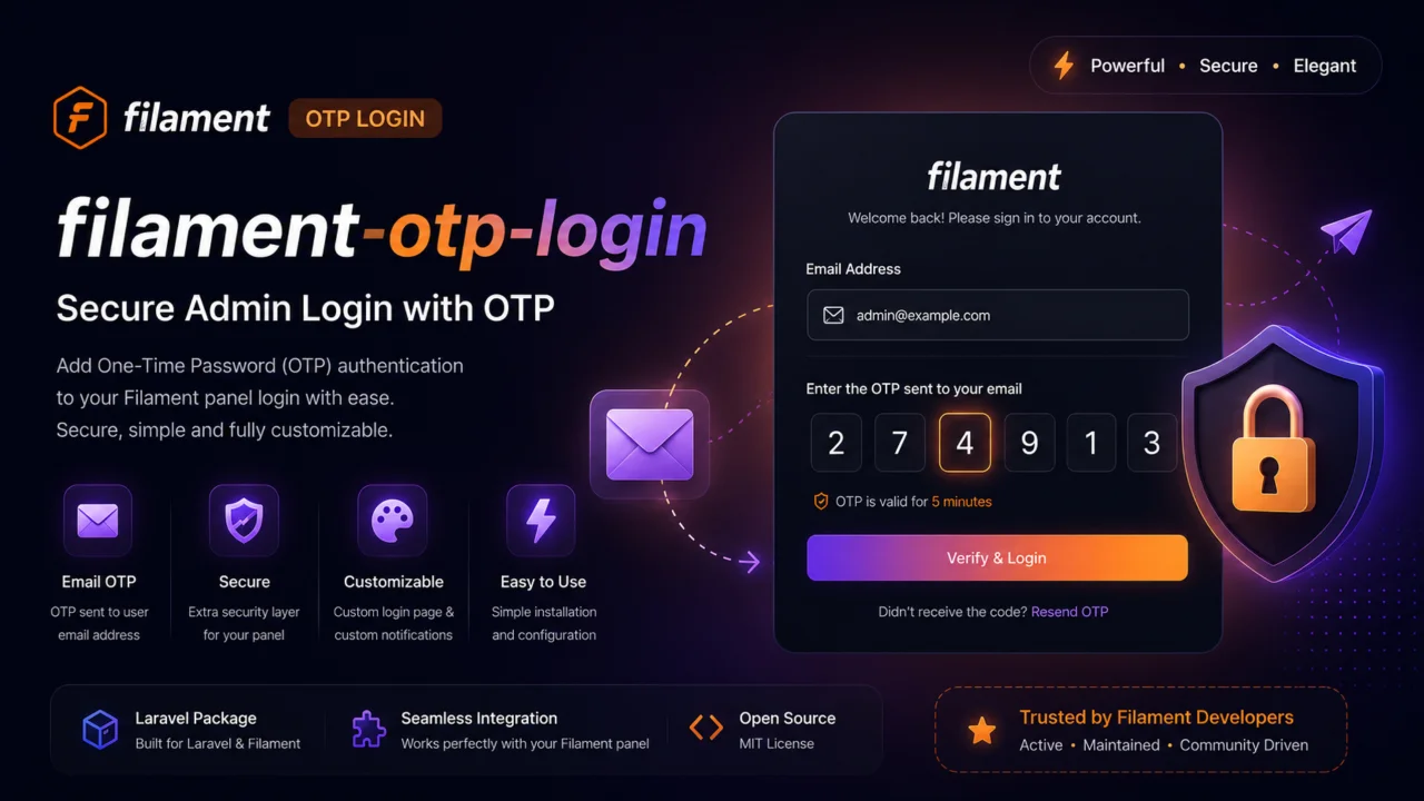
OTP Login
OTP Login for FilamentPHP.
Author:
Azad Furkan ŞAKAR
Featured Plugins
A selection of plugins curated by the Filament team
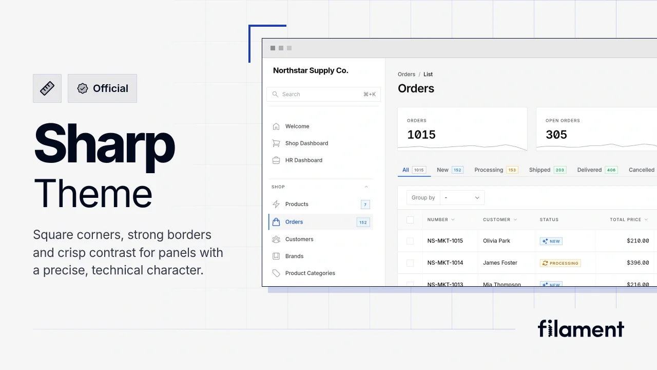
Sharp Theme
A theme that gives panels a precise, technical look with square corners, strong borders, and clear contrast.
 Filament
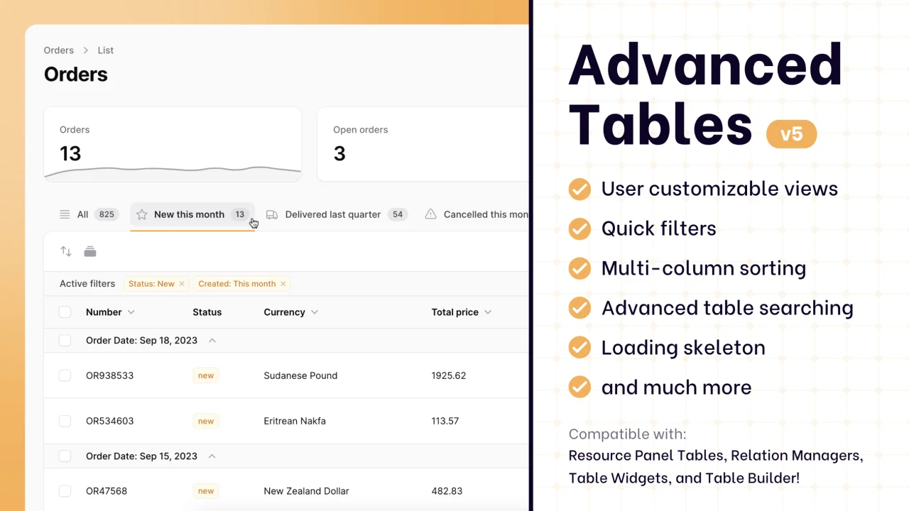
Advanced Tables (formerly Filter Sets)
Supercharge your tables with powerful features like user-customizable views, quick filters, multi-column sorting, advanced table searching, convenient view management, and more. Compatible with Resource Panel Tables, Relation Managers, Table Widgets, and Table Builder!
 Kenneth Sese
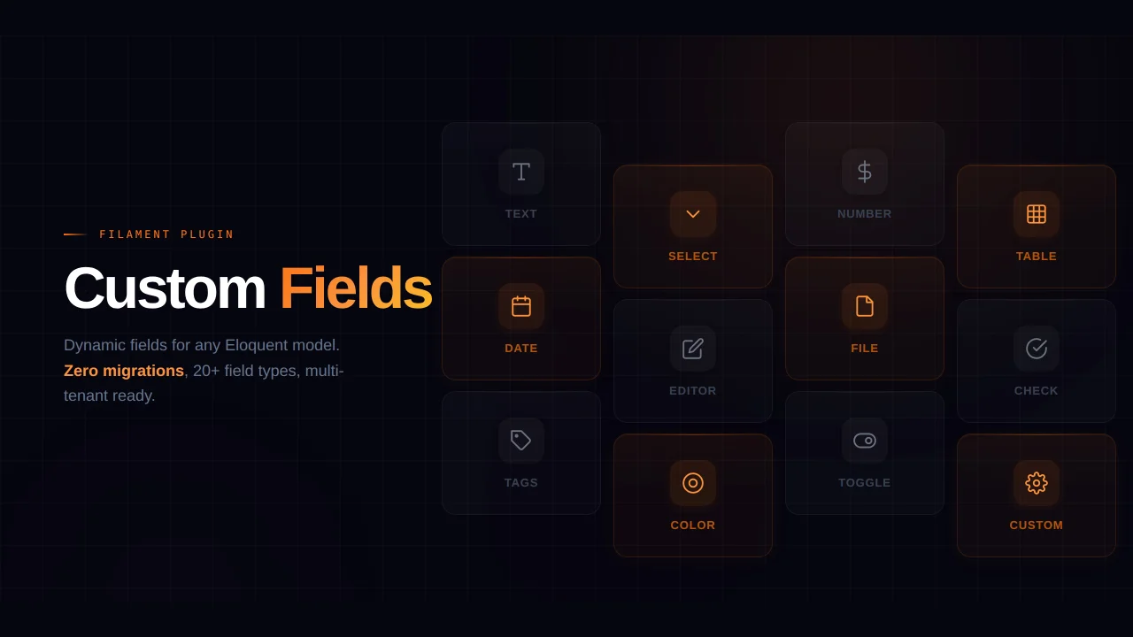
Custom Fields
Eliminate custom field migrations forever. Let your users create and manage form fields directly in Filament admin panels with 20+ built-in field types, validation, and zero database changes.
 Relaticle