Better Options
A set of better radio and checkbox options for Filament 4 applications.
 Author:
Tone Gabes
Author:
Tone Gabes
Documentation
- Available components
- Features
- Requirements
- Installation
- Configuration
- Usage
- Using Enums
- Available Components
- Component Methods
- Styling and Themes
- Credits
- License


Enhanced form components for Filament Forms with modern interface, advanced features, and excellent performance. Provides CheckboxList, CheckboxCards, RadioList and RadioCards with icons, visual indicators, descriptions, extra texts, per-option colors, search functionality, and bulk operations.
#Available components
| Family | List | Cards |
|---|---|---|
| Checkbox | CheckboxList |
CheckboxCards |
| Radio | RadioList |
RadioCards |
#Features
✨ Enhanced UI Components
- Modern card-based and list layouts
- Extensible icon system using Filament icons aliases
- Flexible icon positioning (before/after)
- Support for descriptions and extra texts
- Pre-defined themes (minimal, modern, classic)
#Advanced Features
- Real-time search with debounced input
- Bulk select/deselect operations for checkboxes
- Configurable positioning and visibility
- Performance-optimized JavaScript
🎨 Extensible Architecture
- Tailwind CSS styling with dark mode support
- Configurable default positions and icons via config file
- Full accessibility support
#Performance & Caching
- Intelligent icon caching system
- Efficient DOM operations and caching
- Alpine.js components loaded on demand
- Minimal JavaScript footprint
#Requirements
- PHP 8.2+
- Laravel 11.28+
- Filament 5.0+
- Livewire 4.0+
- Tailwind CSS 4.0+
#Optional
tonegabes/filament-phosphor-icons^1.3 — when installed, Phosphor icons are used as defaults for indicators. Without it the package falls back to Heroicons aliases. You can always override defaults viaconfig('better-options.icons.defaults').
#Installation
Install the package via Composer:
composer require tonegabes/filament-better-options
Optionally, publish the configuration file for positioning settings:
php artisan vendor:publish --tag="better-options-config"
Optionally, publish the assets for customization:
php artisan vendor:publish --tag="better-options-assets"
#Configuration
The published configuration file (config/better-options.php) provides customization positioning options:
return [
    'components' => [
        'checkbox' => [
            'list' => [
                'icon_position'      => 'after',
                'indicator_position' => 'before',
            ],
            'cards' => [
                'icon_position'      => 'before',
                'indicator_position' => 'after',
            ],
        ],
        'radio' => [
            'list' => [
                'icon_position'      => 'after',
                'indicator_position' => 'before',
            ],
            'cards' => [
                'icon_position'      => 'before',
                'indicator_position' => 'after',
            ],
        ],
    ],
];
#Usage
#Basic Examples
use ToneGabes\BetterOptions\Forms\Components\CheckboxCards;
use ToneGabes\Filament\Icons\Enums\Phosphor;
// Checkbox Cards with default features
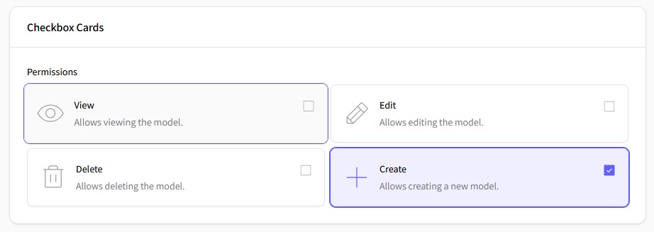
CheckboxCards::make('permissions')
->label('Permissions')
->columns(2)
->options([
'view' => 'View',
'edit' => 'Edit',
'delete' => 'Delete',
'create' => 'Create',
])
->descriptions([
'view' => 'Allows viewing the model.',
'edit' => 'Allows editing the model.',
'delete' => 'Allows deleting the model.',
'create' => 'Allows creating a new model.',
])
->icons([
'view' => Phosphor::Eye->thin(),
'edit' => Phosphor::Pencil->thin(),
'delete' => Phosphor::Trash->thin(),
'create' => Phosphor::Plus->thin(),
])
,
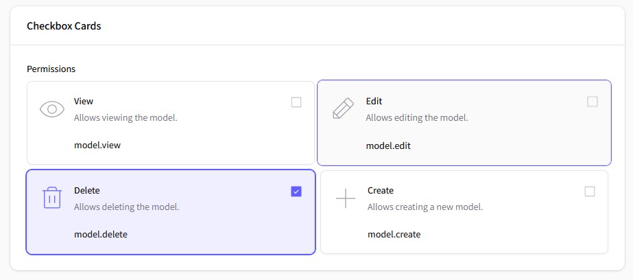
use ToneGabes\BetterOptions\Forms\Components\CheckboxList;
use ToneGabes\Filament\Icons\Enums\Phosphor;
// Checkbox List with default features
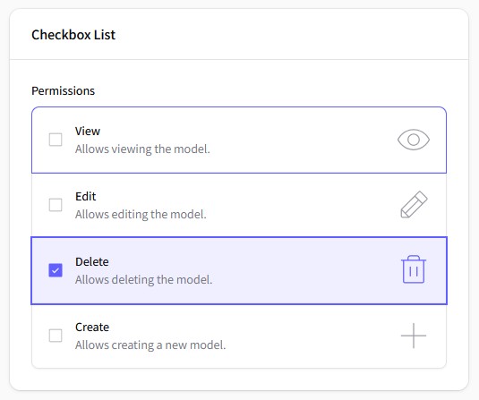
CheckboxList::make('permissions')
->label('Permissions')
->options([
'view' => 'View',
'edit' => 'Edit',
'delete' => 'Delete',
'create' => 'Create',
])
->descriptions([
'view' => 'Allows viewing the model.',
'edit' => 'Allows editing the model.',
'delete' => 'Allows deleting the model.',
'create' => 'Allows creating a new model.',
])
->icons([
'view' => Phosphor::Eye->thin(),
'edit' => Phosphor::Pencil->thin(),
'delete' => Phosphor::Trash->thin(),
'create' => Phosphor::Plus->thin(),
])
,
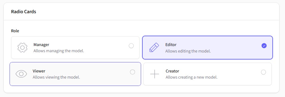
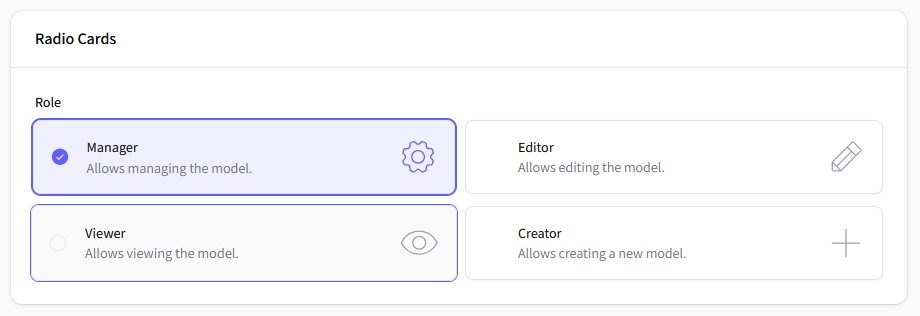
use ToneGabes\BetterOptions\Forms\Components\RadioCards;
use ToneGabes\Filament\Icons\Enums\Phosphor;

// Radio Cards with default features
RadioCards::make('role')
    ->label('Role')
    ->columns(2)
    ->options([
        'manager' => 'Manager',
        'editor'  => 'Editor',
        'viewer'  => 'Viewer',
        'creator' => 'Creator',
    ])
    ->descriptions([
        'manager' => 'Allows managing the model.',
        'editor'  => 'Allows editing the model.',
        'viewer'  => 'Allows viewing the model.',
        'creator' => 'Allows creating a new model.',
    ])
    ->icons([
        'manager' => Phosphor::Gear->thin(),
        'editor'  => Phosphor::Pencil->thin(),
        'viewer'  => Phosphor::Eye->thin(),
        'creator' => Phosphor::Plus->thin(),
    ])
,
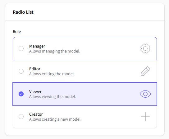
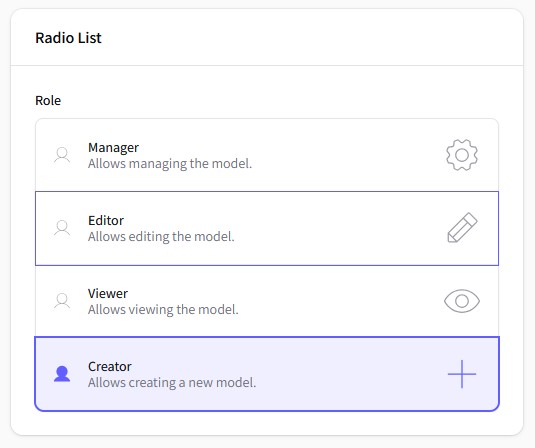
use ToneGabes\BetterOptions\Forms\Components\RadioList;
use ToneGabes\Filament\Icons\Enums\Phosphor;

// Radio List with default features
RadioList::make('role')
    ->label('Role')
    ->options([
        'manager' => 'Manager',
        'editor'  => 'Editor',
        'viewer'  => 'Viewer',
        'creator' => 'Creator',
    ])
    ->descriptions([
        'manager' => 'Allows managing the model.',
        'editor'  => 'Allows editing the model.',
        'viewer'  => 'Allows viewing the model.',
        'creator' => 'Allows creating a new model.',
    ])
    ->icons([
        'manager' => Phosphor::Gear->thin(),
        'editor'  => Phosphor::Pencil->thin(),
        'viewer'  => Phosphor::Eye->thin(),
        'creator' => Phosphor::Plus->thin(),
    ])
,
#Using Enums
This package provides a convenient way to use PHP enums for defining options, descriptions, and icons. Here's how you can leverage enums in your component definitions:
use Filament\Support\Contracts\HasDescription;
use Filament\Support\Contracts\HasIcon;
use Filament\Support\Contracts\HasLabel;
use ToneGabes\BetterOptions\Contracts\HasExtraText;
use ToneGabes\Filament\Icons\Enums\Phosphor;

enum Roles: string implements HasDescription, HasExtraText, HasIcon, HasLabel {
    case Manager = 'manager';
    case Editor = 'editor';
    case Viewer = 'viewer';
    case Creator = 'creator';

    public function getDescription(): string {
        return match($this) {
            self::Manager => 'Allows managing the model.',
            self::Editor  => 'Allows editing the model.',
            self::Viewer  => 'Allows viewing the model.',
            self::Creator => 'Allows creating a new model.',
        };
    }

    public function getExtraText(): string {
        return match($this) {
            self::Manager => 'model.manager',
            self::Editor  => 'model.editor',
            self::Viewer  => 'model.viewer',
            self::Creator => 'model.creator',
        };
    }

    public function getIcon(): string {
        return match($this) {
            self::Manager => Phosphor::Gear->thin(),
            self::Editor  => Phosphor::Pencil->thin(),
            self::Viewer  => Phosphor::Eye->thin(),
            self::Creator => Phosphor::Plus->thin(),
        };
    }

    public function getLabel(): string {
        return match($this) {
            self::Manager => 'Manager',
            self::Editor  => 'Editor',
            self::Viewer  => 'Viewer',
            self::Creator => 'Creator',
        };
    }
}
Passing a Backend Enum automatically maps the enum cases to the component options, descriptions, icons, and extra texts.
RadioList::make('role')
    ->label('Role')
    ->enum(Roles::cases())

    //  No need to specify these if enum is using filament enum contracts
    // ->descriptions()
    // ->icons()
    // ->extraTexts()
,
You can hide the descriptions, icons, and extra texts if you don't need them.
RadioList::make('role')
    ->enum(Roles::class)
    ->hiddenDescriptions()
    ->hiddenIcons()
    ->hiddenExtraTexts()
,

// Accepts Closures
RadioList::make('role')
    ->enum(Roles::class)
    ->hiddenDescription(fn () => false)
    ->hiddenIcon(fn () => false)
    ->hiddenExtraText(fn () => false)
,
#Advanced Features
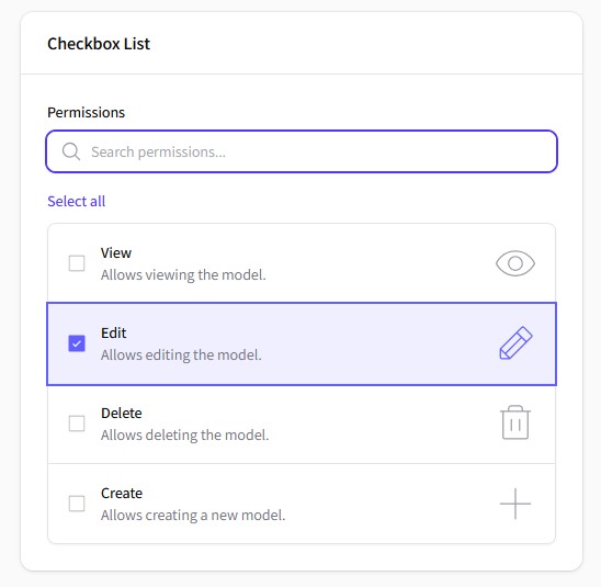
#Search and Bulk Operations
CheckboxList::make('permissions')
    ->label('Permissions')
    ->enum(Permissions::class)
    ->searchable()
    ->searchPrompt('Search permissions...')
    ->bulkToggleable()
,
#Custom Positioning and Visibility
RadioCards::make('role')
    ->label('Role')
    ->columns(2)
    ->enum(Roles::class)
    ->partiallyHiddenIndicator()
    ->itemsCenter()
    ->iconAfter()
    ->indicatorBefore()

    // ->hiddenIndicator() // You also can totaly hide the indicator
,
#Icons and Indicators
RadioList::make('role')
    ->label('Role')
    ->enum(Roles::class)
    ->idleIndicator(Phosphor::User->thin())
    ->selectedIndicator(Phosphor::User->fill())
,
#Extra Texts/Values
CheckboxCards::make('permissions')
    ->label('Permissions')
    ->columns(2)
    ->enum(Permissions::class)
    ->extraTexts([
        'view'   => 'model.view',
        'edit'   => 'model.edit',
        'delete' => 'model.delete',
        'create' => 'model.create',
    ])
,
RadioCard::make('storage')
    ->enum(Storages::class)
    ->hiddenIcon()
    ->partiallyHiddenIndicator()
    ->idleIndicator(Phosphor::HardDrives->thin())
    ->selectedIndicator(Phosphor::HardDrives->fill())
#Pre-defined Themes
// Modern Theme - Icons before, indicators after, centered
CheckboxCards::make('options')
    ->options($options)
    ->theme('modern');

// Minimal Theme - Subtle indicators
CheckboxCards::make('options')
    ->options($options)
    ->theme('minimal');

// Classic Theme - Traditional layout
CheckboxCards::make('options')
    ->options($options)
    ->theme('classic');
#Available Components
| Component | Description | Features |
|---|---|---|
CheckboxList |
Vertical list of checkboxes | Search, Bulk toggle, Icons |
CheckboxCards |
Grid of checkbox cards | All list features + Columns, Centering |
RadioList |
Vertical list of radio buttons | Extends native Radio, icons, custom indicators |
RadioCards |
Grid of radio button cards | All list features + Columns, Centering, Themes |
#Color by enum
Every component supports a per-option color. When the associated enum implements
Filament\Support\Contracts\HasColor, each case's getColor() is used automatically
to tint its option:
use ToneGabes\BetterOptions\Forms\Components\CheckboxCards;

CheckboxCards::make('roles')
    ->options(RolesEnum::class);
You can also provide colors explicitly, bypassing the enum contract:
CheckboxList::make('priority')
    ->options(['low' => 'Low', 'high' => 'High'])
    ->optionColors([
        'low'  => 'gray',
        'high' => 'danger',
    ]);
#Component Methods
#Common Methods (All Components)
// Content
->options(array $options)
->descriptions(array $descriptions)
->extraTexts(array $extraTexts)
->hiddenDescription(bool|Closure $condition = true)
->hiddenExtraText(bool|Closure $condition = true)

// Icons and Indicators
->icons(array $icons)
->iconBefore()
->iconAfter()
->hiddenIcon(bool|Closure $condition = true)
->idleIndicator(string $icon)
->selectedIndicator(string $icon)
->indicatorBefore()
->indicatorAfter()
->hiddenIndicator(bool|Closure $condition = true)
->partiallyHiddenIndicator(bool|Closure $condition = true)
#Checkbox-Specific Methods
// Search functionality
->searchable(bool $condition = true)
->searchPrompt(string $prompt)

// Bulk operations
->bulkToggleable(bool $condition = true)
->selectAllAction(Action $action)
->deselectAllAction(Action $action)
#Card-Specific Methods
// Layout
->columns(int|array $columns)
->itemsCenter(bool|Closure $condition = true)
#Styling and Themes
The package uses Tailwind CSS classes and supports Filament's theming system. Main CSS classes:
/* Component containers */
.fi-fo-checkbox-list
.fi-fo-checkbox-card
.fi-fo-radio-list

/* Individual options */
.fi-fo-checkbox-option
.fi-fo-radio-item

/* Content elements */
.fi-fo-checkbox-option__label
.fi-fo-checkbox-option__description
.fi-fo-checkbox-option__extra
.fi-fo-checkbox-option__icon
.fi-fo-checkbox-option__indicator

/* State classes */
.is-selected
.is-centered
.is-indicator-partially-hidden
.is-indicator-partially-hidden
#Credits
#License
The MIT License (MIT). Please see License File for more information.
Made with ❤️ by Tone Gabes
The author
I build interactive platforms with Filament and Livewire. Passionate about clean code and clean UI
From the same author
Featured Plugins
A selection of plugins curated by the Filament team
Custom Dashboards
Let your users build and share their own dashboards with a drag-and-drop interface. Define your data sources in PHP and let them do the rest.
 Filament
Custom Fields
Eliminate custom field migrations forever. Let your users create and manage form fields directly in Filament admin panels with 20+ built-in field types, validation, and zero database changes.
 Relaticle
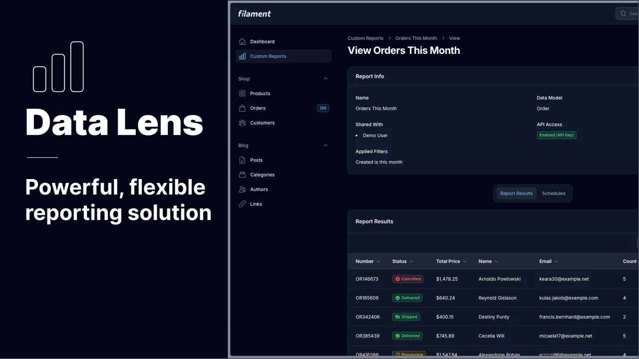
Data Lens
Advanced Data Visualization for Laravel Filament - a premium reporting solution enabling custom column creation, sophisticated filtering, and enterprise-grade data insights within admin panels.
 Padmission