Decorated Column by ornio
CommunityDecorate any text column or entry with rich prefixes and suffixes. Badges, dots, trends, progress bars and more, with no theme build needed.
 Author:
ornio
Package health
Automated checks of this plugin's Composer package
15 checks
- Passed: GitHub Actions pinned to SHA
- Skipped: GitLab CI includes pinned to SHA
- Passed: Open security advisories
- Passed: Dependabot PR responsiveness — No open Dependabot PRs.
- Skipped: Renovate MR responsiveness
- Passed: Dependabot or Renovate configured
- Passed: Dependency update cooldown configured
- Passed: Provides a security policy
- Passed: Abandoned or archived — No consulted source marks the package abandoned (packagist, github).
- Passed: Commit and release recency — Active: last commit 2 days ago; last release 3 days ago.
-
Passed:
composer.lock not committed by library
—
composer.lockis absent from the released dist archive. - Passed: Dist archive is lean
-
Passed:
Current Laravel version supported
—
Package dependencies resolve together with current Laravel
13.0. -
Passed:
Current PHP version supported
—
Constraint
^8.2supports current PHP8.5. - Skipped: Current Symfony version supported
filament/
namespace. Review the source and install at your own risk. Found
malware or an unresolved security issue the author won't
address?
Report it
.
Documentation
- Installation
- Usage
- Badges
- Icons
- Dots
- Images
- Text
- Colors
- Trends
- Progress
- Pills
- Separator
- Closure parameters
- Testing
- Changelog
- Contributing
- Security Vulnerabilities
- Credits
- License
Decorate any text column or entry with rich prefixes and suffixes. Badges, dots, trends, progress bars and more, with no theme build needed.




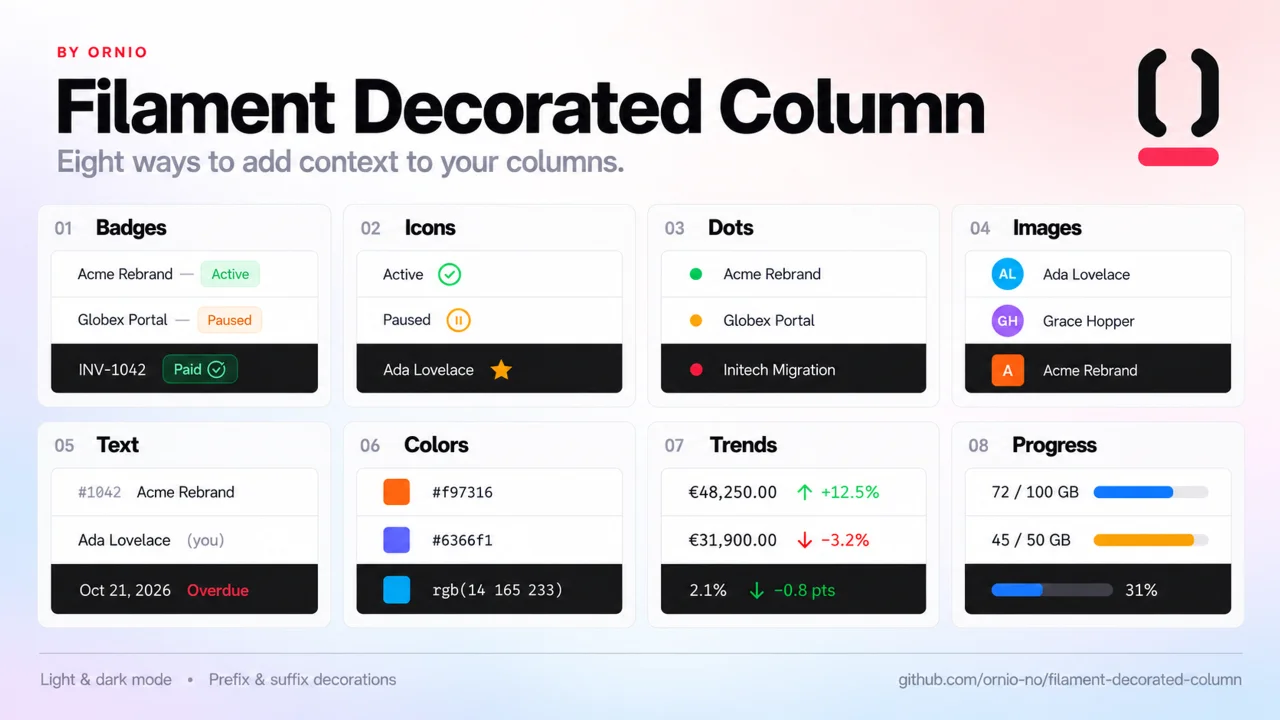
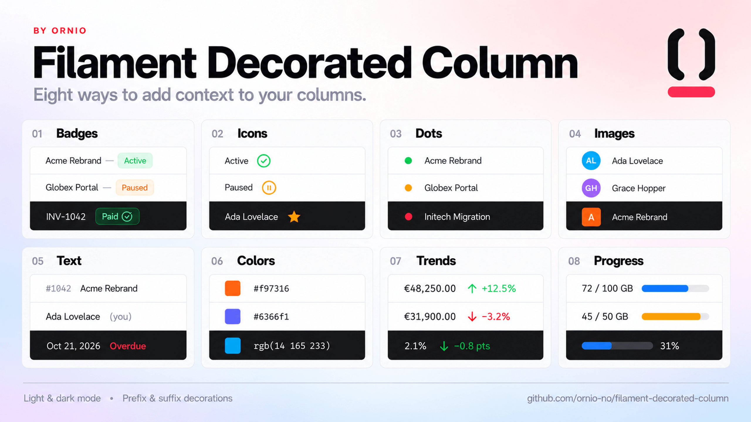
DecoratedColumn and DecoratedEntry are Filament's TextColumn and TextEntry with a slot before and a slot after the text. A status, an avatar, or a trend can then sit next to the value it describes instead of taking a column of its own. The slots hold decorations of eight kinds, in any mix: badges, icons, dots, images, secondary text, colour samples, trends, and progress bars. Every decoration can have a tooltip, and every setter accepts a closure that receives the row's record. The views use inline styles and Filament's own fi-* classes, so there is no theme to build and no @source line to add.
use App\Models\Client;
use Filament\Support\Icons\Heroicon;
use Ornio\FilamentDecoratedColumn\BadgeDecoration;
use Ornio\FilamentDecoratedColumn\DecoratedColumn;
use Ornio\FilamentDecoratedColumn\IconDecoration;

DecoratedColumn::make('name')
    ->prefixDecorations([
        IconDecoration::make('type')->icon(Heroicon::OutlinedBriefcase)->label('Business'),
    ])
    ->suffixBadges([
        BadgeDecoration::make('vip')
            ->label('VIP')
            ->color('success')
            ->visible(fn (Client $record): bool => $record->is_vip),
    ]);
Each row shows the briefcase, an em dash, and the name. VIP rows add another em dash and a green badge.
#Installation
composer require ornio/filament-decorated-column
Requires PHP 8.2 or later and Filament 5.7 or later. Laravel discovers the service provider. There is no panel plugin to register, no config to publish, and no theme to build.
To change the markup, publish the views:
php artisan vendor:publish --tag="filament-decorated-column-views"
#Usage
#Table columns
DecoratedColumn extends TextColumn, so description(), searchable(), sortable(), wrap(), and the rest work unchanged. Add decorations with prefixDecorations() and suffixDecorations(), or their aliases prefixBadges() and suffixBadges(). All four take an array of decorations or a closure that returns one. The array can mix kinds, such as a DotDecoration next to a BadgeDecoration.
use App\Models\Client;
use Filament\Tables\Table;
use Ornio\FilamentDecoratedColumn\BadgeDecoration;
use Ornio\FilamentDecoratedColumn\DecoratedColumn;

public static function configure(Table $table): Table
{
    return $table->columns([
        DecoratedColumn::make('name')
            ->description(fn (Client $record): ?string => $record->registration_number)
            ->suffixBadges([
                BadgeDecoration::make('type')
                    ->label(fn (Client $record): string => $record->type->getLabel())
                    ->color(fn (Client $record): string => $record->type->getColor()),
            ])
            ->searchable()
            ->sortable(),
    ]);
}
Here type casts to an enum that implements Filament's HasLabel and HasColor contracts.
A bare icon in the prefix slot, driven by an enum that implements HasIcon:
use App\Models\Activity;
use Filament\Support\Enums\IconSize;
use Filament\Support\Icons\Heroicon;
use Ornio\FilamentDecoratedColumn\DecoratedColumn;
use Ornio\FilamentDecoratedColumn\IconDecoration;

DecoratedColumn::make('description')
    ->prefixDecorations([
        IconDecoration::make('type')
            ->icon(fn (Activity $record): Heroicon => $record->type->getIcon())
            ->size(IconSize::Large),
    ])
    ->wrap(),
#Infolist entries
DecoratedEntry extends TextEntry and takes the same methods.
use App\Models\Client;
use Filament\Schemas\Schema;
use Ornio\FilamentDecoratedColumn\BadgeDecoration;
use Ornio\FilamentDecoratedColumn\DecoratedEntry;

public static function configure(Schema $schema): Schema
{
    return $schema->components([
        DecoratedEntry::make('name')
            ->suffixBadges([
                BadgeDecoration::make('type')
                    ->label(fn (Client $record): string => $record->type->getLabel())
                    ->color(fn (Client $record): string => $record->type->getColor()),
            ]),
    ]);
}
Both work in any table or infolist, whether it sits in a panel or in a Livewire component outside one.
#Badges
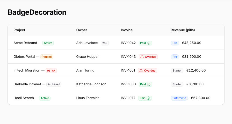
BadgeDecoration::make('name') creates a badge. The name doubles as the default label: BadgeDecoration::make('hot') reads "Hot" and BadgeDecoration::make('is_paid') reads "Is paid".
| Method | What it sets | Default |
|---|---|---|
label() |
The text. | Derived from the name |
color() |
A Filament colour name such as success or gray, or a palette array. |
primary |
size() |
Size::ExtraSmall to Size::ExtraLarge, or xs to xl. |
Size::Small |
weight() |
A FontWeight case or its string value. |
FontWeight::Medium |
fontFamily() |
FontFamily::Sans, Serif, or Mono, or the string. |
Inherited |
isPill() |
Full rounding (border-radius: 9999px) for this badge alone. isPill(false) opts out of the column's asPills(). null follows the column. |
null |
icon() |
An icon, such as Heroicon::OutlinedCheckCircle. |
None |
iconPosition() |
IconPosition::Before or IconPosition::After. |
IconPosition::Before |
tooltip() |
Text shown on hover. | None |
visible(), hidden() |
Whether the badge renders. | Visible |
Every method accepts a closure. See Closure parameters.
weight() and fontFamily() put Filament's fi-font-* class on the badge (fi-font-bold, fi-font-mono). Filament's stylesheet defines those classes for text items and links, not for badges, so they change a badge only where your theme styles .fi-badge.fi-font-*.
A hidden badge renders nothing. When every decoration in a slot is hidden, the slot's separator goes with it.
use App\Models\TeamMember;
use Filament\Support\Enums\IconPosition;
use Filament\Support\Icons\Heroicon;

BadgeDecoration::make('you')
    ->color('gray')
    ->tooltip('You cannot change your own role.')
    ->visible(fn (TeamMember $record): bool => $record->user_id === auth()->id()),

BadgeDecoration::make('paid')
    ->color('success')
    ->icon(Heroicon::OutlinedCheckCircle)
    ->iconPosition(IconPosition::After),
#Icons
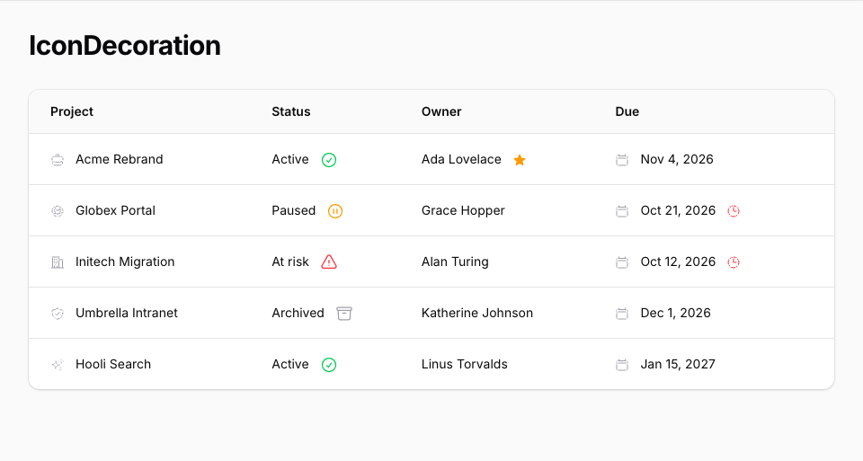
IconDecoration::make('name') renders an icon with no badge around it.
| Method | What it sets | Default |
|---|---|---|
icon() |
The icon to draw. | None |
size() |
An IconSize case or its string value. |
IconSize::Small |
color() |
A Filament colour name, or a palette array. Gray draws with var(--gray-400); any other name uses shade 500, as a TextColumn icon does. |
gray |
label() |
A name for screen readers. The icon gets role="img" and aria-label. |
None |
tooltip() |
Text shown on hover. | None |
visible(), hidden() |
Whether the icon renders. | Visible |
On an icon, dot, text, or progress bar, the colour name goes into an inline style. A name holding anything but lowercase letters, digits, and hyphens draws gray instead, so a name returned by a closure can't inject CSS.
Without label() the icon is decorative and carries aria-hidden="true". That is right when the text beside it already says what the icon means. Give a label when the icon carries meaning on its own, and add tooltip() to show that meaning on hover too.
IconDecoration::make('type')
    ->icon(Heroicon::OutlinedBriefcase)
    ->label('Business')
    ->tooltip('Business client'),
#Dots
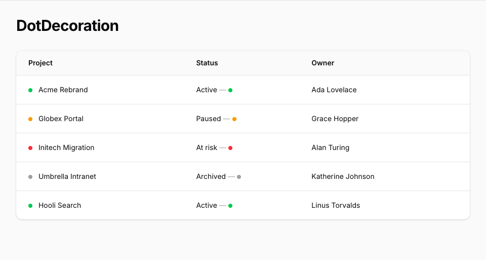
DotDecoration::make('name') renders a filled circle 0.5rem across, in a palette colour. Use it for a status. It has no size setting.
| Method | What it sets | Default |
|---|---|---|
color() |
A Filament colour name such as success or danger. Gray draws with var(--gray-400); any other name uses shade 500, as an icon does. Palette arrays are not supported. |
gray |
label() |
A name for screen readers. The dot gets role="img" and aria-label. |
None |
tooltip() |
Text shown on hover. | None |
visible(), hidden() |
Whether the dot renders. | Visible |
Without label() the dot is decorative and carries aria-hidden="true", as an unlabelled icon does. A screen reader can't announce a colour, so give a label when the dot shows a status that the text beside it doesn't.
use App\Models\Client;
use Ornio\FilamentDecoratedColumn\DotDecoration;

DecoratedColumn::make('name')
    ->prefixDecorations([
        DotDecoration::make('status')
            ->color(fn (Client $record): string => $record->is_active ? 'success' : 'gray')
            ->label(fn (Client $record): string => $record->is_active ? 'Active' : 'Inactive')
            ->tooltip(fn (string $state): string => $state),
    ]),
#Images
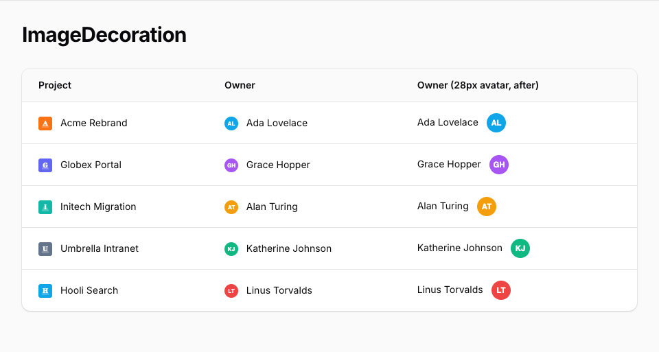
ImageDecoration::make('name') renders a small picture from a URL, such as an avatar, a logo, or a flag. The picture is cropped to fill its box, never stretched (object-fit: cover), and loads lazily.
| Method | What it sets | Default |
|---|---|---|
image() |
The picture's URL. | None |
size() |
Width and height: a CSS length such as '2rem', '12px', or '50%', or an integer number of pixels. Anything else, such as calc(), a unitless string like '32', or a negative length, falls back to the default. |
'1.25rem', one line of text |
circular() |
Full rounding, for avatars. Calling it with no argument turns it on. | Square |
label() |
The alt text. |
None |
tooltip() |
Text shown on hover. | None |
visible(), hidden() |
Whether the image renders. | Visible |
Without label() the image is decorative and gets alt="", so screen readers skip it. That suits an avatar beside the person's name.
When the URL is null or an empty string, the image renders nothing, as if it were hidden. If nothing else in the slot renders, the separator goes too, so a row without a picture shows only its text.
use App\Models\User;
use Ornio\FilamentDecoratedColumn\ImageDecoration;

DecoratedColumn::make('name')
    ->prefixDecorations([
        ImageDecoration::make('avatar')
            ->image(fn (User $record): ?string => $record->avatar_url)
            ->circular(),
    ]),
#Text
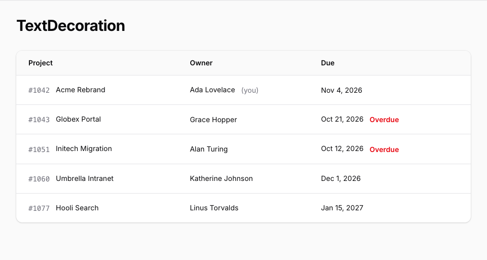
TextDecoration::make('name') shows its label as secondary text, such as "(you)" after a name. As on a badge, the label is derived from the name when unset, and it is escaped. The text has no size setting: it takes the size of the text around it.
| Method | What it sets | Default |
|---|---|---|
label() |
The text. | Derived from the name |
color() |
A Filament colour name. Gray draws with var(--gray-500); any other name uses shade 600 in light mode and shade 400 in dark mode, through CSS light-dark(). Palette arrays are not supported. |
gray |
weight() |
A FontWeight case or its string value. |
Inherited |
fontFamily() |
FontFamily::Sans, Serif, or Mono, or the string. |
Inherited |
tooltip() |
Text shown on hover. | None |
visible(), hidden() |
Whether the text renders. | Visible |
light-dark() follows the color-scheme: dark that a Filament panel sets in dark mode. Outside a panel, coloured text keeps its light-mode shade unless your page sets color-scheme itself.
weight() and fontFamily() set the text's font-weight and font-family inline. A weight is set as its number, such as 700 for FontWeight::Bold. A family uses the font your panel is configured with (the --font-family, --serif-font-family, and --mono-font-family variables that Filament sets), followed by generic families for pages outside a panel. A string that is not a FontWeight or FontFamily value is added as a class instead, for your theme to style.
use App\Models\Invoice;
use App\Models\TeamMember;
use Ornio\FilamentDecoratedColumn\TextDecoration;

TextDecoration::make('you')
    ->label('(you)')
    ->visible(fn (TeamMember $record): bool => $record->user_id === auth()->id()),

TextDecoration::make('overdue')
    ->color('danger')
    ->visible(fn (Invoice $record): bool => $record->is_overdue),
#Colors
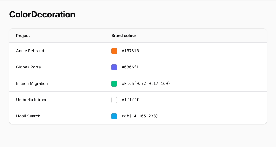
ColorDecoration::make('name') shows a sample of a raw colour from your data, such as a product's hex code. The sample is a 1.25rem square with slightly rounded corners and a thin translucent gray border, so white and black samples stay visible.
| Method | What it sets | Default |
|---|---|---|
value() |
The raw colour, in one of the formats below. | None |
label() |
A name for screen readers. The sample gets role="img" and aria-label. |
None |
tooltip() |
Text shown on hover. | None |
visible(), hidden() |
Whether the sample renders. | Visible |
The raw colour goes into an inline style, where HTML escaping doesn't stop CSS injection, so only these formats are accepted, in any letter case:
#rgb,#rgba,#rrggbb, and#rrggbbaa.rgb(),rgba(),hsl(),hsla(), andoklch()holding only numbers, each with an optional%,deg,grad,rad, orturnunit. Commas, slashes, and plain spaces may separate them. A tab or a line break inside the parentheses gets the value rejected.
Any other value, such as a colour name like red, a var(), or null, renders nothing, as if it were hidden. The inherited color() is ignored, because the sample always shows the raw colour.
Without label() the sample is decorative and hidden from screen readers, which suits a sample next to the colour code it shows.
use App\Models\Product;
use Ornio\FilamentDecoratedColumn\ColorDecoration;

DecoratedColumn::make('color')
    ->prefixDecorations([
        ColorDecoration::make('sample')
            ->value(fn (Product $record): ?string => $record->color),
    ]),
#Trends
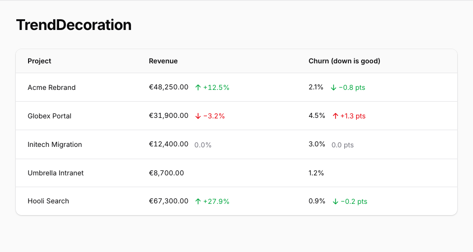
TrendDecoration::make('name') shows a change as an arrow and a signed number, coloured by direction:
- A rise shows an up arrow, a plus sign, and the success colour:
+12.5%. - A fall shows a down arrow, a minus sign (
−, not a hyphen), and the danger colour:−3.2%. - Zero shows in gray, with no arrow and no sign:
0.0%.
The direction is decided after rounding, so a change of 0.04 shows as a gray 0.0%, never as a green +0.0%.
| Method | What it sets | Default |
|---|---|---|
value() |
The change, as an int or a float. A closure may also return a numeric string, which is what a decimal column or cast gives; any other string renders nothing. |
None |
decimals() |
How many decimal places the change is rounded to. | 1 |
unit() |
Text appended exactly as given, with no space added. null removes it. |
'%' |
inverse() |
Swaps the success and danger colours, for a metric where down is good, such as churn or cost. The arrow and sign still follow the change. Calling it with no argument turns it on. | Off |
tooltip() |
Text shown on hover. | None |
visible(), hidden() |
Whether the trend renders. | Visible |
The colour follows the direction, so the inherited color() is ignored. It uses the same shades as a text decoration: 600 in light mode and 400 in dark mode, or var(--gray-500) at zero.
The number ignores the app's locale. It always has a . decimal point and no thousands separator, as in +1234.5%. A null change, or one that is not a finite number (NAN or infinity), renders nothing, as if it were hidden.
Screen readers skip the arrow and read the signed number.
use App\Models\Account;
use Ornio\FilamentDecoratedColumn\TrendDecoration;

DecoratedColumn::make('revenue')
    ->suffixDecorations([
        TrendDecoration::make('revenue_change')
            ->value(fn (Account $record): ?float => $record->revenue_change),
    ]),

DecoratedColumn::make('churn_rate')
    ->suffixDecorations([
        TrendDecoration::make('churn_change')
            ->value(fn (Account $record): ?float => $record->churn_change)
            ->decimals(2)
            ->unit(' pp')
            ->inverse(),
    ]),
#Progress
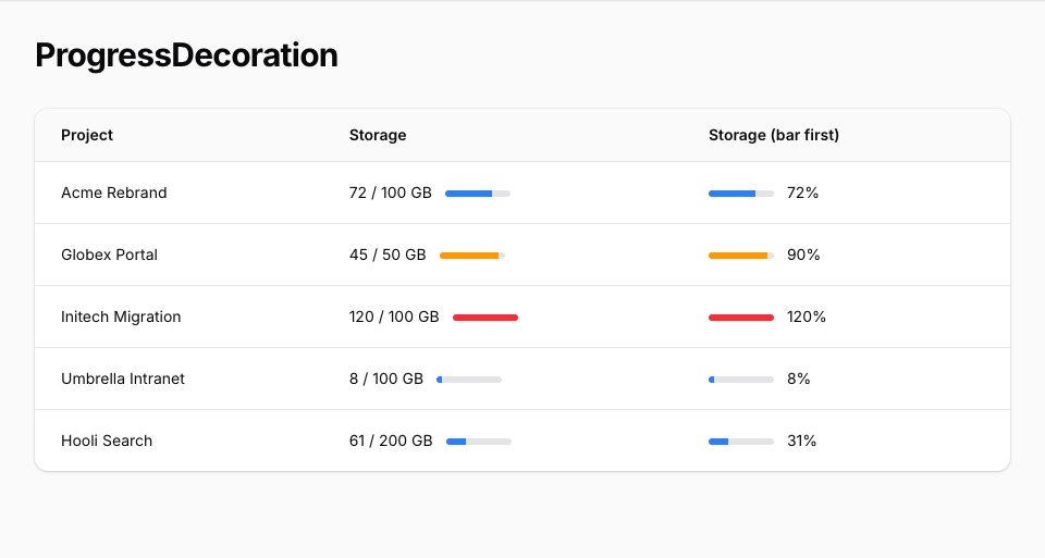
ProgressDecoration::make('name') shows how close a value is to its maximum as a thin, partly filled bar. The track is 3.75rem wide and 0.375rem tall, with rounded ends.
| Method | What it sets | Default |
|---|---|---|
value() |
The value, as an int or a float. | None |
max() |
The maximum. | 100 |
color() |
A Filament colour name for the fill. Gray draws with var(--gray-400); any other name uses shade 500. Palette arrays are not supported. |
primary |
label() |
A name for screen readers. The bar gets role="progressbar", aria-valuenow, aria-valuemin, aria-valuemax, and aria-label. |
None |
tooltip() |
Text shown on hover. | None |
visible(), hidden() |
Whether the bar renders. | Visible |
The value is clamped between 0 and the maximum, so the fill never overflows the track, and aria-valuenow reports the clamped value. A maximum of zero or less shows an empty bar, and aria-valuemax reports it as 0. A null value renders nothing, as if it were hidden.
Without label() the bar is decorative and hidden from screen readers, which suits a bar beside the figure it draws.
use App\Models\Account;
use Ornio\FilamentDecoratedColumn\ProgressDecoration;

DecoratedColumn::make('seats_used')
    ->suffixDecorations([
        ProgressDecoration::make('seats')
            ->value(fn (Account $record): int => $record->seats_used)
            ->max(fn (Account $record): int => $record->seat_limit)
            ->color(fn (Account $record): string => $record->seats_used >= $record->seat_limit ? 'danger' : 'primary'),
    ]),
#Pills
asPills() on the column or entry rounds every badge in both slots. It accepts a closure. A single badge overrides it with isPill() or isPill(false).
DecoratedColumn::make('name')
    ->asPills()
    ->suffixBadges([
        BadgeDecoration::make('new'),
        BadgeDecoration::make('draft')->isPill(false),
    ]);
#Separator
separator() sets the mark between the text and a non-empty slot. It takes a string or a closure. By default the mark is an em dash (—) at 37.5% opacity. Calling separator() with no argument sets a comma, because the method's own default is ','. A blank string removes the mark and widens the gap between slot and text from 0.25rem to 0.5rem.
DecoratedColumn::make('name')->separator('')->suffixBadges([/* ... */]);
DecoratedColumn::make('name')->separator('·')->suffixBadges([/* ... */]);
The separator is output as raw HTML, so entities work and user input must never go there.
Text set with prefix() or suffix() still renders, between the separator and the column text.
On TextColumn and TextEntry, separator() means something else: it splits a string state into a list on that character. DecoratedColumn and DecoratedEntry replace that method, and the inherited getSeparator() stays null, so the state is never split. With separator(','), a name like Smith, John stays one value. If you need a list, give the column an array state.
#Closure parameters
Every closure on a decoration can ask for these parameters by name:
$record: the row's Eloquent model, or null when the column has none.$state: the decoration's own resolved label, not the column's state.$livewire: the Livewire component that owns the table or infolist.
Parameters match by name, so call them exactly that. The type hint can be your model class: fn (Client $record). Other type-hinted parameters resolve from the container, as in any Filament closure.
The data setters work the same way: image() on an image, value() on a colour sample, trend, or progress bar, and max() on a progress bar. None of them receives the column's state, so read the data from $record, as the examples above do.
$state is for color(), icon(), tooltip(), visible(), value(), and the like. Don't request it inside label(): the label is what $state resolves to, so the closure would call itself. Inside weight() and fontFamily(), Filament's own traits inject $state as null.
use App\Models\Invoice;

BadgeDecoration::make('status')
    ->label(fn (Invoice $record): string => $record->status->getLabel())
    ->color(fn (string $state): string => $state === 'Overdue' ? 'danger' : 'gray'),
#Testing
composer test
#Changelog
See CHANGELOG for recent changes.
#Contributing
See CONTRIBUTING.
#Security Vulnerabilities
To report a security vulnerability, follow our security policy.
#Credits
#License
The MIT License (MIT). Please see License File for more information.
Featured Plugins
A selection of plugins curated by the Filament team
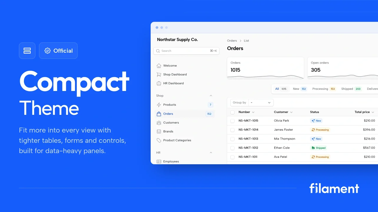
Compact Theme
A theme that makes data-heavy panels easier to scan by fitting more useful information on each screen.
 Filament
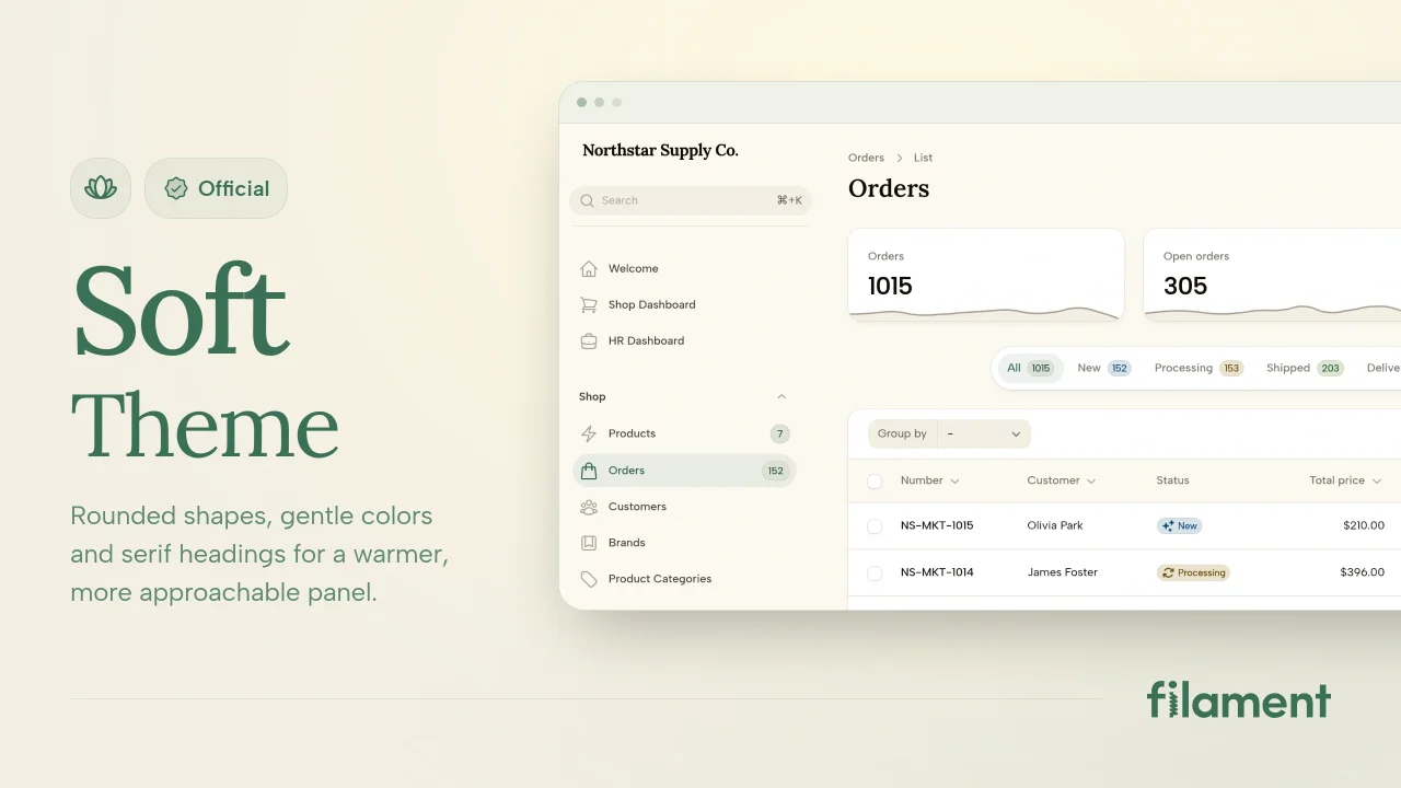
Soft Theme
A theme that gives panels a warm, approachable look with rounded shapes, gentle colors, and serif headings.
Filament
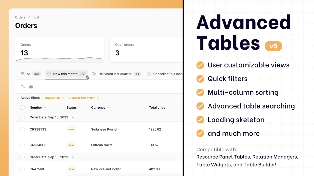
Advanced Tables (formerly Filter Sets)
Supercharge your tables with powerful features like user-customizable views, quick filters, multi-column sorting, advanced table searching, convenient view management, and more. Compatible with Resource Panel Tables, Relation Managers, Table Widgets, and Table Builder!
 Kenneth Sese