Alert Box
CommunityA modern, customizable alert box plugin for FilamentPHP with render hooks support and 4 beautiful card styles.
 Author:
Mohammad Arif
Author:
Mohammad Arif
Package health
BetaAutomated checks of this plugin's Composer package
13 checks
-
Failed:
Current Laravel version supported
—
The newest Laravel line the package co-installs with is
11.0, which is end-of-life. View details on Plumb -
Passed:
Current PHP version supported
—
Constraint
^8.1supports current PHP8.5. - Skipped: Current Symfony version supported
- Passed: Abandoned or archived — No consulted source marks the package abandoned (packagist, github).
- Failed: Commit and release recency — Inactive: last commit 384 days ago; last release 385 days ago. View details on Plumb
-
Passed:
composer.lock not committed by library
—
composer.lockis absent from the released dist archive. - Passed: Dist archive is lean
- Failed: GitHub Actions pinned to SHA — View details on Plumb
- Passed: Open security advisories
- Passed: Dependabot PR responsiveness — No open Dependabot PRs.
- Failed: Dependabot or Renovate configured — No dependency updater configuration found. View details on Plumb
- Skipped: Dependency update cooldown configured
- Failed: Provides a security policy — View details on Plumb
filament/
namespace. Review the source and install at your own risk. Found
malware or an unresolved security issue the author won't
address?
Report it
.
Documentation
- Features
- Installation
- Usage
- API Reference
- Card Style Previews
- Customization
- Requirements
- Contributing
- License
- Credits
- Support
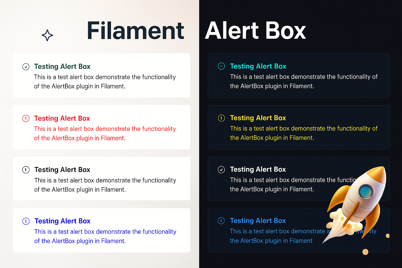
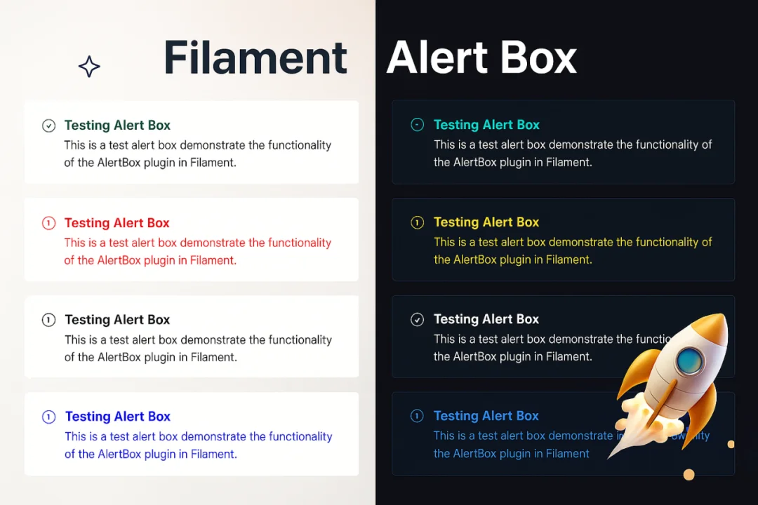
A modern, customizable alert box plugin for FilamentPHP with render hooks support. Create beautiful alerts with a fluent, chainable API across 4 different card styles.


#Features
- 🎨 4 Beautiful Card Styles - Banner, Card with Border, Modern Card, and Minimalist
- 🔗 Fluent Chainable API -
AlertBox::make('Title')->success()->modernCard()->show() - 🎯 FilamentPHP Render Hooks - Perfectly integrated with Filament's architecture
- 💾 In-Memory Storage - No database or session dependencies
- 🎭 Auto-Hide & Permanent - Configure timeout or make alerts persistent
- 🎪 Customizable Icons & Colors - Full control over appearance with 5 icon sizes (xs, s, m, lg, xl)
- ⚡ Zero Configuration - Works out of the box
- 📱 Responsive Design - Works on all screen sizes
#Installation
Install the package via Composer:
composer require rifrocket/filament-alert-box
Register the plugin in your Panel provider:
use RifRocket\FilamentAlertBox\AlertBoxPlugin;

public function panel(Panel $panel): Panel
{
    return $panel
        ->plugins([
            AlertBoxPlugin::make(),
        ]);
}
Optionally, publish the views:
php artisan vendor:publish --tag=alert-box-views
#Usage
#Basic Usage
use RifRocket\FilamentAlertBox\Facades\AlertBox;

// Simple success alert
AlertBox::make('Operation Successful')
    ->success()
    ->show();

// Error alert with description
AlertBox::make('Error Occurred')
    ->message('Something went wrong while processing your request.')
    ->danger()
    ->permanent()
    ->show();
#Card Styles
Choose from 4 beautiful card styles:
// Style 1: Simple Banner (default)
AlertBox::make('Welcome')->success()->bannerStyle()->show();

// Style 2: Card with Border
AlertBox::make('Information')->info()->cardWithBorder()->show();

// Style 3: Modern Card
AlertBox::make('Warning')->warning()->modernCard()->show();

// Style 4: Minimalist
AlertBox::make('Update Available')->info()->minimalistStyle()->show();

// Or use the generic method
AlertBox::make('Custom')->success()->cardStyle(2)->show();
#Position-Based Methods
Use position-specific methods to control WHERE alerts appear:
AlertBox::make('Header Alert')->success()->pageHeaderAfter()->show();
AlertBox::make('Sidebar Alert')->warning()->sidebarNavEnd()->show();
AlertBox::make('Topbar Alert')->info()->topBarStart()->show();
AlertBox::make('Footer Alert')->info()->footer()->show();
#Combining Style and Position
Mix card styles with positions for complete control:
// Modern card in header position
AlertBox::make('Welcome')->success()->modernCard()->pageHeaderAfter()->show();

// Minimalist style in topbar
AlertBox::make('Quick Notice')->info()->minimalistStyle()->topBarStart()->show();

// Bordered card at page end
AlertBox::make('Done!')->success()->cardWithBorder()->pageEnd()->show();
#Alert Types
// Success alerts
AlertBox::make('Success!')->success()->show();

// Error/Danger alerts
AlertBox::make('Error!')->danger()->show();
AlertBox::make('Error!')->error()->show(); // Alias for danger

// Warning alerts
AlertBox::make('Warning!')->warning()->show();

// Info alerts (default)
AlertBox::make('Information')->info()->show();
#Advanced Configuration
AlertBox::make('Custom Alert')
    ->message('This is the main message')
    ->description('Additional description text')
    ->icon('heroicon-o-check-circle')
    ->iconColor('#10b981')
    ->titleColor('#059669')
    ->success()
    ->modernCard() // Use modern card style
    ->pageHeaderAfter() // Position in header
    ->canBeClose(true)
    ->autoDisappear(10) // Auto-hide after 10 seconds
    ->classes('custom-alert-class')
    ->style('border: 2px solid red;')
    ->show();
#Auto-Hide vs Permanent
// Auto-hide after 5 seconds
AlertBox::make('Auto Hide')
    ->success()
    ->autoDisappear(5)
    ->show();

// Permanent alert (user must close)
AlertBox::make('Important Notice')
    ->warning()
    ->permanent()
    ->show();

// Closeable control
AlertBox::make('Closeable Alert')
    ->info()
    ->canBeClose(false) // Cannot be closed by user
    ->show();
#Quick Static Methods
Convenience methods for rapid alert creation:
// Quick success alert
AlertBox::success('Operation completed successfully!')->show();

// Quick error alert
AlertBox::error('Something went wrong!')->show();

// Quick warning alert
AlertBox::warning('Please check your input.')->show();

// Quick info alert
AlertBox::info('Here is some information.')->show();

// Chain additional methods with quick methods
AlertBox::success('Data saved!')
    ->modernCard()
    ->autoDisappear(5)
    ->pageHeaderAfter()
    ->show();
#API Reference
#AlertBuilder Methods
| Method | Description | Example |
|---|---|---|
make(string $title = null) |
Create new alert builder | AlertBox::make('Title') |
title(string $title) |
Set alert title | ->title('Alert Title') |
message(string $message) |
Set alert message (alias for description) | ->message('Alert message') |
description(string $description) |
Set alert description | ->description('Alert description') |
cardStyle(int $style) |
Set card style (1-4) | ->cardStyle(2) |
bannerStyle() |
Simple banner style | ->bannerStyle() |
cardWithBorder() |
Card with border style | ->cardWithBorder() |
modernCard() |
Modern card style | ->modernCard() |
minimalistStyle() |
Minimalist style | ->minimalistStyle() |
icon(string $icon) |
Set alert icon | ->icon('heroicon-o-check') |
noIcon(bool $state = true) |
Disable alert icon | ->noIcon() |
iconColor(string $color) |
Set icon color | ->iconColor('#10b981') |
iconSize(string $size) |
Set icon size (xs, s, m, lg, xl) | ->iconSize('lg') |
iconXS() |
Set extra small icon | ->iconXS() |
iconS() |
Set small icon | ->iconS() |
iconM() |
Set medium icon (default) | ->iconM() |
iconLG() |
Set large icon | ->iconLG() |
iconXL() |
Set extra large icon | ->iconXL() |
titleColor(string $color) |
Set title color | ->titleColor('#059669') |
descriptionColor(string $color) |
Set description color | ->descriptionColor('#6b7280') |
success() |
Set as success alert | ->success() |
danger() |
Set as danger alert | ->danger() |
error() |
Alias for danger | ->error() |
warning() |
Set as warning alert | ->warning() |
info() |
Set as info alert | ->info() |
canBeClose(bool $closeable = true) |
Set closeable | ->canBeClose(false) |
autoDisappear(int $seconds) |
Auto-hide timeout | ->autoDisappear(10) |
permanent(bool $permanent = true) |
Make permanent | ->permanent() |
classes(string $classes) |
Add CSS classes | ->classes('my-class') |
style(string $style) |
Add inline styles | ->style('color: red;') |
position(string $position) |
Set custom position | ->position('custom-hook') |
renderHook(string $hook) |
Set render hook | ->renderHook(PanelsRenderHook::PAGE_START) |
show() |
Display the alert | ->show() |
#Position Methods
| Method | Description | Hook |
|---|---|---|
pageHeaderAfter() |
After page header widgets | PAGE_HEADER_WIDGETS_AFTER |
pageStart() |
At page start | PAGE_START |
sidebarNavEnd() |
End of sidebar navigation | SIDEBAR_NAV_END |
topbarStart() |
Start of topbar | TOPBAR_START |
pageEnd() |
At page end | PAGE_END |
footer() |
In footer | FOOTER |
#Manager Methods
use RifRocket\FilamentAlertBox\AlertBoxManager;

// Get alerts for position
$alerts = AlertBoxManager::getAlerts('position');

// Clear alerts for position
AlertBoxManager::clearAlerts('position');

// Clear all alerts
AlertBoxManager::clearAll();

// Get alert count
$count = AlertBoxManager::getAlertCount();
#Card Style Previews
#Style 1: Simple Banner
Clean, simple banner-style alert with a colored left border. Perfect for basic notifications.
#Style 2: Card with Border
Enhanced card with a full border, more padding, and refined styling. Great for important messages.
#Style 3: Modern Card
Premium card design with gradient top border, enhanced shadows, and sophisticated styling. Best for key announcements.
#Style 4: Minimalist
Compact, clean design with minimal styling. Perfect for subtle notifications and inline messages.
#Customization
#Publishing Views
php artisan vendor:publish --tag=alert-box-views
The alert styles use Tailwind CSS utility classes exclusively. You can customize the appearance by publishing and modifying the Blade views at resources/views/vendor/alert-box/.
#Custom Icons
Use any Heroicon or custom icon with different sizes:
AlertBox::make('Custom Icon')
    ->icon('heroicon-o-star')
    ->iconSize('lg') // or ->iconLG()
    ->success()
    ->show();
#Icon Sizes
Choose from 5 different icon sizes:
// Extra Small (3x3)
AlertBox::make('Minimal Alert')->iconXS()->info()->show();

// Small (4x4)
AlertBox::make('Small Alert')->iconS()->warning()->show();

// Medium (6x6) - Default
AlertBox::make('Normal Alert')->iconM()->success()->show();

// Large (8x8)
AlertBox::make('Important Alert')->iconLG()->danger()->show();

// Extra Large (10x10)
AlertBox::make('Critical Alert')->iconXL()->error()->show();
#Requirements
- PHP 8.1+
- FilamentPHP 3.0+
- Laravel 10.0+ or 11.0+
#Contributing
Contributions are welcome! Please feel free to submit a Pull Request.
#License
The MIT License (MIT). Please see License File for more information.
#Credits
#Support
If you find this package helpful, please consider starring the repository!
The author
Mohammad Arif is a passionate Laravel and FilamentPHP developer focused on creating practical, well-documented packages that enhance developer productivity. With expertise in modern web technologies and UI/UX design, Mohammad builds tools that solve real-world problems while maintaining high code quality and comprehensive documentation.
When not coding, Mohammad enjoys exploring new technologies and contributing to the open-source community. He believes in creating software that is not only functional but also enjoyable to use.
Featured Plugins
A selection of plugins curated by the Filament team

Blueprint
Filament Blueprint is a premium Laravel Boost extension that helps AI agents produce accurate, detailed implementation plans and security reports for Filament apps.
 Filament
Custom Dashboards
Let your users build and share their own dashboards with a drag-and-drop interface. Define your data sources in PHP and let them do the rest.
Filament
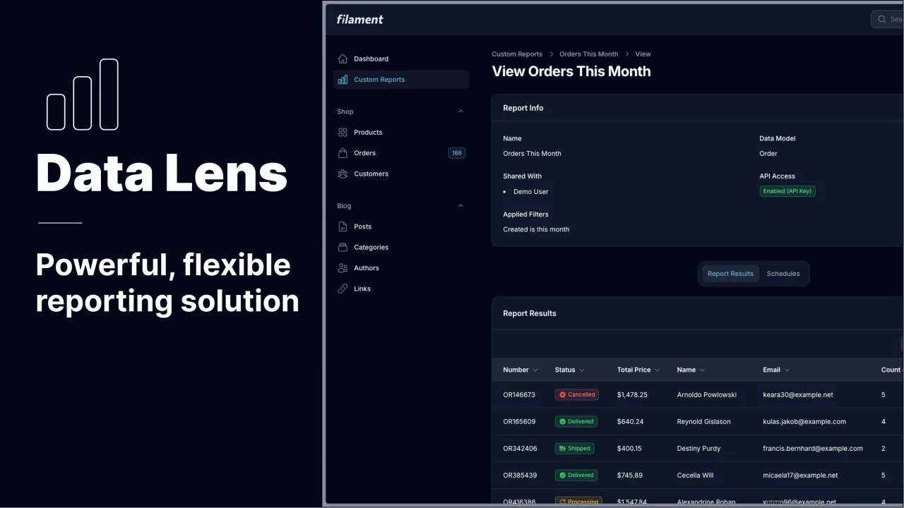
Data Lens
Advanced Data Visualization for Laravel Filament - a premium reporting solution enabling custom column creation, sophisticated filtering, and enterprise-grade data insights within admin panels.
 Padmission