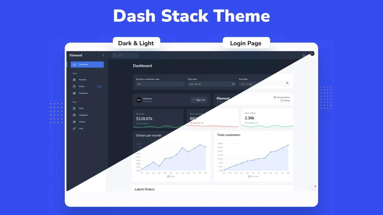
Dash Stack Theme
CommunityDash Stack Dashboard Theme.
 Author:
Farouk Braik
Author:
Farouk Braik
Package health
BetaAutomated checks of this plugin's Composer package
13 checks
-
Warning:
Current Laravel version supported
—
Package does not co-install with current Laravel
13.0; the newest co-installable line is12.0, which still receives active support but is not the current stable. -
Passed:
Current PHP version supported
—
Constraint
^8.2supports current PHP8.5. - Skipped: Current Symfony version supported
- Passed: Abandoned or archived — No consulted source marks the package abandoned (packagist, github).
- Warning: Commit and release recency — Low activity: last commit 316 days ago; last release 358 days ago.
-
Failed:
composer.lock not committed by library
—
composer.lockis present in the released dist archive. View details on Plumb - Warning: Dist archive is lean
- Failed: GitHub Actions pinned to SHA — View details on Plumb
- Passed: Open security advisories
- Passed: Dependabot PR responsiveness — No open Dependabot PRs.
- Failed: Dependabot or Renovate configured — No dependency updater configuration found. View details on Plumb
- Skipped: Dependency update cooldown configured
- Passed: Provides a security policy
filament/
namespace. Review the source and install at your own risk. Found
malware or an unresolved security issue the author won't
address?
Report it
.
Documentation


Tested on Filamentphp demo app
#Acknowledgements
Name based and Design inspired from DashStack Theme. Big thanks for Seju for this amazing design.
#Documentation
#Installation
#Step 1: Install this package using composer:
composer require nuxtifyts/dash-stack-theme
#Step 2: Run install command:
Running this command will install required npm packages (If they're not already installed), and it will publish its assets as well.
php artisan filament-dash-stack-theme:install
#Step 3: Register filament plugin:
Within your targeted panel provider, you can now use and register dash stack theme plugin:
use Nuxtifyts\DashStackTheme\DashStackThemePlugin;

// ...

$panel->plugin(DashStackThemePlugin::make());
#Step 4: Add DashStack to your vite config:
Add DashStack theme to your vite.config.js:
input: [
   // ...
   'vendor/nuxtifyts/dash-stack-theme/resources/css/theme.css',
],
For more information on using theme, check filament docs.
#Configuration
DashStack theme comes by default with a configuration for primary color used, and predefined dashboard configs for the theme, if needed to be altered, you can always publish vendor config file and change them however you see fit:
// filament-dash-stack-theme.php

use Nuxtifyts\DashStackTheme\Support\Colors\Color;

return [
    'default-colors' => [
        'primary' => Color::Blue,
    ],

    'side-bar-collapsable-on-desktop' => true,

    'collapsible-navigation-groups' => false,

    'breadcrumbs' => false,

    /**
     * Nunito Sans is the default font for the theme.
     */
    'use-default-font' => true,
];
note: The default font used for Dash Stack Theme is Nunito Sans, you can disable this behavior by publish the config file of this package, and setting
use-default-fonttofalse.
#Upcoming Features
Eventually these components will be added to the package, if you have any suggestions/feedback, if you have a feature request, please don't hesitate to do so in GitHub.
#List of upcoming changes:
- Date / DateTime / DateRange component
- Select component (Could be only UI changes for this one)
#Appearance
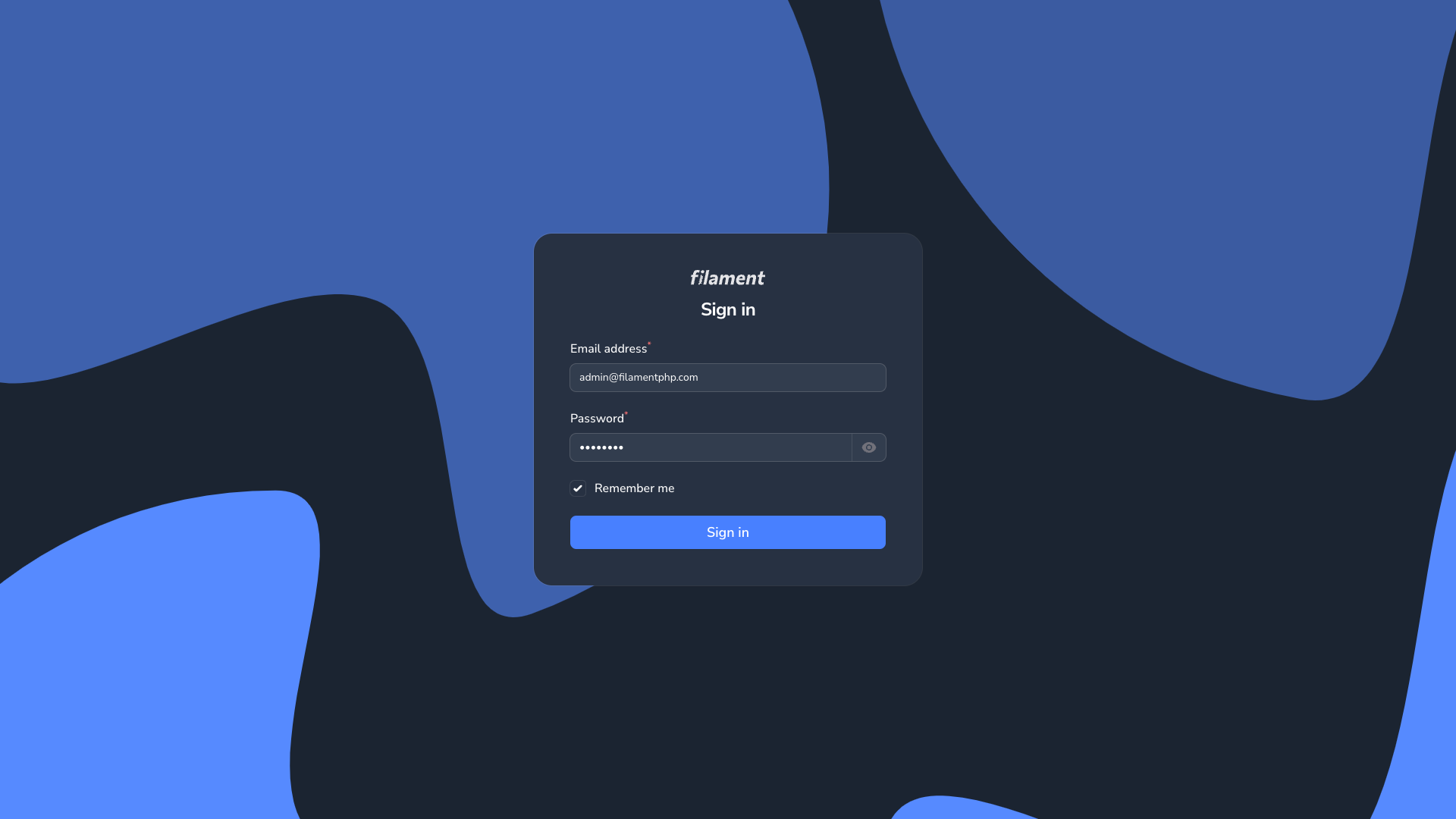
#Login Page
| Login Page Light | Login Page Dark |
|---|---|
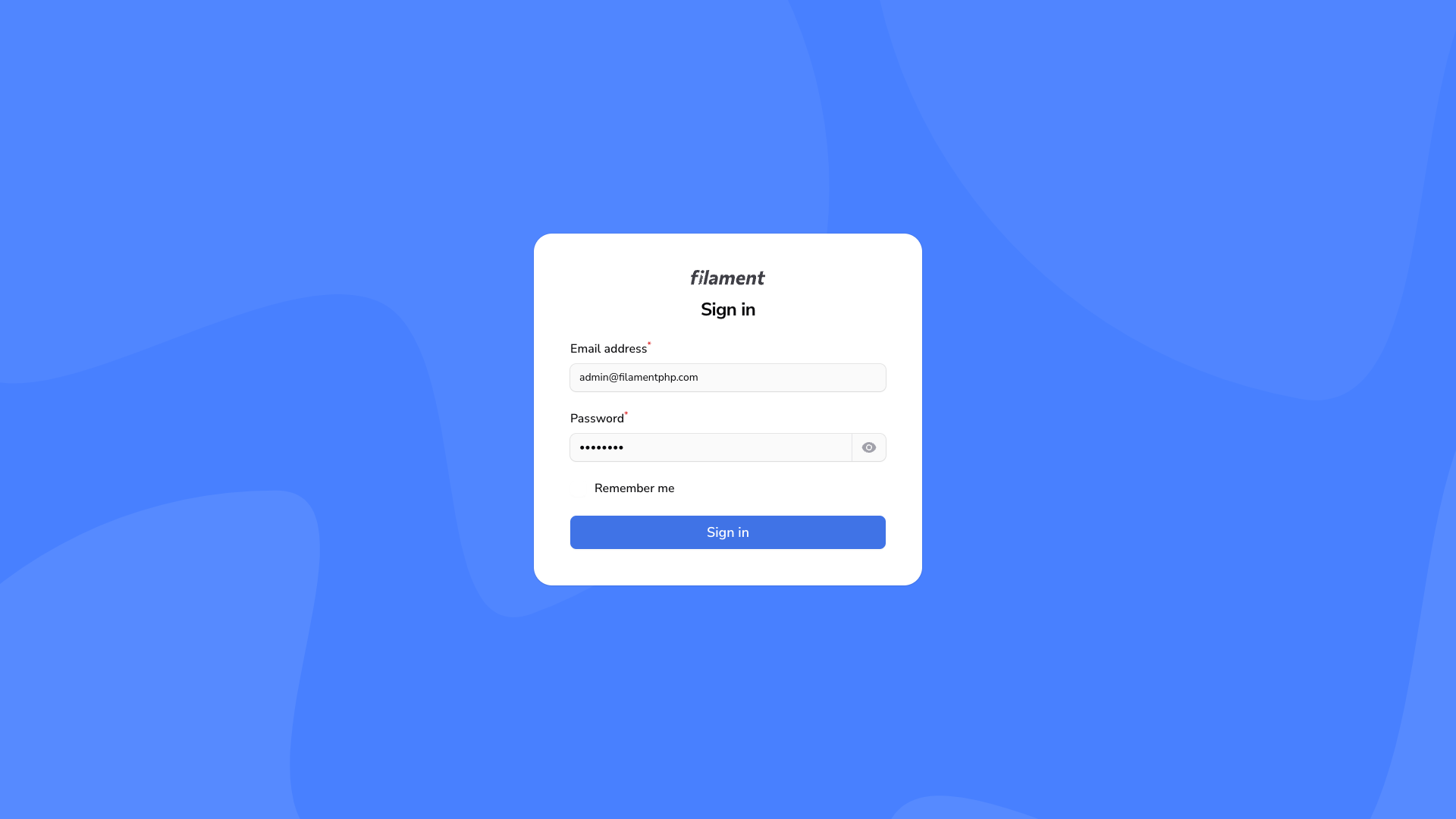
|
|
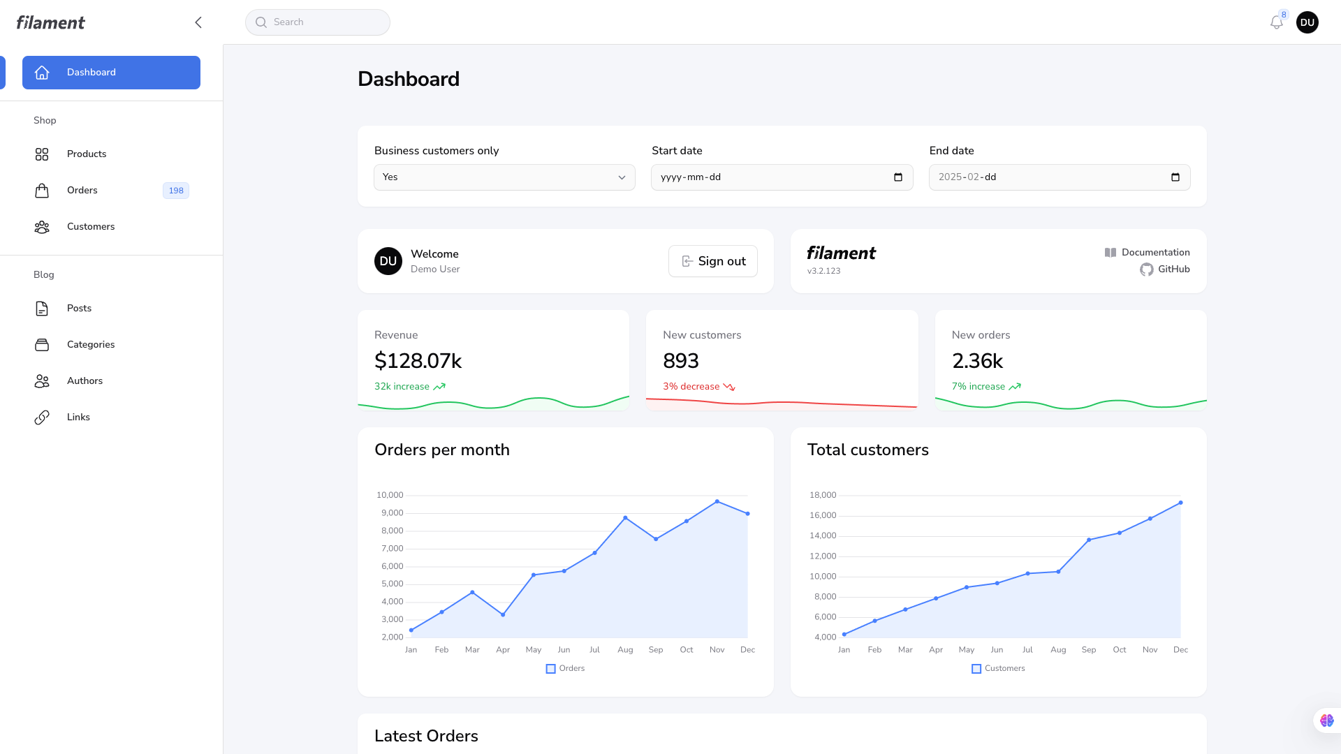
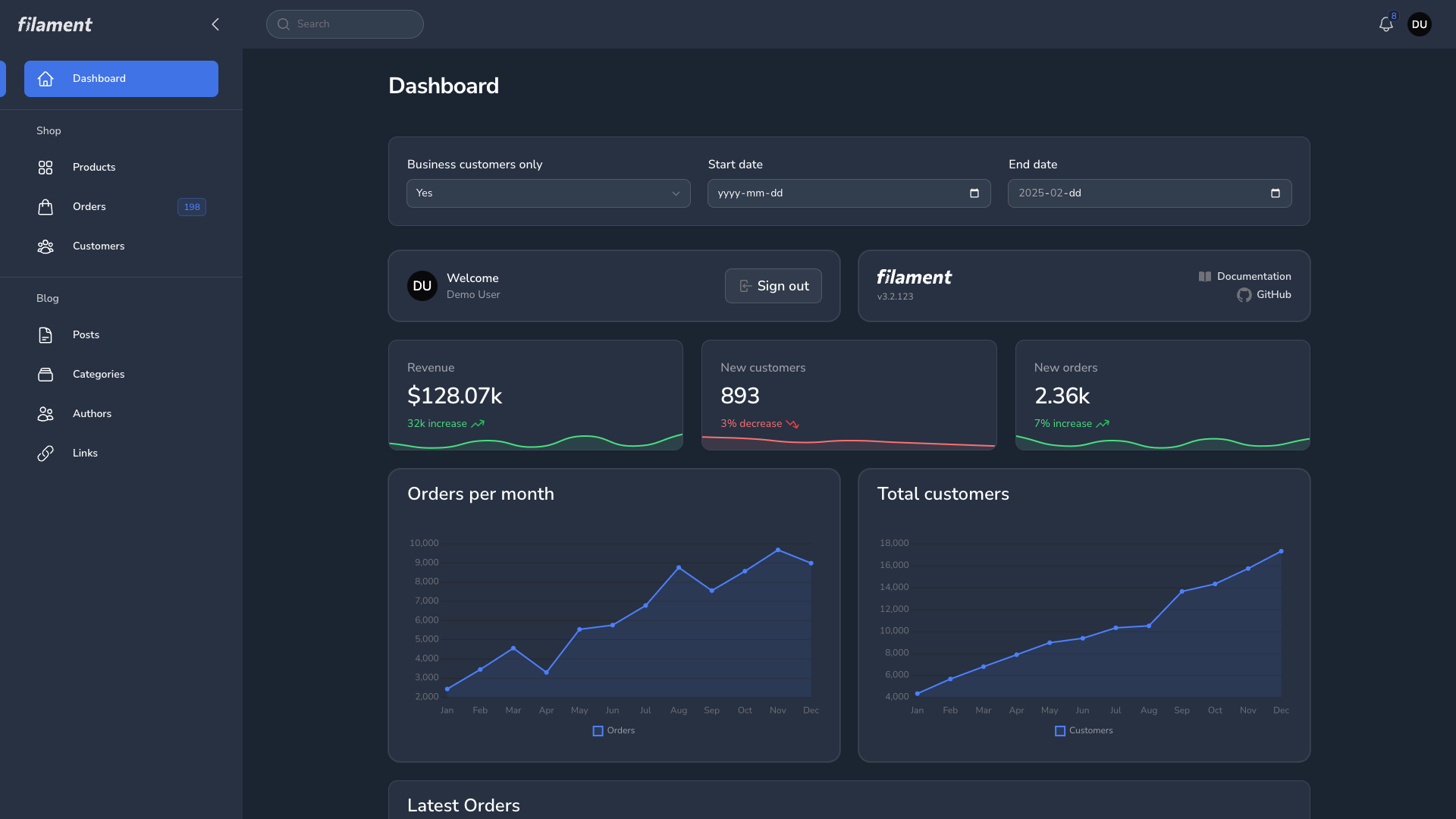
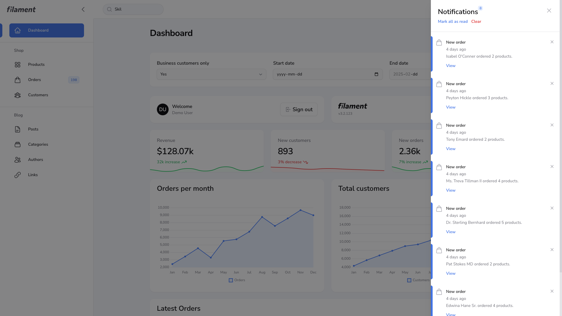
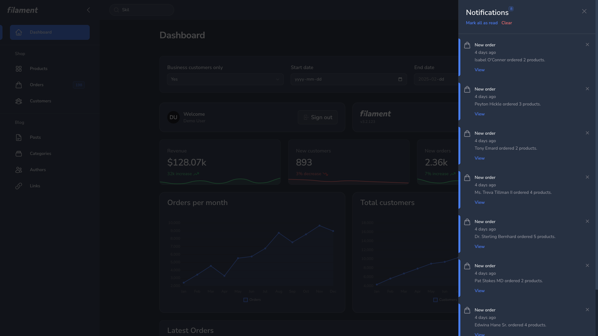
#Dashboard Page
| Dashboard Page Light | Dashboard Page Dark |
|---|---|
|
|
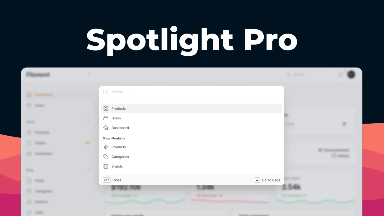
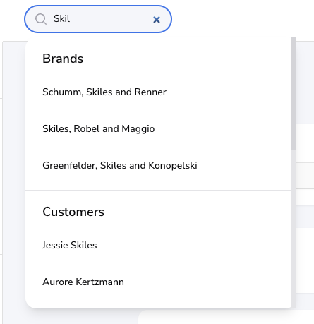
#Global Search
| Global Search Light | Global Search Dark |
|---|---|
|
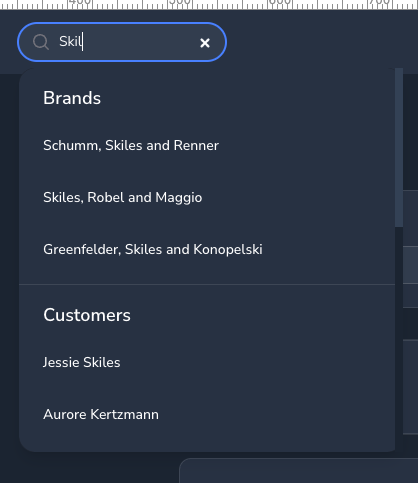
|
#Notification Modal
| Notification Modal Light | Notification Modal Dark |
|---|---|
|
|
#User Menu
| User Menu Light | User Menu Dark |
|---|---|
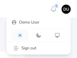
|
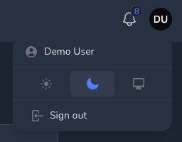
|
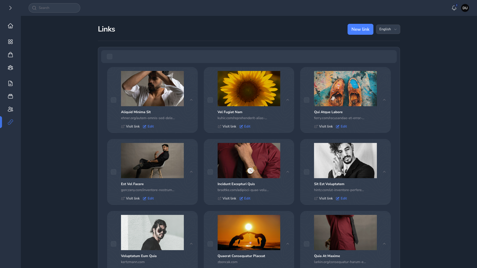
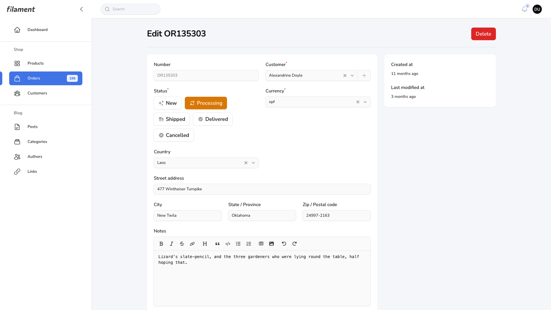
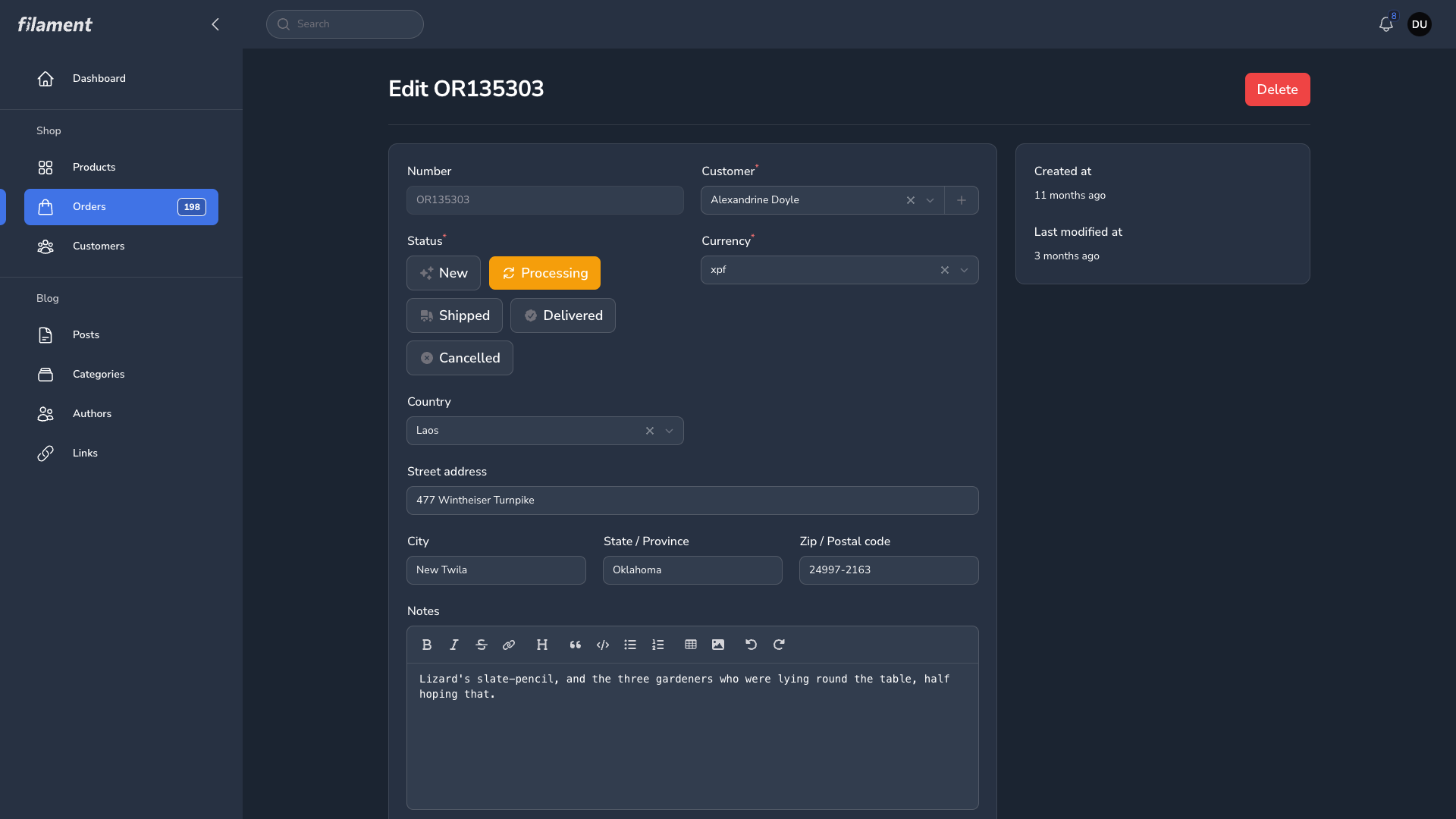
#Resource Page
| Resource Page Light | Resource Page Dark |
|---|---|
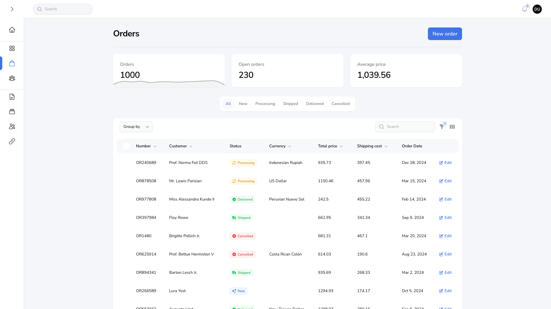
|
|
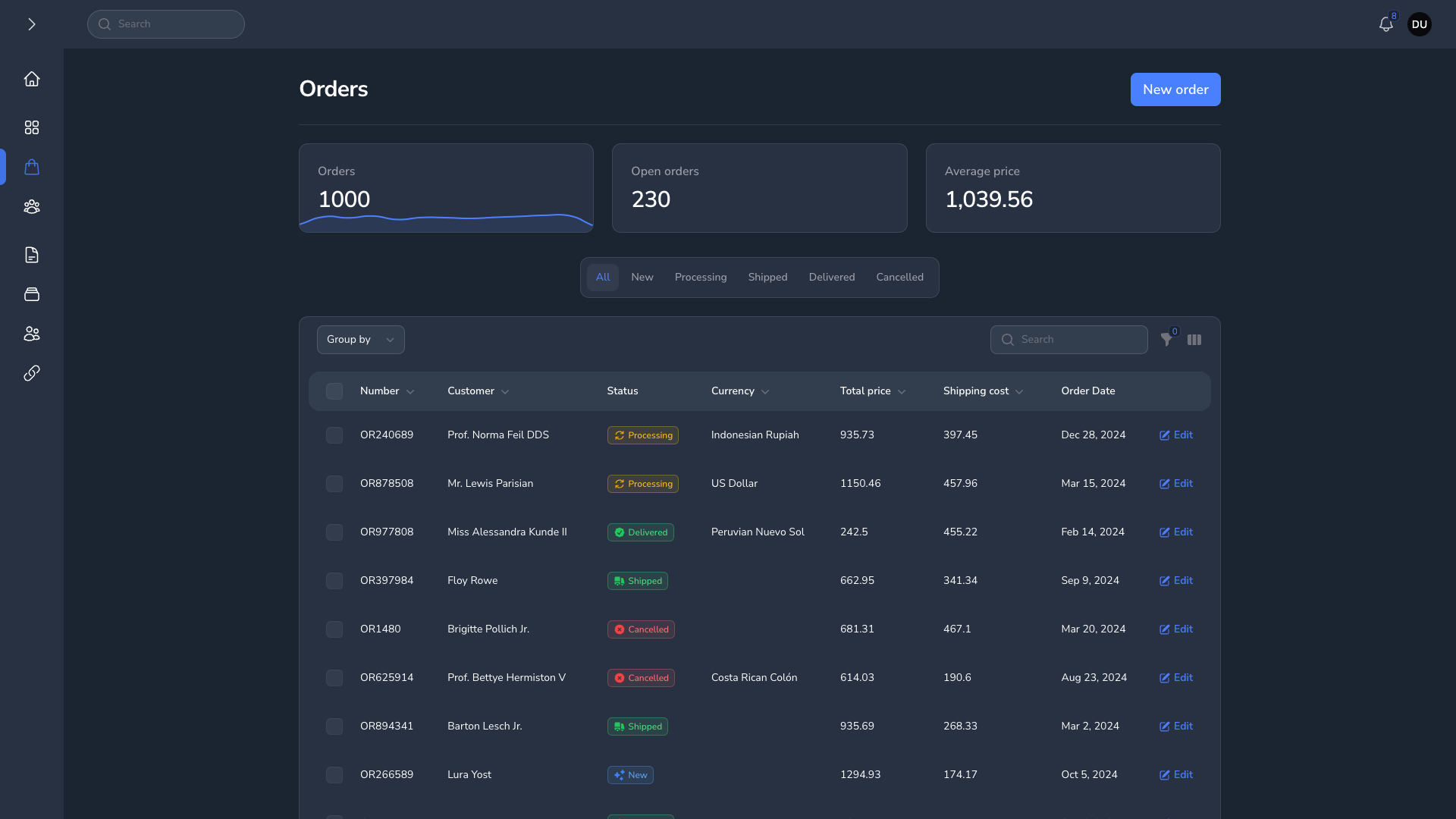
#Grid Table
| Grid Table Light | Grid Table Dark |
|---|---|
|
|
#Forms
| Forms Light | Forms Dark |
|---|---|
|
|
The author
I am a Full-Stack web developer with over 4 years of experience specializing in Back-end. I prefer using Laravel with either Livewire & AlpineJs or a Vue.js/Nuxt, depending on the complexity of the application. I have a strong preference for tailwind CSS for my projects
Featured Plugins
A selection of plugins curated by the Filament team
Custom Dashboards
Let your users build and share their own dashboards with a drag-and-drop interface. Define your data sources in PHP and let them do the rest.
 Filament
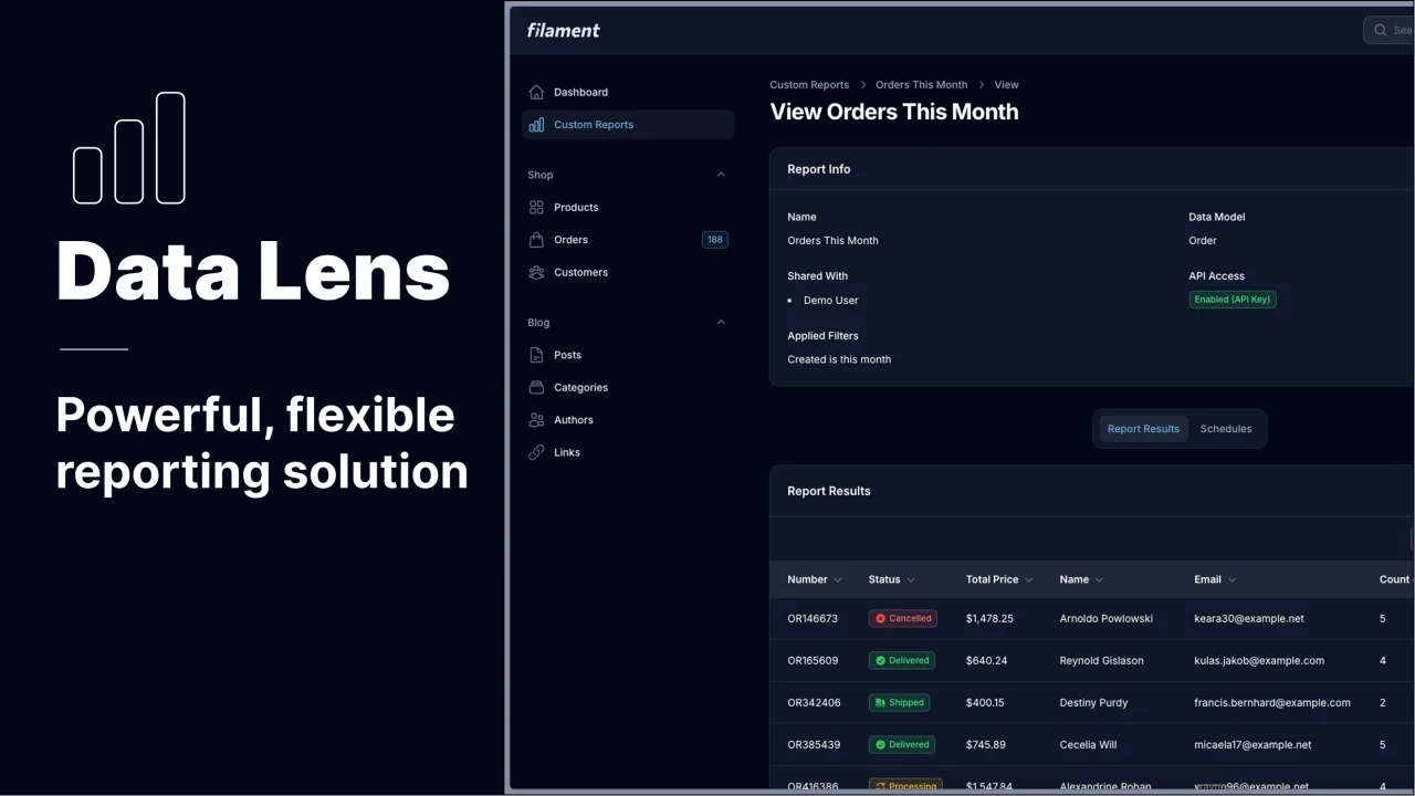
Data Lens
Advanced Data Visualization for Laravel Filament - a premium reporting solution enabling custom column creation, sophisticated filtering, and enterprise-grade data insights within admin panels.
 Padmission

Blueprint
Filament Blueprint is a premium Laravel Boost extension that helps AI agents produce accurate, detailed implementation plans and security reports for Filament apps.
Filament