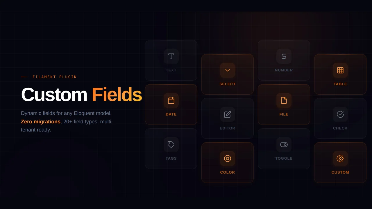
Auth UI Enhancer
Transform your auth pages with ease and make them truly stand out with this flexible alternative to the default auth pages in the Filament Panels package.
 Author:
Diogo Pinto
Author:
Diogo Pinto
Documentation
- Looking for an easy way to customize the UI of your Auth Pages in your Filament Panel?
- Navigation
- Version Compatibility
- Installation
- Usage
- Customizing the Auth UI
- Further Customization - CSS
- Working Example
- Todo
- Changelog
- Contributing
- Security Vulnerabilities
- Credits
- License


#Looking for an easy way to customize the UI of your Auth Pages in your Filament Panel?
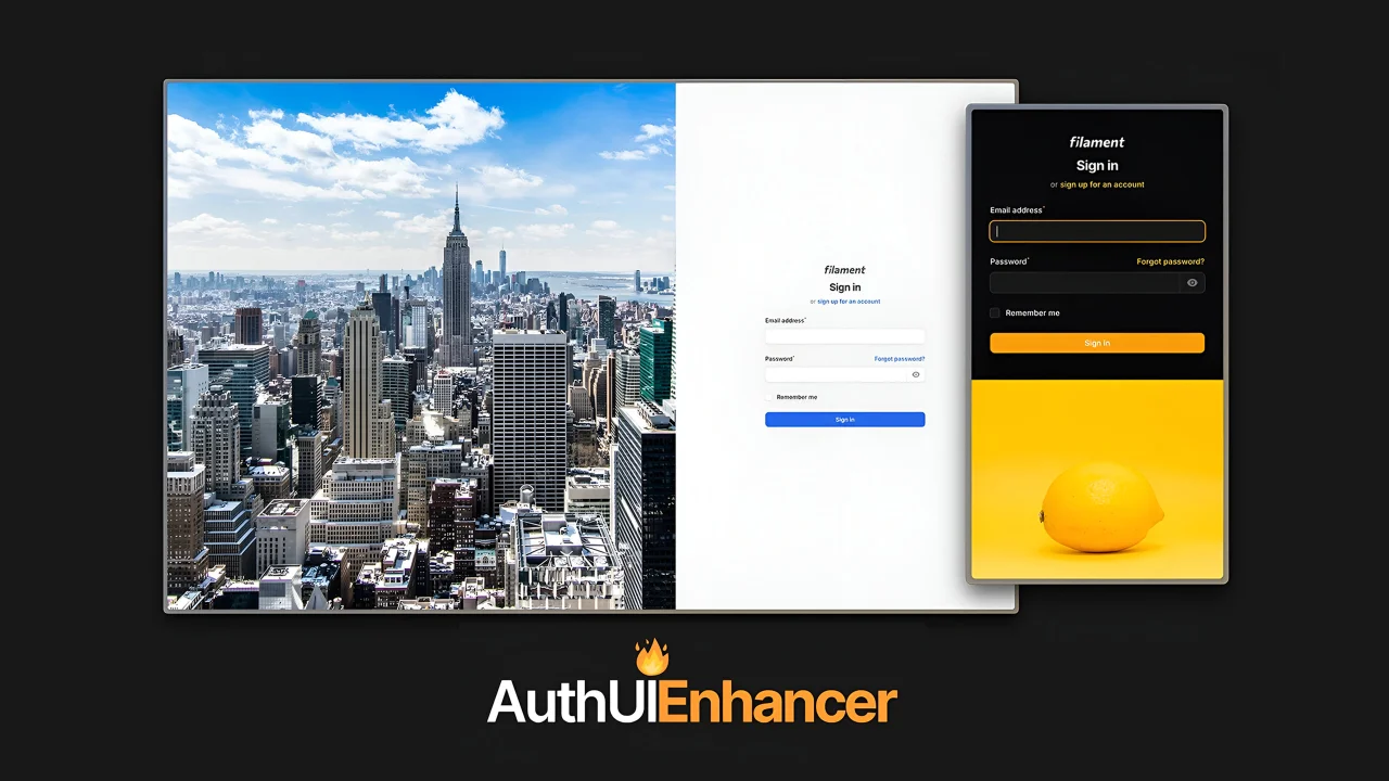
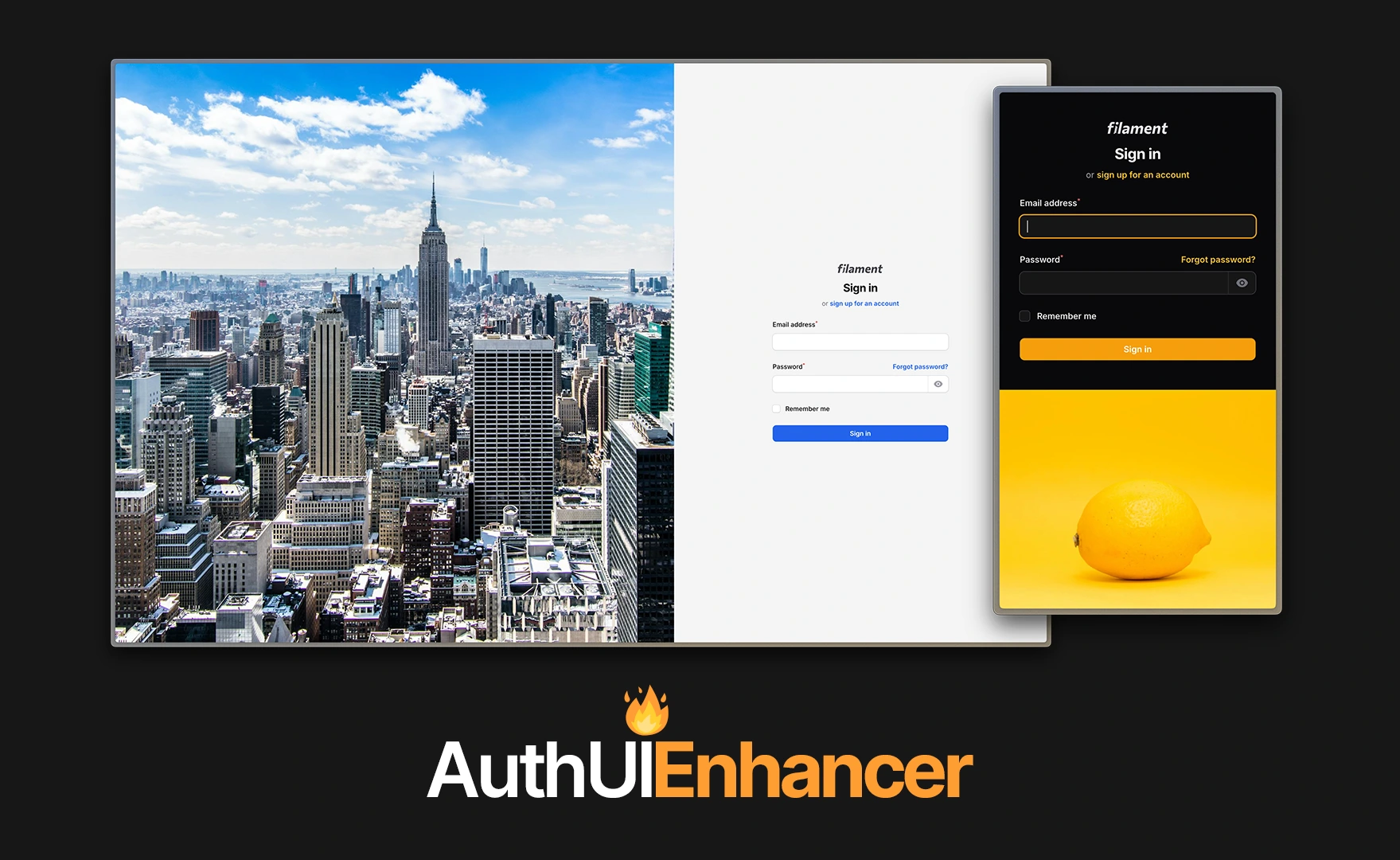
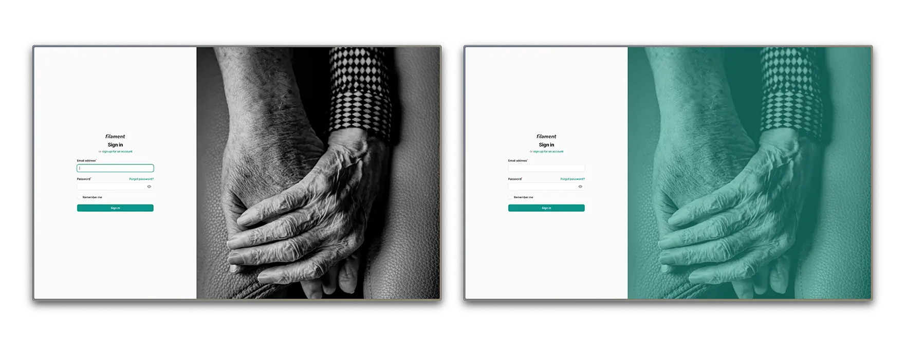
This Filament plugin empowers you to transform your auth pages with ease, allowing you to make them truly stand out. It offers a flexible alternative to the default auth pages in the Filament Panels package.
Setting it up is a breeze, and it comes packed with a variety of customizable features—plus, there’s a lot more to come! 🔥
#Check out some examples you can create right out of the box:
#Navigation
- Version Compatibility
- Installation
- Usage
- Customizing the Auth UI
- Further Customization - CSS
- Working Examples
- Todo
- Changelog
- Contributing
- Security Vulnerabilities
- Credits
- License
#Version Compatibility
| Plugin Version | Filament Version | PHP Version |
|---|---|---|
^2.0 |
^4.0 | ^5.0 |
^8.2 |
^1.0 |
^3.0 |
^8.1 |
#Installation
Start by installing the plugin via composer:
composer require diogogpinto/filament-auth-ui-enhancer
In an effort to align with Filament's theming methodology you will need to use a custom theme to use this plugin.
[!IMPORTANT] If you have not set up a custom theme, follow the instructions in the Filament Docs first.
- Add the following to your
theme.cssfile:
@source '../../../../vendor/diogogpinto/filament-auth-ui-enhancer/resources/**/*.blade.php';
[!IMPORTANT] The above content should be placed in your filament theme's
theme.cssfile, under the /resources/css/filament/{panel-name} path
- Run
npm run buildin your terminal
#Usage
To start using the plugin, you need to add the plugin to your plugins array in your filament panel.
use DiogoGPinto\AuthUIEnhancer\AuthUIEnhancerPlugin;

 ->plugins([
    AuthUIEnhancerPlugin::make(),
])
#Auth Page Discovery
#Default Auth Logic
If you don't have any custom classes on the auth methods of your Filament panel (login(), registration(), resetPassword() and emailVerification()), this plugin will work almost out of the box.
If your panel provider is setup like below, this plugin will automatically apply the changes to your UI.
$panel
    ->login()
    ->registration()
#Custom Auth Logic
If you have custom logic in the mentioned methods, there is a simple way to make that UI pop, using a simple trait from this plugin. If your panel looks like the below:
$panel
    ->login(YourLoginClass::class)
Just add the following trait to YourLoginClass:
use DiogoGPinto\AuthUIEnhancer\Pages\Auth\Concerns\HasCustomLayout;

class YourLoginClass extends BaseLogin
{
    use HasCustomLayout;
}
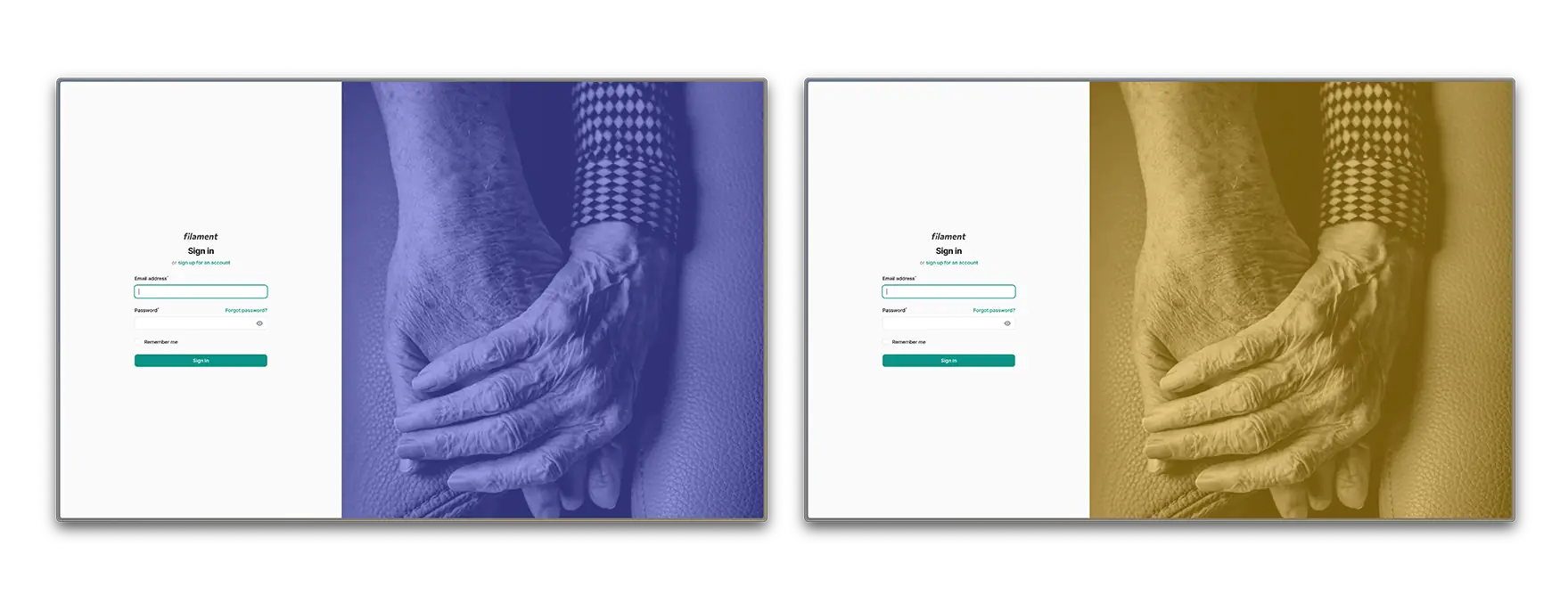
#Customizing the Auth UI
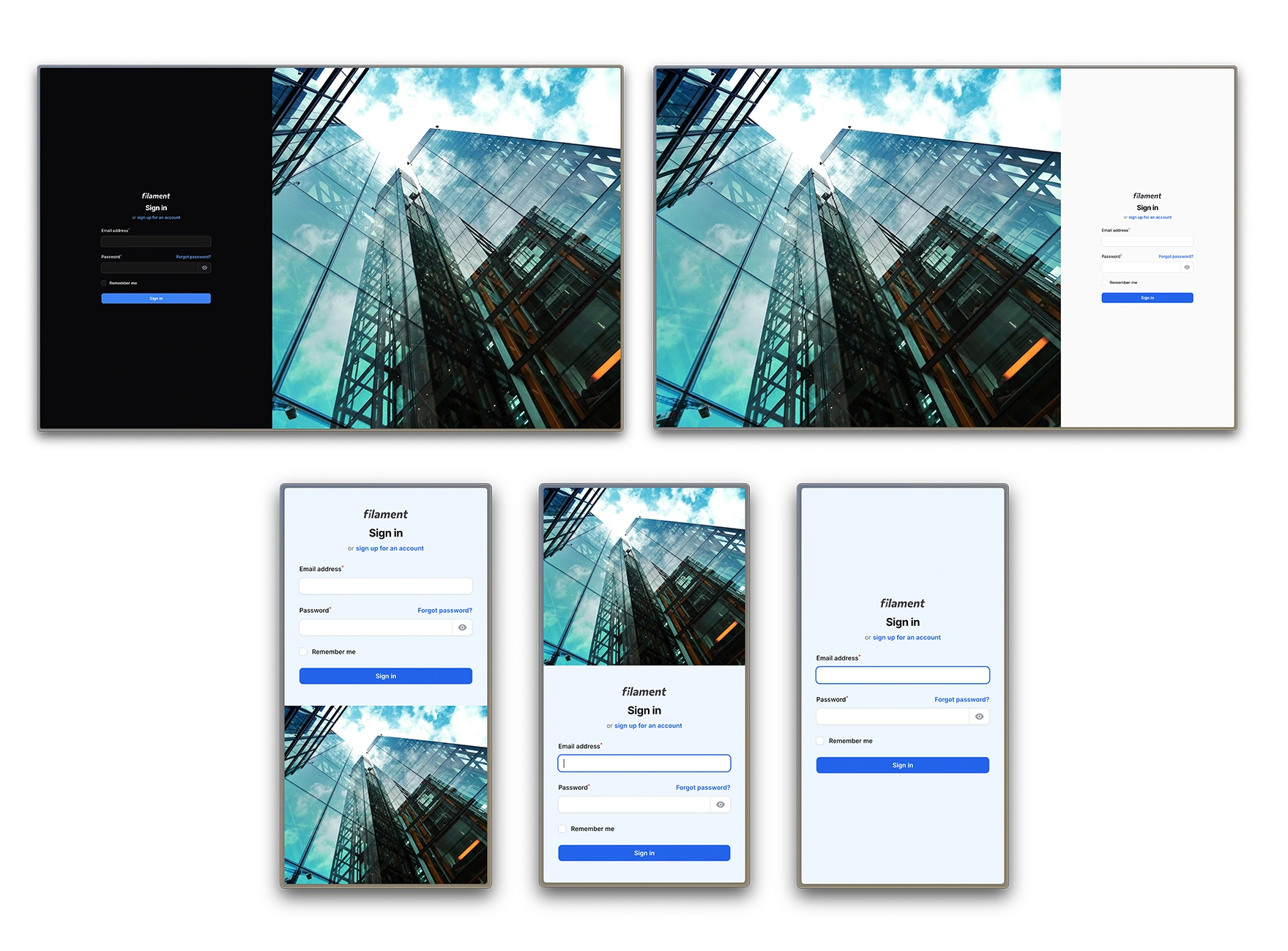
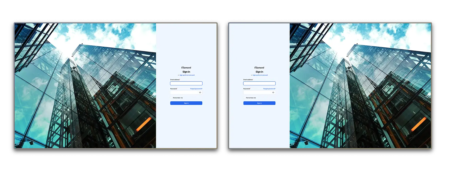
The view for this package divides your screen in two sections:
- Form Panel - The panel that contains the form
- Empty Panel - The panel that contains the image
#Customizing the Form Panel
You can customize:
- The form panel position in both desktop and mobile
- The form panel width in desktop
- The form panel background color
#Form Position
You can make the form appear on the left side of the page or in the right side of the page.
->formPanelPosition('left')
#Form Position on Mobile
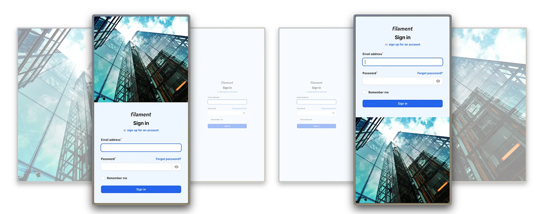
On mobile devices, you can chose if the form appears above the empty container or below.
->mobileFormPanelPosition('bottom')
This method accepts top or bottom as arguments. You can also hide the empty panel on mobile (see below).
#Form Panel Width
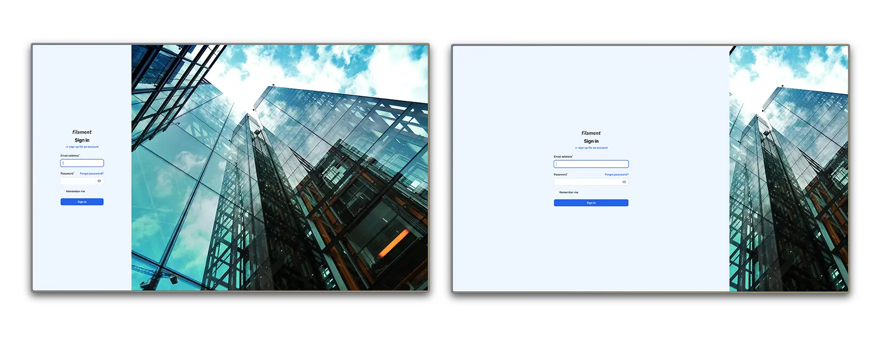
The form panel width has a default value of 50%. You can change it by adding the following method and passing the desired width.
->formPanelWidth('40%')
Sizes must be expressed in rem, %, px, em, vw, vh or pt.
#Form Panel Background Color
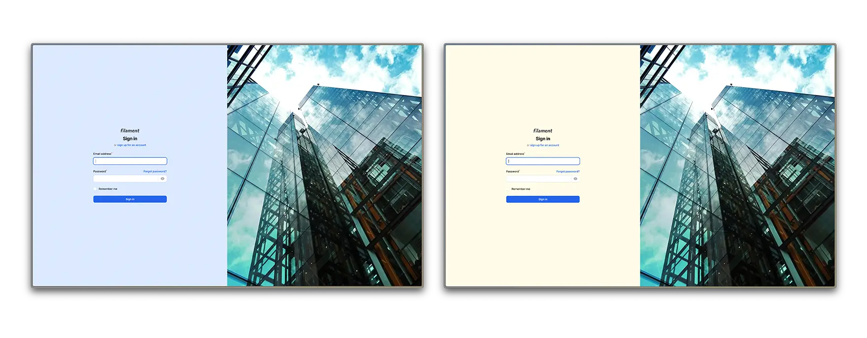
You can change the form panel background color by using the following method:
use Filament\Support\Colors\Color;

->formPanelBackgroundColor(Color::Zinc, '300')
In this case, 300 is the shade of the color you want to use.
You can also set the color using HEX or RGB, like in a typical filament panel:
use Filament\Support\Colors\Color;

->formPanelBackgroundColor(Color::hex('#f0f0f0'))
#Customizing the Empty Panel
You can customize:
- The empty panel background color
- The empty panel background image and its opacity
- The empty panel view
- Either to show or hide empty panel on mobile
#Empty Panel Background Image and Image Opacity
You can set an image to be displayed on the empty panel, and control its opacity.
->emptyPanelBackgroundImageUrl('images/login.webp')
You can pass an asset URL with Laravel's asset('images/login.webp') function.
If you would like to change the image opacity, you can use the following method:
->emptyPanelBackgroundImageOpacity('50%')
#Empty Panel Background Color
The default background color is your panel's primary color. You can change the empty panel background color by using the following method:
use Filament\Support\Colors\Color;

->emptyPanelBackgroundColor(Color::Zinc, '300')
In this case, 300 is the shade of the color you want to use.
You can also set the color using HEX or RGB, like in a typical filament panel:
use Filament\Support\Colors\Color;

->emptyPanelBackgroundColor(Color::hex('#f0f0f0'))
#Empty Panel Custom View
You can decide to use a custom view inside the empty panel instead of a background. Decide which view to use by using the following method:
->emptyPanelView('view')
The method only accepts the view name as a parameter. If both background image and custom view are provided, the plugin will prioritize the view.
#Hide Empty Panel on Mobile Devices
You can just use the following method, so the empty panels disappears on mobile and the form container spans to full height:
->showEmptyPanelOnMobile(false)
#Further Customization - CSS
You can create further customizations in your theme's CSS file. The following classes are available:
/* Whole page wrapper */
.custom-auth-wrapper {
}

/* Empty panel wrapper */
.custom-auth-empty-panel {
}

/* Form panel wrapper */
.custom-auth-form-panel {
}

/* Form wrapper */
.custom-auth-form-wrapper {
}
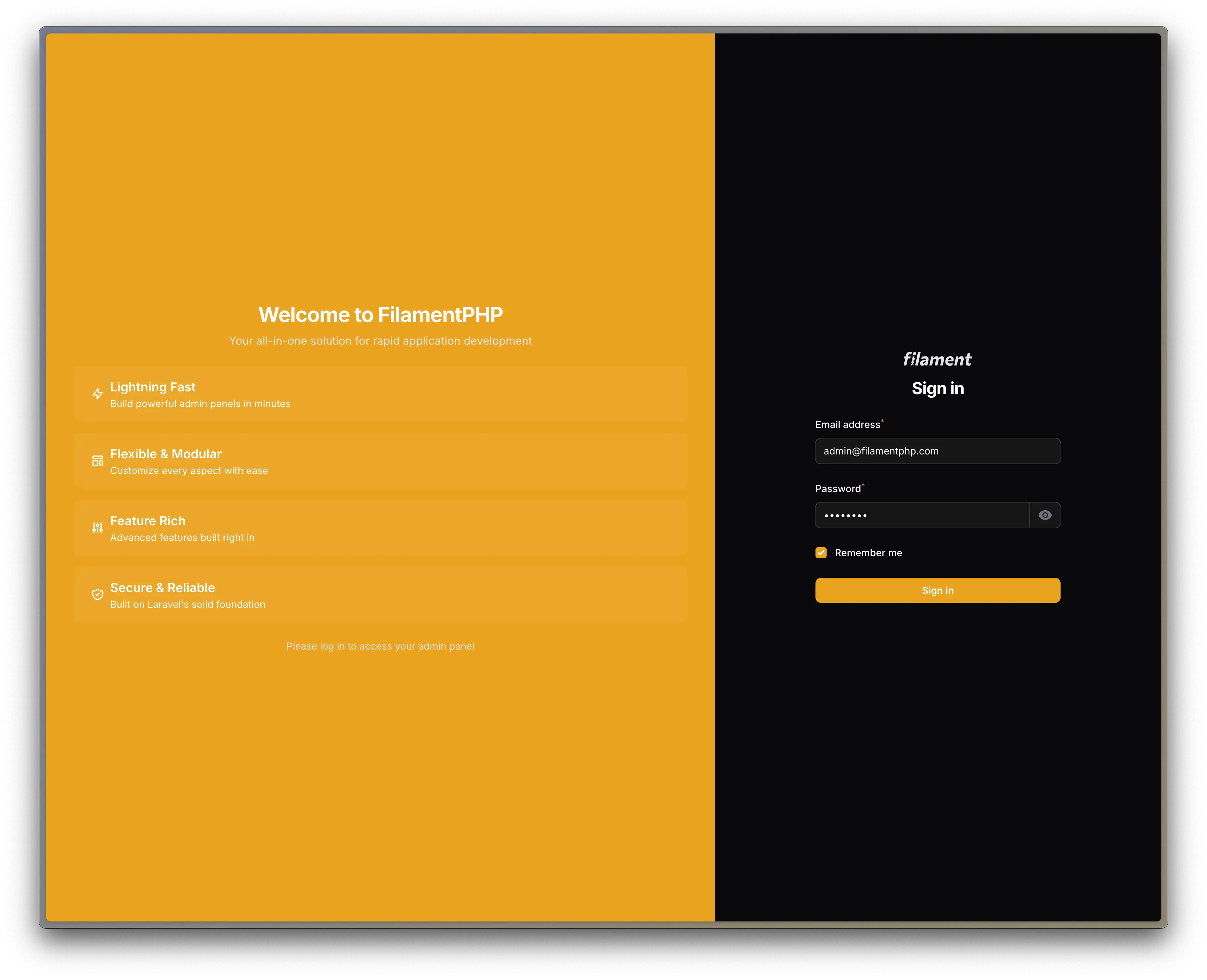
#Working Example
If you're just looking to plug and play some code into your Filament Panel, here's a working code so you can just insert into your plugins array:
use DiogoGPinto\AuthUIEnhancer\AuthUIEnhancerPlugin;
$panel
    ->plugins([
        AuthUIEnhancerPlugin::make()
            ->showEmptyPanelOnMobile(false)
            ->formPanelPosition('right')
            ->formPanelWidth('40%')
            ->emptyPanelBackgroundImageOpacity('70%')
            ->emptyPanelBackgroundImageUrl('https://images.pexels.com/photos/466685/pexels-photo-466685.jpeg?auto=compress&cs=tinysrgb&w=1260&h=750&dpr=2')
    ]);
[!WARNING]
This is a random image URL I got from Pexels. If you want to use it in production or commercially you should check its license.
#Todo
- Develop different layouts
#Changelog
Please see CHANGELOG for more information on what has changed recently.
#Contributing
Please see CONTRIBUTING for details.
#Security Vulnerabilities
Please review our security policy on how to report security vulnerabilities.
#Credits
- Diogo Pinto - you can follow me on Twitter
- Joao Patrício for his amazing support
- CodeWithDennis for his early contributions
- Alexandre for making the
viewsfeature possible - Jicoy for his contribution on v4 upgrade
- Davide Prevosto for his contribution on v5 upgrade
- Geridoc for allowing me to release our packages with Open Source licenses
- All Contributors
#License
The MIT License (MIT). Please see License File for more information.
The author
I'm Diogo and I'm crafting health tech with Laravel, TALL Stack & Filament. 🚀 CEO of Geridoc, a Portuguese medical company, blending code with care. 🇵🇹
Featured Plugins
A selection of plugins curated by the Filament team
Custom Dashboards
Let your users build and share their own dashboards with a drag-and-drop interface. Define your data sources in PHP and let them do the rest.
 Filament
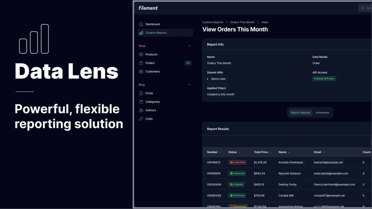
Data Lens
Advanced Data Visualization for Laravel Filament - a premium reporting solution enabling custom column creation, sophisticated filtering, and enterprise-grade data insights within admin panels.
 Padmission
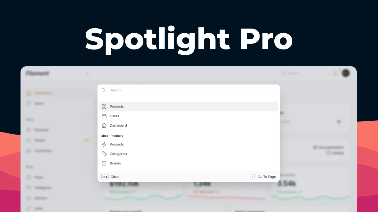
Spotlight Pro
Browse your Filament Panel with ease. Filament Spotlight Pro adds a Spotlight/Raycast like Command Palette to your Filament Panel.
 Dennis Koch