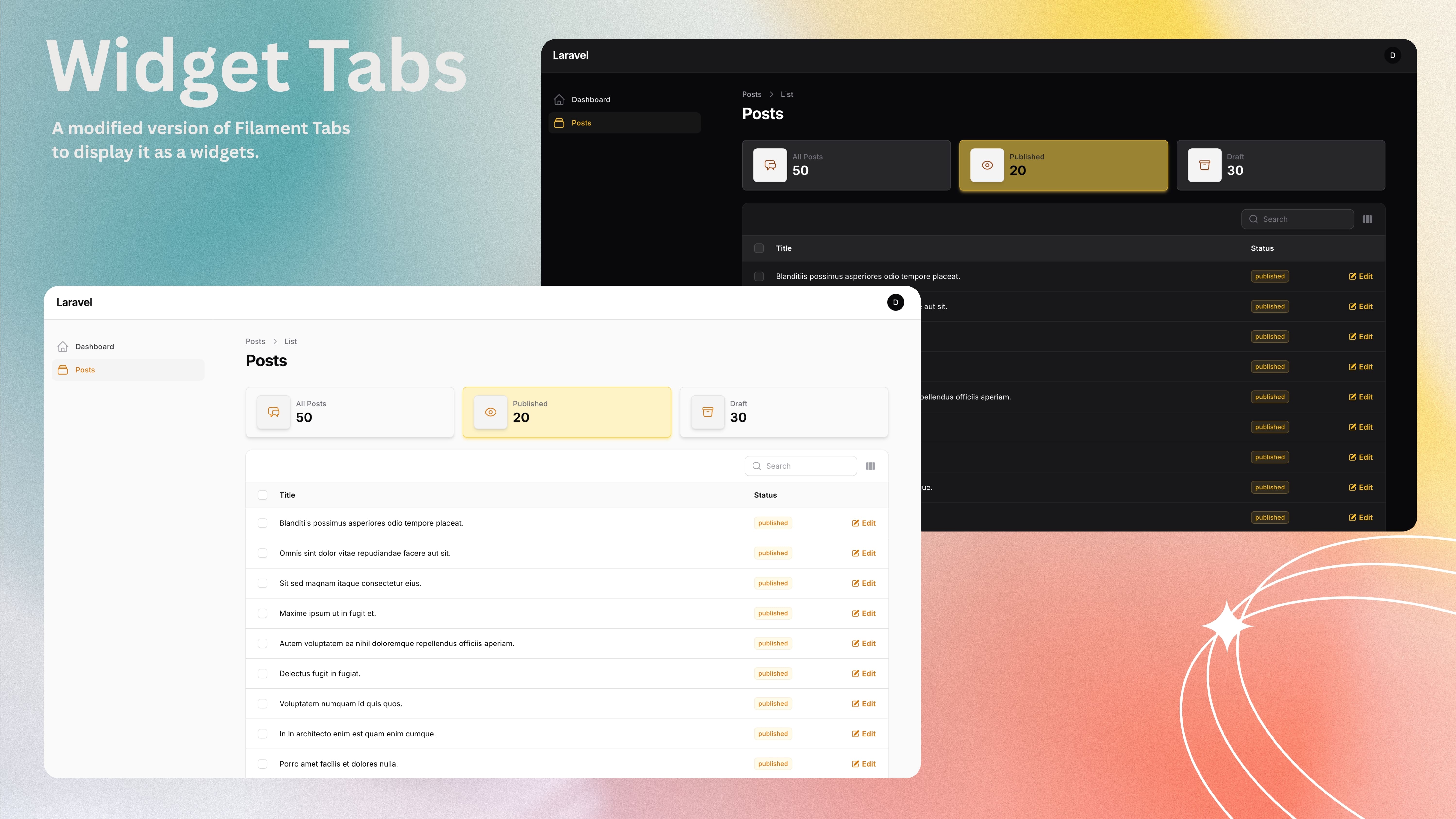
Widget Tabs
CommunityA modified version of the Filament Tabs to display it as a widgets.
 Author:
Data Shkubuliani
Author:
Data Shkubuliani
Package health
BetaAutomated checks of this plugin's Composer package
15 checks
- Failed: GitHub Actions pinned to SHA — View details on Plumb
- Skipped: GitLab CI includes pinned to SHA
- Passed: Open security advisories
- Passed: Dependabot PR responsiveness — No open Dependabot PRs.
- Skipped: Renovate MR responsiveness
- Failed: Dependabot or Renovate configured — No dependency updater configuration found. View details on Plumb
- Skipped: Dependency update cooldown configured
- Passed: Provides a security policy
- Passed: Abandoned or archived — No consulted source marks the package abandoned (packagist, github).
- Passed: Commit and release recency — Active: last commit 255 days ago; last release 100 days ago.
-
Passed:
composer.lock not committed by library
—
composer.lockis absent from the released dist archive. - Passed: Dist archive is lean
-
Passed:
Current Laravel version supported
—
Package dependencies resolve together with current Laravel
13.0. -
Passed:
Current PHP version supported
—
Constraint
^8.2supports current PHP8.5. - Skipped: Current Symfony version supported
filament/
namespace. Review the source and install at your own risk. Found
malware or an unresolved security issue the author won't
address?
Report it
.
Documentation


#Installation
[!WARNING] This plugin currently supports Filament v3 only due to its reliance on Tailwind v3. Filament v4 support is not yet available.
You can install the package via composer:
composer require shkubu18/filament-widget-tabs
In an effort to align with Filament's theming methodology you will need to use a custom theme to use this plugin.
[!IMPORTANT] If you have not set up a custom theme and are using a Panel follow the instructions in the Filament Docs.
- Import the plugin's stylesheet in your theme's css file.
@import '<path-to-vendor>/shkubu18/filament-widget-tabs/resources/css/widget-tabs.css';
- Add the plugin's views to your
tailwind.config.jsfile.
content: [
    '<path-to-vendor>/shkubu18/filament-widget-tabs/resources/**/*.blade.php',
]
#Publishing Views
If you need to customize the views, you can publish them with:
php artisan vendor:publish --tag=filament-widget-tabs-views
#Usage
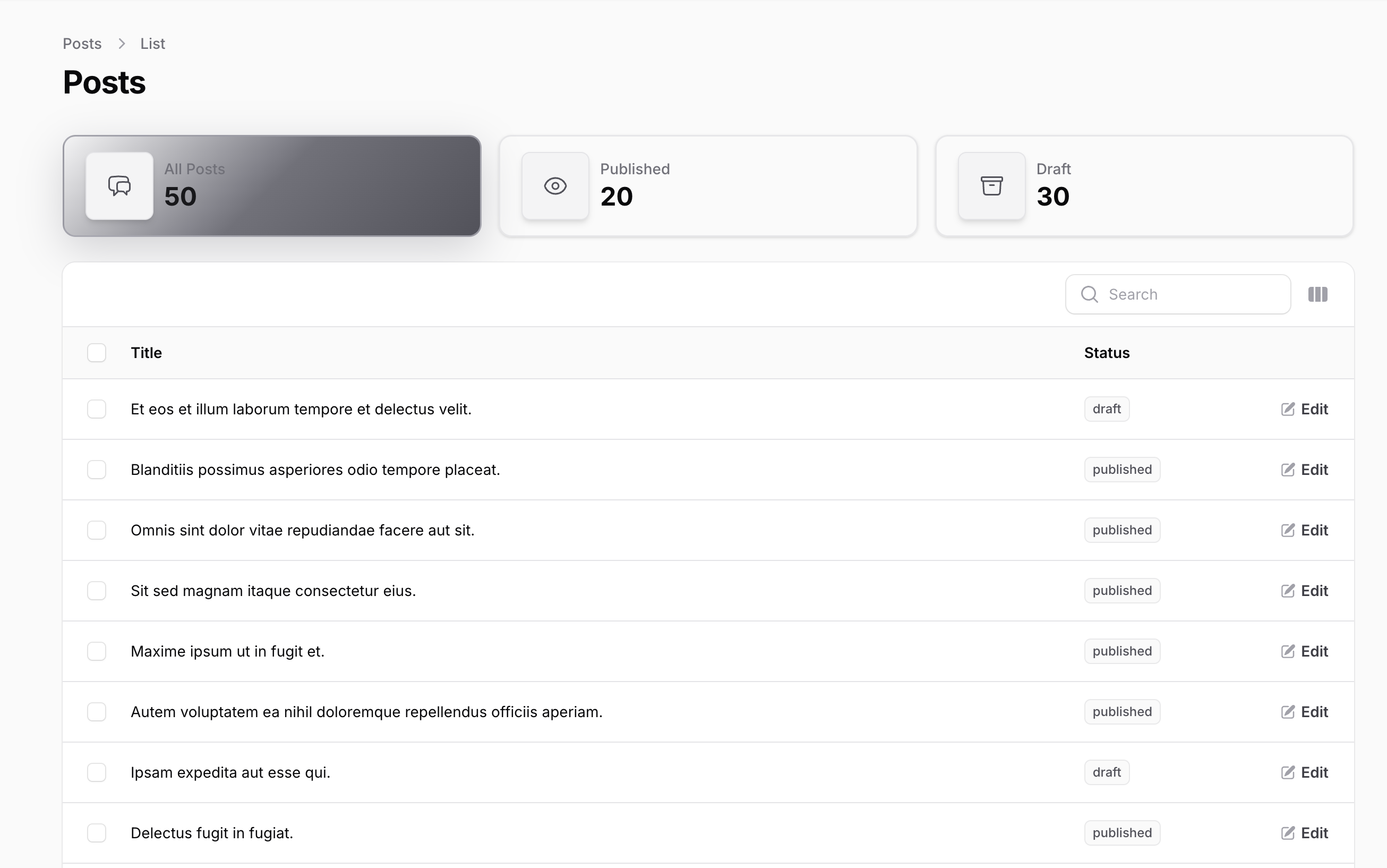
Filament Widget Tabs works similarly to Filament Tabs, but displays each tab as a “widget” that can filter your resource’s table with a single click.
#Add the HasWidgetTabs trait
Add the HasWidgetTabs trait to your Filament resource page.
#Implement the getWidgetTabs() method
Define your widget tabs by implementing the getWidgetTabs() method in your page class.
Each tab is created with the WidgetTab::make() component, allowing you to specify label, icon, value, and filtering
behavior:
use App\Enums\PostStatusEnum;
use Illuminate\Database\Eloquent\Builder;
use Filament\Resources\Pages\ListRecords;
use Shkubu\FilamentWidgetTabs\Concerns\HasWidgetTabs;
use Shkubu\FilamentWidgetTabs\Components\WidgetTab;

class ListPosts extends ListRecords
{
    use HasWidgetTabs;

    public function getWidgetTabs(): array
    {
        return [
            'all' => WidgetTab::make()
                ->label('All Posts')
                ->icon('heroicon-o-chat-bubble-left-right')
                ->value(Post::count()),
            'published' => WidgetTab::make()
                ->label('Published')
                ->icon('heroicon-o-eye')
                ->value(Post::where('status', PostStatusEnum::PUBLISHED)->count())
                ->modifyQueryUsing(fn (Builder $query): Builder => $query->where('status', PostStatusEnum::PUBLISHED)),
            'drafts' => WidgetTab::make()
                ->label('Drafts')
                ->icon('heroicon-o-archive-box')
                ->value(Post::where('status', PostStatusEnum::DRAFT)->count())
                ->modifyQueryUsing(fn (Builder $query): Builder => $query->where('status', PostStatusEnum::DRAFT)),
        ];
    }
}
That's all you need to get started with Widget Tabs! Your resource list page will now display beautiful widget-style tabs that filter your table data just like default Filament tabs, but with the added benefit of displaying important data values within each tab widget.
#Features
#Auto-loading Default Active Widget Tab
By default, widget tabs will not automatically load a default active widget tab when the page mounts. If you want to
enable automatic loading of the default widget tab, you can override the shouldAutoLoadDefaultActiveWidgetTab method
in your page class:
protected function shouldAutoLoadDefaultActiveWidgetTab(): bool
{
    return true; // Enable auto-loading of the default active widget tab
}
#Widget Tabs Layout
You can customize how many widget tabs appear in each row by overriding the getWidgetsPerRow() method in your page
class:
 protected function getWidgetsPerRow(): int|array
 {
    return 4; // Default is 3 widgets per row
 }
It is also possible to specify an array of breakpoints for different display sizes:
 protected function getWidgetsPerRow(): int|array
 {
    return ['sm' => 2, 'md' => 3, 'lg' => 4];
 }
#Labels
Add a descriptive label to your widget tab:
WidgetTab::make()
    ->label('Published Posts')
#Icons
Add an icon to visually enhance your widget tab:
WidgetTab::make()
    ->icon('heroicon-o-document-text')
You can also specify the icon size:
use Filament\Support\Enums\IconSize;

WidgetTab::make()
    ->icon('heroicon-o-document-text')
    ->iconSize(IconSize::Large)
#Values
Display a count or other relevant value in your widget tab:
WidgetTab::make()
    ->value(Post::count())
You can control the decimal precision of numeric values:
WidgetTab::make()
    ->label('Average Rating')
    ->value(Post::avg('rating'))
    ->precision(2) // Will display with 2 decimal places, e.g., "4.75"
#Percentages
When enabled, the percentage method formats your value as a percentage, displaying it with a % symbol instead of as a regular number:
WidgetTab::make()
    ->value(25)
    ->percentage() // This will display as "25%" instead of "25"
You can control the decimal precision of percentage values independently from regular numeric values, giving you fine-grained control over how different types of data are displayed:
WidgetTab::make()
    ->label('Published Ratio')
    ->value(fn (): float => (Post::where('status', 'published')->count() / Post::count()) * 100)
    ->percentage()
    ->percentagePrecision(1) // Will display as "25.4%" instead of "25%"
#Theming
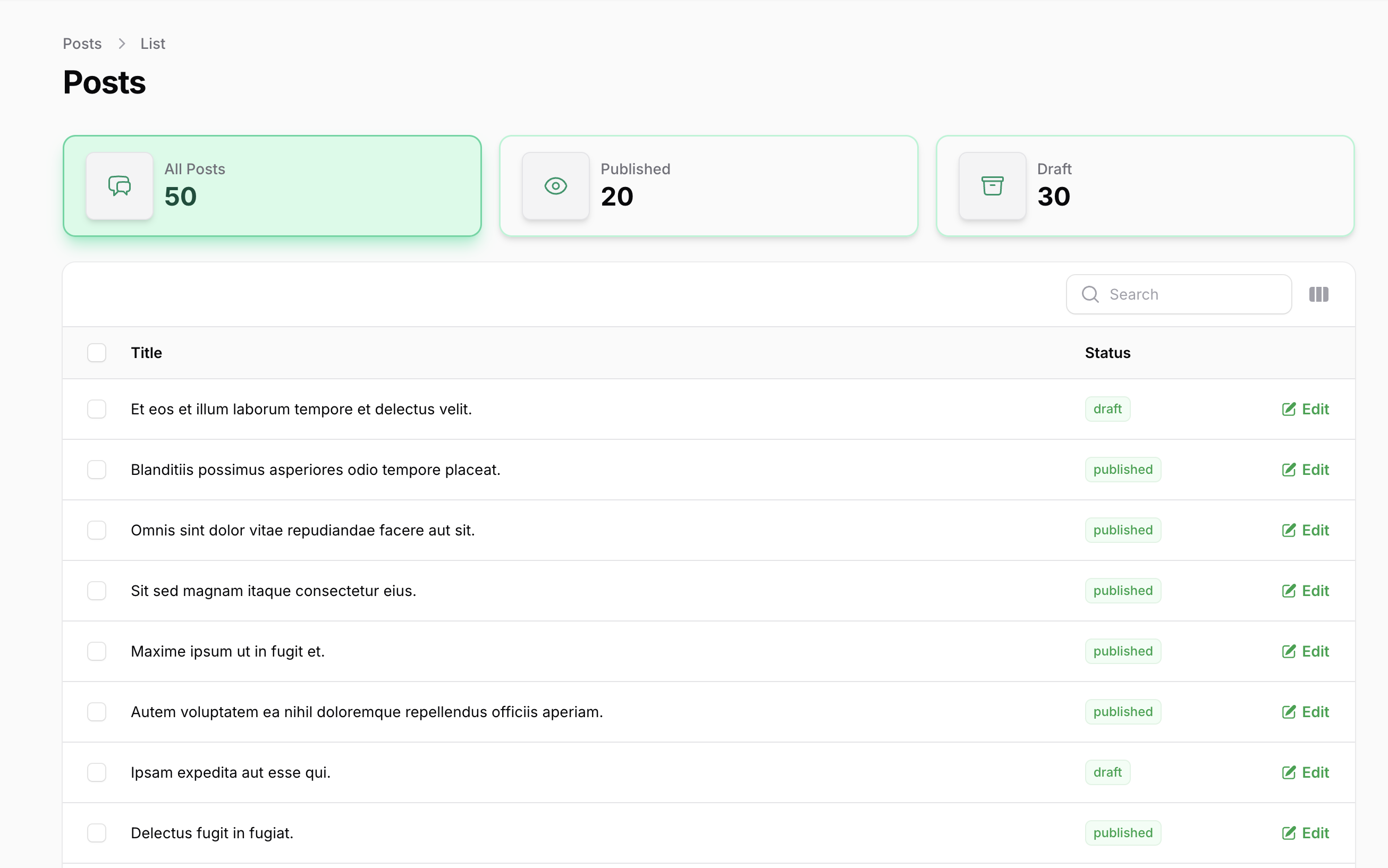
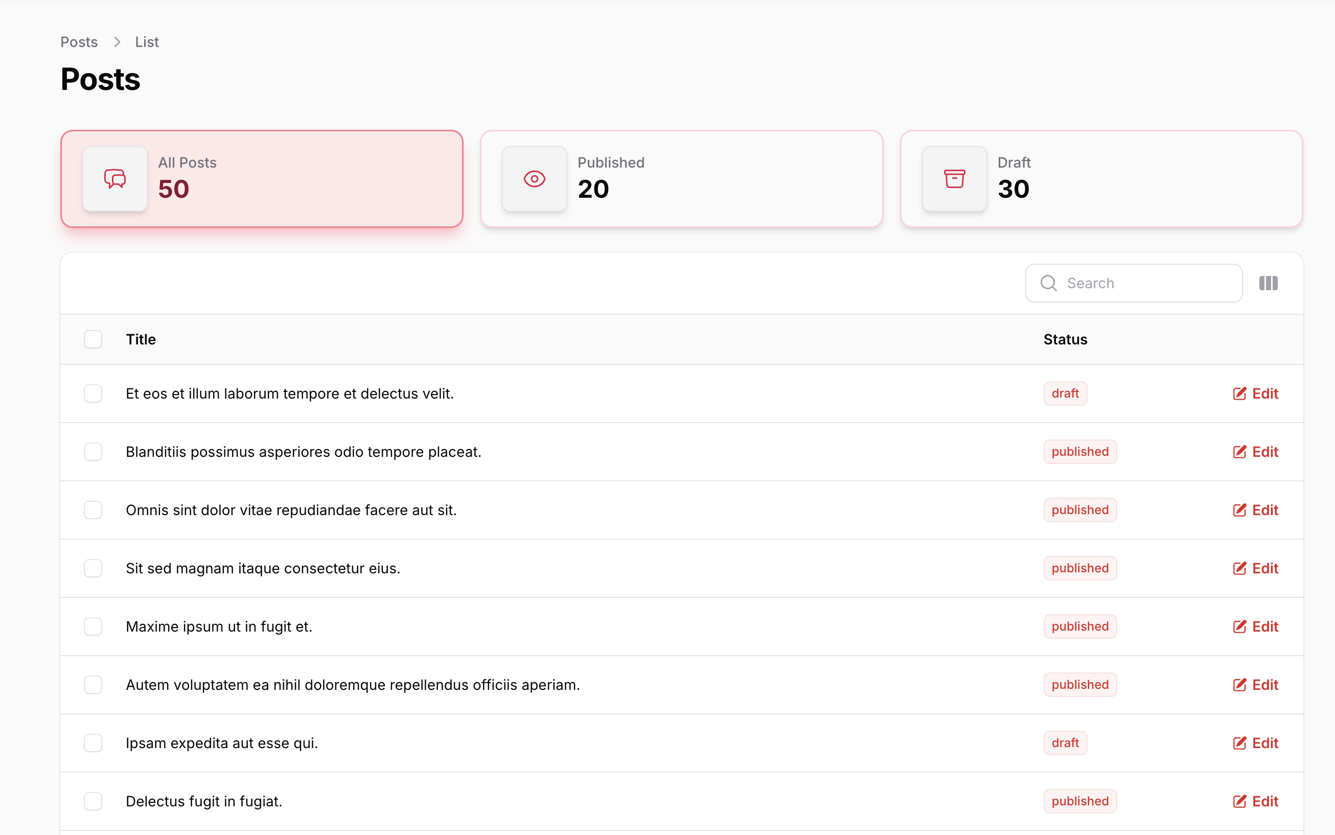
Widget Tabs supports advanced theming with pre-built color schemes and gradients.
#Pre-built Color Schemes
Apply different color themes to your widget tabs:
WidgetTab::make()
    ->label('Success Posts')
    ->value(Post::where('status', 'published')->count())
    ->success()

WidgetTab::make()
    ->label('Failed Posts')
    ->value(Post::where('status', 'failed')->count())
    ->danger()

WidgetTab::make()
    ->label('Draft Posts')
    ->value(Post::where('status', 'draft')->count())
    ->info()
    //...
Preview:
| Success Theme | Danger Theme | Info Theme |
|---|---|---|
 |
 |
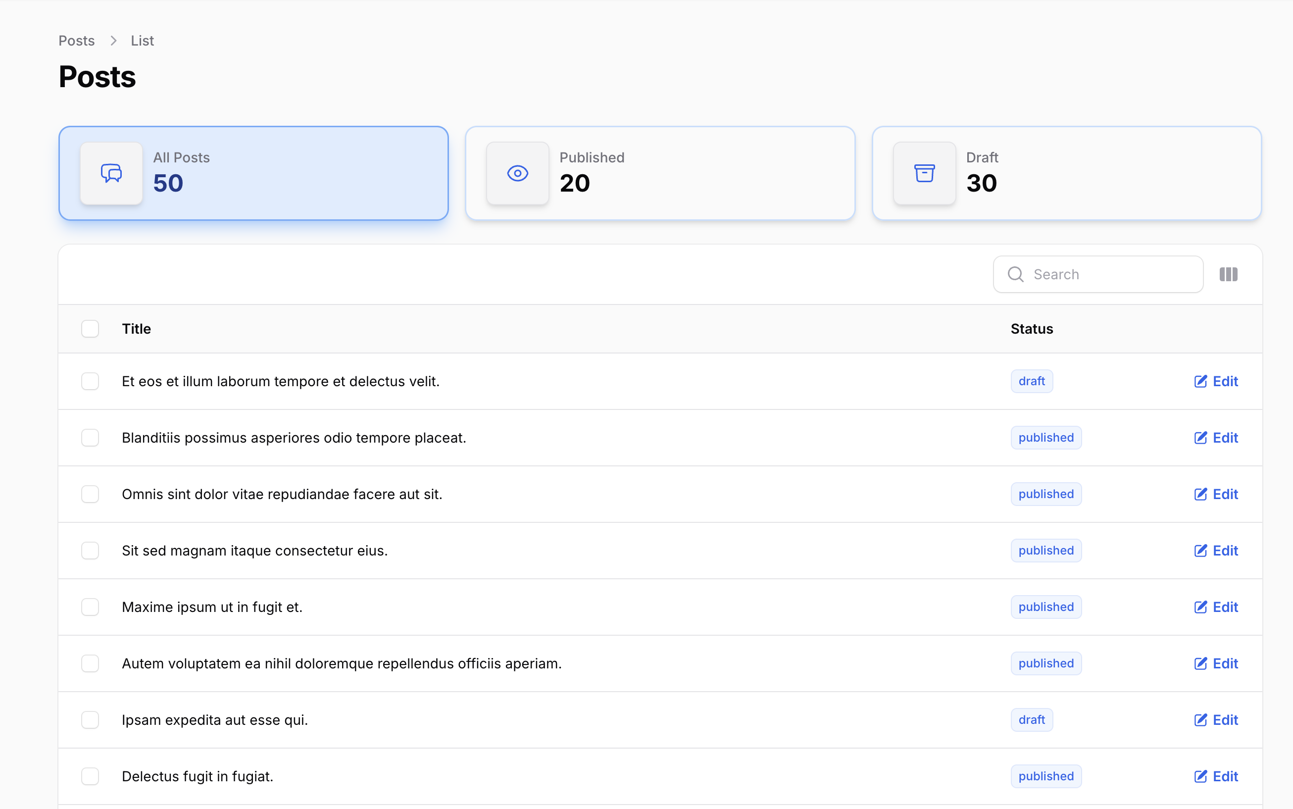 |
| Warning Theme | Secondary Theme | |
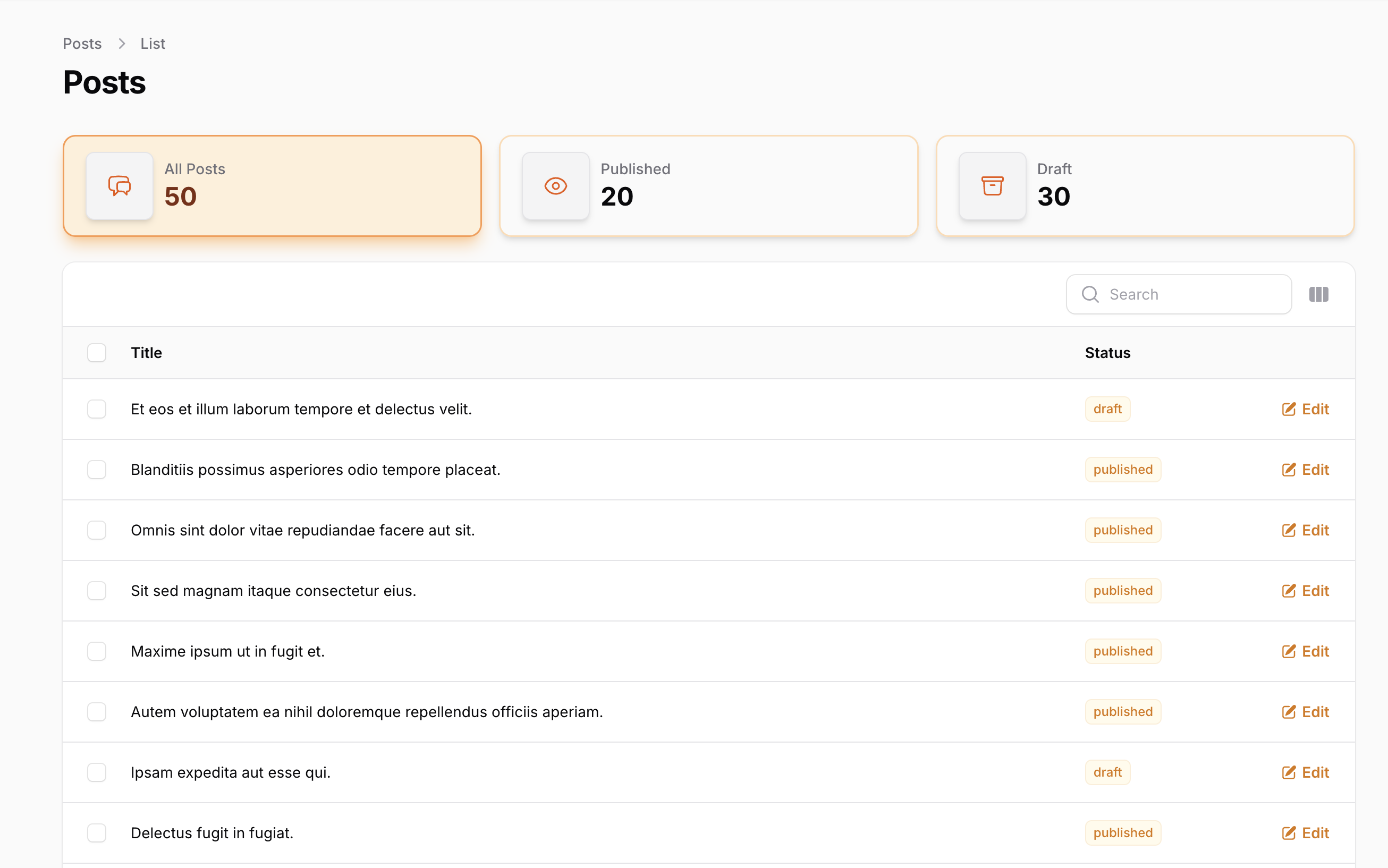 |
 |
You can also use the generic theme() method with enum or string values:
use Shkubu\FilamentWidgetTabs\Enums\WidgetTabTheme;

WidgetTab::make()
    ->theme(WidgetTabTheme::Success) // Using enum
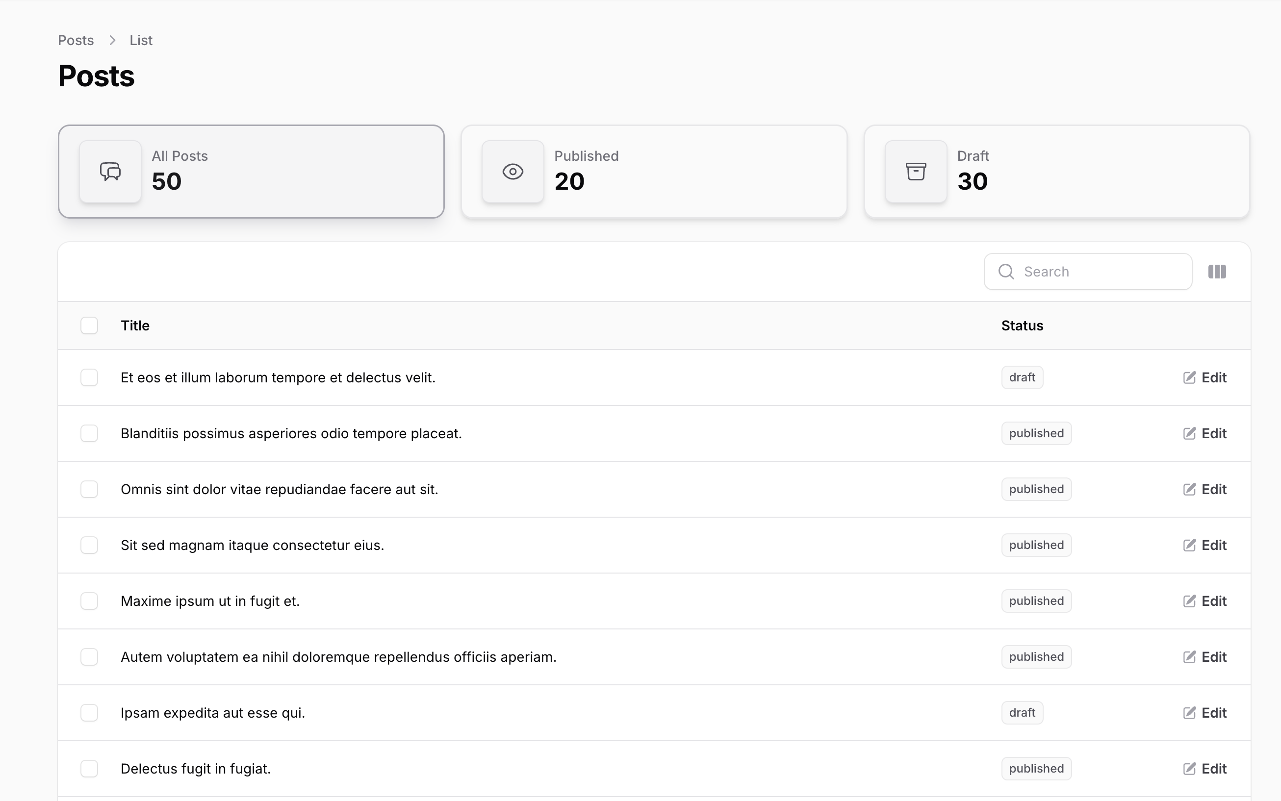
#Gradient Effects
Add beautiful gradient backgrounds to your widget tabs:
WidgetTab::make()
    ->label('Premium Posts')
    ->value(Post::where('is_premium', true)->count())
    ->secondary()
    ->gradient() // Adds gradient effect
Preview:
#Custom Theme Classes
For advanced customization, you can add custom CSS classes:
WidgetTab::make()
    ->label('Custom Styled')
    ->value(100)
    ->customThemeClasses([
        'custom-shadow',
        'custom-border',
        'my-special-theme'
    ])

// Or use a closure for dynamic classes
WidgetTab::make()
    ->customThemeClasses(fn () => [
        'dynamic-class-' . now()->format('Y'),
        'user-role-' . auth()->user()->role
    ])
#Available Themes
- Secondary: Neutral gray theme for secondary content
- Success: Green theme for positive states and success messages
- Warning: Yellow/orange theme for warnings and attention
- Danger: Red theme for errors and critical states
- Info: Blue theme for informational content
#Extra Attributes
Add extra HTML attributes to your widget tab:
WidgetTab::make()
    ->extraAttributes(['attribute' => 'value'])
#Query Modification
Filter the resource table based on the selected tab:
WidgetTab::make()
    ->modifyQueryUsing(fn (Builder $query): Builder => $query->where('status', 'published'))
Or use the shorter query() method:
WidgetTab::make()
    ->query(fn (Builder $query): Builder => $query->where('status', 'published'))
#Contributing
Please see CONTRIBUTING for details.
#Security Vulnerabilities
Please review our security policy on how to report security vulnerabilities.
#Credits
#License
The MIT License (MIT). Please see License File for more information.
The author
Data is a passionate developer who loves working with Laravel, PHP, and modern web technologies. He enjoys building scalable applications and is particularly enthusiastic about Filament – it's made creating beautiful admin panels so much fun! Always curious and learning, he’s on a journey to level up his coding skills, while solving interesting problems along the way.
Featured Plugins
A selection of plugins curated by the Filament team

Blueprint
Filament Blueprint is a premium Laravel Boost extension that helps AI agents produce accurate, detailed implementation plans and security reports for Filament apps.
 Filament
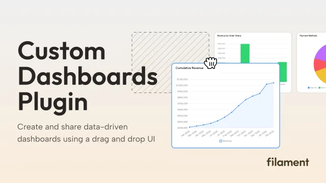
Custom Dashboards
Let your users build and share their own dashboards with a drag-and-drop interface. Define your data sources in PHP and let them do the rest.
Filament
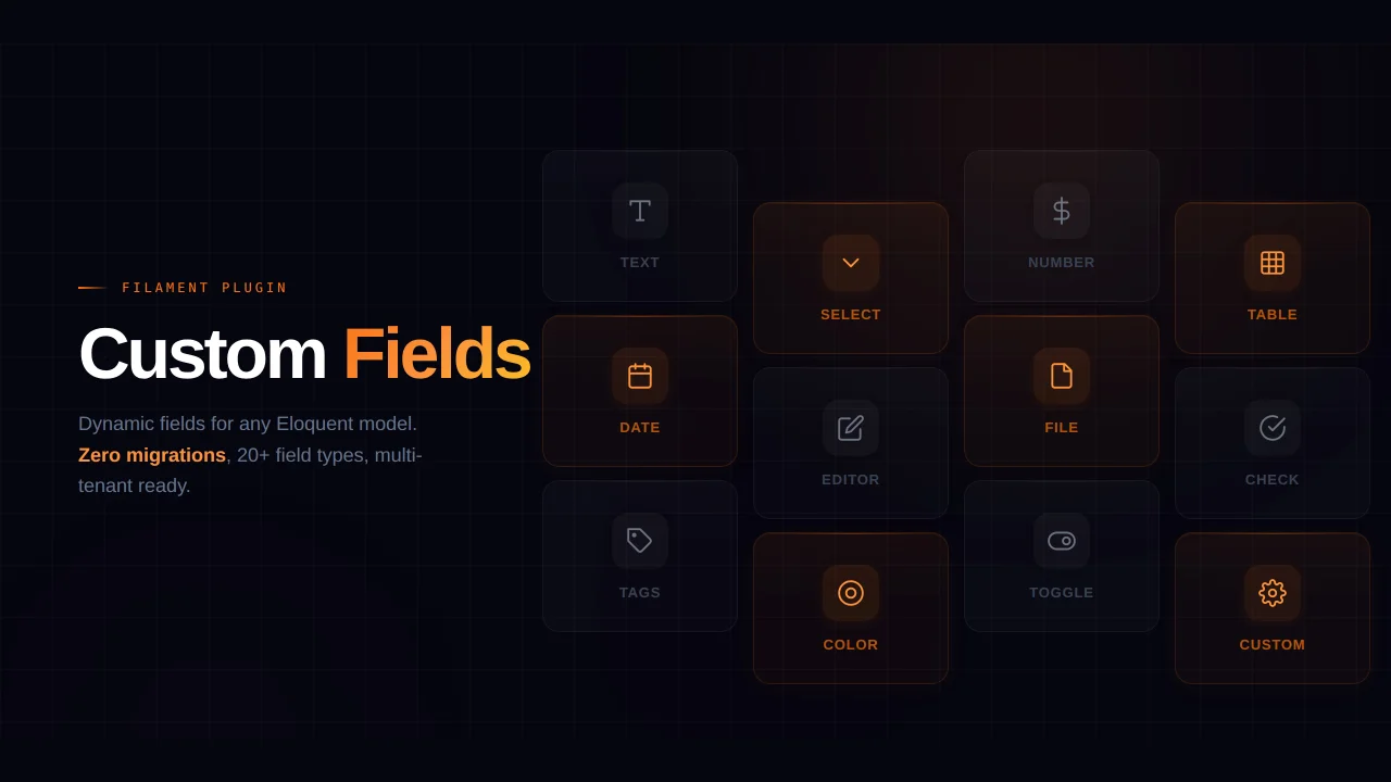
Custom Fields
Eliminate custom field migrations forever. Let your users create and manage form fields directly in Filament admin panels with 20+ built-in field types, validation, and zero database changes.
 Relaticle