Toggle Icon Column by asign
CommunityClickable icon column that toggles a boolean in place, with on/off colours and hover preview — the successor of archilex's plugin.
 Author:
asign
Author:
asign
Package health
Automated checks of this plugin's Composer package
15 checks
- Passed: GitHub Actions pinned to SHA
- Skipped: GitLab CI includes pinned to SHA
- Passed: Open security advisories
- Passed: Dependabot PR responsiveness — No open Dependabot PRs.
- Skipped: Renovate MR responsiveness
- Passed: Dependabot or Renovate configured
- Passed: Dependency update cooldown configured
- Passed: Provides a security policy
- Passed: Abandoned or archived — No consulted source marks the package abandoned (packagist, github).
- Passed: Commit and release recency — Active: last commit 0 days ago; last release 0 days ago.
-
Passed:
composer.lock not committed by library
—
composer.lockis absent from the released dist archive. - Passed: Dist archive is lean
-
Passed:
Current Laravel version supported
—
Package dependencies resolve together with current Laravel
13.0. -
Passed:
Current PHP version supported
—
Constraint
^8.3supports current PHP8.5. - Skipped: Current Symfony version supported
filament/
namespace. Review the source and install at your own risk. Found
malware or an unresolved security issue the author won't
address?
Report it
.
Documentation
- Screenshots
- Requirements
- Installation
- Usage
- Configuration
- Gotchas
- Translations
- AI agents
- Testing
- Changelog
- License
- Migrating from archilex/filament-toggle-icon-column
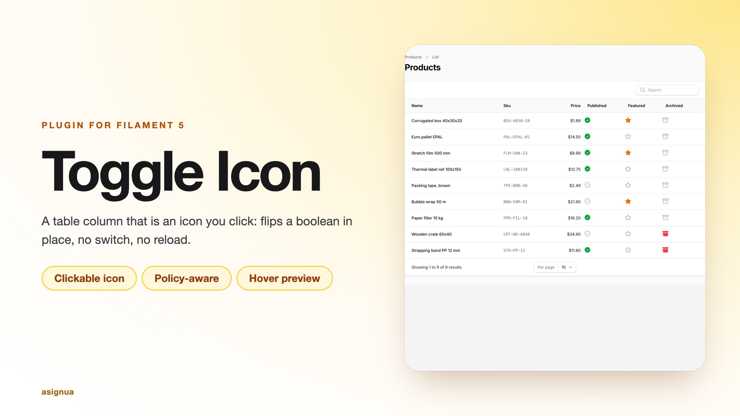

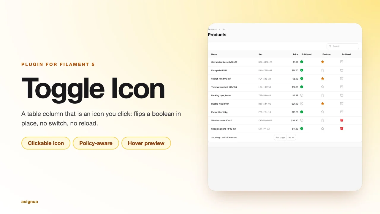
A table column that is an icon you click: it flips a boolean attribute in place, with no switch and no page reload. The Filament 5
successor of archilex/filament-toggle-icon-column (which stopped at Filament 3).
Filament core has ToggleColumn (a switch) and IconColumn (read-only), but nothing that is an editable icon. This column adds
the missing piece and keeps the core saving contract: validation, beforeStateUpdated/afterStateUpdated, disabled(),
and, unlike the core editable columns, a model-policy check.
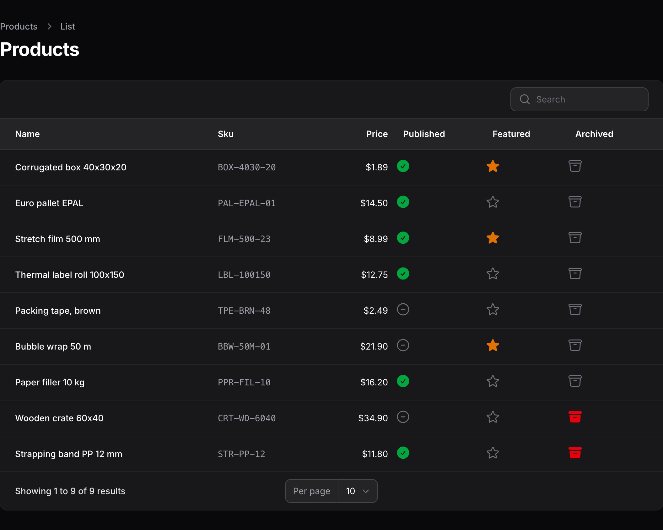
#Screenshots
The column renders as a single clickable icon in the table cell (check-circle / x-circle by default), in light and dark mode:
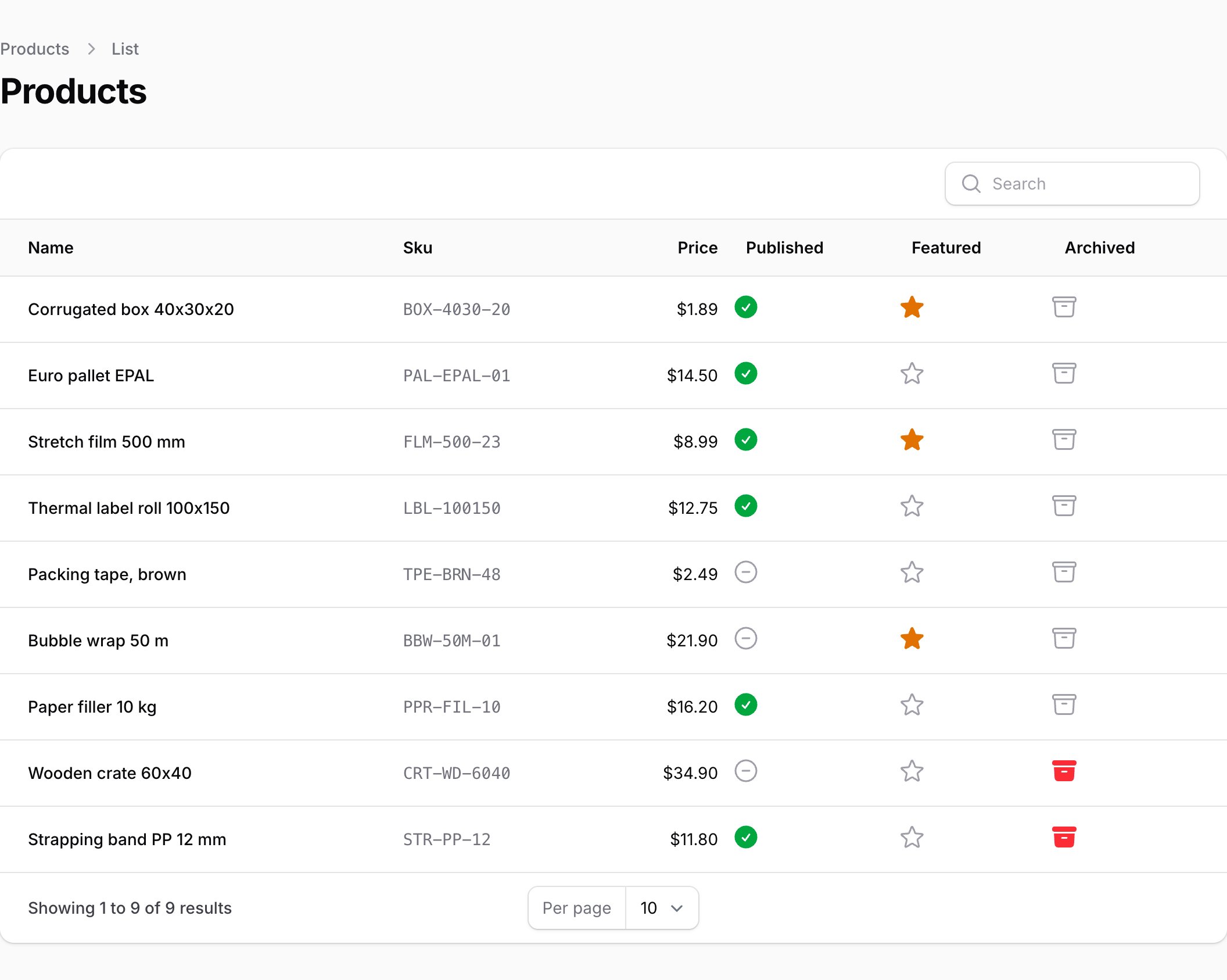
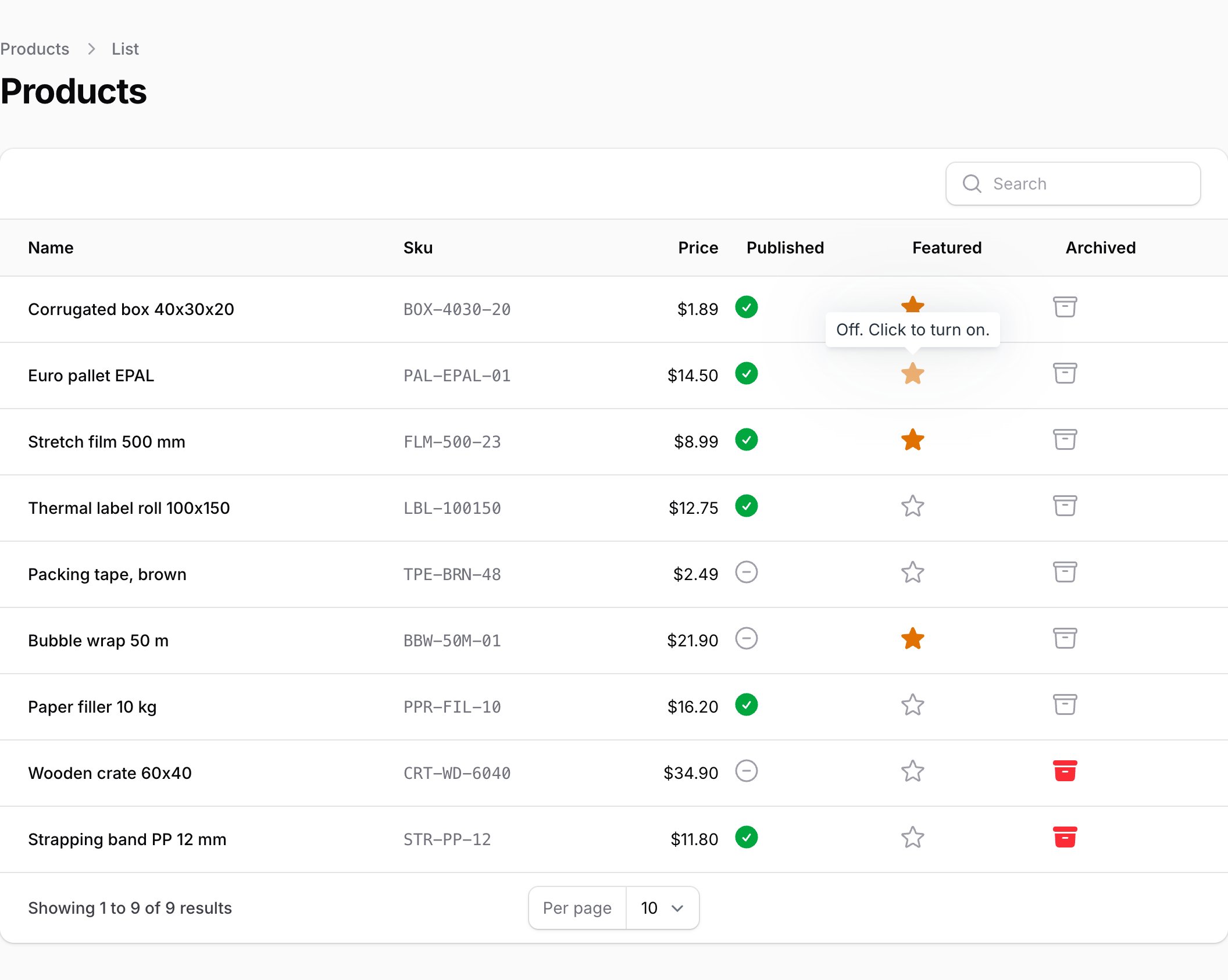
Hovering an enabled icon previews the state the click would produce:
#Requirements
- PHP 8.3+
- Laravel 12 or 13
- Filament 5
#Installation
composer require asignua/filament-toggle-icon-column
php artisan filament:assets
filament:assets publishes the small stylesheet that colours the icons (onColor(), offColor(), hoverColor()). The column is a plain class and needs no registration. Registering ToggleIconColumnPlugin::make() on a panel is optional and only
marks the plugin as installed.
#Usage
use Asignua\FilamentToggleIconColumn\Columns\ToggleIconColumn;
use Filament\Support\Enums\IconSize;

ToggleIconColumn::make('is_active')
    ->onIcon('heroicon-s-check-circle')
    ->offIcon('heroicon-o-x-circle')
    ->onColor('success')
    ->offColor('gray')
    ->size(IconSize::Large)
    ->tooltip('Toggle active'),
It works in resource tables and in relation managers (both use Filament's updateTableColumnState()).
#Saving, validation and hooks
Same API as ToggleColumn:
ToggleIconColumn::make('is_published')
    ->rules(['boolean'])                                  // default; an error shows in the tooltip and the icon reverts
    ->beforeStateUpdated(fn (Post $record, bool $state) => ...)
    ->afterStateUpdated(fn (Post $record, bool $state) => ...)
    ->updateStateUsing(fn (Post $record, bool $state) => $record->publish($state));  // replaces the default write
#Disabling and authorization
->disabled(fn (Post $record): bool => $record->is_archived)   // greyed out, and the server refuses to write
->authorize()            // default: Gate `update` on the record, only when the model has a policy
->authorize('publish')   // another ability
->authorize(false)       // skip the policy check (core ToggleColumn behaviour)
->authorize(fn (Task $record): bool => ! $record->is_locked)  // closure gate: false denies, true allows (the policy is not asked)
->authorize(fn (): string => 'publish')                       // closure returning a string: the ability to check
Core's editable columns only honour disabled(); this column also asks the policy, so a user who may not edit the record cannot
flip it by crafting a Livewire call. The policy of every record the write touches is asked: the row, the related record for a
relationship column (user.is_active), and a pivot that has its own policy. Semantics are Filament's own
(get_authorization_response()): a model without a policy stays editable, a policy without the method allows, and the panel's
strictAuthorization() is honoured (it throws for a missing policy).
#Hover hint
By default, hovering (or focusing) an enabled icon previews the state the click would produce: the opposite icon, dimmed.
Turn it off with ->hoverHint(false); ->hoverColor('warning') recolours the previewed icon. On a cell that cannot be clicked the
state tooltip only reports the state. ->stateTooltip() adds a translated tooltip ("On. Click to turn off.") when you set none.
#Accessibility
The icon is a role="button" with aria-pressed, aria-label (the column label), aria-disabled, aria-busy and aria-invalid;
Enter and Space toggle it, and disabled icons leave the tab order.
#Configuration
There is no config file; everything is a fluent setter on the column (see Usage). size() (an IconSize or 'xs'...'2xl'), hoverColor(), hoverHint(), authorize() and
stateTooltip() are the additions over the core editable column API.
#Gotchas
- Rules as an array.
rules(['boolean', 'accepted']), never a pipe string. - Alpine CSP build is not supported: the column's client logic is an inline
x-dataobject. - Row URL / record action. Clicks on the icon never reach the row action (
disabledClick()is on); the rest of the cell does. updateStateUsing()replaces the write, including for JSON paths such assettings.flag; the default write handles those itself.- Policy without
update. As in Filament resources, a policy that lacks the method allows the write (deny it explicitly in the policy; strict mode throws instead).
#Translations
The interface ships in English, Ukrainian, German, Spanish, French, Italian, Dutch, Polish, Brazilian Portuguese and Turkish
under the filament-toggle-icon-column::filament-toggle-icon-column namespace. A test keeps every language in step with the English keys. Override a
string by publishing the translations (--tag=filament-toggle-icon-column-translations) and editing the copy in
lang/vendor/filament-toggle-icon-column.
#AI agents
The package ships Laravel Boost guidelines (resources/boost/guidelines/core.blade.php) so a
coding agent wires it up correctly.
#Testing
composer install
vendor/bin/phpunit
vendor/bin/phpstan analyse --memory-limit=1G
vendor/bin/pint --test
#Changelog
See CHANGELOG.md.
#License
The MIT License (MIT). See LICENSE.md.
#Migrating from archilex/filament-toggle-icon-column
onIcon(), offIcon(), onColor(), offColor(), size('xl') and hoverColor() keep their names. Saving follows Filament 5's
editable-column contract (updateStateUsing, beforeStateUpdated, afterStateUpdated, rules). New here: authorize(),
hoverHint(), stateTooltip().
The author
asign is a small web-dev company from Lviv, Ukraine. We build business applications on Laravel and Filament — CRMs, automation systems for standard and non-standard business processes, booking and content management systems, including our own Filament-based CMS. We open-source the parts that prove useful beyond a single project
From the same author
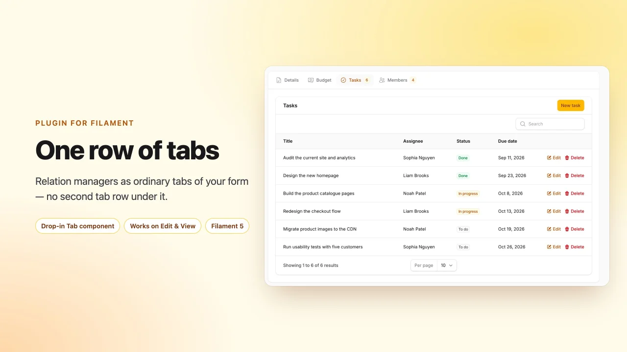
Relation Manager Tabs
Render relation managers as ordinary tabs of the record form, so an edit or view page has exactly one row of tabs.
Author:
asign
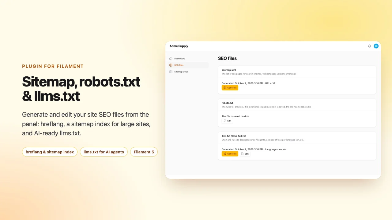
SEO Files
Generate and edit sitemap.xml with hreflang and a sitemap index for large sites, robots.txt and llms.txt / llms-full.txt from your Filament panel
Author:
asign
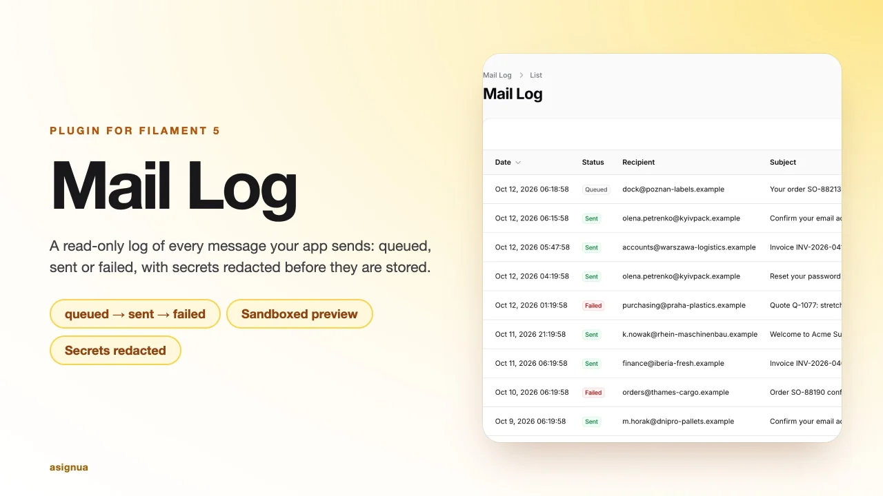
Mail Log
Log of every outgoing mail with queue status, a sandboxed preview and signed links, tokens and passwords redacted before storage.
Author:
asign
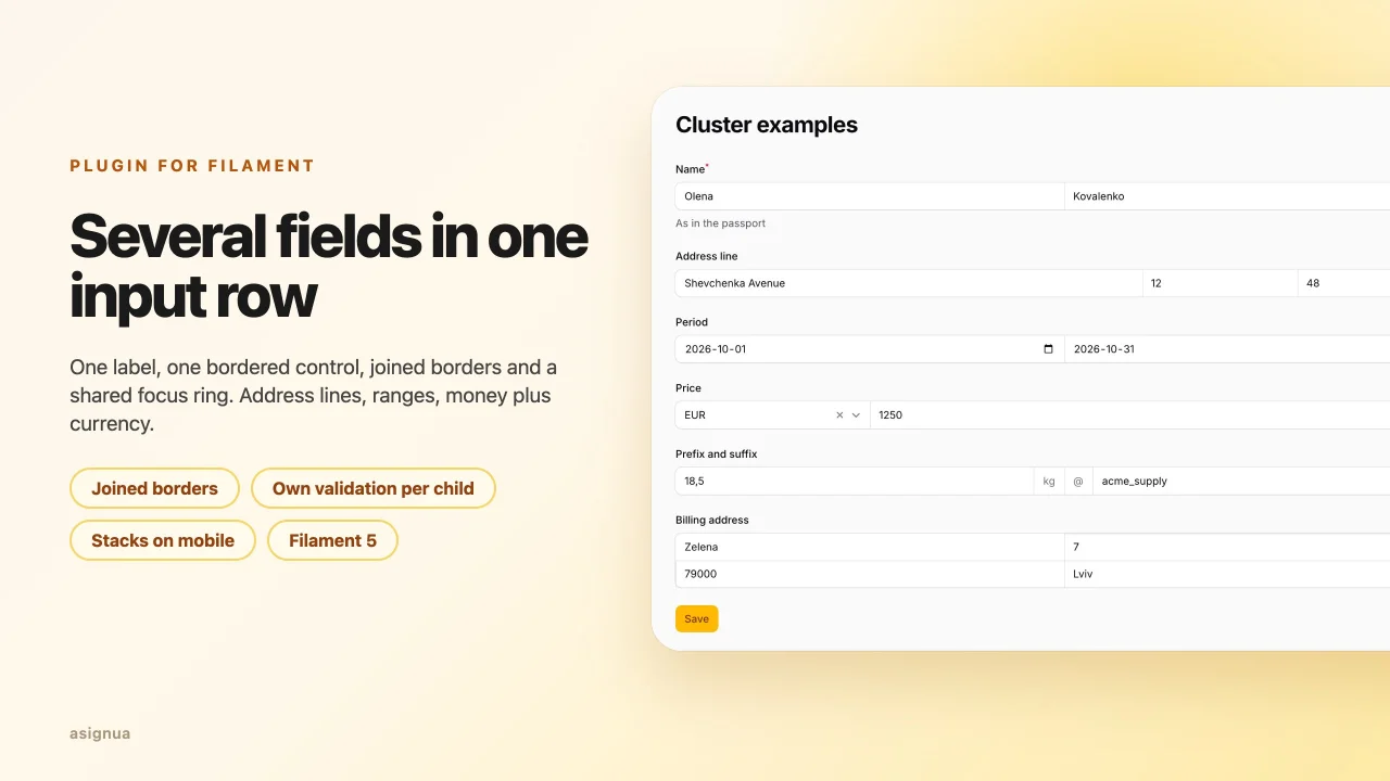
Clusters
Group several fields into one input row with a shared label, joined borders and one focus ring — the successor of guava/filament-clusters.
Author:
asign
Featured Plugins
A selection of plugins curated by the Filament team

Blueprint
Filament Blueprint is a premium Laravel Boost extension that helps AI agents produce accurate, detailed implementation plans and security reports for Filament apps.
 Filament
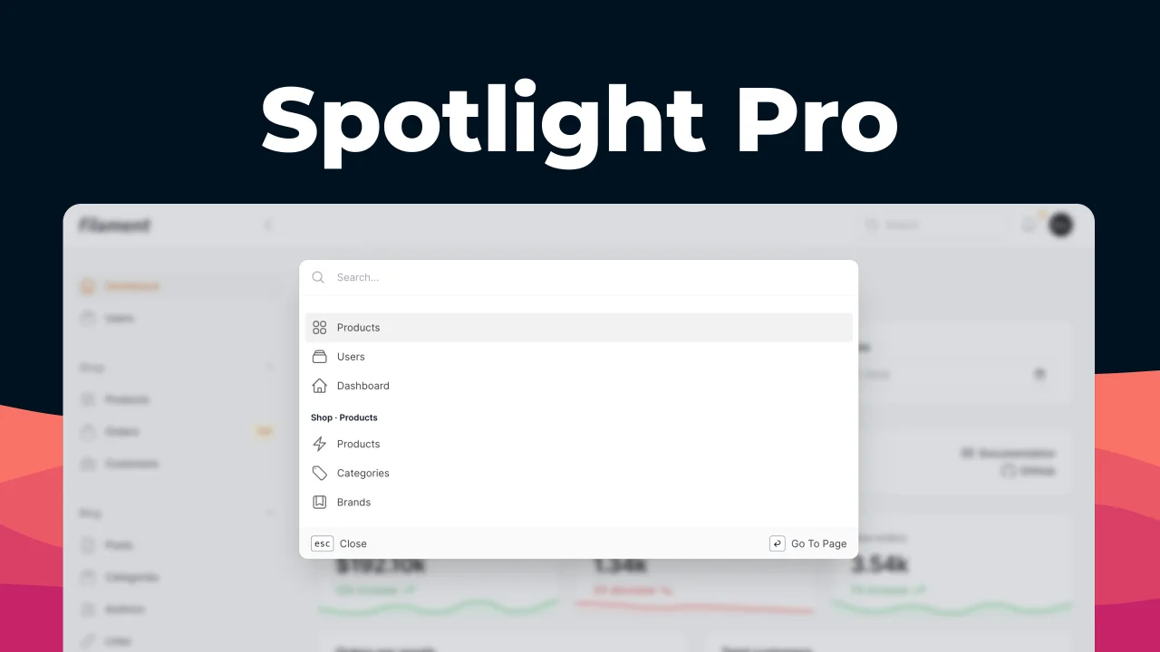
Spotlight Pro
Browse your Filament Panel with ease. Filament Spotlight Pro adds a Spotlight like Command Palette to your Filament Panel.
 Dennis Koch
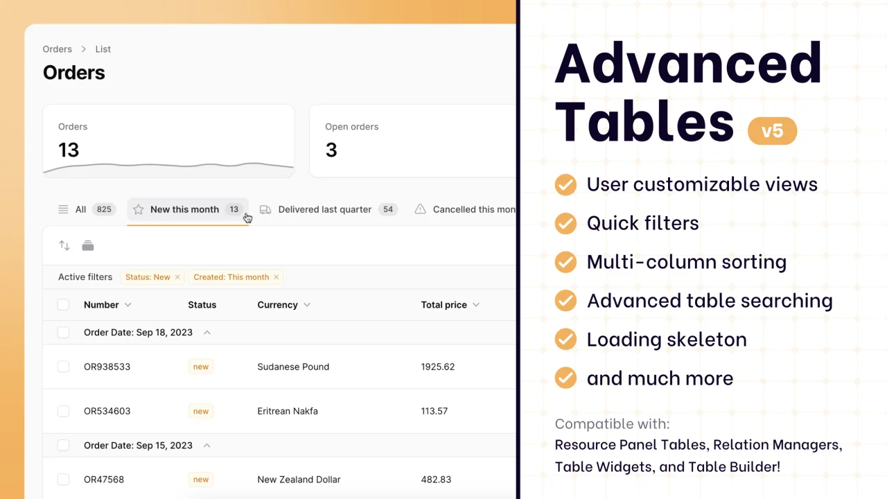
Advanced Tables (formerly Filter Sets)
Supercharge your tables with powerful features like user-customizable views, quick filters, multi-column sorting, advanced table searching, convenient view management, and more. Compatible with Resource Panel Tables, Relation Managers, Table Widgets, and Table Builder!
 Kenneth Sese