Selectify
Two alternative fields for toggles, radio buttons, and other selectors.
 Author:
Andrew Wallo
Author:
Andrew Wallo
Documentation
- Installation
- Registering Styles
- Usage
- Changelog
- Contributing
- Security Vulnerabilities
- Credits
- License
A small package featuring two simple components that serve as excellent alternatives to toggles, radio buttons, and other selectors. These components not only offer seamless user interactions but also maintain UI consistency by effortlessly aligning with neighboring fields and components.

#Installation
You can install the package via composer:
composer require andrewdwallo/filament-selectify
Optionally, you can publish the views using
php artisan vendor:publish --tag="filament-selectify-views"
#Registering Styles
In order for component styles to be processed, you must add this package's vendor directory into the content array of your tailwind.config.js file:
export default {
    content: [
        './resources/**/*.blade.php',
        './vendor/filament/**/*.blade.php',
        './vendor/andrewdwallo/filament-selectify/resources/views/**/*.blade.php', // The package's vendor directory
    ],
    // ...
}
#Usage
#ToggleButton
The ToggleButton has the following options. The onLabel() and offLabel() represent the true and false states. You may also customize the color representing each state using onColor() and offColor().
ToggleButton::make('enabled')
    ->offColor('danger')
    ->onColor('primary')
    ->offLabel('No')
    ->onLabel('Yes')
    ->default(true),
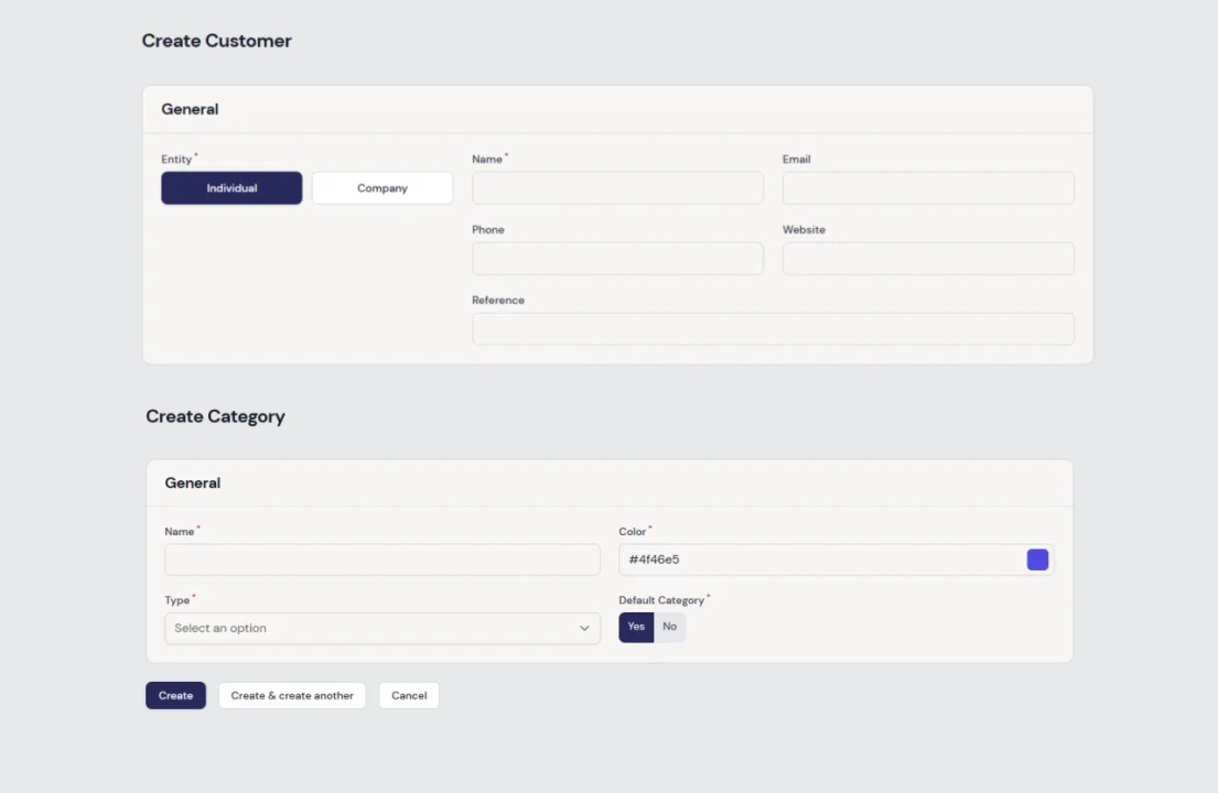
#ButtonGroup
The ButtonGroup has the following options. You may customize the color representing each state. The onColor() represents the button or value that is selected and the offColor() represents the button or value that is not selected. You may use gridDirection() to change the layout of the buttons. The options are column and row. The default is column.
You may optionally add icons for the buttons using icons() and supplying an array that contains the option values as keys and icon names as values. Icon position and size can be changed using iconPosition() (default: before) and iconSize() (default: Small).
ButtonGroup::make('entity')
    ->options([
        'individual' => 'Individual',
        'company' => 'Company',
    ])
    ->onColor('primary')
    ->offColor('gray')
    ->gridDirection('row')
    ->default('individual')
    ->icons([
        'individual' => 'heroicon-m-user',
        'company' => 'heroicon-m-building-office',
    ])
    ->iconPosition(\Filament\Support\Enums\IconPosition::After)
    ->iconSize(Filament\Support\Enums\IconSize::Medium),
#Changelog
Please see CHANGELOG for more information on what has changed recently.
#Contributing
Please see CONTRIBUTING for details.
#Security Vulnerabilities
Please review our security policy on how to report security vulnerabilities.
#Credits
#License
The MIT License (MIT). Please see License File for more information.
The author
From the same author
Featured Plugins
A selection of plugins curated by the Filament team
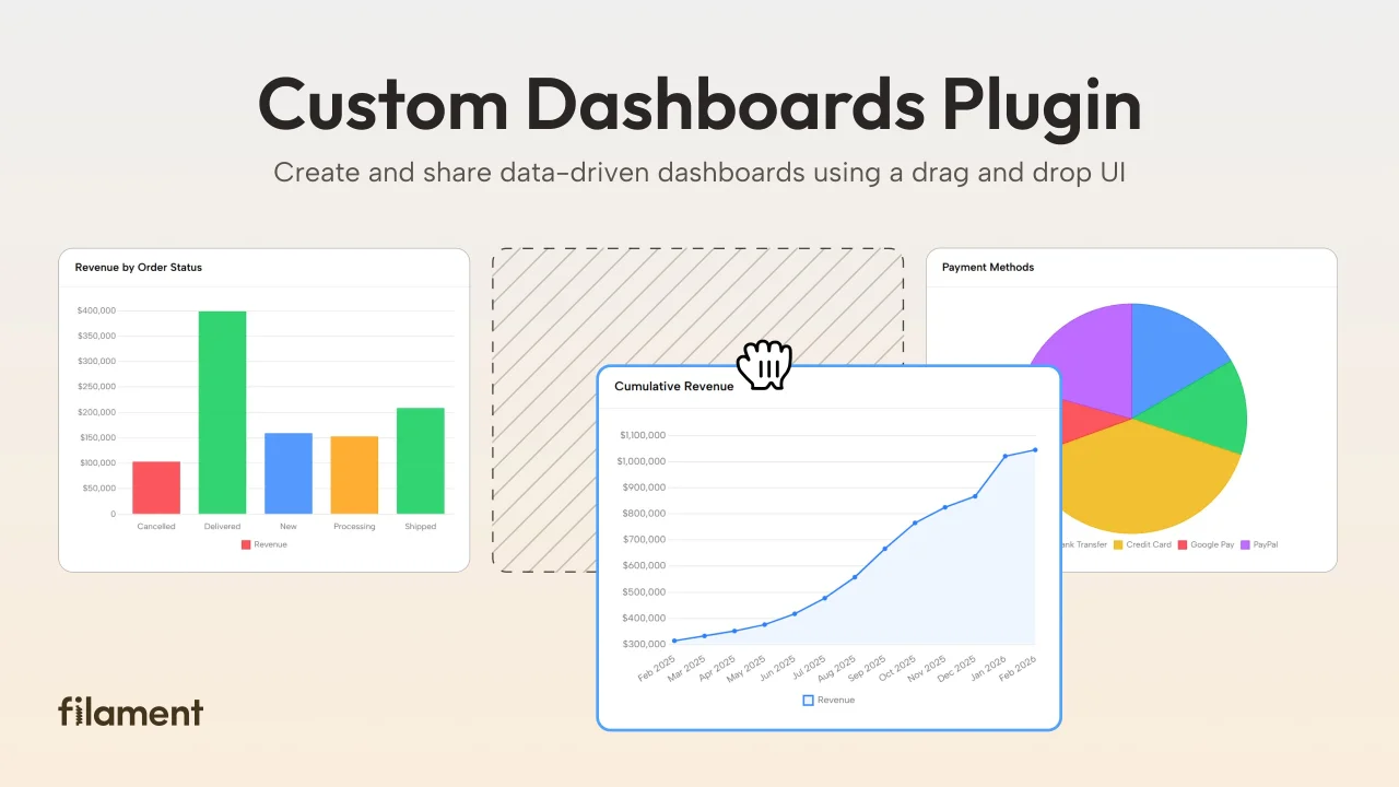
Custom Dashboards
Let your users build and share their own dashboards with a drag-and-drop interface. Define your data sources in PHP and let them do the rest.
 Filament
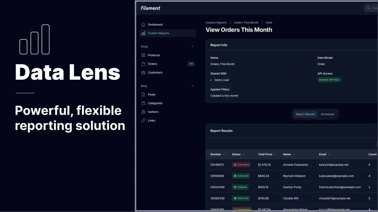
Data Lens
Advanced Data Visualization for Laravel Filament - a premium reporting solution enabling custom column creation, sophisticated filtering, and enterprise-grade data insights within admin panels.
 Padmission
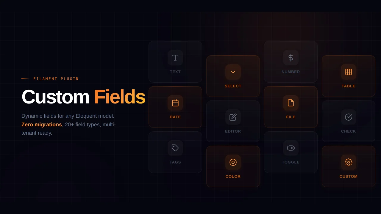
Custom Fields
Eliminate custom field migrations forever. Let your users create and manage form fields directly in Filament admin panels with 20+ built-in field types, validation, and zero database changes.
 Relaticle