Documentation
Filament demo with ApexCharts
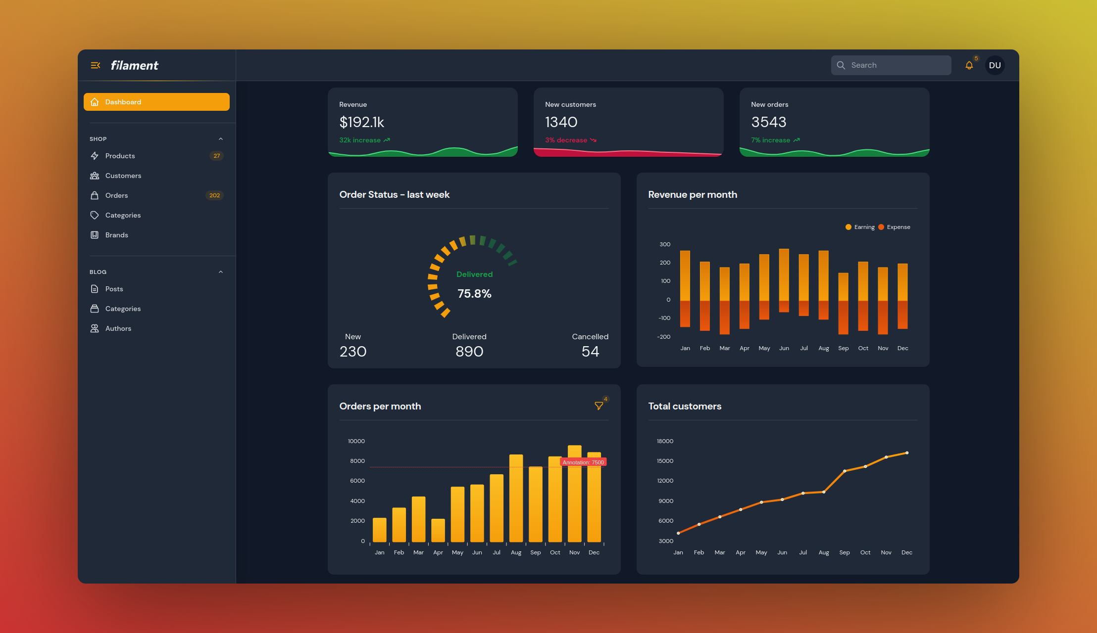
Online Filament Project Example
#Installation
You can install the package via composer:
composer require leandrocfe/filament-apex-charts
Optionally, you can publish the views using:
php artisan vendor:publish --tag="filament-apex-charts-views"
#Usage
Start by creating a widget with the command:
php artisan make:filament-apex-charts BlogPostsChart
#Available chart samples
You may choose:
- Area
- Bar
- Boxplot
- Bubble
- Candlestick
- Column
- Donut
- Heatmap
- Line
- Mixed-LineAndColumn
- Pie
- PolarArea
- Radar
- Radialbar
- RangeArea
- Scatter
- TimelineRangeBars
- Treemap
You may also create an empty chart by selecting the Empty option.
This command will create the BlogPostsChart.php file in app\Filament\Widgets. Ex:
namespace App\Filament\Widgets;
use Leandrocfe\FilamentApexCharts\Widgets\ApexChartWidget;
class BlogPostsChart extends ApexChartWidget
{
/**
* Chart Id
*
* @var string
*/
protected static string $chartId = 'blogPostsChart';
/**
* Widget Title
*
* @var string|null
*/
protected static ?string $heading = 'BlogPostsChart';
/**
* Chart options (series, labels, types, size, animations...)
* https://apexcharts.com/docs/options
*
* @return array
*/
protected function getOptions(): array
{
return [
'chart' => [
'type' => 'bar',
'height' => 300,
],
'series' => [
[
'name' => 'BlogPostsChart',
'data' => [7, 4, 6, 10, 14, 7, 5, 9, 10, 15, 13, 18],
],
],
'xaxis' => [
'categories' => ['Jan', 'Feb', 'Mar', 'Apr', 'May', 'Jun', 'Jul', 'Aug', 'Sep', 'Oct', 'Nov', 'Dec'],
'labels' => [
'style' => [
'colors' => '#9ca3af',
'fontWeight' => 600,
],
],
],
'yaxis' => [
'labels' => [
'style' => [
'colors' => '#9ca3af',
'fontWeight' => 600,
],
],
],
'colors' => ['#6366f1'],
];
}
}
Now, check out your new widget in the dashboard.
#Available options
The getOptions() method is used to return an array of options based on Apex Charts Options. This structure is identical with the Apex Chart library, which Filament Apex Charts uses to render charts. You may use the Apex Chart documentation to fully understand the possibilities to return from getOptions().
#Examples
#Setting a widget title
You may set a widget title:
protected static ?string $heading = 'Blog Posts Chart';
Optionally, you can use the getHeading() method.
#Setting a chart id
You may set a chart id:
protected static string $chartId = 'blogPostsChart';
#Setting a widget height
You may set a widget height:
protected static ?int $contentHeight = 300; //px
Optionally, you can use the getContentHeight() method.
protected function getContentHeight(): ?int
{
return 300;
}
Setting a widget footer
You may set a widget footer:
protected static ?string $footer = 'Lorem Ipsum is simply dummy text of the printing and typesetting industry.';
You can also use the getFooter() method:
Custom view:
use Illuminate\Contracts\View\View;
protected function getFooter(): string|View
{
return view('custom-footer', ['text' => 'Lorem Ipsum is simply dummy text of the printing and typesetting industry.']);
}
<!--resources/views/custom-footer.blade.php-->
<div>
<p class="text-danger-500">{{ $text }}</p>
</div>
Html string:
use Illuminate\Support\HtmlString;
protected function getFooter(): string|View
{
return new HtmlString('<p class="text-danger-500">Lorem Ipsum is simply dummy text of the printing and typesetting industry.</p>');
}
#Filtering chart data
You can set up chart filters to change the data shown on chart. Commonly, this is used to change the time period that chart data is rendered for.
#Filter forms
You may use components from the Form Builder to create custom filter forms:
use Filament\Forms\Components\DatePicker;
use Filament\Forms\Components\TextInput;
protected function getFormSchema(): array
{
return [
TextInput::make('title')
->default('My Chart'),
DatePicker::make('date_start')
->default('2023-01-01'),
DatePicker::make('date_end')
->default('2023-12-31')
];
}
The data from the custom filter form is available in the $this->filterFormData array. You can use the active filter form values within your getOptions() method:
protected function getOptions(): array
{
$title = $this->filterFormData['title'];
$dateStart = $this->filterFormData['date_start'];
$dateEnd = $this->filterFormData['date_end'];
return [
//chart options
];
}
#Single select
To set a default filter value, set the $filter property:
public ?string $filter = 'today';
Then, define the getFilters() method to return an array of values and labels for your filter:
protected function getFilters(): ?array
{
return [
'today' => 'Today',
'week' => 'Last week',
'month' => 'Last month',
'year' => 'This year',
];
}
You can use the active filter value within your getOptions() method:
protected function getOptions(): array
{
$activeFilter = $this->filter;
return [
//chart options
];
}
#Live updating (polling)
By default, chart widgets refresh their data every 5 seconds.
To customize this, you may override the $pollingInterval property on the class to a new interval:
protected static ?string $pollingInterval = '10s';
Alternatively, you may disable polling altogether:
protected static ?string $pollingInterval = null;
#Defer loading
This can be helpful when you have slow queries and you don't want to hold up the entire page load:
protected static bool $deferLoading = true;
protected function getOptions(): array
{
//showing a loading indicator immediately after the page load
if (!$this->readyToLoad) {
return [];
}
//slow query
sleep(2);
return [
//chart options
];
}
#Loading indicator
You can change the loading indicator:
protected static ?string $loadingIndicator = 'Loading...';
You can also use the getLoadingIndicator() method:
use Illuminate\Contracts\View\View;
protected function getLoadingIndicator(): null|string|View
{
return view('custom-loading-indicator');
}
<!--resources/views/custom-loading-indicator.blade.php-->
<div>
<p class="text-danger-500">Loading...</p>
</div>
#Dark mode
The dark mode is supported and enabled by default now.
Optionally, you can disable it:
protected static bool $darkMode = false;
You can also set the theme in the getOptions method:
protected function getOptions(): array
{
return [
'theme' => [
'mode' => 'light' //dark
],
'chart' => [
'type' => 'bar',
...
],
...
];
}
